
- Latest SAPUI Version 1.124
- SAPUI5 Version 1.122
- SAPUI5 Version 1.120
- SAPUI5 Version 1.118
- SAPUI5 Version 1.116
- SAPUI5 Version 1.114
- SAPUI5 Version 1.112
- SAPUI5 Version 1.110
- SAPUI5 Version 1.108
- SAPUI5 Version 1.106
- SAPUI5 Version 1.104
- SAPUI5 Version 1.102
- SAPUI5 Version 1.100
- SAPUI5 Version 1.98
- SAPUI5 Version 1.96
- SAPUI5 Version 1.94
- SAPUI5 Version 1.92
- SAPUI5 Version 1.90
- SAPUI5 Version 1.88
- SAPUI5 Version 1.86
- SAPUI5 Version 1.84
- SAPUI5 Version 1.82
- SAPUI5 Version 1.80
- SAPUI5 Version 1.78
- SAPUI5 Version 1.76
- SAPUI5 Version 1.74
- SAPUI5 Version 1.72
- SAPUI5 Version 1.70
- SAPUI5 Version 1.68
- SAPUI5 Version 1.66
- SAPUI5 Version 1.64
- SAPUI5 Version 1.62
- SAPUI5 Version 1.60
- SAPUI5 Version 1.58
- SAPUI5 Version 1.56
- SAPUI5 Version 1.54
- SAPUI5 Version 1.52
- SAPUI5 Version 1.50
- SAPUI5 Version 1.48
- SAPUI5 Version 1.46
- SAPUI5 Version 1.44
- SAPUI5 Version 1.42
- SAPUI5 Version 1.40
- SAPUI5 Version 1.38
- SAPUI5 Version 1.34
- SAPUI5 Version 1.32
- SAPUI5 Version 1.30
- SAPUI5 Version 1.28
- SAPUI5 Version 1.26
- Latest SAPUI Version 1.124
- SAPUI5 Version 1.122
- SAPUI5 Version 1.120
- SAPUI5 Version 1.118
- SAPUI5 Version 1.116
- SAPUI5 Version 1.114
- SAPUI5 Version 1.112
- SAPUI5 Version 1.110
- SAPUI5 Version 1.108
- SAPUI5 Version 1.106
- SAPUI5 Version 1.104
- SAPUI5 Version 1.102
- SAPUI5 Version 1.100
- SAPUI5 Version 1.98
- SAPUI5 Version 1.96
- SAPUI5 Version 1.94
- SAPUI5 Version 1.92
- SAPUI5 Version 1.90
- SAPUI5 Version 1.88
- SAPUI5 Version 1.86
- SAPUI5 Version 1.84
- SAPUI5 Version 1.82
- SAPUI5 Version 1.80
- SAPUI5 Version 1.78
- SAPUI5 Version 1.76
- SAPUI5 Version 1.74
- SAPUI5 Version 1.72
- SAPUI5 Version 1.70
- SAPUI5 Version 1.68
- SAPUI5 Version 1.66
- SAPUI5 Version 1.64
- SAPUI5 Version 1.62
- SAPUI5 Version 1.60
- SAPUI5 Version 1.58
- SAPUI5 Version 1.56
- SAPUI5 Version 1.54
- SAPUI5 Version 1.52
- SAPUI5 Version 1.50
- SAPUI5 Version 1.48
- SAPUI5 Version 1.46
- SAPUI5 Version 1.44
- SAPUI5 Version 1.42
- SAPUI5 Version 1.40
- SAPUI5 Version 1.38
- SAPUI5 Version 1.36
- SAPUI5 Version 1.34
- SAPUI5 Version 1.32
- SAPUI5 Version 1.30
- SAPUI5 Version 1.28
- SAPUI5 Version 1.26
Overview Page (Smart Templates/SAP Fiori Elements)
Intro
The overview page (OVP) is a new data-driven SAP Fiori app that provides all the information a user needs in a single page, based on the user’s specific domain or role. It allows the user to focus on the most important tasks, enabling faster decision-making as well as immediate action.
The overview page employs cards (containers of content), which are based on smart template technology, and which act as a UI framework for organizing large amounts of information on an equal plane within the page. The overview page is created by a developer based on annotated views of app data (meaning that app content can be tailored to the domain or role). Information can be visualized in an attractive and efficient way using different types of cards.
In short, the overview page is a simple, one-stop, data-driven SAP Fiori app that gives a role all essential information. It allows the user to view, filter, and react to information quickly.
Usage
Use the overview page if:
- The user has a specific role and needs to filter and react to information stemming from a range of applications.
- The user needs to gather information from different sources that support a specific task focus or information need.
- You want to offer different information formats (such as charts, lists, and tables) on a single page for a specific domain or role.
- You want to organize and display a set of (filterable) data to provide an entry-level view of content related to a specific domain or role.
Do not use the overview page if:
- A high-level or birds-eye view of application content is sufficient.
- You want give access to all available SAP Fiori apps for all groups or domains.
- You want to add or delete applications. Instead, consider using the SAP Fiori launchpad home page.
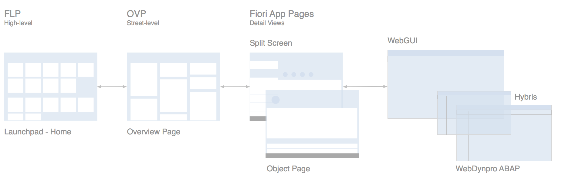
The Difference Between the SAP Fiori Launchpad Home Page, Overview Page and the Object Page
The launchpad home page contains all of a user’s favorite apps and offers access to them via tiles. This covers all the roles that a user would have, such as employee, manager, production worker, or quality manager.
An overview page, on the other hand, focuses on the tasks of a specific role. The user may therefore use multiple overview pages. For example, one overview page could be used to reflect the user’s role as manager, and allow him or her to manage the performance reviews of the team. Another overview page could be used to track quality issues and other relevant information pertaining to the machines that he or she is responsible for in the role of quality manager.
The overview page uses cards. These cards display more (preview) information than tiles due to their sizes and properties. A further distinctive feature is that identical card types also could perform simple actions.
The overview page is always role-based. This means the user will find heterogeneous information related to a specific business context and the daily tasks of the specific role. This is not the case with the object page, which contains object-based, homogenous information.
Have a look at the tables below, which further describe the differences between the launchpad home page, the object page, and the overview page:
| Fiori Launchpad Home Page | Overview Pagge |
| Framework (given) | SAP Fiori application (optional) |
| “Birds-eye” view | “Street level” view |
| Single point of entry | Specific business context for a role |
| No actions | Micro actions |
| One SAP Fiori launchpad per user | Multiple overview pages per user possible |
| Overview Page | Object Page |
| Role-based | Object-based |
| “Street level” view | “Details” view |
| Heterogeneous information | Homogeneous information |
Role-Specific Overview Pages
Only provide an overview page for a role if it makes sense to do so. An overview page gathers information from different sources that support a specific task focus or information need. If a role or user has several such main tasks that require a specific set of information, the role or user might also have multiple overview pages. However, there is no fixed coupling (for example, one overview page per role).
Interaction Flow
The overview page in SAP Fiori functions like a typical SAP Fiori app. This means that you can start it by clicking a tile on the SAP Fiori launchpad home page, or by bookmarking the direct link to the overview page in your browser to access it directly as you would any other app. The figure below illustrates the complete interaction flow.
Overview page screen navigation flow
Responsiveness
The entire SAP Fiori overview page floorplan is fully responsive and uses letterboxing. The flexible “easy scan” layout can accommodate typical laptop screens as well as larger desktop monitors, and features responsive (collapsible) “columns” of cards that can scale all the way down to tablet or phone screen sizes. The columns are of equal width and contain the cards in the following layout sizes:
- Small: one column
- Medium: two columns
- Large: three columns
- Extended: four to five columns for large desktop screen resolutions (maximum five columns)
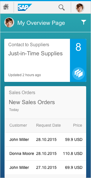
Overview page for smartphone
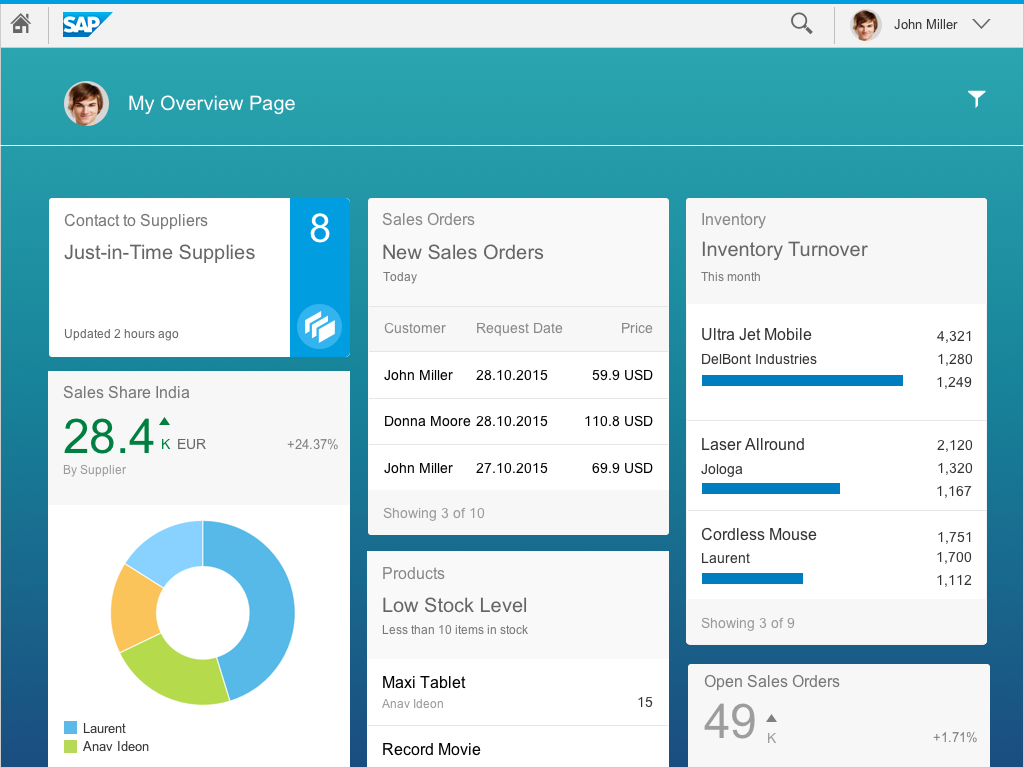
Overview page for tablet
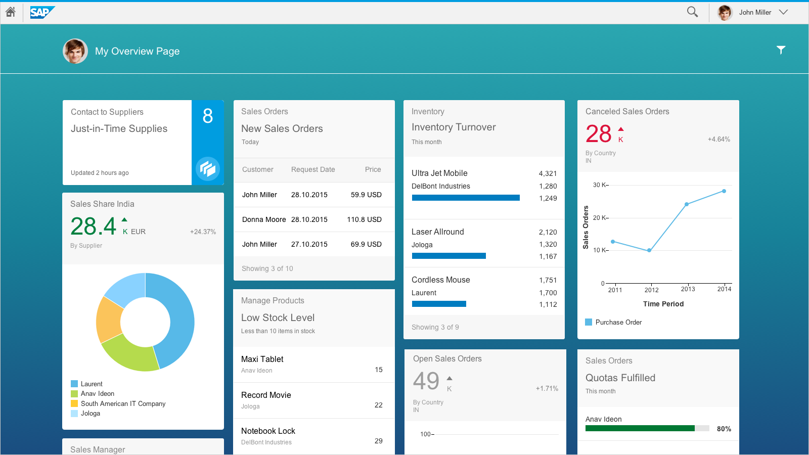
Overview page for desktop
The width of the cards changes depending on the screen size being used: either 20 or 25 rem is displayed. This process starts automatically and saves the responsiveness and readability of the cards to each device. This flexible width behavior applies to all card types.
Structure
The overview page consists of the following components:
- Overview page header
- Smart filter bar
- Content area with cards
These are described in more detail below.

Overview page structure
Components
Overview Page Header
The overview page uses the object page header for a page header. The header is the uppermost element in the floorplan. Its purpose is to provide the user with context and relevant information about the page it represents. The information allowed in the object page header of an overview page is limited to a title, subtitle (optional), and an icon button used to open the smart filter bar.
Smart Filter Bar
The smart filter bar is used “as is”, meaning that for the overview page, all existing functions and behaviors of the current UI5 control are available, including variant management. The smart filter bar filters all the content on the page and in the data base. A notable exception is that the smart filter bar is not visible when the page is first loaded; the user must select the filter icon from the object header to cause the smart filter bar to appear on the page. On a desktop, once the smart filter bar has been invoked, it is always displayed in extended mode. On mobile devices, once it has been invoked, the smart filter bar is always displayed as collapsed.
Content Area of the Overview Page
The content area contains responsive (collapsible) columns of cards. The content area of the overview page features what is referred to as the “easy scan” layout. Note that you cannot place tiles in the content area on the overview page. Like an operating system’s home screen, the home screen only offers access to apps, but no further functionality for keeping the home page clean and usable. The overview page contains cards but no tiles. Cards have more than one interaction area and might even offer actions, thus making them much richer than tiles. Apps can be launched from an overview page through the header area of a card that is related to the specific app.
Cards, which are entirely new for the overview page, are containers of application content. A card is a smart component that uses UI annotation to render its content, and is bound to a single data source. Cards differ in the content they display. They can show a chart, a list of items, a table, informative text, or a combination of two elements. For example, an analytical card may show a KPI header and a chart.
Cards used for the “easy scan” layout always have a uniform horizontal width, but may vary in their vertical dimension based on the card type.
The vertical size (height) is determined by the card type and the embedded control.
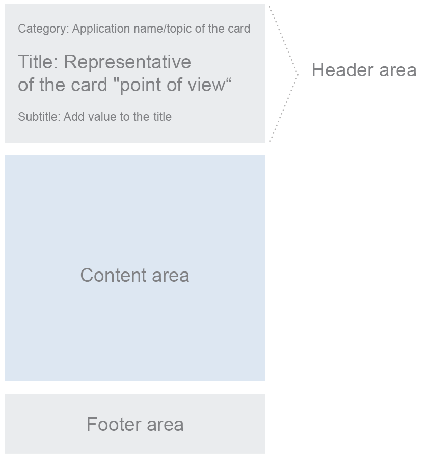
Card Components
Every card comprises three components: a header area, a content area, and a footer area. The header and content areas are mandatory. In some cases, the footer area is not needed (such as for the stack or analytical cards) and is therefore optional.
Card components
Header Area
The card header area is a required section of the card layout. It serves two purposes:
- It indicates what content the card contains.
- It functions as a navigation area. As the entire header is selectable, the user can navigate to the specific app or view from which the card content originates. We recommend that you continuously use a navigation functionality on all cards.
The height of the header area is variable; it expands vertically to contain the text. The header area is mandatory and can contain up to three text fields for descriptive purposes (category, title, subtitle). At least one of the text labels must be used in the header area as a required element. We recommend that you use at least the category and the title to ensure that all cards are displayed homogeneously.
The primary purpose of the header area is to identify the content source (category), to present the reason why it is important to look at the card (title), to show any relevant parameters (subtitle), and to provide navigation to the content source (an app).
Category
The category explains what the card is about and/or identifies the source or parent application.
Title
The headline represents the card’s “point of view”. In one or two words, it explains why this card exists and why a user might want to use it. It is a natural language reflection of the annotated view and should express the results of the setting.
Subtitle
You should use the subtitle for any clarifying description, such as a filter parameter or setting info that adds value to the title.
Content Area of Cards
The content area is mandatory and reserved for application content. Content is currently displayed in a card by embedding a UI5 control that specifies the properties and data format to be displayed. For example, an embedded UI5 standard list control provides formatting (such as row height, font sizes, and number of text blocks).
Footer Area
The footer area has a fixed height. It is also optional as, in some cases, a footer area is not needed (such as for stack or analytical cards). It serves two purposes:
- For cards that display information about a single object or data point, the footer area is used to display actions associated to the content of the card. This only applies to the quick view card. For more information, see the section on Behavior and Interaction in this article.
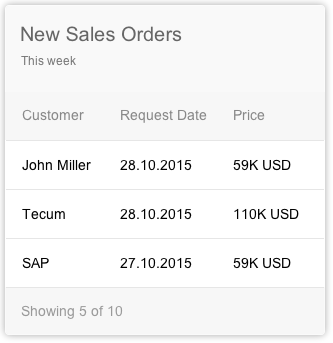
- For cards that display links to a group of multiple objects (such as list or table cards), the footer is informational and contains no actions. It provides a summary text label which describes how many items are shown on the card in respect to all items returned for the particular annotated view. For example: Showing 3 of 10. If there aren’t any items, the following text should be displayed: No items found.
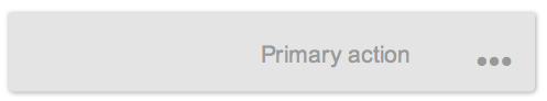
Footer area with actions
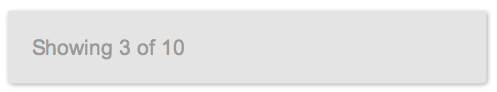
Footer area with a summary text label
Card Types
Single-Object Cards
Cards that feature content with a single focal point, detail, or entity are called single-object cards. An example is a business card with information about a particular contact. The quick view card and the analytical card are single-object cards.
Object Group Cards
Cards that feature a subset of items grouped together by relation to a common topic are called object group cards. A typical example would be a list of sales orders grouped by amount, status, or most recent status. They do not have actions, but are designed in such a way that each row or list item is selectable, thus providing direct navigation to the detailed object within the parent application. Object group cards include all types of list cards and table cards.

Quick view card on the overview page
The quick view card displays basic details about a single object, such as a contact with name, address, and telephone numbers. A small picture can also be added. Clicking on the header area of a card opens the corresponding app. The quick view card inherits the UI5 element sap.m.QuickView. It is only available inside the object stream; you cannot position it on the overview page itself. Only the footer area of the quick view card can currently provide actions.
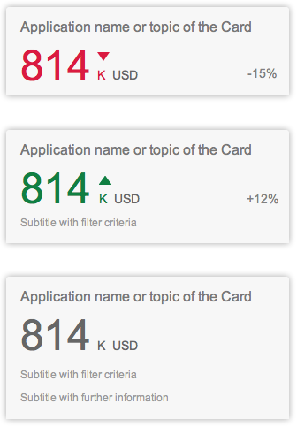
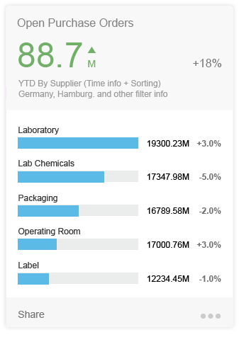
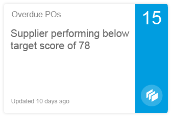
Analytical cards are used for data visualization. They are single-object cards that consist of two areas: a header area that displays the aggregated value of a key measure (KPI), and a chart area that displays a representation of data in graphical format.
The KPI header includes the title and a subtitle. The headline is replaced by the KPI with the respective unit, which can be shown using semantic colors. An optional percentage indicator and a triangle indicator (showing an upward or a downward trend) can also be displayed. The optional subtitle can show the filter criteria used for the chart, and can contain up to two lines of text.
Currently, the VizFrame line chart, bubble chart, and donut chart without a footer area are available for use on the overview page.
For more information, see analytical card.
KPI header in analytical cards
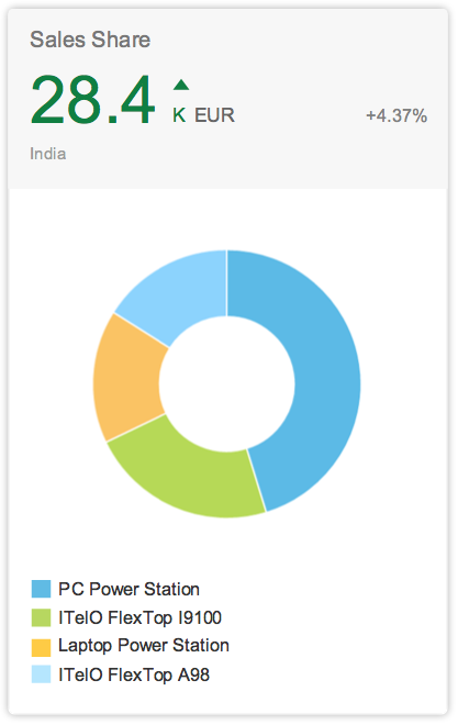
Analytical card with a donut chart
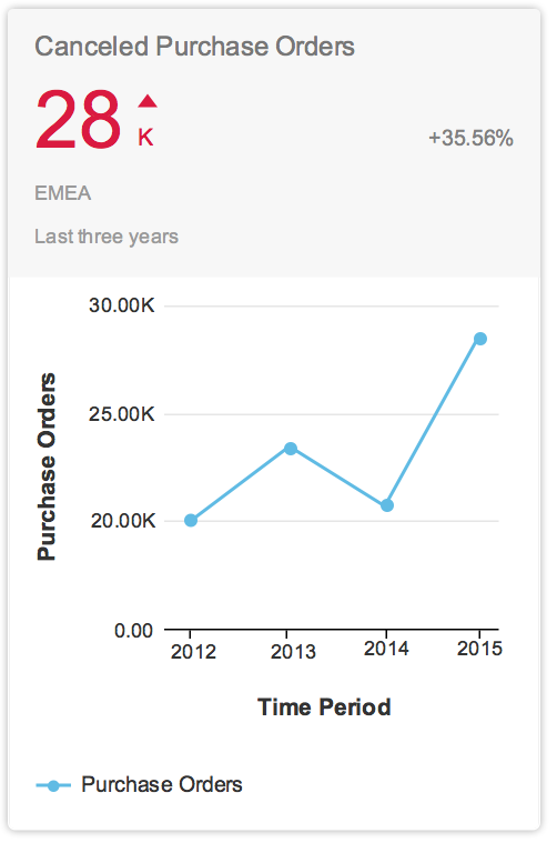
Analytical card with a line chart
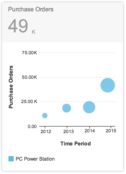
Analytical card with a bubble chart
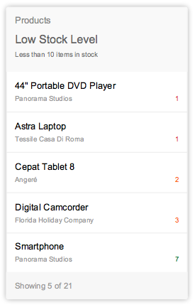
List cards are a type of object group card, and display a set of items in a vertical list. The list card uses the sap.m.List container in the content area. Clicking the header area of a list card opens the parent application, which uses the same filter as the annotated card, and shows a list of all the returned ResultSet objects. Clicking on a list item (row) on the card opens the detail view for that specific item in the same parent application.
Two different line item types are available: “condensed list item” and “extended list item”. However, you can only use one type of list item on any given card. The condensed list item shows minimal information – two lines of text and a number – and contains the same properties as the SAPUI5 control sap.m.StandardListItem. The extended list item displays more information – three lines of text and three numbers – and contains the same properties as the SAPUI5 control sap.m.ObjectListItem.
Size
The size of list cards displaying multiple objects adjusts depending on the amount content available. The height can vary depending on the number of text fields. However, there are rules for the fixed number of list items: You should show no more than 5 condensed list items and no more than 3 extended list items in one list card. The user should expect to navigate to the full app to see a list of all possible items or the result set.
List card with condensed list items
Condensed list items with semantic colors
List card with extended list items
Extended list items with semantic colors
The bar chart list card adds a chart component to a list. You can embed a progress indicator in either a condensed or extended list format.
Overview page – Bar chart list card
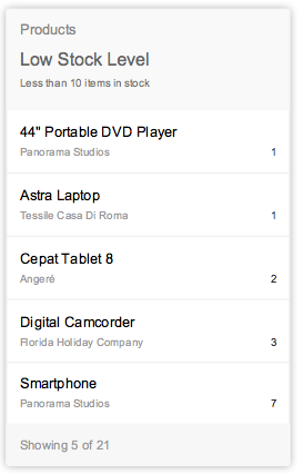
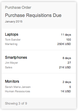
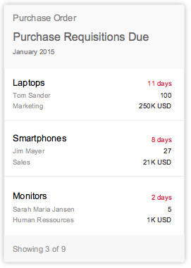
Table cards are a type of object group card, and display a set of items in a table format. Table cards use the responsive SAPUI5 control sap.m.Table. Clicking on the header area of a table card opens the parent application with the same filter applied as for the annotated card with access to a table of all the returned ResultSet objects. In contrast, clicking on a table row inside the card opens that specific object detail screen within an app. The card limit the width of the table to three columns and no row should display more than three lines of text The first and second column show a data field and the last column a data point. The height of the card reflects its content. If one or more items are returned, show the items in the footer area with a summary text “Showing x of x”.
Overview page – Table card
Size
The size of list cards displaying multiple objects adjusts depending on the amount content available. The height can vary depending on the number of text fields. However, there are rules for the fixed number of list items: You should show no more than 5 condensed list items and no more than 3 extended list items in one list card. The user should expect to navigate to the full app to see a list of all possible items or the result set.
If no items are found, the card should only display the header and footer information. The only selectable area would be the header for navigation to the corresponding app.
If one or more items are returned, show the items in the list/table format with a footer area for summary text. The height of the card depends on the amount of content.
Stack Card
A stack card is a special collection of up to 20 single-object cards based on a topic or action. Click the stack card cover to open and browse individual cards, with the option to view, inspect, or take action.
Overview page – Stack card
The stack card cover contains the following components:
Title Area
The title should be one line of text and can be the name of an app or a topic.
Stack Content Count
Stack card covers should always display the total number of cards contained within the stack. The maximum number of cards in a stack is 20.
Headline Area
The headline in a stack card can have up to two lines of text. Subtitles are not available. The headline should be used to explain the contents of the stack, and to highlight what is new or has changed since the last visit.
Status Area
Every stack card should display a single line of text to indicate a status. This can be the time of the last update, an indication of urgency, or the last time the user opened the stack.
Navigation
The stack card cover contains two clickable areas for navigation: the left area navigates to the parent application, and the right area triggers the opening of the object stream (see below), which contains the scrollable collection of cards in an overlay.
The object stream is a scrollable, open stack of cards that appears on the surface of the OVP in a modeless overlay. Cards in the object stream should be ordered chronologically, with the most recent items appearing first by default. However, app developers can also define the best object stream sorting option for their own needs and custom content.
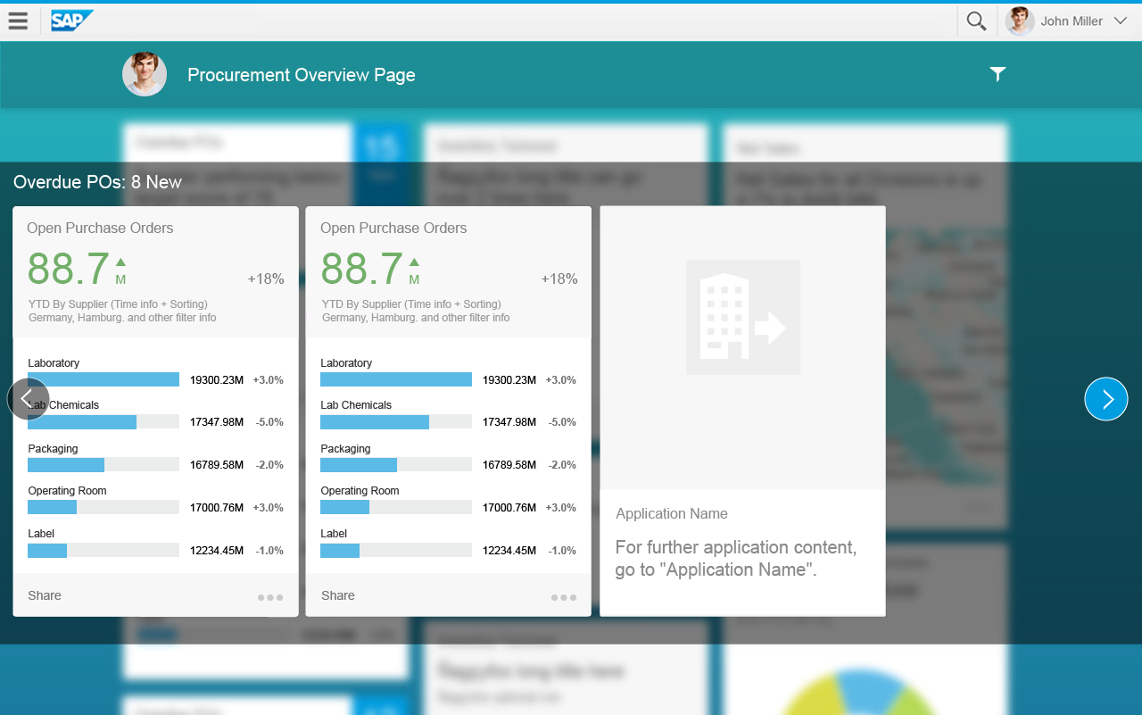
Object stream with scrolling cards
Object Stream Components
The modeless overlay serves as a container or layer for other controls and functionality. Clicking on the stack card cover opens the overlay. When invoked, it should be bound to the card object that launched it. The opened overlay should appear centered vertically to the entire screen window.
Once invoked, the modeless overlay should expand to contain whatever content is provided by the object stream. If more cards are available than fit in the available overlay window space, the area becomes scrollable, and the user can scroll or swipe to see more cards. An arrow icon appears, indicating that the object stream contains more cards.
The overlay should contain a single-line label for text and a Close button. Clicking outside the overlay surface also closes the overlay.
If the stack card contains no cards, the stack link is not active and the overlay cannot be opened. The stack count number displays 0. If only one card is in the stack, an object stream opens containing just a single card.
Tablet Version
On tablet devices, the modeless overlay should expand horizontally to display three cards in landscape mode and two in portrait mode. It should also expand vertically to contain the card height plus room for an area at the top of the control where the stack card title and a button can be provided allowing the user to close the overlay. The overlay should be vertically centered in the entire screen window.
Smartphone Version
On a smartphone, tapping on the right navigation area opens the object stream in a new window that fills the screen at the top of the OVP page. Here, the user can swipe through cards in the stack and take micro actions. Tapping the Close button closes the stack card and returns the user to the main OVP page.
Arrow Indicators (Scrolling)
Arrows appear only in the desktop version. If all cards in a stream are displayed on the screen, no arrows are visible. If there are more cards in the stream than fit in the visible area, the arrow icon appears on the right side when hovering over anywhere on the object stream. Hovering the mouse anywhere over the arrow button area causes the cards to advance.
Once the first card begins to move out of the viewable overlay area, a second arrow button indicator appears on the left. Once the last card has come completely into view, the right arrow indicator disappears.
Placeholder Card
The object stream can display up to 20 cards. A placeholder card occupies the last card position in any object stream. It marks the end point of the object stream and provides a quick navigation point for jumping to the app or apps that have card content in the stream. The placeholder is not included in the number of cards shown to the user on the stack card cover.
The entire card is navigable and should direct the user to the app that the stack card represents, or should display links to the apps corresponding to the cards in the stack.
Behavior and Interaction
The layout of the overview page consists a scrollable page of cards for each device, making it easy to scan through quickly.
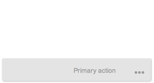
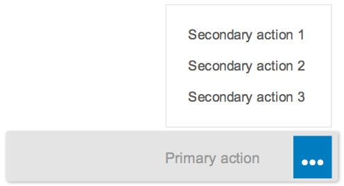
Only quick view cards can have actions in the footer area (inside the object stream). The order of actions assigned and displayed on a card should be determined by the app’s owner. “Primary” and “secondary” actions are possible.
A primary action appears on the left side of the footer area. If more than one action is to be displayed, the additional action moves into the overflow and is described as a secondary action. The three dots (…) represent the overflow action icon. This icon is used as a place to consolidate all other actions except the primary action. Clicking on the overflow invokes the appearance of an action sheet, which is displayed on top of the card’s surface with the list of secondary actions. Clicking on an action starts it and dismisses the action sheet. A maximum of five secondary actions are allowed in the overflow (although we recommend permitting a maximum of three secondary actions here). Including the primary action, you can therefore display up to six actions.
Primary action and the overflow
Primary action and the overflow
Primary action and the listed secondary actions
There are two possible types of action: navigation and function import. Any combination of navigation and function import actions should be allowed. The order of actions assigned to a card should be determined by the app’s owner. Any error messaging or confirmation toasts would be displayed directly on the overview page.
Navigate
Navigation is “intent-based” and takes the user to a different SAP Fiori app that specializes in executing an action. Navigation actions are always multiple-click (meaning that they can be repeated over and over). If we take the example of an SAP Fiori detail view that supports operations for the intended action, the intended destination screen would open in the same browser window, and any errors or task confirmation toast messages would be handled by the supporting application, not the overview page. If another application is open, the object stream should remain as is until the user returns to the overview page.
Import Function
The import function is a term to describe how actions are named in OData. It has two purposes:
- An action requires some input parameters. These would be handled on the overview page screen without further navigation. When an action choice is made (through user selection), the card should change to a dialog, and the input or selection action can be carried out.
- An action can have no parameters, and in such a case, the action request is sent immediately. Once the action has been completed, the card disappears from the object stream.
Action on Phone
Action behavior on a phone is very similar to that on a desktop or tablet. The main difference is that whenever an action on a card requires an input dialog box, the default option should be to use a full screen version for the phone’s form factor.
Resources
Want to dive deeper? Follow the links below to find out more about the SAP Fiori Overview Page.
Elements and Controls
- Introduction to Smart Templates (guidelines)
- List (guidelines)
- Standard List Item (guidelines)
- Responsive Table (guidelines)
- Progress Indicator (guidelines)
- Chart (guidelines)
- Toolbar Overview (guidelines)
- Dialog (guidelines)
- Message Handling (guidelines)
Implementation
- List (SAPUI5 samples)
- Standard List Item (SAPUI5 samples)
- Responsive Table (SAPUI5 samples)
- Progress Indicator (SAPUI5 samples)
- Chart (SAPUI5 samples)
- Overflow Toolbar (SAPUI5 samples)
- Dialog (SAPUI5 samples)
- Message Toast (SAPUI5 samples)
- List (SAPUI5 API reference)
- Standard List Item (SAPUI5 API reference)
- ResponsiveTable (SAPUI5 API reference)
- Progress Indicator (SAPUI5 API reference)
- Chart (SAPUI5 API reference)
- Overflow Toolbar (SAPUI5 API reference)
- Dialog (SAPUI5 API reference)
- Message Toast (SAPUI5 API reference)
 Your feedback has been sent to the SAP Fiori design team.