
- Latest SAPUI Version 1.124
- SAPUI5 Version 1.122
- SAPUI5 Version 1.120
- SAPUI5 Version 1.118
- SAPUI5 Version 1.116
- SAPUI5 Version 1.114
- SAPUI5 Version 1.112
- SAPUI5 Version 1.110
- SAPUI5 Version 1.108
- SAPUI5 Version 1.106
- SAPUI5 Version 1.104
- SAPUI5 Version 1.102
- SAPUI5 Version 1.100
- SAPUI5 Version 1.98
- SAPUI5 Version 1.96
- SAPUI5 Version 1.94
- SAPUI5 Version 1.92
- SAPUI5 Version 1.90
- SAPUI5 Version 1.88
- SAPUI5 Version 1.86
- SAPUI5 Version 1.84
- SAPUI5 Version 1.82
- SAPUI5 Version 1.80
- SAPUI5 Version 1.78
- SAPUI5 Version 1.76
- SAPUI5 Version 1.74
- SAPUI5 Version 1.72
- SAPUI5 Version 1.70
- SAPUI5 Version 1.68
- SAPUI5 Version 1.66
- SAPUI5 Version 1.64
- SAPUI5 Version 1.62
- SAPUI5 Version 1.60
- SAPUI5 Version 1.58
- SAPUI5 Version 1.56
- SAPUI5 Version 1.54
- SAPUI5 Version 1.52
- SAPUI5 Version 1.50
- SAPUI5 Version 1.48
- SAPUI5 Version 1.46
- SAPUI5 Version 1.44
- SAPUI5 Version 1.42
- SAPUI5 Version 1.40
- SAPUI5 Version 1.38
- SAPUI5 Version 1.34
- SAPUI5 Version 1.32
- SAPUI5 Version 1.30
- SAPUI5 Version 1.28
- SAPUI5 Version 1.26
- Latest SAPUI Version 1.124
- SAPUI5 Version 1.122
- SAPUI5 Version 1.120
- SAPUI5 Version 1.118
- SAPUI5 Version 1.116
- SAPUI5 Version 1.114
- SAPUI5 Version 1.112
- SAPUI5 Version 1.110
- SAPUI5 Version 1.108
- SAPUI5 Version 1.106
- SAPUI5 Version 1.104
- SAPUI5 Version 1.102
- SAPUI5 Version 1.100
- SAPUI5 Version 1.98
- SAPUI5 Version 1.96
- SAPUI5 Version 1.94
- SAPUI5 Version 1.92
- SAPUI5 Version 1.90
- SAPUI5 Version 1.88
- SAPUI5 Version 1.86
- SAPUI5 Version 1.84
- SAPUI5 Version 1.82
- SAPUI5 Version 1.80
- SAPUI5 Version 1.78
- SAPUI5 Version 1.76
- SAPUI5 Version 1.74
- SAPUI5 Version 1.72
- SAPUI5 Version 1.70
- SAPUI5 Version 1.68
- SAPUI5 Version 1.66
- SAPUI5 Version 1.64
- SAPUI5 Version 1.62
- SAPUI5 Version 1.60
- SAPUI5 Version 1.58
- SAPUI5 Version 1.56
- SAPUI5 Version 1.54
- SAPUI5 Version 1.52
- SAPUI5 Version 1.50
- SAPUI5 Version 1.48
- SAPUI5 Version 1.46
- SAPUI5 Version 1.44
- SAPUI5 Version 1.42
- SAPUI5 Version 1.40
- SAPUI5 Version 1.38
- SAPUI5 Version 1.36
- SAPUI5 Version 1.34
- SAPUI5 Version 1.32
- SAPUI5 Version 1.30
- SAPUI5 Version 1.28
- SAPUI5 Version 1.26
Rating Indicator
sap.m.RatingIndicator
Intro
The rating indicator can be used to rate content or to indicate a rating. It enables users to rate an item on a numeric scale. The most popular scale is 1 (lowest) to 5 (highest).

Rating indicator
Responsiveness
The rating indicator runs on all form factors and therefore works on all devices. It is embedded in a container and thus behaves as part of it.
Rating indicator as part of the form – Size S (for example, smartphone)
Rating indicator as part of the form – Sizes M and L (for example, tablet and desktop)
Layout
Context
Use the rating indicator in forms, tables, or in a dialog box.
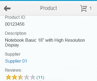
Rating indicator as part of a form
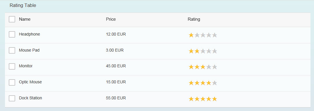
Rating indicator as part of a table
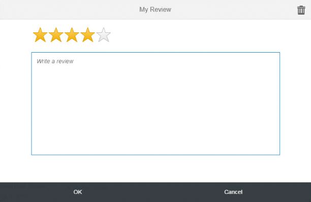
Rating indicator as part of a dialog box
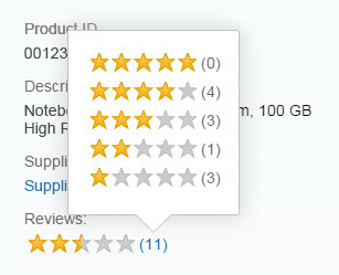
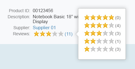
Popover with Details
Details for rating in popover
Behavior and Interaction
Hover
When the user hovers over the rating indicator, a different icon or image is shown (property: iconHovered). This is an orange star by default.
Select
If enabled for rating, the rating that the user previously selected is shown. When the user performs a rating, an event is triggered.
Properties
Rating Symbols
You can also specify the URLs for the images or icons that are used as rating symbols (property: iconUnselected). Five star symbols are used by default. Although you can use other images or icons, we generally recommend that you use the star symbol. You can only choose 1 symbol for the unselected and 1 for the hovered state.
Number of Rating Symbols
You can specify the number of rating symbols (property: maxValue). We recommend using a maximum of 7 symbols, although 5 symbols are preferred.
Float Values
Float values can be visualized as a half or full star (property: visualMode).
Size of Rating Symbols
The recommended sizes of the image or icon to be displayed are:
- Small: 1 rem (16 px)
- Normal: 1.375 rem (22 px) – default
- Large: 2 rem (32 px)

Possible sizes of rating indicator: small, medium, large
Resources
Want to dive deeper? Follow the links below to find out more about related controls, the SAPUI5 implementation, and the visual design.
Elements and Controls
- No links
 Your feedback has been sent to the SAP Fiori design team.