
- Latest SAPUI Version 1.124
- SAPUI5 Version 1.122
- SAPUI5 Version 1.120
- SAPUI5 Version 1.118
- SAPUI5 Version 1.116
- SAPUI5 Version 1.114
- SAPUI5 Version 1.112
- SAPUI5 Version 1.110
- SAPUI5 Version 1.108
- SAPUI5 Version 1.106
- SAPUI5 Version 1.104
- SAPUI5 Version 1.102
- SAPUI5 Version 1.100
- SAPUI5 Version 1.98
- SAPUI5 Version 1.96
- SAPUI5 Version 1.94
- SAPUI5 Version 1.92
- SAPUI5 Version 1.90
- SAPUI5 Version 1.88
- SAPUI5 Version 1.86
- SAPUI5 Version 1.84
- SAPUI5 Version 1.82
- SAPUI5 Version 1.80
- SAPUI5 Version 1.78
- SAPUI5 Version 1.76
- SAPUI5 Version 1.74
- SAPUI5 Version 1.72
- SAPUI5 Version 1.70
- SAPUI5 Version 1.68
- SAPUI5 Version 1.66
- SAPUI5 Version 1.64
- SAPUI5 Version 1.62
- SAPUI5 Version 1.60
- SAPUI5 Version 1.58
- SAPUI5 Version 1.56
- SAPUI5 Version 1.54
- SAPUI5 Version 1.52
- SAPUI5 Version 1.50
- SAPUI5 Version 1.48
- SAPUI5 Version 1.46
- SAPUI5 Version 1.44
- SAPUI5 Version 1.42
- SAPUI5 Version 1.38
- SAPUI5 Version 1.36
- SAPUI5 Version 1.34
- SAPUI5 Version 1.32
- SAPUI5 Version 1.30
- SAPUI5 Version 1.28
- SAPUI5 Version 1.26
- Latest SAPUI Version 1.124
- SAPUI5 Version 1.122
- SAPUI5 Version 1.120
- SAPUI5 Version 1.118
- SAPUI5 Version 1.116
- SAPUI5 Version 1.114
- SAPUI5 Version 1.112
- SAPUI5 Version 1.110
- SAPUI5 Version 1.108
- SAPUI5 Version 1.106
- SAPUI5 Version 1.104
- SAPUI5 Version 1.102
- SAPUI5 Version 1.100
- SAPUI5 Version 1.98
- SAPUI5 Version 1.96
- SAPUI5 Version 1.94
- SAPUI5 Version 1.92
- SAPUI5 Version 1.90
- SAPUI5 Version 1.88
- SAPUI5 Version 1.86
- SAPUI5 Version 1.84
- SAPUI5 Version 1.82
- SAPUI5 Version 1.80
- SAPUI5 Version 1.78
- SAPUI5 Version 1.76
- SAPUI5 Version 1.74
- SAPUI5 Version 1.72
- SAPUI5 Version 1.70
- SAPUI5 Version 1.68
- SAPUI5 Version 1.66
- SAPUI5 Version 1.64
- SAPUI5 Version 1.62
- SAPUI5 Version 1.60
- SAPUI5 Version 1.58
- SAPUI5 Version 1.56
- SAPUI5 Version 1.54
- SAPUI5 Version 1.52
- SAPUI5 Version 1.50
- SAPUI5 Version 1.48
- SAPUI5 Version 1.46
- SAPUI5 Version 1.44
- SAPUI5 Version 1.42
- SAPUI5 Version 1.40
- SAPUI5 Version 1.38
- SAPUI5 Version 1.36
- SAPUI5 Version 1.34
- SAPUI5 Version 1.32
- SAPUI5 Version 1.30
- SAPUI5 Version 1.28
- SAPUI5 Version 1.26
Contextual Filter
sap.m.toolbar
Intro
The contextual filter allows you to show a prefiltered view of a list, such as a master list.
Usage
Use the contextual filter if:
- You want to show the user a meaningful extract of an otherwise highly complex list.
- You need to improve the performance if your app handles very large object lists.
Do not use the contextual filter if:
- You just want to provide a way to filter a list. In this case, use the regular filter instead.
Responsiveness
The contextual filter (sap.m.toolbar) spans the whole width of the list or table it is attached to, while its height remains unchanged. Text inside the bar does not wrap if there is insufficient space, but becomes truncated.
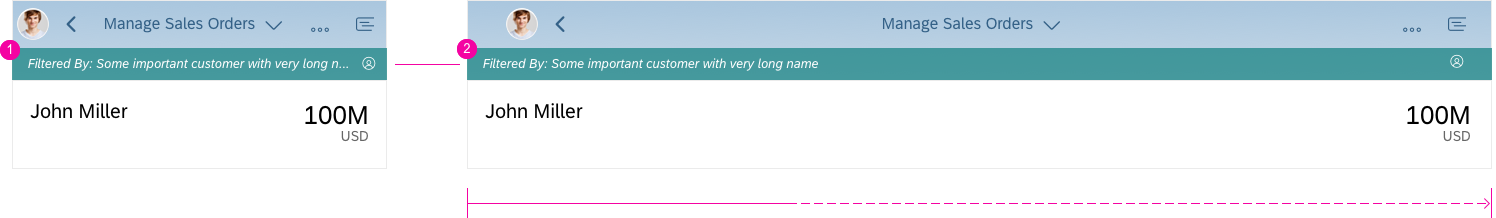
Contextual filter – Responsiveness
- Contextual filter with truncated text in a narrow container, such as on a smartphone.
- Responsive behavior in wider spaces.
Layout
The contextual filter is shown as a bar directly above the master list. It comprises two parts:
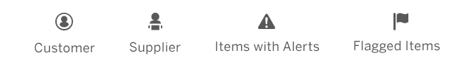
- The filter value on the left (for example, a customer name).
- The icon for the filter criterion on the right (here, the object type “customer”). The icon helps the user to put the filter value into context.
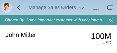
Contextual filter – Layout
Behavior and Interaction
The following example shows a prefiltered master list and explains how to change the filter criterion.
Change Filter
The user opens the app and sees a prefiltered list of objects. The bar on top of the master list indicates that the list is filtered and by which criteria.
When the user clicks or taps the bar, a screen (on phones) or popup (on desktops/tablets) appears on which the user can select another criterion.
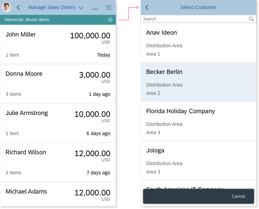
Contextual filter – Change filter setting
Select Filter Criterion
In this use case, the user should not be able to disable the filter because there is no way to reset it.
Other master list functions (such as Search or Refresh) are still available and remain unaffected by the contextual filter.
Once a criterion has been selected, the user is taken back to the master list (on phones) or the popup closes (on desktops/tablets). The list is now filtered by the newly selected criterion.
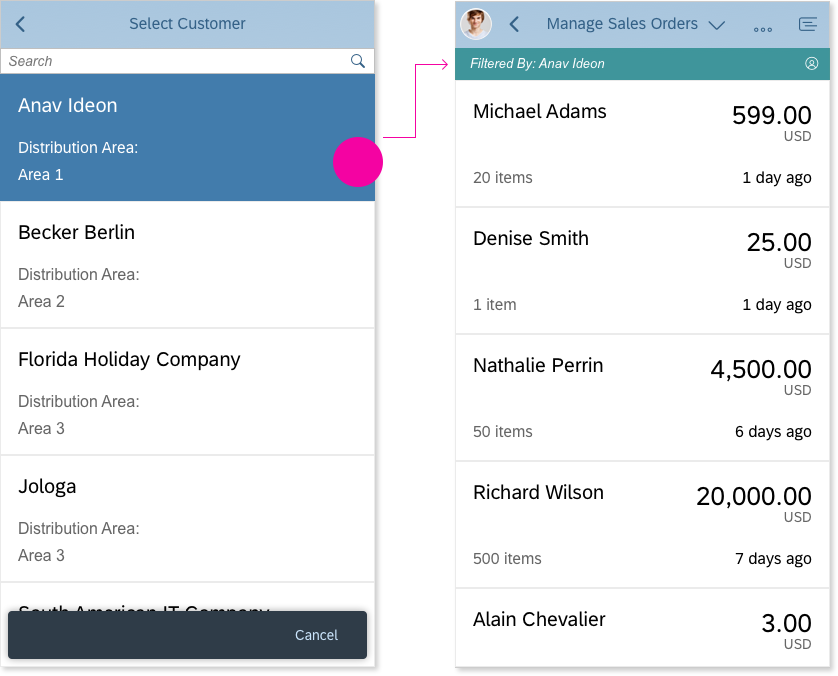
Contextual filter – Select filter attribute
Guidelines
Do not use the contextual filter in place of the regular filter in the footer bar. The regular filter is much more versatile and can also be deactivated by the user.
Also note that the contextual and the regular filter both use the same bar to visualize the filter criteria. If the contextual filter is being used, the regular filter can no longer be visualized. Although both filters can technically be used in parallel, we highly recommend that you avoid having both in one list.
Use an icon that is unique and visually represents the current filter criterion.
Do not use any of the generic filter icons because they may be confused with the user-triggered filters.
Properties
The contextual filter is not a separate control. To build a contextual filter, you need to use the sap.m.OverflowToolbar control. The filtering itself must be carried out by the app.
Exceptions
There is one exception when the contextual filter can actually be cancelled by the user. In this special case, the contextual filter is used to prefilter the listed items in a select dialog.
This use of the contextual filter conveniently offers users a narrowed down list based on their previous selection.
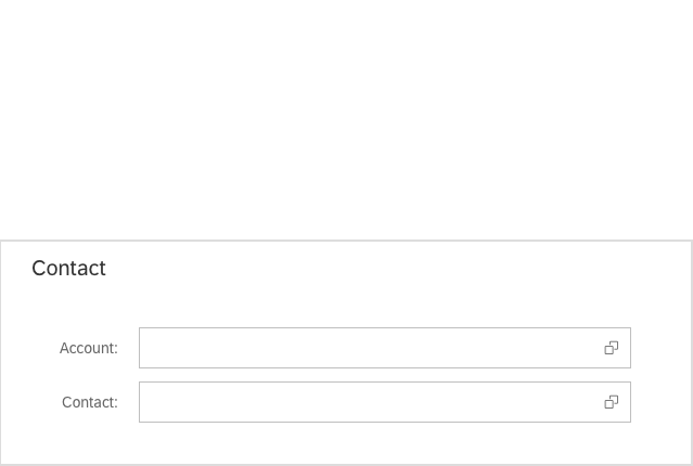
(1) Initial situation: The user is about to select an account and a contact.
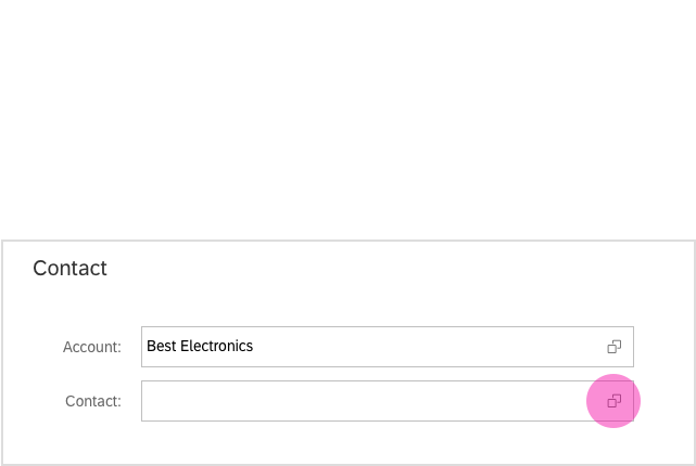
(2) The user selects “Best Electronics” and then clicks or taps the value help icon in the Contact field.
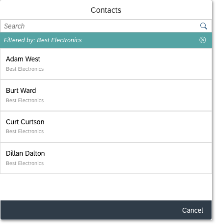
(3) The value help dialog appears showing a list of contacts. These are prefiltered (using the contextual filter) to show only contacts from “Best Electronics” (the company the user selected previously).
Note that this time the icon in the filter’s toolbar does not show an account icon, but a Remove icon instead. This allows the user to cancel the filter if he or she wants to add a contact that is not associated with the account selected previously.
When the user clicks or taps the Remove icon , the filter is removed and the entire contact list is shown.
Once the user has selected a contact, the dialog closes and the name is added to the relevant field on the main page.
Opening the value help again resets the dialog to its initial state with the filter set to “Best Electronics”.
Resources
Want to dive deeper? Follow the links below to find out more about related controls, the SAPUI5 implementation, and the visual design.
 Your feedback has been sent to the SAP Fiori design team.