
- Latest SAPUI Version 1.124
- SAPUI5 Version 1.122
- SAPUI5 Version 1.120
- SAPUI5 Version 1.118
- SAPUI5 Version 1.116
- SAPUI5 Version 1.114
- SAPUI5 Version 1.112
- SAPUI5 Version 1.110
- SAPUI5 Version 1.108
- SAPUI5 Version 1.106
- SAPUI5 Version 1.104
- SAPUI5 Version 1.102
- SAPUI5 Version 1.100
- SAPUI5 Version 1.98
- SAPUI5 Version 1.96
- SAPUI5 Version 1.94
- SAPUI5 Version 1.92
- SAPUI5 Version 1.90
- SAPUI5 Version 1.88
- SAPUI5 Version 1.86
- SAPUI5 Version 1.84
- SAPUI5 Version 1.82
- SAPUI5 Version 1.80
- SAPUI5 Version 1.78
- SAPUI5 Version 1.76
- SAPUI5 Version 1.74
- SAPUI5 Version 1.72
- SAPUI5 Version 1.70
- SAPUI5 Version 1.68
- SAPUI5 Version 1.66
- SAPUI5 Version 1.64
- SAPUI5 Version 1.62
- SAPUI5 Version 1.60
- SAPUI5 Version 1.58
- SAPUI5 Version 1.56
- SAPUI5 Version 1.54
- SAPUI5 Version 1.52
- SAPUI5 Version 1.50
- SAPUI5 Version 1.48
- SAPUI5 Version 1.46
- SAPUI5 Version 1.44
- SAPUI5 Version 1.42
- SAPUI5 Version 1.38
- SAPUI5 Version 1.36
- SAPUI5 Version 1.34
- SAPUI5 Version 1.32
- SAPUI5 Version 1.30
- SAPUI5 Version 1.28
- SAPUI5 Version 1.26
- Latest SAPUI Version 1.124
- SAPUI5 Version 1.122
- SAPUI5 Version 1.120
- SAPUI5 Version 1.118
- SAPUI5 Version 1.116
- SAPUI5 Version 1.114
- SAPUI5 Version 1.112
- SAPUI5 Version 1.110
- SAPUI5 Version 1.108
- SAPUI5 Version 1.106
- SAPUI5 Version 1.104
- SAPUI5 Version 1.102
- SAPUI5 Version 1.100
- SAPUI5 Version 1.98
- SAPUI5 Version 1.96
- SAPUI5 Version 1.94
- SAPUI5 Version 1.92
- SAPUI5 Version 1.90
- SAPUI5 Version 1.88
- SAPUI5 Version 1.86
- SAPUI5 Version 1.84
- SAPUI5 Version 1.82
- SAPUI5 Version 1.80
- SAPUI5 Version 1.78
- SAPUI5 Version 1.76
- SAPUI5 Version 1.74
- SAPUI5 Version 1.72
- SAPUI5 Version 1.70
- SAPUI5 Version 1.68
- SAPUI5 Version 1.66
- SAPUI5 Version 1.64
- SAPUI5 Version 1.62
- SAPUI5 Version 1.60
- SAPUI5 Version 1.58
- SAPUI5 Version 1.56
- SAPUI5 Version 1.54
- SAPUI5 Version 1.52
- SAPUI5 Version 1.50
- SAPUI5 Version 1.48
- SAPUI5 Version 1.46
- SAPUI5 Version 1.44
- SAPUI5 Version 1.42
- SAPUI5 Version 1.40
- SAPUI5 Version 1.38
- SAPUI5 Version 1.36
- SAPUI5 Version 1.34
- SAPUI5 Version 1.32
- SAPUI5 Version 1.30
- SAPUI5 Version 1.28
- SAPUI5 Version 1.26
Micro Chart
sap.suite.ui.microchart.BulletChart | sap.suite.ui.microchart.ColumnMicroChart | sap.suite.ui.microchart.ComparisonChart
Intro
Micro charts help you visualize a small number of data points in a small, non-interactive way. They can be embedded in tiles, SAP Smart Business drilldowns, and any SAPUI5 container (such as SAPUI5 tables).
Several chart types are available: bullet chart, trend chart, column chart, comparison chart, and harvey ball chart.
Responsiveness
All micro charts are fully responsive.
Types
There are different types of micro charts currently available:
- Bullet
- Column
- Trend
- Comparison
- Delta
- Harvey Ball
Bullet Chart
A bullet chart is a variation of a bar graph originally developed by Stephen Few and adapted by SAP Fiori in order to fulfill additional requirements. Much like the traditional thermometer charts and progress bars found in many dashboards, the bullet chart serves as a replacement for dashboard gauges and meters.
The bullet chart features a single, primary measure (for example, current year-to-date revenue). It compares that measure to one or more other measures to enrich its meaning (for example, compared to a target), and displays it in the context of qualitative ranges of performance, such as poor, satisfactory, and good.
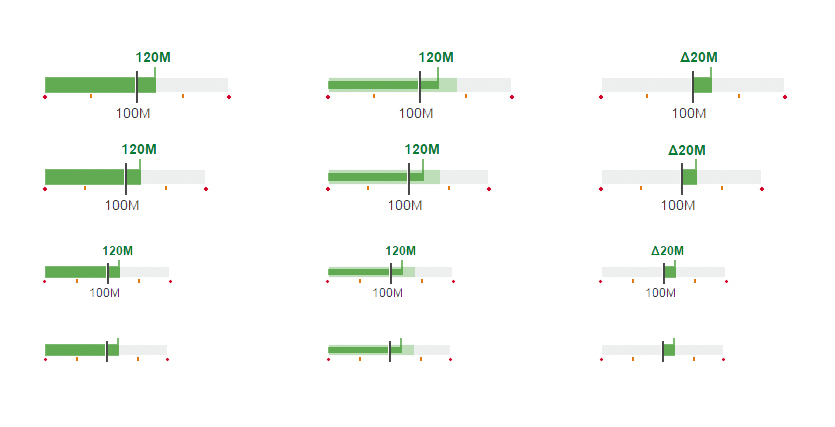
Bullet chart without forecast, with forecast, and with only delta value shown
The actual value is shown as a horizontal bar, the target value as a vertical line (marker), and the thresholds as indicators below the bar. The actual value and target value can have a label.
Only semantic colors (good, critical, bad, neutral) can be used for the actual value.
The forecast is shown as a bar with a lighter tint of the same color as the actual value in the background.
Based on the data points you want to show, choose one of the following visualizations:
- Actual value vs. target value.
- Actual value vs. target value with forecast.
- The delta between the actual value and the target value. For this option, the delta is shown as a bar starting or ending at the target marker.
Column Chart
A column chart (also known as a bar chart) uses rectangular bars to compare categories. One axis of the chart shows the specific categories being compared, the other axis represents a value.
Note: The current version does not show axis or data point labels.
Only semantic colors (good, critical, bad, neutral) can be used.
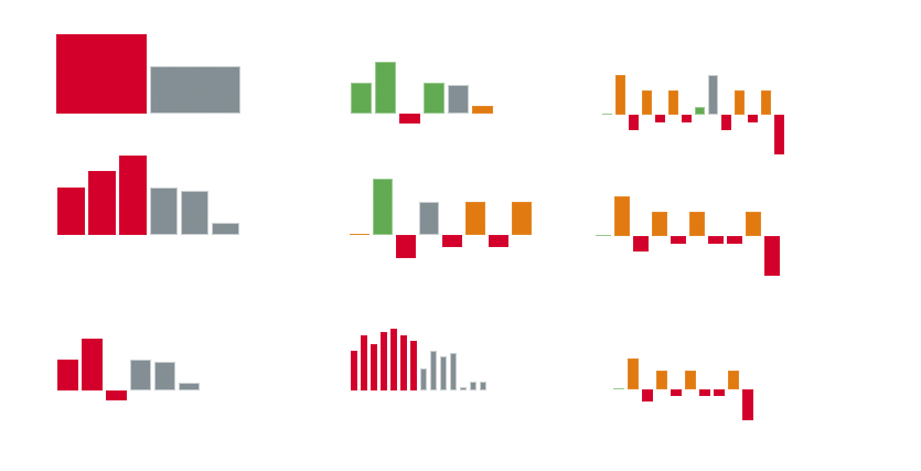
Multiple column charts
Trend Chart (Area Chart)
A trend chart is a line and area chart that provides the same information as a bullet chart, with one exception: A bullet chart shows an additional forecast value, but a trend chart provides information for a specific range of time.
The actual value is shown as a solid line, the target value as a dotted line, and the thresholds as colored areas in the background.
You can show labels for the start value, the end value, the minimum value, the maximum value, and the beginning and end of the time range.
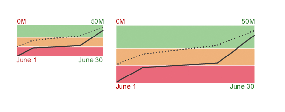
Trend chart with horizontal forecast
Comparison Chart
The comparison chart is a bar chart. It compares entries in a top N list. You can choose between two different layouts depending on the available space/parent container. You can use the semantic color palette as well as the chart palette.
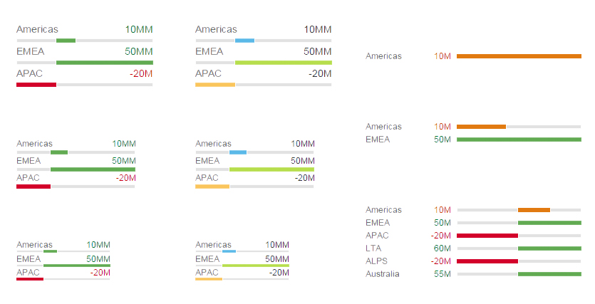
Different comparison charts
Delta Chart
The delta chart helps to visualize a delta value between two main key figures. The delta can be a positive or negative value. Configured thresholds define the semantic coloring of the delta bar. The left-aligned labels can be omitted, whereas the right-aligned labels with the values are always shown.
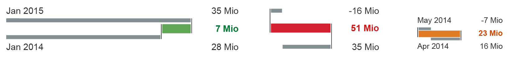
Different delta charts
Harvey Ball Chart
A harvey ball chart should be used to visualize a value compared to its total. This is not a pie chart with multiple values or sections, but rather just one value from a total. If the thresholds are configured, the semantic color of the value shows a positive, critical, or negative value. Regular chart colors without semantic meaning can also be used.
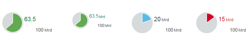
Different harvey ball charts
Behavior and Interaction
Clicking/Tapping (Optional)
The charts include one behavior or interaction: a click event that can be switched on or off.
Resources
Want to dive deeper? Follow the links below to find out more about related controls, the SAPUI5 implementation, and the visual design.
Implementation
- Micro Bullet Charts (SAPUI5 samples)
- Micro Column Charts (SAPUI5 samples)
- Micro Comparison Charts (SAPUI5 samples)
- Micro Area Charts (SAPUI5 samples)
- Micro Delta Charts (SAPUI5 samples)
- Harvey Ball Charts (SAPUI5 samples)
 Your feedback has been sent to the SAP Fiori design team.