
- Latest SAPUI Version 1.124
- SAPUI5 Version 1.122
- SAPUI5 Version 1.120
- SAPUI5 Version 1.118
- SAPUI5 Version 1.116
- SAPUI5 Version 1.114
- SAPUI5 Version 1.112
- SAPUI5 Version 1.110
- SAPUI5 Version 1.108
- SAPUI5 Version 1.106
- SAPUI5 Version 1.104
- SAPUI5 Version 1.102
- SAPUI5 Version 1.100
- SAPUI5 Version 1.98
- SAPUI5 Version 1.96
- SAPUI5 Version 1.94
- SAPUI5 Version 1.92
- SAPUI5 Version 1.90
- SAPUI5 Version 1.88
- SAPUI5 Version 1.86
- SAPUI5 Version 1.84
- SAPUI5 Version 1.82
- SAPUI5 Version 1.80
- SAPUI5 Version 1.78
- SAPUI5 Version 1.76
- SAPUI5 Version 1.74
- SAPUI5 Version 1.72
- SAPUI5 Version 1.70
- SAPUI5 Version 1.68
- SAPUI5 Version 1.66
- SAPUI5 Version 1.64
- SAPUI5 Version 1.62
- SAPUI5 Version 1.60
- SAPUI5 Version 1.58
- SAPUI5 Version 1.56
- SAPUI5 Version 1.54
- SAPUI5 Version 1.52
- SAPUI5 Version 1.50
- SAPUI5 Version 1.48
- SAPUI5 Version 1.46
- SAPUI5 Version 1.44
- SAPUI5 Version 1.42
- SAPUI5 Version 1.38
- SAPUI5 Version 1.36
- SAPUI5 Version 1.34
- SAPUI5 Version 1.32
- SAPUI5 Version 1.30
- SAPUI5 Version 1.28
- SAPUI5 Version 1.26
- Latest SAPUI Version 1.124
- SAPUI5 Version 1.122
- SAPUI5 Version 1.120
- SAPUI5 Version 1.118
- SAPUI5 Version 1.116
- SAPUI5 Version 1.114
- SAPUI5 Version 1.112
- SAPUI5 Version 1.110
- SAPUI5 Version 1.108
- SAPUI5 Version 1.106
- SAPUI5 Version 1.104
- SAPUI5 Version 1.102
- SAPUI5 Version 1.100
- SAPUI5 Version 1.98
- SAPUI5 Version 1.96
- SAPUI5 Version 1.94
- SAPUI5 Version 1.92
- SAPUI5 Version 1.90
- SAPUI5 Version 1.88
- SAPUI5 Version 1.86
- SAPUI5 Version 1.84
- SAPUI5 Version 1.82
- SAPUI5 Version 1.80
- SAPUI5 Version 1.78
- SAPUI5 Version 1.76
- SAPUI5 Version 1.74
- SAPUI5 Version 1.72
- SAPUI5 Version 1.70
- SAPUI5 Version 1.68
- SAPUI5 Version 1.66
- SAPUI5 Version 1.64
- SAPUI5 Version 1.62
- SAPUI5 Version 1.60
- SAPUI5 Version 1.58
- SAPUI5 Version 1.56
- SAPUI5 Version 1.54
- SAPUI5 Version 1.52
- SAPUI5 Version 1.50
- SAPUI5 Version 1.48
- SAPUI5 Version 1.46
- SAPUI5 Version 1.44
- SAPUI5 Version 1.42
- SAPUI5 Version 1.40
- SAPUI5 Version 1.38
- SAPUI5 Version 1.36
- SAPUI5 Version 1.34
- SAPUI5 Version 1.32
- SAPUI5 Version 1.30
- SAPUI5 Version 1.28
- SAPUI5 Version 1.26
Radio Button
sap.m.RadioButton
Intro
Radio buttons provide users with a set of mutually exclusive options. They allow a user to select only one option from two or more choices. Each option is represented by a radio button. Consequently, radio buttons only work in groups.
Usage
Use the radio button if:
- You need to help users choose quickly between at least two clearly different choices.
Do not use the radio button if:
- You need to offer the user the option of multiple selection. In this case, use checkboxes instead because radio buttons are for single-selection contexts only.
- You want to allow the user to select list items. Instead, let the user tab the list item to make a single selection (consider a message toast for confirmation) and provide checkboxes to select multiple list items.
- The default option is recommended for most users in most situations. In this case, consider a dropdown list instead, which uses less space by not showing all options straightaway.
- You need to present more than 8 options. Use a dropdown box or list view.
- In special cases, there are only two mutually exclusive options. Combine them into a single checkbox or toggle switch. For example, use a checkbox for “I agree” (for example, to terms and conditions) instead of two radio buttons for “I agree” and “I don’t agree”.
- The options are numbers with fixed steps. Use a slider control.
Responsiveness
The radio button group control is not responsive. A horizontal radio button group should be displayed as a vertical group on smartphones because a horizontal group should never break into two lines.
Also note that the control does not handle long labels in horizontal groups. Such labels do not break and are not truncated. Therefore, check label lengths and padding in horizontal groups on desktop and tablets.
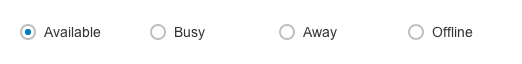
A horizontal radio button group does not match the size of mobile phone screens
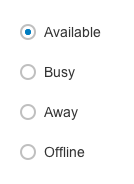
On smartphones, a horizontal group should always break into a vertical button group
Behavior and Interaction
Activation
The user taps a radio button to activate the related option. Note that tapping an activated option does not deactivate it, but tapping a different option transfers activation to that option. Therefore, a user can select only one option from a group of radio buttons.
A group of radio buttons behaves like a single control: Only the selected choice is accessible using the tab key, but users can cycle through the group using the arrow keys.
Styles
The radio button attributes set various states. The value state attribute sets one of four states: default, read-only, error, and warning. Radio buttons display the state depending on the interaction.
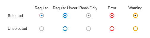
Radio button interaction states
Column Attribute
The radio button attributes also set arrangement so that you do not have to implement this for every single control. The column attribute adds or removes n-columns to a set of radio buttons.
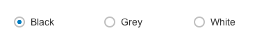
Three columns – the example shows background color settings
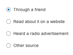
One column – the example shows a customer survey
Guidelines
The radio button control serves the purpose of exclusive selection and adds clarity and weight to very important options in your app. Use radio buttons when the options being presented are important enough to occupy more screen space. They should only be used if the user needs to see all available options instantly and side by side. Radio buttons draw more attention to the options as they emphasize all options equally.
Labeling
A label to indicate the option is mandatory for each radio button. Limit the radio button’s label to a single line.
Sorting
List the options in a logical order, such as lowest to highest risk, simplest to most complex operation, or most to least likely to be selected.
Alphabetical ordering is less recommended as it is language-dependent and therefore not localizable.
Aligning
Try to align radio buttons vertically instead of horizontally, especially for long labels. Horizontal alignment is harder to read and localize. Consider horizontal alignment in cases of one-word labels, such as in the background color settings example above.
In forms, always align radio buttons vertically instead of horizontally as the length of the labels may vary for different languages.
Do not put two radio button groups right next to each other as it is difficult to determine which buttons belong to which group. Use group labels and padding to separate them.
Offering “No Choice”
If the user is also able to select none of the options, be sure to add this option to the control as well (as this option is generally not offered in the control). Add a radio button that offers None or Does not apply.
Default State
Because radio buttons do not generally offer “no choice”, the app should show the less risky option (most likely the first option in the group) as preselected by default.
Exceptional Case: No Preselection by Default
In rare cases, preselection might result in incorrect inputs or assumptions. One such example is gender selection in a form. In this case, you should offer no preselection and decide whether a user input is mandatory or not depending on the use case.
If a choice is mandatory, set an error state if validation proves that a user did not select an option.
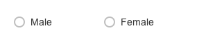
Offer no selection by default in this case of gender selection because a preselection might be misleading
Resources
Want to dive deeper? Follow the links below to find out more about related controls, the SAPUI5 implementation, and the visual design.
 Your feedback has been sent to the SAP Fiori design team.