
- Latest SAPUI Version 1.124
- SAPUI5 Version 1.122
- SAPUI5 Version 1.120
- SAPUI5 Version 1.118
- SAPUI5 Version 1.116
- SAPUI5 Version 1.114
- SAPUI5 Version 1.112
- SAPUI5 Version 1.110
- SAPUI5 Version 1.108
- SAPUI5 Version 1.106
- SAPUI5 Version 1.104
- SAPUI5 Version 1.102
- SAPUI5 Version 1.100
- SAPUI5 Version 1.98
- SAPUI5 Version 1.96
- SAPUI5 Version 1.94
- SAPUI5 Version 1.92
- SAPUI5 Version 1.90
- SAPUI5 Version 1.88
- SAPUI5 Version 1.86
- SAPUI5 Version 1.84
- SAPUI5 Version 1.82
- SAPUI5 Version 1.80
- SAPUI5 Version 1.78
- SAPUI5 Version 1.76
- SAPUI5 Version 1.74
- SAPUI5 Version 1.72
- SAPUI5 Version 1.70
- SAPUI5 Version 1.68
- SAPUI5 Version 1.66
- SAPUI5 Version 1.64
- SAPUI5 Version 1.62
- SAPUI5 Version 1.60
- SAPUI5 Version 1.58
- SAPUI5 Version 1.56
- SAPUI5 Version 1.54
- SAPUI5 Version 1.52
- SAPUI5 Version 1.50
- SAPUI5 Version 1.48
- SAPUI5 Version 1.46
- SAPUI5 Version 1.44
- SAPUI5 Version 1.42
- SAPUI5 Version 1.38
- SAPUI5 Version 1.36
- SAPUI5 Version 1.34
- SAPUI5 Version 1.32
- SAPUI5 Version 1.30
- SAPUI5 Version 1.28
- SAPUI5 Version 1.26
- Latest SAPUI Version 1.124
- SAPUI5 Version 1.122
- SAPUI5 Version 1.120
- SAPUI5 Version 1.118
- SAPUI5 Version 1.116
- SAPUI5 Version 1.114
- SAPUI5 Version 1.112
- SAPUI5 Version 1.110
- SAPUI5 Version 1.108
- SAPUI5 Version 1.106
- SAPUI5 Version 1.104
- SAPUI5 Version 1.102
- SAPUI5 Version 1.100
- SAPUI5 Version 1.98
- SAPUI5 Version 1.96
- SAPUI5 Version 1.94
- SAPUI5 Version 1.92
- SAPUI5 Version 1.90
- SAPUI5 Version 1.88
- SAPUI5 Version 1.86
- SAPUI5 Version 1.84
- SAPUI5 Version 1.82
- SAPUI5 Version 1.80
- SAPUI5 Version 1.78
- SAPUI5 Version 1.76
- SAPUI5 Version 1.74
- SAPUI5 Version 1.72
- SAPUI5 Version 1.70
- SAPUI5 Version 1.68
- SAPUI5 Version 1.66
- SAPUI5 Version 1.64
- SAPUI5 Version 1.62
- SAPUI5 Version 1.60
- SAPUI5 Version 1.58
- SAPUI5 Version 1.56
- SAPUI5 Version 1.54
- SAPUI5 Version 1.52
- SAPUI5 Version 1.50
- SAPUI5 Version 1.48
- SAPUI5 Version 1.46
- SAPUI5 Version 1.44
- SAPUI5 Version 1.42
- SAPUI5 Version 1.40
- SAPUI5 Version 1.38
- SAPUI5 Version 1.36
- SAPUI5 Version 1.34
- SAPUI5 Version 1.32
- SAPUI5 Version 1.30
- SAPUI5 Version 1.28
- SAPUI5 Version 1.26
Upload Collection
sap.m.UploadCollection
Intro
The upload collection control allows users to upload single or multiple files from a device (desktop, tablet, or phone) to the SAP Fiori app. Typically, uploaded files appear in an Attachments tab. However, files can also be displayed elsewhere.
Usage
Use the upload collection control if:
- You want to show a list of uploaded files that can be modified.
- You want to allow users to add or remove files, and to change the file names.
- You are still using the old sap.ca.ui.FileUpload control.
Do not use the upload collection control if:
- The user can upload only one file to the app. In this case, use the sap.ui.unified.FileUploader control instead.
Responsiveness
The upload collection control supports small, medium, and large containers.
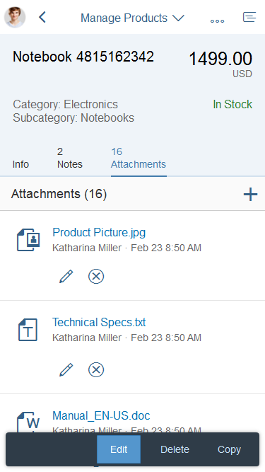
Upload collection – Size S

Upload collection – Size M

Upload collection – Size L/XL
Layout
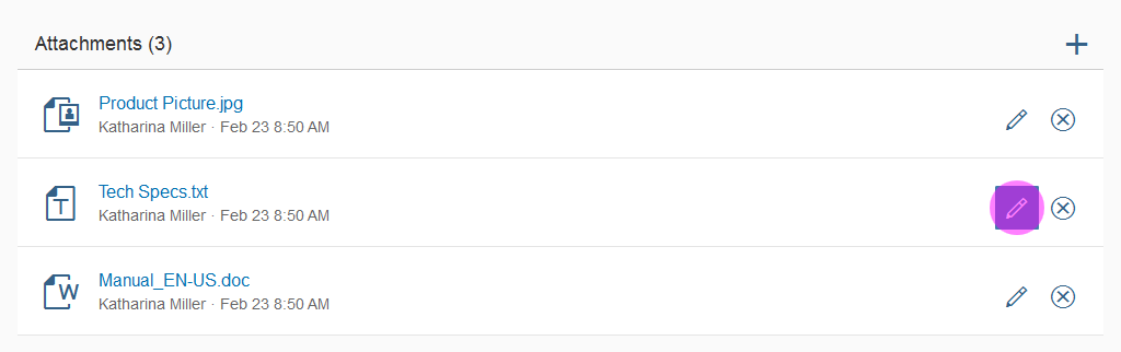
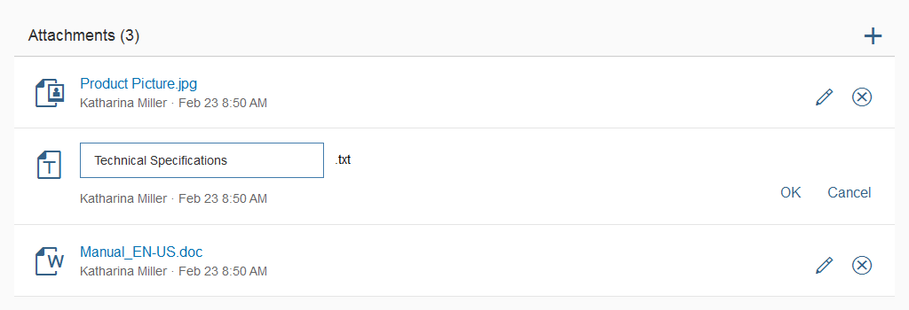
The toolbar at the top of the upload collection control contains an Attachments header with a counter on the left, and an Add button ( ) for adding new items on the right. You can overwrite both the default text Attachments and the counter (property: numberOfAttachmentsText).
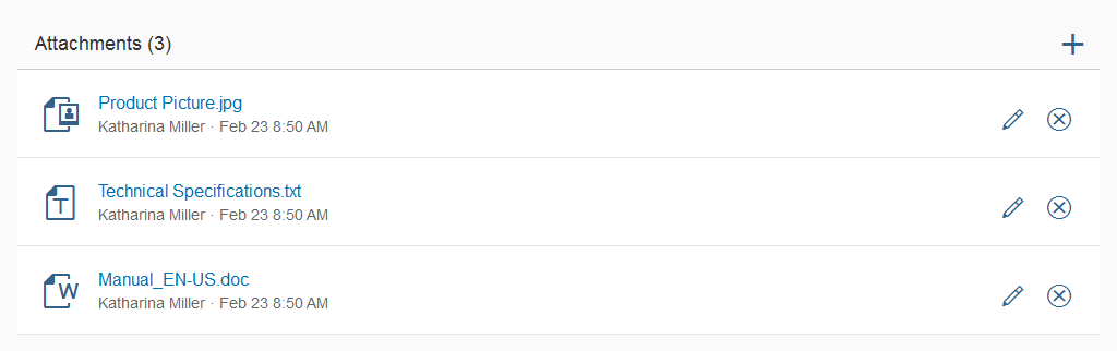
Files are listed vertically. Each item has a Rename ( ) and a Remove ( ) button.
While most file types have generic icons (for example documents, spreadsheets, or presentations), image files have a small thumbnail preview.
Layout – Items
Attributes and Statuses
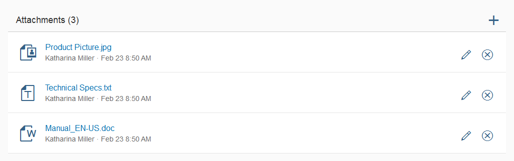
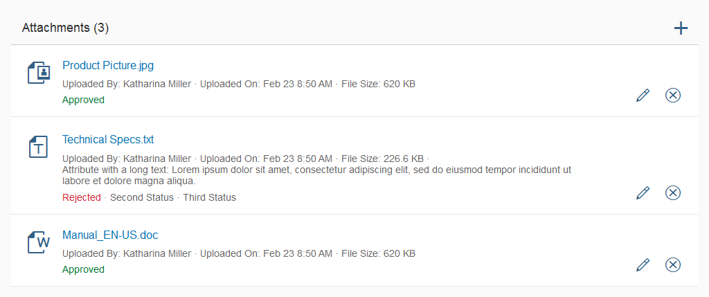
You can display additional attributes and statuses below the file name. Attributes can include the name of the person who uploaded the file, the upload date, the version number, file size, and so on.
App developers can also set individual statuses. These statuses usually refer to an object’s state in a workflow (such as Approved or Overdue).
If multiple attributes or statuses are displayed, they are separated by a bullet.
Layout – Attributes and statuses
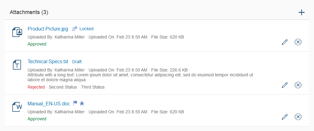
Technical Statuses
In contrast to the statuses mentioned above, technical statuses are not bound to a workflow or business process. Their main use is to show the current editing status of an object (Draft, Locked, Unsaved Changes). For further uses and more details see the object display components and draft handling articles.
Layout – Technical statuses
Types
The upload collection control offers two different modes: UploadCollection and UploadCollectionForPendingUpload.
The classic upload collection allows users to upload single or multiple files directly to the app, where these files are displayed as a list.
In contrast, the upload collection for pending upload requires the user to first add multiple files to a list (usually presented in a dialog) and then explicitly trigger the upload for the entire list.
When the dialog with the list is confirmed, the user returns to the app screen with the upload collection set to busy until the upload is finished.
Behavior and Interaction
Uploading Files
As long as no files have been added to the upload collection, applications need to show a mock-entry that provides users with a hint on how to upload their files.
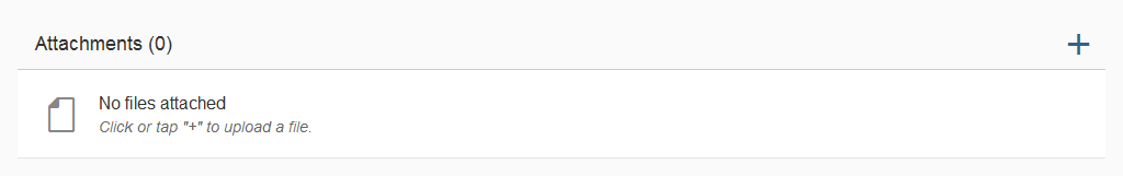
Interaction – Upload (1)
The Add button ( ) triggers a native operating system dialog that allows users to select the files they want to upload. You can decide whether the dialogs should allow users to select multiple items, or only one item.
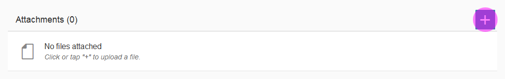
Interaction – Upload (2)
Once the files have been selected and the dialog closes, the uploading progress is shown in the list.
Users can cancel individual uploads by pressing the Remove button provided on each item.

Interaction – Upload (4)
Opening Files
The user can click or tap the icons or thumbnails in front of the attachment. Opening files is handled differently depending on the operating system.
On a desktop device, clicking the file name or icon of a file opens the respective program that has been assigned to this file type. Mobile devices usually open a dialog in which the user can select an app that supports this file type.
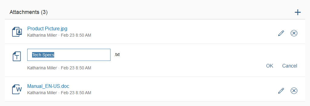
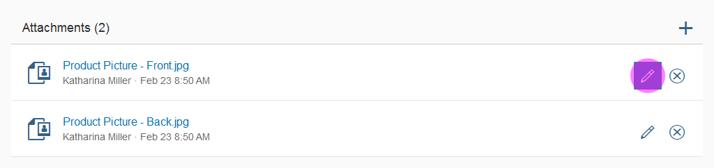
Renaming Files
The rename function works identically on desktop and mobile devices.
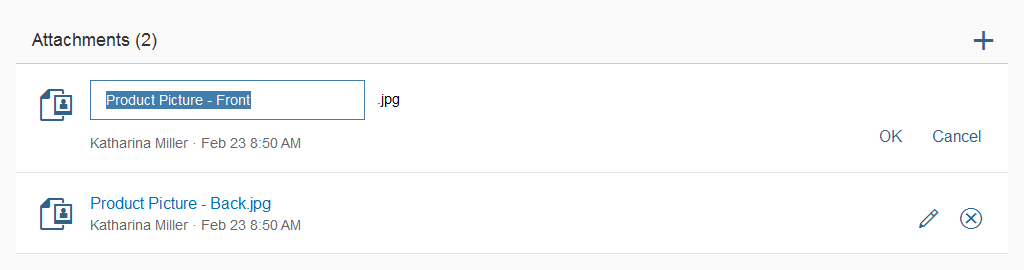
The user clicks or taps the Rename ( ) button.
The file name becomes an input field in which the existing name is highlighted. At the same time, the Rename ( ) and Remove buttons are replaced by two options: OK and Cancel.
When the user starts typing, the highlighted text is overwritten. Alternatively, the user can use the mouse or keyboard to change the selected text.
There are three ways in which to validate the new file name:
- The user clicks or taps somewhere outside the input field to change the focus.
- The user clicks OK.
- The user presses ENTER.
Editing Files
If users need to edit more than just the name of uploaded files, applications can implement an edit dialog with all the elements that can be changed by the user.
The image shows an example of how to structure such a dialog. The fields depend entirely on the use case and can be freely determined by each application.
Further details about editing parts of an object in a dialog can be found in the article manage objects – parts of an object. If multiple files need to be edited simultaneously, make sure to follow the guidelines for mass editing.

Interaction – Example of edit dialog
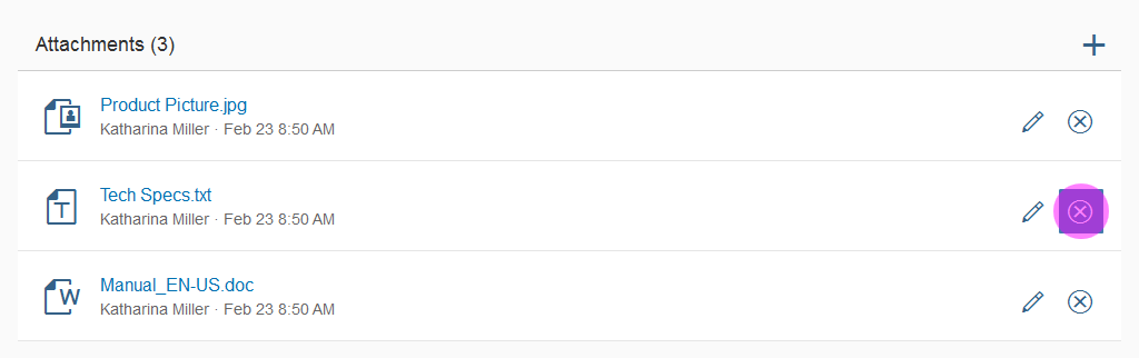
Deleting Files
The delete function works identically on desktop and mobile devices.
As soon as the user clicks or taps the Remove button on a file, a dialog appears asking the user to confirm the deletion of the respective file.
The file name has to be specified in the dialog. Delete confirms the deletion and the file is removed from the list. Cancel aborts the process, closes the dialog, and brings the user back to the file list without making any changes.
Interaction – Delete
Clickable Attributes
Object attributes can be made clickable. This can be very helpful to provide users with a direct way to access certain information such as a person’s profile, contact data, or the version history of a file.
Examples:
Uploaded By: John Miller
Last Edited By: Donna Moore
Version 1.1
Do not use more than two or three linked attributes per item. Excessive use of clickable attributes will overload the UI with interactive elements and have a negative impact on usability.
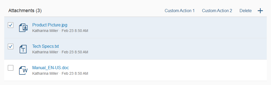
Custom and Bulk Actions
App developers can introduce their own actions and apply an action to multiple objects (bulk actions).
Place both custom and bulk actions in the toolbar of the upload collection control. For the order of the actions, apply the same rules as for other toolbars.
If you want to use custom or bulk actions, you must use multiple selection (property: mode = MultiSelect). This mode removes the actions from each item. Instead, offer all necessary actions in the toolbar.
Interaction – Multi selection
Uploading a New Version
With SAPUI5 version 1.38 and higher, the old version of an upload collection will be automatically replaced when the user uploads a newer version. This change no longer requires the user to delete the old version manually.
To upload a new version, the user needs to select a file and click Upload New Version. This button needs to be provided by the application as a custom action (see previous section). The following dialog (identical to standard uploading procedure) allows the user to pick a new file to replace the old one.
Handling Duplicates
Some applications may allow duplicate files and file names. This section covers steps to prevent duplicates.
Duplicate File Name During Renaming
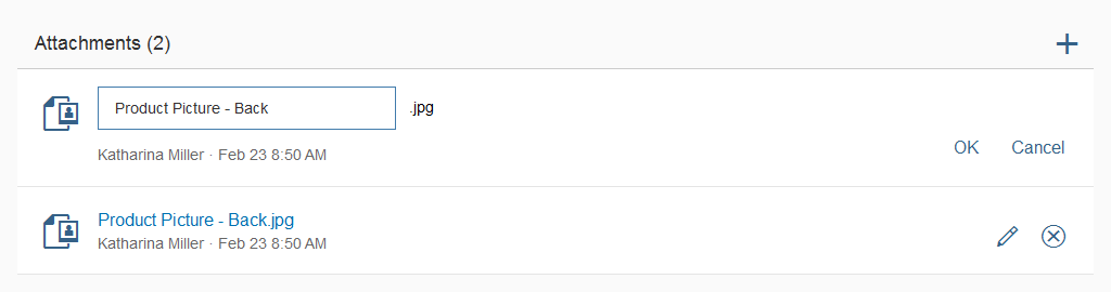
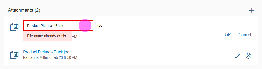
In this example, there are two different image files: Product Picture – Front and Product Picture – Back.
Interaction – Validation for renaming (1)
Interaction – Validation for renaming (2)
The user types in a name that is identical to one that already exists.
Interaction – Validation for renaming (3)
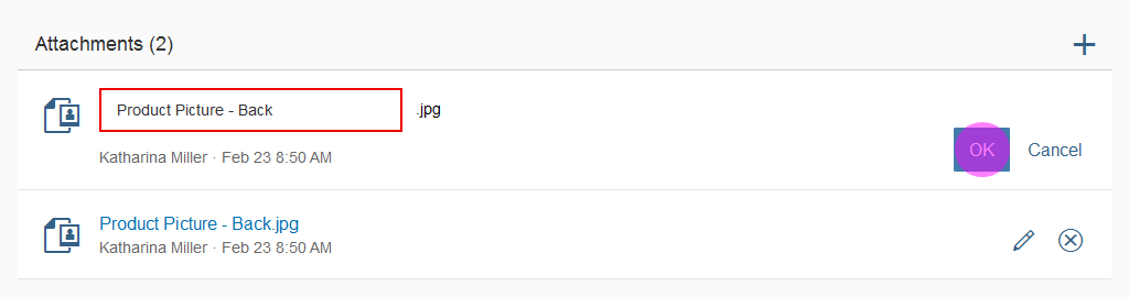
When the user clicks OK or tries to remove the focus from the input field, the field is highlighted (semantic color: error).
Interaction – Validation for renaming (4)
Placing the focus back on the field shows the error message (form field validation).
Interaction – Validation for renaming (5)
Duplicate Files During Upload
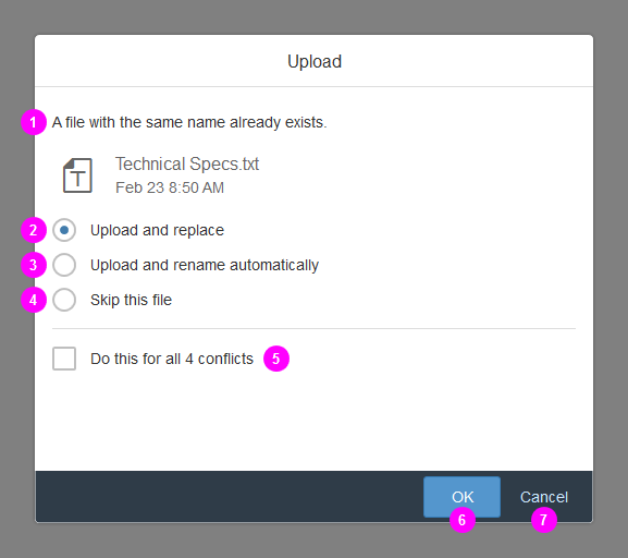
If a duplicate is recognized during the upload process, a dialog appears that allows the user to do one of the following:
1) This text explains the current conflict (no actions possible).
2) With Upload and replace, the current file is replaced with the newly updated one.
3) With Upload and rename automatically, the current file is kept and an incrementally increasing number is added to the newly uploaded file, such as “Technical Specs_2”.
4) With Skip this file, the file is not uploaded and the current file is kept instead.
5) If Do this for all n conflicts is checked, the selected action is applied to all remaining conflicts.
6) The OK button confirms selected action(s).
7) The Cancel button cancels the entire upload process.
Interaction – Upload duplicate – Details
Styles
The showSeparators property allows you to display dividers between each item. The default value is All, meaning that all dividers are shown. We recommend that you only turn off the separators if you expect to have just a few items since they can help to maintain a better overview in long lists.

Styles – Separators (default)

Styles – No separators
Guidelines
When to Show/Deactivate/Hide Actions
Apps can control the visibility and the active state for all actions at item level. This applies to the Edit and Delete buttons.
The properties are as follows:
- VisibleEdit
- VisibleDelete
- EnableEdit
- EnableDelete
All the properties are set to true by default.
If users are not allowed to edit uploaded files, all the Edit buttons should be set to invisible. The same applies to the Delete function.
Identical actions should be placed directly beneath one another.
Do not leave buttons enabled, only to show an error message informing the user that the function is not available.
Identical actions should always appear beneath one another.
Show identical actions beneath each other
If users are not allowed to use a certain function, these buttons should not be shown at all.
Hide functions if the user doesn't have authorization
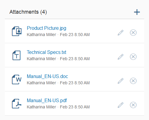
If certain actions are unavailable in some cases, such as for files from other users, we recommended that you disable these actions.
Disable functions not available for a specific file
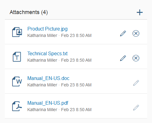
Do not disable all actions. If users are not allowed to use a certain action, these buttons should not be shown at all.
Don't disable all actions
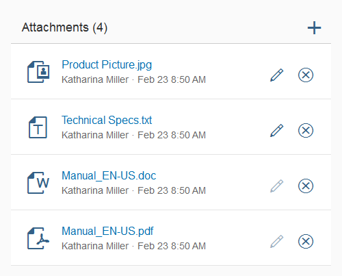
Identical actions should be placed directly beneath one another. In the example opposite, the Remove buttons on the lower two items should be visible but disabled.
Do not position the same actions differently
Resources
Want to dive deeper? Follow the links below to find out more about related controls, the SAPUI5 implementation, and the visual design.
Implementation
- Upload Collection (SAPUI5 samples)
- Upload Collection For Pending Upload (SAPUI5 samples)
- Upload Collection (SAPUI5 API reference)
- Upload Collection For Pending Upload (SAPUI5 API reference)
 Your feedback has been sent to the SAP Fiori design team.