Skip to search Skip to content
  • Home
  • What’s New
  • Explore SAP Fiori
  • Foundation
    • Get Started
    • SAP Fiori and Design Principles
    • Design-Led Development Process (external)
    • Multi-Device Support: Responsive vs. Adaptive
    • Mobile First
    • Layout
      • Grid Layout
      • Letterboxing
      • Content Density (Cozy & Compact)
    • Theming
    • Animation
    • Belize Colors
    • Iconography
    • Typography
  • General Concepts
    • SAP Fiori Launchpad
      • SAP Fiori Launchpad – Overview
      • Home Page
      • App Finder
      • Shell Bar
      • Enterprise Search
      • Tile
      • SAP Fiori Launchpad Services
    • Action Placement
    • Collaboration
    • Copy
    • Create with Reference
    • Draft Handling
    • Flag and Favorite
    • Form Field Validation
    • Formatting
      • Overview
      • Dates
      • Numbers
      • Time
      • Units of Measurement
    • Forward
    • Handling Busy States
    • Manage Objects
      • Overview
      • Simple Objects
      • Parts of an Object
      • Local Flow
      • Global Flow
      • Mass Editing
    • Message Handling
    • Mobile Integration
      • Mobile Integration Concept
      • Barcode Scanning
    • Navigation
    • Using Tooltips
  • SAP Fiori Elements, Floorplans & Frameworks
    • Overview
    • SAP Fiori Elements
      • Introduction
      • List Report
      • Object Page
      • Overview Page
    • Frameworks
      • Analysis Path Framework
      • SAP Smart Business Framework
    • Full Screen Layout
    • Split-Screen Layout
      • Split Screen
      • Master List
    • Create Page
    • Initial Page
    • List Report
    • Multi Instance Handling
    • Object Page
    • Object View
    • Flat Object View
    • Wizard
    • Worklist
    • Tool Development
      • Tool Development Overview
      • Block Layout
      • Side Navigation
      • Tool Header
  • UI Elements
    • Action
      • Action Sheet
      • Breadcrumb
      • Button
      • Link
      • Menu Button
      • Upload Collection
    • Container
      • Carousel
      • Panel
    • Data Visualization
      • Analytical Card
      • Chart (VizFrame)
      • Gantt Chart
      • Micro Chart
      • Map
      • Process Flow
    • Dialog
    • Display
      • Currency
      • Image
      • Label
      • Object Display Components
      • Progress Indicator
      • Text
      • Title
    • Dynamic Side Content
    • Filter
      • Contextual Filter
      • Filter Bar
      • Info Bar
    • Form / Simple Form
    • Icon Tab Bar
    • Invisible Message
    • List
      • Overview
      • Object List Item
      • Standard List Item
      • Display List Item
      • Action List Item
      • Input List Item
    • Loading
      • Busy Dialog
      • Busy Indicator
      • Busy State
    • Messaging
      • Message Box
      • Message Page
      • Message Popover
      • Message Toast
    • Object Header
    • Popover
      • Popover
      • Quick View
    • Smart Controls
      • Smart Link
      • Smart Table
    • Snapping Header
    • Table
      • Overview
      • Responsive Table
      • Analytical Table (ALV)
      • Grid Table
      • Tree Table
      • Personalization & Dialogs
    • Timeline
    • Toolbar
      • Overview
      • Chart Toolbar
      • Footer Toolbar
      • Table Toolbar
    • Variant Management
    • User Input
      • Calendar Date Interval
      • Checkbox
      • Combo Box
      • Date Picker
      • Date/Time Picker
      • Date Range Selection
      • Feed and Notes
      • Input Field
      • Mask Input
      • Multi-Combo Box
      • Multi-Input Field
      • Planning Calendar
      • Radio Button
      • Range Slider
      • Rating Indicator
      • Search
      • Select
      • Select Dialog
      • Slider
      • Step Input
      • Switch
      • Table Select Dialog
      • Text Area
      • Time Picker
      • Token
      • Value Help Dialog
  • Services & Resources
    • Design Stencils
    • SAP Fiori Client
    • SAPUI5 Planning & Development
  • Contact Us
  • Guideline Versions 1.26 – 1.28

Fiori Design Guidelines

Explore SAP Fiori

Explore SAP Fiori

Categories

UI Element Types

Action List Item

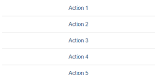
Action-List-Items_small_1.46

The action list item control lets the user trigger actions directly from a list. Used in dialog boxes and popovers.

Category: UI Elements
Type: List

Action Sheet

An action sheet lets you to display a list of actions for the user to choose from. You can also cluster actions.

Category: UI Elements
Type: Action

Analysis Path Framework

You can use this framework to create chart-based drilldown apps for analyzing KPIs from different sources.

Category: Layouts, Floorplans and Frameworks
Type: -

Analytical Card

Analytical cards visualize data on an overview page. Each card has a header/KPI area and a chart area.

Category: UI Elements
Type: Data Visualization

Analytical Table (ALV)

Analytical tables offer powerful options for working with the data, including advanced grouping and aggregations.

Category: UI Elements
Type: Table

Breadcrumb

Breadcrumb - Featured image

A breadcrumb is a type of secondary navigation that indicates the position of a page in a hierarchy.

Category: UI Elements
Type: Action

Bullet Chart

The bullet chart is used to compare primary and secondary (comparison) values.

Category: UI Elements
Type: Data Visualization

Bullet Chart – Color Use for Primary Values

This article provides guidelines for using color to indicate primary values in bullet charts.

Category: UI Elements
Type: Data Visualization

Busy Dialog

The busy dialog informs the user about an ongoing operation. During the operation the entire screen is blocked.

Category: UI Elements
Type: Popover

Busy Indicator

The busy indicator informs the user about an ongoing operation.

Category: UI Elements
Type: Loading

Busy State

You can set a busy state for each SAPUI5 control. This function adapts to the space available on the UI.

Category: UI Elements
Type: Loading

Button

Button - Featured image

Buttons allow users to trigger actions – either by clicking or tapping the button, or by pressing a corresponding key.

Category: UI Elements
Type: Action

Calendar Date Interval

The calendar date interval control displays a range of days in a single row, saving on horizontal space.

Category: UI Elements
Type: User Input

Carousel

Carousel - Featured image

The carousel is a control for browsing through a set of items one item at a time.

Category: UI Elements
Type: Container

Chart – Deviation

This article explains how to visualize the deviation (difference or variance) between two measures.

Category: UI Elements
Type: Data Visualization

Chart – Variation through Time

This article illustrates the different ways you can visualize changes of measures through time.

Category: UI Elements
Type: Data Visualization

Chart – Color Palette – Values and Names

This page provides all the color names in the chart palettes.

Category: UI Elements
Type: Data Visualization

Chart – Color Palettes

This article explains the three chart visualization color palettes and how you can leverage their unique properties.

Category: UI Elements
Type: Data Visualization

Chart – Comparison

This article will help you choose the correct chart for comparing items that do not need to be displayed in a particular order.

Category: UI Elements
Type: Data Visualization

Chart – Gestures

The following gestures are available in charts: tap, press and drag, drag or slide, flick, or spread or pinch.

Category: UI Elements
Type: Data Visualization

Chart – Number and Time Format

This article explains how numbers and time information can be configured to users’ local settings.

Category: UI Elements
Type: Data Visualization

Chart – Part to Whole

This article explains how to use charts to visualize the different parts of a whole (expressed as a percentage).

Category: UI Elements
Type: Data Visualization

Chart – Selection

This article describes the different ways users can select one or more data points.

Category: UI Elements
Type: Data Visualization

Chart – Time Axis

The time axis shows the variation of values through time (years, quarters, months, weeks, days, and so on).

Category: UI Elements
Type: Data Visualization

Chart – Value Display

This article describes how value labels are displayed and how you can customize them.

Category: UI Elements
Type: Data Visualization

Chart – Value-Based Legend

The value-based legend is used to visually represent value ranges through color shades.

Category: UI Elements
Type: Data Visualization

Chart – Zoom

The zoom function enables users to change the scale of an axis on a chart.

Category: UI Elements
Type: Data Visualization

Chart (VizFrame)

Chart - Featured image

You can use the VizFrame control to display different types of chart that are both interactive and responsive.

Category: UI Elements
Type: Data Visualization

Chart Toolbar

Chart Toolbar - Featured image

The chart toolbar acts as a container for charts. It comes with built-in actions for the table display and personalization.

Category: UI Elements
Type: Toolbar

Checkbox

Checkbox - Featured image

A checkbox indicates whether a state is true (checked) or false (unchecked). Users can check multiple options.

Category: UI Elements
Type: User Input

Column Chart

Column charts are used to compare multiple values over time, or values that have an intrinsic order (such as age or ratings).

Category: UI Elements
Type: Data Visualization

Combo Box

The combo box lets users select an item from a predefined list. It has both an input field and a dropdown menu.

Category: UI Elements
Type: User Input

Contextual Filter

The contextual filter allows you to show a prefiltered view of a large or complex list.

Category: UI Elements
Type: Filter

Create Page Floorplan

Use the “Create Page” floorplan when you need to create a new object in a full screen or split-screen layout.

Category: Layouts, Floorplans and Frameworks
Type: -

Currency

Currency - Featured image

The currency control lets you align amounts with different currencies vertically at the decimal point.

Category: UI Elements
Type: Display

Date Picker

The date picker lets users pick a localized date using touch, mouse, or keyboard input.

Category: UI Elements
Type: User Input

Date Range Selection

Users can type in a localized date range manually, or select a date range in the calendar.

Category: UI Elements
Type: User Input

Date/Time Picker

The date/time input control allows users to select a combination of date and time.

Category: UI Elements
Type: User Input

Dialog

The dialog control interrupts the current app process to prompt the user for information or a response.

Category: UI Elements
Type: Popover

Display List Item

Display List Item - Featured image

Display list items are simple list items comprising a label and a text. They have largely been replaced by forms.

Category: UI Elements
Type: List

Feed and Notes

A combination of controls to input and post plain text, and to display the text alongside the user’s name.

Category: UI Elements
Type: User Input

Filter Bar / Smart Filter Bar

Filter Bar - Filters

The filter bar lets users filter item lists and tables by various criteria, and create custom filter variants.

Category: UI Elements
Type: Filter, User Input

Flat Object View Floorplan

Flat Object View Floorplan - Featured image

The flat object view floorplan displays all the information for an object on one long scrollable page.

Category: Layouts, Floorplans and Frameworks
Type: -

Footer Toolbar

Footer Bar - Featured image

The footer toolbar at the bottom of the screen is used for key actions that impact the whole page.

Category: UI Elements
Type: Action, Toolbar

Form

Forms display other UI elements (such as labels, input fields, checkboxes, and sliders) in a structured layout.

Category: UI Elements
Type: Container

Full Screen Layout

Use the full screen layout to display large amounts of data, large visualizations, or wide tables.

Category: Layouts, Floorplans and Frameworks
Type: -

Gantt Chart

The Gantt chart shows the sequence in which various activities occur and the dependencies between these activities.

Category: UI Elements
Type: Data Visualization

Grid Table

A grid table can handle large numbers of items and columns, but is not fully responsive.

Category: UI Elements
Type: Table

Icon Tab Bar

The icon tab bar comprises a series of tabs that each link to a different content area or view.

Category: UI Elements
Type: -

Image

image - featured

You can use the image control to insert responsive images in various places within an app.

Category: UI Elements
Type: Display

Info Bar

Infobar - Featured Image

The infobar is a type of toolbar that appears above a list or panel, and shows filter or selection settings.

Category: UI Elements
Type: Toolbar

Initial Page Floorplan

Use the “Initial Page” floorplan if the user needs to navigate to a single object in as few steps as possible.

Category: Layouts, Floorplans and Frameworks
Type: -

Input Field

Input Field - Featured image

A text input field allows users to enter and edit text or numeric values in one line.

Category: UI Elements
Type: User Input

Input List Item

Input List Item - Featured image

The input list item comprises a label and input UI element. This control has largely been replaced by forms.

Category: UI Elements
Type: List

Invisible Text

invisible text - featured

The invisible text control provides a simple hidden text that can be used by assistive technologies.

Category: UI Elements
Type: -

Label

A label is the name or title of a control or group of related controls.

Category: UI Elements
Type: Display

Link

Link-featured_

A link is a clickable text element that can be used for navigation or to trigger an event.

Category: UI Elements
Type: Action

List

The list control displays a simple data set that the user can sort, filter, or group.

Category: UI Elements
Type: List

List Report (Smart Templates/SAP Fiori Elements)

The SAP Fiori element “List Report” is an implementation of the list report floorplan as a reusable template.

Category: Layouts, Floorplans and Frameworks
Type: -

List Report Floorplan

List Report Floorplan - Featured image

The list report floorplan allows the user to work with a large, filterable list of items and take action.

Category: Layouts, Floorplans and Frameworks
Type: -

Map

Map - Featured image

A map is a symbolic visual illustration of areas, regions, and themes. Maps can be analytical or geographic.

Category: UI Elements
Type: Data Visualization

Mask Input

Mask Input - Featured image

The mask input control governs what a user is allowed to enter in an input field.

Category: UI Elements
Type: User Input

Menu Button

menu button - featured

The menu button allows you to offer multiple options in a dropdown list.

Category: UI Elements
Type: Action

Message Box

Message Box - Featured image

The message box is a special dialog for displaying error, warning, information, and success messages.

Category: UI Elements
Type: Popover

Message Page

Message pages give feedback to the user when an app or list is empty, or when an error has occurred.

Category: UI Elements
Type: Display

Message Popover

The message popover control can display multiple messages without interrupting the user.

Category: UI Elements
Type: Popover

Message Toast

A message toast is a non-disruptive popup for success messages, which disappears after a few seconds.

Category: UI Elements
Type: Display

Micro Chart

Micro charts help you visualize a small number of data points, and can be embedded in other controls.

Category: UI Elements
Type: Data Visualization

Multi-Combo Box

The multi-combo box lets users select one or more options from a predefined list, and has an input box for filtering.

Category: UI Elements
Type: User Input

Multi-Input Field

A multi-input field allows the user to enter multiple values, which are displayed as tokens.

Category: UI Elements
Type: User Input

Multi-Instance Handling Floorplan

Multi Instance Handling Floorplan - Featured image

The multi instance handling floorplan allows users to open multiple documents in a tabbed view.

Category: Layouts, Floorplans and Frameworks
Type: -

Object Display Components

Object Display Elements - Featured image

Object display components represent key object attributes, such as the object ID or status.

Category: UI Elements
Type: Display

Object Header

An object header is the first element on a page for a single object (object view or flat object view).

Category: UI Elements
Type: Display

Object List Item

Object List Item - Featured image

The object list item provides a quick overview of an object in a list, typically in the master list of a split-screen app.

Category: UI Elements
Type: List

Object Page – Snapping Header

The snapping header is the top element of the object page floorplan, and contains key information on an object.

Category: UI Elements
Type: -

Object Page (Floorplan + SAP Fiori Element)

The object page floorplan is the recommended floorplan for displaying, creating, and editing business objects.

Category: Layouts, Floorplans and Frameworks
Type: -

Object View Floorplan

The object view is a floorplan for displaying objects (predecessor to the object page floorplan).

Category: Layouts, Floorplans and Frameworks
Type: -

Overview Page (Smart Templates/SAP Fiori Elements)

The overview page is a data-driven Fiori app that provides all the information a user needs in a single page.

Category: Layouts, Floorplans and Frameworks
Type: -

P13n-Dialog

The P13n dialog allows you to build analytical tables with extensive personalization options.

Category: UI Elements
Type: Table, User Input

Panel

The panel is a container for grouping and displaying information. It can be collapsed to save space.

Category: UI Elements
Type: Container

Planning Calendar

Planning Calendar - Featured image 01

The planning calendar allows users to see parallel appointments and create new events.

Category: UI Elements
Type: User Input

Popover

A popover displays additional information for an object, and can also offer actions.

Category: UI Elements
Type: Popover

Process Flow

You can use the process flow control to represent the stages in a business process (such as approval).

Category: UI Elements
Type: Data Visualization

Progress Indicator

The progress indicator shows the current completion status for a business process (static value).

Category: UI Elements
Type: Data Visualization, Display

Quick View

The quick view is similar to a popover, but has a predefined structure and automatic UI rendering.

Category: UI Elements
Type: Popover

Radio Button

Radio-Button-featured

Use radio buttons if you want the user to select only one option from a group of mutually exclusive alternatives.

Category: UI Elements
Type: User Input

Range Slider

The range slider enables the user to select a value range within a predefined numerical interval.

Category: UI Elements
Type: -

Rating Indicator

You can use the rating indicator to let users rate content, or to display a content rating.

Category: UI Elements
Type: User Input

Reference Lines

Add reference lines to highlight a particular value.

Category: UI Elements
Type: Data Visualization

Responsive Table

The responsive table is the default table in SAP Fiori. It supports various features at line item level.

Category: UI Elements
Type: Table

SAP Smart Business Framework

SAP Smart Business is a framework for analytical drilldown apps based on key performance indicators (KPIs).

Category: Layouts, Floorplans and Frameworks
Type: -

Search

The search field enables users to search for information or filter data by entering key words as text.

Category: UI Elements
Type: User Input

Select

The select control (also known as a dropdown) allows users to select an item from a predefined list.

Category: UI Elements
Type: User Input

Select Dialog

Select Dialog - Featured image

The select dialog enables users to select one or more items from a comprehensive and searchable list.

Category: UI Elements
Type: User Input

Size of the Chart Container

The property “autoAdjustHeight” helps to correctly manage the sizes of charts contained in a chart container.

Category: UI Elements
Type: Data Visualization

Slider

Slider featured image

A slider is a control that enables the user to adjust single values within a specified numerical range.

Category: UI Elements
Type: User Input

Smart Link

SmartLink featured

The smart link triggers a popover with additional information and links to related apps.

Category: UI Elements
Type: Action, Popover

Smart Table

The smart table is a wrapper for SAP Fiori tables that lets you reuse back-end data structures and generic features.

Category: UI Elements
Type: Table

Split-Screen Layout

The split-screen layout is optimized for working on a list of items (master list on the left, selected item on the right).

Category: Layouts, Floorplans and Frameworks
Type: -

Standard List Item

Standard List Item - Featured image

You can use the standard list item to display a simple set of data in a select dialog or (non-object) master list.

Category: UI Elements
Type: List

Step Input

The step input control allows the user to adjust numeric values in predefined increments (steps).

Category: UI Elements
Type: -

Switch

The toggle switch mimics a physical switch that allows users to turn things on or off.

Category: UI Elements
Type: User Input

Table Personalization (Overview)

Table personalization allows users to modify the display and settings of a table.

Category: UI Elements
Type: Table

Table Personalization Dialog

This personalization dialog for small tables allows users to show/hide columns, and sort and filter the entries.

Category: UI Elements
Type: User Input

Table Select Dialog

The table select dialog is a table-based selection list. It allows you to show comprehensive data for each item.

Category: UI Elements
Type: User Input

Table Toolbar

The table toolbar appears above a table and is used for key actions that impact the entire table.

Category: UI Elements
Type: Toolbar

Text

Text - Display controls text

You can use the text control to display text inside a form, table, or any other content area.

Category: UI Elements
Type: Display

Text Area

Text Area - User input controls textarea

The text area is an input control that allows the user to enter multiple lines of text.

Category: UI Elements
Type: User Input

Time Picker

Timepicker - Featured Image

The time picker allows the user to select a localized time, an exact duration, or a time range (with two time pickers).

Category: UI Elements
Type: User Input

Timeline

The timeline control shows objects, events, or posts in chronological order, with the most recent entry on top.

Category: UI Elements
Type: Data Visualization

Title

The title control is a simple, one-line text with additional semantic information for accessibility purposes.

Category: UI Elements
Type: Display

Token

Tokens visualize previously selected items, and are similar to tags. Users can add, remove, select, or deselect tokens.

Category: UI Elements
Type: User Input

Tree Table

Tree Table - Featured image

A tree table contains a hierarchical set of data that is structured in rows and columns and grouped into nodes.

Category: UI Elements
Type: Table

Upload Collection

The upload collection control allows users to upload single or multiple files to an SAP Fiori app.

Category: UI Elements
Type: Action

Value Help Dialog

Value Help Dialog - Featured image

The value help dialog helps the user find and select single or multiple values, based on different attributes.

Category: UI Elements
Type: User Input

Variant Management

Variant management allows users to save and load different sets of filter or table settings.

Category: UI Elements
Type: Filter

View Settings Dialog

View Settings Dialog - Featured image

The view settings dialog allows the user to sort, filter, or group data within a (master) list or a table.

Category: UI Elements
Type: Table

Wizard Floorplan

Wizard Floorplan featured

You can use the wizard floorplan to guide users through a long or unfamiliar task by dividing it into sections.

Category: Layouts, Floorplans and Frameworks
Type: -

Worklist Floorplan

The worklist floorplan shows a list of items the user needs to process. The focus is on completing the tasks.

Category: Layouts, Floorplans and Frameworks
Type: -
© 2021 SAP SE. All rights reserved.
  • Privacy
  • Legal Disclosure
  • Copyright
  • Terms of Use
  • Go.SAP.com
  • SAP Community Network
Skip to toolbar
  • Log In