
- Latest SAPUI Version 1.124
- SAPUI5 Version 1.122
- SAPUI5 Version 1.120
- SAPUI5 Version 1.118
- SAPUI5 Version 1.116
- SAPUI5 Version 1.114
- SAPUI5 Version 1.112
- SAPUI5 Version 1.110
- SAPUI5 Version 1.108
- SAPUI5 Version 1.106
- SAPUI5 Version 1.104
- SAPUI5 Version 1.102
- SAPUI5 Version 1.100
- SAPUI5 Version 1.98
- SAPUI5 Version 1.96
- SAPUI5 Version 1.94
- SAPUI5 Version 1.92
- SAPUI5 Version 1.90
- SAPUI5 Version 1.88
- SAPUI5 Version 1.86
- SAPUI5 Version 1.84
- SAPUI5 Version 1.82
- SAPUI5 Version 1.80
- SAPUI5 Version 1.78
- SAPUI5 Version 1.76
- SAPUI5 Version 1.74
- SAPUI5 Version 1.72
- SAPUI5 Version 1.70
- SAPUI5 Version 1.68
- SAPUI5 Version 1.66
- SAPUI5 Version 1.64
- SAPUI5 Version 1.62
- SAPUI5 Version 1.60
- SAPUI5 Version 1.58
- SAPUI5 Version 1.56
- SAPUI5 Version 1.54
- SAPUI5 Version 1.52
- SAPUI5 Version 1.50
- SAPUI5 Version 1.48
- SAPUI5 Version 1.46
- SAPUI5 Version 1.44
- SAPUI5 Version 1.42
- SAPUI5 Version 1.38
- SAPUI5 Version 1.36
- SAPUI5 Version 1.34
- SAPUI5 Version 1.32
- SAPUI5 Version 1.30
- SAPUI5 Version 1.28
- SAPUI5 Version 1.26
- Latest SAPUI Version 1.124
- SAPUI5 Version 1.122
- SAPUI5 Version 1.120
- SAPUI5 Version 1.118
- SAPUI5 Version 1.116
- SAPUI5 Version 1.114
- SAPUI5 Version 1.112
- SAPUI5 Version 1.110
- SAPUI5 Version 1.108
- SAPUI5 Version 1.106
- SAPUI5 Version 1.104
- SAPUI5 Version 1.102
- SAPUI5 Version 1.100
- SAPUI5 Version 1.98
- SAPUI5 Version 1.96
- SAPUI5 Version 1.94
- SAPUI5 Version 1.92
- SAPUI5 Version 1.90
- SAPUI5 Version 1.88
- SAPUI5 Version 1.86
- SAPUI5 Version 1.84
- SAPUI5 Version 1.82
- SAPUI5 Version 1.80
- SAPUI5 Version 1.78
- SAPUI5 Version 1.76
- SAPUI5 Version 1.74
- SAPUI5 Version 1.72
- SAPUI5 Version 1.70
- SAPUI5 Version 1.68
- SAPUI5 Version 1.66
- SAPUI5 Version 1.64
- SAPUI5 Version 1.62
- SAPUI5 Version 1.60
- SAPUI5 Version 1.58
- SAPUI5 Version 1.56
- SAPUI5 Version 1.54
- SAPUI5 Version 1.52
- SAPUI5 Version 1.50
- SAPUI5 Version 1.48
- SAPUI5 Version 1.46
- SAPUI5 Version 1.44
- SAPUI5 Version 1.42
- SAPUI5 Version 1.40
- SAPUI5 Version 1.38
- SAPUI5 Version 1.36
- SAPUI5 Version 1.34
- SAPUI5 Version 1.32
- SAPUI5 Version 1.30
- SAPUI5 Version 1.28
- SAPUI5 Version 1.26
Multi-Input Field
sap.m.MultiInput
Intro
A multi-input field allows the user to enter multiple values, which are displayed as tokens. These can be displayed in single and multiline mode. To help the user enter a valid value, you can enable the autocomplete suggestions feature and the value help option.
Usage
Use the multi-input field if:
- You want the user to select multiple ranges (with the value help option and the value help dialog).
- The data set to choose from is expected to increase over time (for example, to more than 200 values).
- You need to provide the value help option to help users select or search multiple business objects.
Do not use the multi-input field if:
- You want the user to select one entry only. In this case, use the input field or combo box instead.
- You want the user to select from a pre-defined set of options only. In this case, use the multi-combo box instead.
Responsiveness
In the examples below, the autocomplete feature is shown in different sizes for single and multiline modes.
Single Line Mode (Default)
Size S (Smartphones)
- Cozy mode.
- When the user taps the multi-input field, a new full-screen dialog opens in which the autocomplete suggestions can be selected. When the user makes a selection, the dialog closes and the token is displayed.
- The user can review the tokens by swiping them to the left or right.
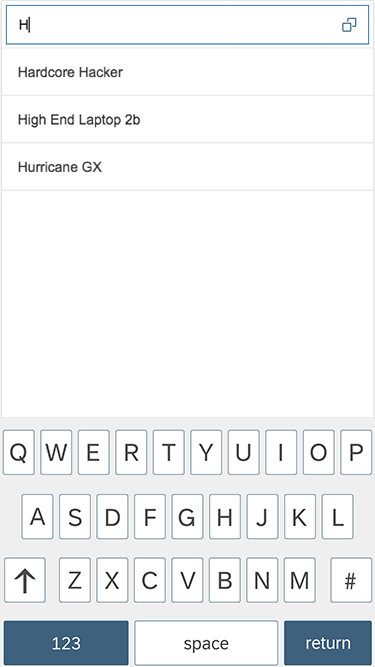
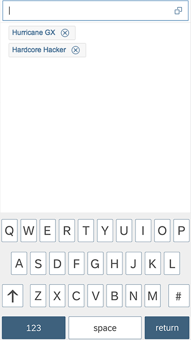
Autocomplete feature on a smartphone (size S)

Users can review tokens by swiping left and right on touch devices
Size M (Tablets)
- Cozy mode.
- The user can review tokens by swiping them to the left or right.
- The autocomplete suggestions appear below or above the multi-input field.
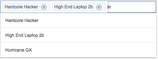
Autocomplete on a tablet (size M)
Size L (Desktops)
- Compact mode.
- The user can review tokens by pressing the right or left arrows on the keyboard.
- The autocomplete suggestions appear below or above the multi-input field.
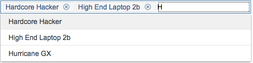
Autocomplete on a desktop (size L)
Multiline Mode
Size S (Smartphones)
- Cozy mode.
- When the user taps the multi-input field, a new full-screen dialog opens in which the suggested items can be selected. When the user makes a selection within that dialog, the token is displayed in the input field. When the user enters a new search term, the display area of the token is replaced by the autocomplete suggestions.
Smartphone multiline mode – Closed
Smartphone multiline mode – Open

Autocomplete on smartphone - Multiline mode
Size M (Tablets)
- Cozy mode.
- When the user taps or focuses on the multi-input field, the single-line field expands to a multiline field. All tokens are displayed.
Tablet multiline mode – No token selcted
Tablet multiline mode active – Expanded
Tablet multiline mode – Suggest
Size L (Desktops)
- Compact mode.
- When the user focuses on the multi-input field, it expands to a multiline field.
- The autocomplete suggestions open below the multi-input field.

Desktop multiline mode – Not focused

Desktop multiline mode active – Expanded
Desktop multiline mode – Suggest
Types
The input types of the multi-input are identical to those of the input field. For more information, see input field.
Behavior and Interaction
Single Line Mode
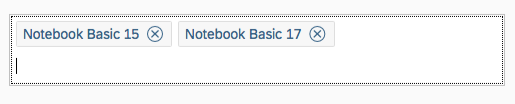
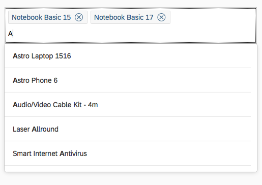
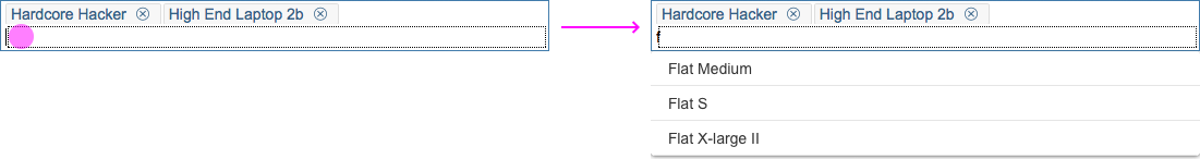
Adding a Token
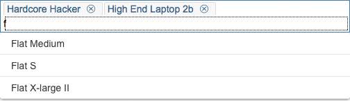
The user can add a token via autocomplete suggestions or value help. When an item is selected from the autocomplete box, the corresponding token is created. The input is ready for the next entry. Tokens are placed next to each other on one line.
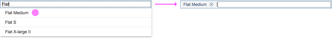
Adding tokens
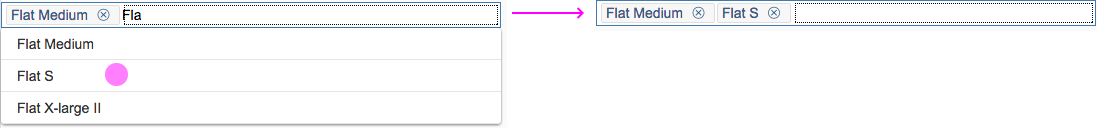
Adding a second token
Reviewing Tokens
The user can review tokens by using the left or right cursor keys on a desktop, or by swiping to the left or right on a smartphone or tablet.

Left/right keyboard cursor
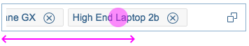
Swiping left and right on a touch device
Deleting Tokens
The user can delete tokens by pressing the Backspace or Del button (when selected) on a desktop’s keyboard, or by tapping the Delete icon on a mobile device.

Deleting tokens
Using Value Help
You can enable the value help option to provide a more advanced dialog for finding the relevant business object. Two dialogs can be used at present:
- Select dialog (simple)
- Value help dialog (complex)
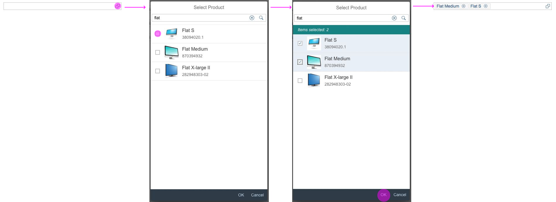
Value help with select dialog
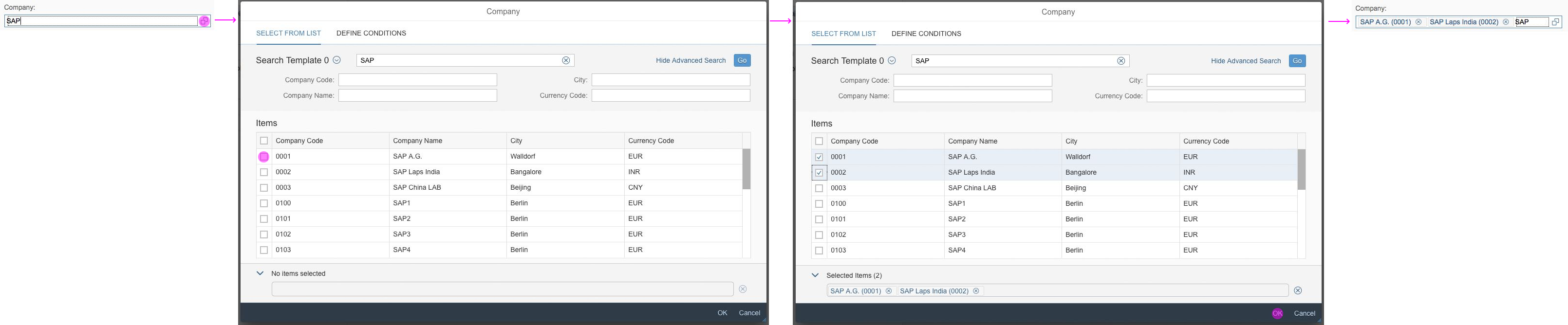
Value help with value help dialog
Multiline Mode
Single line mode is active by default, so to activate multiline mode, you need to enable it (property: enableMultiLineMode).
Adding a Token
The user can add a token via autocomplete suggestions or value help. The token is created by selecting an item from the autocomplete box. The input is ready for the next entry. Tokens are placed next to each other. If there is not enough space on one line, the control expands.
Adding a token
Reviewing Tokens
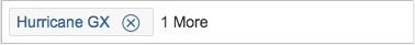
When the multi-input field is not focused, it is shown in collapsed mode. The token that was entered last is displayed. If there is more than one token, the number of hidden tokens is shown next to the last token.
When tokens are entered into the multi-input field, the control expands to show all tokens. On screen size S, a new dialog is opened to review the tokens.

Reviewing tokens
Copying and Pasting Data from a Spreadsheet or Text File
The multi-input control can handle paste actions containing, for example, multiple items that have been selected in a column of a spreadsheet or text file. The user simply selects a whole column in the spreadsheet and copies it. When items are entered into the multi-input field, the user just pastes them from the clipboard and each item is represented as a token.
Guidelines
- Use the multiline mode instead of the single line mode (default). This provides greater flexibility for displaying multiple tokens.
- Give the control a width that is appropriate for the range of values that are going to be entered. Try to avoid setting a fixed width on this control. Instead, embed it in a proper layout (such as a form, simple form, or grid layout) and work with the layout data property.
- Provide meaningful labels for all input fields. Do not use the placeholder as a replacement for the label. The placeholder should only provide an additional hint.
- The multi-input field can currently contain tokens and one free text value. If you allow only validated values, display an error or warning when the user tries to leave the field to indicate that the value entered is invalid, or remove the value.
Properties
Since the multi-input field is derived from the input field, refer to the properties in the input field article.
Resources
Want to dive deeper? Follow the links below to find out more about related controls, the SAPUI5 implementation, and the visual design.
Elements and Controls
- Multi-Combo Box (guidelines)
- Input (guidelines)
- Combo Box (guidelines)
- Select (guidelines)
- Select Dialog (guidelines)
- Value Help Dialog (guidelines)
- Tokenizer (guidelines)
 Your feedback has been sent to the SAP Fiori design team.