
- Latest SAPUI Version 1.124
- SAPUI5 Version 1.122
- SAPUI5 Version 1.120
- SAPUI5 Version 1.118
- SAPUI5 Version 1.116
- SAPUI5 Version 1.114
- SAPUI5 Version 1.112
- SAPUI5 Version 1.110
- SAPUI5 Version 1.108
- SAPUI5 Version 1.106
- SAPUI5 Version 1.104
- SAPUI5 Version 1.102
- SAPUI5 Version 1.100
- SAPUI5 Version 1.98
- SAPUI5 Version 1.96
- SAPUI5 Version 1.94
- SAPUI5 Version 1.92
- SAPUI5 Version 1.90
- SAPUI5 Version 1.88
- SAPUI5 Version 1.86
- SAPUI5 Version 1.84
- SAPUI5 Version 1.82
- SAPUI5 Version 1.80
- SAPUI5 Version 1.78
- SAPUI5 Version 1.76
- SAPUI5 Version 1.74
- SAPUI5 Version 1.72
- SAPUI5 Version 1.70
- SAPUI5 Version 1.68
- SAPUI5 Version 1.66
- SAPUI5 Version 1.64
- SAPUI5 Version 1.62
- SAPUI5 Version 1.60
- SAPUI5 Version 1.58
- SAPUI5 Version 1.56
- SAPUI5 Version 1.54
- SAPUI5 Version 1.52
- SAPUI5 Version 1.50
- SAPUI5 Version 1.48
- SAPUI5 Version 1.46
- SAPUI5 Version 1.44
- SAPUI5 Version 1.42
- SAPUI5 Version 1.38
- SAPUI5 Version 1.36
- SAPUI5 Version 1.34
- SAPUI5 Version 1.32
- SAPUI5 Version 1.30
- SAPUI5 Version 1.28
- SAPUI5 Version 1.26
- Latest SAPUI Version 1.124
- SAPUI5 Version 1.122
- SAPUI5 Version 1.120
- SAPUI5 Version 1.118
- SAPUI5 Version 1.116
- SAPUI5 Version 1.114
- SAPUI5 Version 1.112
- SAPUI5 Version 1.110
- SAPUI5 Version 1.108
- SAPUI5 Version 1.106
- SAPUI5 Version 1.104
- SAPUI5 Version 1.102
- SAPUI5 Version 1.100
- SAPUI5 Version 1.98
- SAPUI5 Version 1.96
- SAPUI5 Version 1.94
- SAPUI5 Version 1.92
- SAPUI5 Version 1.90
- SAPUI5 Version 1.88
- SAPUI5 Version 1.86
- SAPUI5 Version 1.84
- SAPUI5 Version 1.82
- SAPUI5 Version 1.80
- SAPUI5 Version 1.78
- SAPUI5 Version 1.76
- SAPUI5 Version 1.74
- SAPUI5 Version 1.72
- SAPUI5 Version 1.70
- SAPUI5 Version 1.68
- SAPUI5 Version 1.66
- SAPUI5 Version 1.64
- SAPUI5 Version 1.62
- SAPUI5 Version 1.60
- SAPUI5 Version 1.58
- SAPUI5 Version 1.56
- SAPUI5 Version 1.54
- SAPUI5 Version 1.52
- SAPUI5 Version 1.50
- SAPUI5 Version 1.48
- SAPUI5 Version 1.46
- SAPUI5 Version 1.44
- SAPUI5 Version 1.42
- SAPUI5 Version 1.40
- SAPUI5 Version 1.38
- SAPUI5 Version 1.36
- SAPUI5 Version 1.34
- SAPUI5 Version 1.32
- SAPUI5 Version 1.30
- SAPUI5 Version 1.28
- SAPUI5 Version 1.26
Dynamic Side Content
Intro
Dynamic side content is a layout control that allows additional content, such as a timeline, chat, or additional information, to be displayed in a way that flexibly adapts to different screen sizes. App development teams can configure the behavior of the control on smaller screen sizes by following the relevant guidelines.
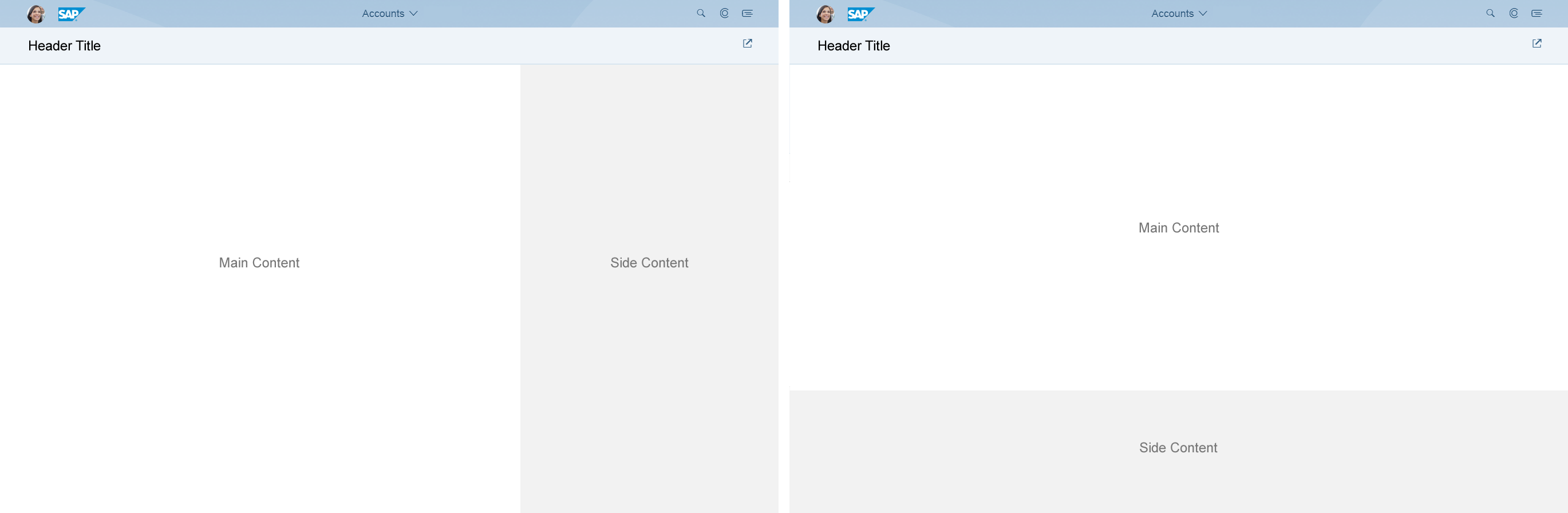
Dynamic side content layout
Usage
Use dynamic side content if:
- You want to display relevant information that is not critical for users to complete a task. Users should have access to all the key functions and critical information in the app even if they do not see the side content. This is important because on smaller screen sizes it may be difficult to display the side content in a way that is easily accessible for the user.
Do not use dynamic side content if:
- You want to display navigation or critical information that prevents users from completing a task when they have no access to the side content.
Layout
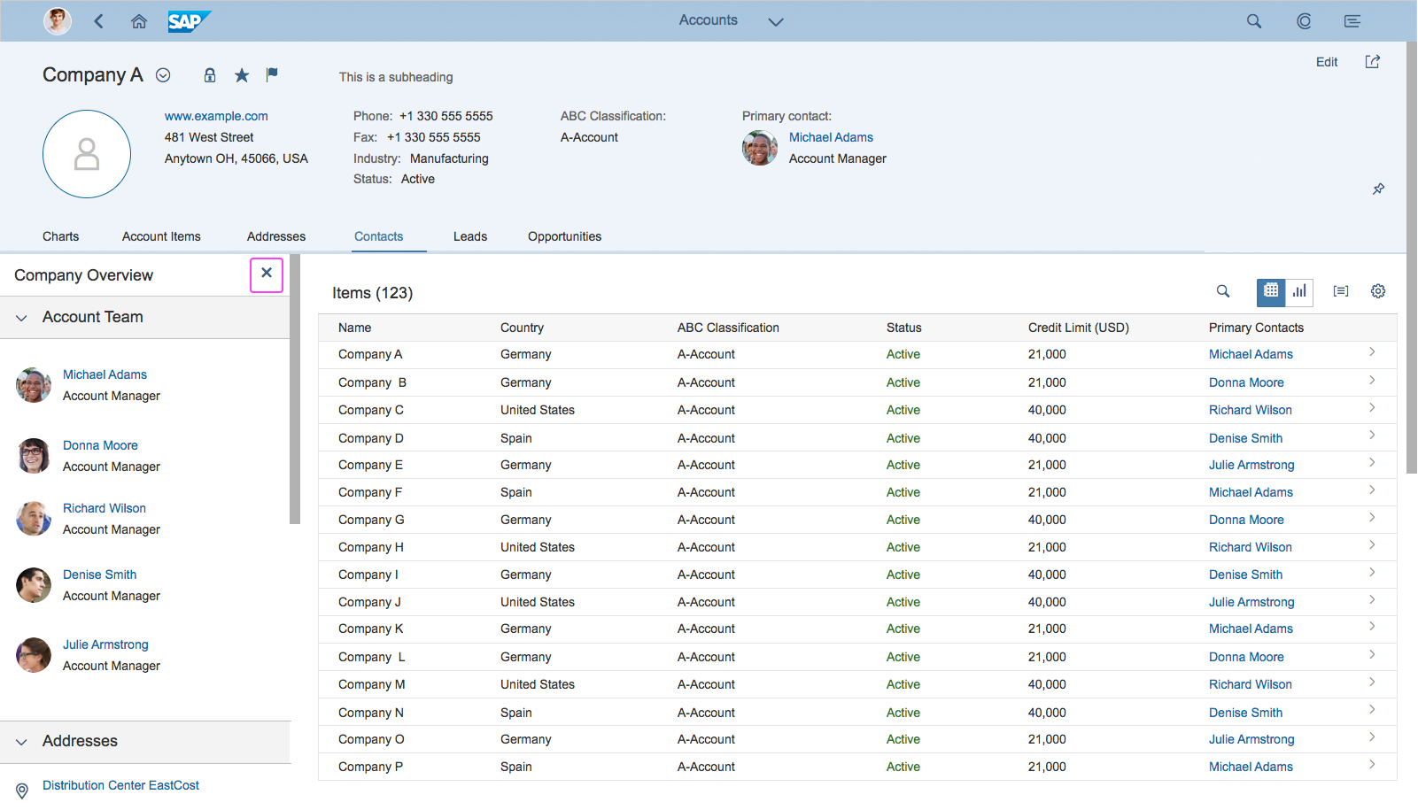
The dynamic side content appears in a container next to or directly below the main content. The side content does not overlay the main content. When the side content is triggered, the main content becomes narrower (if appearing side-by-side). When appearing next to the main content, the side content also contains a separate scrollbar.
Structure of dynamic side content layout
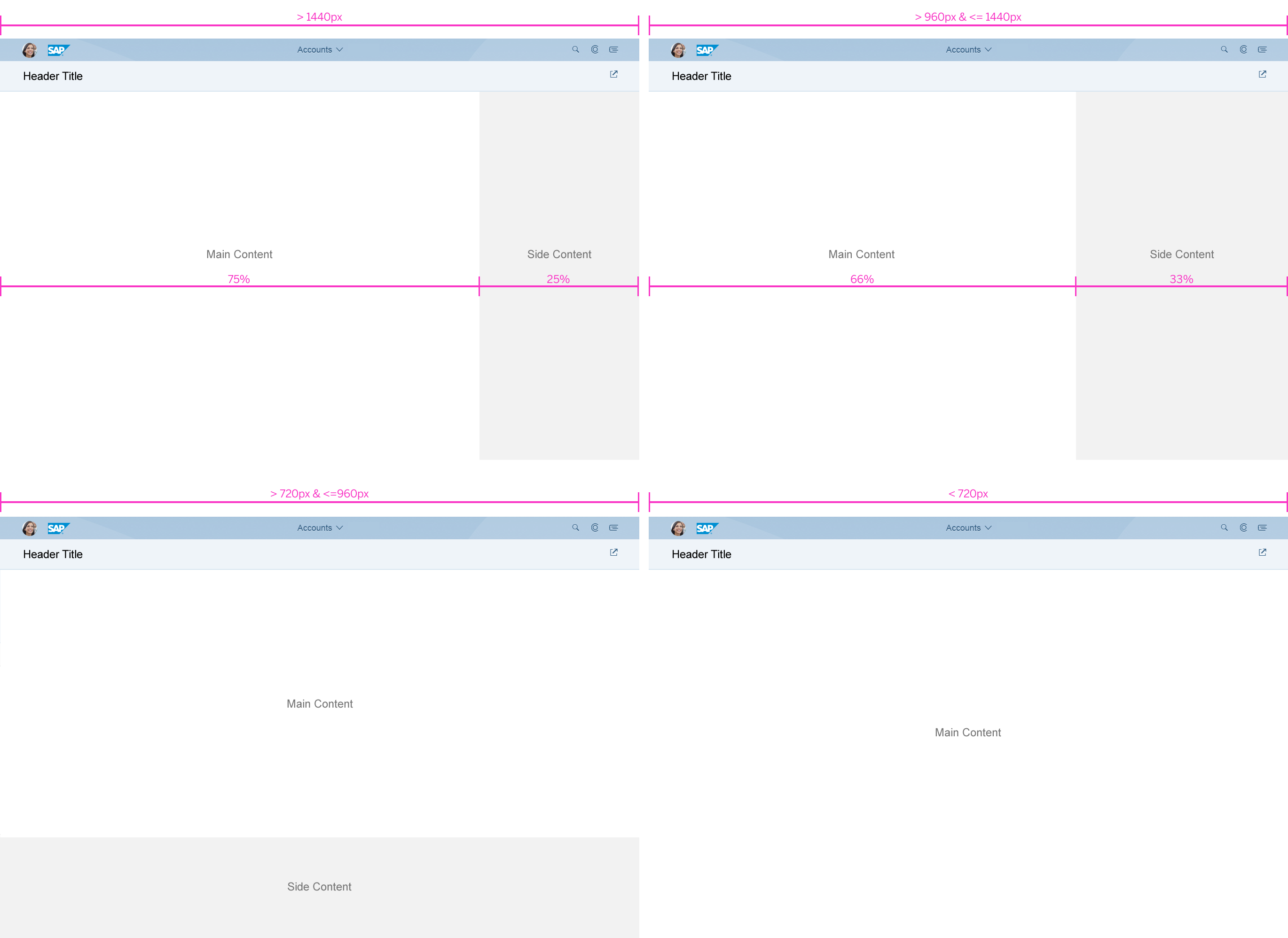
Responsiveness
The dynamic side content control is built for different screen sizes and layouts. The default screen layout features the side content on the left or right side of the screen, covering 25% of the screen width on a large desktop (over 1440 px).
Dynamic side content – Size S
Dynamic side content – Size M
Dynamic side content – Size L
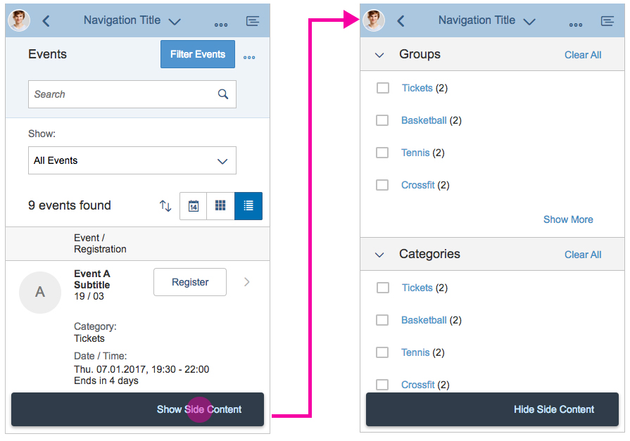
Responsive behavior of the dynamic side content
Equal split: A special view of the side content is the 50:50 view, which enables users to show more data, for example, for comparison purposes. The responsive behavior of the equal split is the same as in the standard view: The side content disappears on screen widths of less than 720 px and can only be viewed by triggering it.
On smaller screen sizes (under 1440 px), the side content occupies 33% of the screen width to accommodate the nested controls. If the side content width falls below 320 px, the side content automatically slides under the main content, unless the app development team specifies that it should disappear.
On screen sizes of less than or equal to 720 px, the side content automatically disappears from the screen (unless specified to stay under the content) and can be triggered from a preset trigger (specified within the app). When the side content is triggered, it replaces the main content. We recommend that you always place the trigger for the side content in the same location, such as in the app footer.
The app development team may specify that the side content should slide under the main content when the screen is resized to a smaller width. Sliding the side content under the main content on smaller screens allows it to remain on the screen at all times. However, it may only be accessible via scrolling.
Navigation
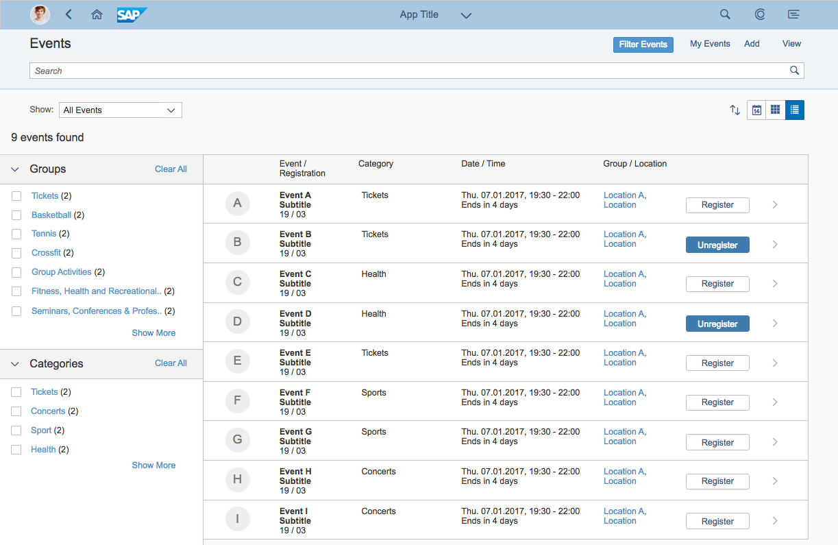
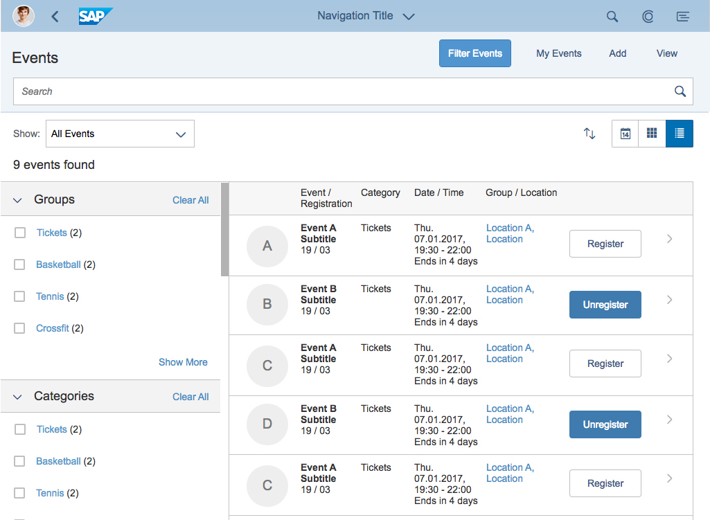
The side content is always related to the main content, so it must show content that can be triggered from the main content. This also means minimizing navigation such as drill-ins inside the side content and displaying content that is triggered from the main content area. An example would be showing additional details like contact information or conversation history. If a different type of data relates to the main content, app developers can implement a switcher in the side content. However, we recommend that you keep the side content free of additional navigation elements.
Triggering the side content: The side content can be set to hidden by default, and it automatically disappears when the screen width is less than or equal to 720 px (except when it is set to be under the main content). The app design team can define the trigger point. Ensure that the user can understand how to trigger the side content. If the side content information relates not only to a specific element but also to the entire object, the trigger point should be a link in the footer toolbar. In this case, we strongly recommend that you place the link next to the side content with as few actions as possible between them. Note: This link should be prioritized to prevent it from going into the overflow, where the user might not expect it.
Hiding the side content: The side content should be hidden from the header (top) section of the side content. The side content container itself has no header. We therefore strongly recommend that you use a toolbar control with a title, a transparent button labeled Close, and a spacer between them.
Hiding side content – From the header section
Guidelines
Use of Controls in the Dynamic Side Content
You can use most of the main controls in the dynamic side content, such as text, simple form, chart, list, panel, tree, timeline, or feed and notes. However, you must make sure that the control doesn’t result in the appearance of a horizontal scrollbar.
Do not use complex controls, such as tables.
Resources
Want to dive deeper? Follow the links below to find out more about related controls, the SAPUI5 implementation, and the visual design.
 Your feedback has been sent to the SAP Fiori design team.