
- Latest SAPUI Version 1.124
- SAPUI5 Version 1.122
- SAPUI5 Version 1.120
- SAPUI5 Version 1.118
- SAPUI5 Version 1.116
- SAPUI5 Version 1.114
- SAPUI5 Version 1.112
- SAPUI5 Version 1.110
- SAPUI5 Version 1.108
- SAPUI5 Version 1.106
- SAPUI5 Version 1.104
- SAPUI5 Version 1.102
- SAPUI5 Version 1.100
- SAPUI5 Version 1.98
- SAPUI5 Version 1.96
- SAPUI5 Version 1.94
- SAPUI5 Version 1.92
- SAPUI5 Version 1.90
- SAPUI5 Version 1.88
- SAPUI5 Version 1.86
- SAPUI5 Version 1.84
- SAPUI5 Version 1.82
- SAPUI5 Version 1.80
- SAPUI5 Version 1.78
- SAPUI5 Version 1.76
- SAPUI5 Version 1.74
- SAPUI5 Version 1.72
- SAPUI5 Version 1.70
- SAPUI5 Version 1.68
- SAPUI5 Version 1.66
- SAPUI5 Version 1.64
- SAPUI5 Version 1.62
- SAPUI5 Version 1.60
- SAPUI5 Version 1.58
- SAPUI5 Version 1.56
- SAPUI5 Version 1.54
- SAPUI5 Version 1.52
- SAPUI5 Version 1.50
- SAPUI5 Version 1.48
- SAPUI5 Version 1.46
- SAPUI5 Version 1.44
- SAPUI5 Version 1.40
- SAPUI5 Version 1.38
- SAPUI5 Version 1.36
- SAPUI5 Version 1.34
- SAPUI5 Version 1.32
- SAPUI5 Version 1.30
- SAPUI5 Version 1.28
- SAPUI5 Version 1.26
- Latest SAPUI Version 1.124
- SAPUI5 Version 1.122
- SAPUI5 Version 1.120
- SAPUI5 Version 1.118
- SAPUI5 Version 1.116
- SAPUI5 Version 1.114
- SAPUI5 Version 1.112
- SAPUI5 Version 1.110
- SAPUI5 Version 1.108
- SAPUI5 Version 1.106
- SAPUI5 Version 1.104
- SAPUI5 Version 1.102
- SAPUI5 Version 1.100
- SAPUI5 Version 1.98
- SAPUI5 Version 1.96
- SAPUI5 Version 1.94
- SAPUI5 Version 1.92
- SAPUI5 Version 1.90
- SAPUI5 Version 1.88
- SAPUI5 Version 1.86
- SAPUI5 Version 1.84
- SAPUI5 Version 1.82
- SAPUI5 Version 1.80
- SAPUI5 Version 1.78
- SAPUI5 Version 1.76
- SAPUI5 Version 1.74
- SAPUI5 Version 1.72
- SAPUI5 Version 1.70
- SAPUI5 Version 1.68
- SAPUI5 Version 1.66
- SAPUI5 Version 1.64
- SAPUI5 Version 1.62
- SAPUI5 Version 1.60
- SAPUI5 Version 1.58
- SAPUI5 Version 1.56
- SAPUI5 Version 1.54
- SAPUI5 Version 1.52
- SAPUI5 Version 1.50
- SAPUI5 Version 1.48
- SAPUI5 Version 1.46
- SAPUI5 Version 1.44
- SAPUI5 Version 1.42
- SAPUI5 Version 1.40
- SAPUI5 Version 1.38
- SAPUI5 Version 1.36
- SAPUI5 Version 1.34
- SAPUI5 Version 1.32
- SAPUI5 Version 1.30
- SAPUI5 Version 1.28
- SAPUI5 Version 1.26
Animation
Intro
In SAP Fiori, animations are used to emphasize actions, provide orientation, and help users to perform actions by providing transitions and additional multiple actions. The aim is to improve the overall user experience.
Responsiveness
The same transitions (swipes, drop effects, and dissolve effects) are used for all devices and screen sizes.
Types
Curves
Timing : To focus the user’s attention on certain objects, changes in acceleration or deceleration should be smooth during an animation. The variation in speed gives motion a personality and an aesthetic look, thus avoiding monotonous linear movement.
Smooth acceleration showing change in motion curves
AVOID linear acceleration and timing

Example of correct timing for any motion inside SAP Fiori
This reference can be applied to all kinds of translations (transitions), rotation, and scaling done to any object in SAP Fiori.
Normally we use: EaseIn-Out and to add more detail it is possible to implement the following functions:
easeInExpo, easeOutExpo, easeInOutExpo, easeInSine, easeOutSine, easeInOutSine, easeInQuead, easeOutQuead, easeInOutQuead, easInCubic, easOutCubic, easInOutCubic, easInQuart, easeOutQuart, easeInOutQuart, easeInQuint, easeOutQuint, easeInOutQuint.
In SAP Fiori, we differentiate between three animation types: transitions, interactive motions, and functional animations.
Transitions
These help the user to remain oriented while navigating through the user interface. The user gets a sense of moving along a path. To keep this metaphor alive, a new screen always needs to appear from the right, while backwards navigation brings in the old screen from the left.
Interactive Motions
These are driven by the user and enhance the user experience by giving responsive feedback through motion. They are objects that move or change shape on the screen, such as to indicate a loading process. Interactive motions tell the user that something is happening. For example, a change in the state of a button helps the user understand that the system is reacting to the user’s input.
Functional Animations
Is the tool that serves a design concept that follows a clear and logical propose as it’s only goal.
Orientation Focus on the direction and structure according to the page layout. (e.g. Navigation) Purpose: Avoid surprising actions and transitions and orient the user.
Same Location, New Action Used when the space is limited and when a new functionality changed under certain conditions. (e.g. Action buttons) Purpose: show that a function changed to a different state)
Zoom Selected as a visual clue to expand or relocate an object to a prominent position. (e.g. Click on a Image inside a gallery) Purpose: Associate an low definition object or a thumbnail with its detailed or high definition view.
Visual Hints Assist users to better understand how to interact with a product’s interface. It is especially needed in designs that contain an unconventional object or a unique navigation method. (e.g.Quick tour in a first installed app and shows how certain functionality in the design operates, so a first time animation is displayed the “how to”) Purpose: Explain unconventional functionality or a hidden action.
Highlight Applied in case of a noisy layout or multiple visual content. Motion is used to bring the element to a higher level, directing the attention to this action. (e.g. add an item to the shopping cart inside a crowded page full of items) Purpose: Attract the user’s attention, and move the object above a noisy layout.
Simulation or Customized animations, when a simple motion doesn’t describe what the user wants, simulation is needed just for special cases. In Fiori it is common to achieve this due to the complexity of its functionality and the quantity of controls, so it is possible to differentiate each one of them. (e.g horizontal wipe transitions to other sections in Fiori home screen ) Purpose: Simulate topics that are different and somehow hard to demonstrate.
Visual Feedback Buttons, controls and objects respond to interaction. This topic can be confused with the previous themes but the difference of this particular animation ends by being extremely subtle and very well thought, always constrained to just show and minimal interaction. (e.g. a simple rollover button mostly for mobile experience) Purpose: Acknowledge the user’s action.
System Status Implemented to show control and understanding the current context in the system at any time. Indicates when a process has initiated, in progress and terminated. (e.g. Loading page bar) Purpose: Sense of control in a linear time process.
Marketing Functional animation can be used to promote brand’s value or product’s behavior, as an effective way to sell or to be recognize in the market. The difference is based in the freedom to experiment with graphics and visual styles (e.g. skype logo animation) Purpose: Support a company’s brand values and product’s strengths.
Behavior and Interaction
There are different animations in SAP Fiori. Starting an app from the launchpad requires a different transition than navigating within an app. An overview of all animations in SAP Fiori is shown below.
Launch App
When an app is launched, maintain the following choreography:
- Launchpad: The user clicks or taps a tile on the home page.
- Launchpad loading: The launchpad gets a white, semitransparent overlay and a flower-like “waiting” indicator.
- App: When the app has been loaded, the overlay is removed.
When the app screen becomes visible, there should be no animations or transitions after the SAP Fiori flower.
Load your app until the app structure is complete and you have reached a point where users understand what they are seeing.
It is permissible for a section of your app, like a graph, to be loading while the rest is complete.
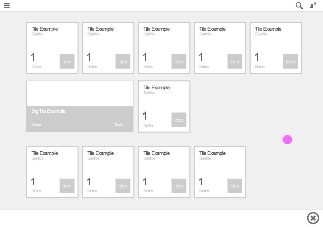
SAP Fiori app launch
Navigate (In-App)
Use the following transitions for in-app navigation:
- Forward navigation: Use a right-to-left slide transition.
- Backward navigation: Use a left-to-right slide transition.
These transitions appear in the screen area where the navigation takes place.
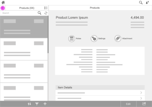
Master List
For navigation inside a (hierarchical) master list, use transitions only within the master list.
Navigating in a master list
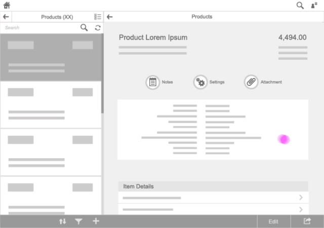
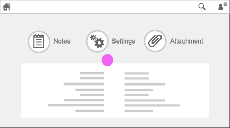
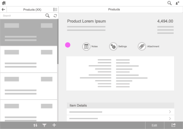
Details Area
For navigation inside a details area, use transitions only within this area. Side-swipe transition is used to go to lower-level pages and inverse swipe to return to higher levels inside this area.
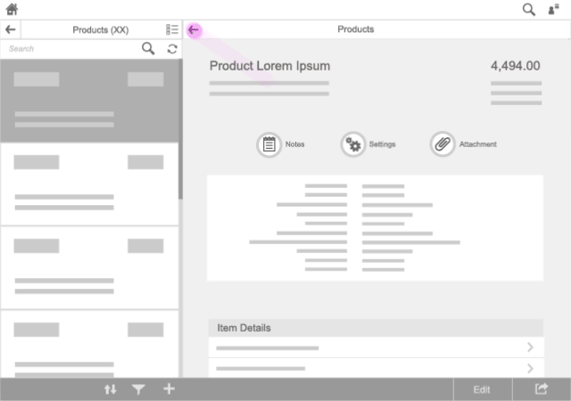
In-app detail transition
Full Screen
Navigation on a full-screen app uses the whole page for transitional animations as this maintains a high level of detail. The same timing principle is adopted as for non-full-screen navigation. The same animation rules apply here as for loading an application; in other words, use the SAP Fiori flower animation.
Navigate (App to App)
Whether the user is navigating forward or backward, use the the SAP Fiori flower animation (as described above for starting an app from the launchpad).
An exception to this is when the user navigates back to the launchpad; in this case, use the backward transition (slide left to right).
Styles
Approach the Styles as a basic motion structure (not implemented) to have an idea of the goal in your object/control. This represents a graphic way that helps to classify the motion in different groups depending on their functionality.
The posible groups we could find in Fiori are:
Hoover

Scaling action
Color action
Animated icon action
Transitions

Horizontal transition
Horizontal 3D transition
 Your feedback has been sent to the SAP Fiori design team.