
- Latest SAPUI Version 1.124
- SAPUI5 Version 1.122
- SAPUI5 Version 1.120
- SAPUI5 Version 1.118
- SAPUI5 Version 1.116
- SAPUI5 Version 1.114
- SAPUI5 Version 1.112
- SAPUI5 Version 1.110
- SAPUI5 Version 1.108
- SAPUI5 Version 1.106
- SAPUI5 Version 1.104
- SAPUI5 Version 1.102
- SAPUI5 Version 1.100
- SAPUI5 Version 1.98
- SAPUI5 Version 1.96
- SAPUI5 Version 1.94
- SAPUI5 Version 1.92
- SAPUI5 Version 1.90
- SAPUI5 Version 1.88
- SAPUI5 Version 1.86
- SAPUI5 Version 1.84
- SAPUI5 Version 1.82
- SAPUI5 Version 1.80
- SAPUI5 Version 1.78
- SAPUI5 Version 1.76
- SAPUI5 Version 1.74
- SAPUI5 Version 1.72
- SAPUI5 Version 1.70
- SAPUI5 Version 1.68
- SAPUI5 Version 1.66
- SAPUI5 Version 1.64
- SAPUI5 Version 1.62
- SAPUI5 Version 1.60
- SAPUI5 Version 1.58
- SAPUI5 Version 1.56
- SAPUI5 Version 1.54
- SAPUI5 Version 1.52
- SAPUI5 Version 1.50
- SAPUI5 Version 1.48
- SAPUI5 Version 1.46
- SAPUI5 Version 1.44
- SAPUI5 Version 1.40
- SAPUI5 Version 1.38
- SAPUI5 Version 1.36
- SAPUI5 Version 1.34
- SAPUI5 Version 1.32
- SAPUI5 Version 1.30
- SAPUI5 Version 1.28
- SAPUI5 Version 1.26
- Latest SAPUI Version 1.124
- SAPUI5 Version 1.122
- SAPUI5 Version 1.120
- SAPUI5 Version 1.118
- SAPUI5 Version 1.116
- SAPUI5 Version 1.114
- SAPUI5 Version 1.112
- SAPUI5 Version 1.110
- SAPUI5 Version 1.108
- SAPUI5 Version 1.106
- SAPUI5 Version 1.104
- SAPUI5 Version 1.102
- SAPUI5 Version 1.100
- SAPUI5 Version 1.98
- SAPUI5 Version 1.96
- SAPUI5 Version 1.94
- SAPUI5 Version 1.92
- SAPUI5 Version 1.90
- SAPUI5 Version 1.88
- SAPUI5 Version 1.86
- SAPUI5 Version 1.84
- SAPUI5 Version 1.82
- SAPUI5 Version 1.80
- SAPUI5 Version 1.78
- SAPUI5 Version 1.76
- SAPUI5 Version 1.74
- SAPUI5 Version 1.72
- SAPUI5 Version 1.70
- SAPUI5 Version 1.68
- SAPUI5 Version 1.66
- SAPUI5 Version 1.64
- SAPUI5 Version 1.62
- SAPUI5 Version 1.60
- SAPUI5 Version 1.58
- SAPUI5 Version 1.56
- SAPUI5 Version 1.54
- SAPUI5 Version 1.52
- SAPUI5 Version 1.50
- SAPUI5 Version 1.48
- SAPUI5 Version 1.46
- SAPUI5 Version 1.44
- SAPUI5 Version 1.42
- SAPUI5 Version 1.40
- SAPUI5 Version 1.38
- SAPUI5 Version 1.36
- SAPUI5 Version 1.34
- SAPUI5 Version 1.32
- SAPUI5 Version 1.30
- SAPUI5 Version 1.28
- SAPUI5 Version 1.26
Object Header
sap.m.ObjectHeader
Intro
The object header usually represents an object instance. As such, it contains the most important information a user needs to see in order to understand what the object is about and what its status is. It is the first control on a page dedicated to a single object instance, usually the object view.
The control can also be used as the header of other pages, such as the full screen layout. In that case, the object header contains the most important aggregated information of the items that are listed below.
Usage
Use the object header:
- As the first component on a page that handles a single object instance to enable the user identify it easily.
- As the header of other pages, such as the full screen layout. In this case, the object header contains the most important aggregated information of the items that are listed below.
Do not use the object header:
- Inside the content area as a work-around for visualizing something that is not possible with current means.
Responsiveness
The object header generally adjusts to different screen sizes. To achieve this, there is a built-in rule set that defines which content wraps or truncates when necessary, and how attributes and status texts are arranged depending on the screen size.
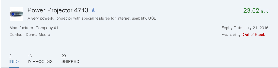
Object header – Split-screen layout (Responsive = true, FullScreenOptimized = false)
Responsive
As of SAPUI5 1.28, the app team should generally set the responsive flag to ‘true’. In this case, the attributes are the first set of entries in the header, followed by the second set of statuses. The on-screen distribution differs from previous SAPUI5 versions. Even if there are many attributes and only a few statuses, use of the space is now optimized as the entries fill the respective columns equally.
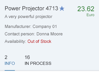
Object header – Smartphone size (Responsive = true, FullScreenOptimized = false)
Full Screen Optimized
The second attribute, FullScreenOptimized, should be activated when the header makes full use of the screen width and is not used in a split-screen layout.
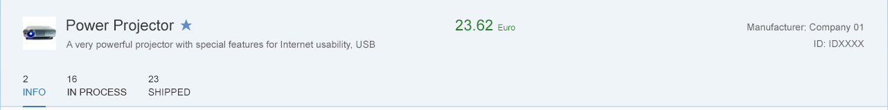
Object header – Full screen optimized (responsive = true, FullScreenOptimized = true)
Attribute/Status Distribution
The following table shows how the attributes are distributed automatically when the responsive flag is set to ‘true’ on various screen sizes.
| Screen Size | 2 Attributes | 3 Attributes | 4 Attributes | 5+ Attributes |
| Desktop (full screen) | Next to the title area (1 column of 1-2 attributes) | Next to the title area (1 column of 3 attributes) | Underneath the title area (4 columns split by 1/1/1/1) | Underneath the title area (4 columns split by 2/1/1/1) |
| Desktop (split screen layout) | Underneath (2 columns split by 1/1 | Underneath (2 columns split by 2/1) | Underneath (2 columns split by 2/2) | Underneath (3 columns split by 2/2/1) |
| Tablet (full screen – landscape) | Underneath (2 columns split by 1/1) | Underneath (3 columns split by 1/1/1) | Underneath (3 columns split by 2/1/1) | Underneath (3 columns split by 2/2/1) |
| Tablet (split screen layout) or Tablet (full screen – portrait) | Underneath (2 columns split by 1/1) | Underneath (2 columns split by 2/1) | Underneath (2 columns split by 2/2) | Underneath (2 columns split by 3/2) |
| Smartphone | Underneath (1 column of 1-2 attributes) | Underneath (1 column of 3 attributes) | Underneath (1 column of 4 attributes) | Underneath (1 column of 5+ attributes) |
Prior to SAPUI5 1.28 (Responsive Set to ‘False’)
The responsive flag is deactivated by default in apps that were built before SAPUI5 1.28. As mentioned above, this mainly impacts the attributes and status arrangement. If the responsive flag is turned off, all attributes are left-aligned in the object header and all statuses are right-aligned, regardless of their individual number.
The object header still reacts correctly to resizing, but does not make optimal use of the space available.
For example, three attributes and one status with Responsive and FullScreenOptimized both set to ‘false’ results in two columns: the first (left) column contains three attributes, and the other column (right) has one status. Altogether, this is three rows in height, whereas the same number of entries on a desktop full screen with the two flags set to ‘true’ results in a height of just one row (spread over four columns).
Components
Title
- The object header has a mandatory title that serves as the key identifier of the object instance (property: title).
- Long titles wrap once before they truncate on the second line.
- A title can be actionable (property: titleActionable), in which case, it looks like a link and triggers an event, which usually results in a quick view.
- An additional icon or image that identifies the object (property: icon) can be shown in front of the title. The icon or image can also be set to actionable (property: IconActionable).
- Additionally, the title can show a title selector (which is visualized like a menu). It is mainly used to provide navigation targets, allowing the object to be opened in a different app.
Object header (Responsive=false) – Title not actionable
Object header (Responsive=false) – Title actionable
Object header (Responsive=false) – Title selector
Object Number
- The object number contains the key attribute of the object instance.
- The object number consists of text that represents the key attribute of an object, usually a number (property: number) and its unit (property: numberUnit). The object number has a semantic color (property: state). The unit inherits the semantic color of its number.
- As usual in SAP Fiori, the semantic colors available are negative (property: error), critical (property: warning), positive (property: success), and neutral (property: none).
Object header (Responsive=false) – Negative object number
Object Attribute
- The object header can contain 0 to n attributes (property: objectAttribute).
- The attributes are listed first in the list of attributes in the object header.
- Attributes can be text (property: text) or actionable (property: actionable), in which case, they are rendered similar to links.

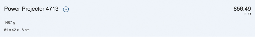
Object header (Responsive=false) – Attribute active
Object Status
- The object header can contain a list of 0 to n object statuses (property: objectStatus).
- The statuses are listed as the second set of attributes in the object header.
- The status has a semantic color.
- Statuses can be text or icons. A combination of the two is technically also possible, in which case, the icon is placed in front of the text. We generally recommend that you use text only (see guidelines below).
- A progress indicator may also be shown as a status. If used, the progress indicator should be the last item in the list of statuses.
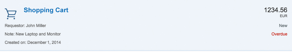
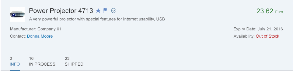
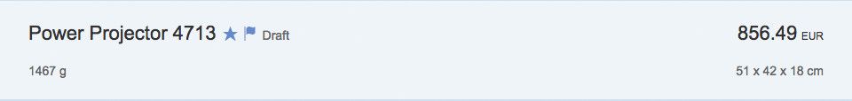
Object header (Responsive=true) – one object marker, three object attributes, and one object status
Object Marker
The object marker allows you to express the technical status of an object.
- Objects can be flagged and marked as favorites. The object header provides flags for both (properties: markFavorite, markFlagged).
- To show them in the object header, you also need to activate the respective flag (property: showMarkers).
- When they are used and shown, they appear directly behind the title.
- With version 1.42 an editing status is available in object header. This status is part of draft handling concept. There are four editing statuses – unchanged/active version, draft, locked and unsaved changes.
- Unchanged: The default status for a saved entity that no one is working on. There is no special indicator for this status on the screen.
- Draft: A user’s own draft is tagged as Draft.
- Locked: If a user is editing a business entity, it is locked for other users. The object remains locked until the user has finished editing or until the locking time has passed.
- Unsaved changes: If the locking time has expired, other users can see that there are unsaved changes by the person who edited the object.
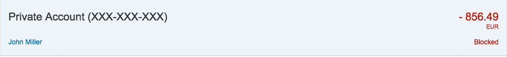
Object header (Responsive=false) – Two object markers, three object attributes, and one object status
Object header with three object markers
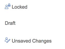
Object marker - editing status types
Intro
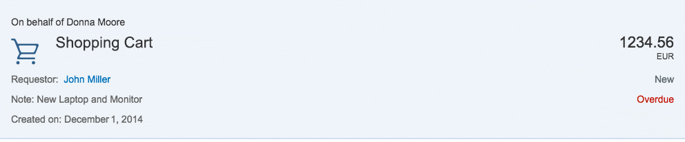
- As mentioned above, another component from the early days of SAP Fiori called the intro (property: intro) is available.
- It is now shown directly below the title in a smaller font size.
- The intro can call an event if it is set to actionable (property: introActionable).
- Previously, the intro appeared above the title, and was used to indicate the origin of an object (for example, Forwarded by…, On behalf of …). It now tends to be used as a short subtitle.
Object header (Responsive=true) – Intro text used as subtitle
Object header (Responsive=false) – Intro text
Condensed
- The object header provides a condensed flag for cases in which it is used as a page header with little information (property: condensed).
- When turned on, the object header displays only the title, object number, and one attribute.
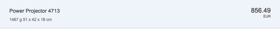
Object header – Condensed mode
Guidelines
Settings
- Set the object header responsiveness flag to ‘true’ (property: responsive) to make optimal use of the screen real estate.
- If your app runs in full-screen mode (not master/details), make optimal use of the header area by setting the respective property to ‘true’ (property: FullScreenOptimized).
- If you need to enforce the sequence and stable display of the attributes independently of the screen size, such as for an address, you might still decide to set the Responsive property to ‘false’ as an exception.
Title
- The object header contains a mandatory title, which serves as the key identifier of the object instance (property: title). The title should be easily readable text without any IDs. If an ID is essential to the user, for example, to distinguish between identical titles, it can be put in brackets, such as Product ABC (1234567). If it is usually a long number, you can also consider adding it as a first attribute. In that case, however, you must give it a label (property: title of the Object Attribute).
- Although the title can be truncated, keep it as short as possible and only as long as necessary.
- If you make the title actionable and use an image or icon as well, both should be actionable and trigger the same event.
- If you do use a title selector, it should open an action sheet that allows the user to choose from different options.
Object Number
- The object number contains the key attribute of the object instance, which is usually a numeric attribute. In rare cases, it can also be used with text if that is the key attribute of the item. Be careful when you use text because it often leads to issues during translation if the text is too long.
- As usual with SAP Fiori, the semantic colors available are negative (property: error), critical (property: warning), positive (property: success), and neutral (property: none).
- For very long numbers, use a formatter.
- The object number can be left blank if there is no key attribute worth showing.
For more information, see object number.
Object Attribute
- These object attributes do not generally need a label if it is clear what they refer to. If attributes are not distinct, you can use a label (property: title).
- To facilitate recognition of the object header, we recommend using no more than four attributes.
For more information, see object attribute.
Object Status
- Although it is technically possible to show icons together with text, we recommend using text only.
- Only use icons that are clear and unambiguous. If you think your icon would need a descriptive text to be understood, use text only.
- In the case of locked items, however, you may also add further information about who has locked the item (when available).
- The same rule for choosing semantic colors as elsewhere in SAP Fiori applies for the statuses negative (property: error), critical (property: warning), positive (property: success), and neutral (property: none).
- In terms of indicating status priority, the general guidance is: very high (property: error), high (property: warning), medium, low, or other (property: none).
- You can also show a progress indicator as a status. If you use it, the progress indicator should be the last item in the list of statuses.
- As with the attributes, statuses do not need a label if it is clear what they refer to. If statuses are not distinct, you can use a label (property: title).
- Here, too, we recommend that you have no more than four entries in the status list (including progress indicators and flag or favorite).
For more information, see object status.
Intro
- The intro usually contains a short subtitle and should only be used when necessary.
- Do not use the intro for standard attributes.
Object Marker
An object might contain multiple technical statuses at the same time. However, the editing statuses are mutually exclusive. As a result, an object can have a maximum of 3 technical status visible on the screen: Flag, Favorite and one editing status. The app developer is responsible for the technical statuses.
Every technical status has a default visualization that can be changed by the app developer depending on the usage context.
Flag and Favorite are usually displayed as icon. The same applies to all screen sizes.
The default behavior for the editing status is described below.
On S size:
- Locked and Unsaved Changes are displayed as icon, while Draft is displayed as text.
- Flag and Favorite are displayed as icons.
For more information, see object marker.
Master/Details
- When used in the details area of the split screen (master/details) and the master list contains object list items, the object header should show the same information as the object list item, plus additional information if necessary.
- Unlike the object list item, the object number uses large number formatting because the object header has more space for handling long text.
Resources
Want to dive deeper? Follow the links below to find out more about related controls, the SAPUI5 implementation, and the visual design.
 Your feedback has been sent to the SAP Fiori design team.