
- Latest SAPUI Version 1.124
- SAPUI5 Version 1.122
- SAPUI5 Version 1.120
- SAPUI5 Version 1.118
- SAPUI5 Version 1.116
- SAPUI5 Version 1.114
- SAPUI5 Version 1.112
- SAPUI5 Version 1.110
- SAPUI5 Version 1.108
- SAPUI5 Version 1.106
- SAPUI5 Version 1.104
- SAPUI5 Version 1.102
- SAPUI5 Version 1.100
- SAPUI5 Version 1.98
- SAPUI5 Version 1.96
- SAPUI5 Version 1.94
- SAPUI5 Version 1.92
- SAPUI5 Version 1.90
- SAPUI5 Version 1.88
- SAPUI5 Version 1.86
- SAPUI5 Version 1.84
- SAPUI5 Version 1.82
- SAPUI5 Version 1.80
- SAPUI5 Version 1.78
- SAPUI5 Version 1.76
- SAPUI5 Version 1.74
- SAPUI5 Version 1.72
- SAPUI5 Version 1.70
- SAPUI5 Version 1.68
- SAPUI5 Version 1.66
- SAPUI5 Version 1.64
- SAPUI5 Version 1.62
- SAPUI5 Version 1.60
- SAPUI5 Version 1.58
- SAPUI5 Version 1.56
- SAPUI5 Version 1.54
- SAPUI5 Version 1.52
- SAPUI5 Version 1.50
- SAPUI5 Version 1.48
- SAPUI5 Version 1.46
- SAPUI5 Version 1.44
- SAPUI5 Version 1.40
- SAPUI5 Version 1.38
- SAPUI5 Version 1.36
- SAPUI5 Version 1.34
- SAPUI5 Version 1.32
- SAPUI5 Version 1.30
- SAPUI5 Version 1.28
- SAPUI5 Version 1.26
- Latest SAPUI Version 1.124
- SAPUI5 Version 1.122
- SAPUI5 Version 1.120
- SAPUI5 Version 1.118
- SAPUI5 Version 1.116
- SAPUI5 Version 1.114
- SAPUI5 Version 1.112
- SAPUI5 Version 1.110
- SAPUI5 Version 1.108
- SAPUI5 Version 1.106
- SAPUI5 Version 1.104
- SAPUI5 Version 1.102
- SAPUI5 Version 1.100
- SAPUI5 Version 1.98
- SAPUI5 Version 1.96
- SAPUI5 Version 1.94
- SAPUI5 Version 1.92
- SAPUI5 Version 1.90
- SAPUI5 Version 1.88
- SAPUI5 Version 1.86
- SAPUI5 Version 1.84
- SAPUI5 Version 1.82
- SAPUI5 Version 1.80
- SAPUI5 Version 1.78
- SAPUI5 Version 1.76
- SAPUI5 Version 1.74
- SAPUI5 Version 1.72
- SAPUI5 Version 1.70
- SAPUI5 Version 1.68
- SAPUI5 Version 1.66
- SAPUI5 Version 1.64
- SAPUI5 Version 1.62
- SAPUI5 Version 1.60
- SAPUI5 Version 1.58
- SAPUI5 Version 1.56
- SAPUI5 Version 1.54
- SAPUI5 Version 1.52
- SAPUI5 Version 1.50
- SAPUI5 Version 1.48
- SAPUI5 Version 1.46
- SAPUI5 Version 1.44
- SAPUI5 Version 1.42
- SAPUI5 Version 1.40
- SAPUI5 Version 1.38
- SAPUI5 Version 1.36
- SAPUI5 Version 1.34
- SAPUI5 Version 1.32
- SAPUI5 Version 1.30
- SAPUI5 Version 1.28
- SAPUI5 Version 1.26
Multi-Combo Box
sap.m.MultiComboBox
Intro
The multi-combo box control is commonly used to enable users to select one or more options from a predefined list. The control provides an editable input field to filter the list, and a dropdown arrow to open the list of available options. The select options in the list have checkboxes that permit multiselection.
Usage
Use the multi-combo box if:
- The user needs to select one or more options from a long list of options (maximum of approximately 200).
- The values of the option list contain secondary information that does not need to be displayed right away.
Do not use the multi-combo box if:
- The user needs to choose between two options, such as ON or OFF and YES or NO. In this case, consider using a switch control instead.
- You need to display more than one attribute. In this case, consider using the select dialog or value help dialog instead.
- The user needs to search on multiple attributes. In this case, consider using the select dialog or value help dialog instead.
- Your use case requires all available options to be displayed right away, without any user interaction. In this case, consider using checkboxes instead.
Responsiveness
The multi-combo box is optimized for keyboard and mouse interaction.
Size S

Filter bar with multi-combo box - Size S
Option list in full screen - Size S
Size M
Filter bar with multi-combo box - Size M
Size L

Filter bar with multi-combo box - Size L
Filter bar with multi-combo box - Size L
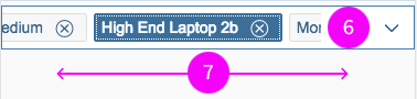
Components
Input Field
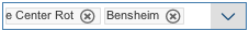
The input field (2) can display a placeholder text (6) when it’s empty, or a token (1) if a value is selected.
Dropdown Trigger
The dropdown button (3) collapses and expands the dropdown list.
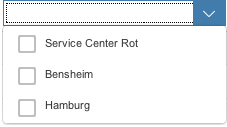
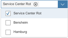
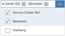
Option List
The option list (7) contains a list of selectable options (5). Clicking the label of an entry closes the option list and creates a token of the selected option. Every entry is accompanied by a checkbox (4) to allow multiselection. Clicking a checkbox creates a token. The option list remains open.
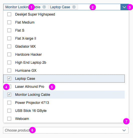
Components of the multi-combo box
Behavior and Interaction
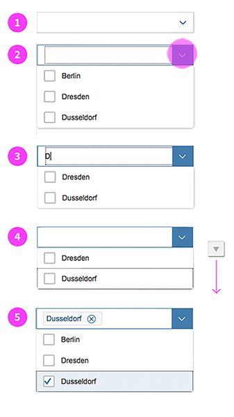
Select a Value
There are three ways to select an item from the list:
- Tick the checkbox (option list remains open).
- Click or tap the label of a select option (option list is closed).
- Use the keyboard (spacebar or Enter).
The user clicks or taps the input field to place the cursor in the field (1). Clicking the arrow displays the list (2). As the user types into the input field, the list is filtered accordingly (3). The up and down arrows move the focus within the list (4). Selected options are automatically entered into the input field as tokens (5).
Input Field
Any character in the input field acts as a filter for the option list. The input field only allows users to type text that matches the items in the list. If a user tries to enter character combinations that are not in the option list, a visual feedback is provided to indicate that the combination of characters is invalid, while the input field suppresses the characters entered.
Behavior - Sizes M and L
Choose from Option List
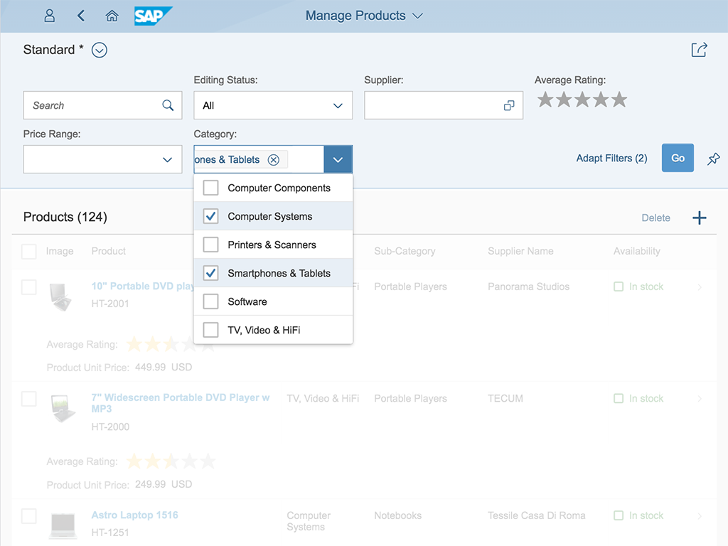
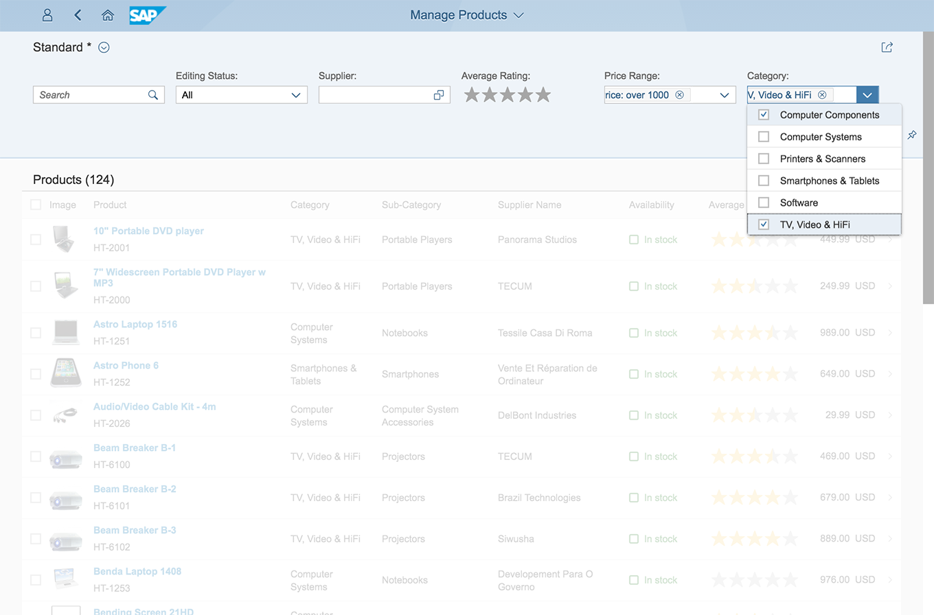
The option list displays all the available items that the user can choose from. Clicking the arrow opens the option list below the field. If there is not enough space to display the dropdown list below the field, it is displayed above the field instead.
Behavior for Mobile Devices
The following sections describe how the multi-combo box interacts on mobile devices.
Tapping the Arrow
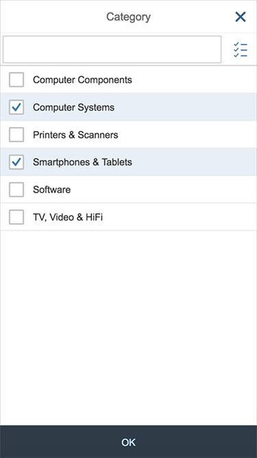
Tapping the arrow opens the option list in a full screen dialog (1) with a title displayed in the header (2). The Close button (3) closes the dialog and cancels any selection changes in the option list. Clicking the label of an entry (4) closes the option list and creates a token of the selected option. By selecting a checkbox (5), the option list remains open and allows multi-selection. The OK button (6) takes over the selection and closes the dialog.
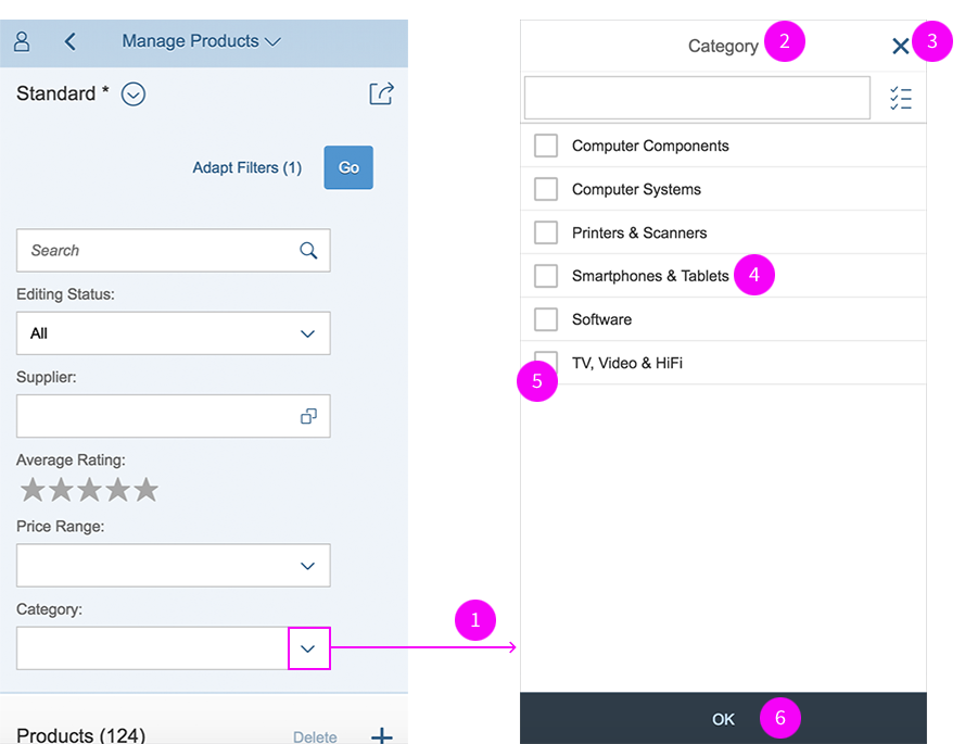
Left: Filter bar with multi-combo box. Right: Full-screen multi-combo box selection.
As the user types into the input field (7), the list is filtered accordingly using the “starts with” approach. Pressing the button next to the input field (8) toggles the view between all options and the selected one only.
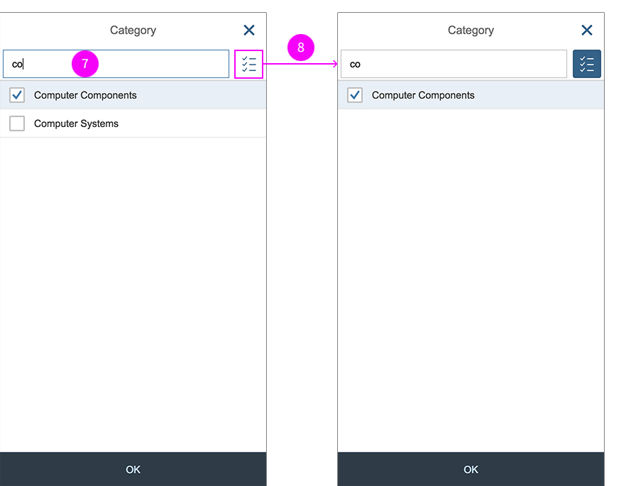
Left: Option list, filtered by user input. Right: Selected options from the list.
Input Field on Collapsed List
If items have already been selected, the input field remains functional and the tokens remain visible (1). Tapping the Remove icon in a token removes it (2). When the user taps on the input field, the list opens to full screen (3). Tapping on the input field sets the focus on it (4) and the mobile device’s keyboard opens (5). When the user types in the first character, the list is filtered by this character (6) using the “starts with” approach. The input field only allows characters to be typed in that match the items in the list.
Left: Multi-combo box with tokens in the input field. Right: List for selection filtered by a character.
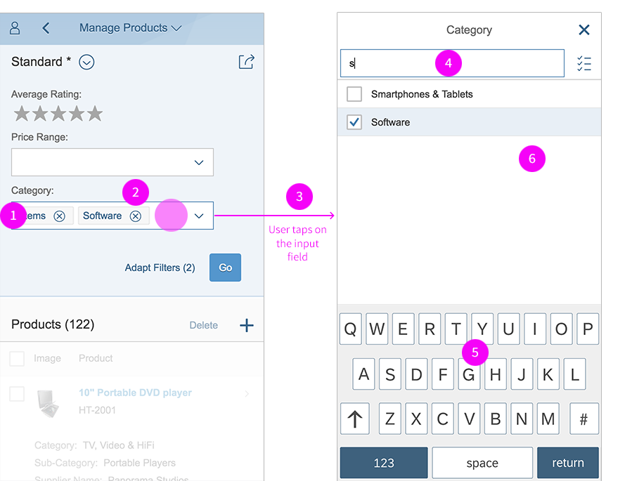
Multiple Selected Items
Not all the selected tokens can be displayed at the same time because the space is limited to the size of the input field (6). Swiping to the side scrolls horizontally to reveal a cropped token (7).
Swiping to display tokens
Copying and Pasting Data from a Spreadsheet or Text File
The control for the multi-combo box can handle paste actions containing, for example, multiple items that have been selected in a column of a spreadsheet or text file. The user simply selects an entire column in the spreadsheet and copies it. When items are entered into the multi-combo box, the user just pastes them from the clipboard and each item is then represented as a token. Only items that are part of the list are displayed as tokens.
Styles
These are the styles of the multi-combo box and their respective states:

Unselected

Unselected predefined placeholder

Unselected on hover

In focus
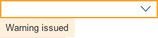
Warning
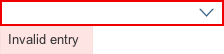
Error
Expanded
Expanded selection
Expanded multiselection
Selected items shown as tokens
Hover highlighting in list
Guidelines
Label
The multi-combo box control can be displayed with or without a label. If the field is attached to another field, you don’t need to define a second label. For more information about labels in SAP Fiori, see the label guidelines.
Placeholder
Don’t use the placeholder attribute as an alternative to a label. This is important because the placeholder text will be overwritten as soon as the form is filled out. Labels are necessary because they indicate the meaning of the form fields if the placeholders are no longer visible. Show a placeholder only if the user needs a hint about what data to enter. Don’t repeat the content of the label. A hint could be a sample value or a brief description of the expected format. For more information about how to use the placeholder, see input field.
Option List
Keep the label of an entry in the select option list as short as possible because the list uses single lines only. Values that are too long may be truncated. If you need to indicate that none of the selection options are selected, show a blank input field. Define a default selection whenever possible. The multi-combo box cannot display columns. If you want to show two values in the option list, show the leading information first, followed by the secondary information in parentheses, such as Walldorf (Germany). Typing into the input field shows all items that start with the search text.
Sorting
The option list contains all available items that the user can choose from. Choose one of the following styles depending on how you want the content to be arranged:
Logical: Sort items into a meaningful order. Group related options together and show the most common options first followed by less common options.
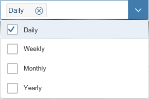
Logical multi-combo box
Alphabetical: Sort currencies, names, and so on into alphabetical order. We recommend this for lists with more than eight items.
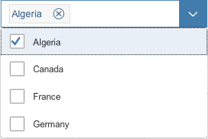
Alphabetical multi-combo box
Numeric: Sort numeric values into a sequential order with the lowest number first.
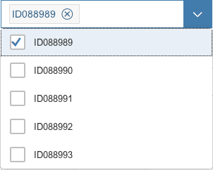
Numeric multi-combo box
Chronological: Sort time-related information into chronological order with the most recent first (if applicable).
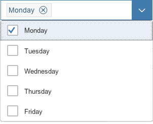
Chronological multi-combo box
Width
You can adjust the width of the option list to some extent. The multi-combo box control is usually used in forms, where the width is determined by the form element or container in which it is embedded. Therefore, we don’t recommend defining a fixed width, but rather working with proper layout containers such as the form, simple form, or responsive grid layout, and with the layout data property, where the width is defined. If you need to restrict the width to a defined value, set the width accordingly. Keep in mind that there’s no horizontal scrolling in the option list. Entries that are too long are truncated and users won’t be able to read them.
Resources
Want to dive deeper? Follow the links below to find out more about related controls, the SAPUI5 implementation, and the visual design.
Elements and Controls
- Combo Box (guidelines)
- Select (guidelines)
- Input Field (guidelines)
- Form (guidelines)
- Radio Button (guidelines)
- Checkbox (guidelines)
- Toolbar (guidelines)
- Switch (guidelines)
Implementation
- No links
 Your feedback has been sent to the SAP Fiori design team.