
- Latest SAPUI Version 1.124
- SAPUI5 Version 1.122
- SAPUI5 Version 1.120
- SAPUI5 Version 1.118
- SAPUI5 Version 1.116
- SAPUI5 Version 1.114
- SAPUI5 Version 1.112
- SAPUI5 Version 1.110
- SAPUI5 Version 1.108
- SAPUI5 Version 1.106
- SAPUI5 Version 1.104
- SAPUI5 Version 1.102
- SAPUI5 Version 1.100
- SAPUI5 Version 1.98
- SAPUI5 Version 1.96
- SAPUI5 Version 1.94
- SAPUI5 Version 1.92
- SAPUI5 Version 1.90
- SAPUI5 Version 1.88
- SAPUI5 Version 1.86
- SAPUI5 Version 1.84
- SAPUI5 Version 1.82
- SAPUI5 Version 1.80
- SAPUI5 Version 1.78
- SAPUI5 Version 1.76
- SAPUI5 Version 1.74
- SAPUI5 Version 1.72
- SAPUI5 Version 1.70
- SAPUI5 Version 1.68
- SAPUI5 Version 1.66
- SAPUI5 Version 1.64
- SAPUI5 Version 1.62
- SAPUI5 Version 1.60
- SAPUI5 Version 1.58
- SAPUI5 Version 1.56
- SAPUI5 Version 1.54
- SAPUI5 Version 1.52
- SAPUI5 Version 1.50
- SAPUI5 Version 1.48
- SAPUI5 Version 1.46
- SAPUI5 Version 1.44
- SAPUI5 Version 1.40
- SAPUI5 Version 1.38
- SAPUI5 Version 1.36
- SAPUI5 Version 1.34
- SAPUI5 Version 1.32
- SAPUI5 Version 1.30
- SAPUI5 Version 1.28
- SAPUI5 Version 1.26
- Latest SAPUI Version 1.124
- SAPUI5 Version 1.122
- SAPUI5 Version 1.120
- SAPUI5 Version 1.118
- SAPUI5 Version 1.116
- SAPUI5 Version 1.114
- SAPUI5 Version 1.112
- SAPUI5 Version 1.110
- SAPUI5 Version 1.108
- SAPUI5 Version 1.106
- SAPUI5 Version 1.104
- SAPUI5 Version 1.102
- SAPUI5 Version 1.100
- SAPUI5 Version 1.98
- SAPUI5 Version 1.96
- SAPUI5 Version 1.94
- SAPUI5 Version 1.92
- SAPUI5 Version 1.90
- SAPUI5 Version 1.88
- SAPUI5 Version 1.86
- SAPUI5 Version 1.84
- SAPUI5 Version 1.82
- SAPUI5 Version 1.80
- SAPUI5 Version 1.78
- SAPUI5 Version 1.76
- SAPUI5 Version 1.74
- SAPUI5 Version 1.72
- SAPUI5 Version 1.70
- SAPUI5 Version 1.68
- SAPUI5 Version 1.66
- SAPUI5 Version 1.64
- SAPUI5 Version 1.62
- SAPUI5 Version 1.60
- SAPUI5 Version 1.58
- SAPUI5 Version 1.56
- SAPUI5 Version 1.54
- SAPUI5 Version 1.52
- SAPUI5 Version 1.50
- SAPUI5 Version 1.48
- SAPUI5 Version 1.46
- SAPUI5 Version 1.44
- SAPUI5 Version 1.42
- SAPUI5 Version 1.40
- SAPUI5 Version 1.38
- SAPUI5 Version 1.36
- SAPUI5 Version 1.34
- SAPUI5 Version 1.32
- SAPUI5 Version 1.30
- SAPUI5 Version 1.28
- SAPUI5 Version 1.26
Title
sap.m.Title
Intro
The title control is a simple, one-line text containing additional semantic information for accessibility purposes.
The difference between a title and a manually styled heading is that the title can be used by assistive technologies such as screen readers to create a hierarchical site map for faster navigation.
The title is used, for example, by panel, toolbar, or list components.
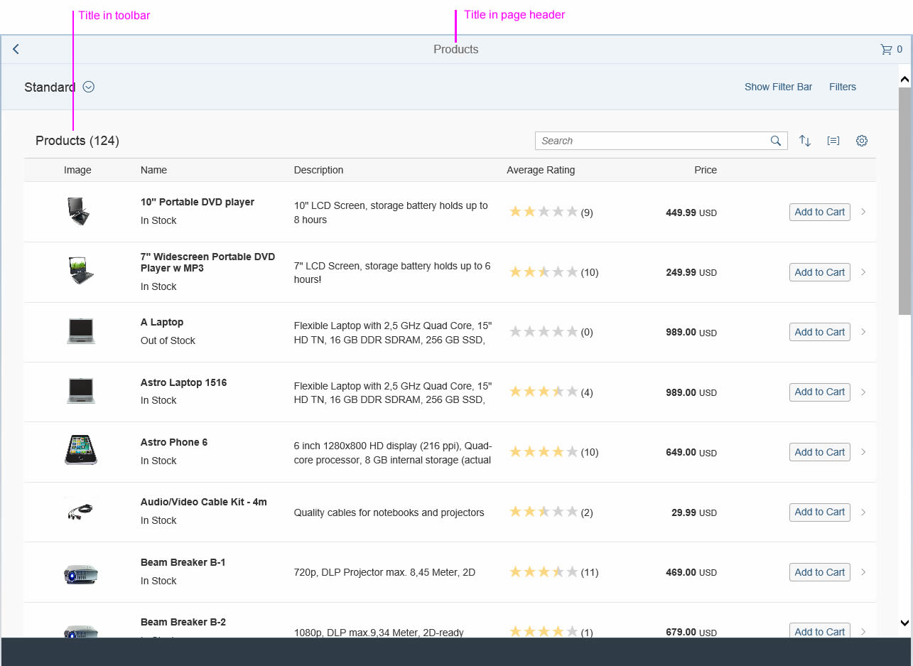
Table with title in toolbar and header
Usage
Use the title if:
- You want to set the title above a table or form.
- You want to show text in the page header.
Do not use the title if:
- The text is inside a text block.
- The text is inside a form element.
Responsiveness
Long titles can become truncated if the screen is smaller than the entire title.
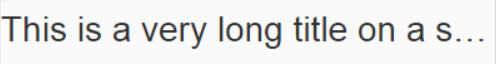
A long title that is truncated on small screens
Styles
The actual appearance of the title and the different styles always depends on the theme being used.
The semantic level of the title can be set automatically or explicitly. With the automatic setting (property: level, value: Auto) no explicit level information is written (HTML5 header element). If you want to set it explicitly, use an HTML H1-H6 element (property: level, value: H1-H6).
The level (property: level, value: Auto, H1-H6) and title style (property: titleStyle, value: Auto, H1-H6) can be set independently.
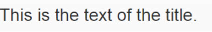
Title with default level and style (H1)

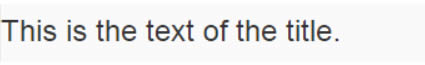
Title with level H1 and default style
Title with level H2 and default style
Title with level H3 and default style
Title with level H4 and default style
Title with level H5 and default style
Title with level H6 and default style
Properties
The following properties are available:
- The property text defines the text that should be displayed as a title.
- The property level (default: auto) defines the semantic level used by assistive technology. The default level can be overridden with H1 to H6 to set the level explicitly.
- The property titleStyle (default: auto) defines the actual appearance of the title. When you use automatic styling, the appearance of the title depends on the current position of the title and the defined level. This automatism can be overridden by explicitly setting a different style between H1 and H6.
- The property width defines the width of the title.
- The property textAlign (default: initial) defines the alignment of the text within the title. Note: This property only has an effect if the overall width of the title control is larger than the displayed text.
Resources
Want to dive deeper? Follow the links below to find out more about related controls, the SAPUI5 implementation, and the visual design.
 Your feedback has been sent to the SAP Fiori design team.