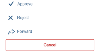
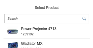
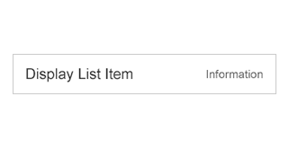
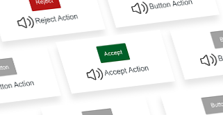
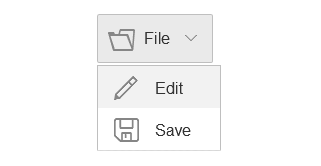
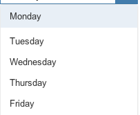
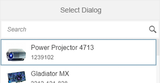
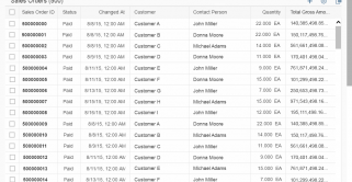
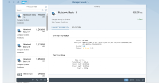
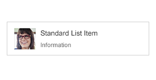
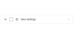
Skip to search Skip to content
  • Home
  • What’s New
  • Explore SAP Fiori
  • Foundation
    • Navigating the Guidelines
    • Design Principles
    • Design-Led Development Process (external)
    • Multi-Device Support: Responsive vs. Adaptive
    • Mobile First
    • Layout
      • Grid Layout
      • Letterboxing
      • Content Density (Cozy & Compact)
    • Theming
    • Animation
    • Belize Colors
    • Iconography – Quartz
    • Typography – Quartz
  • General Concepts
    • SAP Fiori Launchpad
      • SAP Fiori Launchpad – Overview
      • Home Page
      • App Finder
      • Shell Bar
      • Enterprise Search
      • Notifications
      • Tile
      • SAP Fiori Launchpad Services
    • Action Placement
    • Collaboration
    • Copy
    • Create with Reference
    • Draft Handling
    • Flag and Favorite
    • Form Field Validation
    • Formatting
      • Overview
      • Dates
      • Numbers
      • Time
      • Units of Measurement
    • Forward
    • Handling Busy States
    • Manage Objects
      • Overview
      • Simple Objects
      • Parts of an Object
      • Local Flow
      • Global Flow
      • Mass Edit
    • Message Handling – Overview
    • Mobile Integration
      • Mobile Integration Concept
      • Barcode Scanning
    • Navigation
    • Using Tooltips
  • SAP Fiori Elements, Floorplans & Frameworks
    • Overview
    • SAP Fiori Elements
      • Introduction
      • Analytical List Page
      • List Report
      • Object Page
      • Overview Page
    • Frameworks
      • Analysis Path Framework
      • SAP Smart Business Framework
    • Dynamic Page Layout
    • Full Screen Layout
    • Split-Screen Layout
      • Split Screen
      • Master List
    • Create Page
    • Initial Page
    • List Report
    • Multi Instance Handling
    • Object Page
    • Object View
    • Wizard
    • Worklist
  • UI Elements
    • Action
      • Action Sheet
      • Breadcrumb
      • Button
      • Link
      • Menu Button
      • Upload Collection
    • Container
      • Carousel
      • Lightbox
      • Panel
    • Data Visualization
      • Analytical Card
      • Chart (VizFrame)
      • Gantt Chart
      • Micro Chart
      • Map
    • Dialog
    • Display
      • Currency
      • Image
      • Label
      • Object Display Components
      • Progress Indicator
      • Text
      • Title
    • Dynamic Side Content
    • Filter
      • Contextual Filter
      • Filter Bar
      • Info Bar
    • Form / Simple Form
    • Icon Tab Bar
    • Invisible Text
    • List
      • Overview
      • Object List Item
      • Standard List Item
      • Display List Item
      • Action List Item
      • Input List Item
    • Loading
      • Busy Dialog
      • Busy Indicator
      • Busy State
    • Messaging
      • Message Box
      • Message Page
      • Message Popover
      • Message Toast
    • Object Header
    • Popover
      • Popover
      • Quick View
    • Process Flow
    • Smart Controls
      • Smart Link
      • Smart Table
    • Snapping Header
    • Table
      • Overview
      • Responsive Table
      • Analytical Table (ALV)
      • Grid Table
      • Tree Table
      • Personalization & Dialogs
    • Timeline
    • Toolbar
      • Overview
      • Chart Toolbar
      • Footer Toolbar
      • Header Toolbar
      • Table Toolbar
    • Tree
    • Views (Variant Management)
    • User Input
      • Calendar Date Interval
      • Checkbox
      • Combo Box
      • Date Picker
      • Date/Time Picker
      • Date Range Selection
      • Feed and Notes
      • Input Field
      • Mask Input
      • Multi-Combo Box
      • Multi-Input Field
      • Planning Calendar
      • Radio Button
      • Range Slider
      • Rating Indicator
      • Search
      • Select
      • Select Dialog
      • Slider
      • Step Input
      • Switch
      • Table Select Dialog
      • Text Area
      • Time Picker
      • Token
      • Value Help Dialog
  • Services & Resources
    • Download Fonts
    • SAP Fiori Client
    • SAPUI5 Planning & Development
  • Ask the Community
  • Guideline Versions 1.26 – 1.28

Fiori for Web Design Guidelines

Explore SAP Fiori

Explore SAP Fiori

Categories

UI Element Types

Action List Item

Action-List-Items_small_1.46

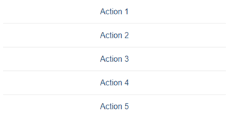
The action list item control lets the user trigger actions directly from a list. Used in dialog boxes and popovers.

Category: UI Elements - SAPUI5
Type: -

Action Sheet

An action sheet lets you to display a list of actions for the user to choose from. You can also cluster actions.

Category: UI Elements - SAPUI5
Type: Action / Navigation

Analytical Card

Analytical cards visualize data on an overview page. Each card has a header/KPI area and a chart area.

Category: UI Elements - SAPUI5
Type: Data Visualization

Analytical List Page (SAP Fiori Element)

The analytical list page (ALP) is one of the main elements of SAP Fiori embedded analytics. You can use it to create a landing page for performing detailed analytics in SAP Fiori apps quickly and easily.

Category: Floorplans
Type: -

Analytical Table (ALV)

Analytical tables offer powerful options for working with the data, including advanced grouping and aggregations.

Category: UI Elements - SAPUI5
Type: Table / List / Tree

Breadcrumb

Breadcrumb - Featured image

A breadcrumb is a type of secondary navigation that indicates the position of a page in a hierarchy.

Category: UI Elements - SAPUI5
Type: Action / Navigation

Bullet Chart

The bullet chart is used to compare primary and secondary (comparison) values.

Category: UI Elements - SAPUI5
Type: Data Visualization

Bullet Chart – Color Use for Primary Values

This article provides guidelines for using color to indicate primary values in bullet charts.

Category: UI Elements - SAPUI5
Type: Data Visualization

Busy Dialog

The busy dialog informs the user about an ongoing operation. During the operation the entire screen is blocked.

Category: UI Elements - SAPUI5
Type: Loading / Processing

Busy Indicator

The busy indicator informs the user about an ongoing operation.

Category: UI Elements - SAPUI5
Type: Loading / Processing

Busy State

You can set a busy state for each SAPUI5 control. This function adapts to the space available on the UI.

Category: UI Elements - SAPUI5
Type: Loading / Processing

Button

Button - Featured image

Buttons allow users to trigger actions – either by clicking or tapping the button, or by pressing a corresponding key.

Category: UI Elements - SAPUI5
Type: Action / Navigation

Calendar Date Interval

The calendar date interval control displays a range of days in a single row, saving on horizontal space.

Category: UI Elements - SAPUI5
Type: User Input

Carousel

Carousel - Featured image

The carousel is a control for browsing through a set of items one item at a time.

Category: UI Elements - SAPUI5
Type: Display, Form / Layout / Container

Chart – Deviation

This article explains how to visualize the deviation (difference or variance) between two measures.

Category: UI Elements - SAPUI5
Type: Data Visualization

Chart – Variation through Time

This article illustrates the different ways you can visualize changes of measures through time.

Category: UI Elements - SAPUI5
Type: Data Visualization

Chart – Color Palette – Values and Names

This page provides all the color names in the chart palettes.

Category: UI Elements - SAPUI5
Type: Data Visualization

Chart – Color Palettes

This article explains the three chart visualization color palettes and how you can leverage their unique properties.

Category: UI Elements - SAPUI5
Type: Data Visualization

Chart – Comparison

This article will help you choose the correct chart for comparing items that do not need to be displayed in a particular order.

Category: UI Elements - SAPUI5
Type: Data Visualization

Chart – Number and Time Format

This article explains how numbers and time information can be configured to users’ local settings.

Category: UI Elements - SAPUI5
Type: Data Visualization

Chart – Part to Whole

This article explains how to use charts to visualize the different parts of a whole (expressed as a percentage).

Category: UI Elements - SAPUI5
Type: Data Visualization

Chart – Selection

This article describes the different ways users can select one or more data points.

Category: UI Elements - SAPUI5
Type: Data Visualization

Chart – Time Axis

The time axis shows the variation of values through time (years, quarters, months, weeks, days, and so on).

Category: UI Elements - SAPUI5
Type: Data Visualization

Chart – Value Display

This article describes how value labels are displayed and how you can customize them.

Category: UI Elements - SAPUI5
Type: Data Visualization

Chart – Value-Based Legend

The value-based legend is used to visually represent value ranges through color shades.

Category: UI Elements - SAPUI5
Type: Data Visualization

Chart – Zoom

The zoom function enables users to change the scale of an axis on a chart.

Category: UI Elements - SAPUI5
Type: Data Visualization

Chart (VizFrame)

Chart - Featured image

You can use the VizFrame control to display different types of chart that are both interactive and responsive.

Category: UI Elements - SAPUI5
Type: Data Visualization

Chart Toolbar

Chart Toolbar - Featured image

The chart toolbar acts as a container for charts. It comes with built-in actions for the table display and personalization.

Category: UI Elements - SAPUI5
Type: Toolbar

Checkbox

Checkbox - Featured image

A checkbox indicates whether a state is true (checked) or false (unchecked). Users can check multiple options.

Category: UI Elements - SAPUI5
Type: User Input

Column Chart

Column charts are used to compare multiple values over time, or values that have an intrinsic order (such as age or ratings).

Category: UI Elements - SAPUI5
Type: Data Visualization

Combo Box

The combo box lets users select an item from a predefined list. It has both an input field and a dropdown menu.

Category: UI Elements - SAPUI5
Type: User Input

Contextual Filter

The contextual filter allows you to show a prefiltered view of a large or complex list.

Category: UI Elements - SAPUI5
Type: Filter

Create Page Floorplan

Use the “Create Page” floorplan when you need to create a new object in a full screen or split-screen layout.

Category: Floorplans
Type: -

Currency

Currency - Featured image

The currency control lets you align amounts with different currencies vertically at the decimal point.

Category: UI Elements - SAPUI5
Type: Display

Date Picker

The date picker lets users pick a localized date using touch, mouse, or keyboard input.

Category: UI Elements - SAPUI5
Type: User Input

Date Range Selection

Users can type in a localized date range manually, or select a date range in the calendar.

Category: UI Elements - SAPUI5
Type: User Input

Date/Time Picker

The date/time input control allows users to select a combination of date and time.

Category: UI Elements - SAPUI5
Type: User Input

Dialog

The dialog control interrupts the current app process to prompt the user for information or a response.

Category: UI Elements - SAPUI5
Type: Dialog / Popover

Display List Item

Display List Item - Featured image

Display list items are simple list items comprising a label and a text. They have largely been replaced by forms.

Category: UI Elements - SAPUI5
Type: -

Dynamic Page Layout

The dynamic page is a new layout control designed to support various floorplans and use cases. The layout is fully responsive and is set to be the successor of the full screen layout. The dynamic page header enables the user to focus on the actual content, while still keeping the most important information and actions of the [...]
Category: Page Layouts
Type: -

Feed and Notes

A combination of controls to input and post plain text, and to display the text alongside the user’s name.

Category: UI Elements - SAPUI5
Type: Collaboration, User Input

Filter Bar / Smart Filter Bar

Filter Bar - Filters

The filter bar lets users filter item lists and tables by various criteria, and create custom filter variants.

Category: UI Elements - SAPUI5
Type: Filter, User Input

Footer Toolbar

Footer Bar - Featured image

The footer toolbar at the bottom of the screen is used for key actions that impact the whole page.

Category: UI Elements - SAPUI5
Type: Toolbar

Form

Forms display other UI elements (such as labels, input fields, checkboxes, and sliders) in a structured layout.

Category: UI Elements - SAPUI5
Type: Form / Layout / Container

Full Screen Layout

Use the full screen layout to display large amounts of data, large visualizations, or wide tables.

Category: Floorplans
Type: -

Gantt Chart

The Gantt chart shows the sequence in which various activities occur and the dependencies between these activities.

Category: UI Elements - SAPUI5
Type: Data Visualization

Grid Table

A grid table can handle large numbers of items and columns, but is not fully responsive.

Category: UI Elements - SAPUI5
Type: Table / List / Tree

Header Toolbar

The header toolbar is always visible at the top of the page, and contains actions that are relevant for the entire page.

Category: UI Elements - SAPUI5
Type: Toolbar

Icon Tab Bar

The icon tab bar comprises a series of tabs that each link to a different content area or view.

Category: UI Elements - SAPUI5
Type: Action / Navigation, Filter, Form / Layout / Container

Image

image - featured

You can use the image control to insert responsive images in various places within an app.

Category: UI Elements - SAPUI5
Type: Display

Info Bar

Infobar - Featured Image

The infobar is a type of toolbar that appears above a list or panel, and shows filter or selection settings.

Category: UI Elements - SAPUI5
Type: Display, Filter, Toolbar

Initial Page Floorplan

Use the “Initial Page” floorplan if the user needs to navigate to a single object in as few steps as possible.

Category: Floorplans
Type: -

Input Field

Input Field - Featured image

A text input field allows users to enter and edit text or numeric values in one line.

Category: UI Elements - SAPUI5
Type: User Input

Input List Item

Input List Item - Featured image

The input list item comprises a label and input UI element. This control has largely been replaced by forms.

Category: UI Elements - SAPUI5
Type: -

Invisible Text

invisible text - featured

The invisible text control provides a simple hidden text that can be used by assistive technologies.

Category: UI Elements - SAPUI5
Type: Support for Assistive Technologies

Label

A label is the name or title of a control or group of related controls.

Category: UI Elements - SAPUI5
Type: Display

Lightbox

Lightbox
The lightbox control allows the user to view an imagine in its original size. This control displays the image in a popup while dimming the rest of the screen. Usage Use the lightbox if: The thumbnail view is not detailed enough, and it would help the user to see the image in its original size. The original size of [...]
Category: UI Elements - SAPUI5
Type: Display

Link

Link-featured_

A link is a clickable text element that can be used for navigation or to trigger an event.

Category: UI Elements - SAPUI5
Type: Action / Navigation

List

The list control displays a simple data set that the user can sort, filter, or group.

Category: UI Elements - SAPUI5
Type: Table / List / Tree

List Report (SAP Fiori Elements)

The SAP Fiori element “List Report” is an implementation of the list report floorplan as a reusable template.

Category: Floorplans
Type: -

List Report Floorplan

List Report Floorplan - Featured image

The list report floorplan allows the user to work with a large, filterable list of items and take action.

Category: Floorplans
Type: -

Map

Map - Featured image

A map is a symbolic visual illustration of areas, regions, and themes. Maps can be analytical or geographic.

Category: UI Elements - SAPUI5
Type: Data Visualization

Mask Input

Mask Input - Featured image

The mask input control governs what a user is allowed to enter in an input field.

Category: UI Elements - SAPUI5
Type: User Input

Menu Button

menu button - featured

The menu button allows you to offer multiple options in a dropdown list.

Category: UI Elements - SAPUI5
Type: Action / Navigation

Message Box

Message Box - Featured image

The message box is a special dialog for displaying error, warning, information, and success messages.

Category: UI Elements - SAPUI5
Type: Dialog / Popover, Messaging

Message Page

Message pages give feedback to the user when an app or list is empty, or when an error has occurred.

Category: UI Elements - SAPUI5
Type: Messaging

Message Popover

The message popover control can display multiple messages without interrupting the user.

Category: UI Elements - SAPUI5
Type: Messaging

Message Toast

A message toast is a non-disruptive popup for success messages, which disappears after a few seconds.

Category: UI Elements - SAPUI5
Type: Messaging

Micro Chart

Micro charts help you visualize a small number of data points, and can be embedded in other controls.

Category: UI Elements - SAPUI5
Type: Data Visualization

Multi-Combo Box

The multi-combo box lets users select one or more options from a predefined list, and has an input box for filtering.

Category: UI Elements - SAPUI5
Type: User Input

Multi-Input Field

A multi-input field allows the user to enter multiple values, which are displayed as tokens.

Category: UI Elements - SAPUI5
Type: User Input

Multi-Instance Handling Floorplan

Multi Instance Handling Floorplan - Featured image

The multi instance handling floorplan allows users to open multiple documents in a tabbed view.

Category: Page Layouts
Type: -

Object Display Components

Object Display Elements - Featured image

Object display components represent key object attributes, such as the object ID or status.

Category: UI Elements - SAPUI5
Type: Display

Object Header

An object header is the first element on a page for a single object (object view or flat object view).

Category: UI Elements - SAPUI5
Type: Display

Object List Item

Object List Item - Featured image

The object list item provides a quick overview of an object in a list, typically in the master list of a split-screen app.

Category: UI Elements - SAPUI5
Type: -

Object Page – Snapping Header

The snapping header is the top element of the object page floorplan, and contains key information on an object.

Category: UI Elements - SAPUI5
Type: -

Object Page (Floorplan + SAP Fiori Element)

The object page floorplan is the recommended floorplan for displaying, creating, and editing business objects.

Category: Floorplans
Type: -

Object View Floorplan

The object view is a floorplan for displaying objects (predecessor to the object page floorplan).

Category: Floorplans
Type: -

Overview Page (SAP Fiori Elements)

The overview page is a data-driven Fiori app that provides all the information a user needs in a single page.

Category: Floorplans
Type: -

P13n-Dialog

The P13n dialog allows you to build analytical tables with extensive personalization options.

Category: UI Elements - SAPUI5
Type: Table / List / Tree, User Input

Panel

The panel is a container for grouping and displaying information. It can be collapsed to save space.

Category: UI Elements - SAPUI5
Type: Form / Layout / Container

Planning Calendar

Planning Calendar - Featured image 01

The planning calendar allows users to see parallel appointments and create new events.

Category: UI Elements - SAPUI5
Type: User Input

Popover

A popover displays additional information for an object, and can also offer actions.

Category: UI Elements - SAPUI5
Type: Dialog / Popover

Process Flow

You can use the process flow control to represent the stages in a business process (such as approval).

Category: UI Elements - SAPUI5
Type: Data Visualization

Progress Indicator

The progress indicator shows the current completion status for a business process (static value).

Category: UI Elements - SAPUI5
Type: Display

Quick View

The quick view is similar to a popover, but has a predefined structure and automatic UI rendering.

Category: UI Elements - SAPUI5
Type: Dialog / Popover

Radio Button

Radio-Button-featured

Use radio buttons if you want the user to select only one option from a group of mutually exclusive alternatives.

Category: UI Elements - SAPUI5
Type: User Input

Range Slider

The range slider enables the user to select a value range within a predefined numerical interval.

Category: UI Elements - SAPUI5
Type: -

Rating Indicator

You can use the rating indicator to let users rate content, or to display a content rating.

Category: UI Elements - SAPUI5
Type: User Input

Reference Lines

Add reference lines to highlight a particular value.

Category: UI Elements - SAPUI5
Type: Data Visualization

Responsive Table

The responsive table is the default table in SAP Fiori. It supports various features at line item level.

Category: UI Elements - SAPUI5
Type: Table / List / Tree

Search

The search field enables users to search for information or filter data by entering key words as text.

Category: UI Elements - SAPUI5
Type: User Input

Select

The select control (also known as a dropdown) allows users to select an item from a predefined list.

Category: UI Elements - SAPUI5
Type: User Input

Select Dialog

Select Dialog - Featured image

The select dialog enables users to select one or more items from a comprehensive and searchable list.

Category: UI Elements - SAPUI5
Type: Dialog / Popover, User Input

Size of the Chart Container

The property “autoAdjustHeight” helps to correctly manage the sizes of charts contained in a chart container.

Category: UI Elements - SAPUI5
Type: Data Visualization

Slider

Slider featured image

A slider is a control that enables the user to adjust single values within a specified numerical range.

Category: UI Elements - SAPUI5
Type: User Input

Smart Link

SmartLink featured

The smart link triggers a popover with additional information and links to related apps.

Category: UI Elements - SAPUI5
Type: Action / Navigation, Smart Controls

Smart Table

The smart table is a wrapper for SAP Fiori tables that lets you reuse back-end data structures and generic features.

Category: UI Elements - SAPUI5
Type: Smart Controls, Table / List / Tree

Split-Screen Layout

The split-screen layout is optimized for working on a list of items (master list on the left, selected item on the right).

Category: Floorplans
Type: -

Standard List Item

Standard List Item - Featured image

You can use the standard list item to display a simple set of data in a select dialog or (non-object) master list.

Category: UI Elements - SAPUI5
Type: -

Step Input

The step input control allows the user to adjust numeric values in predefined increments (steps).

Category: UI Elements - SAPUI5
Type: -

Switch

The toggle switch mimics a physical switch that allows users to turn things on or off.

Category: UI Elements - SAPUI5
Type: User Input

Table Personalization Dialog

This personalization dialog for small tables allows users to show/hide columns, and sort and filter the entries.

Category: UI Elements - SAPUI5
Type: User Input

Table Select Dialog

The table select dialog is a table-based selection list. It allows you to show comprehensive data for each item.

Category: UI Elements - SAPUI5
Type: Dialog / Popover, User Input

Table Toolbar

The table toolbar appears above a table and is used for key actions that impact the entire table.

Category: UI Elements - SAPUI5
Type: Toolbar

Text

Text - Display controls text

You can use the text control to display text inside a form, table, or any other content area.

Category: UI Elements - SAPUI5
Type: Display

Text Area

Text Area - User input controls textarea

The text area is an input control that allows the user to enter multiple lines of text.

Category: UI Elements - SAPUI5
Type: User Input

Time Picker

Timepicker - Featured Image

The time picker allows the user to select a localized time, an exact duration, or a time range (with two time pickers).

Category: UI Elements - SAPUI5
Type: User Input

Timeline

The timeline control shows objects, events, or posts in chronological order, with the most recent entry on top.

Category: UI Elements - SAPUI5
Type: Collaboration, Data Visualization

Title

The title control is a simple, one-line text with additional semantic information for accessibility purposes.

Category: UI Elements - SAPUI5
Type: Display

Token

Tokens visualize previously selected items, and are similar to tags. Users can add, remove, select, or deselect tokens.

Category: UI Elements - SAPUI5
Type: Display, Filter

Tree

tree_final
With SAP Fiori, we distinguish between tree tables and trees. Both usually allow the user to display and work with a hierarchical set of items. While tree tables are usually used for more complex data, trees are generally used for rather basic data. Trees are mostly used in the master list section of the split-screen layout and in popovers or dialogs. In certain use [...]
Category: UI Elements - SAPUI5
Type: Table / List / Tree

Tree Table

Tree Table - Featured image

A tree table contains a hierarchical set of data that is structured in rows and columns and grouped into nodes.

Category: UI Elements - SAPUI5
Type: Table / List / Tree

Upload Collection

The upload collection control allows users to upload single or multiple files to an SAP Fiori app.

Category: UI Elements - SAPUI5
Type: User Input

Value Help Dialog

Value Help Dialog - Featured image

The value help dialog helps the user find and select single or multiple values, based on different attributes.

Category: UI Elements - SAPUI5
Type: Dialog / Popover, User Input

Variant Management

Variant management allows users to save and load different sets of filter or table settings.

Category: UI Elements - SAPUI5
Type: Filter

View Settings Dialog

View Settings Dialog - Featured image

The view settings dialog allows the user to sort, filter, or group data within a (master) list or a table.

Category: UI Elements - SAPUI5
Type: Table / List / Tree

Wizard Floorplan

Wizard Floorplan featured

You can use the wizard floorplan to guide users through a long or unfamiliar task by dividing it into sections.

Category: Floorplans
Type: -

Worklist Floorplan

The worklist floorplan shows a list of items the user needs to process. The focus is on completing the tasks.

Category: Floorplans
Type: -
© 2025 SAP SE. All rights reserved.
  • Privacy
  • Legal Disclosure
  • Copyright
  • Terms of Use
  • Go.SAP.com
  • SAP Community Network

The SAP Fiori Design Guidelines will soon be moving to the new SAP Design System portal. Check out the new experience here.

We'd appreciate your feedback!

Processing your feedback

Thank you 
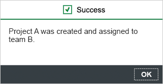
Your feedback has been sent to the SAP Fiori design team.

Thank you for your helping us to improve our guidelines!

 
We'd appreciate your feedback!
Please fill out the form to send us your feedback.
    • Can you tell us why?

Your feedback is anonymous, so you won't receive a reply. If you'd like help with a specific question, please visit the SAP Fiori Community