
- Latest SAPUI Version 1.124
- SAPUI5 Version 1.122
- SAPUI5 Version 1.120
- SAPUI5 Version 1.118
- SAPUI5 Version 1.116
- SAPUI5 Version 1.114
- SAPUI5 Version 1.112
- SAPUI5 Version 1.110
- SAPUI5 Version 1.108
- SAPUI5 Version 1.106
- SAPUI5 Version 1.104
- SAPUI5 Version 1.102
- SAPUI5 Version 1.100
- SAPUI5 Version 1.98
- SAPUI5 Version 1.96
- SAPUI5 Version 1.94
- SAPUI5 Version 1.92
- SAPUI5 Version 1.90
- SAPUI5 Version 1.88
- SAPUI5 Version 1.86
- SAPUI5 Version 1.84
- SAPUI5 Version 1.82
- SAPUI5 Version 1.80
- SAPUI5 Version 1.78
- SAPUI5 Version 1.76
- SAPUI5 Version 1.74
- SAPUI5 Version 1.72
- SAPUI5 Version 1.70
- SAPUI5 Version 1.68
- SAPUI5 Version 1.66
- SAPUI5 Version 1.64
- SAPUI5 Version 1.62
- SAPUI5 Version 1.60
- SAPUI5 Version 1.58
- SAPUI5 Version 1.56
- SAPUI5 Version 1.54
- SAPUI5 Version 1.52
- SAPUI5 Version 1.50
- SAPUI5 Version 1.46
- SAPUI5 Version 1.44
- SAPUI5 Version 1.42
- SAPUI5 Version 1.40
- SAPUI5 Version 1.38
- SAPUI5 Version 1.36
- SAPUI5 Version 1.34
- SAPUI5 Version 1.32
- SAPUI5 Version 1.30
- SAPUI5 Version 1.28
- SAPUI5 Version 1.26
- Latest SAPUI Version 1.124
- SAPUI5 Version 1.122
- SAPUI5 Version 1.120
- SAPUI5 Version 1.118
- SAPUI5 Version 1.116
- SAPUI5 Version 1.114
- SAPUI5 Version 1.112
- SAPUI5 Version 1.110
- SAPUI5 Version 1.108
- SAPUI5 Version 1.106
- SAPUI5 Version 1.104
- SAPUI5 Version 1.102
- SAPUI5 Version 1.100
- SAPUI5 Version 1.98
- SAPUI5 Version 1.96
- SAPUI5 Version 1.94
- SAPUI5 Version 1.92
- SAPUI5 Version 1.90
- SAPUI5 Version 1.88
- SAPUI5 Version 1.86
- SAPUI5 Version 1.84
- SAPUI5 Version 1.82
- SAPUI5 Version 1.80
- SAPUI5 Version 1.78
- SAPUI5 Version 1.76
- SAPUI5 Version 1.74
- SAPUI5 Version 1.72
- SAPUI5 Version 1.70
- SAPUI5 Version 1.68
- SAPUI5 Version 1.66
- SAPUI5 Version 1.64
- SAPUI5 Version 1.62
- SAPUI5 Version 1.60
- SAPUI5 Version 1.58
- SAPUI5 Version 1.56
- SAPUI5 Version 1.54
- SAPUI5 Version 1.52
- SAPUI5 Version 1.50
- SAPUI5 Version 1.48
- SAPUI5 Version 1.46
- SAPUI5 Version 1.44
- SAPUI5 Version 1.42
- SAPUI5 Version 1.40
- SAPUI5 Version 1.38
- SAPUI5 Version 1.36
- SAPUI5 Version 1.34
- SAPUI5 Version 1.32
- SAPUI5 Version 1.30
- SAPUI5 Version 1.28
- SAPUI5 Version 1.26
Create Page Floorplan
Intro
The create page floorplan is used when a new object needs to be created in a full screen or split-screen layout.
Creating an object is a special case for the edit pattern. For details not covered in this article, please refer to the manage simple objects article.
Furthermore, this floorplan does not cover the creation of another line item within a screen, so for more information about line item creation, see the local flow with reference items article.
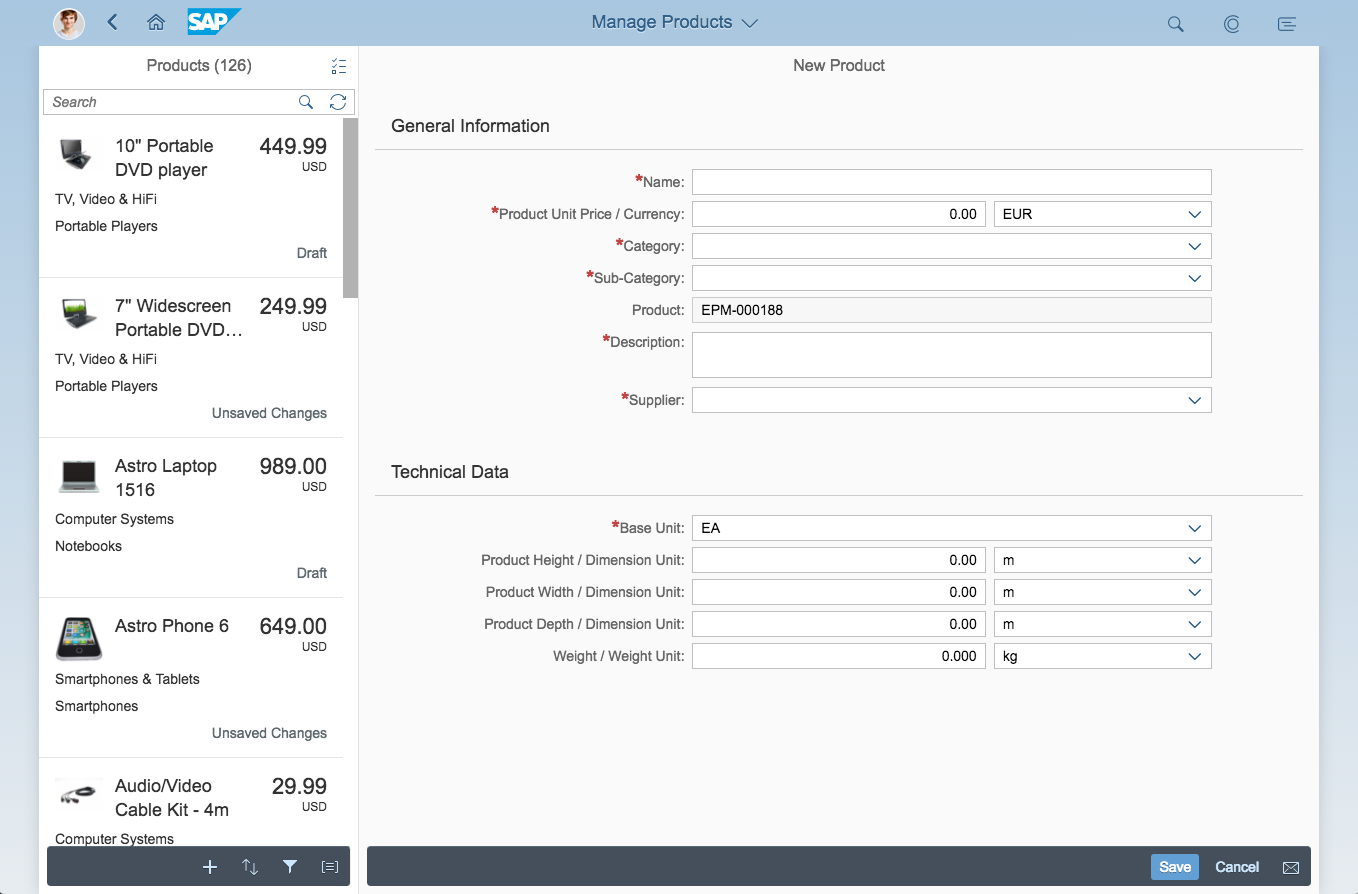
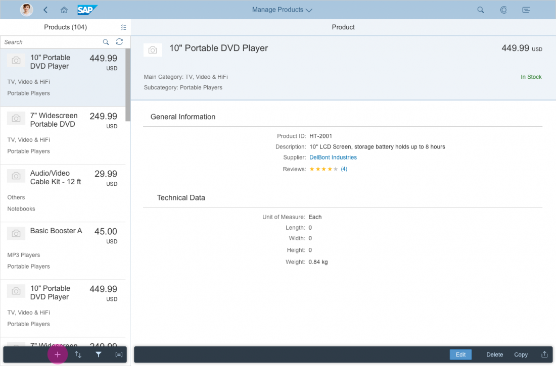
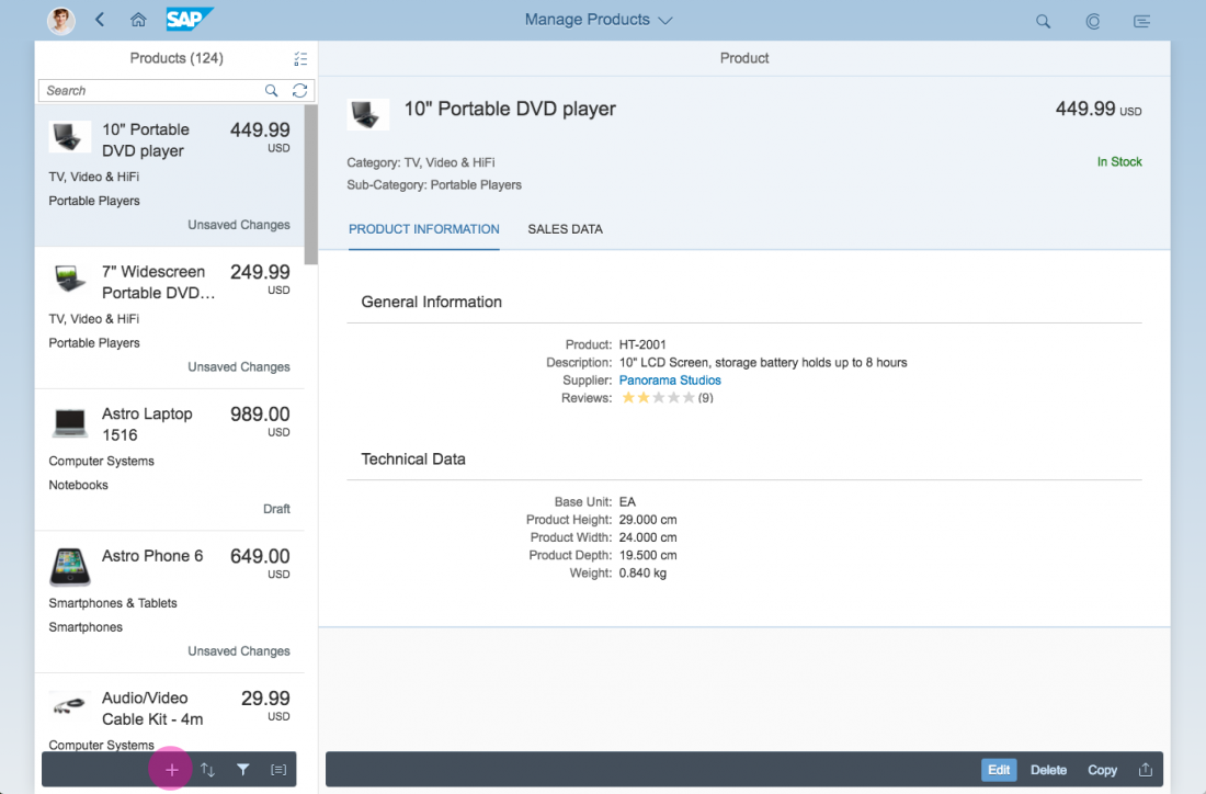
Simple edit (compact mode) on split-screen layout
There are several ways in which the user can trigger create mode:
- Enter the app, and the default screen is a “create object” page (such as a new leave request).
- Click or tap the Create button (the plus icon ( )) in the master list footer or in the details area footer.
- Add a new line item by clicking the + icon at the top of a table control. For more information about this functionality, see the manage complex objects article.
Which variant you should choose depends on the use case.
There are also several ways of creating an object to support different use cases (more details about this are provided later):
- Create the object via a dialog.
- Create the object via the details screen.
- Create the object using subpages (for more information, see manage complex objects).
- Create the object using the wizard in case of a long form, where the user needs more guidance.
Note the following:
The flow of the form should follow the logic of creation. Use in-place messages on the fields for validation.
Usage
- Use create via dialog if there is only one object with a small number of fields that the user can edit (maximum of 7 editable fields).
- The Create button (or “ “) is the preferred way to trigger the creation of a new object. We do not recommend hiding editable information from the user in tabs.
- Use the create flow with subpages if there are multiple child pages included in the object. For more information about how creation with child pages works, see the manage complex objects article.
Structure
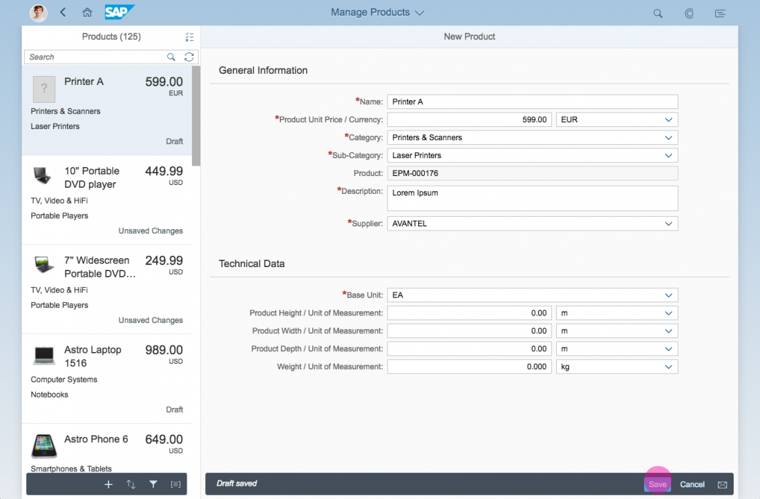
The create page floorplan is flexible and can be embedded in the full screen layout or split-screen layout. The title (app header) shows New and the current <Item Type>, such as New Product. The main pattern of the create page is the form. The footer toolbar is located at the bottom.

Create page layout
Responsiveness
The responsiveness of the create page floorplan follows the responsive behavior of the forms and controls being used.
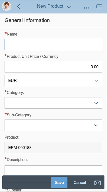
Create page floorplan on a smartphone
Create page floorplan on a tablet
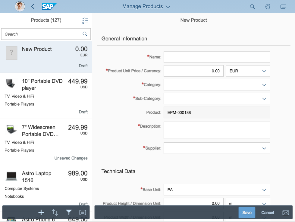
Create page floorplan on a desktop
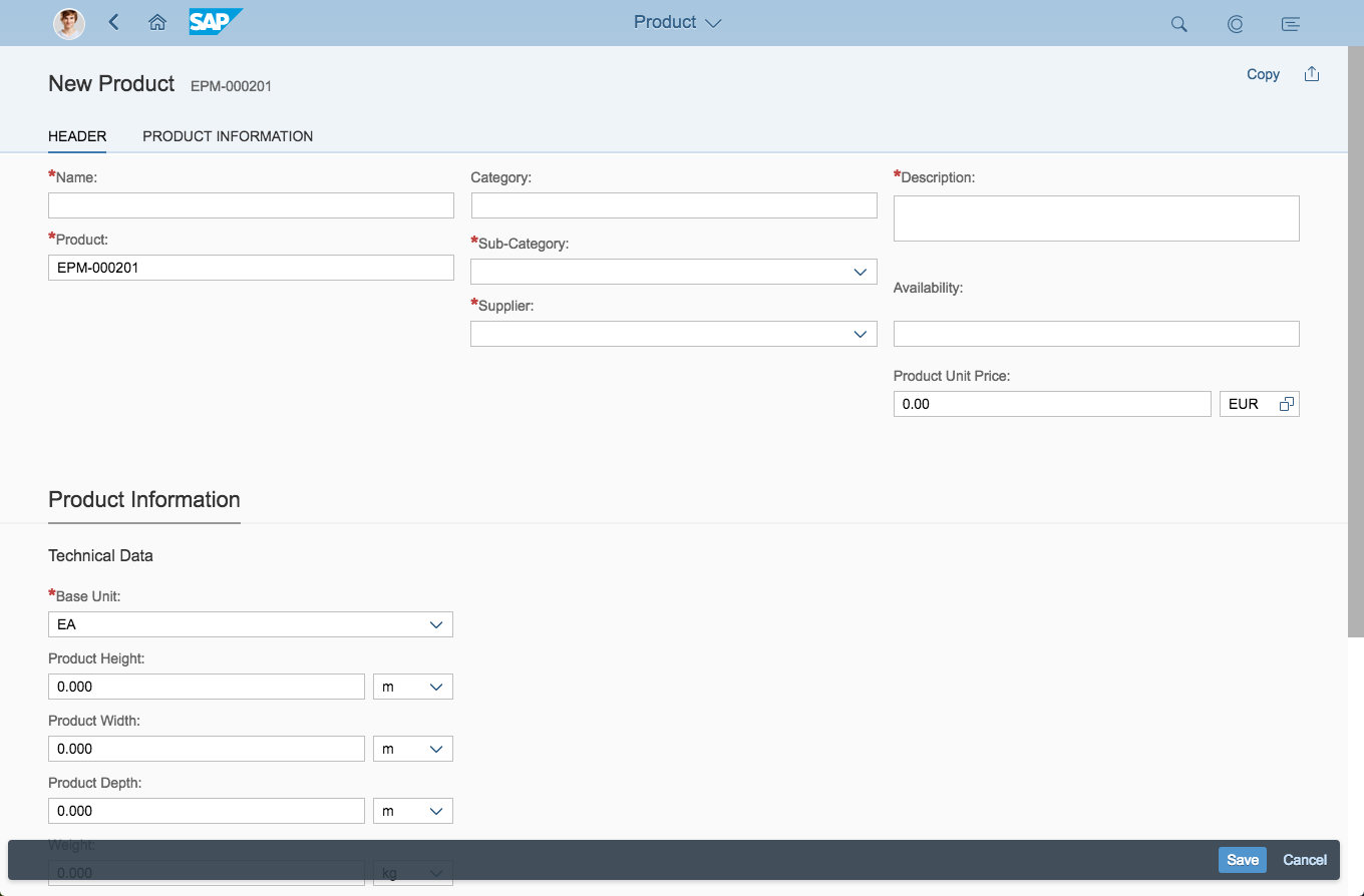
Create page floorplan on a desktop in full screen
Flows and Variants
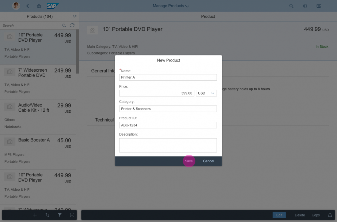
Create via Dialog
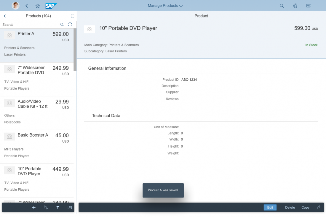
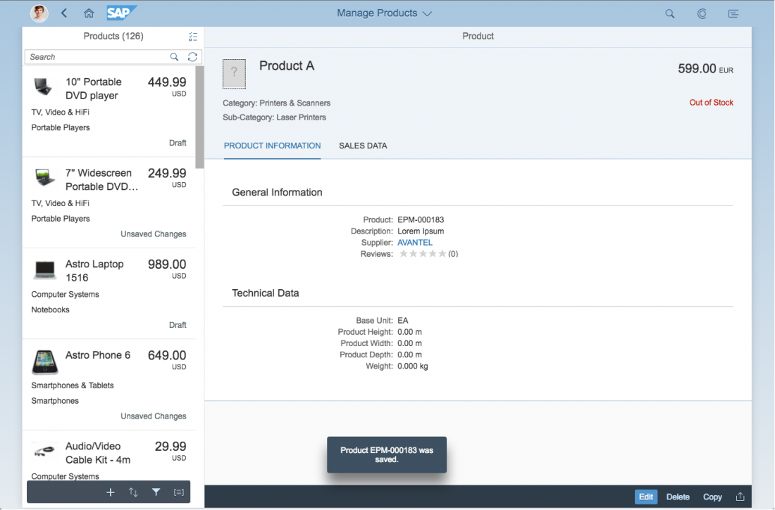
The create via dialog flow describes how a user can create an object, for example, in the split-screen layout. The user must first click or tap the Create ( ) button. The data can now be changed in edit mode. Once the user has completed the entries, he or she clicks the Save button. The updated object is now included in the master list, and object details are shown in the split screen.
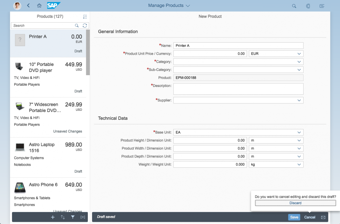
Clicking the Cancel button closes the dialog. A data loss message or quick confirmation popover is not necessary.
Create via Dialog Flow
Create via Details Screen
Use the whole screen for displaying the form if:
- You need to create elements in multiple categories (for example, general information and details).
- You need to add a large amount of data that cannot be displayed in a dialog without scrolling or using tabs.
Show a data loss message whenever the user tries to navigate away from the page. The only exception is by using the draft handling. Clicking the Cancel button while in edit mode opens a quick confirmation popover. However, if the user has not changed anything, a data loss message is not necessary.
Create via Details Screen Flow
Resources
Want to dive deeper? Follow the links below to find out more about related controls, the SAPUI5 implementation, and the visual design.
 Your feedback has been sent to the SAP Fiori design team.