
- Latest SAPUI5 Version 1.120
- Version 1.118
- SAPUI5 Version 1.116
- SAPUI5 Version 1.114
- SAPUI5 Version 1.112
- SAPUI5 Version 1.110
- SAPUI5 Version 1.108
- SAPUI5 Version 1.106
- SAPUI5 Version 1.104
- SAPUI5 Version 1.102
- SAPUI5 Version 1.100
- SAPUI5 Version 1.98
- SAPUI5 Version 1.96
- SAPUI5 Version 1.94
- SAPUI5 Version 1.92
- SAPUI5 Version 1.90
- SAPUI5 Version 1.88
- SAPUI5 Version 1.86
- SAPUI5 Version 1.84
- SAPUI5 Version 1.82
- SAPUI5 Version 1.80
- SAPUI5 Version 1.78
- SAPUI5 Version 1.76
- SAPUI5 Version 1.74
- SAPUI5 Version 1.72
- SAPUI5 Version 1.70
- SAPUI5 Version 1.68
- SAPUI5 Version 1.66
- SAPUI5 Version 1.64
- SAPUI5 Version 1.62
- SAPUI5 Version 1.60
- SAPUI5 Version 1.58
- SAPUI5 Version 1.56
- SAPUI5 Version 1.54
- SAPUI5 Version 1.52
- SAPUI5 Version 1.50
- SAPUI5 Version 1.46
- SAPUI5 Version 1.44
- SAPUI5 Version 1.42
- SAPUI5 Version 1.40
- SAPUI5 Version 1.38
- SAPUI5 Version 1.36
- SAPUI5 Version 1.34
- SAPUI5 Version 1.32
- SAPUI5 Version 1.30
- SAPUI5 Version 1.28
- SAPUI5 Version 1.26
- Latest SAPUI5 Version 1.120
- Version 1.118
- SAPUI5 Version 1.116
- SAPUI5 Version 1.114
- SAPUI5 Version 1.112
- SAPUI5 Version 1.110
- SAPUI5 Version 1.108
- SAPUI5 Version 1.106
- SAPUI5 Version 1.104
- SAPUI5 Version 1.102
- SAPUI5 Version 1.100
- SAPUI5 Version 1.98
- SAPUI5 Version 1.96
- SAPUI5 Version 1.94
- SAPUI5 Version 1.92
- SAPUI5 Version 1.90
- SAPUI5 Version 1.88
- SAPUI5 Version 1.86
- SAPUI5 Version 1.84
- SAPUI5 Version 1.82
- SAPUI5 Version 1.80
- SAPUI5 Version 1.78
- SAPUI5 Version 1.76
- SAPUI5 Version 1.74
- SAPUI5 Version 1.72
- SAPUI5 Version 1.70
- SAPUI5 Version 1.68
- SAPUI5 Version 1.66
- SAPUI5 Version 1.64
- SAPUI5 Version 1.62
- SAPUI5 Version 1.60
- SAPUI5 Version 1.58
- SAPUI5 Version 1.56
- SAPUI5 Version 1.54
- SAPUI5 Version 1.52
- SAPUI5 Version 1.50
- SAPUI5 Version 1.48
- SAPUI5 Version 1.46
- SAPUI5 Version 1.44
- SAPUI5 Version 1.42
- SAPUI5 Version 1.40
- SAPUI5 Version 1.38
- SAPUI5 Version 1.36
- SAPUI5 Version 1.34
- SAPUI5 Version 1.32
- SAPUI5 Version 1.30
- SAPUI5 Version 1.28
- SAPUI5 Version 1.26
List
sap.m.List
Intro
Usage
Use the list if:
- You want to display a homogeneous set of basic data.
- You need to sort, group, or filter simple data sets.
- You need to display a single-level hierarchy rather than using a complex tree table to support this simple use case.
Do not use the list if:
Responsiveness
The list is like a layout container. You can change its width, but you must also ensure that the items contained in the list adapt whenever the list is resized.
All list item variants available in SAP Fiori already adapt to the respective screen size.
List Item Variants
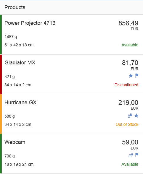
Object List Item
The object list item is the list item variant used most frequently in SAP Fiori applications. Consisting of a title, key figure, attributes, and a status, it contains the most important information about an object.
The space available for the attributes and status is limited as it should only show crucial information that allows the user to decide which items should be dealt with first.
All essential information about an object is usually provided when the user navigates to the item details.
For more information, see object list item.
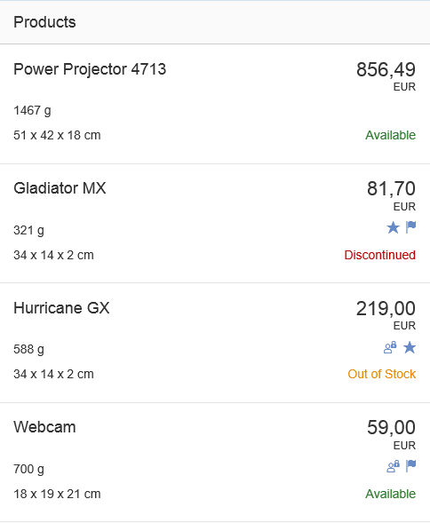
Object list items
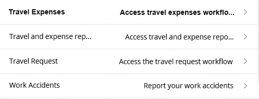
Standard List Item
The standard list item is used for less complex entries, such as when the user selects an item in a dialog. This list item contains an optional image, a title, description, and a single info text (which can contain semantic information).
For more information, see standard list item.
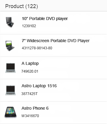
Standard list items
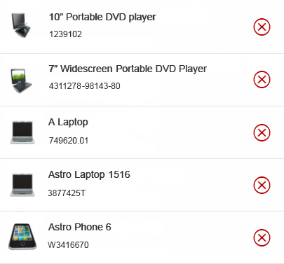
Display List Item
The display list item is the simplest form of a list item and is only capable of showing a label and values. It is seldom used.
For more information, see display list item.
Display list items
Action List Item
The action list item allows various actions to be triggered in a dialog. The action list item is not used in the content area.
For more information, see action list item.
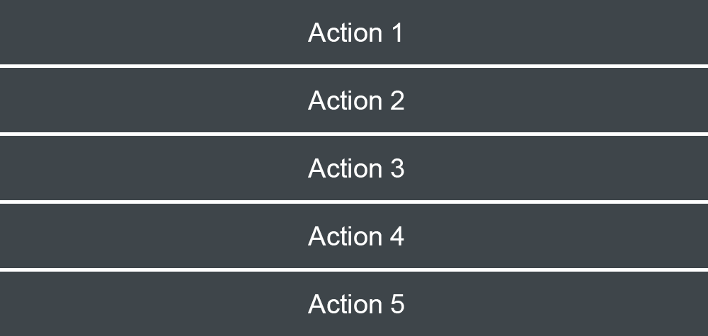
Action list item
Feed List Item
The feed list item is mainly used in feeds and notes.
For more information, see feed list item.
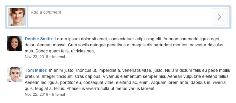
Feed with feed list items
Input List Item
The input list item allows the user to enter data in a list item. It is seldom used in SAP Fiori apps as forms are usually the preferable method for entering data.
For more information, see input list item.
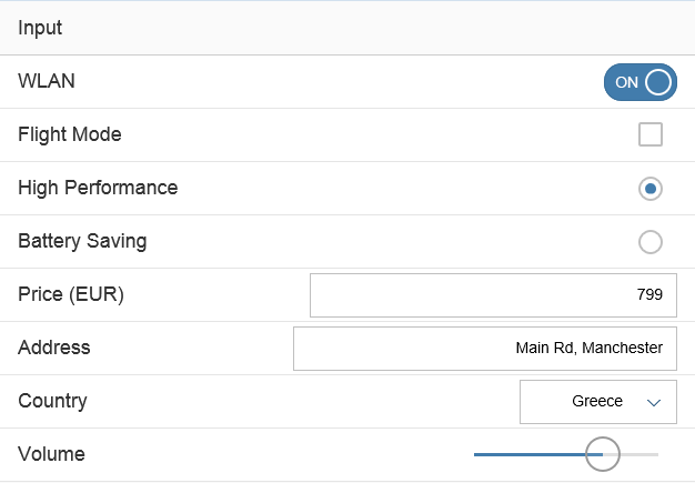
Input list item
Components
Header
The header text contains the title of the list. It is usually only used when the list is in the content area.
Footer
The footer text is the last entry in the list, and as such, it scrolls away with the content. Therefore, this property is also seldom used.
Lazy Loading
Like the table, the list also allows lazy loading. The “growing” list property is used for this purpose.
List with header and footer
Empty List
The noDataText property is used if the list contains no entries. A generic “No Data” text is set by default, but we recommend replacing it with a more specific text.
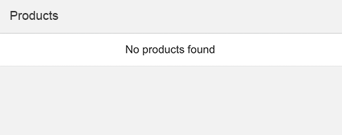
Empty list
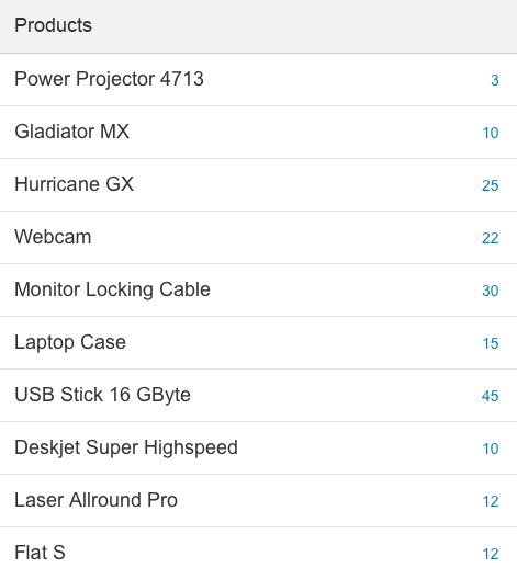
Count
List items can have a count, which is located on the far right of a row. You can use the count in simple lists, such as those that contain standard list items, to indicate how many subitems the user can expect when navigating to the item.
Standard list items with counter
Read/Unread
You can set an indicator to highlight unread items, making it easier for the user to discover them (property: showUnread = true). If you set this indicator, all texts for the unread items are shown in bold font.
By default, this indicator is switched off, and all list items are displayed in normal font.
Display list item with read and unread items
Highlighting Items
To show that an item needs attention, a highlight indicator can be shown in front of the item (property: highlight). The highlight indicator can be used to show:
- A semantic state (for example, red or orange if the item contains an error or warning)
- A neutral state (for example, blue to highlight newly added items)
Highlighted items using semantic colors
Behavior and Interaction
There are several ways to interact with the list and its list items:
Mode
The list can have several modes. The respective property (Mode) allows the following methods of selection:
- None
- SingleSelectMaster (used to pick one item with no additional indicator, as used in the master list)
- SingleSelectLeft (used to pick one item using a radio button on the far left)
- MultiSelect (used to pick several items from the list using checkboxes on the far left)
- Delete (used to delete items from the list using a delete indicator on the far right)

List with multiple selection
List with explicit single selection
List with delete mode
Grouping
List items can be grouped. The group header is a visually separate line at the top of the items it groups. It does not currently provide an interaction of its own.

Grouped list
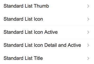
Type
The list item type defines the interaction of the list item, which is accompanied by a visual cue.
The items can be one of the following:
- Active (click event; cursor changes to indicate that)
- Inactive (no click event; cursor does not change)
- Navigation (a small arrow appears on the far right, indicating that clicking would navigate)
- Detail (a pencil appears on the far right, indicating that something can be changed. The user can only click on the pencil.)
- Detail and active (same as “detail”, but the item itself is also clickable)
The example shows how all these types are visualized.
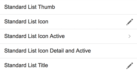
All list item types: inactive, detail, navigation, active, detail and active
Swipe
You can provide a swipe feature (SwipeDirection) for quickly approving or deleting items without having to look at the details. It must only be provided as an additional feature, and not be the only way of performing the action.
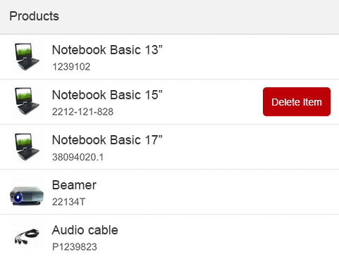
List with swipe action
Styles
The list items can have a header when they are used in a content area. It is also technically possible to change the background of the header and of the list itself. Depending on the use case, the lines between the list items and around the list can be shown or hidden.
The property Show Separators (All, Inner, None) allows only the outer lines (Inner) or all the lines (None) to be hidden when the list is used as a more structural element within a content area.
List without separators
Guidelines
Text Length
When you use the list in the master area, keep the texts as short as possible and only as long as necessary. If you expect large numbers, use formatting instead.
Custom List Items
If none of the list items provided suits the requirements of your app, you can also create a custom list. If you choose this option, ensure that your custom list item is responsive when resized.
Radio Button
Only use radio buttons if they are absolutely necessary. One example would be if you want to distinguish single selection from navigation. This is a rare case in which visible radio buttons for single selection are allowed.
Resources
Want to dive deeper? Follow the links below to find out more about related controls, the SAPUI5 implementation, and the visual design.
Elements and Controls
- Object List Item (guidelines)
- Standard List Item (guidelines)
- Display List Item (guidelines)
- Action List Item (guidelines)
- Feed List Item (guidelines)
- Input List Item (guidelines)
Implementation
- List (SAPUI5 samples)
- Object List Item (SAPUI5 samples)
- Standard List Item (SAPUI5 samples)
- Display List Item (SAPUI5 samples)
- Action List Item (SAPUI5 samples)
- Feed List Item (SAPUI5 samples)
- Input List Item (SAPUI5 samples)
- List (SAPUI5 API reference)
- Object List Item (SAPUI5 API reference)
- Standard List Item (SAPUI5 API reference)
- Display List Item (SAPUI5 API reference)
- Action List Item (SAPUI5 API reference)
- Feed List Item (SAPUI5 API reference)
- Input List Item (SAPUI5 API reference)
 Your feedback has been sent to the SAP Fiori design team.