
- Latest SAPUI Version 1.124
- SAPUI5 Version 1.122
- SAPUI5 Version 1.120
- SAPUI5 Version 1.118
- SAPUI5 Version 1.116
- SAPUI5 Version 1.114
- SAPUI5 Version 1.112
- SAPUI5 Version 1.110
- SAPUI5 Version 1.108
- SAPUI5 Version 1.106
- SAPUI5 Version 1.104
- SAPUI5 Version 1.102
- SAPUI5 Version 1.100
- SAPUI5 Version 1.98
- SAPUI5 Version 1.96
- SAPUI5 Version 1.94
- SAPUI5 Version 1.92
- SAPUI5 Version 1.90
- SAPUI5 Version 1.88
- SAPUI5 Version 1.86
- SAPUI5 Version 1.84
- SAPUI5 Version 1.82
- SAPUI5 Version 1.80
- SAPUI5 Version 1.78
- SAPUI5 Version 1.76
- SAPUI5 Version 1.74
- SAPUI5 Version 1.72
- SAPUI5 Version 1.70
- SAPUI5 Version 1.68
- SAPUI5 Version 1.66
- SAPUI5 Version 1.64
- SAPUI5 Version 1.62
- SAPUI5 Version 1.60
- SAPUI5 Version 1.58
- SAPUI5 Version 1.56
- SAPUI5 Version 1.54
- SAPUI5 Version 1.52
- SAPUI5 Version 1.50
- SAPUI5 Version 1.46
- SAPUI5 Version 1.44
- SAPUI5 Version 1.42
- SAPUI5 Version 1.40
- SAPUI5 Version 1.38
- SAPUI5 Version 1.36
- SAPUI5 Version 1.34
- SAPUI5 Version 1.32
- SAPUI5 Version 1.30
- SAPUI5 Version 1.28
- SAPUI5 Version 1.26
- Latest SAPUI Version 1.124
- SAPUI5 Version 1.122
- SAPUI5 Version 1.120
- SAPUI5 Version 1.118
- SAPUI5 Version 1.116
- SAPUI5 Version 1.114
- SAPUI5 Version 1.112
- SAPUI5 Version 1.110
- SAPUI5 Version 1.108
- SAPUI5 Version 1.106
- SAPUI5 Version 1.104
- SAPUI5 Version 1.102
- SAPUI5 Version 1.100
- SAPUI5 Version 1.98
- SAPUI5 Version 1.96
- SAPUI5 Version 1.94
- SAPUI5 Version 1.92
- SAPUI5 Version 1.90
- SAPUI5 Version 1.88
- SAPUI5 Version 1.86
- SAPUI5 Version 1.84
- SAPUI5 Version 1.82
- SAPUI5 Version 1.80
- SAPUI5 Version 1.78
- SAPUI5 Version 1.76
- SAPUI5 Version 1.74
- SAPUI5 Version 1.72
- SAPUI5 Version 1.70
- SAPUI5 Version 1.68
- SAPUI5 Version 1.66
- SAPUI5 Version 1.64
- SAPUI5 Version 1.62
- SAPUI5 Version 1.60
- SAPUI5 Version 1.58
- SAPUI5 Version 1.56
- SAPUI5 Version 1.54
- SAPUI5 Version 1.52
- SAPUI5 Version 1.50
- SAPUI5 Version 1.48
- SAPUI5 Version 1.46
- SAPUI5 Version 1.44
- SAPUI5 Version 1.42
- SAPUI5 Version 1.40
- SAPUI5 Version 1.38
- SAPUI5 Version 1.36
- SAPUI5 Version 1.34
- SAPUI5 Version 1.32
- SAPUI5 Version 1.30
- SAPUI5 Version 1.28
- SAPUI5 Version 1.26
Worklist Floorplan
Intro
A worklist displays a collection of items that a user needs to process. Working through the list usually involves reviewing details of the items and taking action. In most cases, the user has to either complete a work item or delegate it.
The focus of the worklist floorplan is on processing the items. This differs from the list report floorplan, which focuses on filtering content to create a list.
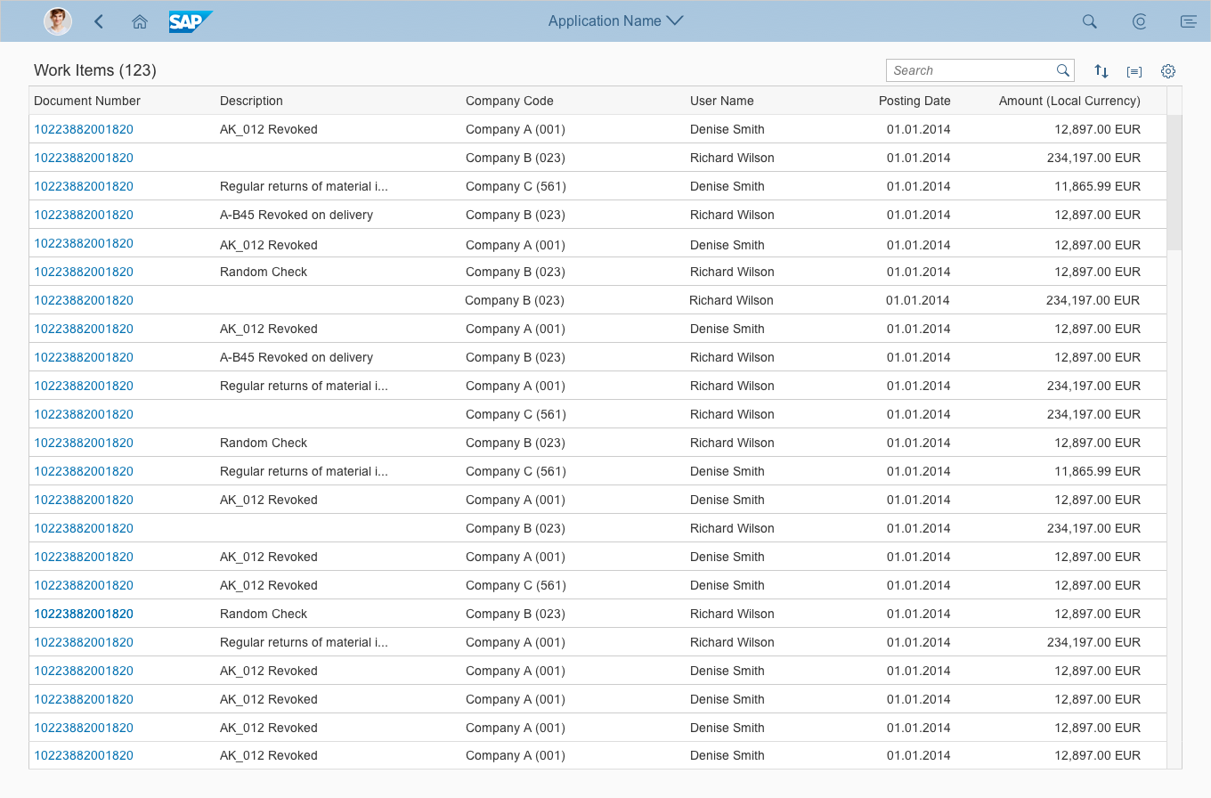
Worklist – Full screen
Usage
Use the worklist floorplan if:
- The user has numerous potential work items and needs to decide which ones to process first.
- You want to give the user a direct entry point for taking action on work items.
- Your app uses the full screen layout. The full screen worklist is preferable if the work items are complex objects. For simple scenarios, use the split-screen layout instead.
Do not use the worklist floorplan if:
- You want to create only a lightweight worklist. Instead, use the split-screen layout for simple scenarios.
- The items you are showing are not work items.
- You want to show large item lists, or combine different data visualizations (charts or tables). In this case, use the list report floorplan instead.
Layout
The launchpad shell bar is always available at the top of SAP Fiori apps. The app title (app header) matches the title of the tile on the SAP Fiori launchpad (for example, Approve Purchase Orders).
The worklist contains a list of work items. You can also use the icon tab bar to split the list into different categories. In addition, the worklist can use filters and variants, as described for the list report floorplan. Bear in mind, however, that if users can filter the list, they may also overlook important work items.
To ensure that the application runs on all devices, we recommend using the responsive table. The responsive table also offers a wide range of options for optimizing the layout, scalability, and how the user takes action.
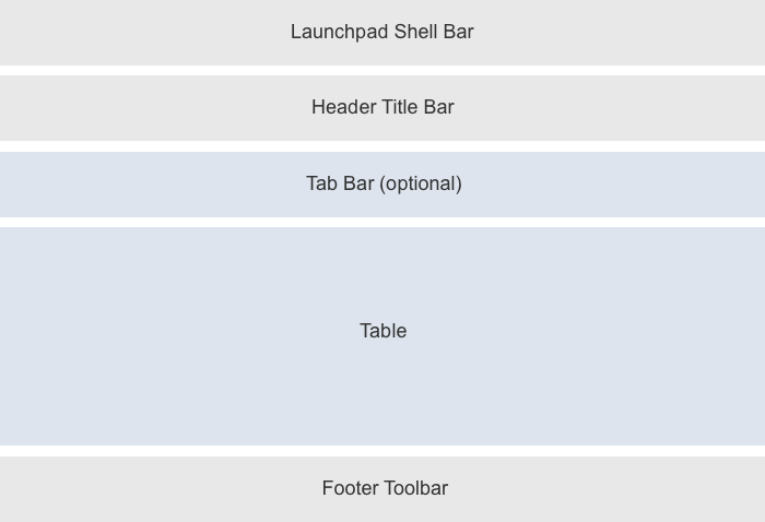
Basic structure
Responsiveness and Adaptiveness
Worklist floorplan - Size S
Worklist floorplan - Size M
Worklist floorplan - Size L
Variant Management and Global Actions
The header title of the dynamic page provides a variant management option and a toolbar for global actions. If the content is collapsed, the header title displays the selected tab.
Dynamic Page Header
The dynamic page supports snapping behavior for the header content, including the tab bar:
- If the header is used with a responsive table
(sap.m.table), the header content collapses automatically when the user scrolls down the page. - If the header is used with a grid table, analytical table, or tree table (
sap.uitables), users can collapse the header manually.
Footer Toolbar
In edit mode or for finalizing actions there is a footer toolbar. This element appears on the bottom of the page content and contains finalizing actions.
Types
Simple Worklist
The worklist floorplan allows the user to work through a list of items. Ideally, the system provides the user with a complete list of work items in the correct order. You should also ensure that no important work items are lost, and keep distracting functions to a minimum.
The most basic version of the worklist is therefore a plain page with a list.
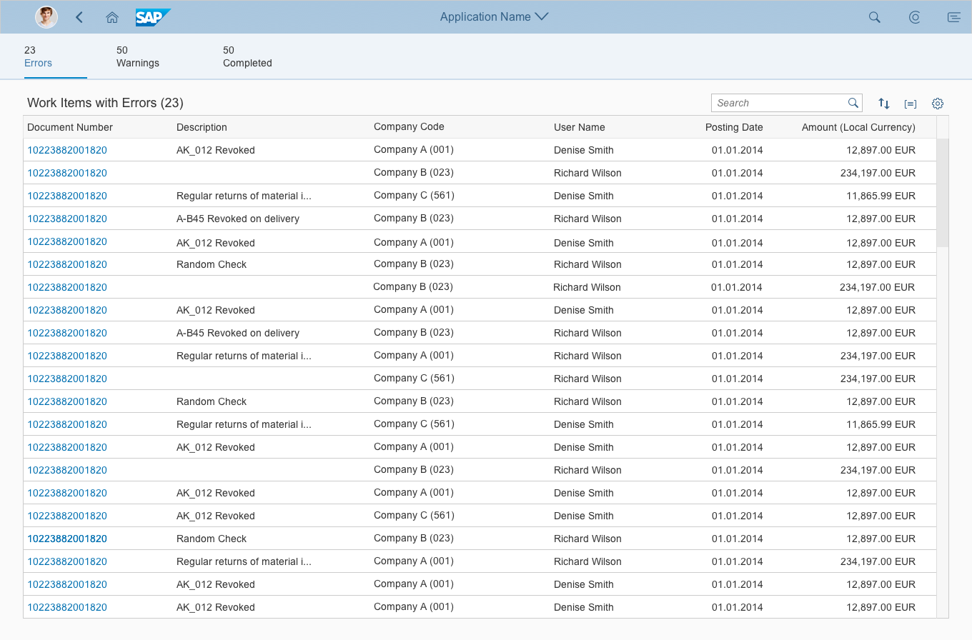
Simple worklist without tabs
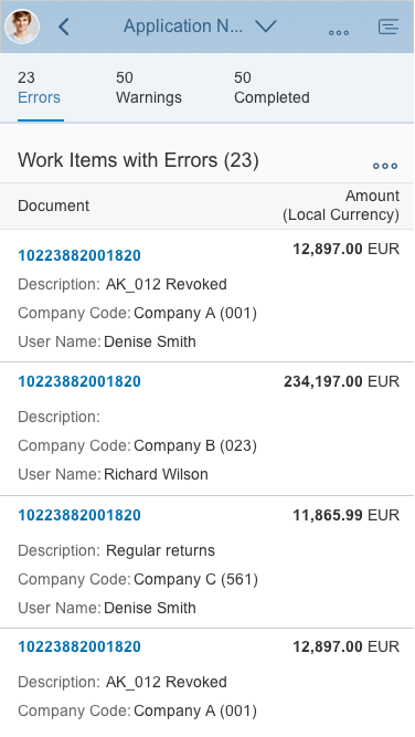
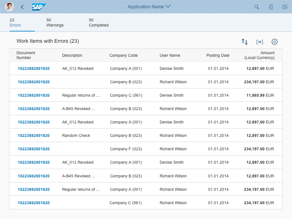
Category Worklist
The icon tab bar enables users to call up work items in specific categories. This can help users identify critical items more easily. Different tabs can also contain tables with different configurations (for example, with different columns or actions).
You can offer visual orientation by applying semantic colors to the icons for the different categories (for example, red on the Error tab).
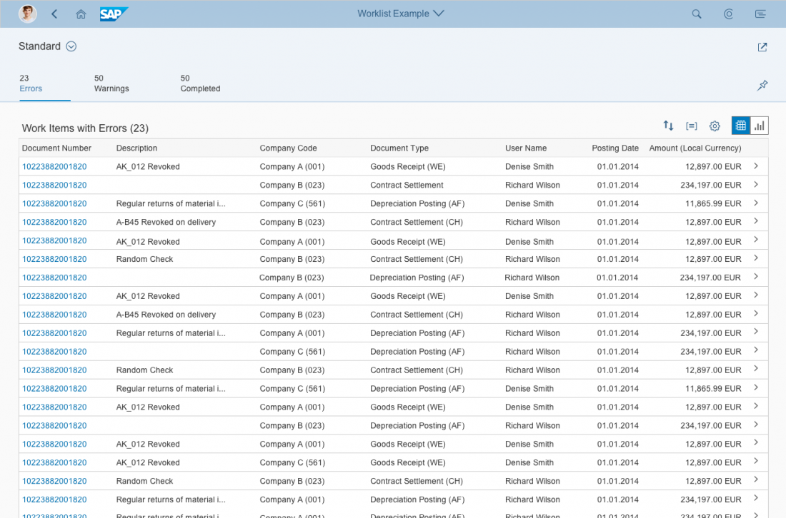
Worklist with tab categories
KPI Worklist
The key performance indicator (KPI) worklist allows the user to track a KPI while processing the worklist. You can display the KPI in the subheader.
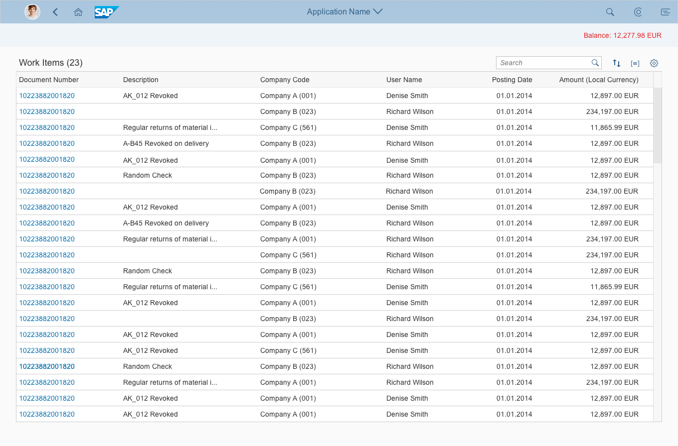
Worklist with KPI
Actions
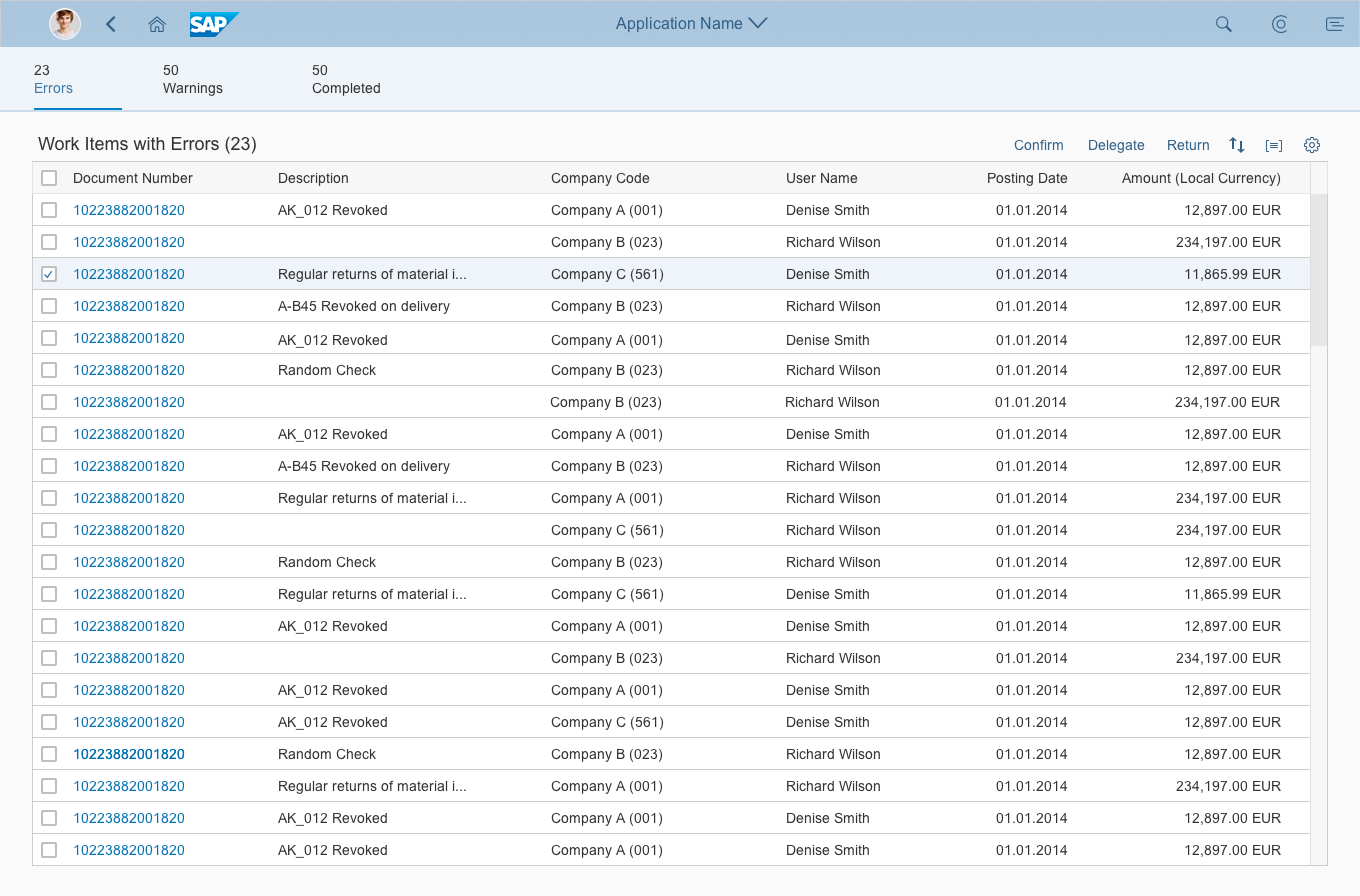
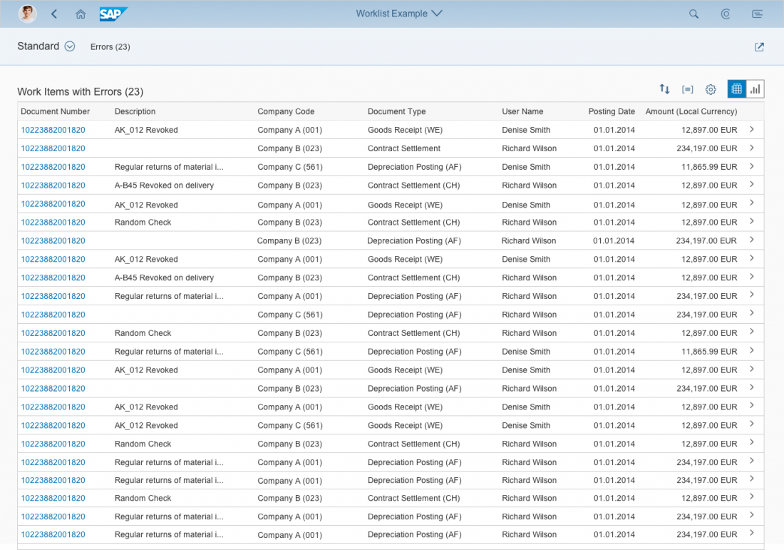
Worklist with table toolbar for actions
The header title contains the global actions. These actions can apply to individual or multiple items selected by the user. Placing actions in the toolbar allows users to process several items at a time. However, more clicks are required to process single work items.
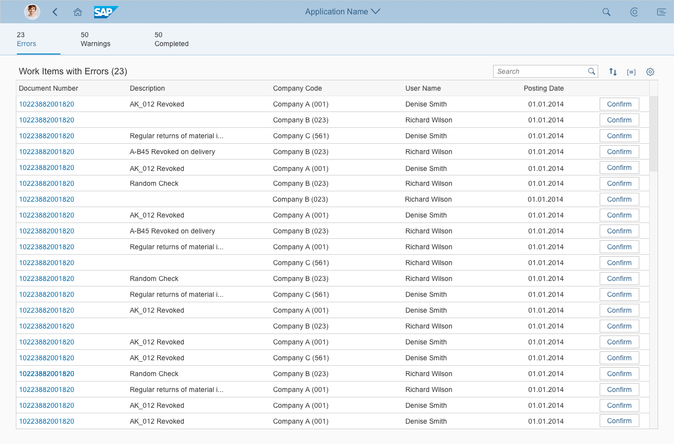
Worklist with actions at line item level
You can also offer actions at line item level. This reduces the interaction required to a single click per item. Consider offering actions at line item level for the most frequently used actions, and if the list provides enough information to make the a decision.
Often, users will need more information before they can take action. In this case, offer navigation to the work item details, and offer all the relevant actions in the detail screen.
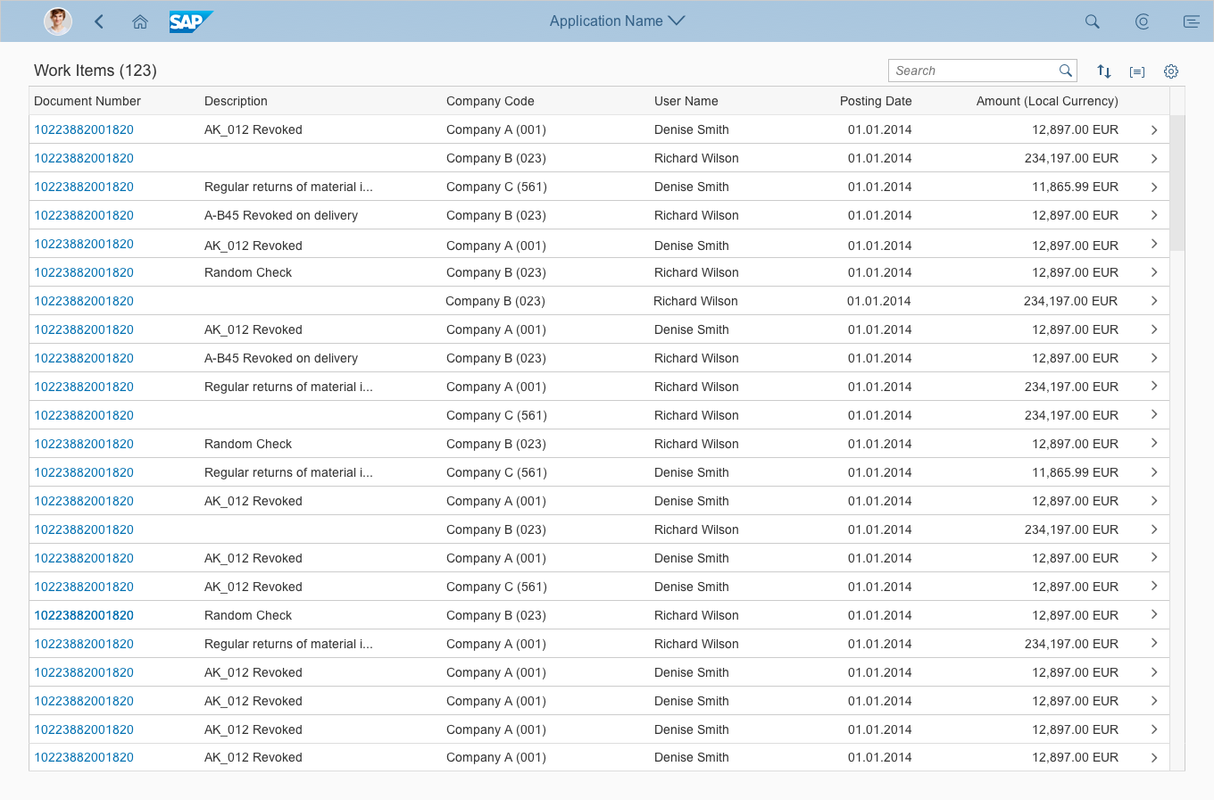
Worklist with navigation to item details
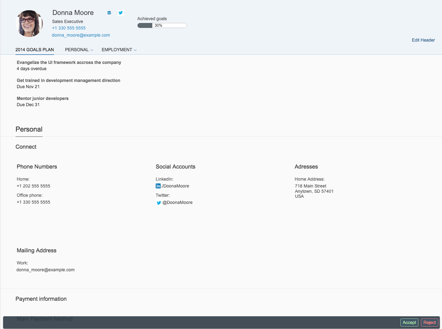
Work item details
Once the user has completed the task, the app should:
- Return the user to the worklist
- Remove the processed item from the list, or move it to a “completed” section
- Confirm the user’s action with a message toast
Resources
Want to dive deeper? Follow the links below to find out more about related controls, the SAPUI5 implementation, and the visual design.
Elements and Controls
- Full Screen Layout (guidelines)
- Variant Management (guidelines)
- Filter Bar (guidelines)
- Tab Bar (guidelines)
- Responsive Table (guidelines)
- Toolbar (guidelines)
- Icons (guidelines)
Implementation
- Filter Bar (documentation)
- Tab Bar/Icon Tab Bar (SAPUI5 API reference)
- Table (SAPUI5 API reference)
- Toolbar (SAPUI5 API reference)
- Popover (SAPUI5 API reference)
 Your feedback has been sent to the SAP Fiori design team.