
- Latest SAPUI Version 1.124
- SAPUI5 Version 1.122
- SAPUI5 Version 1.120
- SAPUI5 Version 1.118
- SAPUI5 Version 1.116
- SAPUI5 Version 1.114
- SAPUI5 Version 1.112
- SAPUI5 Version 1.110
- SAPUI5 Version 1.108
- SAPUI5 Version 1.106
- SAPUI5 Version 1.104
- SAPUI5 Version 1.102
- SAPUI5 Version 1.100
- SAPUI5 Version 1.98
- SAPUI5 Version 1.96
- SAPUI5 Version 1.94
- SAPUI5 Version 1.92
- SAPUI5 Version 1.90
- SAPUI5 Version 1.88
- SAPUI5 Version 1.86
- SAPUI5 Version 1.84
- SAPUI5 Version 1.82
- SAPUI5 Version 1.80
- SAPUI5 Version 1.78
- SAPUI5 Version 1.76
- SAPUI5 Version 1.74
- SAPUI5 Version 1.72
- SAPUI5 Version 1.70
- SAPUI5 Version 1.68
- SAPUI5 Version 1.66
- SAPUI5 Version 1.64
- SAPUI5 Version 1.62
- SAPUI5 Version 1.60
- SAPUI5 Version 1.58
- SAPUI5 Version 1.56
- SAPUI5 Version 1.54
- SAPUI5 Version 1.52
- SAPUI5 Version 1.50
- SAPUI5 Version 1.46
- SAPUI5 Version 1.44
- SAPUI5 Version 1.42
- SAPUI5 Version 1.40
- SAPUI5 Version 1.38
- SAPUI5 Version 1.36
- SAPUI5 Version 1.34
- SAPUI5 Version 1.32
- SAPUI5 Version 1.30
- SAPUI5 Version 1.28
- SAPUI5 Version 1.26
- Latest SAPUI Version 1.124
- SAPUI5 Version 1.122
- SAPUI5 Version 1.120
- SAPUI5 Version 1.118
- SAPUI5 Version 1.116
- SAPUI5 Version 1.114
- SAPUI5 Version 1.112
- SAPUI5 Version 1.110
- SAPUI5 Version 1.108
- SAPUI5 Version 1.106
- SAPUI5 Version 1.104
- SAPUI5 Version 1.102
- SAPUI5 Version 1.100
- SAPUI5 Version 1.98
- SAPUI5 Version 1.96
- SAPUI5 Version 1.94
- SAPUI5 Version 1.92
- SAPUI5 Version 1.90
- SAPUI5 Version 1.88
- SAPUI5 Version 1.86
- SAPUI5 Version 1.84
- SAPUI5 Version 1.82
- SAPUI5 Version 1.80
- SAPUI5 Version 1.78
- SAPUI5 Version 1.76
- SAPUI5 Version 1.74
- SAPUI5 Version 1.72
- SAPUI5 Version 1.70
- SAPUI5 Version 1.68
- SAPUI5 Version 1.66
- SAPUI5 Version 1.64
- SAPUI5 Version 1.62
- SAPUI5 Version 1.60
- SAPUI5 Version 1.58
- SAPUI5 Version 1.56
- SAPUI5 Version 1.54
- SAPUI5 Version 1.52
- SAPUI5 Version 1.50
- SAPUI5 Version 1.48
- SAPUI5 Version 1.46
- SAPUI5 Version 1.44
- SAPUI5 Version 1.42
- SAPUI5 Version 1.40
- SAPUI5 Version 1.38
- SAPUI5 Version 1.36
- SAPUI5 Version 1.34
- SAPUI5 Version 1.32
- SAPUI5 Version 1.30
- SAPUI5 Version 1.28
- SAPUI5 Version 1.26
Multi-Instance Floorplan (Layout)
Intro
The multi-instance floorplan allows users to open multiple documents in a tabular view. After selecting items from a list, the user opens them in a tab container.
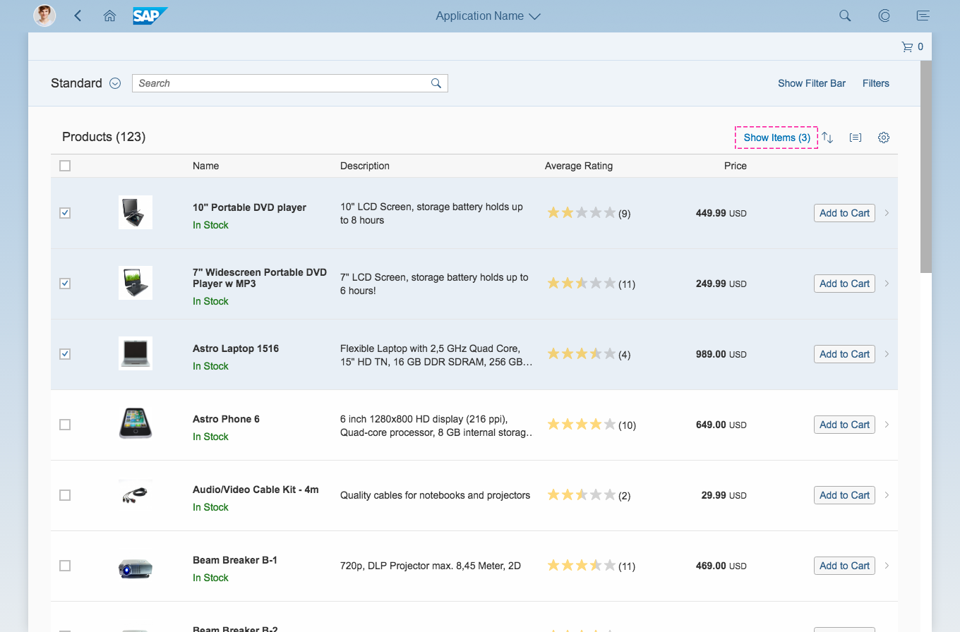
The user selects items from a list and clicks or taps on the "Show Items" button
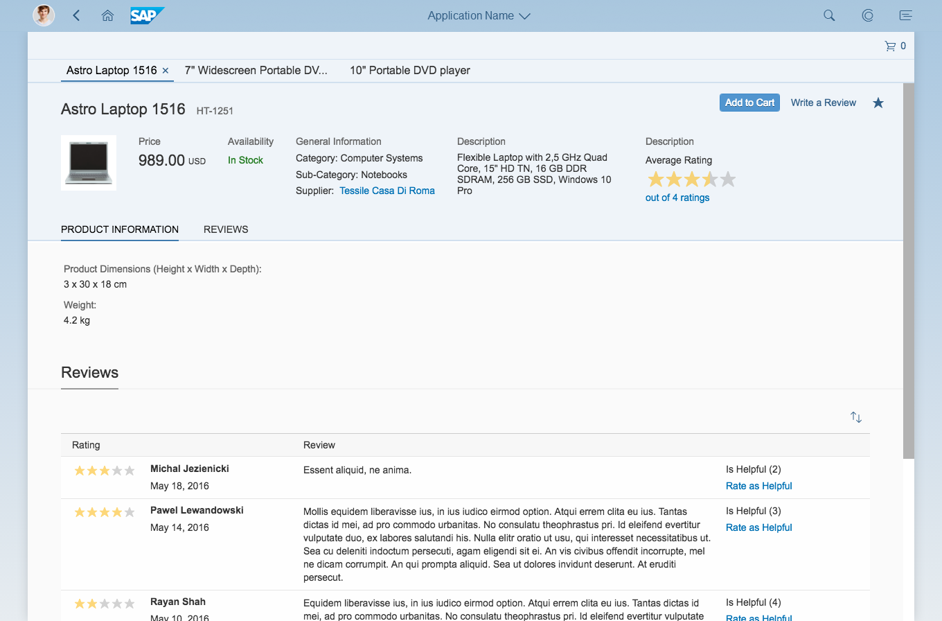
The selected items are opened in the multi-instance handling floorplan
Usage
Use multi-instance handling if you want to let users open and edit multiple items simultaneously (such as object pages or documents). Multi-instance handling also allows users to switch between items without having to move between multiple browser tabs.
Do not use multi-instance handling to open a single item.
Responsiveness
The multi-instance floorplan is controlled by the sap.m.TabContainer control. The tab container supports all three SAP Fiori responsive sizes: small, medium, and large.
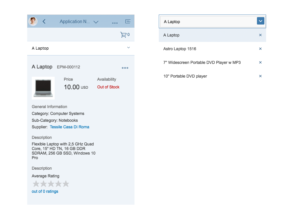
Size S
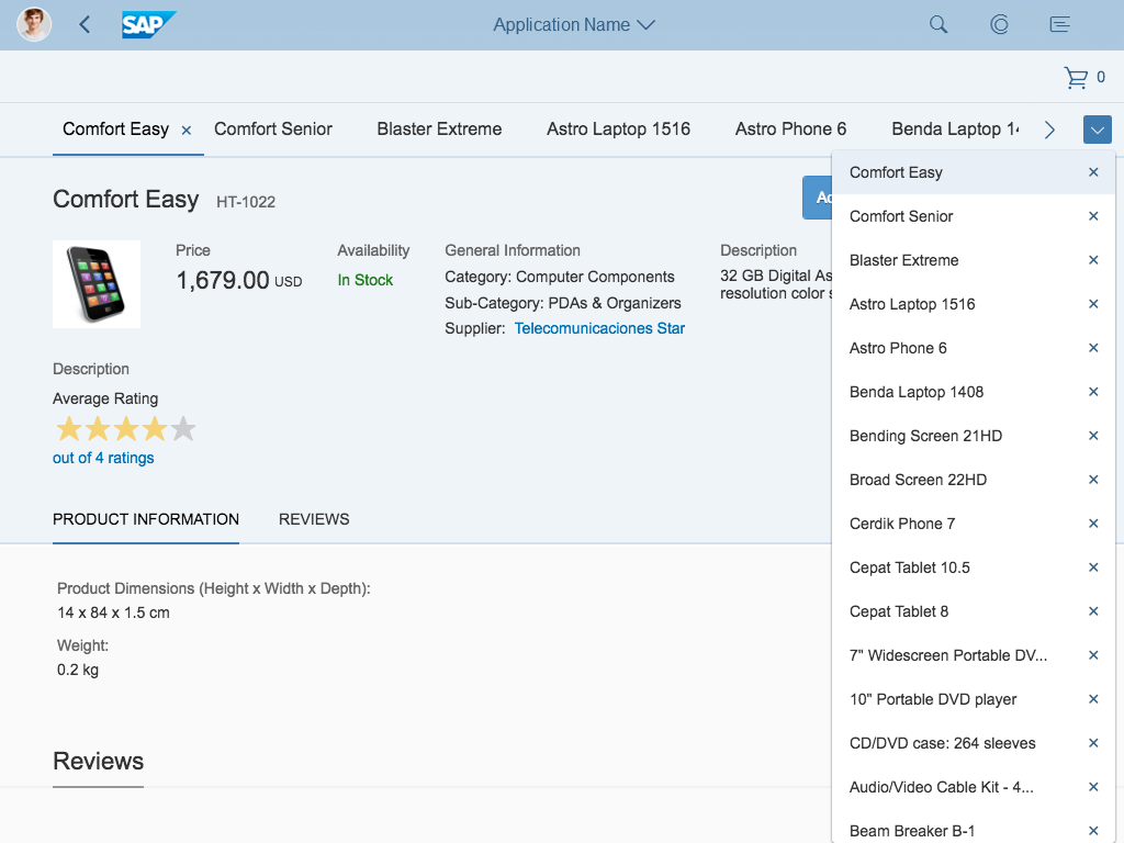
Size M
Size L
Structure
The floorplan for multi-instance handling is a full screen floorplan.
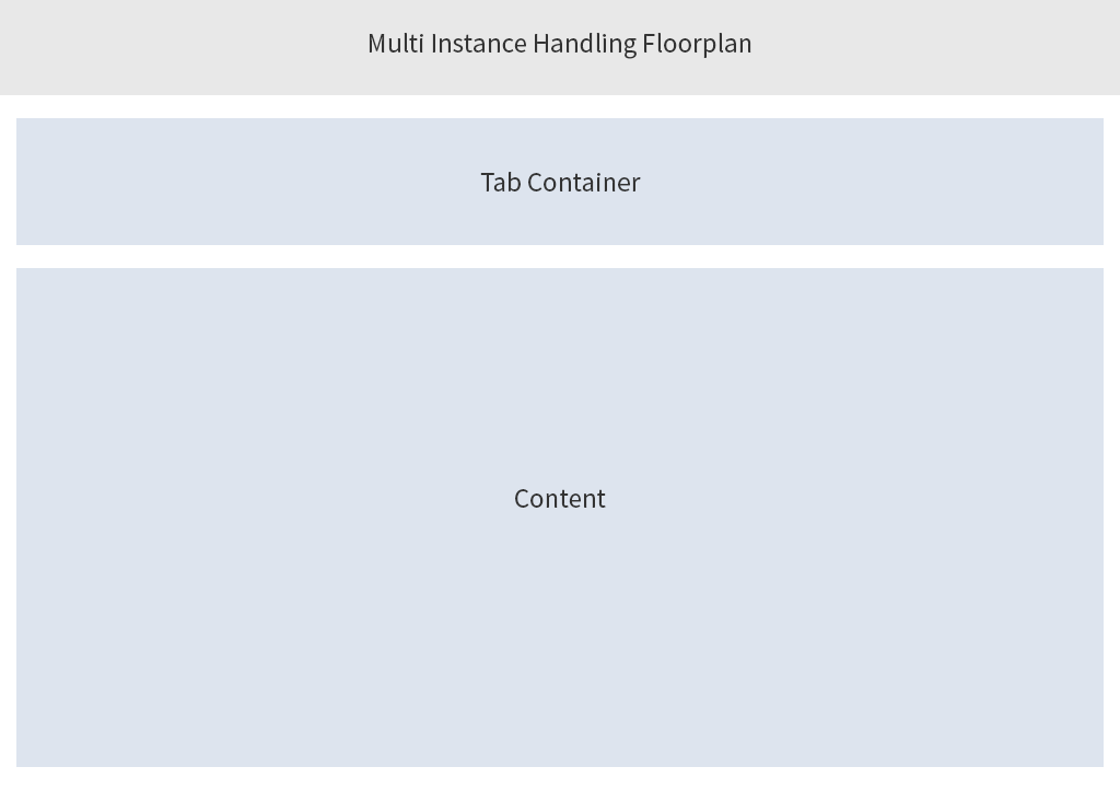
Schematic visualization of multi-instance handling
The display mode of the multi-instance floorplan contains:
- Tab container
- Content

The edit and create modes of the multi-instance floorplan contain:
- Tab container
- Content
- Footer toolbar for actions and messaging
Behavior and Interaction
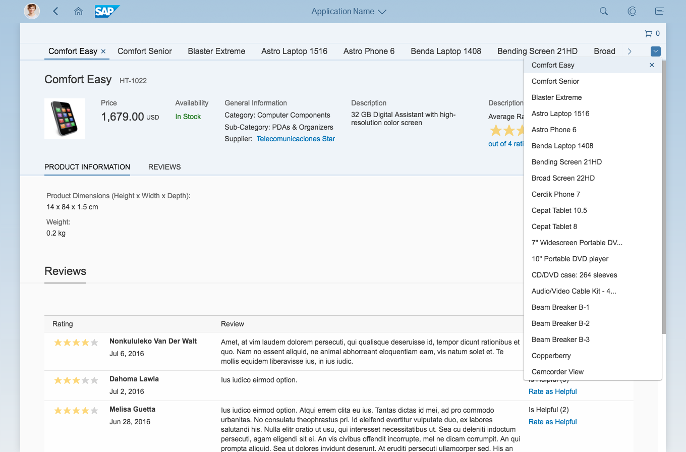
Tab Container
Multi-instance handling – Tab container/Desktop
The tab container is the backbone of the multi-instance floorplan. Users can use the tabs to navigate between the opened items. The tab container contains the opened tabs, the overflow mechanism, and the plus ( ) button for adding new items.
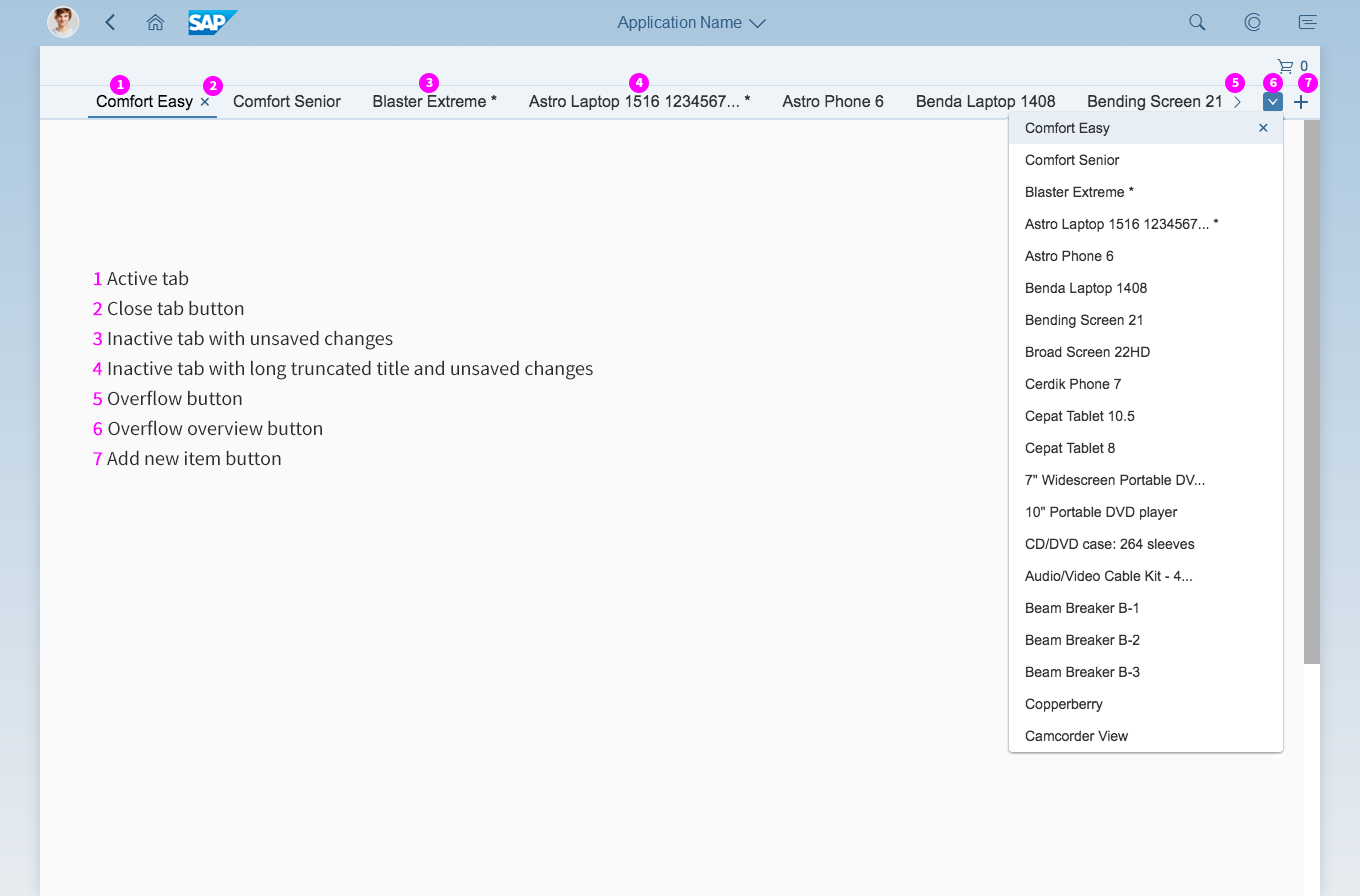
Tabs
The tabs represent the opened items. One tab is always active, while the others are inactive. The user can switch between tabs by clicking or tapping them in the tab container.
Each tab contains:
- A title
The title is the same as the title of the opened item. If the title is longer than 25 characters, the text will be truncated. - A Close Tab button
The Close Tab button closes the tab. In size L, the button is shown only on the active tab. The Close Tab buttons on inactive tabs are shown only when the user hovers over them. In size M, the buttons are always visible. In size S, the buttons are also always visible in the overflow overview.
Unsaved Changes in Tabs
If one or more opened items in the tab container have unsaved changes, the corresponding tabs show visual notifications. An asterisk (*) after the title of the relevant tab indicates that the item has unsaved changes.
If the user clicks or taps the Close Tab button for a tab that has unsaved changes, a warning message appears.
If the user tries to exit multi-instance handling (by using the Back button or by navigating to a different floorplan) and there are tabs with unsaved changes, a warning message appears.
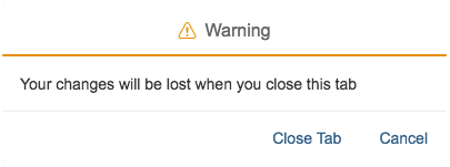
Warning message when closing a tab with unsaved changes
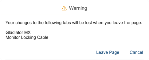
Warning message when navigating out of multi-instance handling when tabs still have unsaved changes
Closing the Last Tab
When the last remaining tab is closed, direct the user back to the original list from which the items were selected.
Overflow
The tab container has an overflow mechanism in case there are too many tabs for them all to be displayed on the screen.
If tabs are hidden in the overflow, the user can click or tap the overflow button (left or right) to scroll the tabs horizontally and show the hidden tabs.
An overflow overview button provides a list of all the opened tabs in a hierarchical dropdown menu, including those that are hidden in the overflow.
Close Tab buttons are also shown in the overflow overview dropdown list. In size L, the Close Tab buttons are shown only when the user hovers over them. In sizes M and S, the Close Tab buttons are always visible.
Button for Adding New Items
The tab container can have a button for adding new items, which appears as an icon () and is located on the far right of the tab container. When the user clicks or taps this button, a new empty item is created and a new tab is opened.
Only use the plus button if the application allows users to create new items or objects, such as a new sales order.
Do not use the plus button to create tabs without content.

Button for adding new items
Content Area
Since multi-instance handling shows instances of objects, use the the following floorplans in the content area:
Resources
Want to dive deeper? Follow the links below to find out more about related controls, the SAPUI5 implementation, and the visual design.
Elements and Controls
- List Report Floorplan (guidelines)
- Object Page Floorplan (guidelines)
- Create Page Floorplan (guidelines)
- Message Handling (guidelines)
 Your feedback has been sent to the SAP Fiori design team.