- Latest Version 1.128
- Version 1.126
- SAPUI Version 1.124
- SAPUI5 Version 1.122
- SAPUI5 Version 1.120
- SAPUI5 Version 1.118
- SAPUI5 Version 1.116
- SAPUI5 Version 1.114
- SAPUI5 Version 1.112
- SAPUI5 Version 1.110
- SAPUI5 Version 1.108
- SAPUI5 Version 1.106
- SAPUI5 Version 1.104
- SAPUI5 Version 1.102
- SAPUI5 Version 1.100
- SAPUI5 Version 1.98
- SAPUI5 Version 1.96
- SAPUI5 Version 1.94
- SAPUI5 Version 1.92
- SAPUI5 Version 1.90
- SAPUI5 Version 1.88
- SAPUI5 Version 1.86
- SAPUI5 Version 1.84
- SAPUI5 Version 1.82
- SAPUI5 Version 1.80
- SAPUI5 Version 1.78
- SAPUI5 Version 1.76
- SAPUI5 Version 1.74
- SAPUI5 Version 1.72
- SAPUI5 Version 1.70
- SAPUI5 Version 1.68
- SAPUI5 Version 1.66
- SAPUI5 Version 1.64
- SAPUI5 Version 1.62
- SAPUI5 Version 1.60
- SAPUI5 Version 1.58
- SAPUI5 Version 1.56
- SAPUI5 Version 1.54
- SAPUI5 Version 1.52
- SAPUI5 Version 1.50
- SAPUI5 Version 1.46
- SAPUI5 Version 1.44
- SAPUI5 Version 1.42
- SAPUI5 Version 1.40
- SAPUI5 Version 1.38
- SAPUI5 Version 1.36
- SAPUI5 Version 1.34
- SAPUI5 Version 1.32
- SAPUI5 Version 1.30
- SAPUI5 Version 1.28
- SAPUI5 Version 1.26
- Latest Version 1.128
- Version 1.126
- SAPUI Version 1.124
- SAPUI5 Version 1.122
- SAPUI5 Version 1.120
- SAPUI5 Version 1.118
- SAPUI5 Version 1.116
- SAPUI5 Version 1.114
- SAPUI5 Version 1.112
- SAPUI5 Version 1.110
- SAPUI5 Version 1.108
- SAPUI5 Version 1.106
- SAPUI5 Version 1.104
- SAPUI5 Version 1.102
- SAPUI5 Version 1.100
- SAPUI5 Version 1.98
- SAPUI5 Version 1.96
- SAPUI5 Version 1.94
- SAPUI5 Version 1.92
- SAPUI5 Version 1.90
- SAPUI5 Version 1.88
- SAPUI5 Version 1.86
- SAPUI5 Version 1.84
- SAPUI5 Version 1.82
- SAPUI5 Version 1.80
- SAPUI5 Version 1.78
- SAPUI5 Version 1.76
- SAPUI5 Version 1.74
- SAPUI5 Version 1.72
- SAPUI5 Version 1.70
- SAPUI5 Version 1.68
- SAPUI5 Version 1.66
- SAPUI5 Version 1.64
- SAPUI5 Version 1.62
- SAPUI5 Version 1.60
- SAPUI5 Version 1.58
- SAPUI5 Version 1.56
- SAPUI5 Version 1.54
- SAPUI5 Version 1.52
- SAPUI5 Version 1.50
- SAPUI5 Version 1.48
- SAPUI5 Version 1.46
- SAPUI5 Version 1.44
- SAPUI5 Version 1.42
- SAPUI5 Version 1.40
- SAPUI5 Version 1.38
- SAPUI5 Version 1.36
- SAPUI5 Version 1.34
- SAPUI5 Version 1.32
- SAPUI5 Version 1.30
- SAPUI5 Version 1.28
- SAPUI5 Version 1.26
Enterprise Search
Intro
The SAP Fiori launchpad offers an enterprise search function that searches across all apps and business objects, such as materials, customers, and maintenance plans. The search icon is displayed in the shell bar of the launchpad and is always readily available at the top of the screen.
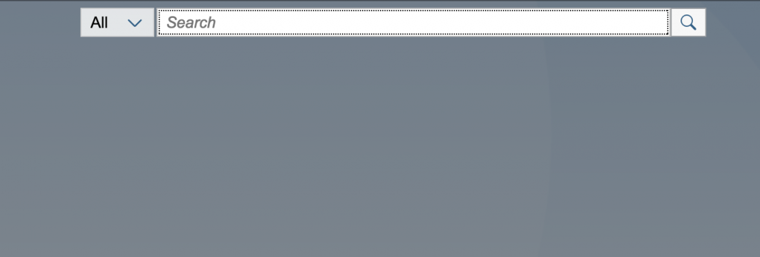
When the user clicks on the search icon in the shell bar, the search field and the type selector appear.
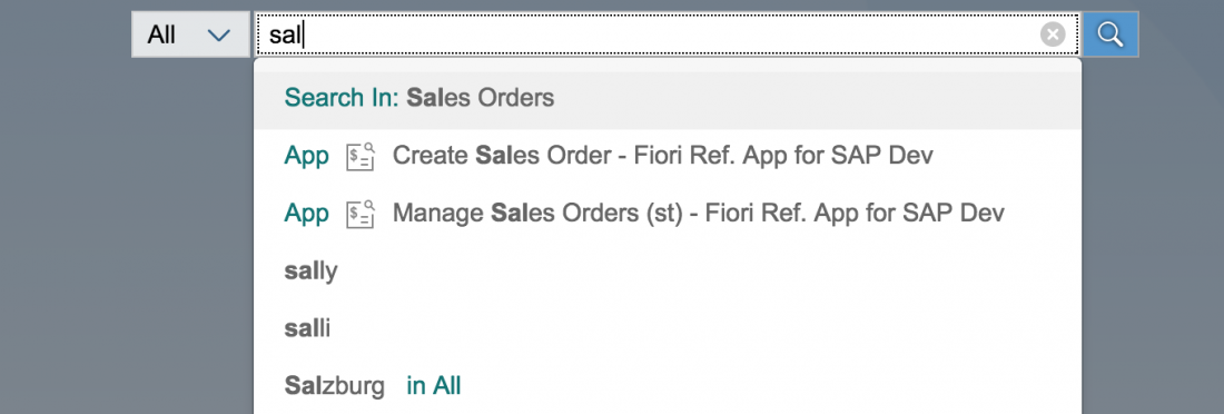
After entering a query, the user can trigger the search by pressing ENTER, by clicking on the magnifier icon, or by selecting one of the suggestions.
If the search field is empty, clicking the search icon closes the search fields again. If the search field is empty and the user triggers the search by pressing ENTER, this creates a search for All (*).
Suggestions
The user enters search terms in the search field. As the user begins to type, suggestions supports him in formulating a query. When a search is carried out, the returned suggestions include term suggestions, source types, business objects and apps.
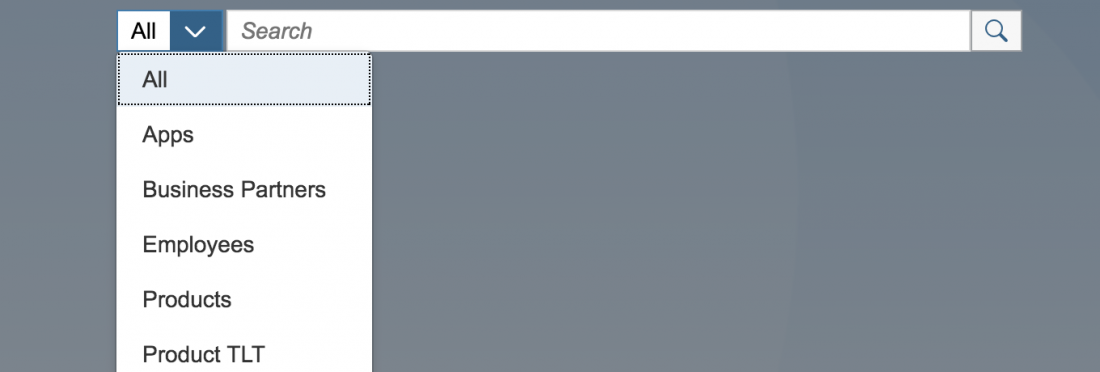
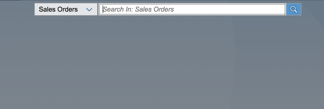
If a specific source type has been choosed via the source type dropdown menu or via a source suggestion, that specific source type is selected within the dropdown and the prompt text within the search field shows the source, the user is going to search in.
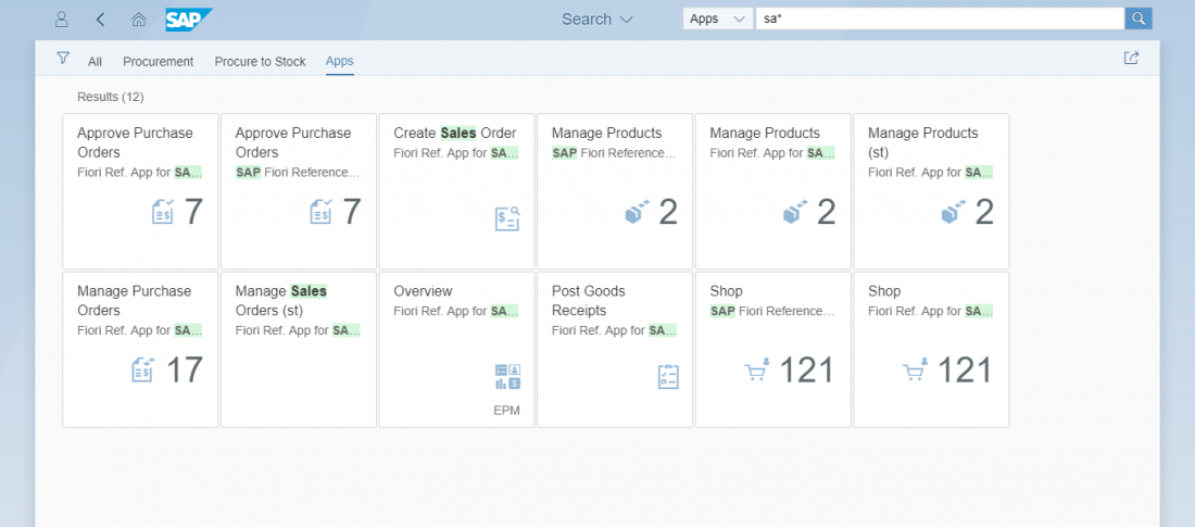
If the user selects Apps in the type selector, the search suggests a few apps that match the query. Apps can be launched directly from the suggestions list.
Result List
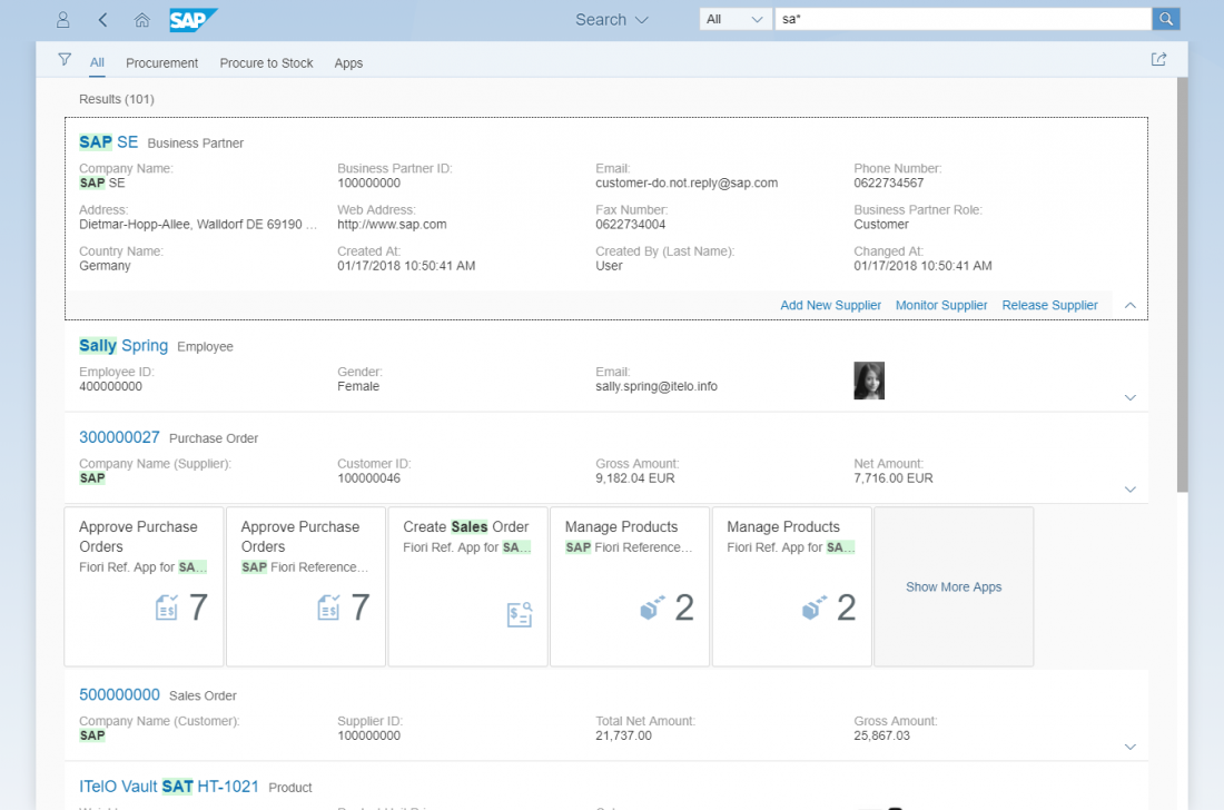
The result list is a ranked list of all matching items. After the first three matching business objects, app results that have been found are presented as a series of horizontal tiles.
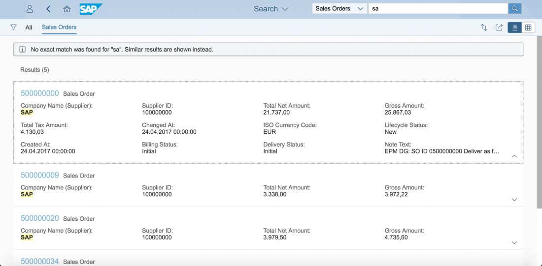
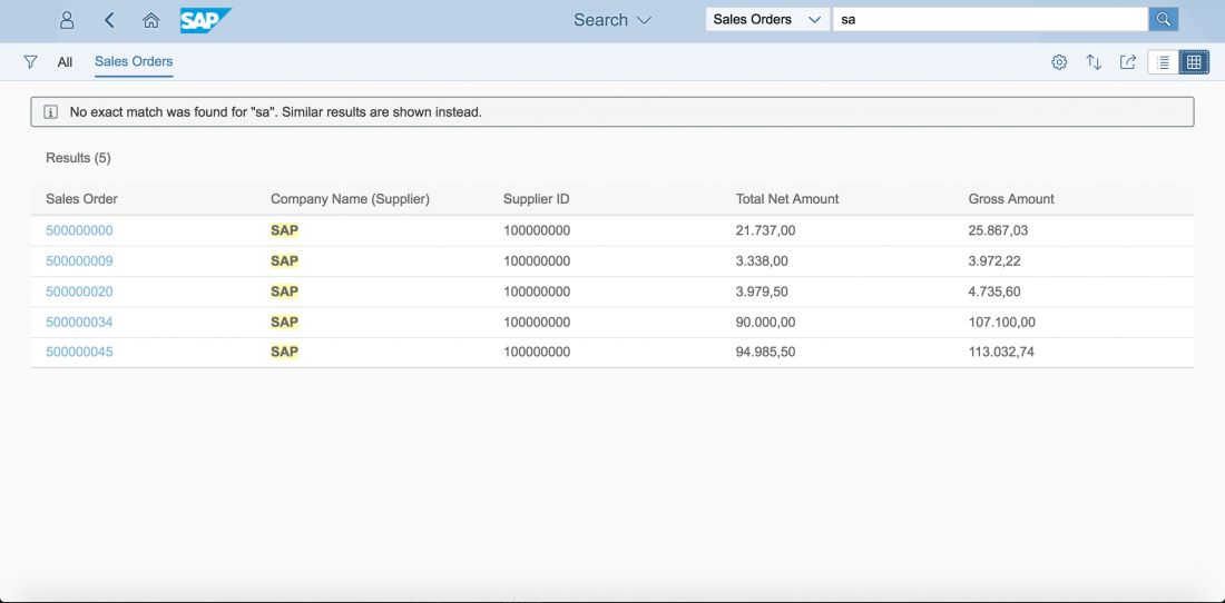
Apps can be launched directly from the result list. Each business object item is summarized in a few lines. To see more details, the user can use the down arrow to expand the item. The up arrow collapses the additional information. Clicking or tapping the title link of a result item opens the corresponding object page or document.
The tabs at the top of the list are results from other source types or data providers. These tabs allow users switch between the different result sets quickly and easily. The tabs are sorted according to the number of hits – categories with most hits appear first.
Personalized Search
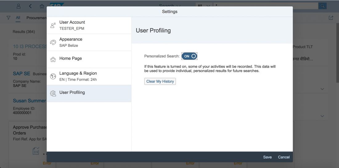
This feature allows the system to track the user’s search behavior in order to personalize and improve future rankings of search results. Algorithms analyze the user’s behaviors and interests, and adapt accordingly to support the user by focusing on context-relevant information.
Within the Me Area, the Settings dialog can be launched by the user. Here, the user can choose the menu entry “User Profiling” to activate/deactivate the Personalized Search. The user can also delete the collected data by pressing the button Clear My History.
Filters
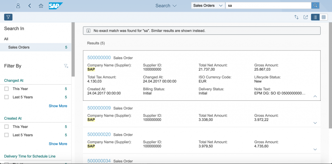
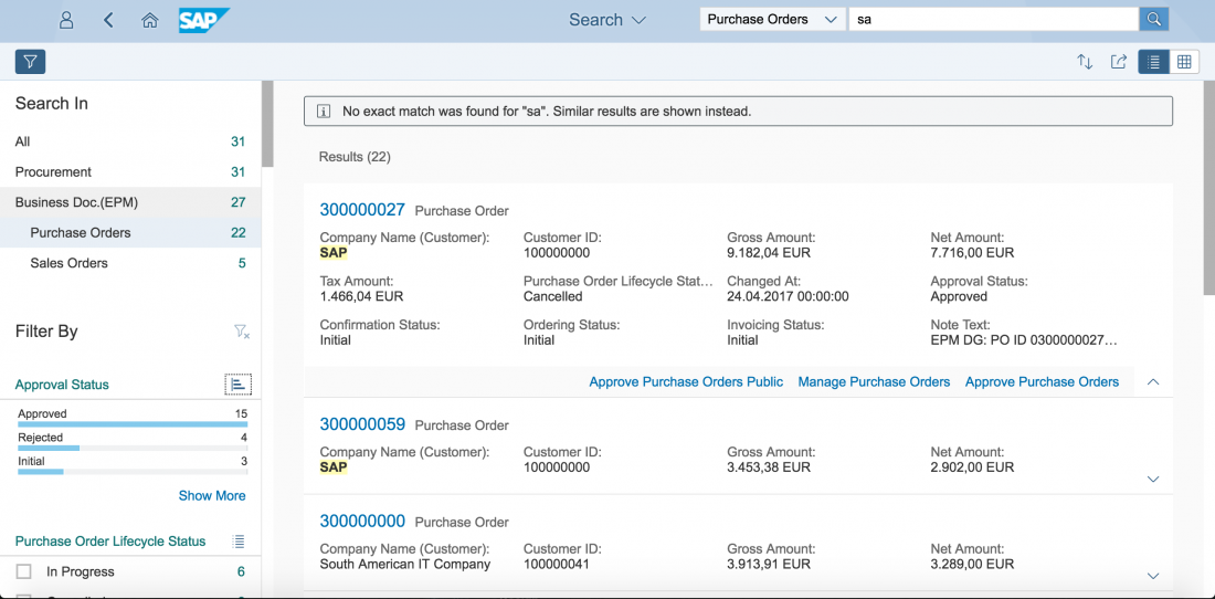
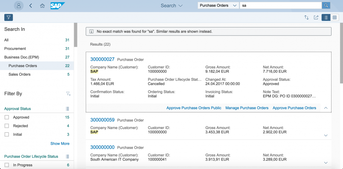
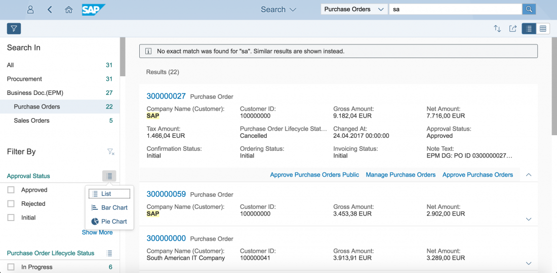
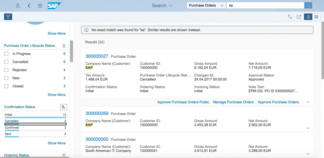
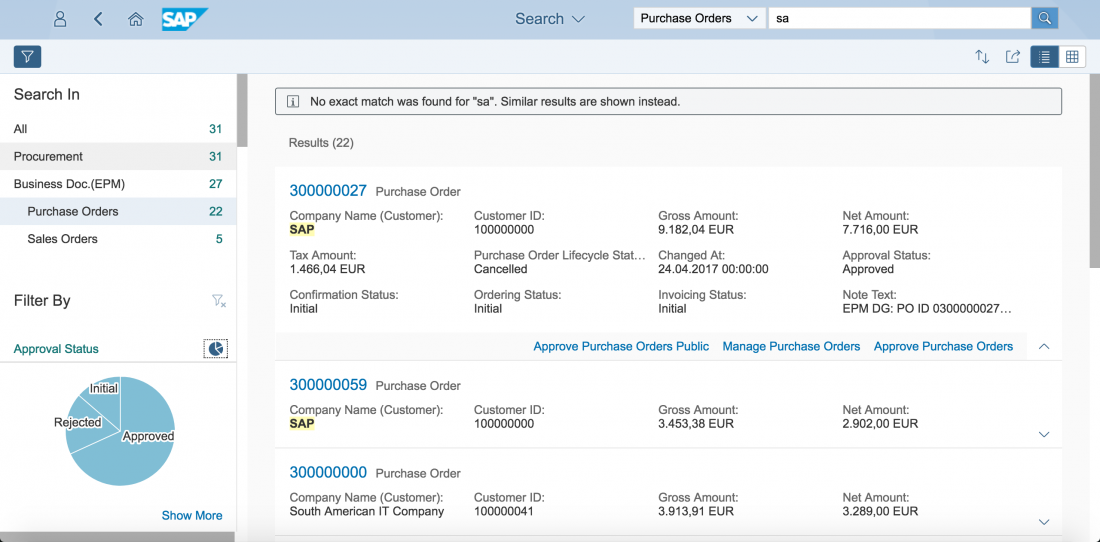
A filter icon next to the back arrow offers further options for filtering the search results. When the user clicks on the filter icon, a filter panel appears on left-hand side. Here, the user can change the source type (equivalent to the type selector) and drill down further to various subcategories. Once the results have been limited to a certain connector source, thus ensuring a homogeneous result set, result-specific facets are then offered.
Filter Panel
Advanced Search
In addition to the automatic extracted filter attributes, the user can also define and set up individual filters at the bottom of each filter. By filling out a line (such as a period of time), an additional line is be added automatically to create multiple individual filters that are interpreted simultaneously in the search. This creates use case-specific filters that offer the user advanced search functionality on demand and within a specific filter context.
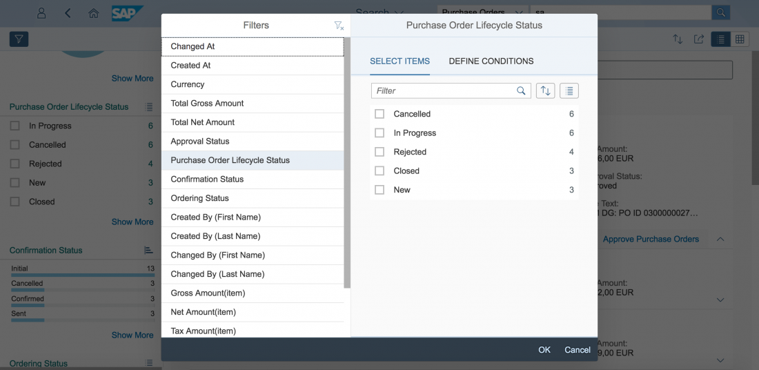
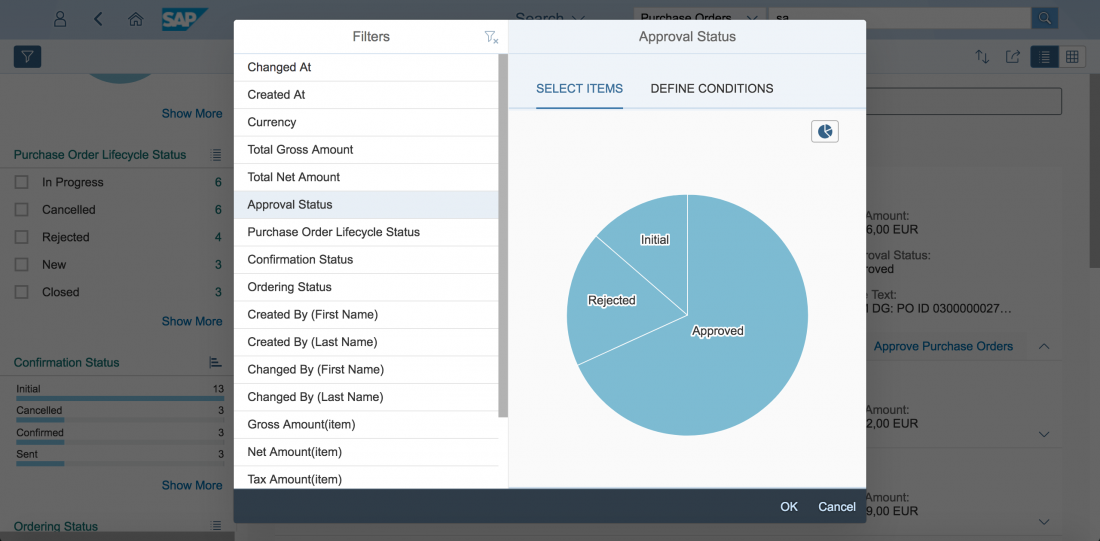
To select certain attributes or define conditions within a certain connector source, users can pick filters from the left panel and choose from corresponding attributes on the right.
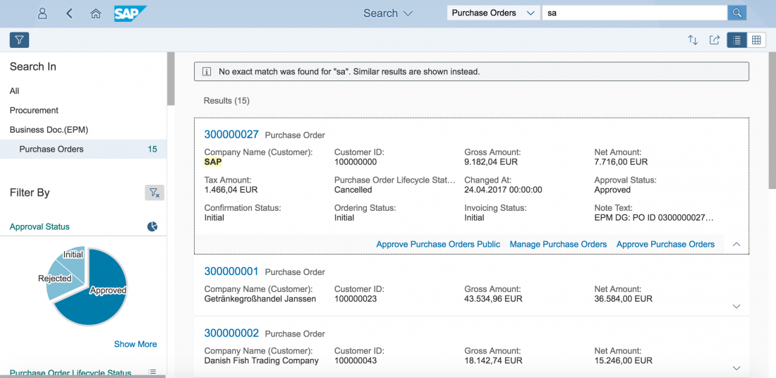
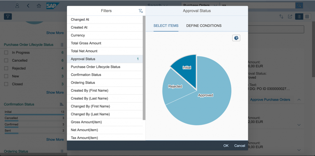
Besides selecting attributes from a list, users can also change the visualization to pie or bar charts. Multiple selection is also supported for the chart visualizations.
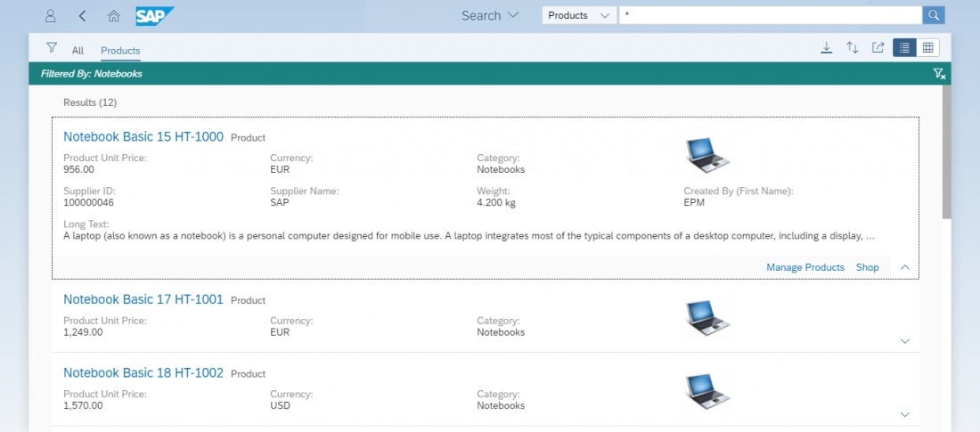
Once the user has finished setting the filters and has closed the filter panel, these filters are visible on a blue filter strip at the top of the results page. On the right side, the user can clear all filters without needing to open up the filter panel again.


 Your feedback has been sent to the SAP Fiori design team.