
- Latest SAPUI Version 1.124
- SAPUI5 Version 1.122
- SAPUI5 Version 1.120
- SAPUI5 Version 1.118
- SAPUI5 Version 1.116
- SAPUI5 Version 1.114
- SAPUI5 Version 1.112
- SAPUI5 Version 1.110
- SAPUI5 Version 1.108
- SAPUI5 Version 1.106
- SAPUI5 Version 1.104
- SAPUI5 Version 1.102
- SAPUI5 Version 1.100
- SAPUI5 Version 1.98
- SAPUI5 Version 1.96
- SAPUI5 Version 1.94
- SAPUI5 Version 1.92
- SAPUI5 Version 1.90
- SAPUI5 Version 1.88
- SAPUI5 Version 1.86
- SAPUI5 Version 1.84
- SAPUI5 Version 1.82
- SAPUI5 Version 1.80
- SAPUI5 Version 1.78
- SAPUI5 Version 1.76
- SAPUI5 Version 1.74
- SAPUI5 Version 1.72
- SAPUI5 Version 1.70
- SAPUI5 Version 1.68
- SAPUI5 Version 1.66
- SAPUI5 Version 1.64
- SAPUI5 Version 1.62
- SAPUI5 Version 1.60
- SAPUI5 Version 1.58
- SAPUI5 Version 1.56
- SAPUI5 Version 1.54
- SAPUI5 Version 1.52
- SAPUI5 Version 1.50
- SAPUI5 Version 1.46
- SAPUI5 Version 1.44
- SAPUI5 Version 1.42
- SAPUI5 Version 1.40
- SAPUI5 Version 1.38
- SAPUI5 Version 1.36
- SAPUI5 Version 1.34
- SAPUI5 Version 1.32
- SAPUI5 Version 1.30
- SAPUI5 Version 1.28
- SAPUI5 Version 1.26
- Latest SAPUI Version 1.124
- SAPUI5 Version 1.122
- SAPUI5 Version 1.120
- SAPUI5 Version 1.118
- SAPUI5 Version 1.116
- SAPUI5 Version 1.114
- SAPUI5 Version 1.112
- SAPUI5 Version 1.110
- SAPUI5 Version 1.108
- SAPUI5 Version 1.106
- SAPUI5 Version 1.104
- SAPUI5 Version 1.102
- SAPUI5 Version 1.100
- SAPUI5 Version 1.98
- SAPUI5 Version 1.96
- SAPUI5 Version 1.94
- SAPUI5 Version 1.92
- SAPUI5 Version 1.90
- SAPUI5 Version 1.88
- SAPUI5 Version 1.86
- SAPUI5 Version 1.84
- SAPUI5 Version 1.82
- SAPUI5 Version 1.80
- SAPUI5 Version 1.78
- SAPUI5 Version 1.76
- SAPUI5 Version 1.74
- SAPUI5 Version 1.72
- SAPUI5 Version 1.70
- SAPUI5 Version 1.68
- SAPUI5 Version 1.66
- SAPUI5 Version 1.64
- SAPUI5 Version 1.62
- SAPUI5 Version 1.60
- SAPUI5 Version 1.58
- SAPUI5 Version 1.56
- SAPUI5 Version 1.54
- SAPUI5 Version 1.52
- SAPUI5 Version 1.50
- SAPUI5 Version 1.48
- SAPUI5 Version 1.46
- SAPUI5 Version 1.44
- SAPUI5 Version 1.42
- SAPUI5 Version 1.40
- SAPUI5 Version 1.38
- SAPUI5 Version 1.36
- SAPUI5 Version 1.34
- SAPUI5 Version 1.32
- SAPUI5 Version 1.30
- SAPUI5 Version 1.28
- SAPUI5 Version 1.26
Smart Table
sap.ui.comp.smarttable.SmartTable
Intro
The smart table is a wrapper around existing tables, and can be used together with the responsive table, grid table, analytical table, or tree table.
The smart table creates columns automatically based on the underlying OData service plus corresponding annotations. It also adds some generic functionality, such as a toolbar, complex personalization settings, variant management, and export to spreadsheet.
Everything that can be done using the smart table can also be achieved using the responsive table, grid table, analytical table, or tree table directly, but with more development effort. Therefore, the main purpose of the smart table is to reduce development effort. However, this comes at the expense of decreased flexibility.
Usage
Use the smart table if:
- Data is fed into the table through OData services.
- You need a simple table with limited flexibility to display its content. In this case, the smart table reduces development effort.
- You need a table in which some columns provide flexible content. In this case, use the smart table together with a responsive table, and provide app-specific column definitions for these columns.
Do not use the smart table if:
- You create your own UI coding, whereby the data is not fed through OData services. In this case, use the underlying table control directly.
- The main use case involves selecting one item from very few items, with no additional details. In this case, a select or combo box might be more suitable.
- The main use case involves selecting one item from several items, with only a few details per item. In this case, a list might be more suitable. Pay attention to the layout of the list item to provide a pleasant appearance (see, for example, the master list and the feed list item).
- The table is displayed together with a chart inside a chart container. The smart table is not designed to work inside an existing chart container. In this case, use the underlying table control directly.
- You need an overview of a large amount of data. In this case, use charts.
- You just need it for layout reasons. In this case, use a layout container, such as the grid layout, instead.
- You need read-only or editable field value pairs. In this case, use a form instead. Tables are not optimized for form-like input navigation.
Responsiveness
The responsiveness of the smart table depends on the encapsulated table. The table toolbar uses the overflow mechanism for adapting to the screen width.
Using the responsive table
The smart table offers a generic responsive behavior (sap.ui.comp.smarttable.SmartTable, property: smartFilterId, value: true):
- For every 10 rem of screen width, one column stays in the tabular layout. All others are moved to the pop-in area. The columns are moved to the pop-in area from right to left, so the column furthest to the right moves to the pop-in first.
- Exception: The first two columns always stay in the tabular layout. This works best if the smart table uses the whole screen width. It might not work well if the smart table uses far less space.
Using the grid table, analytical table, or tree table
- The smart table works only on desktop and tablets, but not on smartphones. It supports touch devices, but is not optimized for small screens.
- If you use a smart table in this configuration, ensure that you implement a fallback solution for small screens. This fallback solution does not need to support all use cases. You could create a fallback by using a responsive table. However, a completely different solution, such as showing charts in a read-only case, might be more suitable.
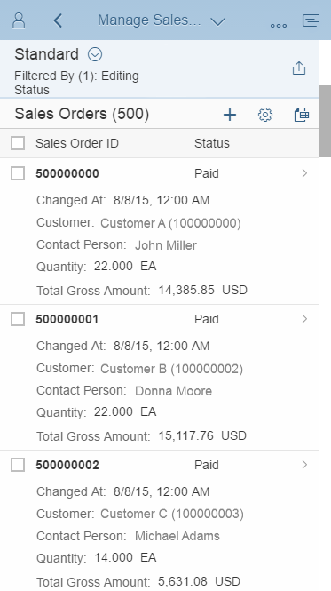
Size S with responsive table
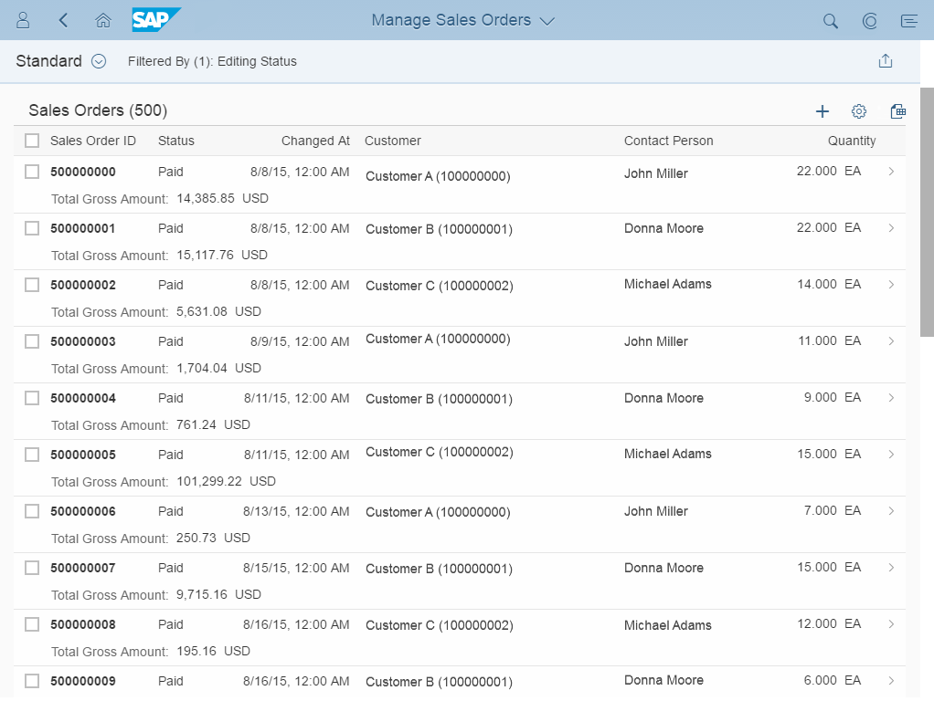
Size M with responsive table

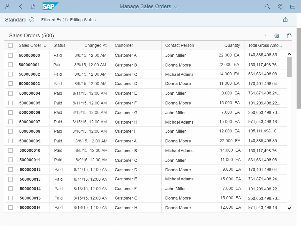
Size L with responsive table
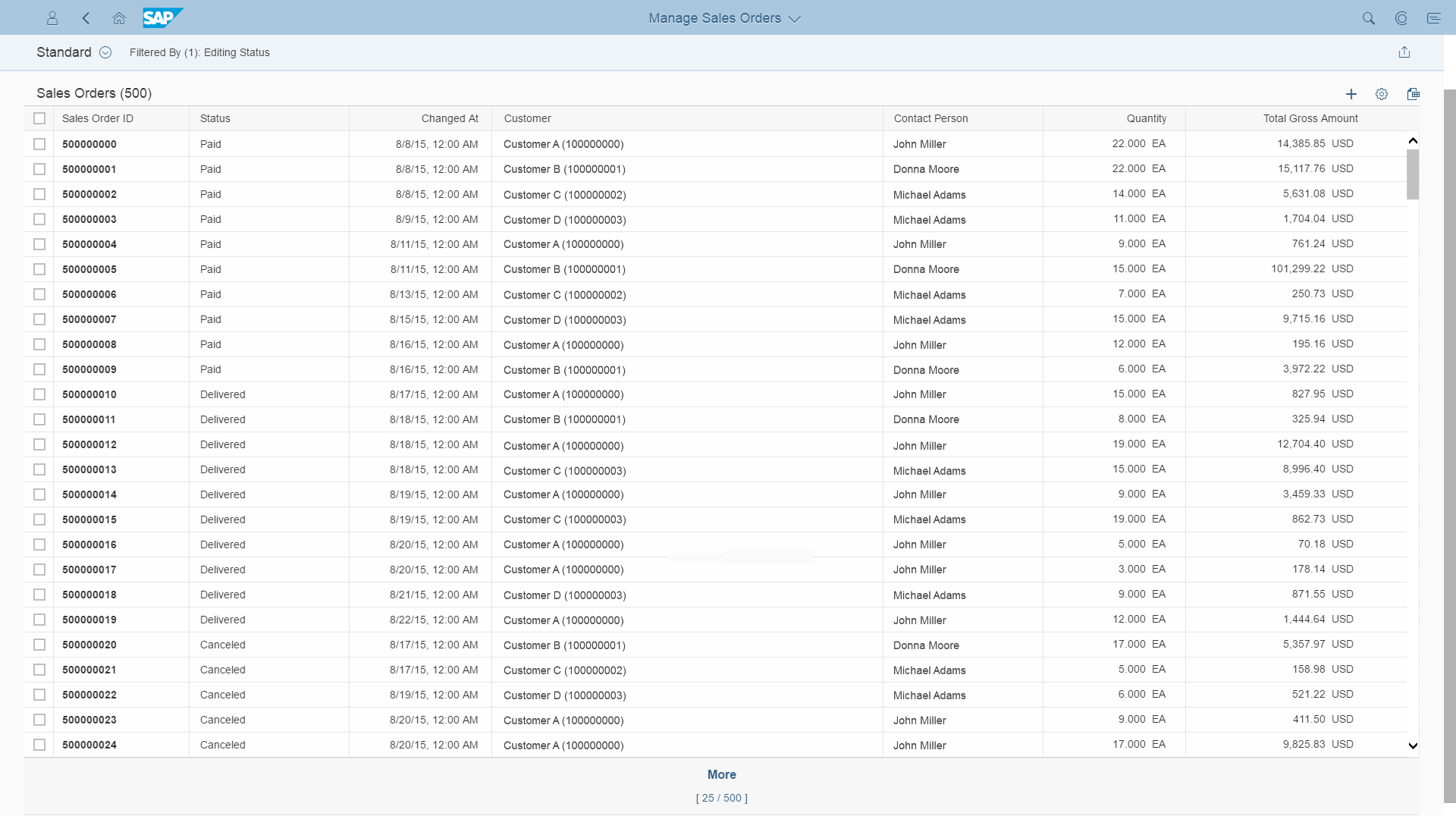
Size M with grid table
Size L with grid table
Layout
The title bar contains the title of the smart table, the item count, variant management, and the toolbar itself. All of these elements are optional.
The table area shows the corresponding table (responsive table, grid table, analytical table, or tree table).
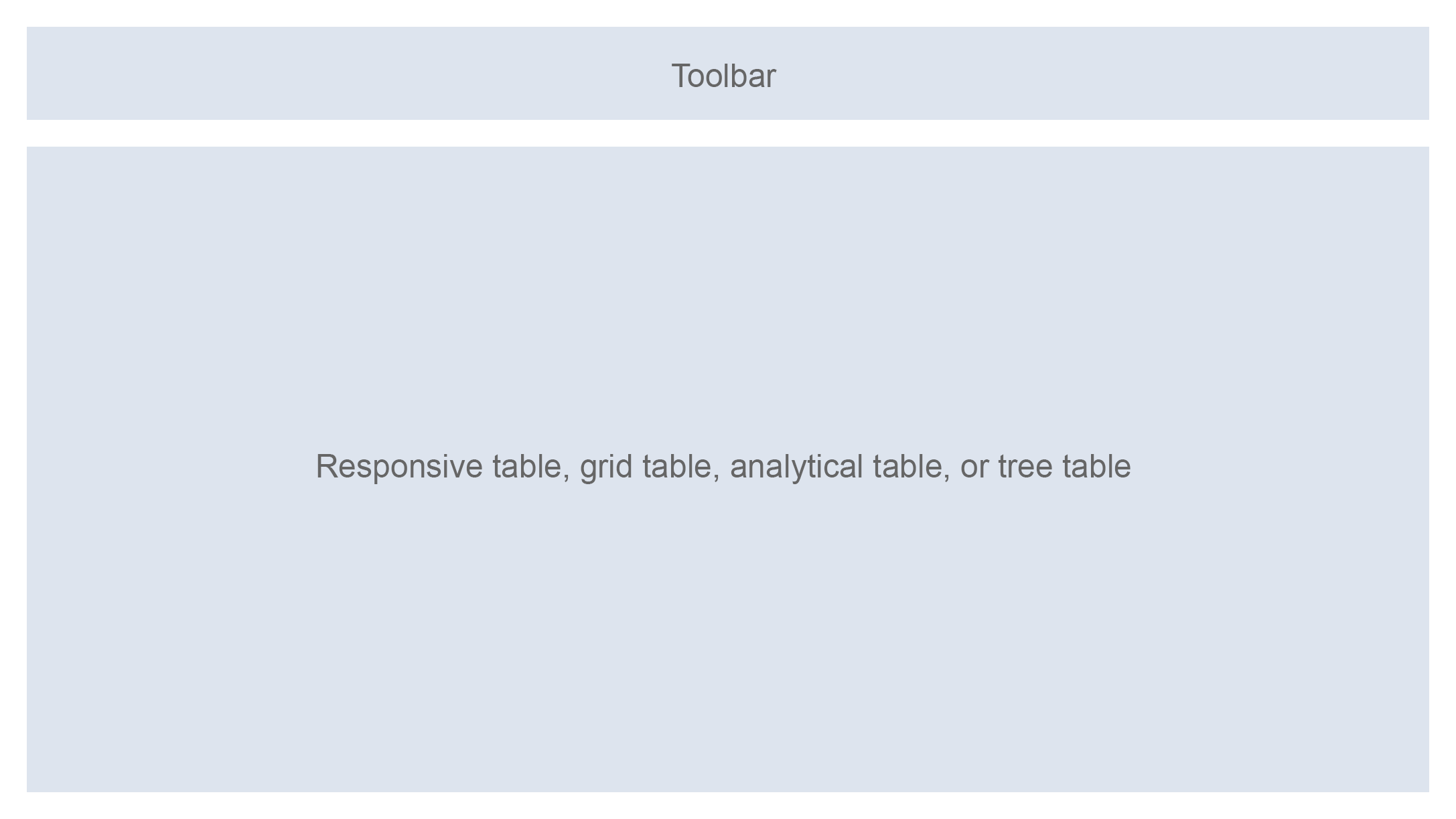
Schematic visualization of the smart table
Components
The title bar consists of a toolbar.
This can be the standard toolbar or a custom toolbar. The standard toolbar can contain a title text with or without item count, variant management, view switch (switching the table to edit mode), an entry point for the P13n dialog, and an Export to Spreadsheet action.
If you require additional functionality, you can use an app-specific toolbar. All toolbar options provided by the smart table can also be added to the app-specific toolbar. (Aggregation: customToolbar)
The table area consists of any of the following tables: responsive table, grid table, analytical table, or tree table.

Standard toolbar with everything enabled

Standard toolbar just with title and item count
Behavior and Interaction
The behavior is generally inherited from the underlying table, toolbar, variant management, and P13n dialog (see the corresponding articles for details.) Note that the smart table provides limited options and not all settings of the underlying controls are available.
Table Level
Table Type
The smart table can encapsulate the responsive table, grid table, analytical table, or tree table. (sap.ui.comp.smarttable.SmartTable, property: tableType)
Automatic Rendering of the Table
The smart table automatically creates columns and renders all items based on the metadata of the underlying OData service (sap.ui.comp.smarttable.SmartTable, property: smartFilterId).
To be more flexible in the table layout, the smart table also offers app-specific column templates for some or all columns. In this case, app developers must provide the definition for the underlying table and for the corresponding (but not necessarily for all) columns in the XML view. For this, the app development team must provide the column keys of the overridden columns via custom data.
Additional columns can also be added. Columns that are defined in this way retain all the options of the underlying table. This is especially useful with the responsive table, which offers complete flexibility in content design. Any columns that are not defined by the app development team are still rendered automatically by the smart table.
No Data
If there is no data to show, the smart table renders default text. This text can be overwritten by the app development team (aggregation: NoData).
Initially Visible Columns
The smart table enables you to define which columns are initially shown. Here, initially means that these columns are shown when the app is first launched. All other columns are initially hidden (annotation: PresentationVariant/ LineItem, property: initiallyVisibleColumns).
Persistency
End users can show additional columns if table personalization is provided. In this case, column settings are persisted. On consecutive startups, the columns are shown with the same settings as last defined by the user (property: persistenceKey).
Removing Columns
The smart table always shows all columns from the OData model. In some cases, columns needs to be in the model but should not be available on the front end at all. Examples of this include:
- A column is needed to provide an ID which is used for navigation purposes, but the front end should only display the corresponding text, not the ID.
- The values of a column are needed to perform calculations, but only the results should be shown on the UI.
In these cases, you can define which columns should not be available at all on the UI. These columns are not shown and are not available in the P13n dialog. You can also do this for columns that are added manually in the XML view (annotation: sap:visible, value:false).
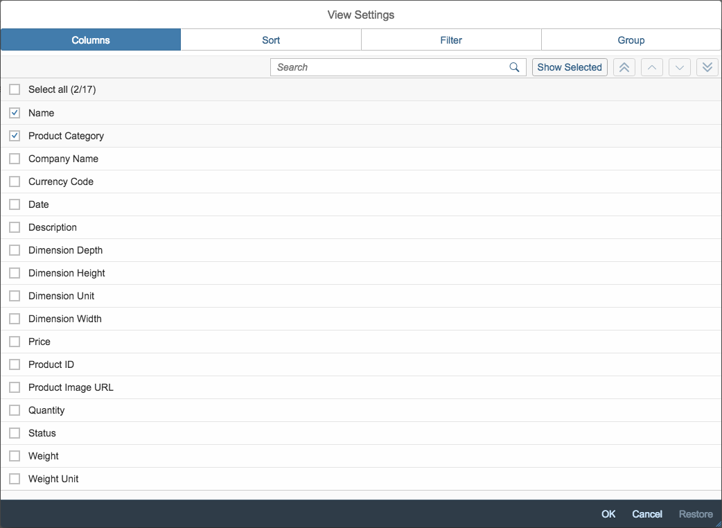
P13n/personalization dialog
Filter Settings
The “Show Field as Column” option for newly added filters is switched on by default.
Sorting and Filtering
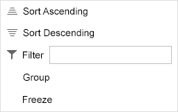
The smart table allows you to add sort and filter settings for each column. These settings enable the corresponding pages in the P13n dialog. For the grid table, analytical table, and tree table, sorting and filtering are also enabled on the column header. (Annotations: sap:sortable and sap:filterable)
Column header menu of the grid table
Smart Table and Smart Filter Bar
The smart table can be linked to a smart filter bar. If linked, filter bar settings are automatically used on the smart table. (sap.ui.comp.smarttable,SmartTable, property:smartFIlterId)
Aggregation
If used with the analytical table, the smart table allows total sums of measure columns to be calculated. The totals are shown in the usual way:
- As the last row of the analytical table.
- As the last row of each group if the group is expanded.
- On the group header of each group if the group is collapsed.
Aggregation settings are not persisted (annotation: sap:aggregation-role, value:measure).
The total count be hidden via the column header menu.

Aggregation entry in column header menu of the grid table
Column Width
A default column width is calculated for each column based on the data displayed in it. Important: end users cannot change the column width in the responsive table (annotations: MaxLength, Precision, Scale).
Column Header
A column header text can be specified for each column (annotation: sap:label).
Persistence
The smart table allows you to persist sort, group, and filter column settings (such as by hidden columns) as well as variants (sap.ui.comp.smarttable.SmartTable, Property:persistenceyKey).
Content
The smart table provides two options to create columns automatically:
- The smart table is rendered in either read-only or edit mode. In this case, the smart table renders the controls as described below. This is the default way of rendering content (property: editable)
- If users need to switch between read-only and edit mode at runtime, the smart table allows smart fields to be rendered instead. You should use this if the edit button is added to the toolbar of the smart table (aggregation: customData key: useSmartField, property: smartToggle).
For option 1, the following controls are used:
- To show currency amounts, the smart table allows the amount and the currency code to be displayed in a single cell. For read-only mode, the currency control is used. For edit mode, a single input field is used, and the currency itself is shown next to the input field as non-editable text (annotation: sap:semantics, value: currency-code).
- To show links that open a quick view, the smart table supports the smart link.
- To show static text, the smart table uses an input field in edit mode, and a text in read-only mode.
- To show dates, the smart table uses a date picker in edit mode, and a text in read-only mode (annotation: sap:display-format, value:Date).
- To show decimal numbers, the smart table uses an input field in edit mode, and a text in read-only mode (Annotations:Precision, Scale).
- The smart table also provides an object status and object identifier control. For more information, see object display components.
- Pictures and microcharts, as well as rating indicators and progress bars are available.
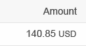
Amount formatting
Link formatting
Date formatting
Value Help
The smart table supports value help in the following ways (annotation: ValueList):
- Input fields can show a value help button. Triggering this button opens a value help dialog. Within this dialog, you can provide a search field (annotation:ValueList, property: SearchSupported).
- You can restrict the number of characters for the input field. Use this if no ValueList annotation is provided (annotation:MaxLength).
Toolbar Level
Table Title
The smart table can provide a title for the table within the toolbar (sap.ui.comp.smarttable.SmartTable, Property:header).
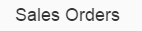
Table title
Item Count
Next to the table title, an item count can be shown (sap.ui.comp.smarttable.SmartTable, Property:showRowCount).
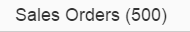
Table title with item count
Edit
The table toolbar can contain a button for toggling the table between read-only and edit modes. If smart fields are used, the smart table handles both modes automatically (sap.ui.comp.smarttable.SmartTable, properties:editTogglable, smartToggle, aggregation: customData, key: useSmartField).
If used with the responsive table, the edit button also switches the keyboard behavior accordingly.

Edit button
View Settings
The table toolbar can contain a button for opening the P13n dialog. This dialog provides extensive sort, group, and filter settings. It also allows columns to be shown, hidden, or rearranged (sap.ui.comp.smarttable.SmartTable, Property:useTablePersonalisation).

Settings button
Export to Spreadsheet
If the back end supports the export of data to spreadsheet, the table toolbar can contain a corresponding button. When this button is triggered, the corresponding file is created and the download starts automatically (sap.ui.comp.smarttable.SmartTable, Property:useExportToExcel).

Export to Spreadsheet button
Full Screen Mode
Applications can implement a maximize button to run the table in full screen (Property: showFullScreenButton).

Maximize button
Footer Toolbar Level
Buttons in the footer toolbar can be set to emphasized to give them a brighter appearance.
Guidelines
In general, the guidelines for the underlying table, toolbar, variant management, and P13n dialog also apply to the smart table (see the corresponding articles for details). However, because the smart table does not offer the complete flexibility of the underlying controls, there are certain differences.
Table Type
The responsive table is the standard table for SAP Fiori. Use the responsive table whenever possible. It is the most flexible table in terms of how its content is displayed, it is fully responsive, and it can handle up to 1,000 line items.
If you cannot use the responsive table, consider using the grid table instead. The grid table can handle a large number of line Items. Compared to the responsive table, however, it is more restricted content-wise (only certain controls can be used to show the data, and only one control per cell), and it does not run on smartphones. If you use the grid table, you need to provide a fallback solution for smartphones, for example, by using the responsive table.
The analytical table is similar to the grid table, but adds several grouping levels and offers total sums on measure columns. The analytical table can also handle a large number of line Items. Compared to the responsive table, however, it is more restricted content-wise (only certain controls can be used to show the data, and only one control per cell), and it does not run on smartphones. If you use the analytical table, you need to provide a fallback solution for smartphones, for example, by using the responsive table.
The tree table is the only table for displaying hierarchical data. Like the grid table, it can handle a large number of line items, although it is restricted content-wise (only certain controls can be used to show the data, and only one control per cell), and it does not run on smartphones. If you use the tree table, you need to provide a fallback solution for smartphones, for example, by using the responsive table.
For more information about the different table controls, see the corresponding articles.
Table Title, Item Count, and Variant Management
Always show the item count together with the table title, unless this is expected to cause performance problems.
If used with the responsive table and if more than 200 items are generally expected, do not show the item count. In this case, the smart table displays a More button to load additional rows. Using the item count together with the More button might lead to confusion (sap.ui.comp.smarttable.SmartTable, Property:showRowCount).
Even if variant management is easy to implement, use it only if it is really needed. The variant management saves the whole page, including filter settings and table layouts.
Empty Tables
Try not to display an empty table. If there is no way around this, provide instructions on how to fill the table with data (aggregatrion: noData).
Columns – Best Practices
Keep the number of initially shown columns to a minimum. Avoid the need to scroll horizontally on a tablet screen size in default delivery (annotation: PresentationVariant/ LineItem).
Keep the number of additional (initially hidden) columns to a minimum. You can use the P13n dialog to show/hide the columns. Select the columns offered in the P13n dialog carefully. Do not just show all columns available in the backend tables (annotation: sap:visible, value:false).
For the grid table, analytical table, and tree table, the column widths are calculated automatically if the corresponding OData annotations are provided (annotations: MaxLength, Precision, Scale).
In contrast, the responsive table uses the same width for all columns.
If used with the responsive table, enable the pop-in behavior (sap.ui.comp.smarttable.SmartTable, property: smartFilterId, value: true).
Show the most important column on the left and the least important on the right. This ensures that the most important columns stay in the tabular layout as long as possible. The most important columns are those that contain the following information:
- The column that identifies the line item
- The column that contains the key attribute
(Annotation: PresentationVariant/ LineItem, Property: initiallyVisibleColumns)
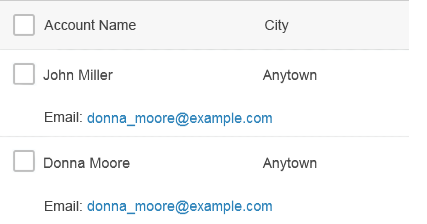
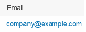
Email column in the pop-in area of the responsive table
Provide a column header text for each column. Do not truncate the column header text in default delivery (annotation: sap:label).

Column header text
Content Alignment and Formatting
The smart table automatically takes care of content alignment and formatting in standard use cases. For this, the OData metadata needs to provide the correct information about the data types, semantics of, and value help for the data.
(Annotations such as: sap:semantics, value: currency-code, edm types, Annotation: sap:display-format, value:Date, Annotation:Precision, Annotation: Scale, Annotation: ValueList, Annotation: ValueList:semantics, value:fixed-values)
Highlight Items
If the smart table is used with the responsive table, you can show the status of an item by displaying a highlight indicator in front of the item (property: highlight). The highlight indicator can be used to show:
- A semantic state, such as red or orange for an error or warning
- A neutral highlight, such as blue to highlight newly added items
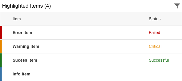
Highlighted items
Actions
To trigger actions on multiple items, use a mutliselection smart table. Do not offer action triggering on multiple items if the table is expected to have fewer than 10 items in most cases.
While the grid table, analytical table, and tree table are multiselectable by default within the smart table, the responsive table is single-selectable. The selection mode can be changed (XMLView).
The following actions can be shown on the standard toolbar of the smart table:
- Edit
Toggles the table between edit and read-only mode. This only works if smart fields are used inside the smart table (sap.ui.comp.smarttable.SmartTable, properties:editTogglable, smartToggle, aggregation: customData, key: useSmartField).
- View Settings
This button opens the P13n dialog. Note that the P13n dialog is quite complex. Neither the simpler view settings dialog nor the table personalization dialog can be used without the app development team developing the entire view settings handling (sap.ui.comp.smarttable.SmartTable, Property:useTablePersonalisation).
- Export to Spreadsheet
Only use this option if your end users typically export the data shown in the table in order to work with it in a spreadsheet application. This is usually the case if data is collected from several systems and analyzed in the spreadsheet application. This is not usually the case for worklists, attachment lists, lists with only a few items, shopping carts, or data that does not need to be analyzed. This option is only available if the corresponding back end supports exporting to spreadsheet (sap.ui.comp.smarttable.SmartTable, property: useExportToExcel).
If additional actions are needed, use a custom toolbar for the table. The smart table can also add integrated functionality such as a table title, item count, variant management, edit and view settings, and export to spreadsheet to the custom toolbar (aggregation: customToolbar).
For navigation to line item details:
- If used with the responsive table, use the navigation mode of the responsive table.
- If used with the grid table, analytical table, or tree table, use a link for the attribute that identifies the row. The user can click this link to trigger the navigation.
Clicking a table row can trigger drill-in navigation to a deeper level of the object, as well as cross-navigation to another SAP Fiori app or even to another system.
Inline Actions
Actions that belong to single items can be placed within the row. They can be displayed as text or icons. Make sure the icon communicates the function clearly enough. Otherwise, use a textual button.
Editable Content
The smart table can be editable or read-only (sap.ui.comp.smarttable.SmartTable, property: editable).
The smart table selects the corresponding editable controls automatically based on the data type, semantic annotations, and value list annotations (annotations such as: sap:semantics, value: currency-code, edm types, Annotation: sap:display-format, value:Date, Annotation:Precision, Annotation: Scale, Annotation: ValueList, Annotation: ValueList:semantics, value:fixed-values).
If an edit mode is needed, the controls are automatically switched from read-only controls (such as text) to editable controls (such as input field or date picker) if smart fields are used inside the smart table (sap.ui.comp.smarttable.SmartTable, Property:editTogglable, smartToggle, aggregation: customData, key: useSmartField). The keyboard behavior is switched accordingly, if this is used together with the responsive table.
Only use this if you need to toggle between both modes. In any other case, show only the mode you need (read-only or edit), but do not offer the switch.
View Settings: Sort, Filter, Group, and Column Settings
If view settings are enabled on the smart table, a settings button is available on the table toolbar. This button opens the P13n dialog. Neither the simpler view settings dialog nor table personalization dialog can be used without extra effort (sap.ui.comp.smarttable.SmartTable, Property:useTablePersonalisation).
The P13n dialog always enables the user to show, hide, and rearrange columns. Alternatively, it can contain settings for sorting, grouping, and/or filtering (annotations: sap:sortable, sap:filterable)
If the smart table uses the grid table, analytical table, or tree table, sort, filter, and group settings are also available in the column header menu.
Offer view settings only if they are really needed. For example, these settings do not make sense if the table contains only a few items and just a few columns.
Note that the P13n dialog is quite complex. It is ideal for tables with a vast number of items, but is quite cumbersome for handling just a few hundred items. Therefore, show only the settings (sort, group, filter) you really need. For example, do not offer grouping if it does not support your use case well.
If filtering is a main use case, do not offer filtering in the P13n dialog. Use the filter bar instead (annotation: sap:filterable)
Be persistent: When the app is reopened, the smart table is shown with the same view settings as last defined by the user (sap.ui.comp.smarttable.SmartTable, property: persistenceKey).
Sort
The current sort state is displayed as follows:
- Using the responsive table, there is no indication that the table is currently sorted.
- Using the grid table, analytical table, or tree table, an icon in the column header of the last sorted column indicates that the table is sorted and the direction in which it is sorted.
In default delivery, sort items in a meaningful order by the row-identifying column (usually the first column in default delivery). For example, use an alphabetical order for text, a numeric order for numbers, and a chronological order for dates (annotations: sap:sortable, PresentationVariant – SortOrder).
Filter
The current filter state is displayed as follows:
- Using the responsive table, there is no indication that the table is currently filtered. The filter info bar can be added with additional effort.
- Using the grid table, analytical table, or tree table, filtering is displayed by an icon on the column header of each filtered column (annotation: sap:filterable).
Group
Group headers display the current group state and are shown automatically. The following text should be shown on the group header:
[Label of the grouped column]: [Grouping value]
This can be done by the smart table, but only if the raw data from the model can be used. In other cases, app development teams must format the group header text. For example, the raw data carries IDs, while the table displays the corresponding names, which are provided by another data source. In this case, app developers must provide the formatting for the group header texts.
Within the responsive table, the grouped column keeps its visibility to reduce confusion after the group settings have been changed. If visible, it stays in the tabular layout even if grouped.
If used with the analytical table, grouping is not offered on measures. Therefore, you can have aggregations or grouping for a specific column.
Reasonable grouping can be offered by default via the property GroupBy.
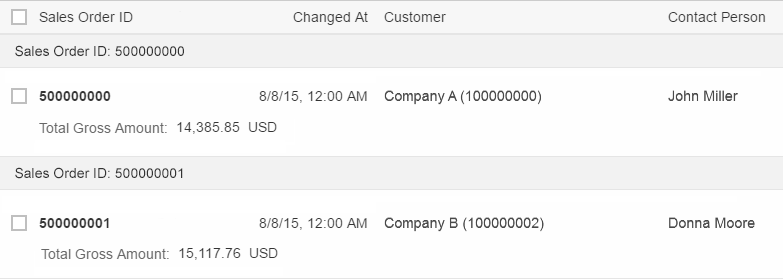
Responsive table grouped by country
Aggregate
If used with the analytical table, aggregation settings can be provided on measure columns. These settings are only available in the column header menu.
To display the current aggregation state, the total sum of the corresponding column is shown at the bottom of the table.
If items are grouped, an intermediate sum is shown per group:
- At the bottom of each group if the group is expanded.
- In the group header if the group is collapsed.
Aggregations are only available on measures, but not on objects or attributes. If aggregation is enabled for a column, this column cannot be grouped.
Avoid aggregations on the first three columns for the default delivery. When grouping is used together with aggregations, collapsing a group shows the aggregation on the group header. This conflicts with the group name.
Where appropriate, offer reasonable aggregation by default (annotation: sap:aggregation-role, value: measure).
Column Settings
Only offer column settings if you need more columns than a tablet screen can display at a time (usually more than five).
If sorting, grouping, and/or filtering are needed, column settings must also be shown (sap.ui.comp.smarttable.SmartTable, Property:useTablePersonalisation).
Add, Remove, Rearrange Columns
Use the P13n dialog to add, remove, and rearrange columns.
When used with the grid table, analytical table, or tree table, columns can also be rearranged by dragging and dropping the column header (sap.ui.comp.smarttable.SmartTable, Property:useTablePersonalisation).
Resize Columns
When used with the grid table, analytical table, or tree table, columns can be resized on the column header (sap.ui.comp.smarttable.SmartTable, Property:useTablePersonalisation).
Freeze Columns
When used with the grid table, analytical table, or tree table, app developers must manually add the options for freezing columns to the column header menu if necessary. They can do this by declaring the corresponding table inside the smart table in the XML view, and by using the corresponding settings on this inner table.
Selecting Freeze on a column freezes all columns from the first one to the one on which Freeze is selected. The menu entry on this column changes from Freeze to Unfreeze.
Properties
The following properties are available on sap.ui.comp.smarttable.SmartTable:
- The property: ignoreFields defines the columns that are not available on the UI – neither in the initial visible columns nor in the P13n dialog.
- The property: requestAtLeastFields can be used for requesting additional technical columns.
- The property: ignoreFromPersonalization removes columns from the P13n dialog.
- The property: toolbarStyleClass is deprecated. Do not use it.
- The property: enableCustomFilter allows the filter menu item in the column header menu to be exchanged.
- The property: useOnlyOneSolidToolbar is deprecated. Do not use it.
- The property: currentVariantId defines the currently used variant.
- The property: enableAutoBinding fetches the data automatically as soon as the corresponding OData model is initialized and the smart table is created.
- The property: tableBindingPath defines the path from which the data is fetched.
- The property: smartToggle influences the way on which controls are displayed in the smart table if smart fields are used.
The following aggregations are available:
- The aggregation: semanticObjectController is used to customize smart links inside the smart table.
- The aggregation: noData provides a text in case the table contains no line items. For example, this can be the case if the table is filtered. The text should provide context-specific instructions on how to get data into the table.
Resources
Want to dive deeper? Follow the links below to find out more about related controls, the SAPUI5 implementation, and the visual design.
Elements and Controls
- Responsive Table (guidelines)
- Grid Table (guidelines)
- Analytical Table (guidelines)
- Tree Table (guidelines)
- Table Overview (guidelines)
- Table Toolbar (guidelines)
- Variant Management (guidelines)
- P13n-Dialog (guidelines)
Implementation
- Smart Table (SAPUI5 samples)
- Smart Table (SAPUI5 API reference)
- Smart Table (Developer Guide)
- P13n-Dialog (SAPUI5 samples)
- P13n-Dialog (SAPUI5 API reference)
- Toolbar (SAPUI5 samples)
 Your feedback has been sent to the SAP Fiori design team.