- Latest Version 1.128
- Version 1.126
- SAPUI Version 1.124
- SAPUI5 Version 1.122
- SAPUI5 Version 1.120
- SAPUI5 Version 1.118
- SAPUI5 Version 1.116
- SAPUI5 Version 1.114
- SAPUI5 Version 1.112
- SAPUI5 Version 1.110
- SAPUI5 Version 1.108
- SAPUI5 Version 1.106
- SAPUI5 Version 1.104
- SAPUI5 Version 1.102
- SAPUI5 Version 1.100
- SAPUI5 Version 1.98
- SAPUI5 Version 1.96
- SAPUI5 Version 1.94
- SAPUI5 Version 1.92
- SAPUI5 Version 1.90
- SAPUI5 Version 1.88
- SAPUI5 Version 1.86
- SAPUI5 Version 1.84
- SAPUI5 Version 1.82
- SAPUI5 Version 1.80
- SAPUI5 Version 1.78
- SAPUI5 Version 1.76
- SAPUI5 Version 1.74
- SAPUI5 Version 1.72
- SAPUI5 Version 1.70
- SAPUI5 Version 1.68
- SAPUI5 Version 1.66
- SAPUI5 Version 1.64
- SAPUI5 Version 1.62
- SAPUI5 Version 1.60
- SAPUI5 Version 1.58
- SAPUI5 Version 1.56
- SAPUI5 Version 1.54
- SAPUI5 Version 1.52
- SAPUI5 Version 1.50
- SAPUI5 Version 1.46
- SAPUI5 Version 1.44
- SAPUI5 Version 1.42
- SAPUI5 Version 1.40
- SAPUI5 Version 1.38
- SAPUI5 Version 1.36
- SAPUI5 Version 1.34
- SAPUI5 Version 1.32
- SAPUI5 Version 1.30
- SAPUI5 Version 1.28
- SAPUI5 Version 1.26
- Latest Version 1.128
- Version 1.126
- SAPUI Version 1.124
- SAPUI5 Version 1.122
- SAPUI5 Version 1.120
- SAPUI5 Version 1.118
- SAPUI5 Version 1.116
- SAPUI5 Version 1.114
- SAPUI5 Version 1.112
- SAPUI5 Version 1.110
- SAPUI5 Version 1.108
- SAPUI5 Version 1.106
- SAPUI5 Version 1.104
- SAPUI5 Version 1.102
- SAPUI5 Version 1.100
- SAPUI5 Version 1.98
- SAPUI5 Version 1.96
- SAPUI5 Version 1.94
- SAPUI5 Version 1.92
- SAPUI5 Version 1.90
- SAPUI5 Version 1.88
- SAPUI5 Version 1.86
- SAPUI5 Version 1.84
- SAPUI5 Version 1.82
- SAPUI5 Version 1.80
- SAPUI5 Version 1.78
- SAPUI5 Version 1.76
- SAPUI5 Version 1.74
- SAPUI5 Version 1.72
- SAPUI5 Version 1.70
- SAPUI5 Version 1.68
- SAPUI5 Version 1.66
- SAPUI5 Version 1.64
- SAPUI5 Version 1.62
- SAPUI5 Version 1.60
- SAPUI5 Version 1.58
- SAPUI5 Version 1.56
- SAPUI5 Version 1.54
- SAPUI5 Version 1.52
- SAPUI5 Version 1.50
- SAPUI5 Version 1.48
- SAPUI5 Version 1.46
- SAPUI5 Version 1.44
- SAPUI5 Version 1.42
- SAPUI5 Version 1.40
- SAPUI5 Version 1.38
- SAPUI5 Version 1.36
- SAPUI5 Version 1.34
- SAPUI5 Version 1.32
- SAPUI5 Version 1.30
- SAPUI5 Version 1.28
- SAPUI5 Version 1.26
PDF Viewer
sap.m.PDFViewer
Intro
The PDF viewer control displays PDF documents within your app. It can be embedded in your page layout, or you can set it to open in a popup dialog. In addition, this control allows you to print and download the PDF documents it displays.
Usage
Use the PDF viewer control if:
- You want your app to display PDF files on all devices and platforms.
- You want the users of your app to be able to preview their documents as PDF files right inside your app.
- You need to ensure the consistent behavior of PDF files across all SAP Fiori apps.
- You need to work with events (loaded, validation, error) provided by the PDF viewer.
Do not use the PDF viewer if:
- You need to provide an interactive PDF file (such as a data input form).
Responsiveness
The PDF viewer control is fully responsive on large-screen devices (size L). The range of responsive behavior available on desktop devices depends on the display mode.
- When the PDF viewer opens in a dialog popup:
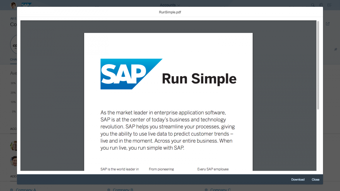
By default, the dialog supports two or more actions, such as Close and Download. On large-screen (desktop) devices, the action buttons are right-aligned. Use compact mode to ensure optimal padding and margins on desktop devices.
If the content height is increased beyond the screen height, the dialog height cannot go beyond 4 rem from the top and bottom of the screen.
The dialog popup must be resized automatically and cannot support dragging or custom resizing.
- When the PDF viewer is embedded in a container on the app page:
The dimensions of the frame in which the PDF file is displayed are defined by the PDF viewer properties.
The control in which the PDF viewer is embedded must have at least 1 rem (16 px) padding to set it apart from the rest of the content.
Only vertical scrolling is allowed. The behavior of desktop touch devices should follow the default behavior of the device or platform.
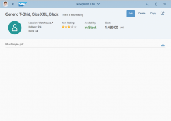
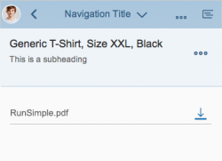
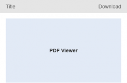
On mobile devices (smartphones and tablets), the PDF viewer control renders a toolbar with the title and a download icon, which behaves as a standard device/browser file link.
If required, you can customize the behavior for mobile devices and trigger the default device action for the file link from a different anchor in the application.
Layout
Displaying PDF Files in a Dialog
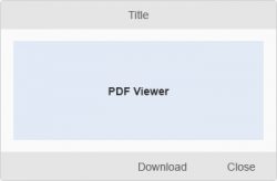
The dialog is positioned in the center of the screen. It opens in a modal window to attract the user’s attention when it displays emergency states. The dialog consists of:
- A dialog header
- A dialog PDF content
- A dialog footer
Displaying Embedded PDF Files
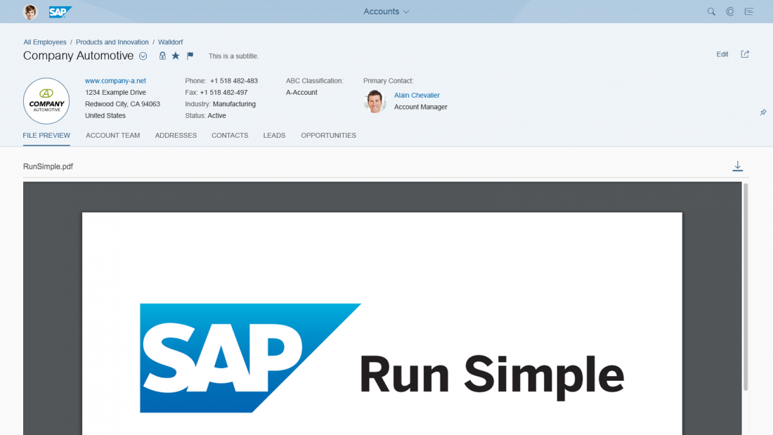
The secondary mode of the PDF viewer displays PDF files directly on the page. The application owner, using the PDF viewer control, provides the dimensions of the frame in which the PDF file is embedded. The container should have at least 1 rem (16px) padding from the other content on the page to allow users to distinguish between the embedded PDF and the rest of the page’s content.
When the PDF viewer is embedded on the page, it comprises:
- An overflow toolbar header
- A container for rendering the PDF file (determined by the application owner)
Components
The PDF viewer in popup mode is rendered within a Dialog and consists of:
Title(Header): The title text appears in the dialog header.
Content: This area contains the actual PDF file displayed within the content of the dialog.
Footer with actions: The footer contains two mandatory buttons: Close and Download. Other actions can be added to the footer as well.
The PDF viewer in embedded mode can be rendered in any container desired by the application.
The title is displayed within the Toolbar (Overflow Toolbar).
Behavior and Interaction
All the interactions for the PDF files themselves must remain the same across platforms and browsers: paging, scrolling, zooming, and print must all be available.
Download – For accessibility reasons, the PDF viewer always provides an additional download button for downloading the displayed PDF file and gives users the option to download the embedded PDF renderer on a specific device or system (not all PDF reader plugins have their own download button).
Popup mode interactions:
- No custom resizing of the dialog
- No dragging of the dialog
Guidelines
To avoid the risk of performance issues, do not embed more than three instances of the PDF viewer per page. You may embed more instances of the PDF viewer in one page if the number of PDFs does not affect performance. Carry out benchmark tests to ensure that performance will not be affected.
The PDF viewer can be used within other sap.m components, such as carousel and panel, respecting the specific guidelines of these components.
The embedded mode of the PDF viewer can be used on the Object Page if the container is as wide as the object page. If this is not the case, use the popup mode of the PDF viewer instead.
The PDF viewer can provide accessibility options when used with screen readers and other accessibility software. To ensure that all the accessibility options are supported, you need to have Adobe PDF Reader installed.
Resources
Want to dive deeper? Follow the links below to find out more about related controls, the SAPUI5 implementation, and the visual design.

 Your feedback has been sent to the SAP Fiori design team.