
- Latest Version 1.128
- Version 1.126
- SAPUI Version 1.124
- SAPUI5 Version 1.122
- SAPUI5 Version 1.120
- SAPUI5 Version 1.118
- SAPUI5 Version 1.116
- SAPUI5 Version 1.114
- SAPUI5 Version 1.112
- SAPUI5 Version 1.110
- SAPUI5 Version 1.108
- SAPUI5 Version 1.106
- SAPUI5 Version 1.104
- SAPUI5 Version 1.102
- SAPUI5 Version 1.100
- SAPUI5 Version 1.98
- SAPUI5 Version 1.96
- SAPUI5 Version 1.94
- SAPUI5 Version 1.92
- SAPUI5 Version 1.90
- SAPUI5 Version 1.88
- SAPUI5 Version 1.86
- SAPUI5 Version 1.84
- SAPUI5 Version 1.82
- SAPUI5 Version 1.80
- SAPUI5 Version 1.78
- SAPUI5 Version 1.76
- SAPUI5 Version 1.74
- SAPUI5 Version 1.72
- SAPUI5 Version 1.70
- SAPUI5 Version 1.68
- SAPUI5 Version 1.66
- SAPUI5 Version 1.64
- SAPUI5 Version 1.62
- SAPUI5 Version 1.60
- SAPUI5 Version 1.58
- SAPUI5 Version 1.56
- SAPUI5 Version 1.52
- SAPUI5 Version 1.50
- SAPUI5 Version 1.48
- SAPUI5 Version 1.46
- SAPUI5 Version 1.44
- SAPUI5 Version 1.42
- SAPUI5 Version 1.40
- SAPUI5 Version 1.38
- SAPUI5 Version 1.36
- SAPUI5 Version 1.34
- SAPUI5 Version 1.32
- SAPUI5 Version 1.30
- SAPUI5 Version 1.28
- SAPUI5 Version 1.26
- Latest Version 1.128
- Version 1.126
- SAPUI Version 1.124
- SAPUI5 Version 1.122
- SAPUI5 Version 1.120
- SAPUI5 Version 1.118
- SAPUI5 Version 1.116
- SAPUI5 Version 1.114
- SAPUI5 Version 1.112
- SAPUI5 Version 1.110
- SAPUI5 Version 1.108
- SAPUI5 Version 1.106
- SAPUI5 Version 1.104
- SAPUI5 Version 1.102
- SAPUI5 Version 1.100
- SAPUI5 Version 1.98
- SAPUI5 Version 1.96
- SAPUI5 Version 1.94
- SAPUI5 Version 1.92
- SAPUI5 Version 1.90
- SAPUI5 Version 1.88
- SAPUI5 Version 1.86
- SAPUI5 Version 1.84
- SAPUI5 Version 1.82
- SAPUI5 Version 1.80
- SAPUI5 Version 1.78
- SAPUI5 Version 1.76
- SAPUI5 Version 1.74
- SAPUI5 Version 1.72
- SAPUI5 Version 1.70
- SAPUI5 Version 1.68
- SAPUI5 Version 1.66
- SAPUI5 Version 1.64
- SAPUI5 Version 1.62
- SAPUI5 Version 1.60
- SAPUI5 Version 1.58
- SAPUI5 Version 1.56
- SAPUI5 Version 1.54
- SAPUI5 Version 1.52
- SAPUI5 Version 1.50
- SAPUI5 Version 1.48
- SAPUI5 Version 1.46
- SAPUI5 Version 1.44
- SAPUI5 Version 1.42
- SAPUI5 Version 1.40
- SAPUI5 Version 1.38
- SAPUI5 Version 1.36
- SAPUI5 Version 1.34
- SAPUI5 Version 1.32
- SAPUI5 Version 1.30
- SAPUI5 Version 1.28
- SAPUI5 Version 1.26
Line Micro Chart
sap.suite.ui.microchart.LineMicroChart
Intro
Usage
Use the line micro chart if:
You want to visualize the shape.
Use this option to show a trend or sparkline. By default, the chart is rendered in blue, but application developers can set any color for the chart using the names for semantic colors or names from the qualitative palette.
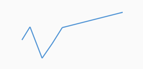
Line micro chart - Sparkline
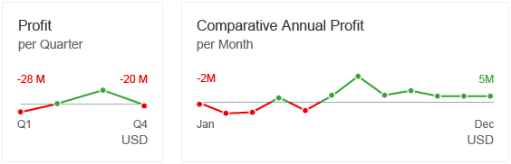
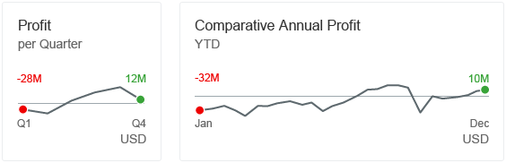
You want to show data points that are above or below a certain threshold.
Note that the threshold can also be set to zero.
In addition to data points, you can use two different colors for the lines. We recommend that you use only semantic colors for this option, such as green for values above the threshold, and red for values below the threshold.
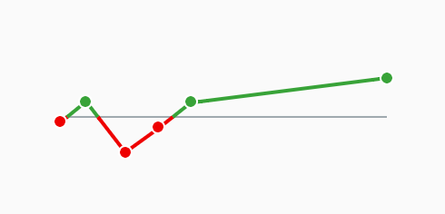
Line micro chart - Data points above and below a threshold
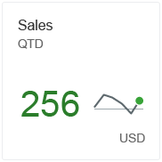
You want to show one or two focus points.
Use this option to display a trend or sparkline to focus on one or two special values, such as the first and/or last value of the chart. By default, the chart is rendered in blue, but application developers can choose another color for the chart line and data points from the qualitative palette.
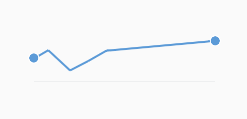
Line micro chart - 2 focus points
You want to show one or two focus points with semantic colors.
Use this option to display a trend or sparkline to focus on one or two special values with a semantic meaning, such as the first and/or last value above or below a certain threshold. Note that the threshold can also be set to zero.
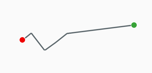
Line micro chart - 2 focus points with semantic meaning
Do not use the line micro chart if:
You have scenarios that do not depict time periods.
Responsiveness
See the micro chart overview article.
Layout
Line micro chart in a tile or facet
The chart with all functionalities and options mentioned above can be embedded in a tile or header facet. It will use the full height and width of the control.
Note: The title of the tile or header facet should clearly express the value of the threshold if it is not equal to zero, such as values above and below 50.
Line micro chart in a tile with data points above and below the zero threshold
Line micro chart (sparkline) in a tile with no semantic meaning
Line micro chart in a tile with focus on first and last data points
Line micro chart in a tile with a semantic focus point and KPI value
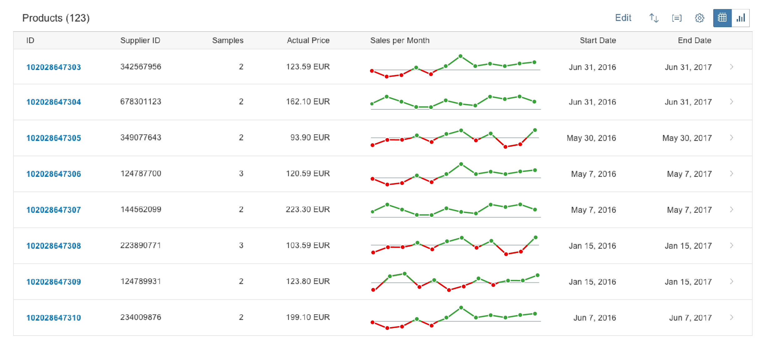
Line micro chart in a table with values above and below a threshold
Line micro chart in a table - Smaller size
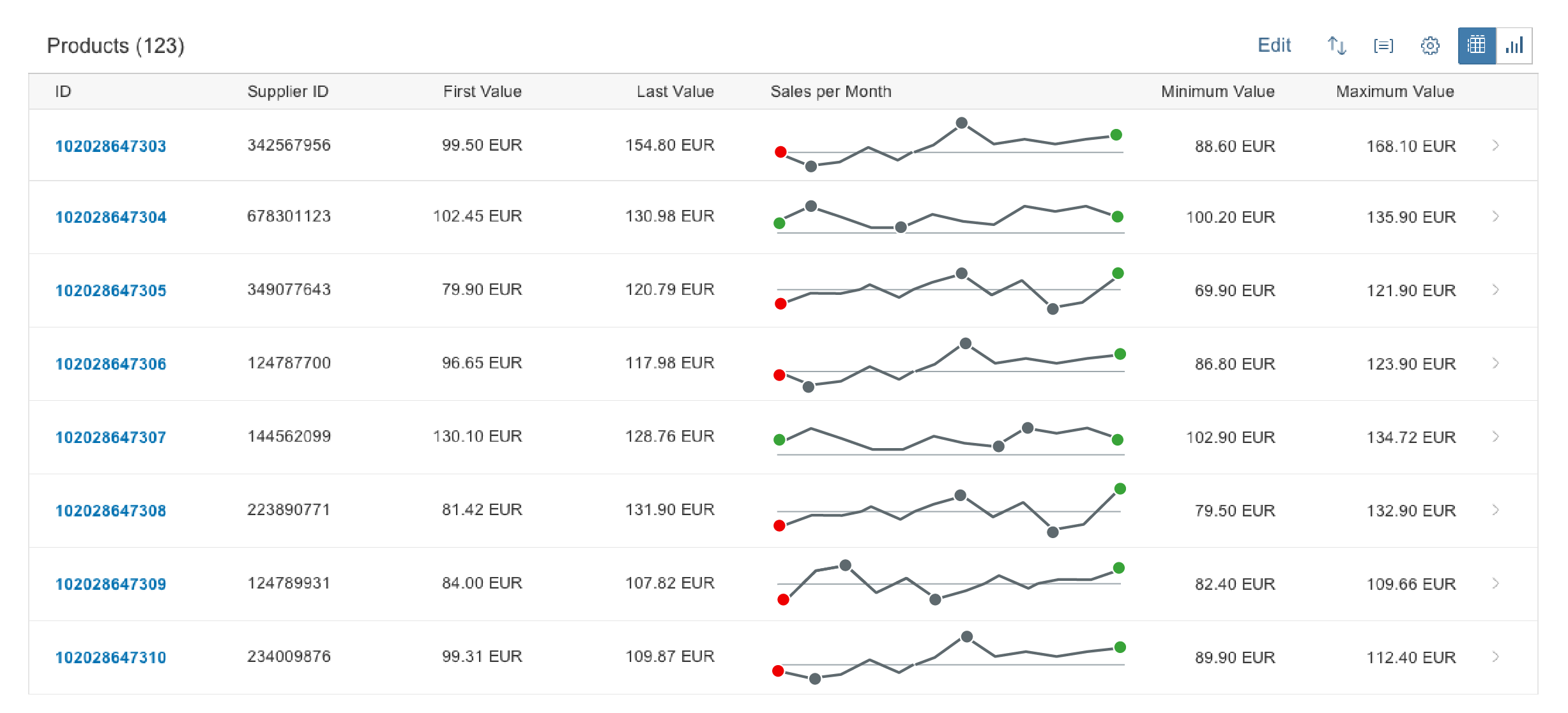
Line micro chart in a table with 4 focus points - First/last and min/max value

Line micro chart in a table with data points hidden
Components
To present the line micro chart in an appealing way, application developers can set several properties.
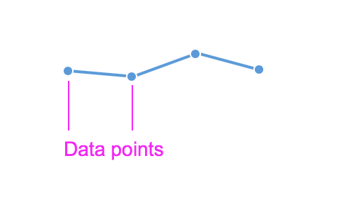
Data points
The line micro chart can display or hide data points. To display data points, we recommend that you use 4 (for quarters) to 12 (for months) data points per chart. The responsive behavior of the chart hides data points if there is not enough space to display them.
If data points have semantic colors (such as green for positive, orange for critical, and red for negative values), the line is colored grey.
If data points do not have a semantic meaning, application developers can assign any color from the qualitative palette. Note that same color is then also applied to the line.
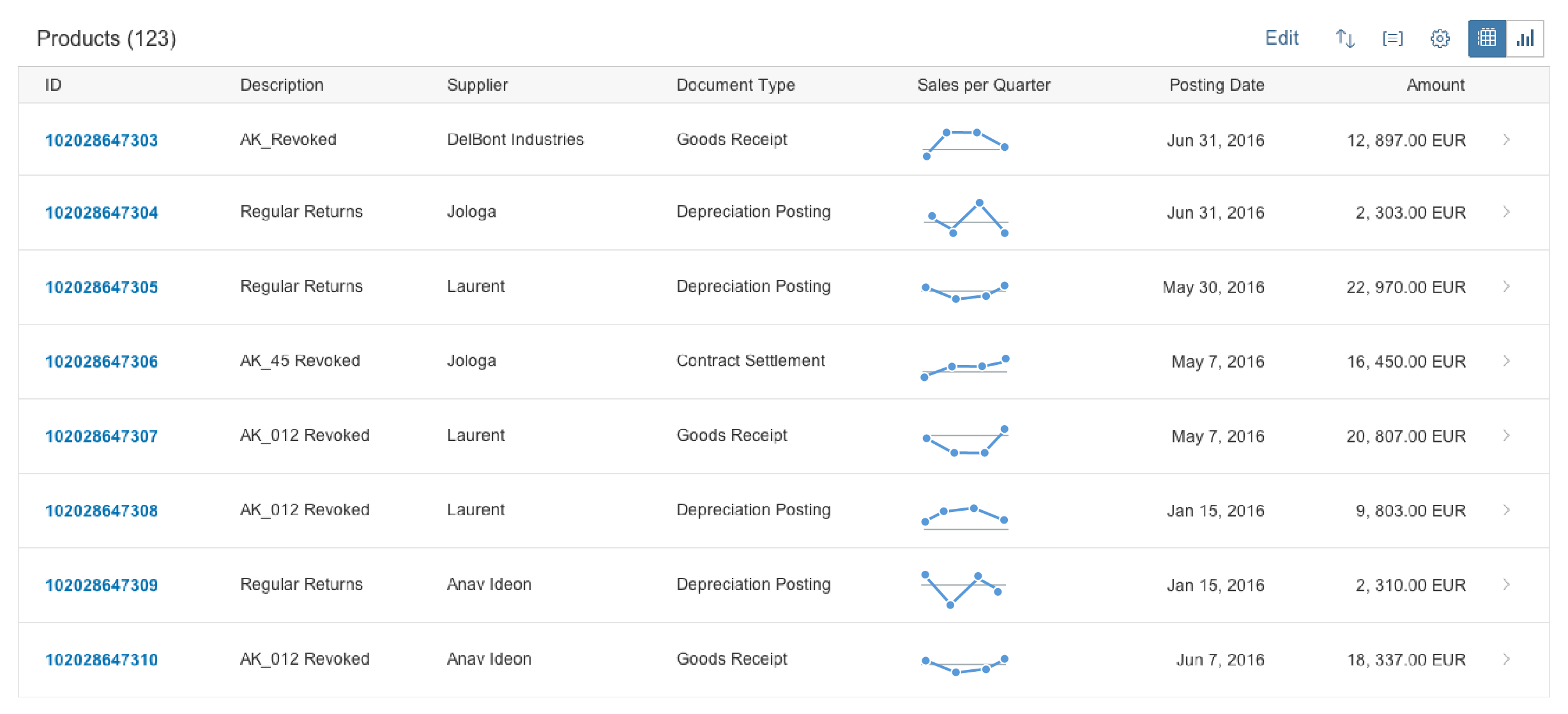
Alternatively, you can show a line-only chart, with all the data points hidden. In this case, you can use up to two colors per chart. If the values relate to a threshold, we recommend using semantic colors for the line to highlight values above or below the threshold.
Line micro chart - Data points
Focus points
Unlike data points, focus points highlight specific values, such as the first and/or last value of a time series. Neutral focus points are colored blue. Focus points with a semantic meaning are colored green, orange, or red.
Focus points are always displayed regardless of the size of the chart.

Line micro chart - Focus points
Threshold line
You can set a threshold line. If the threshold isn’t zero, include its value in the title of the tile, header facet, or column in lists and tables to ensure that the chart is not misleading for the user.
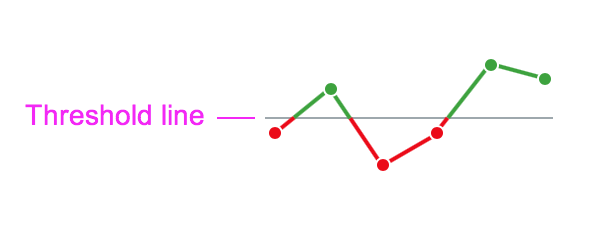
Line micro chart with threshold line
Labels
The labels for the line micro chart are optional. Use the bottom labels to indicate the beginning and the end of the time period. Use the top labels to show the corresponding values for the beginning and the end of the chart. Ensure that the labels for the values are not truncated.
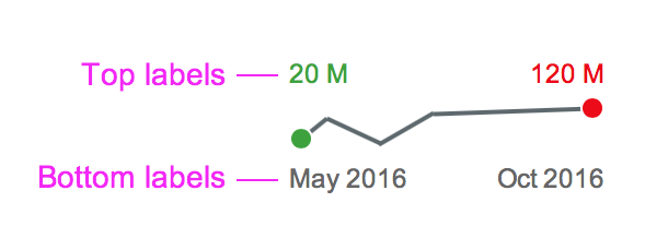
Line micro chart with labels
Scale
Application developers can set the scale manually or automatically. If the threshold is included in the scale, the chart always renders a horizontal reference line.
Use auto scale for lists and tables if you want to display a trend/sparkline per list/table element independently of other list/table elements.
Use the manual scale if list/table entries need to be synchronized. Entering the scale manually ensures that all charts within the list/table are comparable.
Resources
Want to dive deeper? Follow the links below to find out more about related controls, the SAPUI5 implementation, and the visual design.
 Your feedback has been sent to the SAP Fiori design team.