
- Latest SAPUI Version 1.124
- SAPUI5 Version 1.122
- SAPUI5 Version 1.120
- SAPUI5 Version 1.118
- SAPUI5 Version 1.116
- SAPUI5 Version 1.114
- SAPUI5 Version 1.112
- SAPUI5 Version 1.110
- SAPUI5 Version 1.108
- SAPUI5 Version 1.106
- SAPUI5 Version 1.104
- SAPUI5 Version 1.102
- SAPUI5 Version 1.100
- SAPUI5 Version 1.98
- SAPUI5 Version 1.96
- SAPUI5 Version 1.94
- SAPUI5 Version 1.92
- SAPUI5 Version 1.90
- SAPUI5 Version 1.88
- SAPUI5 Version 1.86
- SAPUI5 Version 1.84
- SAPUI5 Version 1.82
- SAPUI5 Version 1.80
- SAPUI5 Version 1.78
- SAPUI5 Version 1.76
- SAPUI5 Version 1.74
- SAPUI5 Version 1.72
- SAPUI5 Version 1.70
- SAPUI5 Version 1.68
- SAPUI5 Version 1.66
- SAPUI5 Version 1.64
- SAPUI5 Version 1.62
- SAPUI5 Version 1.60
- SAPUI5 Version 1.58
- SAPUI5 Version 1.56
- SAPUI5 Version 1.54
- SAPUI5 Version 1.52
- SAPUI5 Version 1.48
- SAPUI5 Version 1.46
- SAPUI5 Version 1.44
- SAPUI5 Version 1.42
- SAPUI5 Version 1.40
- SAPUI5 Version 1.38
- SAPUI5 Version 1.36
- SAPUI5 Version 1.34
- SAPUI5 Version 1.32
- SAPUI5 Version 1.30
- SAPUI5 Version 1.28
- SAPUI5 Version 1.26
- Latest SAPUI Version 1.124
- SAPUI5 Version 1.122
- SAPUI5 Version 1.120
- SAPUI5 Version 1.118
- SAPUI5 Version 1.116
- SAPUI5 Version 1.114
- SAPUI5 Version 1.112
- SAPUI5 Version 1.110
- SAPUI5 Version 1.108
- SAPUI5 Version 1.106
- SAPUI5 Version 1.104
- SAPUI5 Version 1.102
- SAPUI5 Version 1.100
- SAPUI5 Version 1.98
- SAPUI5 Version 1.96
- SAPUI5 Version 1.94
- SAPUI5 Version 1.92
- SAPUI5 Version 1.90
- SAPUI5 Version 1.88
- SAPUI5 Version 1.86
- SAPUI5 Version 1.84
- SAPUI5 Version 1.82
- SAPUI5 Version 1.80
- SAPUI5 Version 1.78
- SAPUI5 Version 1.76
- SAPUI5 Version 1.74
- SAPUI5 Version 1.72
- SAPUI5 Version 1.70
- SAPUI5 Version 1.68
- SAPUI5 Version 1.66
- SAPUI5 Version 1.64
- SAPUI5 Version 1.62
- SAPUI5 Version 1.60
- SAPUI5 Version 1.58
- SAPUI5 Version 1.56
- SAPUI5 Version 1.54
- SAPUI5 Version 1.52
- SAPUI5 Version 1.50
- SAPUI5 Version 1.48
- SAPUI5 Version 1.46
- SAPUI5 Version 1.44
- SAPUI5 Version 1.42
- SAPUI5 Version 1.40
- SAPUI5 Version 1.38
- SAPUI5 Version 1.36
- SAPUI5 Version 1.34
- SAPUI5 Version 1.32
- SAPUI5 Version 1.30
- SAPUI5 Version 1.28
- SAPUI5 Version 1.26
Overview Page (SAP Fiori Element)
Intro
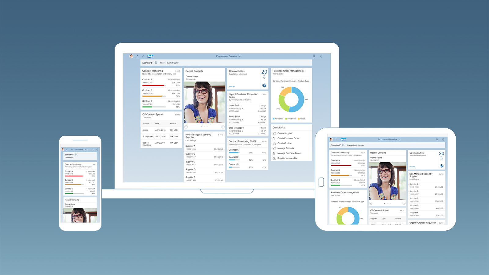
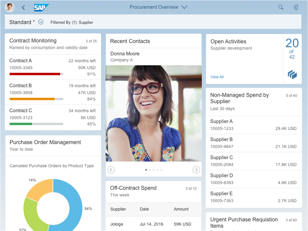
Overview page
View, filter, and take immediate action
The overview page (OVP) is a data-driven SAP Fiori app type and floorplan that provides all the information a user needs in a single page, based on the user’s specific domain or role. It allows the user to focus on the most important tasks, and view, filter, and react to information quickly.
Each task or topic is represented by a card (or content container). The overview page acts as a UI framework for organizing multiple cards on a single page. The overview page is based on SAP Fiori elements technology, and uses annotated views of app data, meaning that the app content can be tailored to the domain or role. Different types of card allow you to visualize information in an attractive and efficient way.
At a glance
-
Entry-level view of content on cards
-
One specific context and task area for one role
-
Content from different sources shows side by side – no need to switch screens
-
Information can be visualized on cards in different ways (texts, charts, lists, tables)
-
Easy filtering
-
Micro actions let users react on the spot
Usage
Use the overview page if:
- You want to provide an entry-level view of content related to a specific domain or role.
- Users needs to filter and react to information from at least two different applications to complete their role-specific tasks.
- You want to offer different information formats (such as charts, lists, and tables) on a single page.
- You plan to have at least three cards. These cards should not all be of the same type.
Do not use the overview page if:
- A high-level or birds-eye view of application content is sufficient.
- You just want the user to launch an application. In this case, use the SAP Fiori launchpad home page instead.
- You want to show information about one object only. In this case, use the object page instead.
- You just represent one application and less than three cards. In this case, use the object page instead.
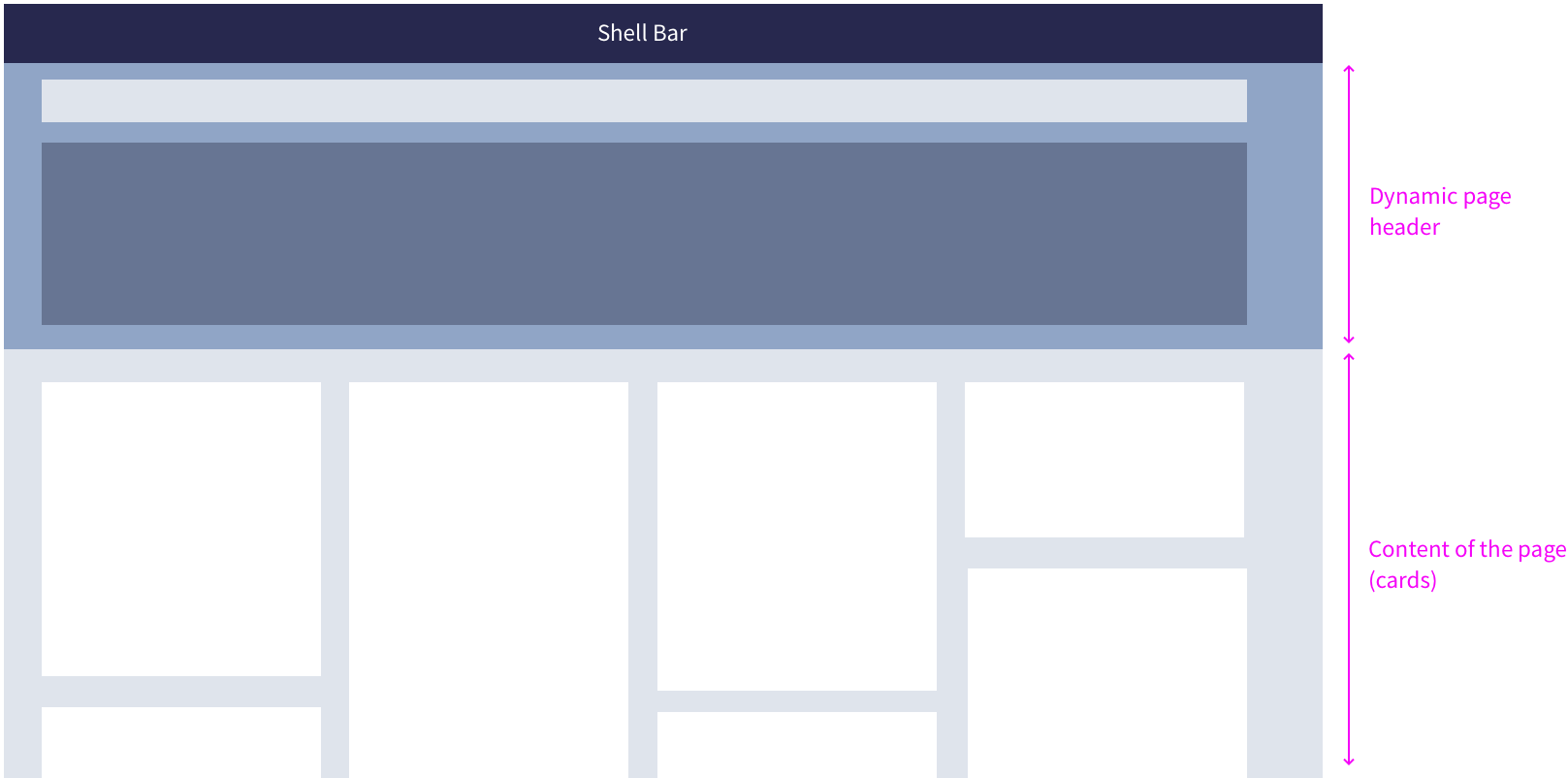
The Difference Between the SAP Fiori Launchpad Home Page, Overview Page, and Object Page
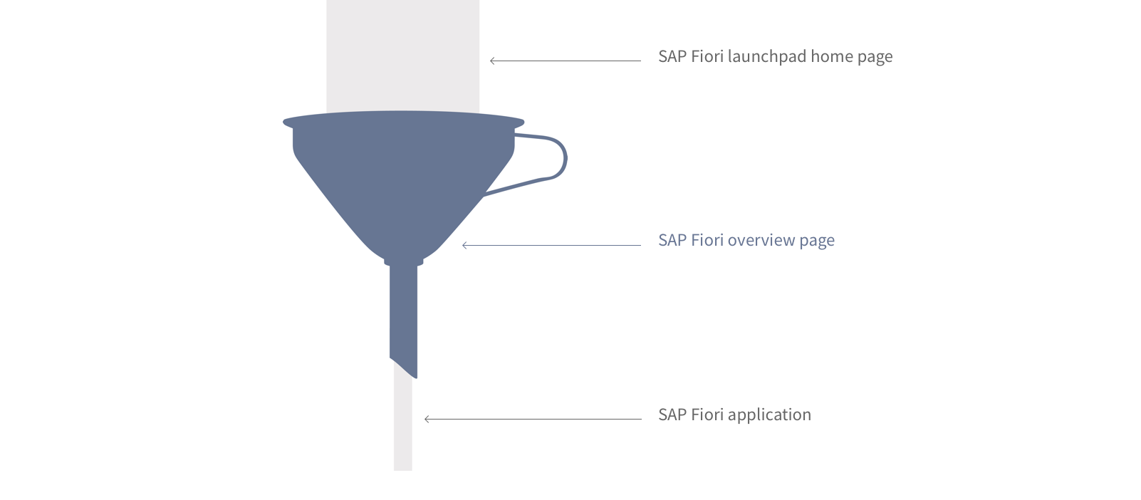
Different entry points in SAP Fiori
As you can see in the picture above, the overall content scope (shown in gray) becomes more focused with each interaction step. The launchpad home page contains all of a user’s favorite apps and offers access to them via tiles. This covers all the roles that a user might have, such as employee, manager, production worker, or quality manager.
An overview page focuses on the key tasks for a specific role, and contains only the most frequently-used apps for that role. The overview page uses cards, which display more (preview) information than tiles because of their size, properties, and interaction areas. One card type also allows users to perform simple actions. Cards represent an entry-level view of application content.
Launchpad Home Page vs. Overview Page
| Launchpad Home Page | Overview Page |
| Framework (given) | SAP Fiori application (optional) |
| “Birds-eye” view | “Street-level” view |
| Single point of entry | Specific business context for a role |
| One SAP Fiori launchpad per user | Multiple overview pages per user possible |
| Access to all the user’s favourite applications | Selected applications are presented as cards |
| Uses tiles | Uses cards |
| No actions | Micro actions |
The overview page is always role-based. The user sees a heterogeneous set of information related to a specific business context and the tasks associated with a specific role. This is not the case with the object page, which contains homogenous, object-based information.
Overview Page vs. Object Page
| Overview Page | Object Page |
| Role-based | Object-based |
| “Street-level” view | “Details” view |
| Heterogeneous information | Homogeneous information |
Role-Specific Overview Pages
Only provide an overview app for a role if it makes sense to do so. An overview page brings together information from different sources that support a specific task focus or information need. If a role or user has several such main tasks that each require a specific set of information, the role or user might also have multiple overview apps. For example, one overview app could be used to reflect the user’s role as manager, and allow him or her to manage the performance reviews of the team. Another overview app could be used to track quality issues and other relevant information pertaining to the machines that he or she is responsible for in the role of quality manager.
Dedicated Floorplan
While other floorplans like the list report and object page can be combined in a single app, there is a 1:1 relationship between the overview page floorplan and the corresponding overview app. The overview page floorplan is never combined with other floorplans. Because of this, the terms “overview page floorplan” and “overview (page) app” are often used synonymously.
Interaction Flow
As for any other SAP Fiori app, users open overview page apps by selecting a tile on the SAP Fiori launchpad home page, or by bookmarking the direct link in a browser. From the overview page the user decides which issues need attention, and navigates via cards to the relevant SAP Fiori apps.
The overview page supports navigation to both SAP Fiori and non-SAP Fiori apps. For SAP Fiori apps, it uses intent-based navigation. Non-SAP Fiori apps open in a new the browser window. In the screen flow, always position the overview app between the SAP Fiori launchpad home page and the SAP Fiori app. Never start overview apps from another SAP Fiori app.
The picture below illustrates the complete interaction flow:
SAP Fiori launchpad home page ➝ SAP Fiori overview app ➝ SAP Fiori app or non-SAP Fiori app
Overview page – Interaction flow
Responsiveness
The overview page floorplan is fully responsive. The card layout can accommodate typical laptop screens as well as larger desktop monitors, and features responsive (collapsible) “columns” of cards that can scale all the way down to tablet or phone screen sizes.
Overview page – Size L/XL
Overview page – Size M
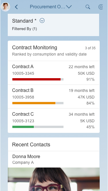
Overview page – Size S
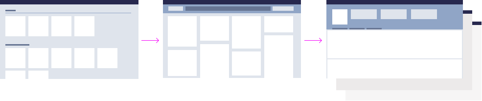
Structure
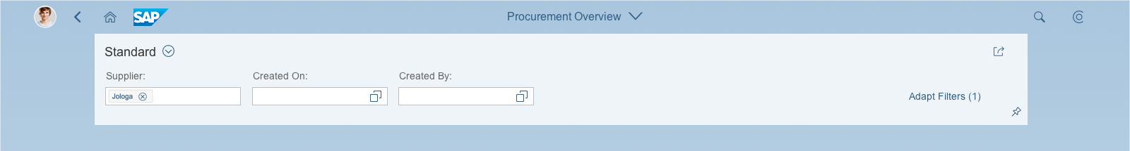
The basic structure and appearance of the overview page is governed by the dynamic page layout. This enables you to use variant management, text, and a smart filter bar in the upper part of the screen (dynamic page header). The content of the overview page is presented using cards. The card layout determines the size and position of the cards.
Overview page – Basic structure
Dynamic Page
Dynamic Page in the Overview Page
The overview page can consume four different versions of the dynamic page, giving you the flexibility to support different requirements. All the variants have two things in common:
- The footer toolbar is not included.
- There are no global actions in the header title.
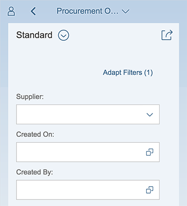
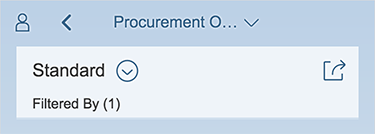
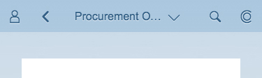
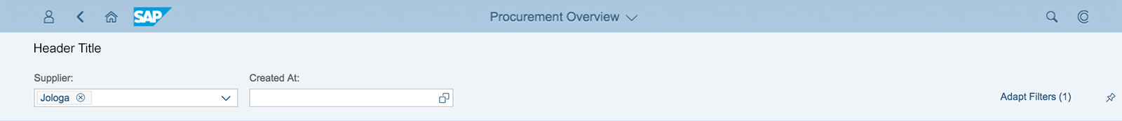
The smart filter bar in the header content uses the live update mode: the results are updated immediately whenever the user changes a filter field. As a result, there is no Go button for the filter bar. In addition, the variant management control lets users share user-defined variants (Save Variant feature).
Dynamic Page Variants for the Overview Page
| Variant 1 | Variant 2 | Variant 3 | Variant 4 | |
| Dynamic page header | Yes | – | – | Yes |
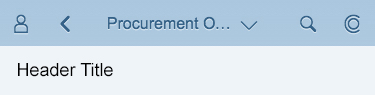
| Header title | Variant Management | Text | – | Text |
| Header content | Smart Filter Bar | – | – | Smart Filter Bar |
| Page content | Cards | Cards | Cards | Cards |
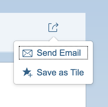
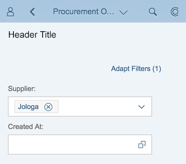
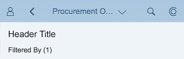
In this variant, the header title contains variant management, and the header content includes the smart filter bar. The initial default uses the snapped mode, since content is already available on the cards and users can start right away. When the user scrolls or clicks, the header content expands as defined. The header title offers the share menu, which enables the actions Send Email and Save as Tile.
Dynamic page variant 1 – Expanded mode for size XL/L/M

Dynamic page variant 1 – Snapped mode for size XL/L/M
Dynamic page variant 1 – Expanded mode for size S
Dynamic page variant 1 – Snapped mode for size S
Share menu
In the second variant, the header title contains a text, which serves the same purpose as the former page subtitle. The header content is empty (auto hidden), and therefore doesn’t snap. The content area displays the overview page cards.

Dynamic page variant 2 – Expanded/snapped mode for size XL/L/M
Dynamic page variant 2 – Expanded/snapped mode for size S
This variant doesn’t snap because both the header title and header content are empty (auto hidden). In this case, the overview page cards (page content) display directly below the shell bar.

Dynamic page variant 3 – Size XL/L/M
Dynamic page variant 3 – Size S
In this variant, the header title contains a text, and the header content area contains the smart filter bar. When the user scrolls or clicks, the header content snaps as defined.
Dynamic page variant 4 – Expanded mode for size XL/L/M

Dynamic page variant 4 – Snapped mode for size XL/L/M
Dynamic page variant 4 – Expanded mode for size S
Dynamic page variant 4 – Snapped mode for size S
Overview Page Layout
The overview page layout describes the position and size of cards in the content area below the dynamic page header (header title and header content).
Only place cards on the overview page. Never add tiles.
Card Layout
The card layout contains responsive (collapsible) columns of cards. The card width is fixed, and the height is determined by the card type and the embedded control.
There is no limit on the number of cards included. To view all the cards, the user just scrolls down.
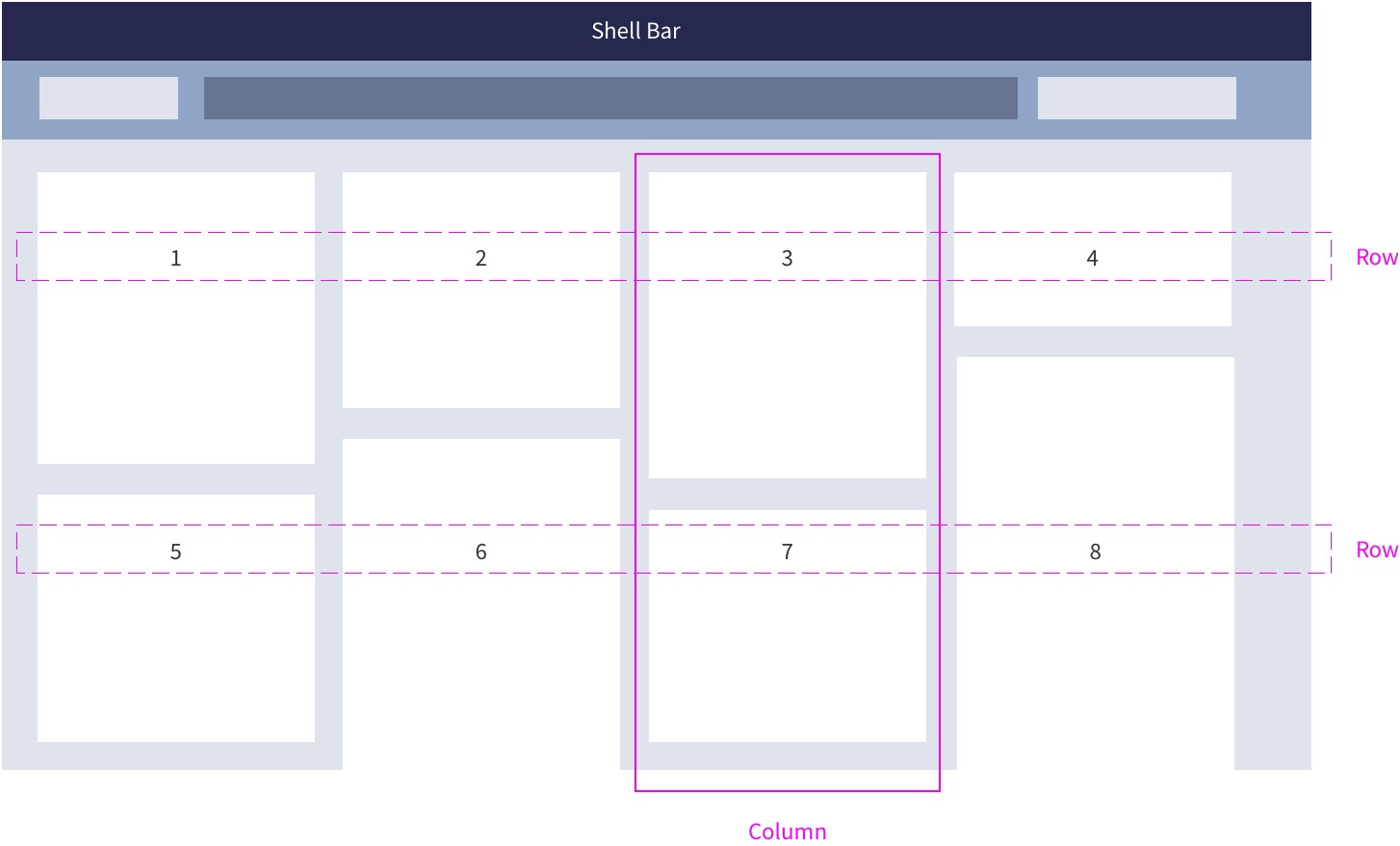
Fixed card layout
The card layout uses padding on both sides. The cards are displayed inside collapsible columns, making the page fully responsive. When the user resizes the browser or uses a smaller screen, the columns containing the cards collapse. In this way, the layout can accommodate typical laptop screens, larger desktop monitors, and mobile devices:
- Phone: 1 column
- Tablet (portrait): 2 columns
- Laptop / tablet (landscape): 3 columns
- Large desktop: 4 columns
- Extended monitor: 5 columns (maximum)
The width of the cards is tied to the column width. Breakpoints for the different screen resolutions determine whether the column width is 20 or 25 rem. The cards inside the columns adapt their width automatically. By contrast, the height of the cards is flexible, and depends on the content and type of card.
Rearranging Cards
Users can reposition cards on the overview page by dragging them to a different location. As the user drags a card, it swaps place with any cards in its path. Releasing the mouse or lifting the finger from the touch surface completes the move. To avoid gaps, cards always snap to the next free space in the row, or to the start of the next row.
The cards are arranged as a “Z” flow: cards are ordered from left to right, starting with the first card on the top left of the page. For example, if a 5-column layout is reduced to 4-column layout, the fifth card drops to the next row, assuming the leftmost position underneath the first card.
Personalized Selection of Cards
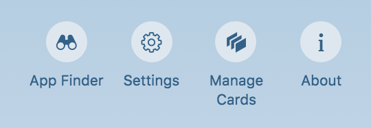
Users can also hide cards. The corresponding setting is in the Me Area under Manage Cards. A dialog appears on the overview page, and lists the different card names. Users can opt to show or hide the cards using a switch control. Restore reinstates the default setup. The personalized setup stays until the user next changes it.
Overview page – Manage cards
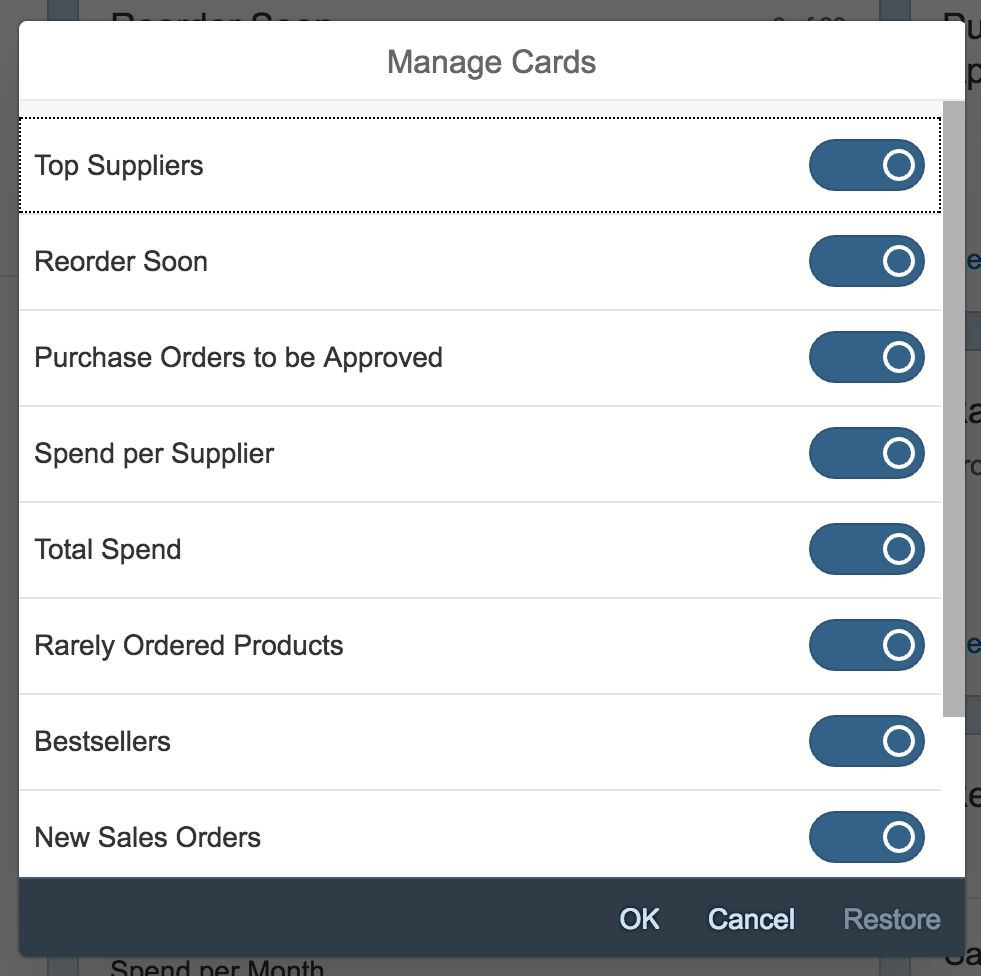
Overview page – 'Manage Cards' dialog (initial loading status)
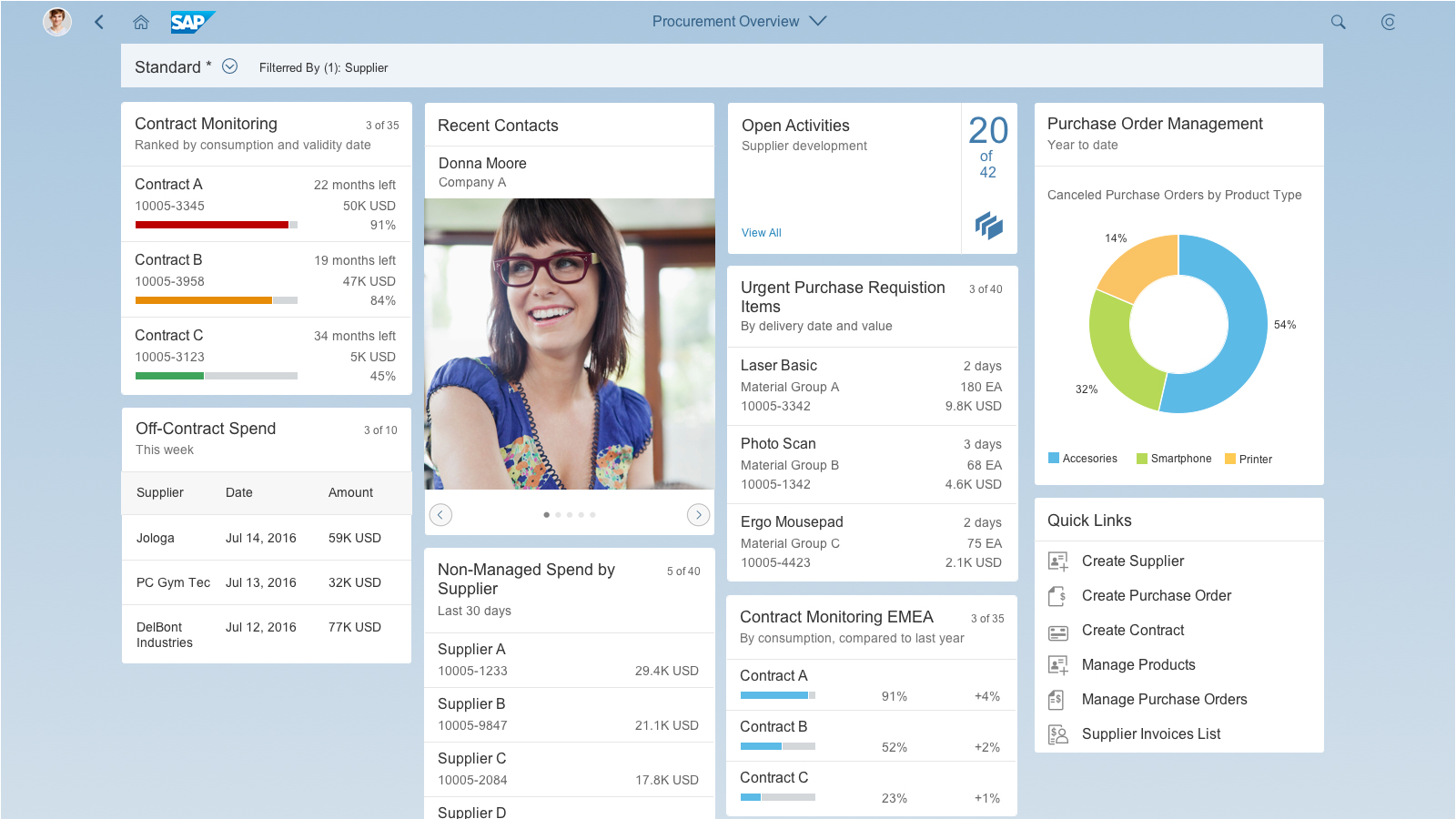
Cards
Cards are containers for app content, and represent an entry-level view of the most pertinent app data for a given topic or issue. Technically, a card is a smart component that uses UI annotations to render its content. Cards differ in the content they display: They can show a chart, a list, a table, informative text, or a combination of two elements. However, cards never have editable fields.
Cards can focus on a single object or topic, or on a group of objects.
You can set a specific refresh interval for the card content. All cards are refreshed at once, so the shorter the refresh interval, the more disruptive it is for users.
Card Components
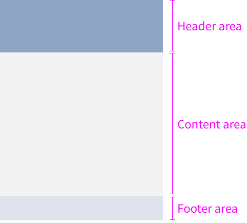
Each card has three components: a header area, a content area, and a footer area. The header and content areas are mandatory. The footer area is only used for actions in the quick view card.
Make sure that you define and format the texts on all the cards consistently. Check the UI text guidelines for the overview page for details.
Overview page – card components
Card Header
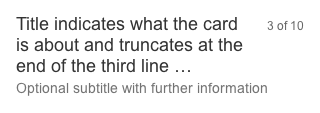
The card header area is mandatory, and serves three purposes:
- It indicates what the card is about.
- It functions as a navigation area for opening the parent app, whereby the whole header area is clickable. We recommend offering this navigation on all cards (exception: link list card).
- A counter shows how many items are on the card in relation to the total number of relevant items.
The height of the header area is variable; it expands vertically to accommodate the text. The header area can contain two text fields: a mandatory title, and an optional subtitle. The primary purpose of the header area is to identify the content source, summarize the focus of the card (title), show any relevant parameters (subtitle), and offer navigation to the content source (parent app).
Title
The title is mandatory and represents the card’s “point of view”. In one or two words, it explains why this card exists and why a user might want to use it. It is a natural language reflection of the annotated view. Titles that exceed three lines are truncated with the ellipsis (…).
Subtitle
The subtitle is optional. You can use it to qualify the title, offer an explanation, or show a status. The use of the subtitle can differ, depending on the card type. Subtitles that exceed one line are truncated with the ellipsis (…).
Card header with counter
Counter
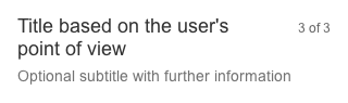
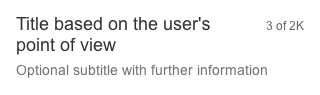
The counter in the header area indicates how many items are showing on the card in relation to the total number of relevant items:
Format: [Items on Card] of [Total Items]
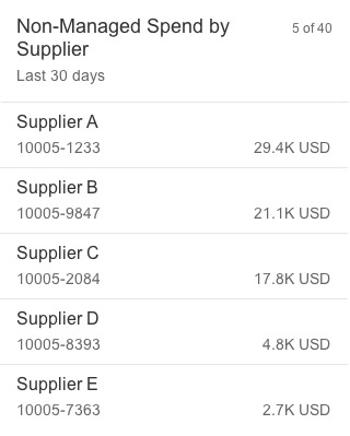
Example: 5 of 40
The counter is right-aligned and is never truncated (the title wraps instead). The width of the counter is flexible, depending on the amount of data. [Items on Card] can show a maximum three digits, and [Total Items] a maximum of four digits. For larger numbers, a scaling factor is shown. If there is an issue loading a card, or no items are found for the filter criteria, no counter is shown.
Card header with all counted items
Card header with scaled counter
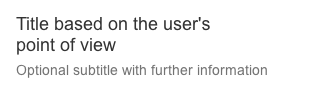
Card header without the counter
Card Content
The content area is mandatory and is reserved for application content. Content is currently displayed on cards by embedding SAPUI5 controls that specify the properties and data format. For example, an embedded standard list control provides formatting, such as row height, font sizes, and the number of text blocks.
Card Footer
On quick view cards that display information on a single object or data point, you can use the footer area to offer related actions. In this case, the overflow toolbar control is used. The height of the footer bar is fixed.

Card footer area with actions
Formatting Dates, Times, Amounts, and Currencies
Apply the following formats:
- Dates: The default is the relative date format (for example, Today). However, you can also use the medium date format (such as Aug 7, 2015).
- Times: Times are not visible per default, but if you need to show a time, use the short format (for example, 11:28 AM).
- Integers/Float/Currencies: Use the short format (for example, 1K for 1000).
The navigation and interaction depends on the technical card type:
This section looks at the different technical card types, how card views can be combined, and how to incorporate actions.
Single-Object Cards
Cards that feature content with a single focal point, detail, or entity are called single-object cards. An example is a quick view card with information about a particular product. Analytical cards are also single-object cards. The header area of this card type always navigates to this specific focal point, detail, or entity. The content area can also have interaction areas (for example, a section in a chart, or a telephone number for a contact). However, only quick view cards can have actions in the footer area.
Interaction for a single-object card
Object Group Cards
Cards that feature a subset of items grouped by a common criterion are called object group cards. A typical example would be a list of purchase orders grouped by delivery date, amount, or supplier. The cards do not have actions, but each row or list item is selectable, thus providing direct navigation to the object details within the parent application. The header area of this card type always navigates to all items in the list or table. Object group cards include all types of list cards, bar chart list cards, and table cards.
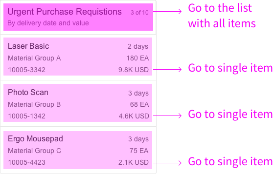
Interaction for an object group card
Link List Cards
Link list cards allow you to display a collection of links or images that can reference both internal and external targets.
- Links can navigate to a target or open a popover with additional information.
- Clicking an image opens an image carousel.
Interaction for a link list card
Stack Cards
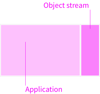
A stack card is a special card type for showing a collection of single-object cards. Stack cards have 3 components with different navigation areas:
- The top-level stack card opens the collection and contains two clickable areas: the left area navigates to the parent app, and the right area opens the object stream.
- The object stream shows individual cards that represent objects from the parent application. The object stream heading links to the parent application, while individual cards can contain links and actions relating to the respective object. A Close button returns the user to the stack card.
- The last card in the object stream is the placeholder card. The entire card is navigable and leads the user directly to the parent application.
Interaction for a stack card
Interaction for a placeholder card
View Switch
You can use a view switch to offer several different content areas on one card, which can help to reduce the number of cards on the overview page. The user chooses the view using a select control. You can only combine views that have a common denominator. The options offered by the select control merely offer different perspectives. For example, a card “Purchasing Spend” (title in the header area) could offer two views “By Material Group” and “By Supplier” (options in the select control). The view switch is located in the upper part of the content area.
You can use the view switch for the following cards:
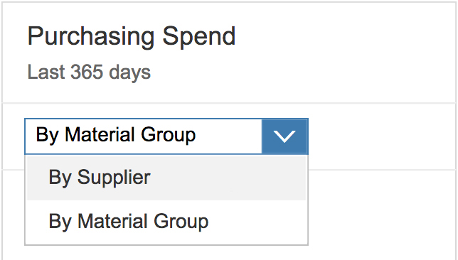
View switch
Only quick view cards within an object stream can have actions in the footer area. The overflow toolbar manages how the actions are displayed. All actions are right-aligned. Any actions that don’t fit into the available space move into the overflow action sheet, represented by the ellipsis ( ). A maximum of six actions are allowed in the footer area. Only offer actions the user really needs in the specific context.
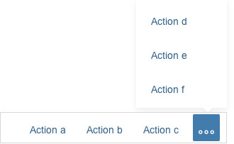
Footer area with additional actions in the overflow
There are two possible types of action: navigation and function import. Any combination of navigation and function import actions is allowed. Error or confirmation messages are displayed directly on the overview page. Always overwrite the predefined default text for errors in a message box: Formulate your message in plain language (without code), describe the issue precisely, and suggest a constructive solution.
Type: Navigation
Navigation is “intent-based” and takes the user to a different SAP Fiori app that specializes in executing an action. Navigation actions are always multi-click (meaning they can be repeated over and over). The destination screen opens in the same browser window, and any error or task confirmation messages are handled by the supporting application, and not by the overview page.
Type: Function Import
Function imports are custom OData service operations for actions. These actions are handled by the overview page, rather than by another SAP Fiori app. The interaction depends on whether or not the action requires user input:
- If the action requires additional user input, the input parameters are handled directly on the overview screen without further navigation. A dialog appears on top of the card, allowing the user to enter data or make a selection. An example of additional input might be the rejection reason for a “Reject” action.
- If the action has no input parameters, the action request is sent immediately. Once the action has been completed, the card disappears from the object stream.
Action on Phone
If an action on a card requires an input dialog box, use a full screen dialog on smartphones.
Card Types
The overview page supports the following standard card types:
Analytical Card
Analytical cards are used for data visualization. They are single-object cards that consist of two areas: a header area that displays the aggregated value of a key measure (KPI), and a chart area that displays a representation of data in graphical format. Analytical cards do not contain a footer area.
The KPI header is mandatory for analytical cards used on the overview page. The KPI header includes the title (mandatory), the KPI with the respective unit (mandatory), and a subtitle (optional). The subtitle can show the filter criteria used for the chart, and can contain up to two lines of text. The KPI itself uses the semantic colors red (negative), green (positive), or gray (neutral). You can also display a percentage indicator (optional) or triangle indicator showing an upward or downward trend (optional).
For more information, see analytical card.
The following (VizFrame) charts are available:
List Card
List cards are a type of object group card, and display a set of items in a vertical list. List cards use the sap.m.List container in the content area.
List Card Navigation
Clicking the header area of a list card opens the parent application, which uses the same filter as the annotated card, and shows a list of all the objects returned for the result set. The counter indicates how many items are showing on the card in relation to the total number of relevant items: [Items on Card] of [Total Items], as in 5 of 40.
Clicking a list item (row) on the card opens the detail view for that specific item in the same parent application. Only aggregate list items in exceptional cases.
Because the header area and line items are based on the same result set, they must always link to the same target application.
List Item Types
Two different list item types are available:
- The standard list item always shows 3 pieces of information and inherits the properties of the SAPUI5 control sap.m.StandardListItem.
- The extended list item can show up to 6 pieces of information and inherits the properties of the SAPUI5 control sap.m.ObjectListItem.
You can only use one type of list item on any given card.
Size of a List Card
List cards resize according to the content available. The height can vary, depending on the number of text fields. Show no more than five standard list items and no more than three extended list items on one card. To see the full result set, the user needs to navigate to the parent app.
In addition, you can display the data on the right-hand side in semantic colors.
List card with standard list item
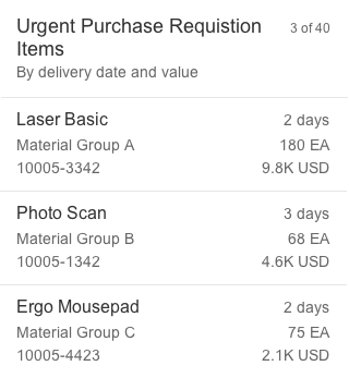
List card with extended list item
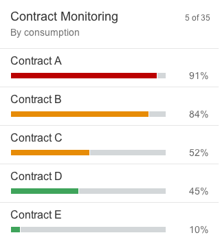
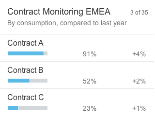
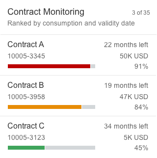
Bar Chart List Card
Bar chart list cards are a type of object group card, and display a set of items in a vertical list. Unlike list cards, bar chart list cards are embedded in another component: the comparison micro chart. This allows you to display negative values and use semantic colors.
Bar Chart List Card Navigation
Clicking the header area of a list card opens the parent application, which uses the same filter as the annotated card, and shows a list of all the objects returned for the result set. The counter indicates how many items are showing on the card in relation to the total number of relevant items: [Items on Card] of [Total Items], as in 5 of 35.
Clicking a list item (row) on the card opens the detail view for that specific item in the same parent application. Only aggregate list items in exceptional cases.
Because the header area and line items are based on the same result set, they must always link to the same target application.
Bar Chart List Item Types
Three different list item types are available:
- The standard list item always shows 3 pieces of information.
- The condensed list item can show up to 4 pieces of information.
- The extended list item can show up to 6 pieces of information.
You can only use one type of list item on any given card.
Size of a Bar Chart List Card
Bar chart list cards resize according to the content available. The height can vary, depending on the number of text fields. Show no more than five standard/condensed list items and no more than three extended list items on one card. To see the full result set, the user needs to navigate to the parent app.
Bar chart list card with standard list item
Bar chart list card with condensed list item
Bar chart list card with extended list item
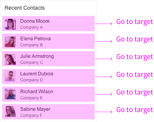
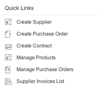
Link List Card
Link list cards allow you to display a collection of links or images that can reference both internal and external targets. Links and images are handled as two separate variants:
Variant Type: List
The list variant shows a collection of links that can navigate to a target or open a popover with additional information. You can also show an optional subtitle below the link with a description or additional information. The link text and subtitle are each limited to one line.
You can display an icon or image before each link. For example, you might want to include app icons for set of links to recently-used apps, or images for a list of recent contacts. Use icons and images consistently:
- If you opt to use icons, show an icon before every link.
- If you include images, use a placeholder for images that are not available.
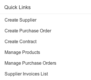
Link list card – Variant type "list"
Link list card – Variant type "list" with icons
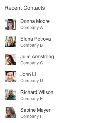
Link list card – Variant type "list" with images
Variant Type: Image
The image variant uses the sap.m.Carousel control to display one or more images. If the carousel contains only one image, the Previous and Next icons and the paging indicator are not visible. The link and an optional subtitle are displayed above the carousel. The link text and subtitle are each limited to one line.

Link list card – Variant type "image"
Table Card
Table cards are a type of object group card, and display a set of items in a table format. Table cards use the responsive SAPUI5 control sap.m.Table.
Table Card Navigation
Clicking the header area of a table card opens the parent application, which uses the same filter as the annotated card, and shows a list of all the objects returned for the result set. The counter indicates how many items are showing on the card in relation to the total number of relevant items: [Items on Card] of [Total Items], as in 3 of 10.
Clicking a list item (row) on the card opens the detail view for that specific object in the same parent application. You can also use the smart link control in table cards. However, we recommend using smart links only if they crucial for your use case. Otherwise, you risk confusing users with multiple navigation targets.
Because the header area and line items are based on the same result set, they must always link to the same target application.
Size of a Table Card
Table cards resize according to the content available. The height can vary depending on the number of table cells. Tables are limited to a maximum of 3 columns and 3 rows, with a maximum of 3 lines of text per row. To see the full result set, the user needs to navigate to the parent app. All three columns can show either a data field or a data point. Data points can use semantic colors.
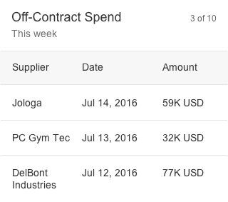
Table card
Stack Card
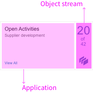
A stack card is a special collection of single-object quick view cards, based on a topic or action. Unlike the other card types, the top-level stack cards don’t show any application content. Instead, they act as an entry point to an object stream containing multiple cards.
Stack cards have the following components:
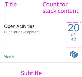
- The title is the top element and is always required. It is used as the heading for the detail view, and comprises 1-2 lines of text.
- The subtitle is optional. You can use it to qualify the title, offer an explanation, or show a status. The purpose of the subtitle is explain the content of the stack in one line, so its usage depends on the context.
- The stack content count indicates the number of cards in the stack (object stream). The object stream can contain up to 20 cards. Below the number of cards in the stack, you see the total number of items returned for the annotated view (for example, “20 of 42”).
Overview Page - Stack Card
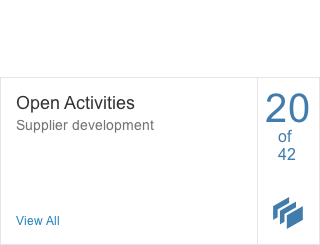
The top-level stack card contains two clickable navigation areas:
- The left area and View All link navigate to the parent application, where the user can see all the objects returned for the annotated view (42 in the example above). The placeholder card and heading inside the object stream have the same navigation target.
- The right area opens the object stream, which contains a scrollable collection of cards presented in an overlay format. The user can browse individual cards, with the option to view, inspect, or take action.
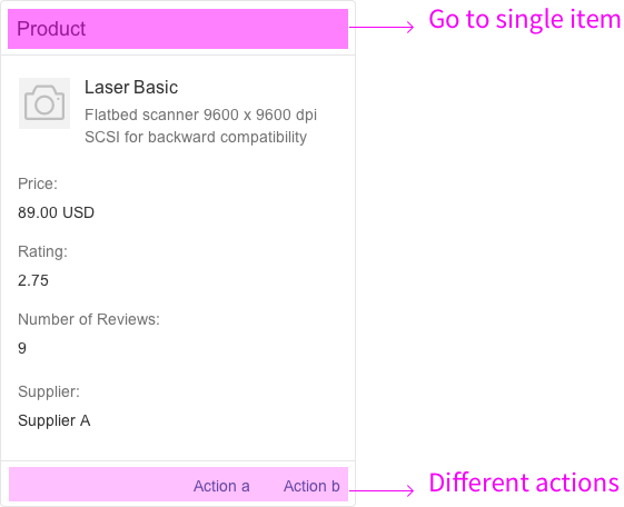
Quick View Card
Quick view cards are single-object cards. They display the basic details for one object, such as the name, address, and phone numbers for a contact. This card type is only available within the object stream; you can’t place quick view cards on the overview page itself. The quick view card inherits the SAPUI5 element sap.m.QuickView.
The header area contains a static text, such as Purchase Order, and an optional dynamic text, such as 1005-3345. In this way, each card header can show different content. Clicking on the header area of the card opens the detailed view of the object in the corresponding parent app. If the content area of a card cannot display all the information, a scrollbar appears on the right. Only the footer area of the quick view card can currently provide actions.
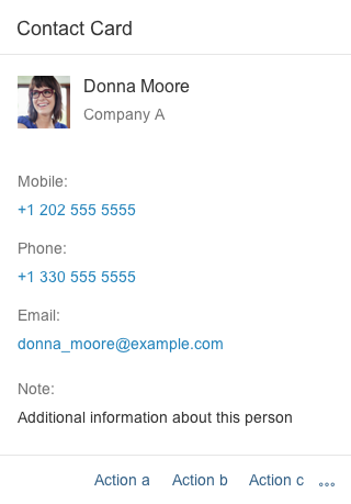
Quick view card for a contact
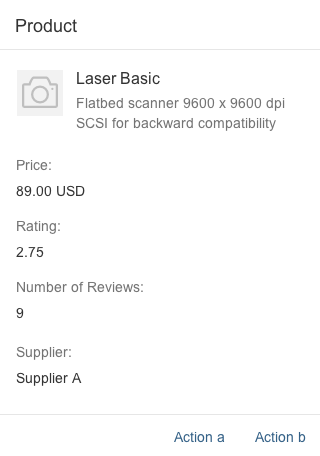
Quick view card for a product
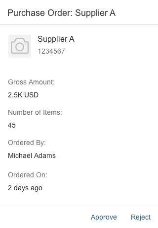
Quick view card for a purchase order
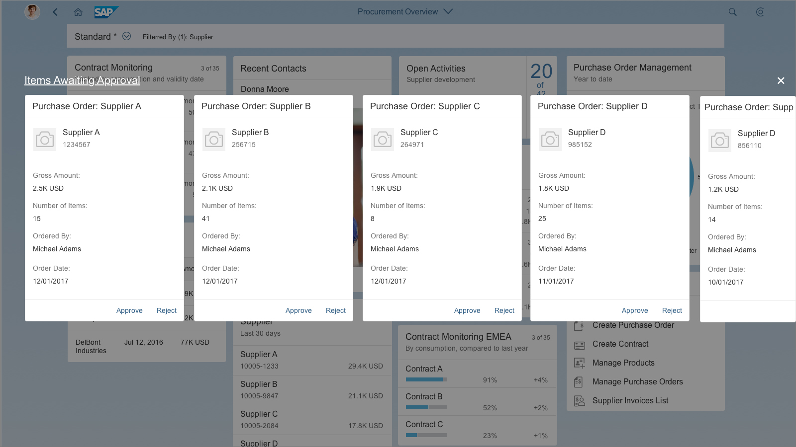
Overview page – Object stream
Clicking the right-hand area of the stack card opens the object stream. The object stream appears on top of the overview page as a modeless overlay, and serves as a layer for showing quick view cards with actions. The overlay has heading on the top left, and a Close button on the right. The heading is the same as the stack card title, and links to the full result set in the parent application (same target as the left-side navigation on the stack card and the navigation from the placeholder card). Clicking outside the overlay area also closes the object stream.
The object stream can have up to 20 cards, which all get their content from the same parent application. By default, the cards are ordered chronologically, with the most recent items first. However, app developers can define the best object stream sorting option for their own needs and custom content. If the number of cards exceeds the available space in the overlay window, an arrow icon appears on the right for scrolling. Mobile device users can swipe to see more cards. If the object stream is empty, the stack link is not active and the overlay cannot be opened. The stack count number displays 0. If only one item is returned, the object stream contains just a single card.
The header area of the quick view cards in the object stream navigates to the detail view for that specific object in the parent application. The footer area of the quick view cards can also offer actions.
Object Stream – Scroll Arrows
Scroll arrows only appear on desktop devices. If all the cards in the object stream fit on the screen, the arrows are not visible. If the number of cards exceeds the available space, an arrow icon appears on the right when the user mouses over the object stream overlay. Mousing over the arrow button area scrolls the cards across the screen from right to left. As soon as the first card on the left moves out of the visible overlay area, a second arrow appears on the left for moving in the other direction. Once the last card is in full view, the arrow on the right disappears.
Object Stream – Placeholder Card
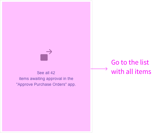
If the number of items returned for the annotated view exceeds the maximum 20 cards allowed in the object stream, a placeholder card is added automatically at the end of the stream (as card 21). The entire placeholder card is navigable, and takes the user to the full result set in the parent application.
The text on the placeholder card is composed as follows:
See all [total] [items] in the“[app name]” app.
Where:
- The values for [total] and [app name] are supplied by the system.
- The term for [items] must be rephrased by the app team to reflect the type of item or business object.
Examples:
- See all 42 items awaiting approval in the “Approve Leave Requests” app.
- See all 42 purchase orders awaiting approval in the “Approve Purchase Orders” app.
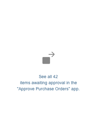
Overview page – Placeholder card
Object Stream – Tablet Version
On tablet devices, the modeless overlay expands horizontally. It also expands vertically to accommodate the card height and allow space for the title and Close button. The user can swipe through cards and perform micro actions. Swiping a card in view moves the entire object stream. Tapping the Close button closes the stack card and returns the user to the main overview page. There are no scroll arrows on touch devices.
Object Stream – Phone Version
On smartphones, the overview page layout collapses to a single column in both portrait and landscape modes. Tapping on the right-hand navigation area of a stack card opens the object stream on top of the overview page in a new full screen window.
The object stream expands horizontally and vertically to accommodate the card height, and to allow space for the title and Close button. The user can swipe through the cards and perform micro actions. Swiping a card moves the entire object stream. Since the cards are too large to fit on the screen in landscape mode, users can also scroll vertically to see the full card content. Tapping the Close button closes the stack card and returns the user to the main overview page. There are no scroll arrows on touch devices.
")
")
")
")
Resources
Want to dive deeper? Follow the links below to find out more about the SAP Fiori Overview Page.
Elements and Controls
- Introduction to SAP Fiori Elements (guidelines)
- List (guidelines)
- Standard List Item (guidelines)
- Responsive Table (guidelines)
- Chart (guidelines) (guidelines)
- Analytical Card (guidelines)
- Toolbar Overview (guidelines)
- Dialog (guidelines)
- Message Handling (guidelines)
- Carousel (guidelines)
- Image (guidelines)
Implementation
- List (SAPUI5 Explored)
- Standard List Item (SAPUI5 Explored)
- Responsive Table (SAPUI5 Explored)
- Chart (SAPUI5 Explored)
- Overflow Toolbar (SAPUI5 Explored)
- Dialog (SAPUI5 Explored)
- Message Handling (SAPUI5 Explored)
- Chart (API)
 Your feedback has been sent to the SAP Fiori design team.