
- Latest SAPUI Version 1.124
- SAPUI5 Version 1.122
- SAPUI5 Version 1.120
- SAPUI5 Version 1.118
- SAPUI5 Version 1.116
- SAPUI5 Version 1.114
- SAPUI5 Version 1.112
- SAPUI5 Version 1.110
- SAPUI5 Version 1.108
- SAPUI5 Version 1.106
- SAPUI5 Version 1.104
- SAPUI5 Version 1.102
- SAPUI5 Version 1.100
- SAPUI5 Version 1.98
- SAPUI5 Version 1.96
- SAPUI5 Version 1.94
- SAPUI5 Version 1.92
- SAPUI5 Version 1.90
- SAPUI5 Version 1.86
- SAPUI5 Version 1.84
- SAPUI5 Version 1.82
- SAPUI5 Version 1.80
- SAPUI5 Version 1.78
- SAPUI5 Version 1.76
- SAPUI5 Version 1.74
- SAPUI5 Version 1.72
- SAPUI5 Version 1.70
- SAPUI5 Version 1.68
- SAPUI5 Version 1.66
- SAPUI5 Version 1.64
- SAPUI5 Version 1.62
- SAPUI5 Version 1.60
- SAPUI5 Version 1.58
- SAPUI5 Version 1.56
- SAPUI5 Version 1.54
- SAPUI5 Version 1.52
- SAPUI5 Version 1.50
- SAPUI5 Version 1.48
- SAPUI5 Version 1.46
- SAPUI5 Version 1.44
- SAPUI5 Version 1.42
- SAPUI5 Version 1.40
- SAPUI5 Version 1.38
- SAPUI5 Version 1.36
- SAPUI5 Version 1.34
- SAPUI5 Version 1.32
- SAPUI5 Version 1.30
- SAPUI5 Version 1.28
- SAPUI5 Version 1.26
- Latest SAPUI Version 1.124
- SAPUI5 Version 1.122
- SAPUI5 Version 1.120
- SAPUI5 Version 1.118
- SAPUI5 Version 1.116
- SAPUI5 Version 1.114
- SAPUI5 Version 1.112
- SAPUI5 Version 1.110
- SAPUI5 Version 1.108
- SAPUI5 Version 1.106
- SAPUI5 Version 1.104
- SAPUI5 Version 1.102
- SAPUI5 Version 1.100
- SAPUI5 Version 1.98
- SAPUI5 Version 1.96
- SAPUI5 Version 1.94
- SAPUI5 Version 1.92
- SAPUI5 Version 1.90
- SAPUI5 Version 1.88
- SAPUI5 Version 1.86
- SAPUI5 Version 1.84
- SAPUI5 Version 1.82
- SAPUI5 Version 1.80
- SAPUI5 Version 1.78
- SAPUI5 Version 1.76
- SAPUI5 Version 1.74
- SAPUI5 Version 1.72
- SAPUI5 Version 1.70
- SAPUI5 Version 1.68
- SAPUI5 Version 1.66
- SAPUI5 Version 1.64
- SAPUI5 Version 1.62
- SAPUI5 Version 1.60
- SAPUI5 Version 1.58
- SAPUI5 Version 1.56
- SAPUI5 Version 1.54
- SAPUI5 Version 1.52
- SAPUI5 Version 1.50
- SAPUI5 Version 1.48
- SAPUI5 Version 1.46
- SAPUI5 Version 1.44
- SAPUI5 Version 1.42
- SAPUI5 Version 1.40
- SAPUI5 Version 1.38
- SAPUI5 Version 1.36
- SAPUI5 Version 1.34
- SAPUI5 Version 1.32
- SAPUI5 Version 1.30
- SAPUI5 Version 1.28
- SAPUI5 Version 1.26
Worklist Floorplan
Intro
A worklist displays a collection of items a user needs to process. Working through the list usually involves reviewing details of the items and taking action. In most cases, the user has to either complete a work item or delegate it.
The worklist is a versatile floorplan that offers three main variants: a simple worklist (plain page with a table), a worklist with tabs, and a worklist with one or more KPI tags. These variants are based on different user needs and use cases. For more details, see the options under Components.
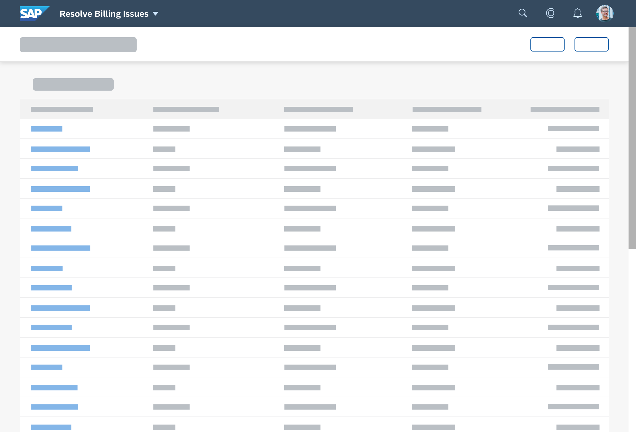
Simple worklist
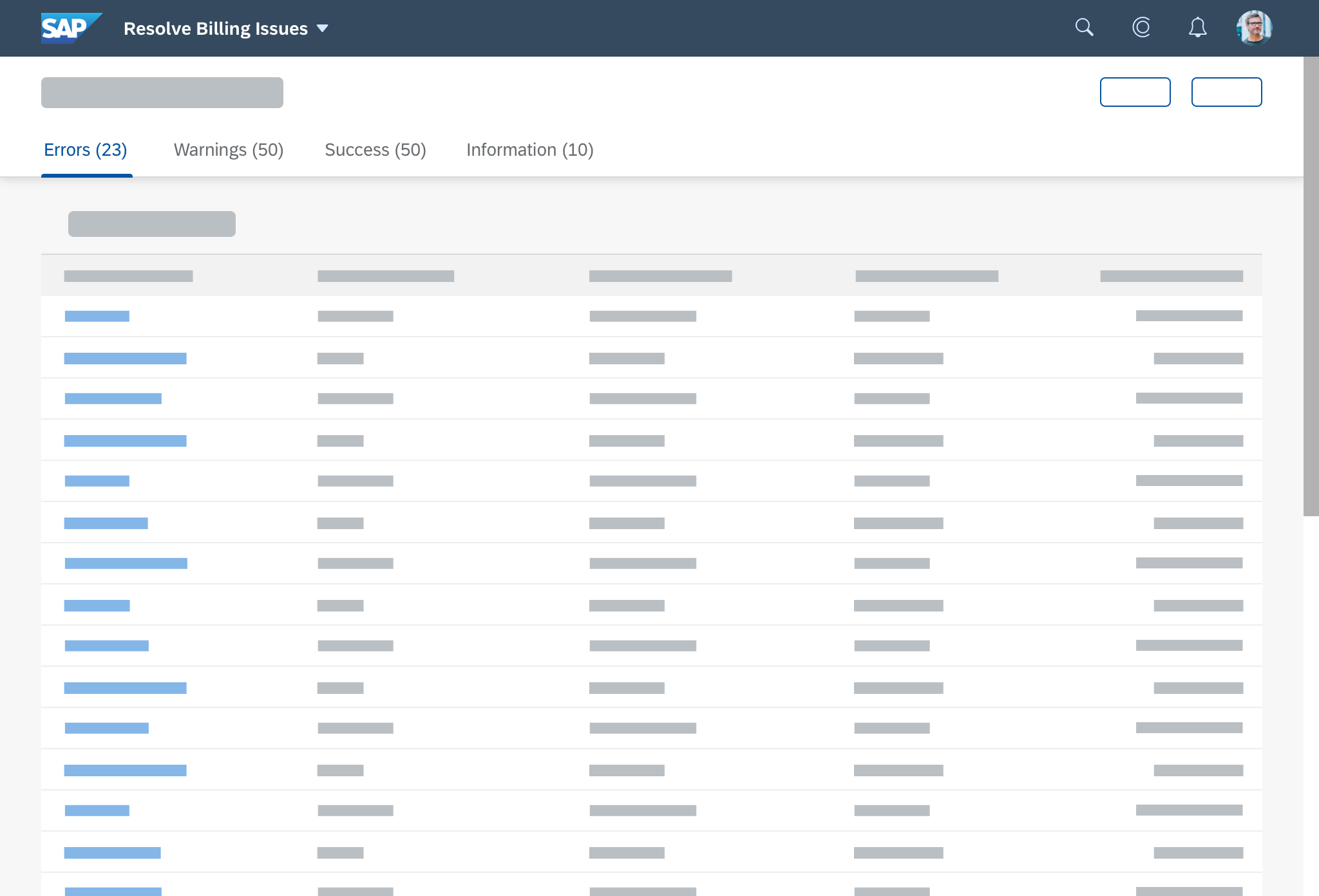
Worklist with tabs
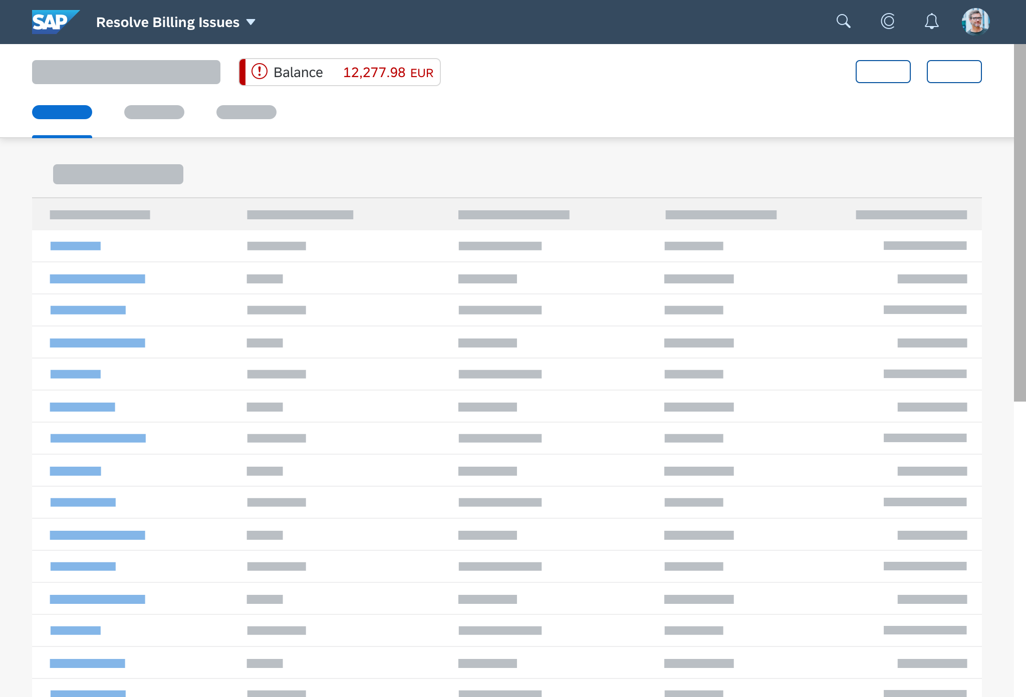
Worklist with KPI
When to Use
Use the worklist floorplan if:
- Users have numerous work items and need to decide which ones to process first.
- You want to give users a direct entry point for taking action on work items.
- Users need to work with multiple views of the same content (for example, items that are “Open”, “In Process”, or “Completed”). You want to offer tabs for switching between views.
Do not use the worklist floorplan if:
- The items you are showing are not work items.
- You want to show large item lists, or combine different data visualizations (charts or tables). In this case, use the list report floorplan instead.
- Users need to find and act on relevant items from within a large set of items by searching, filtering, sorting, and grouping. Use the list report floorplan instead.
Components
The worklist floorplan is based on the dynamic page layout and is divided into a header and the page content. The header has a header title, but no header content. As a result, the expand/collapse and pin features are not needed.
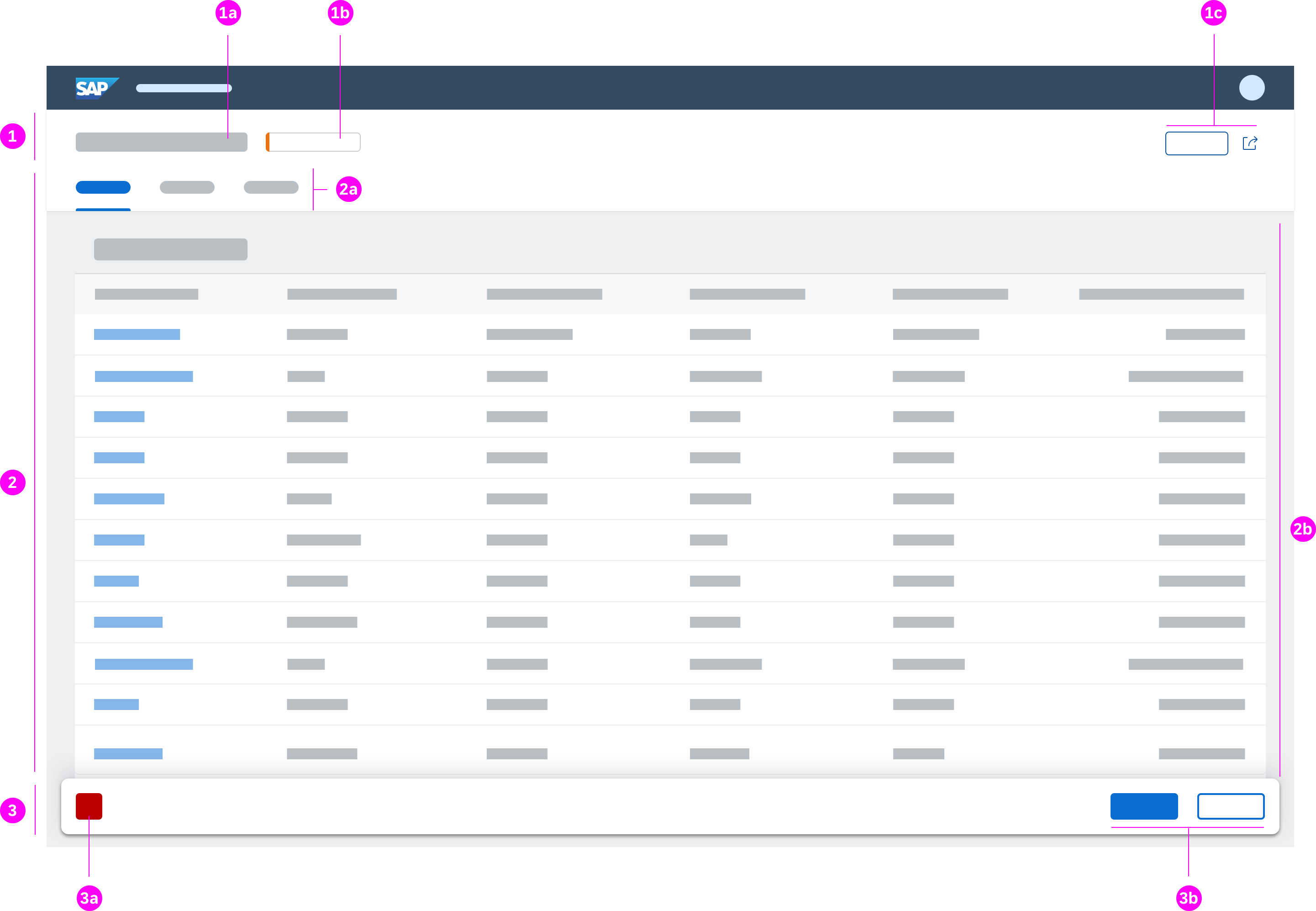
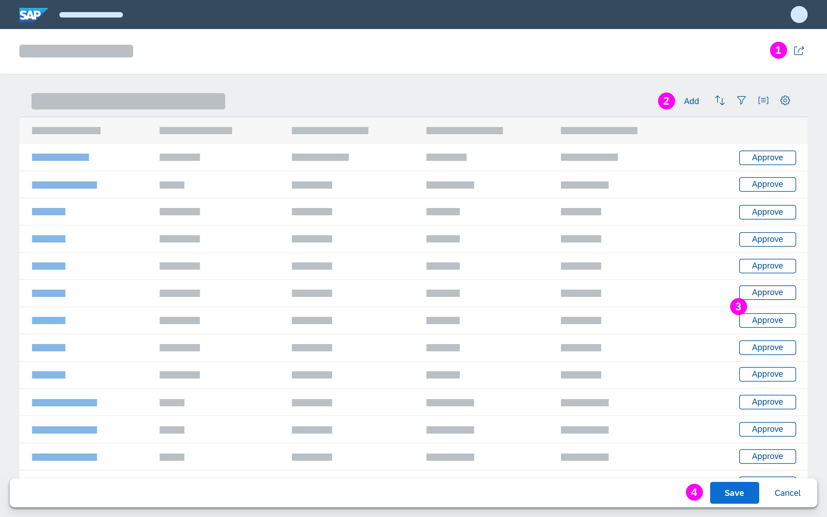
The worklist consists of the following areas:
- The header title containing:
- 1a – A variant or a title for the whole page (mandatory)
- 1b – One or more key performance indicators (KPI) (optional)
- 1c – The header toolbar with global actions (mandatory)
- The content area displaying:
- A footer toolbar (optional) including:
- 3a – The message popover
- 3b – Finalizing actions
Header Title
Variant Management
Variant management is optional. If used, apply it to the whole page. Use the variants to save and restore all settings, including selected tabs, all tables, and all personalization settings.
If variant management is not needed, just show a title that describes the view.
Key performance indicator/ KPI
The key performance indicator (KPI) allows users to track the impact of their actions while processing the worklist. You can display one or more KPIs within the KPI container next to the page title to show the status/criticality of the tag.
Header Toolbar (Global Actions)
Use the header toolbar for global actions, such as Share. Do not place actions that finalize the current process (“finalizing actions”) on the header toolbar of the header title, even if they affect the entire page.
For more information, see Global Actions.
Content Area
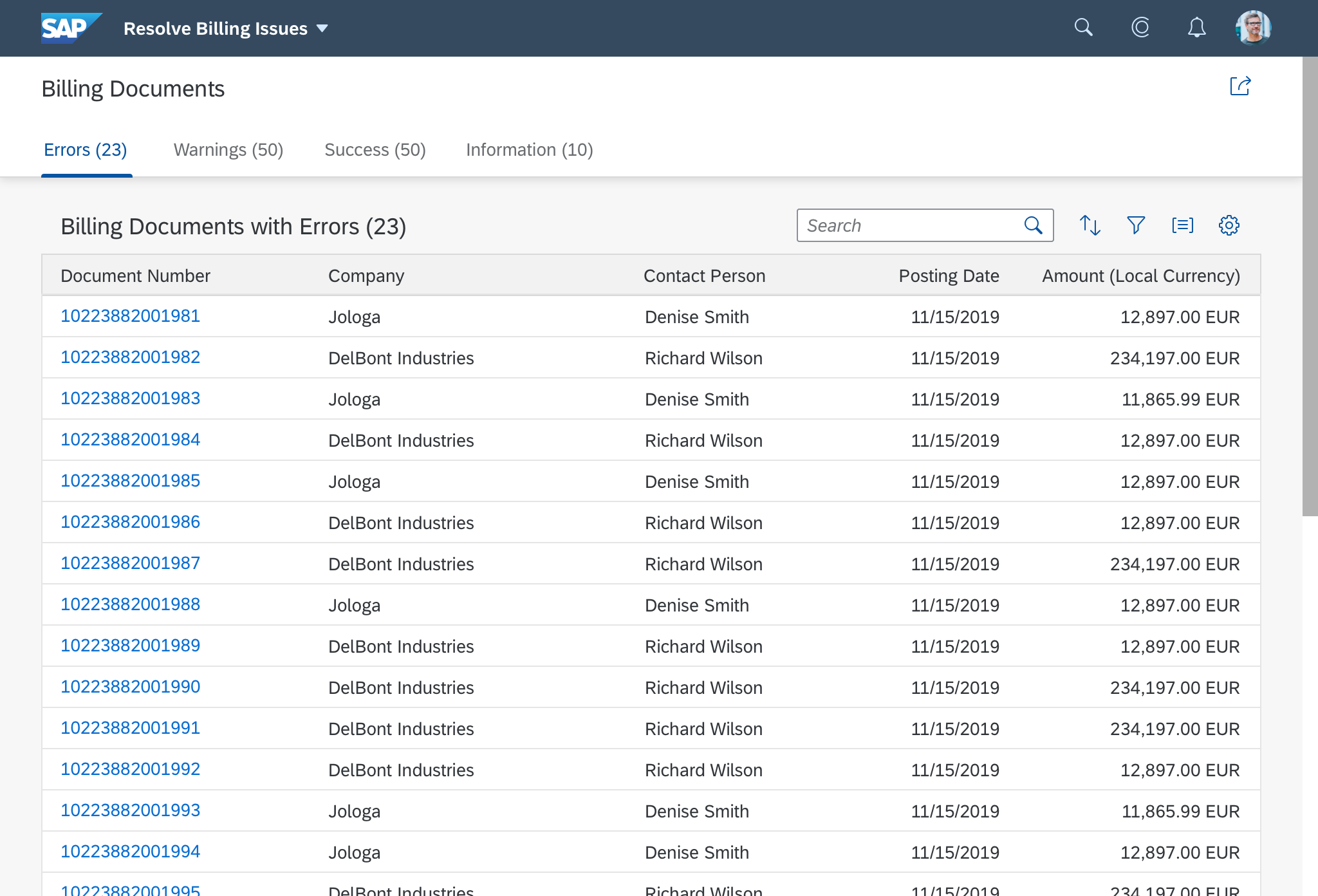
Tab Bar
The tab bar is part of the page content container, and must be sticky.
In the worklist, the icon tab bar works as a filter on the content below. It enables users to call up work items in specific categories. This can help users to identify critical items more easily. Different tabs show different perspectives on the same dataset.
Table Toolbar
Display at least a table title (ideally with an item count) and, if needed, icon-only buttons for sorting, grouping, and column settings. For filter, sort, and group, show a view settings dialog with only the corresponding features enabled. For column settings, show the table personalization dialog. If you need more extensive functionality (for example, grouping or sorting on several levels, tables with more than 20 columns), use the P13n-Dialog with just the corresponding feature enabled.
Table
In general, you can use any kind of table and list for the worklist floorplan in the content area. Nevertheless, we recommend using the responsive table. For more information, see Responsiveness.
If there are no items to display, use the “no data text” for the corresponding table. Explain why the table is empty, and what the user needs to do to display items. For more information and examples see: “No data” texts.
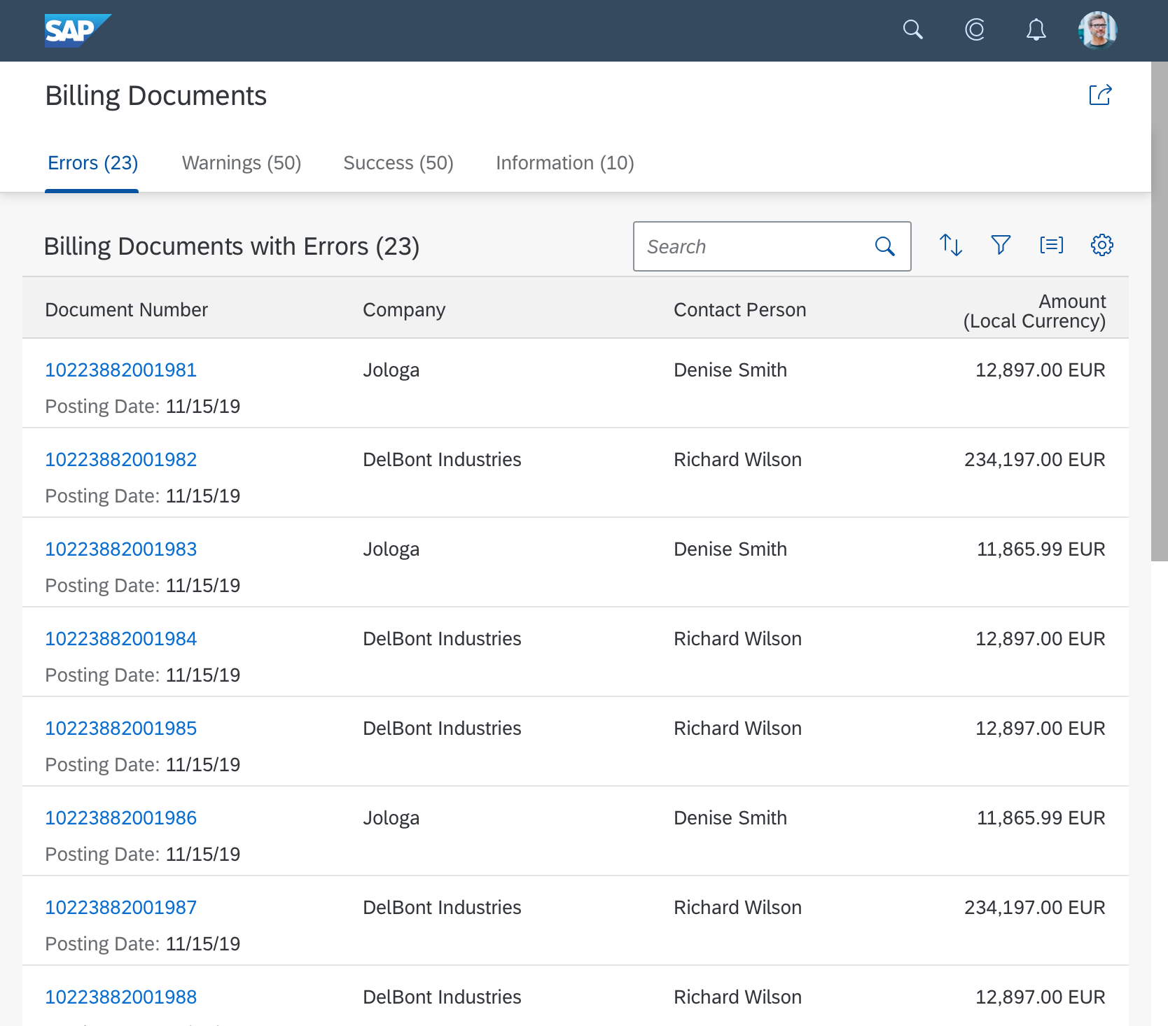
The most basic version of the worklist is the simple worklist: a plain page with a table.
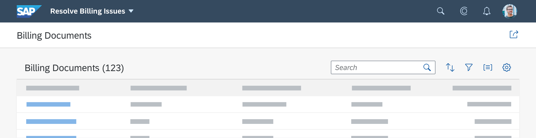
Simple worklist without tabs
Footer Toolbar
The footer toolbar is an optional component of the worklist floorplan. Only use it if finalizing actions for the whole page and/or the message popover are required. Keep in mind that the footer toolbar is only visible in edit mode. For more information, see the guidelines for the footer toolbar.
Behavior and Interaction
Initial Focus
When the worklist is loaded, set the initial focus as follows:
- If the worklist contains only a table, set the focus on the first line item of the table.
- If the worklist contains an icon tab bar, set the focus on the first tab.
Sticky Behavior
The tab bar, table toolbar, and column headers must all be “sticky”. This means that they stay fixed at the top when the user scrolls down the page.
Table Navigation
The worklist floorplan supports three types of navigation at item level:
- Line item navigation: If applicable, allow navigation to a detail view (usually an object page) at line item level. Show a navigation indicator (chevron icon) for each line item that provides a detail view. In a list, tree, or responsive table, clicking the line item triggers the navigation. In a grid table, analytical table, or tree table, clicking the navigation indicator triggers the navigation. Another option is to use a link as the identifier for the line item. This link triggers the navigation. Use it only if the navigation indicator points to a different target.
- Drilldown navigation: If a line item contains aggregated data, allow navigation to a view that contains details for the aggregated amount. This is usually a list report. Use a link to display the aggregated amount. If the table contains many columns with links, use the link options to provide different levels of highlighting. In charts, offer the drilldown navigation link in the popover for the chart element, and navigate to the corresponding list report to show the details.
- Cross navigation: If a line item contains a cross-reference to another entity, such as a person or business object, use a link to display the corresponding data point in the table. Triggering the link opens a quick view.
Actions
Action placement in the worklist
The worklist offers four locations for actions:
- Global actions in the header toolbar
- Table actions in the table toolbar
- Line item actions
- Finalizing actions in the footer toolbar
1. Global Actions
Place actions that affect the entire page in the header title within the header toolbar. Examples of global actions are Edit, Delete, or Share.
Actions in the header toolbar are always right-aligned. Emphasize the most important action and place it on the very left.
For more information, see Header Toolbar.
2. Table Actions
Place actions that affect the content of a table in the table toolbar.
When to Enable, Disable, or Hide Actions
Indicate whether an action is available. Some actions are always available, such as Create for new objects. Other actions are only relevant if items have been selected. For example, Edit at item level, Remove, object-specific actions, or actions that change the status of an item.
Enable the following actions:
- All Add/Create actions, unless the user needs to specify where in the table the new item should be added.
- Edit actions that switch the entire table to edit mode (independent of the selected items).
If the user triggers the Edit button, replace it with Save and Cancel buttons (see Editing the Whole Table). - Item-dependent actions that can be applied to some or all of the selected items.
Disable the following actions:
- Item-dependent actions (such as Delete) when no items or only unsuitable items have been selected .
- Add/Create actions where the user needs to specify the insert position in the table, but either no item has been selected, or more than one item has been selected.
For more information, see UI Element States – Control States.
Partial Processing
Allow the user to apply the changes to as many of the selected items as possible.
If an action can’t be applied to all selected items, show a warning message before executing the action:
- Indicate the number of selected items that can’t be processed (out of the total number of selected items).
- Give a reason why the action can’t be applied to these items.
- Let the user choose whether to apply the action to the remaining items anyway or cancel the action.
Note: In some scenarios, you might not be able to identify whether an action can be applied to all selected items before executing it. If the system is unable to apply the action to all items, show a message after executing the action.
Sort, Group, Personalization
Decide if you need to provide sorting, grouping or personalization for your use case. If you offer more than one of these actions, offer them as single actions. We recommend keeping them in the following order: Sort, Group, Personalization.
For more information on table and chart actions, see:
3. Line Item Actions
In rare cases, actions that affect a single item can be placed directly inside the line item. Use this option only for specific, frequently-used tasks. If the same action can also be applied to several items at once, you can also place it on the table toolbar. However, if you do so, reconsider whether you really need to offer the action at line item level. For more information, see Actions in Table Rows.
Examples of line item actions include: Start/Stop (a batch job), Approve (an item) or Assign (an item).
Do not disable line item actions. If an action can’t be used, hide it.
4. Finalizing Actions
Place actions that trigger the end of a process and affect the entire page in the footer toolbar. Examples of finalizing actions include Save, Cancel, and Submit.
Bear in mind that even if you are using the icon tab bar, there is only one footer toolbar for all tabs.
Responsiveness
Responsiveness for the worklist follows the dynamic page layout. In general, you can use any kind of table and list for the worklist floorplan in the content area. To ensure that the worklist is fully responsive and runs on all devices, we recommend using the responsive table. Note that the floorplan is not fully responsive if the following controls are used:
- Grid table and tree table: Supported on desktop and tablet devices only. Implement a fallback solution on smartphones.
- Smart table: The smart table is a wrapper around the different existing table controls. On smartphones, you can use a responsive table inside the smart table. If you use a grid table inside the smart table, implement a fallback solution for smartphones, as above.
For more details, see the respective guideline articles.

Worklist floorplan - Size L/XL
Worklist floorplan - Size M

Worklist floorplan - Size S
Examples
Worklist floorplan - Size L/XL
Worklist floorplan - Size M

Worklist floorplan - Size S
Top Tips
General
- Decide whether the worklist or the list report is the right floorplan for your needs: The focus of the worklist floorplan is on processing items. This differs from the list report floorplan, which focuses on finding and acting on relevant items from a large dataset.
- Choose one of the three basic worklist variants, based on your use case and the user’s needs.
Header
- Always display a title or offer variant management.
Content
- We recommend using the responsive table for a fully responsive worklist.
- In the table toolbar, display at least a table title (ideally with an item count). If needed, offer icon-only buttons for sorting, grouping, and column settings.
- The tab bar, table toolbar, and column headers of all table types must all be sticky.
Footer Toolbar
- If you are using the icon tab bar, remember that there is only one footer toolbar for all tabs.
- Only use the footer toolbar if finalizing actions for the whole page and/or the message popover are available.
Related Links
Elements and Controls
- Dynamic Page Layout (guidelines)
- Variant Management (guidelines)
- Filter Bar (guidelines)
- Tab Bar (guidelines)
- Responsive Table (guidelines)
- Table Toolbar (guidelines)
Implementation
- Tab Bar / Icon Tab Bar (SAPUI5 API reference)
- Table (SAPUI5 API reference)
- Toolbar (SAPUI5 API reference)
- Popover (SAPUI5 API reference)
- Worklist (SAP Fiori elements developer guide)
 Your feedback has been sent to the SAP Fiori design team.