
- Latest SAPUI Version 1.124
- SAPUI5 Version 1.122
- SAPUI5 Version 1.120
- SAPUI5 Version 1.118
- SAPUI5 Version 1.116
- SAPUI5 Version 1.114
- SAPUI5 Version 1.112
- SAPUI5 Version 1.110
- SAPUI5 Version 1.108
- SAPUI5 Version 1.106
- SAPUI5 Version 1.104
- SAPUI5 Version 1.102
- SAPUI5 Version 1.100
- SAPUI5 Version 1.98
- SAPUI5 Version 1.96
- SAPUI5 Version 1.94
- SAPUI5 Version 1.92
- SAPUI5 Version 1.90
- SAPUI5 Version 1.88
- SAPUI5 Version 1.86
- SAPUI5 Version 1.84
- SAPUI5 Version 1.82
- SAPUI5 Version 1.80
- SAPUI5 Version 1.78
- SAPUI5 Version 1.76
- SAPUI5 Version 1.74
- SAPUI5 Version 1.72
- SAPUI5 Version 1.70
- SAPUI5 Version 1.66
- SAPUI5 Version 1.64
- SAPUI5 Version 1.62
- SAPUI5 Version 1.60
- SAPUI5 Version 1.58
- SAPUI5 Version 1.56
- SAPUI5 Version 1.54
- SAPUI5 Version 1.52
- SAPUI5 Version 1.50
- SAPUI5 Version 1.48
- SAPUI5 Version 1.46
- SAPUI5 Version 1.44
- SAPUI5 Version 1.42
- SAPUI5 Version 1.40
- SAPUI5 Version 1.38
- SAPUI5 Version 1.36
- SAPUI5 Version 1.34
- SAPUI5 Version 1.32
- SAPUI5 Version 1.30
- SAPUI5 Version 1.28
- SAPUI5 Version 1.26
- Latest SAPUI Version 1.124
- SAPUI5 Version 1.122
- SAPUI5 Version 1.120
- SAPUI5 Version 1.118
- SAPUI5 Version 1.116
- SAPUI5 Version 1.114
- SAPUI5 Version 1.112
- SAPUI5 Version 1.110
- SAPUI5 Version 1.108
- SAPUI5 Version 1.106
- SAPUI5 Version 1.104
- SAPUI5 Version 1.102
- SAPUI5 Version 1.100
- SAPUI5 Version 1.98
- SAPUI5 Version 1.96
- SAPUI5 Version 1.94
- SAPUI5 Version 1.92
- SAPUI5 Version 1.90
- SAPUI5 Version 1.88
- SAPUI5 Version 1.86
- SAPUI5 Version 1.84
- SAPUI5 Version 1.82
- SAPUI5 Version 1.80
- SAPUI5 Version 1.78
- SAPUI5 Version 1.76
- SAPUI5 Version 1.74
- SAPUI5 Version 1.72
- SAPUI5 Version 1.70
- SAPUI5 Version 1.68
- SAPUI5 Version 1.66
- SAPUI5 Version 1.64
- SAPUI5 Version 1.62
- SAPUI5 Version 1.60
- SAPUI5 Version 1.58
- SAPUI5 Version 1.56
- SAPUI5 Version 1.54
- SAPUI5 Version 1.52
- SAPUI5 Version 1.50
- SAPUI5 Version 1.48
- SAPUI5 Version 1.46
- SAPUI5 Version 1.44
- SAPUI5 Version 1.42
- SAPUI5 Version 1.40
- SAPUI5 Version 1.38
- SAPUI5 Version 1.36
- SAPUI5 Version 1.34
- SAPUI5 Version 1.32
- SAPUI5 Version 1.30
- SAPUI5 Version 1.28
- SAPUI5 Version 1.26
Interactive Line Chart
sap.suite.ui.microchart.InteractiveLineChart
Intro
The interactive line chart is a type of interactive chart used for visual-based filtering in the visual filter bar (VFB) within the analytical list page (ALP).
It allows the user to filter large sets of data by time period. The user can see both the time period and the measure at the same time, where the period is always the horizontal (X) axis of the chart.
Usage
Use the interactive line chart if:
- You want to give the user the possibility to visually filter data in the analytical list page.
- You want the user to gain insights before filtering large datasets with the visual filter bar.
- You want to measure trends and changes over time when filtering.
Do not use the interactive line chart if:
- You want to visualize data without using it for filtering.
- You are not using the visual filter bar.
- You have scenarios that do not depict time periods.
- You want to visualize data for more complex scenarios. In this case, use the VizFrame chart instead.
Responsiveness
The interactive chart is fully responsive and supports both cozy and compact content density.
Layout
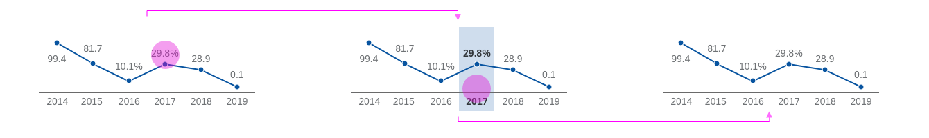
The interactive line chart consists of two mandatory areas – a filter label and an area containing the measure and visualization of the chart. The control itself doesn’t contain an axis title.
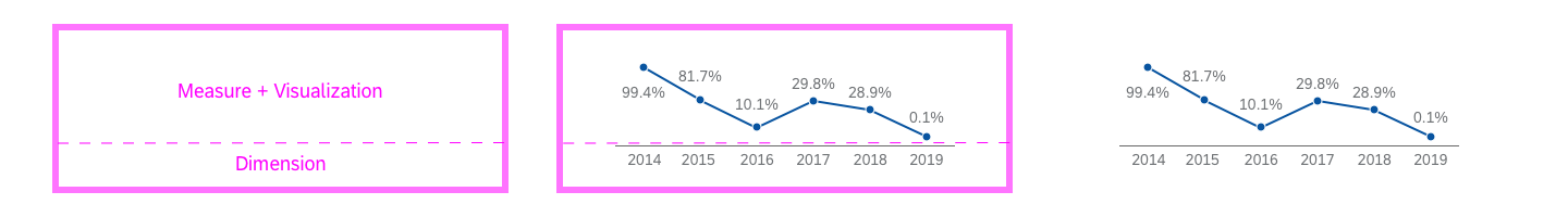
Interactive line chart - Layout
Filter Labels
The filter labels contain the filter criteria and are left-aligned. They may be truncated if not enough space is available. To avoid this, we highly recommend using the short format for time-related filter labels. For example:
- Year: 2017
- Half Year: H1, H2
- Months: Jan, Feb, Mar, Apr, May, Jun, Jul, Aug, Sep, Oct, Nov, Dec
- Quarters: Q1, Q2, Q3, Q4
- Week: W1-W52
- Weekdays: Mon, Tue, Wed, Thu, Fri, Sat, Sun
- Days: Jan 1, Jan 2 … Dec 31
Measure and Visualization
The interactive line chart can display percentage and actual values as a measure, but never a mix of both at the same time. Always display measures using one decimal point. Measures should always be visible and never truncated.
The interactive line chart does not support coloring, and the default color of the bars should not be customized.
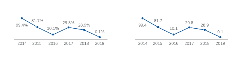
Do: Display measures in either actual or percentage values
Don't: Display a mix of both actual and percentage values
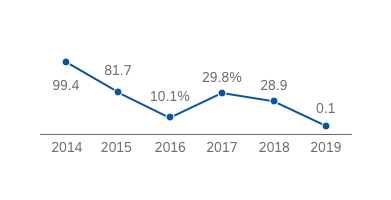
Values
The interactive line chart can display positive, negative and mixed (positive and negative) values.
The time axis line serves as the zero line, which can be displayed accordingly to indicate different relations between the positive and negative values.
Example: Positive and negative values
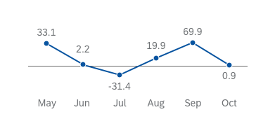
Semantic Colors
The interactive line chart supports semantic colors, which are shown as color dots. Since interactive charts are used to filter content visually, these colors give users even greater clarity when evaluating the information.
Use semantic colors when you want to make users aware of critical thresholds or categories.

Example: Showing a critical line chart data point using a semantic color
Behavior and Interaction
Selecting and deselecting a section resembles toggle-like behavior. If the user clicks on a selected section, it becomes deselected, and vice versa. By default, the interactive line chart supports multiple selection, allowing the user to select more than one filter value.
Interactive line chart - Interaction
Guidelines
Use the interactive line chart in the visual filter bar if you would like to have a filter for the highest or lowest values of a filter dimension. For example, to filter for the highest or lowest margin, revenue, or cost related to a project.
In the visual filter bar, the interactive line chart only displays the first or last six data points (such as last six days, last six months, and so on).
In general:
- Display the measure labels with one decimal point.
- Do not display an axis title.
- Do not display any scrollbars.
Resources
Want to dive deeper? Follow the links below to find out more about related controls, the SAPUI5 implementation, and the visual design.
Elements and Controls
- Interactive Chart (guidelines)
- Interactive Bar Chart (guidelines)
- Interactive Donut Chart (guidelines)
- Analytical List Page (guidelines)
Implementation
- Interactive Line Chart (SAPUI5 samples)
- Interactive Line Chart (SAPUI5 API reference)
 Your feedback has been sent to the SAP Fiori design team.