
- Latest SAPUI Version 1.124
- SAPUI5 Version 1.122
- SAPUI5 Version 1.120
- SAPUI5 Version 1.118
- SAPUI5 Version 1.116
- SAPUI5 Version 1.114
- SAPUI5 Version 1.112
- SAPUI5 Version 1.110
- SAPUI5 Version 1.108
- SAPUI5 Version 1.106
- SAPUI5 Version 1.104
- SAPUI5 Version 1.102
- SAPUI5 Version 1.100
- SAPUI5 Version 1.98
- SAPUI5 Version 1.96
- SAPUI5 Version 1.94
- SAPUI5 Version 1.92
- SAPUI5 Version 1.88
- SAPUI5 Version 1.86
- SAPUI5 Version 1.84
- SAPUI5 Version 1.82
- SAPUI5 Version 1.80
- SAPUI5 Version 1.78
- SAPUI5 Version 1.76
- SAPUI5 Version 1.74
- SAPUI5 Version 1.72
- SAPUI5 Version 1.70
- SAPUI5 Version 1.68
- SAPUI5 Version 1.66
- SAPUI5 Version 1.64
- SAPUI5 Version 1.62
- SAPUI5 Version 1.60
- SAPUI5 Version 1.58
- SAPUI5 Version 1.56
- SAPUI5 Version 1.54
- SAPUI5 Version 1.52
- SAPUI5 Version 1.50
- SAPUI5 Version 1.48
- SAPUI5 Version 1.46
- SAPUI5 Version 1.44
- SAPUI5 Version 1.42
- SAPUI5 Version 1.40
- SAPUI5 Version 1.38
- SAPUI5 Version 1.36
- SAPUI5 Version 1.34
- SAPUI5 Version 1.32
- SAPUI5 Version 1.30
- SAPUI5 Version 1.28
- SAPUI5 Version 1.26
- Latest SAPUI Version 1.124
- SAPUI5 Version 1.122
- SAPUI5 Version 1.120
- SAPUI5 Version 1.118
- SAPUI5 Version 1.116
- SAPUI5 Version 1.114
- SAPUI5 Version 1.112
- SAPUI5 Version 1.110
- SAPUI5 Version 1.108
- SAPUI5 Version 1.106
- SAPUI5 Version 1.104
- SAPUI5 Version 1.102
- SAPUI5 Version 1.100
- SAPUI5 Version 1.98
- SAPUI5 Version 1.96
- SAPUI5 Version 1.94
- SAPUI5 Version 1.92
- SAPUI5 Version 1.90
- SAPUI5 Version 1.88
- SAPUI5 Version 1.86
- SAPUI5 Version 1.84
- SAPUI5 Version 1.82
- SAPUI5 Version 1.80
- SAPUI5 Version 1.78
- SAPUI5 Version 1.76
- SAPUI5 Version 1.74
- SAPUI5 Version 1.72
- SAPUI5 Version 1.70
- SAPUI5 Version 1.68
- SAPUI5 Version 1.66
- SAPUI5 Version 1.64
- SAPUI5 Version 1.62
- SAPUI5 Version 1.60
- SAPUI5 Version 1.58
- SAPUI5 Version 1.56
- SAPUI5 Version 1.54
- SAPUI5 Version 1.52
- SAPUI5 Version 1.50
- SAPUI5 Version 1.48
- SAPUI5 Version 1.46
- SAPUI5 Version 1.44
- SAPUI5 Version 1.42
- SAPUI5 Version 1.40
- SAPUI5 Version 1.38
- SAPUI5 Version 1.36
- SAPUI5 Version 1.34
- SAPUI5 Version 1.32
- SAPUI5 Version 1.30
- SAPUI5 Version 1.28
- SAPUI5 Version 1.26
Chart – Ranking
Intro
This page will help you choose the correct chart for ranking items based on numeric values. This is useful for identifying category items with the largest or smallest values.
By Category
We recommend using a bar chart to display a list of category items sorted by value (for example, a product ranking by revenue).
In the chart below, it is easy to:
- Understand that the category items are sorted by values.
- Identify the top-ranking countries and the lowest-ranking countries.
- See that all the countries in the middle have values that are very close together.
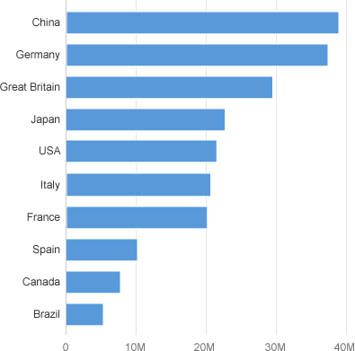
Category items ranked by value
If you’re also interested in seeing how the values are distributed among category items, you can display a reference line that indicates the median.
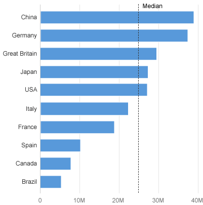
Category items ranked by value, with median
Bar Chart vs. Column Chart
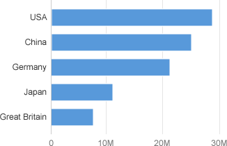
Bar chart with nicely displayed labels
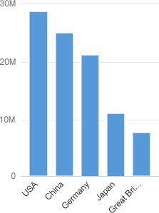
Column chart with truncated labels at 45°
Within a Hierarchy
You can rank items within groups of the hierarchy.
In the example below, the countries are ranked inside their respective continents which makes it easy to compare each continent and each country within each continent.
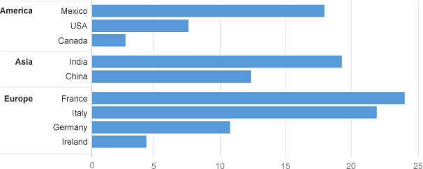
Ranked groups inside a hierachy
Flat Hierarchy
When the hierarchy does not contain many items, you can flatten it and use color to identify the first level of the hierarchy.
In the chart below, you can immediately grasp which top 3 countries have the highest values and that America has the smallest values.
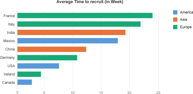
Ranked items in a flat hierachy
The chart below is used in the Cash Management app and displays the liquidity forecast by outcome and income. Displaying the outcome and income seperately helps to identify which income and outcome are the biggest.
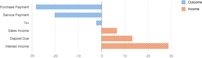
Positive and negative items ranked separately
Ranking and Parts to Whole
If you want to know which items have the biggest values and how much of these items contribute to the total of the values, you can use a Pareto chart which is designed to illustrate the well-known 80%/20% rule (that is, 20% of the items contribute to 80% of the total).
The chart below displays the number of defects by type of defect, and we can see that 80% of the defects come from the first four types of defect.
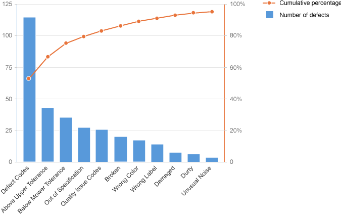
Pareto chart
Resources
Want to dive deeper? Follow the links below to find out more about related controls, the SAPUI5 implementation, and the visual design.
Implementation
- Bar Chart (SAPUI5 samples)
- Column Chart (SAPUI5 samples)
- Bar/Column Chart with Hierarchies (SAPUI5 samples)
- Negative Values (SAPUI5 samples)
 Your feedback has been sent to the SAP Fiori design team.