
- Latest SAPUI Version 1.124
- SAPUI5 Version 1.122
- SAPUI5 Version 1.120
- SAPUI5 Version 1.118
- SAPUI5 Version 1.116
- SAPUI5 Version 1.114
- SAPUI5 Version 1.112
- SAPUI5 Version 1.110
- SAPUI5 Version 1.108
- SAPUI5 Version 1.104
- SAPUI5 Version 1.102
- SAPUI5 Version 1.100
- SAPUI5 Version 1.98
- SAPUI5 Version 1.96
- SAPUI5 Version 1.94
- SAPUI5 Version 1.92
- SAPUI5 Version 1.90
- SAPUI5 Version 1.88
- SAPUI5 Version 1.86
- SAPUI5 Version 1.84
- SAPUI5 Version 1.82
- SAPUI5 Version 1.80
- SAPUI5 Version 1.78
- SAPUI5 Version 1.76
- SAPUI5 Version 1.74
- SAPUI5 Version 1.72
- SAPUI5 Version 1.70
- SAPUI5 Version 1.68
- SAPUI5 Version 1.66
- SAPUI5 Version 1.64
- SAPUI5 Version 1.62
- SAPUI5 Version 1.60
- SAPUI5 Version 1.58
- SAPUI5 Version 1.56
- SAPUI5 Version 1.54
- SAPUI5 Version 1.52
- SAPUI5 Version 1.50
- SAPUI5 Version 1.48
- SAPUI5 Version 1.46
- SAPUI5 Version 1.44
- SAPUI5 Version 1.42
- SAPUI5 Version 1.40
- SAPUI5 Version 1.38
- SAPUI5 Version 1.36
- SAPUI5 Version 1.34
- SAPUI5 Version 1.32
- SAPUI5 Version 1.30
- SAPUI5 Version 1.28
- SAPUI5 Version 1.26
- Latest SAPUI Version 1.124
- SAPUI5 Version 1.122
- SAPUI5 Version 1.120
- SAPUI5 Version 1.118
- SAPUI5 Version 1.116
- SAPUI5 Version 1.114
- SAPUI5 Version 1.112
- SAPUI5 Version 1.110
- SAPUI5 Version 1.108
- SAPUI5 Version 1.106
- SAPUI5 Version 1.104
- SAPUI5 Version 1.102
- SAPUI5 Version 1.100
- SAPUI5 Version 1.98
- SAPUI5 Version 1.96
- SAPUI5 Version 1.94
- SAPUI5 Version 1.92
- SAPUI5 Version 1.90
- SAPUI5 Version 1.88
- SAPUI5 Version 1.86
- SAPUI5 Version 1.84
- SAPUI5 Version 1.82
- SAPUI5 Version 1.80
- SAPUI5 Version 1.78
- SAPUI5 Version 1.76
- SAPUI5 Version 1.74
- SAPUI5 Version 1.72
- SAPUI5 Version 1.70
- SAPUI5 Version 1.68
- SAPUI5 Version 1.66
- SAPUI5 Version 1.64
- SAPUI5 Version 1.62
- SAPUI5 Version 1.60
- SAPUI5 Version 1.58
- SAPUI5 Version 1.56
- SAPUI5 Version 1.54
- SAPUI5 Version 1.52
- SAPUI5 Version 1.50
- SAPUI5 Version 1.48
- SAPUI5 Version 1.46
- SAPUI5 Version 1.44
- SAPUI5 Version 1.42
- SAPUI5 Version 1.40
- SAPUI5 Version 1.38
- SAPUI5 Version 1.36
- SAPUI5 Version 1.34
- SAPUI5 Version 1.32
- SAPUI5 Version 1.30
- SAPUI5 Version 1.28
- SAPUI5 Version 1.26
Time Picker
sap.m.TimePicker
Intro
The time picker allows the user to select a localized time. It can be used with touch, mouse, or keyboard input.
When to Use
Use the time picker if:
- Users need to select a time.
- Users need to select a time range. In this case, one time picker can be used to set the starting time and a second one to set the end time.
- Users need to select a specific duration, such as 1 minute and 30 seconds.
Do not use the time picker if:
- Users need to select a standard duration such as 15 minutes, 30 minutes, 1 hour, or 2 hours. In this case, use the select control instead.
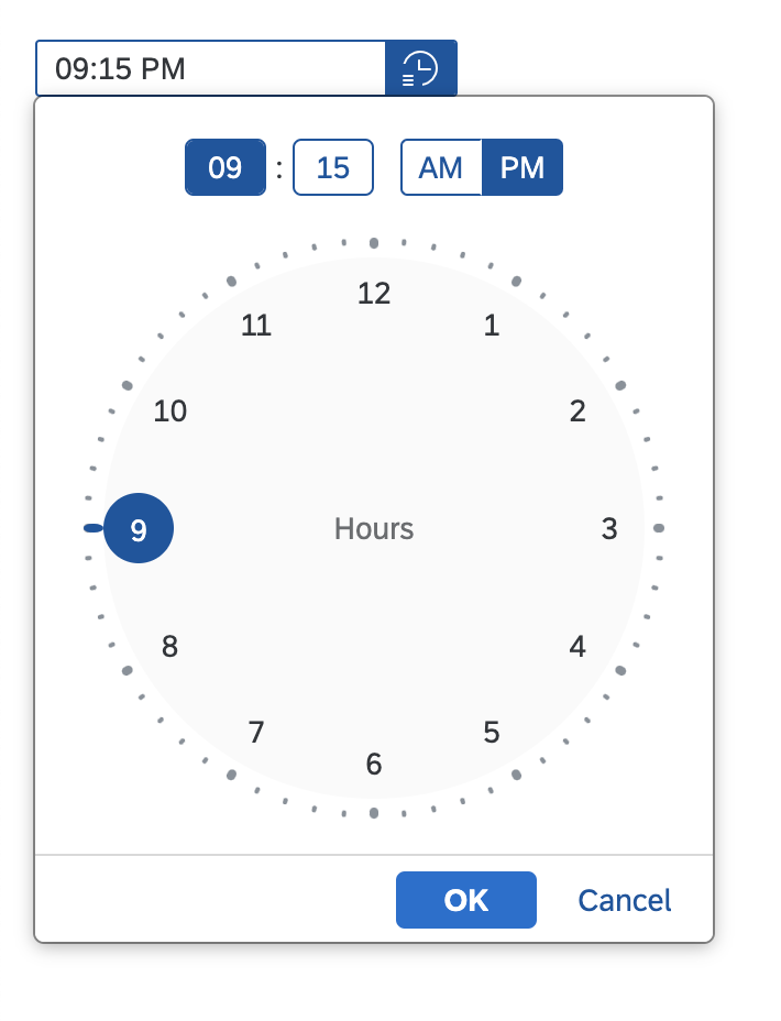
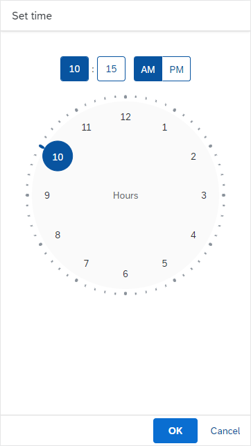
Time picker
Components
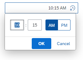
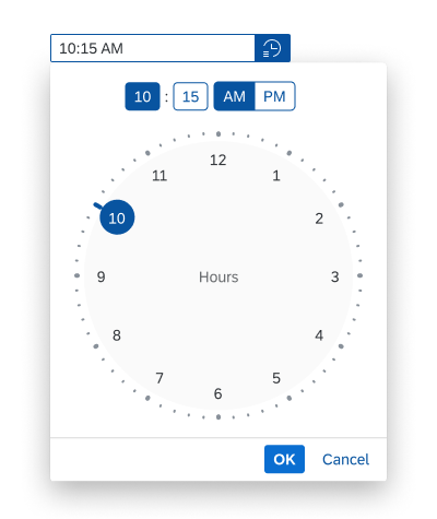
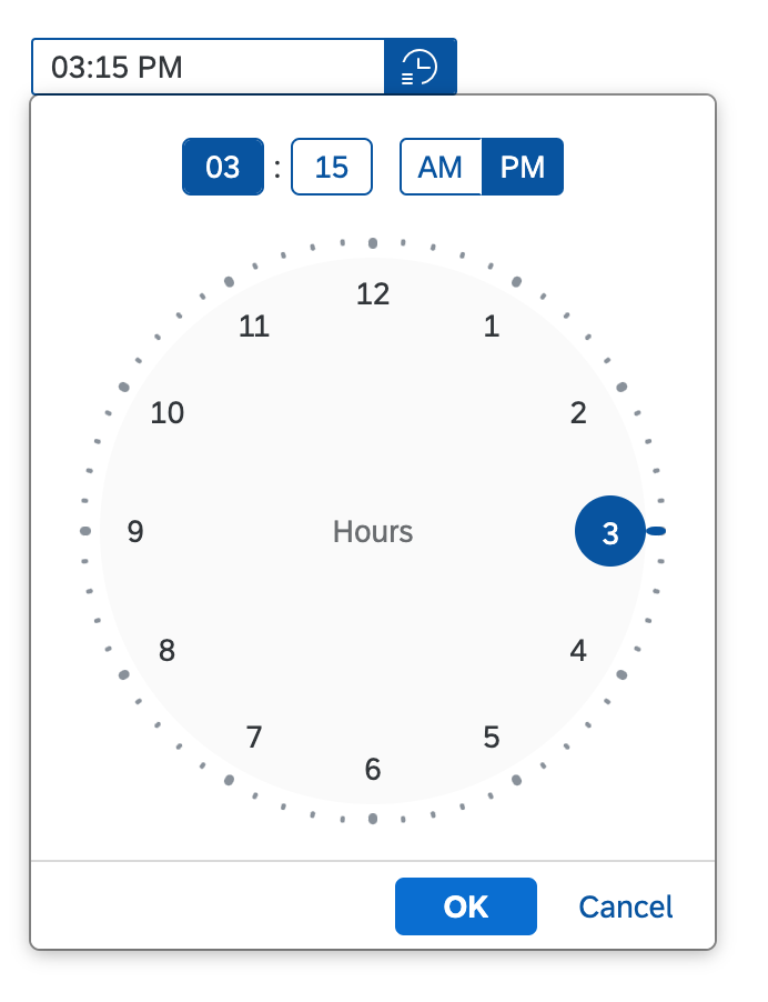
The time picker consists of a time input field. Users can enter a time directly or use the time picker button to select a time using the time picker popover.
On phones, selecting the time input field opens a time input popover for entering the time with the touch keyboard.
The time input field can also contain a placeholder (input prompt).

Time input field on desktop
Time picker popover on desktop

Time input field on tablet
Time picker popover on tablet

Time input field on phone
Time input popover on phone
Time picker popover on phone, opened in full-screen
Time Picker Popover
In the time picker popover, the user can select a time by using the clock face to set hours, minutes, and seconds.
The full time is always displayed at the top of the popover.
If the user has opted for the 12-hour format in the user settings, an AM/PM switch is also displayed.
If seconds are not relevant for the use case, you can remove the seconds field.
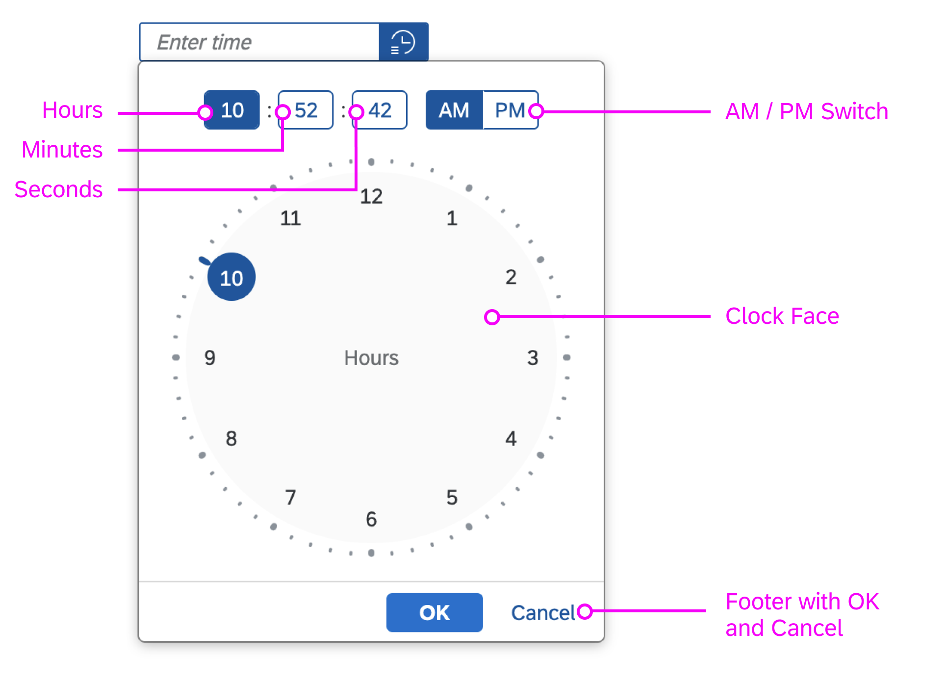
Components of the time picker popover
Hours Clock Face
Depending on the time format, the hours clock face shows 12 hours or 24 hours:
- The 12-hour clock face shows only one circle.
- The 24-hour clock face shows an additional inner circle for the times from 13:00 to 24:00 hours.
12-hour clock face
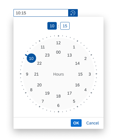
24-hour clock face
Minutes Clock Face
When the minutes value is selected in the time display, the minutes clock face is shown.
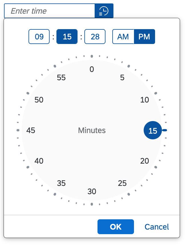
Minutes clock face
Seconds Clock Face
When the seconds value is selected in the time display, the seconds clock face is shown.
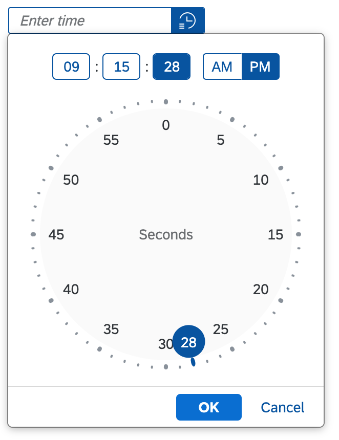
Seconds clock face
Behavior and Interaction
Users can enter the time in two ways:
- Enter a time directly in the input field
- Select a time using the time picker popover
Entering a Time in the Input Field
On desktop devices, the user selects the time input field and enters the time using the keyboard.

Entering a time directly
On phones, focusing on the time input field opens a time input popover. The user can then use the mobile keyboard to enter the time. For the 12-hour time format, the popover also offers an AM/PM switch.
Time input popover on mobile/tablet devices
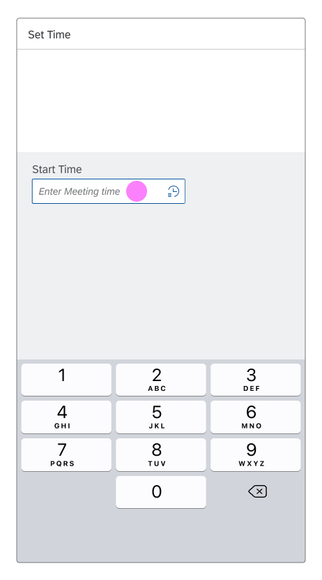
1) Focus on time input field
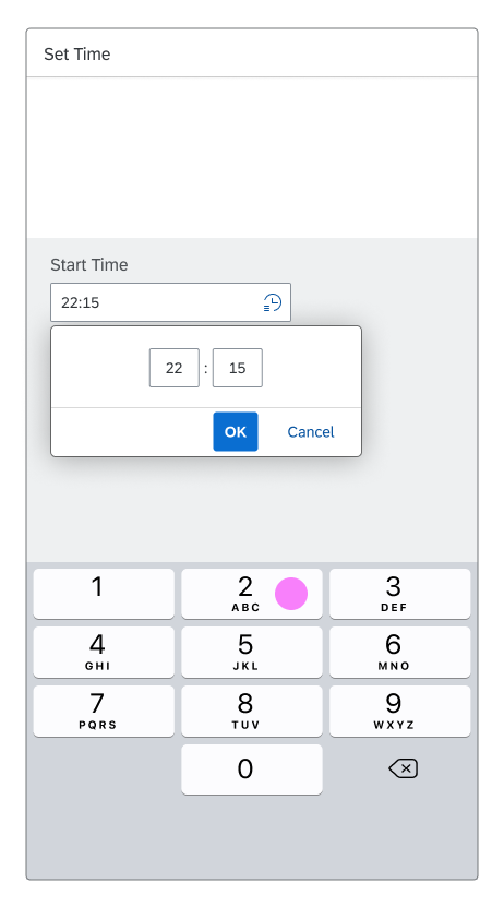
2a) Time input popover, 24-hour format

2b) Time input popover, 12-hour format with AM/PM switch
Selecting a Time with the Time Picker Popover
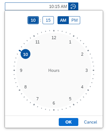
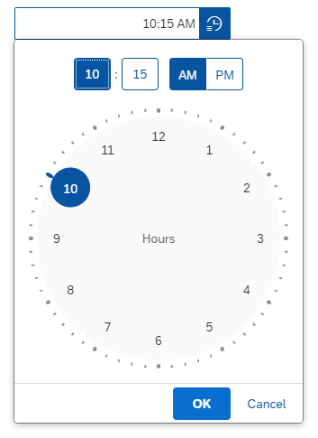
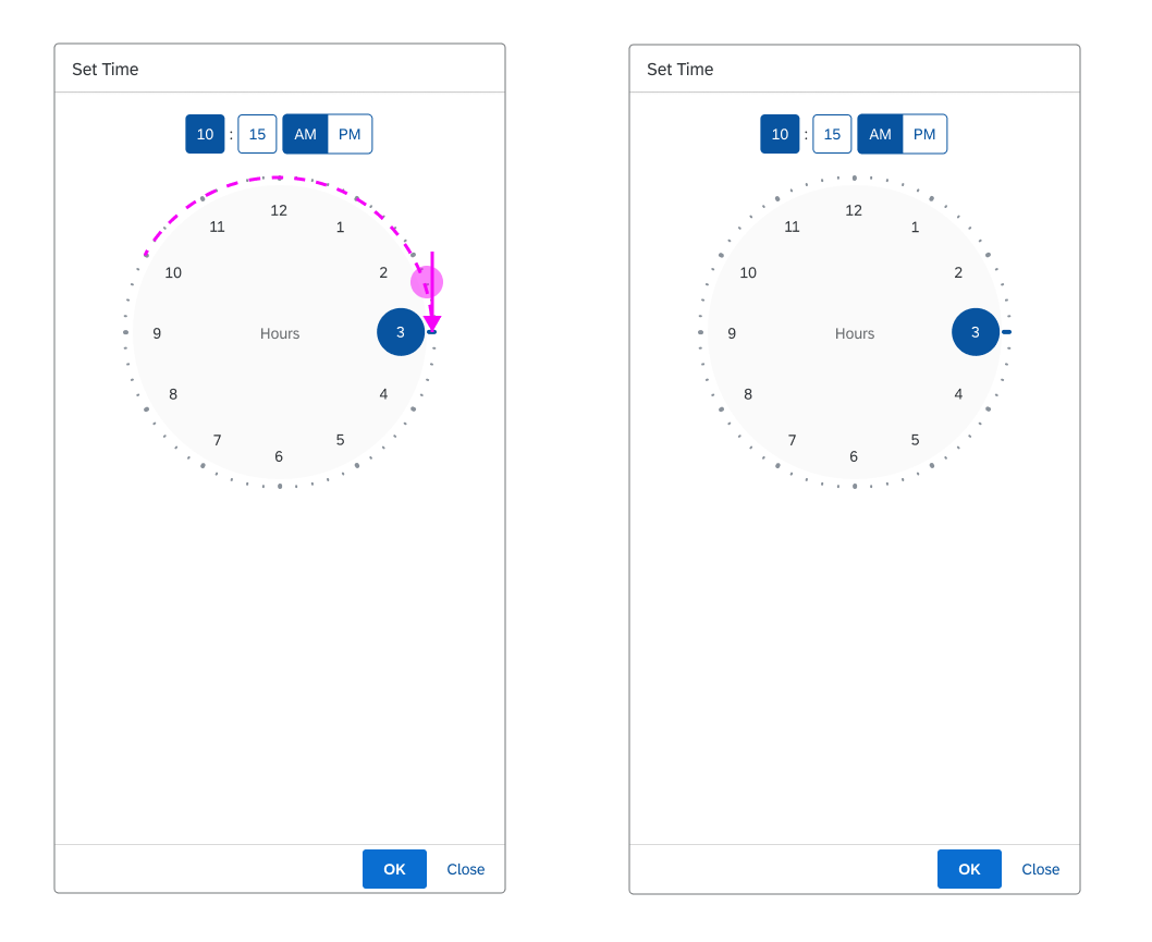
By default, the time picker shows the hours clock face, and the hour value is highlighted in the time display at the top of the popover. On desktop devices, users can select the hour using a mouse or the keyboard arrows. Tablet and mobile device users can drag the handle around the dial to the desired number, or tap the number on the dial. The selected hour is then entered in the time display at the top.
When an hour value is set, the hours clock face automatically switches to the minutes view: the minutes clock face is shown and the minutes value is highlighted in the time display. If an hour was selected by mistake, the user can switch back to the hours clock face by selecting the hours value.
Minutes and seconds are selected in the same way.
Clicking the OK button confirms the selected time. Clicking Cancel or clicking anywhere outside the popover discards the changes.

Selecting time on a desktop device
Interaction options on mobile devices: Drag or tap
Default Time
You can set a predefined time, which shows as the initial value in the time input field and the time picker popover. If you don’t set a default time at application level, the control defaults to the current time. Users can overwrite the initial value.
Preventing Errors
You can prevent users from making incorrect entries by only allowing certain characters (see mask input). If the user enters a time that has the correct format but is invalid (such as 12:60:85), the time picker displays a validation error (see input validation).
You can switch off the integrated mask input feature, but we strongly recommend using it. Only deactivate mask input if you need to make an exception for your use case (for example, if a variable length is required for a specific locale).
Style
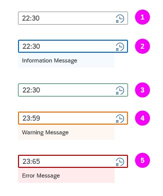
The time picker has five basic value states:
- Regular
- Information
- Success
- Warning
- Error
For the information, warning, and error states, you can also display a message with additional information below the field.
Time picker value states
Responsiveness
The time picker comes with a cozy mode and a compact mode. In the compact mode, the time input field and the button are smaller than in the cozy mode. For more information, see Content Density.
For mobile (size S) devices, the time picker popover does not open below the time input field, but in a subview.
Time picker on a desktop device

Time picker on mobile (size S)
Guidelines
Time Formats
Seconds
Only let the user select time in seconds if this information is really necessary.
Time Zone
If the user has to set a time that is time zone-sensitive, offer a select control next to the time picker control to choose the appropriate time zone.
For more information, see Formatting Time.
Properties
AM and PM are locale-dependent. You can set the locale with the property localeId.
You can define the display format for the time in the input field and at the top of the time picker popover (property: displayFormat). For more information about time formats, see Formatting Dates.
Related Links
Elements and Controls
- Date Picker (guidelines)
- Date/Time Picker (guidelines)
- Input Field (guidelines)
- Select (guidelines)
- Formatting Time (guidelines)
- Formatting Dates (guidelines)
- How To Use Semantic Colors (guidelines)
 Your feedback has been sent to the SAP Fiori design team.