
- Latest SAPUI Version 1.124
- SAPUI5 Version 1.122
- SAPUI5 Version 1.120
- SAPUI5 Version 1.118
- SAPUI5 Version 1.116
- SAPUI5 Version 1.114
- SAPUI5 Version 1.112
- SAPUI5 Version 1.110
- SAPUI5 Version 1.108
- SAPUI5 Version 1.104
- SAPUI5 Version 1.102
- SAPUI5 Version 1.100
- SAPUI5 Version 1.98
- SAPUI5 Version 1.96
- SAPUI5 Version 1.94
- SAPUI5 Version 1.92
- SAPUI5 Version 1.90
- SAPUI5 Version 1.88
- SAPUI5 Version 1.86
- SAPUI5 Version 1.84
- SAPUI5 Version 1.82
- SAPUI5 Version 1.80
- SAPUI5 Version 1.78
- SAPUI5 Version 1.76
- SAPUI5 Version 1.74
- SAPUI5 Version 1.72
- SAPUI5 Version 1.70
- SAPUI5 Version 1.68
- SAPUI5 Version 1.66
- SAPUI5 Version 1.64
- SAPUI5 Version 1.62
- SAPUI5 Version 1.60
- SAPUI5 Version 1.58
- SAPUI5 Version 1.56
- SAPUI5 Version 1.54
- SAPUI5 Version 1.52
- SAPUI5 Version 1.50
- SAPUI5 Version 1.48
- SAPUI5 Version 1.46
- SAPUI5 Version 1.44
- SAPUI5 Version 1.42
- SAPUI5 Version 1.40
- SAPUI5 Version 1.38
- SAPUI5 Version 1.36
- SAPUI5 Version 1.34
- SAPUI5 Version 1.32
- SAPUI5 Version 1.30
- SAPUI5 Version 1.28
- SAPUI5 Version 1.26
- Latest SAPUI Version 1.124
- SAPUI5 Version 1.122
- SAPUI5 Version 1.120
- SAPUI5 Version 1.118
- SAPUI5 Version 1.116
- SAPUI5 Version 1.114
- SAPUI5 Version 1.112
- SAPUI5 Version 1.110
- SAPUI5 Version 1.108
- SAPUI5 Version 1.106
- SAPUI5 Version 1.104
- SAPUI5 Version 1.102
- SAPUI5 Version 1.100
- SAPUI5 Version 1.98
- SAPUI5 Version 1.96
- SAPUI5 Version 1.94
- SAPUI5 Version 1.92
- SAPUI5 Version 1.90
- SAPUI5 Version 1.88
- SAPUI5 Version 1.86
- SAPUI5 Version 1.84
- SAPUI5 Version 1.82
- SAPUI5 Version 1.80
- SAPUI5 Version 1.78
- SAPUI5 Version 1.76
- SAPUI5 Version 1.74
- SAPUI5 Version 1.72
- SAPUI5 Version 1.70
- SAPUI5 Version 1.68
- SAPUI5 Version 1.66
- SAPUI5 Version 1.64
- SAPUI5 Version 1.62
- SAPUI5 Version 1.60
- SAPUI5 Version 1.58
- SAPUI5 Version 1.56
- SAPUI5 Version 1.54
- SAPUI5 Version 1.52
- SAPUI5 Version 1.50
- SAPUI5 Version 1.48
- SAPUI5 Version 1.46
- SAPUI5 Version 1.44
- SAPUI5 Version 1.42
- SAPUI5 Version 1.40
- SAPUI5 Version 1.38
- SAPUI5 Version 1.36
- SAPUI5 Version 1.34
- SAPUI5 Version 1.32
- SAPUI5 Version 1.30
- SAPUI5 Version 1.28
- SAPUI5 Version 1.26
Grid List
sap.f.GridList
Intro
The grid list displays a set of items. Whereas the list and the responsive table display the items in rows, the grid list displays the items as rectangular boxes on a grid. This makes it ideal for displaying visual content, such as images, charts, or object cards.
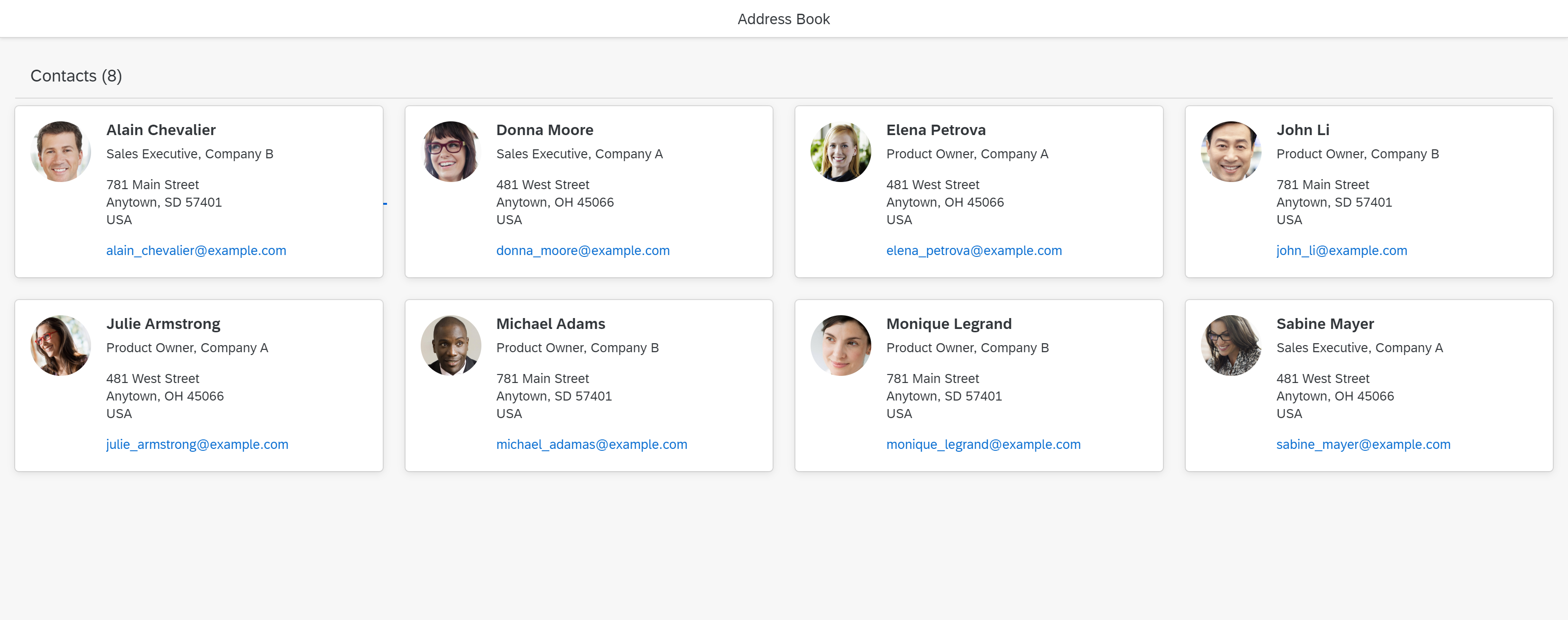
Grid list
When to Use
Use the grid list if:
- You want to display a set of homogeneous items.
- The rectangular format of the items is better suited to your content than tables or lists.
- The focus is on complete items, not cells.
- Your items mimic the format of existing objects (such as business cards).
- Users need to sort, group, or filter the items.
Don’t use the grid list if:
- Your content isn’t suitable for a card-like format. If you need to display a lot of detail or if your content is very text-heavy, use a table instead.
- You expect to show more than 1.000 items. For better performance, use the grid table or analytical table instead.
- You need an overview of a large amount of data. In this case, consider using a chart.
- You only need the grid-style layout. In this case, use a layout container, such as the flexible grid.
Components
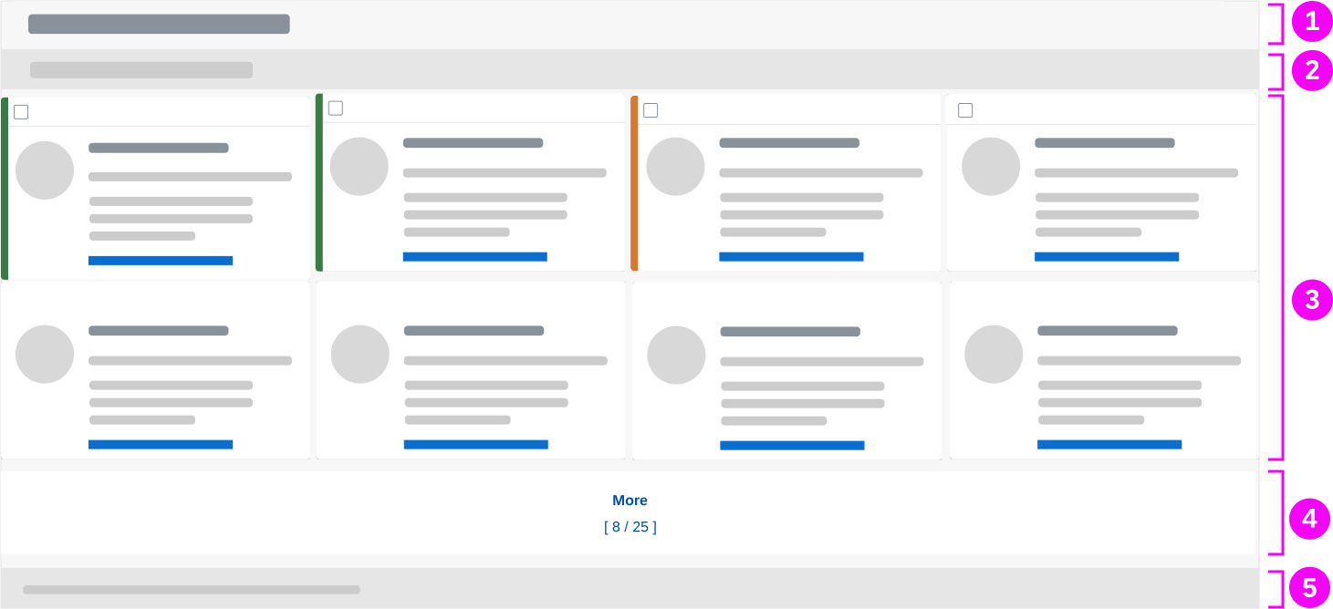
Grid list components
- Title bar or toolbar
- Filter infobar (optional)
- Items
- More button (optional)
- Footer (optional)
1. Title Bar
The title bar contains the title of the grid list and an item counter.
Instead of a a title bar, you can use a toolbar. The toolbar can have the following elements:
- Title and item count
- Variant management
- Actions, such as Add or Edit.
- A segmented button for switching views
- A button to open a view settings dialog

Title bar

Toolbar instead of title bar
2. Filter Infobar (Optional)
The filter infobar shows information on the filter settings.

Filter infobar
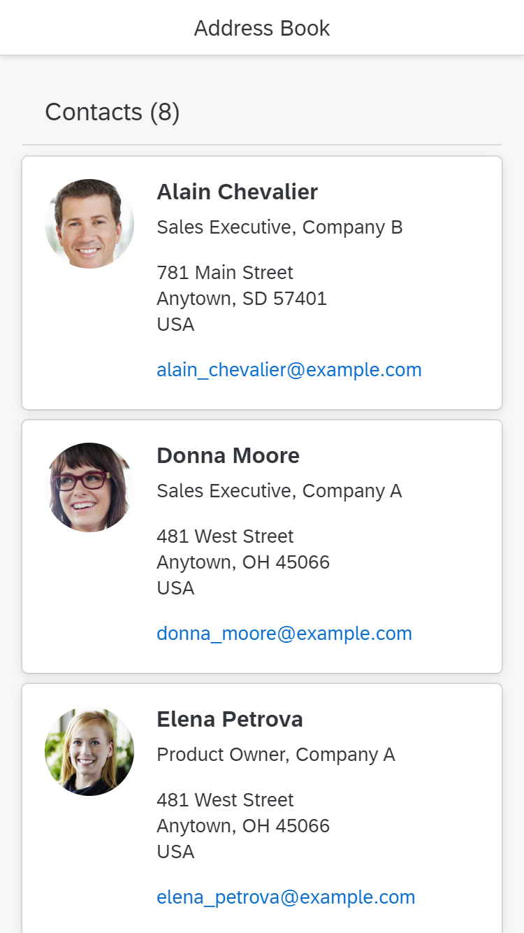
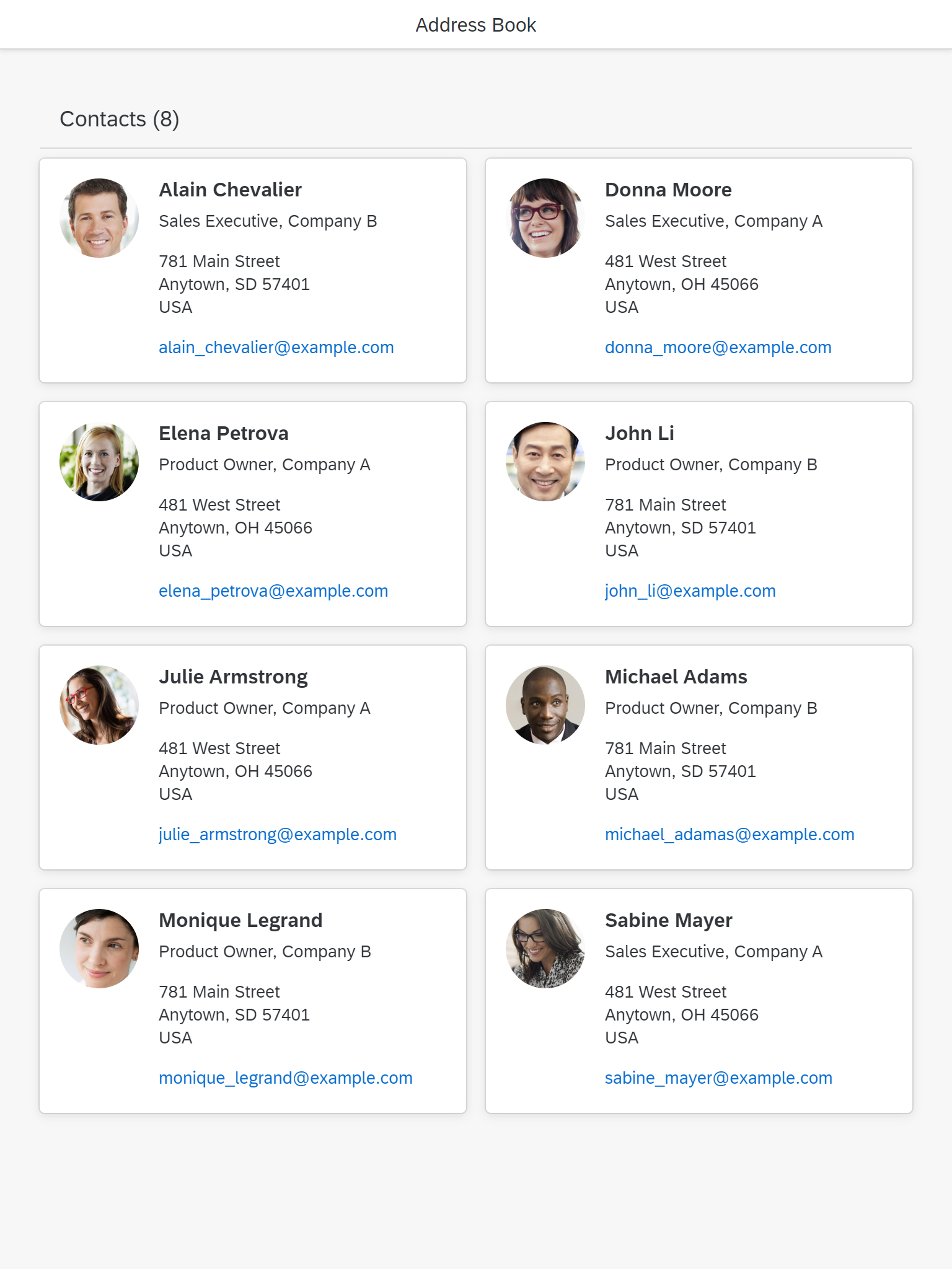
3. Items
A grid list item can contain any content. This can include single controls or a combination of controls (for example, using layout containers).
A grid list can contain different item types. For example:
- Sales orders and purchase orders
- Items in display mode and single items in edit mode
You can highlight items and show an item state (such as “unread” or “locked”).

Example of a grid list item
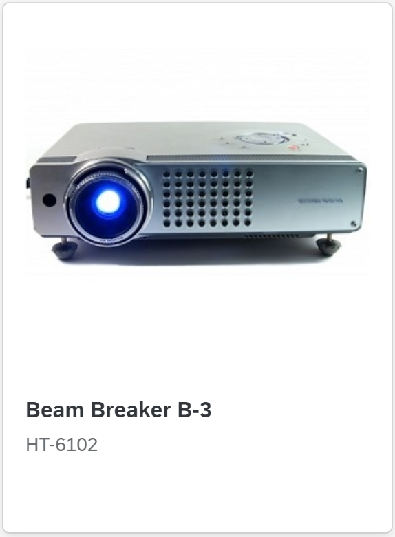
Another example of a grid list item
Highlighting Items
To show that an item needs attention, you can display a highlight indicator to the left of the item.
(sap.m.ListItemBase, property: highlight)

Highlighted item
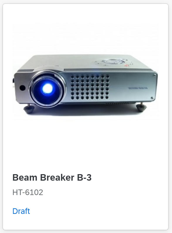
Item States
Show the different item states as follows:
State
Unread
How to Display
Shows most content in bold.
sap.f.GridListproperty:
showUnread
sap.f.GridListItem
property: unread

Unread item next to a read item
Error
Add the string (Contains errors) near the item identifier.
sap.m.ObjectStatus
Property: state
Value: sap.ui.core.ValueState.Error
Highlight the item accordingly
sap.f.GridListItem
property: highlight
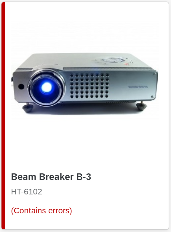
An item with an error
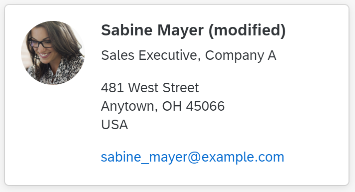
Locked
Add a transparent button with the corresponding icon and the text Locked by [Name] near the item identifier.
Clicking the button opens a quick view of the person.

A locked item
“More” Button (Optional)
The More button loads more items. The count below the button indicates the items displayed and the total number of items.
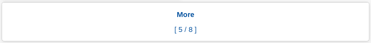
'More' button
Footer (Optional)
You can use the footer to display additional static information relating to the content.

Grid list footer
Behavior and Interaction
This section covers the following topics:
In addition, see the following guidelines for the responsive table:
Loading Items
You can load the grid list in “growing” mode.
In “growing” mode, only a limited number of items are loaded when the grid list is initially displayed. Additional items are only loaded (and rendered) on request. This request can be triggered either by scrolling (preferred) or by clicking the More button.
Scroll
The height of the grid list is defined by the number of items it contains.
The grid list is scrolled together with the page and doesn’t have its own scroll container. When the user scrolls through the page, the title bar and filter infobar can stick to the top of the surrounding layout container
(sap.f.GridList, property:sticky).
Sticky toolbar
“More” Button
The More button is the default implementation when growing is switched on (property: growing = true).
'More' button with loaded/total items
Drag and Drop
The grid list offers the same drag and drop features as the responsive table.
However, because the items in the grid list are rearranged after an item is dropped, it isn’t always clear where the item will finally be placed.
Keyboard Navigation
The grid list supports the following keyboard navigation options:
- Arrow keys: Navigate between items in all directions
- Page Up / Page Down: Skip several rows
- Home: Move the focus to the first item
- End: Move the focus to the last item
Selecting Items
A grid list offers the same selection modes as the responsive table
(sap.f.GridList / sap.m.ListBase, property: mode).
Exception: A Select All checkbox isn’t provided. Users can only select/deselect all items with the keyboard shortcut (CTRL+A).
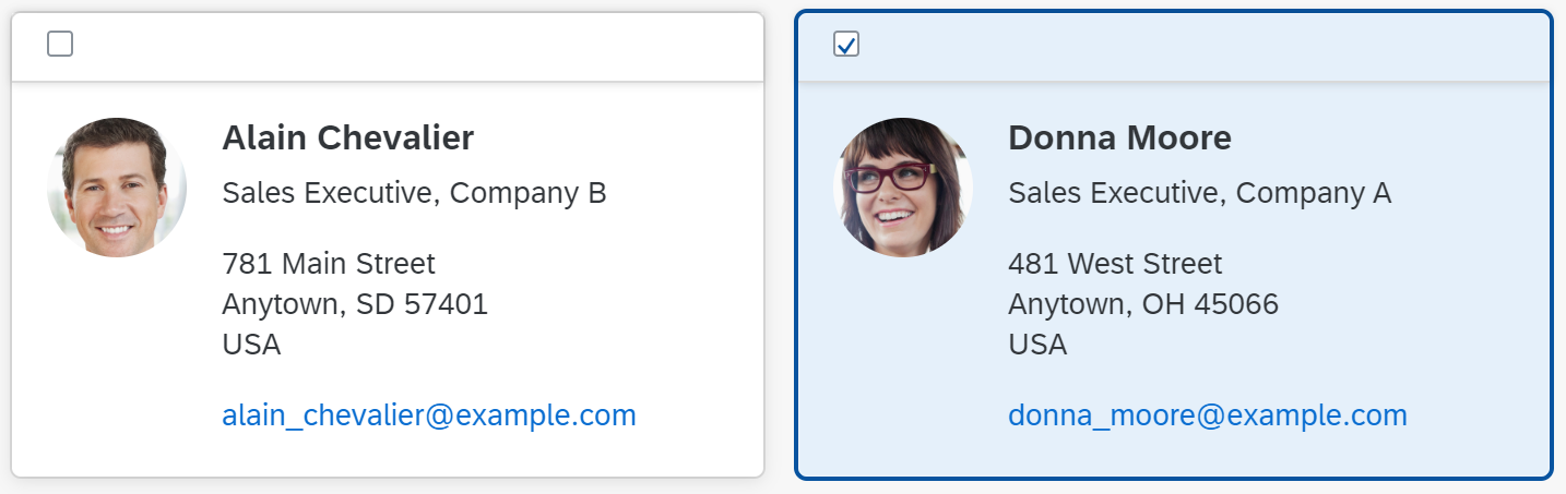
An unselected and a selected item in "multi-selection" mode

A selected item in "single select master" mode
Clickable Items
The whole item can be clickable. You can define the action triggered by the click, such as opening a dialog (sap.f.GridListItem, property: type, value: sap.m.ListType.Active or sap.m.ListType.DetailAndActive).
Active elements don’t have a visual indicator and therefore can’t be differentiated from non-active elements.
Clicks on interactive controls within the item are handled by the interactive control and don’t trigger the event for the item as a whole.
Actions
You can offer actions for the entire grid list, single items, and multiple items.
Actions on Single Items
You can offer actions for single items either on the toolbar or within the item.
Delete, navigation, and edit actions for single items are supported by the grid list control (see below).
Use the “Delete” mode of the grid list (sap.m.ListBase, property: mode, value: sap.m.ListMode.Delete).
This places a Delete button ( ) in the top right area of the item.

'Delete' button
Use the “Navigation” item type (sap.m.ListItemBase, property: type, value: sap.m.ListType.Navigation).
This places a navigation indicator ( ) in the top right area of the item, and the entire item becomes clickable.
By contrast, clicking an interactive control within an item doesn’t trigger the navigation event. Instead, the corresponding control handles the click event.

Navigation indicator
Use the “Detail” list item type (sap.f.GridListItem, property: type, value: sap.m.ListType.Detail).
This places an Edit icon ( ) in the top right area of the item. Clicking the button triggers the edit event. Use this event to switch the corresponding item to edit mode.

Edit button
Actions on Multiple Items
Errors and Warnings
Error handling must be implemented by the app team.
For details on displaying errors, warnings, and other messages, see Message Handling.
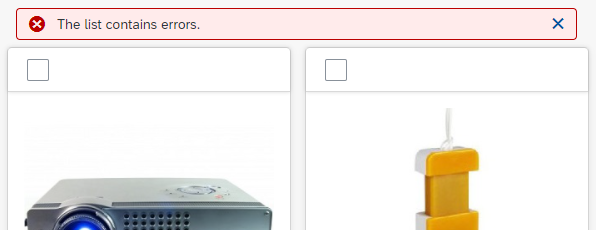
Grid list with errors
Responsiveness
The responsiveness of the grid list results from the underlying grid, which is defined by rows and columns. Columns can have a minimum and maximum size or a fixed size. Whenever an additional column fits on the screen, it is added. If a column no longer fits on the screen, it is removed. Items are re-layouted accordingly.
You can also define different configurations for the underlying grid using breakpoints (for example, based on the device types).
Predefined Layouts
To define the grid layout and behavior, you can use one of the predefined layouts:
- Grid box layout: Adds a variable number of columns, depending on the available screen width. Columns have either a fixed width or can “breathe” slightly. All rows have the same height and all items are the same size.
- Responsive column layout: The number of columns depends on breakpoints (4 columns for size S, 8 for size M, 12 for size ML and L, 16 for size XL, 20 for size XXL and XXXL). The width of the columns grows or shrinks with the available screen space until the next breakpoint is reached. The row height of the grid is determined by the height of the highest item in the row. The number of rows and columns taken up by an item can differ.
Custom Grid
Alternatively, you can define your own grid. This gives you much greater flexibility to influence both the layout and the (responsive) behavior of the grid.
The underlying grid defines the available space per item. The width can differ according to the width of the screen (“breathing”) or be fixed. The height can differ according to the content of the item or be fixed.
Items can use one ore more grid cells. Items can also be different sizes (for example, to allow for varying text lengths/wrapping in different items).
Examples
Size S
Size M
Size L
Properties
sap.f.GridList
The following additional properties are available for the grid list:
insetadds a margin on all sides of the grid list.headerTextis a simple way to set the title for the grid list. However, this excludes the following:- A separate toolbar
- Variant management
headerDesignaffects the appearance of the header if the theme supports it. Leave the default value as it is.footerTextadds a small additional row below the table footer or last item. This row can contain text only. Don’t use this property.widthdefines the width of the whole grid list.includeItemInSelectionuses a click on the whole item to select the corresponding item if the grid list is in a selection mode. This competes with other settings like “Navigation” or “Active” and therefore shouldn’t be used in combination with these two settings.enableBusyIndicatorautomatically shows a busy indicator while data is loaded. (In contrast to thebusyproperty, where the application can control when the grid list is set to busy state)modeAnimationOnhas no effect. Don’t use it.showSeparatorsswipeDirectionhas no effect. Don’t use it..rememberSelectionsleaves items selected even if they aren’t currently visible (for example, after filtering). If this behavior isn’t wanted, you can set the flag to “false”. However, you should only do so in exceptional cases.busysets the grid list to a busy state. While in the busy state, the entire grid list can’t be used and items can’t be read due to an overlay.busyIndicatorDelaydefines how long a busy state is shown after the grid list has been set to this state. Use the default value.visibleshows the grid list (true) or hides it (false).tooltipprovides a tooltip for the whole grid list. Don’t use it.
sap.f.GridListItem
The following additional properties are available for sap.m.ColumnListItem:
selectedallows an item to be selected programmatically.countershows a number on the right side of an item. This is used to show the number of subitems, for example.- Don’t use the
busyproperty. - Don’t the
busyIndicatorDelayproperty. visibleshows or hides the item.tooltipadds a tooltip to a whole item. The tooltip is only shown on mouse interaction. It won’t work on tablets or smartphones. Don’t use it.
Top Tips
- Use the grid list only if the content is suitable for a rectangular format.
- Ensure that items can be identified.
- Keep your grid and your items responsive. Consider allowing cards of different sizes to avoid content truncation.
- In your card design, either mimic existing objects like business cards or follow the guidelines for object cards.
Related Links
Elements and Controls
- List (guidelines)
- Responsive Table (guidelines)
- Table Toolbar (guidelines)
- View Settings Dialog (guidelines)
- Variant Management (guidelines)
- Footer Toolbar (guidelines)
Implementation
- Grid List (SAPUI5 samples)
- Grid List (SAPUI5 API reference)
- Grid List Item (SAPUI5 API reference)
 Your feedback has been sent to the SAP Fiori design team.