
- Latest SAPUI Version 1.124
- SAPUI5 Version 1.122
- SAPUI5 Version 1.120
- SAPUI5 Version 1.118
- SAPUI5 Version 1.116
- SAPUI5 Version 1.114
- SAPUI5 Version 1.112
- SAPUI5 Version 1.110
- SAPUI5 Version 1.108
- SAPUI5 Version 1.106
- SAPUI5 Version 1.104
- SAPUI5 Version 1.102
- SAPUI5 Version 1.100
- SAPUI5 Version 1.98
- SAPUI5 Version 1.96
- SAPUI5 Version 1.94
- SAPUI5 Version 1.92
- SAPUI5 Version 1.90
- SAPUI5 Version 1.88
- SAPUI5 Version 1.86
- SAPUI5 Version 1.84
- SAPUI5 Version 1.82
- SAPUI5 Version 1.80
- SAPUI5 Version 1.78
- SAPUI5 Version 1.76
- SAPUI5 Version 1.74
- SAPUI5 Version 1.72
- SAPUI5 Version 1.70
- SAPUI5 Version 1.68
- SAPUI5 Version 1.66
- SAPUI5 Version 1.64
- SAPUI5 Version 1.62
- SAPUI5 Version 1.60
- SAPUI5 Version 1.58
- SAPUI5 Version 1.56
- SAPUI5 Version 1.54
- SAPUI5 Version 1.52
- SAPUI5 Version 1.48
- SAPUI5 Version 1.46
- SAPUI5 Version 1.44
- SAPUI5 Version 1.42
- SAPUI5 Version 1.40
- SAPUI5 Version 1.38
- SAPUI5 Version 1.36
- SAPUI5 Version 1.34
- SAPUI5 Version 1.32
- SAPUI5 Version 1.30
- SAPUI5 Version 1.28
- SAPUI5 Version 1.26
- Latest SAPUI Version 1.124
- SAPUI5 Version 1.122
- SAPUI5 Version 1.120
- SAPUI5 Version 1.118
- SAPUI5 Version 1.116
- SAPUI5 Version 1.114
- SAPUI5 Version 1.112
- SAPUI5 Version 1.110
- SAPUI5 Version 1.108
- SAPUI5 Version 1.106
- SAPUI5 Version 1.104
- SAPUI5 Version 1.102
- SAPUI5 Version 1.100
- SAPUI5 Version 1.98
- SAPUI5 Version 1.96
- SAPUI5 Version 1.94
- SAPUI5 Version 1.92
- SAPUI5 Version 1.90
- SAPUI5 Version 1.88
- SAPUI5 Version 1.86
- SAPUI5 Version 1.84
- SAPUI5 Version 1.82
- SAPUI5 Version 1.80
- SAPUI5 Version 1.78
- SAPUI5 Version 1.76
- SAPUI5 Version 1.74
- SAPUI5 Version 1.72
- SAPUI5 Version 1.70
- SAPUI5 Version 1.68
- SAPUI5 Version 1.66
- SAPUI5 Version 1.64
- SAPUI5 Version 1.62
- SAPUI5 Version 1.60
- SAPUI5 Version 1.58
- SAPUI5 Version 1.56
- SAPUI5 Version 1.54
- SAPUI5 Version 1.52
- SAPUI5 Version 1.50
- SAPUI5 Version 1.48
- SAPUI5 Version 1.46
- SAPUI5 Version 1.44
- SAPUI5 Version 1.42
- SAPUI5 Version 1.40
- SAPUI5 Version 1.38
- SAPUI5 Version 1.36
- SAPUI5 Version 1.34
- SAPUI5 Version 1.32
- SAPUI5 Version 1.30
- SAPUI5 Version 1.28
- SAPUI5 Version 1.26
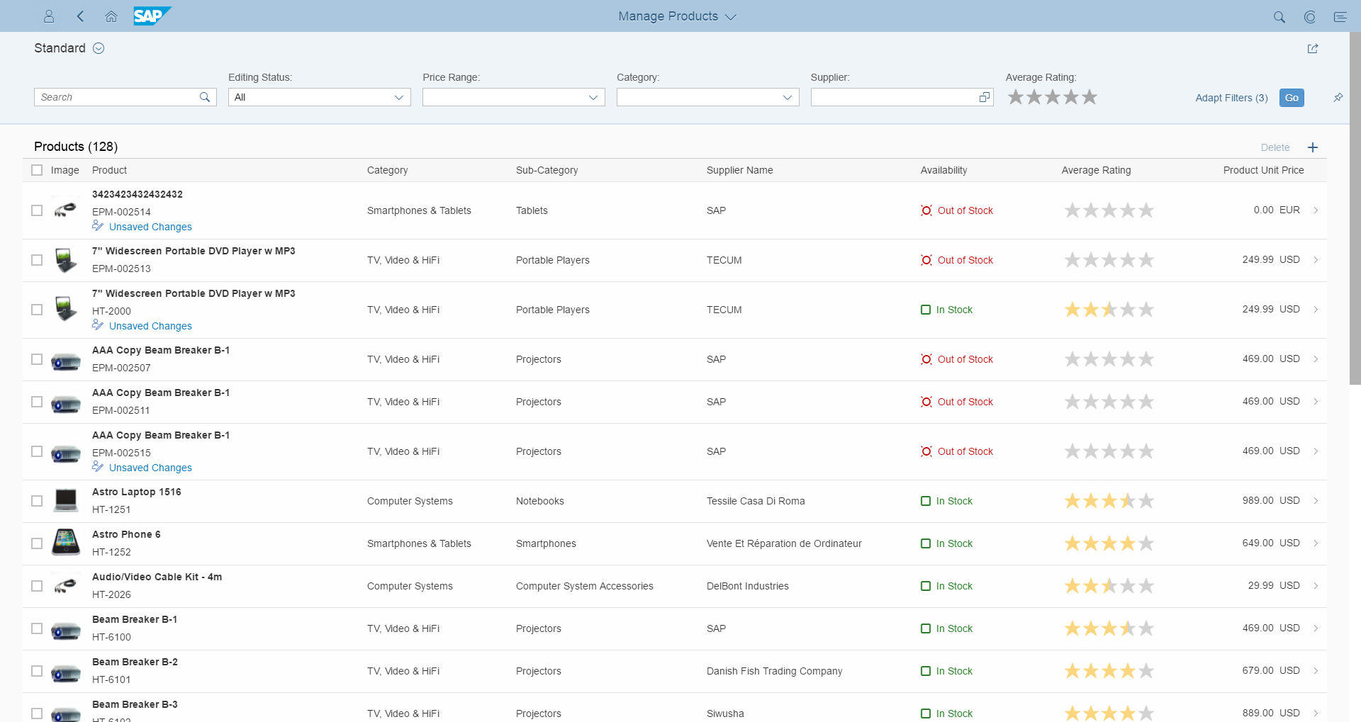
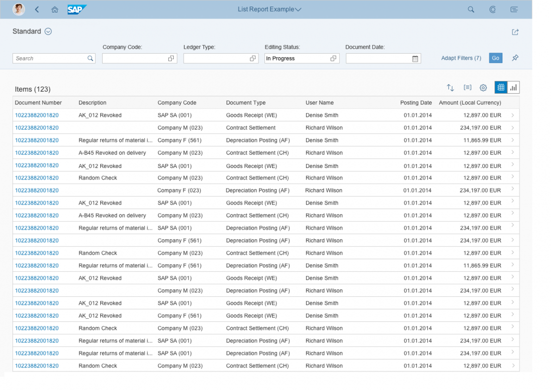
List Report (Floorplan + SAP Fiori Element)
Intro
List report
With a list report, users can view and work with a large set of items. This floorplan offers powerful features for finding and acting on relevant items. It is often used as an entry point for navigating to the item details, which are usually shown on an object page.
You can implement the list report floorplan in two ways:
- Use the corresponding SAPUI5 controls in a dynamic page layout. This gives you much greater flexibility, at the expense of more development time.
- Use the SAP Fiori element for the list report. This generates the floorplan from OData annotations and reduces development time. However, the SAP Fiori element list report will be limited to the most common features. Details on the SAP Fiori element for the list report are included at the end of each section.
Usage
Use the list report floorplan if:
- Users need to find and act on relevant items within a large set of items by searching, filtering, sorting, and grouping.
- Users need to display the whole dataset using different visualizations (for example, as a table and a chart), without requiring interactions between these visualizations. An example use case might be reporting.
Please note that this feature only applies to the freestyle list report floorplan, and not to the list report SAP Fiori element. - Users need to work with multiple views of the same content, for example on items that are “Open”, “In Process”, or “Completed”. Views can be switched using tabs, segmented buttons, or a select.
- Drilldown is rarely or never used, or is only available via navigation to another page, and not as free or flexible drilldown within the page itself.
- Users work on different kinds of items.
Do not use the list report floorplan if:
- Users need to see or edit one item with all its details. Use the object page floorplan instead.
- Users need to find one specific item, where the item or an identifying data point is known to the user (for example, if a barcode scanner is used to identify the item). Use the initial page floorplan instead.
- Users need to work through a comparably small set of items, one by one. Use the work list floorplan instead.
- Users need a way to analyze data step by step from different perspectives and to investigate and act on a root cause by drilling down to transactional content within one page. Use the analytical list page instead.
- Charts are not only used for visualization, but users need to interact between charts and table views. Use the analytical list page instead.
- Users need to see the impact of their action on a KPI. Use the analytical list page instead.
- Users need to see not only the result, but also the impact of their filter settings directly in a chart representation. Use the analytical list page instead.
Structure
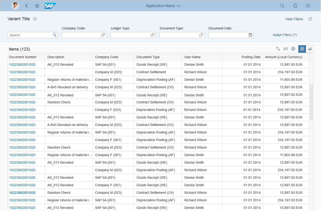
The list report is a full screen floorplan based on the dynamic page. In addition to the SAP Fiori launchpad shell bar, the dynamic page contains the following areas:
- The header title: Use this to display a title or the variant for the whole page, filter information (if the header is collapsed), and a header toolbar with global actions such as Share.
- The header content: Use this to display the filter bar or the smart filter bar.
- The content area: Use this to display:
- An icon tab bar (optional)
- One table/chart toolbar (per tab)
- One or multiple tables and/or charts. You can use any kind of table. If you use a charts, they can be displayed exclusively (without a table), as an additional view for an existing table (switchable), or in addition to an existing table, where the chart and table are shown at the same time.
- The footer toolbar: If needed, use a footer toolbar to display the messaging button and finalizing actions.
SAP Fiori Element List Report
The SAP Fiori element list report does not support:
- An icon tab bar in the content area
- Lists and trees instead of a table or tree table
- Charts in the content area
- The messaging button in the footer toolbar
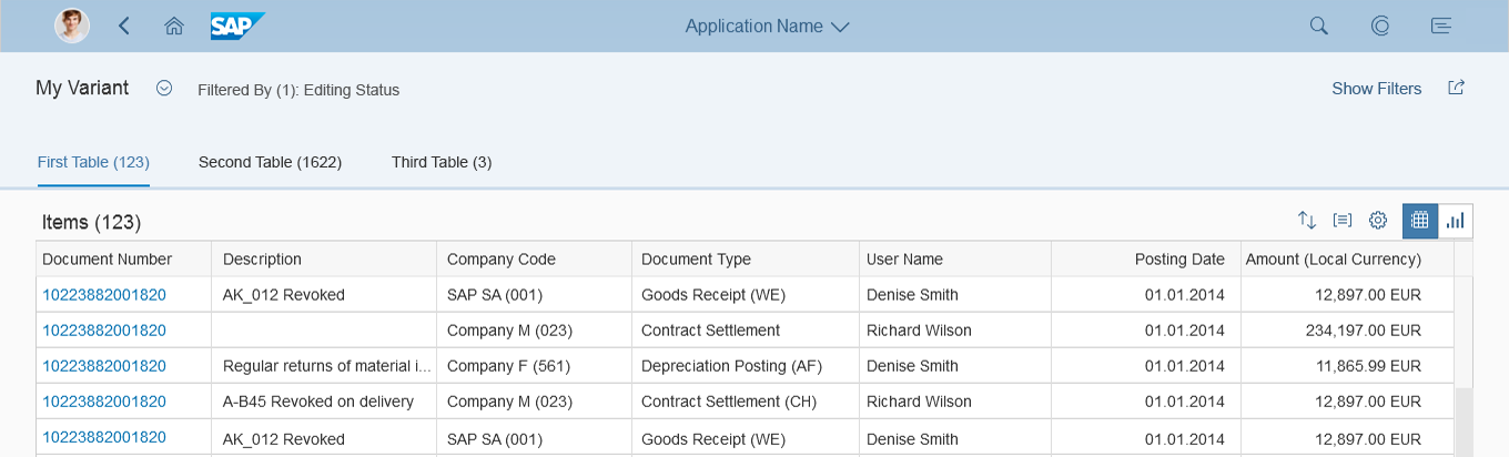
Schematic visualization of a list report
Responsiveness and Adaptiveness
In general, the list report floorplan is responsive. However, there are exceptions if the following controls are used:
- Grid table, analytical table: Supported on desktop and tablet devices only. On smartphones, replace these tables with something else, such as a responsive table or a list. In rare cases, displaying only a chart on smartphones might also suffice.
- Tree table: Supported on desktop and tablet devices only. For smartphones, there is no equivalent alternative. In some cases, a tree, the category navigation pattern, or a chart might work.
- Smart table: The smart table is a wrapper around the different existing table controls. If a grid table, analytical table, or tree table is used inside the smart table, the same issues occur as listed above. On a smartphone, you can use a responsive table inside the smart table. For the tree table, you need to replace the smart table as described above.
For more details, see the respective guideline articles.
SAP Fiori Element List Report
The SAP Fiori element list report automatically replaces grid tables and analytical tables with responsive tables on smartphones.
For tree tables, there is no meaningful fallback solution for smartphones.
List report - Size S
List report - Size M
List report - Size L
Guidelines
Standard Naming Conventions
For all objects, follow the standard conventions for action buttons, the object name, and the title in the shell bar. For more information see Manage Objects – Components and Launchpad Shell Bar – Page Title and Navigation Menu.
Header Title
Variant Management
Variant management is optional. If used, apply it to the whole page. Use the variants to save and restore all settings for filters, selected tabs, all tables, and all charts.
Users can choose a default variant, which is selected every time the app is started.
Allow users to choose whether a variant should be executed automatically as soon as it has been selected. Not executing a variant automatically allows the user to add or remove filters before executing. Provide this option only if the filter bar is in manual update mode. For live updates, this option is not required.
If variant management is not needed, show a title that describes the current view instead.
Variant management
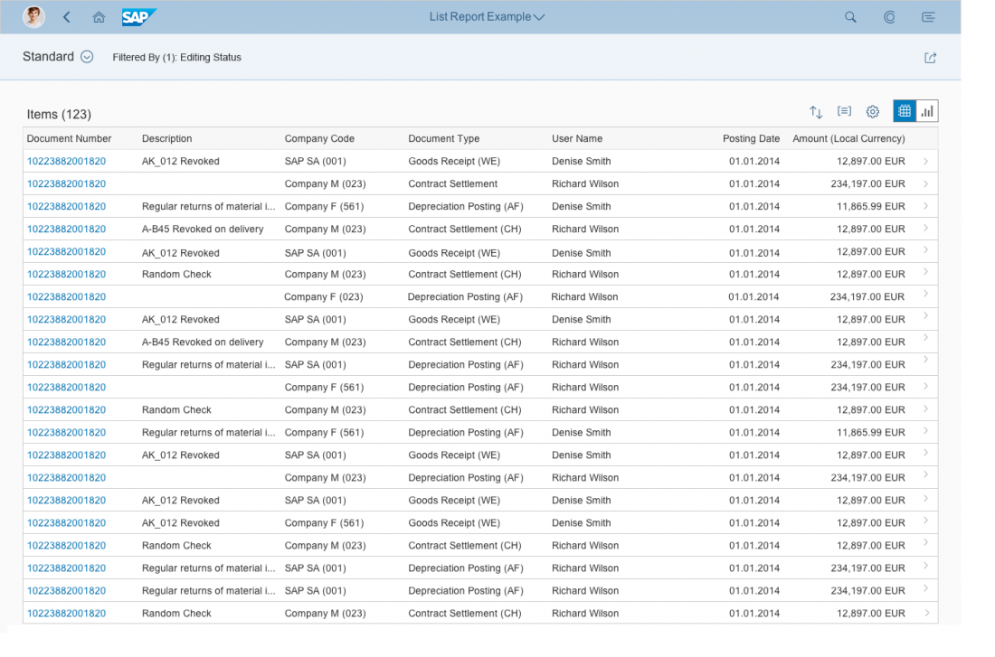
Filter Information
Display the filter information only if the header content is collapsed. Use the following format: Filtered By (x):, followed by a comma-separated list of the filters currently applied. “x” stands for the number of applied filters.
Show up to 5 filters. If more filters have been applied, show an ellipsis (“…”) at the end of the string.
If no filters have been applied, show Filtered By: None.
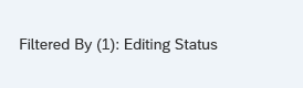
Filter information
Header Toolbar
Use this for non-finalizing global actions such as Share. Share opens an action sheet, which features Save as Tile (if the SAP Fiori launchpad is available), Send Email, and Share in SAP Jam (if SAP Jam is available). Show the Share button only if it makes sense for your application.
If the content area contains a grid table, an analytical table, a tree table, or any other content with its own scrollbar, display a Show Filters / Hide Filters button for expanding and collapsing the header content.
In addition, offer any other global, non-finalizing actions needed. Hide actions that cannot be used at all (for example, because of access rights). To save space on the header toolbar, group similar actions using a menu button.
For more information on global actions, see the guidelines for the header toolbar.
Header toolbar
SAP Fiori Element List Report
If variant management is not used, a default title repeats the text from the shell bar. Use this text only if there is no better alternative. In any other case, replace the title with one that better describes the current view.
In the header toolbar, Share and Show Filters / Hide Filters are supported as standard actions. App-specific actions can be added using a breakout.
By default, the variant management control saves the filter settings only. Change this setting to also save the table layout settings (manifest.json: smartVariantManagement).
Be aware that the SAP Fiori element list report does not support charts in the content area.
Header Content
The header content collapses when scrolling down the page (with responsive table, list, or tree only), and expands again when scrolling back up. To avoid this automatic expand / collapse behavior, users can also pin the header content so that it always stays open. Persist the pin setting.
Users can also expand and collapse the header content by clicking the background of the title bar.
If you are using a grid table, analytical table, tree table, or any other content with its own scrollbar, allow users to explicitly collapse and expand the header content manually with a Show Filters / Hide Filters button on the header title.
When starting the application, expand the header content if no query was fired (and therefore the table is empty). Collapse the header content in other cases.
Header Content - Expand / Collapse Behavior
Filter Bar
The filter bar can contain a search field (optional). If you use the search field, the content shows only items that match both the search and filter criteria.
Filters are applied to all content, including all tables and all charts. To improve performance, consider providing mandatory filter fields and/or default settings for filters.
The filter bar offers two different update modes:
- The live update mode (recommended) triggers filtering immediately whenever a filter setting is changed. If the search field is used, the search is triggered together with all filter settings with every letter typed.
- The manual update mode displays a Go button, which triggers the filtering. If the search field is used, the search is executed together with all filters as soon as the Go button is pressed.
Make sure that all tables and charts in the content area are in a busy state until the new data is available. Also ensure that the content is grayed out as soon as the filter settings do not correspond to the content shown (any table, property: showOverlay). This is usually the case if the content is not yet updated and the Go button needs to be triggered.
Use the manual update mode only if you run into performance problems while loading the table data.
Regardless of the update mode, make sure that the filter bar and the visible content match: The filter bar must always describe the items that are shown in the content area.

Filter bar
SAP Fiori Element List Report
The pin setting for the header content is not persisted.
In manual update mode, the content is grayed out whenever the user changes a filter after pressing Go, even if the change is reverted.
Within the smart filter bar, app-specific filters are also possible. Apart from the combo box, select, input field (with or without value help), date picker, and search field, you can also deploy other controls by using breakout options, such as the rating indicator (SmartFilterBar, annotation: UI.SelectionFields).
Content Area
General Layout
There are three basic list report layouts: simple content, multiple views, and multiple content. These are described in more detail below.
Simple Content
In most cases, the content consists of just a table toolbar and a table. If needed, provide an option to switch between the table and a corresponding chart view.
Multiple Views
For more complex scenarios, provide multiple views of the same content. A view consists of one or more of the following:
- Displaying different columns of the same table
- Displaying the same table in different pre-filtered states. These states are usually based on a status column, for example, items that are Open, In Process, or Closed. Make sure that the corresponding filter is not offered on the filter bar.
- Differentiating between the items displayed in the content in some other fundamental way.
There are two options for switching between different views:
The first option is to replace the table title with a content switch. Use this approach if all views share the same sort and group states, as well as the same actions.
The content switch can be:
- A segmented button for up to three views
- A select control for more than three views, or if the number of views changes dynamically
If you have both a table title and a content switch, display the table title first, then the content switch. Place both on the left side of the table toolbar. Since the content switch is placed on the table toolbar, the same actions are shown for all views.
If you are using the content switch together with charts, ensure that the chart also reacts to the content switch. This can be done by:
- Filtering the data that influences the display of the chart
- Changing the measures and/or dimensions (for example, View by Country, View by Customer, …)
The second option for switching views is to show each view in a tab container of the icon tab bar. Use this approach if all views show different states of the same data (sort states, group states, as well as item selection). Using tabs also allows you to offer different actions on the table toolbar for each view.
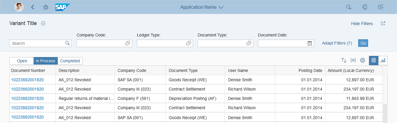
Table toolbar with a segmented button for up to three different views
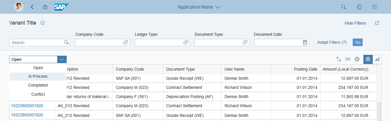
Table toolbar with a select control for more than three views
Multiple Content
To support even more complex use cases, a list report floorplan can also contain multiple tables that display different kinds of objects. The filter bar settings are applied to all of these tables in parallel. For example, a customer overview list report might display different tables for invoices, deliveries, and overdue payments. All of these tables can be filtered for a specific customer and a specific date.
Display each table inside a tab container of an icon tab bar. This also allows you to offer different actions on the table toolbar for each table.
List report floorplan with multiple tables placed in multiple tabs
Icon Tab Bar
Use the text-only version of the icon tab bar. Display the number of items shown in the respective table on each tab (sap.m.IconTabFilter, property: count).
Icon tab bar
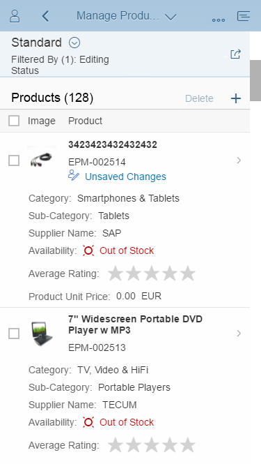
Table Toolbar
Display at least a table title (ideally with an item count) and icon-only buttons for sorting, grouping, and column settings. Do not offer additional filter settings on the table toolbar. For sort and group, show a view settings dialog with just the corresponding features enabled. For column settings, show the table personalization dialog. If you need more extensive functionality (for example, grouping or sorting on several levels, tables with more than 20 columns), use the P13n-Dialog with just the corresponding feature enabled.
If alternative visualizations are provided (such as charts), offer an additional view switch on the table toolbar. Triggering the switch replaces the current visualization with another one. If a table and chart need to be shown in parallel, offer a switch for the combined view.
In rare cases, you can offer an additional layout variant on the table toolbar. The layout variant stores view settings like the column order and the sort and group settings. If you use a layout variant, do not store the table settings in the filter variant. Offer this additional layout variant only if there is a strong use case for switching filter and layout variants independently. If there is no strong use case, or you are unsure, do not use a layout variant at all.
In addition, offer any other actions needed. Disable selection-dependent actions (such as Delete) if no or only non-fitting items are selected. Always enable selection-independent actions (such as Add). To save space on the table toolbar, group similar actions using a menu button. For example:
- Release and Release with Conditions
- Add Contact and Replace Contact
- Edit Account and Edit Title
For more information on table/chart actions, see the guidelines for the table toolbar, the chart toolbar, and for managing objects.

Typical toolbar in the list report floorplan containing the table title with item count as well as buttons for sorting, grouping, and column settings

Toolbar with a switch between table and chart visualizations

Toolbar with a table title and layout variant

Toolbar with additional actions
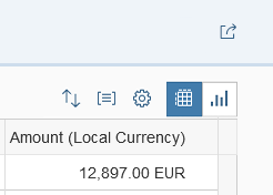
Table without the filter icon
Table with a filter option
Table
If there are no items to display, use the “no data text” of the corresponding table. Explain why the table is empty, and what the user needs to do to display items.
Examples:
- After starting the app, no filters are applied:
No filters set. To start, enter your search and filter settings and run the search. - The filter was executed, but no items were found:
No items found. Try adjusting your search and filter settings. - By opening a related app, the filter criteria were transferred automatically, but no items were found:
No items found. Check the search and filter settings.
Navigation
There are three types of navigation at item level in the list report floorplan:
- Line item navigation: If applicable, allow navigation to a detail view (usually an object page) at line item level. Show a navigation indicator (chevron icon) for each line item that provides a detail view. In a list, tree, or responsive table, clicking the line item triggers the navigation.
In a grid, analytical, or tree table, clicking the navigation indicator triggers the navigation.
Another option is to use a link as identifier for the line item. This link triggers the navigation. Use this only if the navigation indicator is used for a different target.
Only show navigation indicators for target pages the user is authorized to access. - Drilldown navigation: If a line item contains aggregated data, allow navigation to a view that contains details for the aggregated amount. This is usually another list report. In this case, use a link to display the aggregated amount. If the table contains many columns with links, use the link options to provide different levels of highlighting.
In charts, offer the drilldown navigation link in the popover for the chart element. In this case, also navigate to the corresponding list report to show the details. - Cross navigation: If a line item contains cross-references to other entities, such as people or business objects, use a link to display the corresponding data point in the table. Triggering the link opens a quick view. Typically, the quick view displays basic details of the referenced object and a navigation link to another page (usually an object page) or another app that shows the object details.
Footer Toolbar
Use the footer toolbar to display the messaging button and finalizing actions. Only use the footer toolbar if finalizing actions for the whole page and/or the message popover are available.
Always show the footer toolbar in edit mode.
Hide actions that cannot be used at all (for example, if the user doesn’t have authorization). To save space on the footer toolbar, group similar actions using a menu button.
For more information on finalizing actions, see the guidelines for the footer toolbar.

Footer toolbar
SAP Fiori Element List Report
The SAP Fiori element list report supports only simple content and multiple views (manifest.json: quickVariantSelection or quickVariantSelectionX). Multiple content is not supported. If you use tabs with multiple views, the counters for tabs are turned off by default. Turn them on, unless this causes performance problems (manifest.json: showCounts).
Only smart tables are supported. Since charts cannot be displayed, no view switch is needed.
The table toolbar supports:
- Table title (annotation: UI.HeaderInfo, property: TypeNamePlural)
- Item count: Turned on by default.
- Variant management for the table layout: Although it is turned on by default, it should not be used in most cases. If the layout variant is turned off, the table layouts are stored together with the page variant (manifest.json: smartVariantManagement).
- Several standard and custom actions (see below)
Within the SAP Fiori element list report, you can use the responsive table, grid table, analytical table, or tree table within the smart table (manifest.json: tableType).
The smart table supports:
- No selection, single selection, or multiple selection (manifest.json: multiSelect). With multiple selection, the SAP Fiori element list report triggers the action for all selected items. If an error occurs with one or more of the selected items, it can be handled in the following ways (annotation: OperationGroupingType):
- Partial processing: A message is displayed for the items with issues. All other items are processed. The message displayed is generic and must be replaced.
- Roll-back: A message is displayed. All items are reverted. The message displayed is generic and must be replaced.
- Text control in line items
- Rating indicator within line items (annotation: UI.DataPoint)
- Progress indicator within line items (annotation: UI.DataPoint)
- Indicator for the editing status within the rows (for example Draft or Locked by [user]). Users can filter the table by editing status in the filter bar.
- Line item navigation to different targets (maintain detail pages in manifest.json). Authorization rights for the targets are checked per table. Where available, the navigation indicators are displayed for all line items (but not for hidden items). Possible targets include:
- Navigation to a related object page within the app (default). Apps can override this behavior and define their own navigation target. The target can also depend on specific conditions defined by the app (maintain detail pages in manifest.json).
- Cross navigation to another SAP Fiori app or to another system
- Link and smart link to show details in a quick view or to navigate. A quick view can be used as part of the smart link or for displaying contact details. For navigation, the target can be any web page, another app, or a related object page within the same app.
- Line item actions as text or icon buttons (such as Approve and Reject).
- Any control that the corresponding table allows by using breakout columns.
At present, the smart table does not support:
- The object number control. This is only available if you use a breakout column. Without a breakout, amounts appear as standard text only.
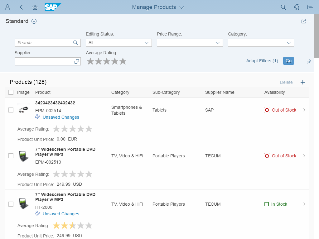
Only the responsive table supports:
- A column that displays the object identifier, including the object name and ID (annotations: Common.SemanticKey with Common.Text)
- Images in line items (annotation: UI.IsImageURL)
- The object status control in line items: Use of a specific status such as Out of Stock in connection with one of the semantic colors and/or a status icon (criticality annotations).
The object status provides different categories: negative (property: error), critical (property: warning), positive (property: success), and neutral (property: none). When a column is sorted by object status, the SAP Fiori element list report sorts by these categories. If a category has multiple values, ensure that the values within the category are sorted in a meaningful way (for example, alphabetically). - A progress indicator in line items (annotation: UI.DataPoint)
- Smart area micro charts, smart bullet micro charts, and smart radial micro charts in line items (annotation: UI.Chart)
Because the SAP Fiori element list report does not support inline editing, the message button is not supported on the footer toolbar.
Actions cannot be grouped using a menu button on the footer toolbar.
Actions
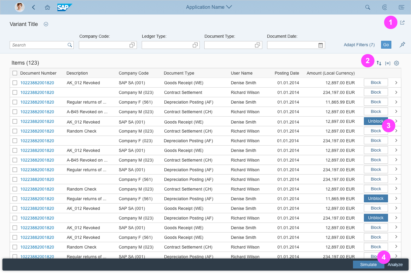
Places for actions in the list report: header toolbar, table toolbar, line item, or footer toolbar
The list report offers four locations for actions: global actions, table actions, line item actions, and finalizing actions.
1. Global Actions
Place actions that affect the entire page in the header toolbar in the header title (1). These include the following standard actions:
- Show Filters / Hide Filters: This button expands and collapses the header content. Show this button only if the list report contains a grid table, analytical table, or tree table.
- Share: This button opens an action sheet that contains actions like Save as Tile (if the SAP Fiori Launchpad is available), Send Email, and Share in SAP Jam (if SAP Jam is available). Show the Share button only if it makes sense for your application.
Hide actions that cannot be used at all (for example, because the user has no authorization). To save space on the header toolbar, group similar actions using a menu button.
Do not place actions that finalize the current process (“finalizing actions”) on the header toolbar of the header title, even if they affect the entire page.
For more information on global actions, see the guidelines for the header toolbar.
SAP Fiori Element List Report
The header toolbar provides the following built-in actions:
- Show Filters / Hide Filters (if needed)
- Share
App-specific actions can be added using a breakout. They cannot be grouped using a menu button on the header toolbar.
2. Table/Chart Actions
Place actions that affect the content of a table or chart in the table toolbar (2).
If an action applies only for selected items, disable it if no items are selected, or if the selected items don’t qualify for the action. For example:
- Disable Remove if no item is selected.
- Always keep Add enabled.
Exception: The user needs to specify where in the table the item should be added. In this case, disable Add if no items are selected, or more than one item is selected. - Always keep Edit enabled if it switches the whole table to edit mode. If Edit applies only to one item or to a selection of items, disable it if no item is selected.
- Disable object-specific actions if no item is selected.
- Disable actions that change the status of one or multiple items if no item is selected.
Hide actions that cannot be used at all (for example, because the user has no authorization). If you are using an icon tab bar, please be aware that each tab contains its own table toolbar.
For more information on table and chart actions, see the guidelines for the table toolbar, chart toolbar, and for managing objects.
SAP Fiori Element List Report
The table toolbar provides the following built-in actions:
- Add: An icon button that triggers an object page for creating an item. If this function is not needed, or if you want users to add or create items differently (for example, in a dialog), turn it off. If you use this button, replace the generic tooltip Create Object with a more specific text, such as Create Purchase Order.
Draft handling is supported (recommended). (annotation: Creatable) - Delete: A text button to delete selected items. Delete is enabled as soon as deletable items are selected. If this function is not needed, turn it off. (annotation: Deletable)
- View Settings (sort, group, column settings): In contrast to the guidelines above, only one button is shown for sort, group, and columns settings. The icon button always opens the p13n-dialog with all features enabled. The less complex view settings dialog cannot be used.
The SAP Fiori element list report also allows users to add filter settings within the p13n-dialog. This feature is only available if an explicit layout variant is being used for the table, which should not usually be the case. Do not use this feature. - In addition, you can add app-specific actions, such as Copy or Approve. These actions are displayed as text buttons. App-specific actions can be enabled or disabled, depending items selected in the table.
There are 3 types of app-specific action:
- The system simply triggers the action.
- The action requires user confirmation. Use this for critical actions that have severe consequences. A message box appears, and the user needs to confirm the action. The message displayed is generic and must be replaced (annotation: IsActionCritical).
- The action needs additional user input, such as an approval comment. The system opens a dialog with one or more user input elements in which the user enters the required data. The system can pre-fill data if applicable (function import with parameters).
App-specific actions can also trigger navigation to another app or to a related object page within the same app. The navigation can depend on zero selected items, or on one selected item.
Actions cannot be grouped using a menu button.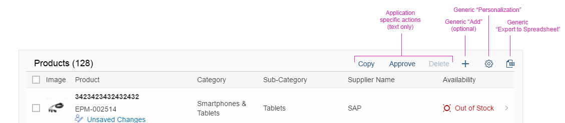
Actions in the smart table toolbar
3. Line Item Actions
In rare cases, actions that affect a single item can be placed directly inside the line item. Use this only for specific, frequently used tasks (3). If the same action can also be applied to several items at once, feel free to also place it on the table toolbar. Nevertheless, if you do so, reconsider whether you really need to offer the action at line item level. Examples of line item actions include:
- Start/Stop (a batch job)
- Approve (an item)
- Assign (an item)
Do not disable line item actions. If an action cannot be used, hide it. For example, hide line items if the user has no authorization or the line item is in the wrong state.
SAP Fiori Element List Report
Actions cannot be grouped using a menu button.
4. Finalizing Actions
Place actions that trigger the end of a process and affect the entire page in the footer toolbar (4).
Examples:
- Save
- Cancel
- Submit
Please be aware: Even if you are using the icon tab bar, there is only one footer toolbar for all tabs.
Hide actions that cannot be used at all (for example, because the user has no authorization).
For more information finalizing actions, see the guidelines for the footer toolbar.
SAP Fiori Element List Report
Actions cannot be grouped using a menu button.SAP Fiori Element
Use the table below to see which features are available for the “list report” SAP Fiori element.
| Feature | Status | Comment |
| Header Title | ||
| Title only (no variant management) | Supported | |
| Variant management: Page variant | Supported | |
| Variant management – Only for filter settings | Supported | Not recommended |
| Filter information | Supported | |
| Global actions | Supported | |
| Generic action: Share | Supported | |
| Generic action: Show Filters / Hide Filters (only with grid table, analytical table, and tree table) | Supported | |
| Header Content | ||
| General | ||
| Persisting pin state | Not Supported | |
| Filter Bar | ||
| Search field | Supported | |
| Mandatory fields | Supported | |
| Default values | Supported | |
| Live update mode | Supported | |
| Manual update mode (Go button) | Supported | Use only in case of performance problems |
| Any control in the filter bar | Supported | Via breakout only |
| Content Area | ||
| General Layout | ||
| Simple content | Supported | One table only |
| Mutiple views: Single toolbar (segmented buttons / select) | Supported | |
| Multiple views: One toolbar each (tabs) | Supported | |
| Multiple content | Not Supported | |
| Tabs | ||
| Item counts on tabs | Supported | |
| Table Toolbar | ||
| Title | Supported | |
| Item count | Supported | |
| Sort / Filter / Group via View Settings dialog | Not Supported | Do not show filter settings on the table toolbar |
| Sort / Filter / Group via P13n dialog | Supported | Do not show filter settings on the table toolbar |
| View switch | Not Supported | |
| Alternative visualization: Chart view | Not Supported | |
| Alternative visualization: Table and chart view | Not Supported | |
| Other alternative visualizations | Not Supported | |
| Layout variant | Supported | Not recommended |
| App-specific actions with partial processing
(In case of errors, display a message message for the items with issues. Process all other items.) |
Supported | Change the generic message texts |
| App-specific actions with roll-back
(In case of errors, display a message. All items are reverted.) |
Supported | Change the generic message texts |
| Enable/disable actions, depending on selection | Supported | |
| Grouping of actions (menu button) | Not Supported | |
| Overflow handling for toolbar | Supported | |
| Generic action: Edit | Not Supported | |
| Table | ||
| Table type: Responsive table | Supported | |
| Table type: Grid table | Supported | |
| Table type: Analytical table | Supported | |
| Table type: Tree table | Supported | |
| Table type: List | Not Supported | |
| Table type: Tree | Not Supported | |
| Selection: Table items are not selectable | Supported | |
| Selection: Single selection | Supported | |
| Selection: Multi-selection | Supported | |
| App-specific column widths (only grid table, analytical table, and tree table) | Not Supported | |
| Content: Text | Supported | |
| Content: Rating indicator | Supported | |
| Content: Progress indicator | Supported | |
| Content: Editing status | Supported | |
| Content: Actions (text or icon buttons) | Supported | |
| Content: Object identifier (responsive table only) | Supported | |
| Content: Images (responsive table only) | Supported | |
| Content: Object status (responsive table only) | Supported | |
| Content: Smart area / bullet / radial micro chart (responsive table only) | Supported | |
| Content: Any other content as long as the underlying table allows it | Supported | Via breakout only |
| Aligning content within columns | Not Supported | |
| Generic “No data” text | Supported | |
| Custom “No data” text | Not Supported | |
| Navigation: Line Item navigation via navigation indicator (within app, cross-app, any target) | Supported | |
| Navigation: Line Item navigation via link with/without quick view (within app, cross-app, any target) | Supported | |
| Footer Toolbar | ||
| Messaging button and message popover | Not Supported | |
| Finalizing actions | Supported | |
| Grouping of actions (menu button) | Not Supported | |
| Actions | ||
| Global Actions | ||
| Generic action: Show Filters / Hide Filters | Supported | |
| Generic action: Share (icon button) | Supported | |
| App-specific actions | Supported | Via breakout only |
| Grouping of actions (menu button) | Not Supported | |
| Table / Chart Actions | ||
| Enable/disable actions depending on the current selection | Supported | |
| Grouping of actions (menu button) | Not Supported | |
| Generic action: Add (via object page) | Supported | Draft handling is supported |
| Generic action: Add (via dialog) | Supported | Via breakout only |
| Generic action: Add (via new row) | Not Supported | |
| Generic action: Delete | Supported | |
| Generic action: Sort (via View Settings dialog) | Not Supported | |
| Generic action: Sort (via P13n dialog) | Not Supported | |
| Generic action: Filter (via View Settings dialog) | Not Supported | Do not use filter settings on the table |
| Generic action: Filter (via P13n dialog) | Not Supported | Do not use filter settings on the table |
| Generic action: Group (via View Settings dialog) | Not Supported | |
| Generic action: Group (via P13n dialog) | Not Supported | |
| Generic action: Column settings (via table personalization dialog) | Not Supported | |
| Generic action: Column settings (via P13n dialog) | Not Supported | |
| Generic action: View settings – combines sort, filter, group, and column settings (via P13n dialog) | Supported | Not recommended. If used, turn off filter settings. |
| Generic action: Export to Spreadsheet | Supported | |
| Generic action: Maximize | Supported | |
| App-specific actions as text button | Supported | |
| App-specific actions as icon-only button | Not Supported | |
| App-specific actions with partial processing | Supported | |
| App-specific actions with roll-back | Supported | |
| App-specific action in emphasized style | Supported | Use this only for a single action |
| App-specific action in positive/negative style | Supported | |
| App-specific action: Trigger immediately | Supported | |
| App-specific action: Needs user confirmation | Supported | |
| App-specific action: Needs additional user input | Supported | |
| App-specific action: Triggers navigation (within app, cross-app) | Supported | |
| App-specific action: Triggers any other behavior | Supported | Via breakout only |
| Line Item Actions | ||
| App-specific actions as text button | Supported | |
| App-specific actions as icon-only button | Supported | |
| Generic action: Delete (icon-only button) | Not Supported | |
| Finalizing Actions | ||
| App-specific actions | Supported | |
| Grouping of actions (menu button) | Not Supported | |
Resources
Want to dive deeper? Follow the links below to find out more about related controls, the SAPUI5 implementation, and the visual design.
Elements and Controls
- Chart (guidelines)
- Filter Bar (guidelines)
- Floorplan Overview (guidelines)
- Icon Tab Bar (guidelines)
- Introduction to SAP Fiori Elements (guidelines)
- Table Overview (guidelines)
- Variant Management (guidelines)
 Your feedback has been sent to the SAP Fiori design team.