
- Latest SAPUI Version 1.124
- SAPUI5 Version 1.122
- SAPUI5 Version 1.120
- SAPUI5 Version 1.118
- SAPUI5 Version 1.116
- SAPUI5 Version 1.114
- SAPUI5 Version 1.112
- SAPUI5 Version 1.110
- SAPUI5 Version 1.108
- SAPUI5 Version 1.106
- SAPUI5 Version 1.104
- SAPUI5 Version 1.102
- SAPUI5 Version 1.100
- SAPUI5 Version 1.98
- SAPUI5 Version 1.96
- SAPUI5 Version 1.92
- SAPUI5 Version 1.90
- SAPUI5 Version 1.88
- SAPUI5 Version 1.86
- SAPUI5 Version 1.84
- SAPUI5 Version 1.82
- SAPUI5 Version 1.80
- SAPUI5 Version 1.78
- SAPUI5 Version 1.76
- SAPUI5 Version 1.74
- SAPUI5 Version 1.72
- SAPUI5 Version 1.70
- SAPUI5 Version 1.68
- SAPUI5 Version 1.66
- SAPUI5 Version 1.64
- SAPUI5 Version 1.62
- SAPUI5 Version 1.60
- SAPUI5 Version 1.58
- SAPUI5 Version 1.56
- SAPUI5 Version 1.54
- SAPUI5 Version 1.52
- SAPUI5 Version 1.50
- SAPUI5 Version 1.48
- SAPUI5 Version 1.46
- SAPUI5 Version 1.44
- SAPUI5 Version 1.42
- SAPUI5 Version 1.40
- SAPUI5 Version 1.38
- SAPUI5 Version 1.36
- SAPUI5 Version 1.34
- SAPUI5 Version 1.32
- SAPUI5 Version 1.30
- SAPUI5 Version 1.28
- SAPUI5 Version 1.26
- Latest SAPUI Version 1.124
- SAPUI5 Version 1.122
- SAPUI5 Version 1.120
- SAPUI5 Version 1.118
- SAPUI5 Version 1.116
- SAPUI5 Version 1.114
- SAPUI5 Version 1.112
- SAPUI5 Version 1.110
- SAPUI5 Version 1.108
- SAPUI5 Version 1.106
- SAPUI5 Version 1.104
- SAPUI5 Version 1.102
- SAPUI5 Version 1.100
- SAPUI5 Version 1.98
- SAPUI5 Version 1.96
- SAPUI5 Version 1.94
- SAPUI5 Version 1.92
- SAPUI5 Version 1.90
- SAPUI5 Version 1.88
- SAPUI5 Version 1.86
- SAPUI5 Version 1.84
- SAPUI5 Version 1.82
- SAPUI5 Version 1.80
- SAPUI5 Version 1.78
- SAPUI5 Version 1.76
- SAPUI5 Version 1.74
- SAPUI5 Version 1.72
- SAPUI5 Version 1.70
- SAPUI5 Version 1.68
- SAPUI5 Version 1.66
- SAPUI5 Version 1.64
- SAPUI5 Version 1.62
- SAPUI5 Version 1.60
- SAPUI5 Version 1.58
- SAPUI5 Version 1.56
- SAPUI5 Version 1.54
- SAPUI5 Version 1.52
- SAPUI5 Version 1.50
- SAPUI5 Version 1.48
- SAPUI5 Version 1.46
- SAPUI5 Version 1.44
- SAPUI5 Version 1.42
- SAPUI5 Version 1.40
- SAPUI5 Version 1.38
- SAPUI5 Version 1.36
- SAPUI5 Version 1.34
- SAPUI5 Version 1.32
- SAPUI5 Version 1.30
- SAPUI5 Version 1.28
- SAPUI5 Version 1.26
Map Container
sap.ui.vk.MapContainer
Intro
The map container is a predefined feature set for maps. It fits most use cases and makes it easier for app developers to work with maps.
If you wish to display a geomap or an analytic map without using the map container features, the app developer can also opt to use the analytic map or geomap control.
Responsiveness
The width and height of the map container are defined by the surrounding application layout.
The map container uses the overflow toolbar control. This control is based on the sap.m.Toolbar and provides overflow when the contents do not fit in the visible area.
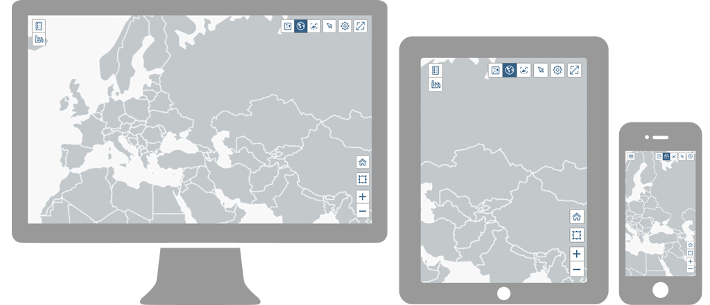
Note: Map container on smartphone displayed menu button instead of list panel icon because of the small screen size.
Components
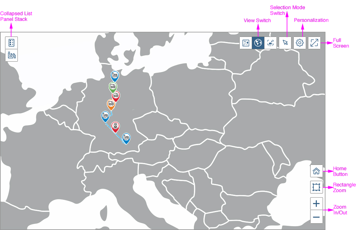
Overview of map container components
The map container includes the following components:
- A map (geomap or analytic map)
- Transparent toolbar containing the following buttons:
- View switch (optional), such as between geomaps and analytic maps
- Selection menu (optional)
- Personalization/settings (optional)
- Full-screen mode
- Overflow toolbar (generic)
- A list panel stack, which can be used for a legend or other application-specific content
- Navigation tools such as:
- Measure
- Scale
- Zoom in/zoom out, including rectangular zoom
- Home button
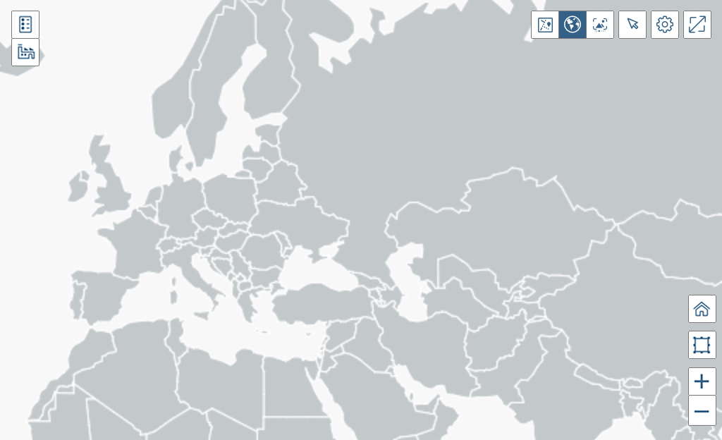
View Switch (Optional)
View switches are optional control. This control allows the user to switch between different map types, charts, and table layouts. You should consider using a view switch for accessibility reasons. For example, users with visual impairments might have a hard time working with subtle color differences or specific color gradients, and might prefer switching to a table view instead.
We recommend using no more than three types of alternate visualization. The segmented button control is used to display the types of visualization available in the view switch, and highlights the type of visualization that is being currently displayed.

The button control gives the user the option to switch between the geomap, analytic map and image view.
Menu for Selection Modes (Optional)
The menu for selection modes enables the user to switch between the available selection modes: single, rectangular, and lasso. These buttons are optional.

Selection menu
Personalization (Optional)

Full-Screen Mode
The map container can be viewed on full-screen mode (property: fullScreen). For desktop and tablet, the Full Screen button is always placed at the top right of the transparent toolbar.
The user can toggle between embedded and full-screen mode via the Maximize Full Screen toggle button. In full-screen mode, the map container occupies the entire width and height. The toolbar replaces the page header bar, and the Minimize icon appears.
For smartphones, the Full Screen button is disabled as the map container is used in full-screen mode by default.

Initiate full-screen button

Minimize full-screen button
Overflow (Generic)
The overflow is activated if there is not enough space on the screen for all the chart bar actions. It is generated automatically.
When the user clicks the overflow button, a popover appears. In this action sheet, all icon buttons are labelled with text.
All buttons go into the overflow from right to left.

Overflow button
Prioritization
You can also prioritize the actions in the toolbar by applying one of five different statuses to them:
- Always overflow: The action will always move into the overflow.
- Disappear: This applies to actions that are not very relevant for the user, and which can disappear if space is limited.
- Low: This applies to actions that the user seldom needs; these actions then move first into the overflow.
- High: These actions remain visible until all actions that are tagged ‘disappear’, ‘low’, or that are untagged, have moved into the overflow.
- Never overflow: These actions will always visible in the toolbar.
All items have equal priority by default. If two items have the same priority, the one on the right overflows first.
Grouping
Items can overflow together, even if they are in different positions. Elements that belong to a group should not have ‘always overflow’ or ‘never overflow’ statuses as these priorities force the items to remain either in the toolbar or in the overflow area. When group elements have different statuses, the priority of the group is defined by the highest priority of its elements.
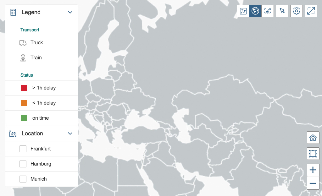
List Panel Stack (Optional)
The list panel stack is aligned to the left in the toolbar. It can be used for a legend and other application-specific content. The list panel stack can be collapsed in a way that only the icons of the different list panels will be seen. We recommend using icons that are easy to understand for each panel, as these icons will be the only visible element when the panels are collapsed. The collapsed list panels serve as quick access to the clicked panel icon.
If you are not using icons for the panels, do not allow the panels to collapse.
The default width of the list panel stack is auto. We recommend defining a precise width to avoid having the width permanently change according to the content. The list panel stack will remain visible on the map, whereas the toolbar buttons will be hidden.
As a general rule, avoid using too many panels as too much scrolling will increase the complexity of the application.
The list panel provides the same features as the standard list item:
- Grouping
- Select items
- Include Icons/color markers or pictures
- Show counter
Collapsed list panel stack (desktop)
Expanded list panel stack (desktop)
Legend
We recommend to include the map legend in the list panel. All necessary features for a legend are provided through the list panel stack (see above).
If your specific use case does not allow you to include the legend in the list panel, you can also use the map legend.
Navigation Tools
Home Button
The map container provides a Home button. Clicking on the Home button leads to the initial zoom position.

Home button
Rectangular Zoom
The Rectangular Zoom button can be used to zoom to a specific position. The rectangular zoom is enabled for the compact form factor by default, and disabled for the cozy form factor. For more information on cozy and compact form factors, see content density.

Rectangular Zoom button
Zoom In/ Zoom Out
The map container provides Zoom In ( ) and Zoom Out ( ) icon buttons, which are positioned on the bottom right corner of the map. When the user clicks these buttons, the chart automatically zooms in or out to the most appropriate scale.
By default, these buttons are enabled.

Zoom In/Zoom Out button
Behavior and Interaction
The buttons have a set priority for the overflow by default. The application developer can change this priority. High-prioritized buttons will overflow last.
On desktop and tablet devices, the list panel stack is always visible, whereas the transparent toolbar overflows. The navigation control is hidden behind the panel list stack.
On a smartphone devices, the list panel stack is minimized to a menu button on the top left. The menu icon always remains on the screen, whereas the transparent toolbar buttons overflow. Clicking on the menu button, the list panel stack opens in full-screen mode.
We generally recommend using either icon buttons or text buttons within the transparent toolbar, but not both. Icons and text should not be combined into one button. Buttons with icon and text only appear in the overflow menu. Buttons are always aligned to the right.
Guidelines
- Think carefully about what actions you really need in the transparent map toolbar – do not overload the map toolbar with actions.
- Think carefully about what content you really need in the panel list stack – do not overload the panel with content.
- Think carefully about which features make sense on the map if the map is not used in full screen. For example, it wouldn’t make sense for a map to have a list panel stack if it is being featured on a card of an overview page.
- Use tooltips for switchable content. For example, label icon buttons as “geomap” or “analytic map” in the toolbar.
Resources
Want to dive deeper? Follow the links below to find out more about related controls, the SAPUI5 implementation, and the visual design.
 Your feedback has been sent to the SAP Fiori design team.