- Latest Version 1.128
- Version 1.126
- SAPUI Version 1.124
- SAPUI5 Version 1.122
- SAPUI5 Version 1.120
- SAPUI5 Version 1.118
- SAPUI5 Version 1.116
- SAPUI5 Version 1.114
- SAPUI5 Version 1.112
- SAPUI5 Version 1.110
- SAPUI5 Version 1.108
- SAPUI5 Version 1.106
- SAPUI5 Version 1.104
- SAPUI5 Version 1.102
- SAPUI5 Version 1.100
- SAPUI5 Version 1.98
- SAPUI5 Version 1.96
- SAPUI5 Version 1.94
- SAPUI5 Version 1.92
- SAPUI5 Version 1.90
- SAPUI5 Version 1.88
- SAPUI5 Version 1.86
- SAPUI5 Version 1.84
- SAPUI5 Version 1.82
- SAPUI5 Version 1.80
- SAPUI5 Version 1.78
- SAPUI5 Version 1.76
- SAPUI5 Version 1.74
- SAPUI5 Version 1.72
- SAPUI5 Version 1.70
- SAPUI5 Version 1.68
- SAPUI5 Version 1.66
- SAPUI5 Version 1.64
- SAPUI5 Version 1.62
- SAPUI5 Version 1.60
- SAPUI5 Version 1.58
- SAPUI5 Version 1.56
- SAPUI5 Version 1.54
- SAPUI5 Version 1.52
- SAPUI5 Version 1.50
- SAPUI5 Version 1.48
- SAPUI5 Version 1.46
- SAPUI5 Version 1.44
- SAPUI5 Version 1.42
- SAPUI5 Version 1.40
- SAPUI5 Version 1.38
- SAPUI5 Version 1.36
- SAPUI5 Version 1.34
- SAPUI5 Version 1.32
- SAPUI5 Version 1.30
- SAPUI5 Version 1.28
- SAPUI5 Version 1.26
Button
sap.m.Button | sap.m.ToggleButton | sap.m.SegmentedButton
Intro
Buttons allow users to trigger an action – either by clicking on or tapping the button, or by pressing certain keys such as Enter or the space bar.
Usage
Standard Buttons
Use buttons for typical actions, such as:
- Create, Edit, Save
- Approve, Reject
- Accept, Decline
- OK, Cancel
The different button styles are designed to give the appropriate feedback to users. Don’t use them for decoration purposes.

Standard buttons in a toolbar

Standard buttons in the footer toolbar
Segmented Buttons
If you want the user to select one option from a small group, offer a segmented button in the toolbar or footer toolbar.
For example:
- Year, Month, Day
- Small, Medium, Large

Segmented button in a toolbar

Segmented button in the footer toolbar
Toggle Buttons
Use toggle buttons in a toolbar or footer toolbar to activate or deactivate an object or element. You can also use toggle buttons to switch between different states.
Responsiveness
The buttons themselves are not responsive. The button text and position depend on the settings for the parent container. In a responsive container or control, the button text may become truncated, or the button may move to another position.
All three button types support the cozy and compact form factors. The compact form factor is used for apps running on a mouse and keyboard-operated device. For more information, check out the article on content density.
Types
Standard Button

Standard button
Clicking or tapping a standard button triggers an action.
Toggle Button

Toggle button
Clicking or tapping a toggle button changes its state to “pressed”. The button returns to its initial state when the user clicks or taps it again. The toggle button is comparable to a checkbox control.
Segmented Button

Segmented button
A segmented button shows a group of options. When the user clicks or taps one of the options, it remains in a pressed state. The segmented button is comparable to a radio button group control.
Components
A button can contain an icon or a text. For more information about icons, check out the article on iconography.
Behavior and Interaction
Enabled, Hover, and Pressed
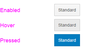
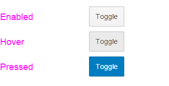
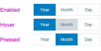
Buttons can be enabled or disabled. Enabled buttons can be clicked or tapped. They also have “hover” and “pressed” states that give feedback to the user.

Standard button behavior

Toggle button behavior

Segmented button behavior
Disabled
Disabled buttons are shown as inactive and cannot be clicked or tapped.

Disabled standard button

Disabled toggle button

Disabled segmented button
Styles
Standard Buttons
The appearance of a button can change depending on where it’s used (for example, in a toolbar, footer toolbar, popup, or dialog box).

Default

Back

Transparent

Positive (property: type = accept)

Negative (property: type = reject)

Emphasized
Toggle Buttons

Default

Transparent
Segmented Buttons
No special styles apply to segmented buttons. As a result, they look almost the same as the default style for standard buttons.
Guidelines
- Don’t combine an icon and text within one button.
- Choose a button text that is short and meaningful.
- Use imperative verbs for all actions; for example: Save, Cancel, Edit.
- Keep in mind that the text can be up to 300% longer in other languages.
- We don’t recommend using tooltips since they are only visible on desktop devices. However, you can use tooltips for icon buttons.
- For icon buttons, make sure the default accessibility text for the icon is correct for your use case. If not, define app-specific accessibility text.
- If an action button is temporarily inactive, use the disabled status.
- If you need to show the number of items that will be affected by the action of the button, you can add the number in brackets. For example, Edit (3).
Exceptions
Segmented Button
By default, the control for segmented buttons calculates the button width and applies it to all buttons within the group. You can change this by setting the width for individual buttons.
Resources
Want to dive deeper? Follow the links below to find out more about related controls, the SAPUI5 implementation, and the visual design.
Elements and Controls
- No links
Implementation
- No links

 Your feedback has been sent to the SAP Fiori design team.