
- Latest SAPUI Version 1.124
- SAPUI5 Version 1.122
- SAPUI5 Version 1.120
- SAPUI5 Version 1.118
- SAPUI5 Version 1.116
- SAPUI5 Version 1.114
- SAPUI5 Version 1.112
- SAPUI5 Version 1.110
- SAPUI5 Version 1.108
- SAPUI5 Version 1.106
- SAPUI5 Version 1.104
- SAPUI5 Version 1.102
- SAPUI5 Version 1.100
- SAPUI5 Version 1.98
- SAPUI5 Version 1.96
- SAPUI5 Version 1.94
- SAPUI5 Version 1.92
- SAPUI5 Version 1.90
- SAPUI5 Version 1.88
- SAPUI5 Version 1.86
- SAPUI5 Version 1.84
- SAPUI5 Version 1.82
- SAPUI5 Version 1.80
- SAPUI5 Version 1.78
- SAPUI5 Version 1.76
- SAPUI5 Version 1.74
- SAPUI5 Version 1.72
- SAPUI5 Version 1.70
- SAPUI5 Version 1.68
- SAPUI5 Version 1.66
- SAPUI5 Version 1.64
- SAPUI5 Version 1.62
- SAPUI5 Version 1.60
- SAPUI5 Version 1.58
- SAPUI5 Version 1.56
- SAPUI5 Version 1.54
- SAPUI5 Version 1.52
- SAPUI5 Version 1.50
- SAPUI5 Version 1.48
- SAPUI5 Version 1.46
- SAPUI5 Version 1.44
- SAPUI5 Version 1.42
- SAPUI5 Version 1.40
- SAPUI5 Version 1.38
- SAPUI5 Version 1.36
- SAPUI5 Version 1.32
- SAPUI5 Version 1.30
- SAPUI5 Version 1.28
- SAPUI5 Version 1.26
- Latest SAPUI Version 1.124
- SAPUI5 Version 1.122
- SAPUI5 Version 1.120
- SAPUI5 Version 1.118
- SAPUI5 Version 1.116
- SAPUI5 Version 1.114
- SAPUI5 Version 1.112
- SAPUI5 Version 1.110
- SAPUI5 Version 1.108
- SAPUI5 Version 1.106
- SAPUI5 Version 1.104
- SAPUI5 Version 1.102
- SAPUI5 Version 1.100
- SAPUI5 Version 1.98
- SAPUI5 Version 1.96
- SAPUI5 Version 1.94
- SAPUI5 Version 1.92
- SAPUI5 Version 1.90
- SAPUI5 Version 1.88
- SAPUI5 Version 1.86
- SAPUI5 Version 1.84
- SAPUI5 Version 1.82
- SAPUI5 Version 1.80
- SAPUI5 Version 1.78
- SAPUI5 Version 1.76
- SAPUI5 Version 1.74
- SAPUI5 Version 1.72
- SAPUI5 Version 1.70
- SAPUI5 Version 1.68
- SAPUI5 Version 1.66
- SAPUI5 Version 1.64
- SAPUI5 Version 1.62
- SAPUI5 Version 1.60
- SAPUI5 Version 1.58
- SAPUI5 Version 1.56
- SAPUI5 Version 1.54
- SAPUI5 Version 1.52
- SAPUI5 Version 1.50
- SAPUI5 Version 1.48
- SAPUI5 Version 1.46
- SAPUI5 Version 1.44
- SAPUI5 Version 1.42
- SAPUI5 Version 1.40
- SAPUI5 Version 1.38
- SAPUI5 Version 1.36
- SAPUI5 Version 1.34
- SAPUI5 Version 1.32
- SAPUI5 Version 1.30
- SAPUI5 Version 1.28
- SAPUI5 Version 1.26
List Report Floorplan
Intro
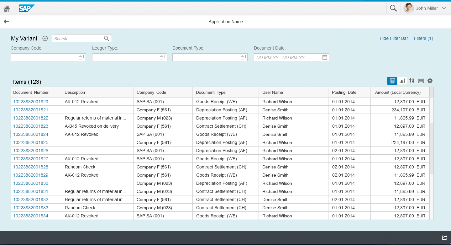
The list report floorplan allows the user to work with a large list of items and take action. This floorplan combines powerful functions for filtering large lists with different ways of displaying the resulting item list. You can only use the list report floorplan with the full screen layout.
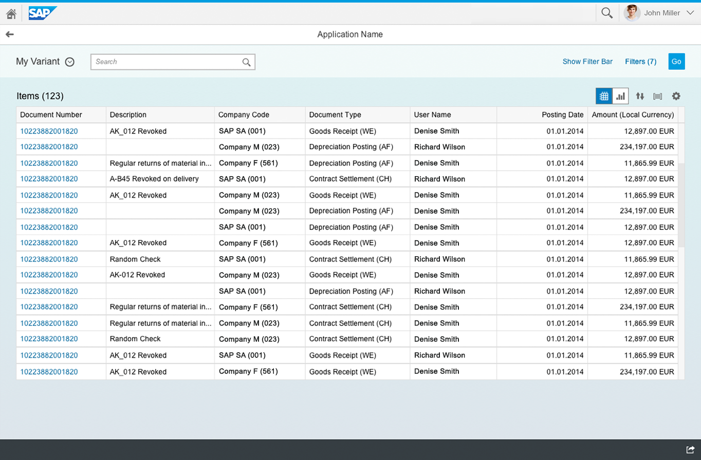
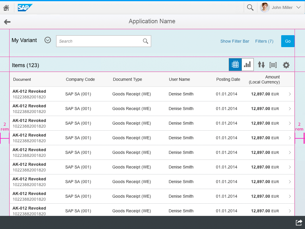
List report floorplan – Live Update
Usage
Use the list report floorplan if:
Do not use the list report floorplan if:
- The users work primarily on a specific list of items. In this case, the focus lies on the action, and less on filtering. Use the work list floorplan instead.
Layout
The launchpad shell bar is always available at the top of SAP Fiori apps. The app title (application header) reflects the title of the launch tile, such as Manage Products.
The list report floorplan is based on the full screen layout. Apart from the common app header and footer toolbar, the list report floorplan has two main elements:
- Filter area: The filter bar is located at the top of the screen. It allows the user to either select a predefined filter set (known as a variant), or to create a new filter set using the individual fields in the filter bar.
- Content area: The content is shown in the lower part of the screen. You can display the data using one or multiple lists, tables, tree tables, or charts. If you want to display different types of content or different tables, you can opt to use an icon tab container.
- Dependency: Since the filter bar and the contents are dependent, the app must ensure that both are always in a consistent state.
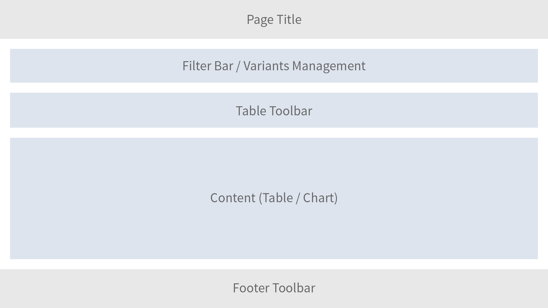
Layout of list report
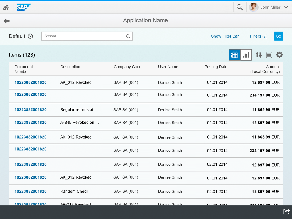
Responsiveness
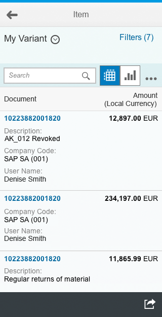
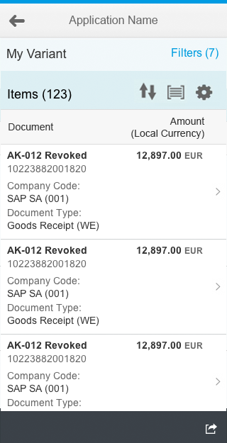
List report floorplan adapted to smartphone
List report floorplan adapted to tablet
List report floorplan adapted to desktop
Currently, the controls used within the list report floorplan do not all adjust responsively across all devices. Depending on the controls you implement, you may need to adapt them for some devices. The level of multi-device support depends on the individual controls used in the floorplan. For details, see the guidelines for the individual controls.
- Filter bar – supported on all devices.
- Icon tab bar – supported on all devices.
- Responsive table, list – supported on all devices (use the responsive features).
- Analytical table – supported on desktop devices only. On tablets and smartphones, replace it with the responsive table.
- Tree table – supported on desktop devices only. There is currently no alternative for tablets and smartphones.
- Chart – supported on all devices.
Filter Area
In the filter area, users specify the data that is displayed in the content area by:
- Using different filter criteria to reduce the number of items displayed.
- Selecting predefined filter sets (known as variants) to support different use cases.
These functions are offered by the filter bar, which is mandatory for any list report floorplan.
The variant management functions allow users to define and manage predefined filter sets. They can set a default variant, and specify how the variant is executed:
- If Execute on Select is active, the variant is executed as soon as the user selects it (live update).
- If Execute on Select is not active, the user can modify the query, but has to execute the search manually to display the data (delayed update).
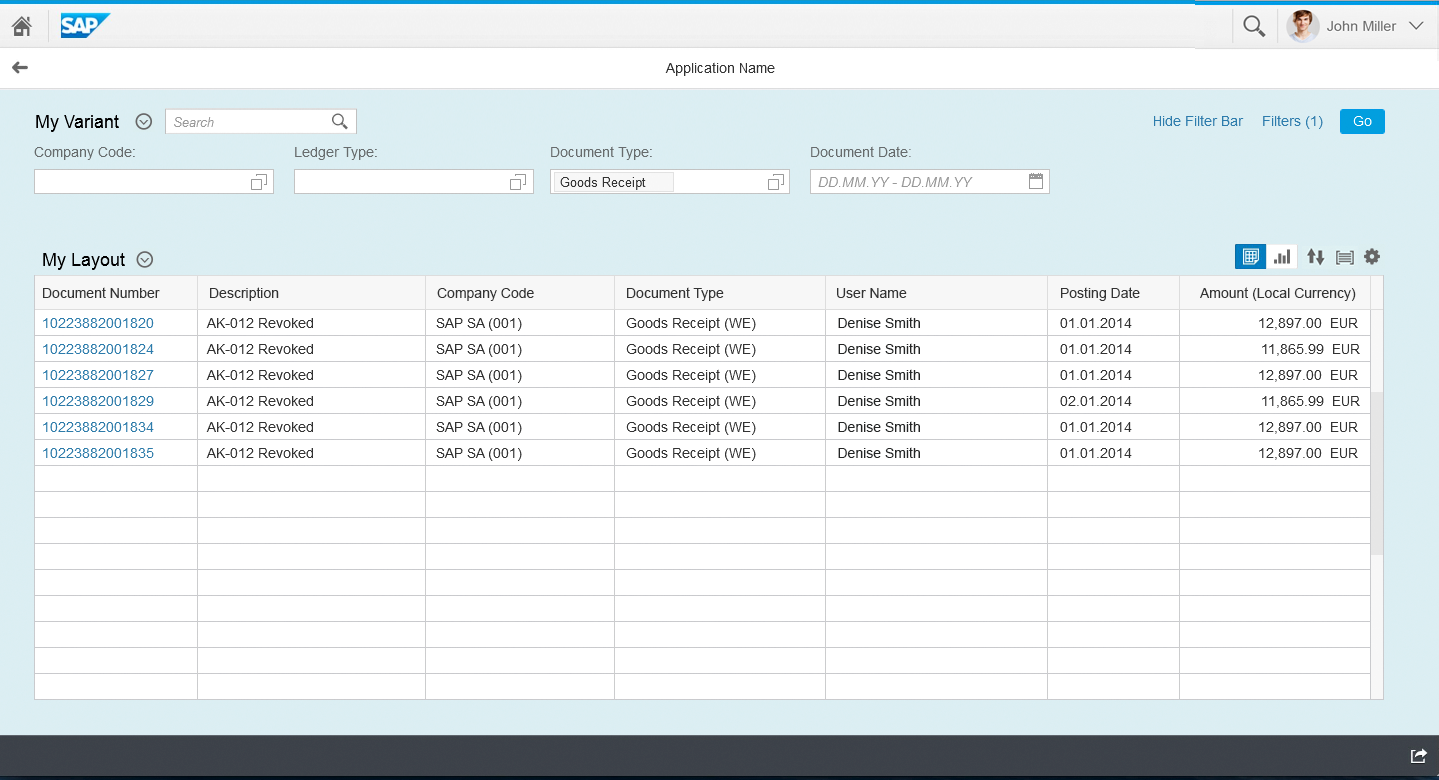
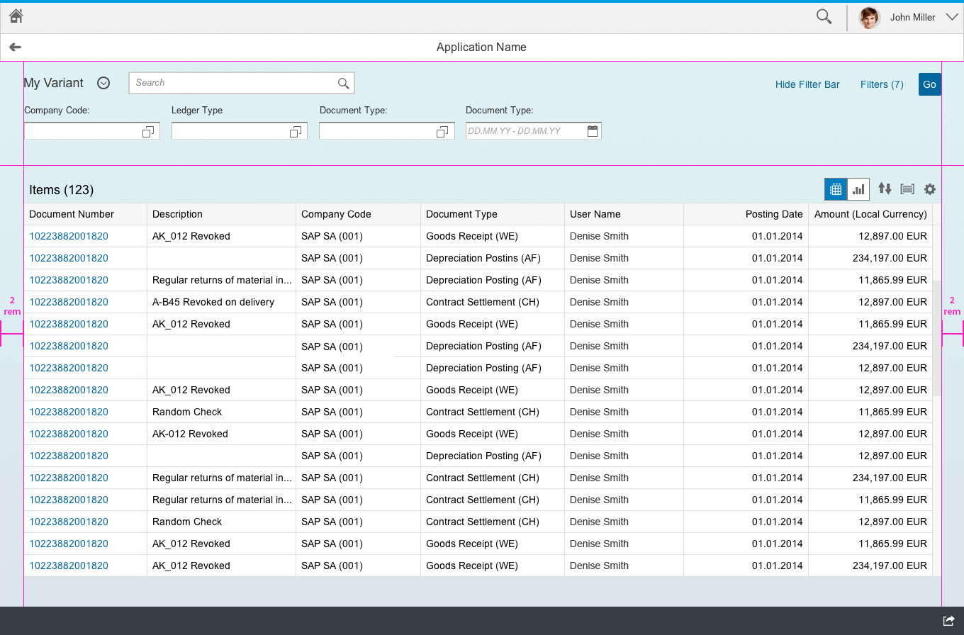
Expanded filter bar in a list report floorplan
The list report floorplan can start with the filter bar expanded or collapsed:
- The expanded view reveals the filter functionality and makes it clear that the user can filter on the list. However, it looks more complex than the collapsed view.
- The collapsed view is simple and user-friendly. However, users might not realize that they can change the content using multiple filters.
Users can expand or collapse the filter bar manually. In this case, the app should persist the status the user has set. The persisted state should override the default state set by the app.
Filter bar in a collapsed state
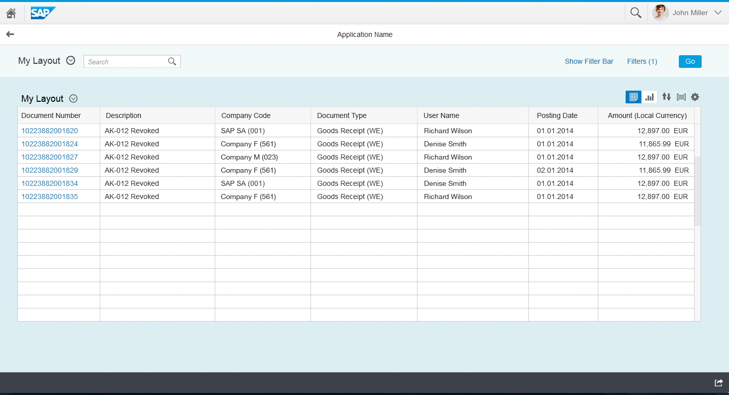
Content Area
The content area is located on the lower part of the screen and contains the actual data. The data shown is determined by the settings in the filter area.
Content
There are various options for displaying large data sets, each of which has specific features and advantages. For more information, see the documentation for the individual control.
- List (sap.m.List)
- Table (sap.m.Table)
- Grid Table (sap.ui.table.Table)
- Analytical table (sap.ui.table.AnalyticalTable)
- Tree table (sap.ui.table.TreeTable)
- Smart Table (sap.ui.comp.smarttable.SmartTable)
- Charts (sap.viz.ui5.controls.VizFrame)
Toolbar
The different content controls allow you to incorporate toolbars in different ways. The details are covered in the guidelines for the respective toolbars. This section only covers the specifics for the list report floorplan.
In the simplest case, the toolbar contains only basic table functionality, such as the table title (count), sorting, grouping, and table personalization.

Typical toolbar in the list report floorplan containing the table title (count), a free text filter, sorting, grouping, and table personalization controls
In addition to the basic list, you can provide alternative visualizations, such as a table or a chart. You can also offer these two functions in the toolbar, including combined visualizations, such as a chart together with a table.

Toolbar with a switch between table and chart visualizations
Users can store personalized table settings in a layout variant, which is also available on the table toolbar.

Toolbar with a table title and layout variant selection
You can extend the toolbar to offer additional contextual actions. These actions can be selection-dependent (enabled only if an item is selected) or selection-independent (always enabled, even without item selection).

Toolbar with additional contextual actions
Simple Content (Default)
In most cases, the content is displayed in a single list or table, with a title toolbar at the top. The title toolbar has a specific style (transparent background), and uses one of the content variants described above.
Multiple Views
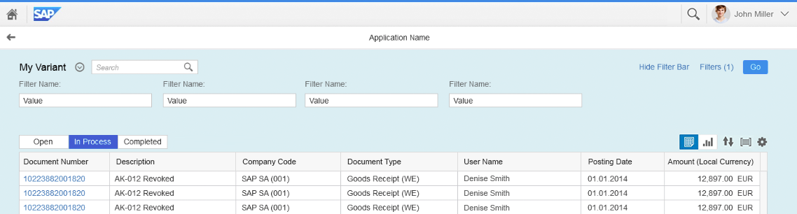
Table toolbar with a segmented button for up to three different views
In many cases, you will want to offer multiple predefined views on the data in the content area. Such views represent certain filter criteria, or some other fundamental differentiation between the items displayed in the content (for example, open items, items in process, and closed items). There are two ways to let users select these views directly:
- For two to three views, use a segmented button .
- For more than three views, or if the number of views can change, use the select control .
For the filter bar also influences the result set shown in the table, avoid repeating filter criteria in the views. If the criterion that determines the view is also a filter criterion, you might run into dependencies that are difficult to resolve. For example, if you have a Status filter in the filter bar, and a view switch with the views Open, In Process, and Closed, both refer to the same property.
If you use a content switch, you no longer need a title. In very rare use cases, both a title and a content switch must be visible. In this case, the title and the content view are left-aligned.
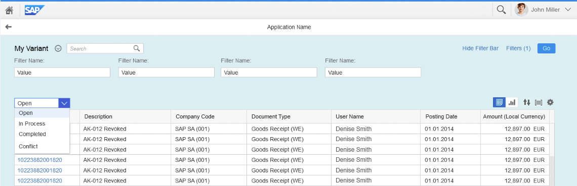
Table toolbar with a select control for more than three views
Switching between views can affect how the content is visualized:
- For tables, the different views do not affect how the content is visualized. They only change the content or items displayed (filter on the content). Table columns and sort settings are not affected by switching views.
- For charts, switching views can affect the visualization. This can be the case if there is a better way to represent the data for a specific view (for example, view by country, view by customer).
Multiple Contents
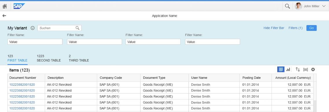
List report floorplan with multiple tables placed in multiple tabs
A list report can contain multiple lists or tables in parallel. The same filter criteria are applied across all tables. For example, if the user filters for specific customers and dates, a customer overview report would show only matching invoices, deliveries, and overdue payments.
To facilitate navigation, you can show each table on a separate tab in the icon tab bar.
Guidelines:
- For the list report floorplan, use the text-only version of the icon tab bar.
- By default, populate the count attribute with the number of items shown in the respective table.
- Use the same name for the tab and the table title.
- You can add a toolbar for table functions. Follow the rules described above for the toolbar.
“No Data” Texts
If the content area is empty, use a placeholder text to tell the user why. To assign a placeholder text, set the “noDataText” attribute.
Typical use cases and placeholder texts:
- The user has started the app, but not applied any filters.
Text: “No items selected. To start, enter your selection criteria and run the search.” - The user has executed the filter, but no items were found.
Text: “No results found. Try adjusting your search and filter settings.” - The user has opened a related app. The filter criteria are transferred automatically, but no items are found in the related app.
Text: “No items selected. Check the search and filter settings.”
Dependencies Between Areas
The filter and content areas must be synchronized at all times. In other words, the filters in the filter bar must always describe the items that are shown in the content area.
Updating the Content Area
The filter bar supports two update modes:
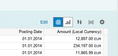
- Live update (default): The user changes a filter criterion, and the content is updated immediately. The results table is updated every time the user changes a filter field or the search field. Therefore, a Go button is not necessary and is not shown if the live update mode is used. Also, the search is triggered with every letter that is entered. Starting with the first letter typed in, the table is updated with the results that match all set filters, including the search term.
The live update mode fits for most use cases and should be used as a default.
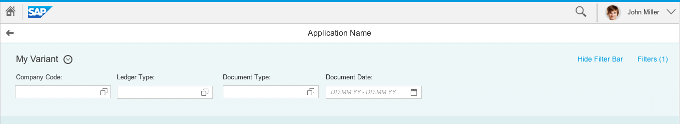
Filter bar in live update mode
- Manual update: The user changes a filter criterion first and then presses the Go button to apply the filter and update the content. In this case, a Go button is mandatory. If a search field is used, it is only triggered by the Go button and not instantly.
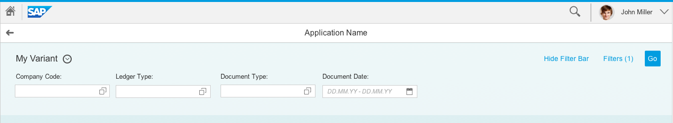
Filter bar in manual update mode
The manual update mode is necessary to reduce load on the back-end systems. In live update mode, the app has to query the back end for every filter change.
In the manual update mode, indicate that the content is not yet updated by graying out the content area (showOverlay = true). As soon as the user triggers the update by selecting Go in the filter bar, set the content area to “busy” (busy = true) until the new data has been retrieved. This will switch the control to busy state.
Filter Bar and Table Filter
Since the filters in the filter bar and the filter option in the table can contain confusing or even contradictory entries, you must deactivate the filter option in the table.
The table without the filter icon
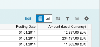
Table including filter option
Basic Search Field and Table Search
The filter bar determines the content of the report. This filter configuration can also be persisted and shared with other users (variant management).
Since the search is not included in the filter bar (except within the smart filter bar), you must implement the search functionality in every app. Every search is executed against the back end and in combination with the set filters.
The report results are now reduced to only those items that contain the search string and match all set filters.
Actions
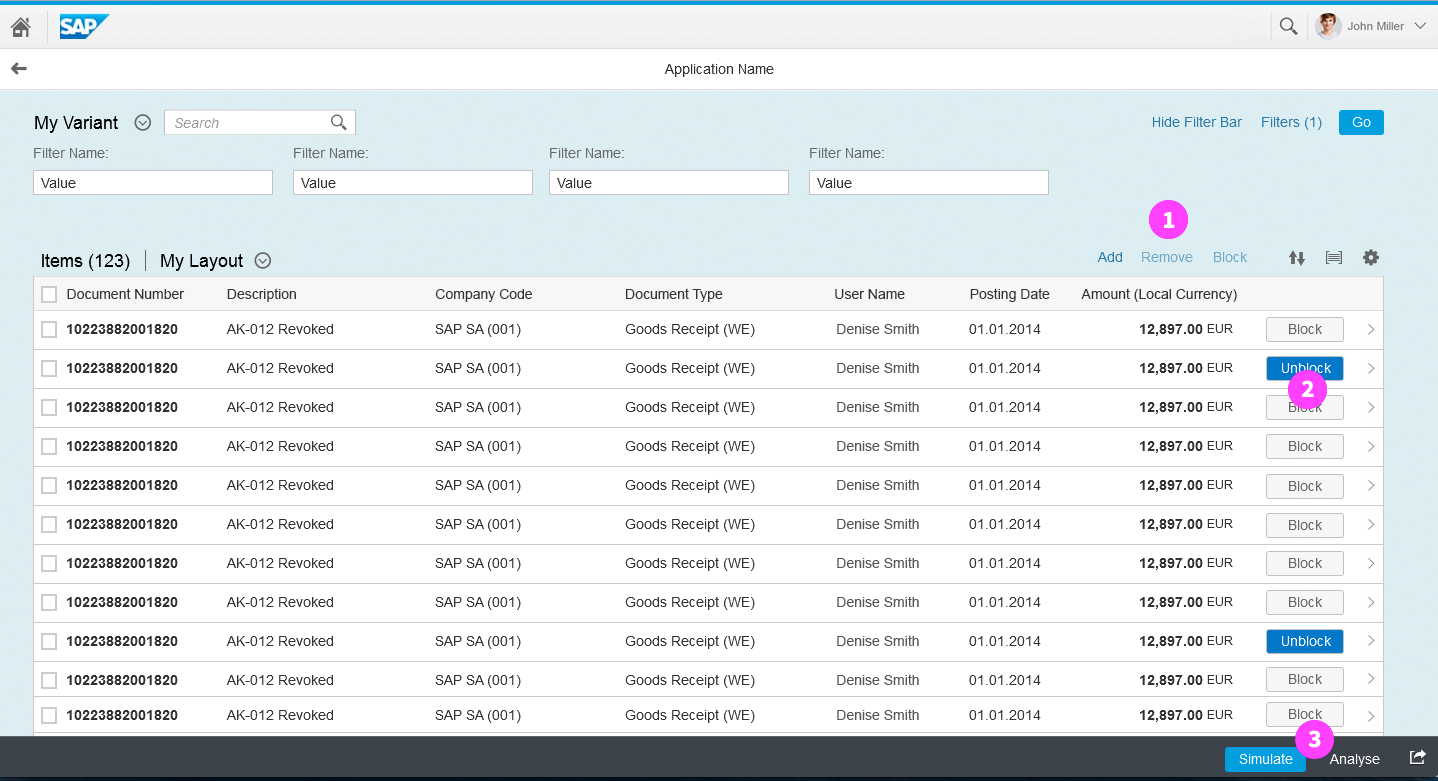
The three places where actions can be located in the list report floorplan: table toolbar, line item, or footer toolbar
Users should also be able to trigger actions on the list report floorplan. Apps can offer three types of action: table actions, line item actions, and global actions.
1. Table Actions
To allow users to change the content of a table, you can offer actions in the table toolbar (1). The scope of these actions depends on the items selected (no item selected, a single item selected, or multiple items selected). If an action applies to specific items, the user has to first select the item or items, and then the action from the toolbar. Examples of such actions include:
- Adding/removing items
- Editing one or multiple items
- Triggering an object function for one or multiple items
- Changing the status of one or multiple items
Disable actions that cannot be currently used (for example, when no items are selected).
2. Line Item Actions
In rare cases it makes sense to let the user trigger specific frequently-used tasks directly from the item. In this case, you can embed a button into a line item. Such actions can be offered alongside corresponding table actions or global actions. Examples of line item actions include:
- Starting/stopping a batch job
- Approving an item
- Assigning an item
3. Global Actions
If the user wants to execute actions that affect the entire page, these actions can be placed in the footer toolbar section of the page (3).
The global actions do also contain the Share button. Show it only if you really need it. If not, remove the Share button.
Navigation
In most cases, users can navigate to the detail view for each line item in the report. In cases where reports display data aggregates, the user might also want to drill into the details for the aggregated amount.
Line Item Navigation
At line item level, navigation to the item details depends on the control that is being used to display the data. In most cases, users navigate to the details either by selecting the table line (list, responsive table), or by selecting the identifier of the line item (grid table, analytical table, tree table). For more details on the navigation behavior, see the guideline for the respective control.
Drilldown Navigation
If a report displays aggregated amounts, the user might want to drill down into the individual items. In this case, we recommend to display the aggregate values as links. Clicking the link takes the user to another report showing the individual figures. Use the possibilities of the link to provide different levels of highlight in cases where the table contains many columns with links.
In charts, offer the drilldown navigation link in the popover for the chart element.
Cross Navigation
Reports – especially tables – can contain cross-references to other entities, such as people or business objects. Show references to other entities in a popover. Typically, the popover displays basic details of the referenced object and a navigation link to another page or another app that shows the object details.
Visual Design
For your convenience, we have integrated the visual design specifications for the list report floorplan.
Basic layout of a list report floorplan on a smartphone
Basic layout of the list report floorplan on a tablet
Basic layout of the list report floorplan on desktop
Resources
Want to dive deeper? Follow the links below to find out more about related controls, the SAPUI5 implementation, and the visual design.
Elements and Controls
- Floorplan Overview (guidelines)
- Analytical Table (guidelines)
- Tree Table (guidelines)
- Responsive Table (guidelines)
- Variant Management (guidelines)
- Icon Tab Bar (guidelines)
Implementation
- Table (SAPUI5 API reference)
- Tree Table (SAPUI5 API reference)
- Facet Filter (SAPUI5 API reference)
- Tab Container (Icon Tab Bar) (SAPUI5 API reference)
 Your feedback has been sent to the SAP Fiori design team.