
- Latest SAPUI Version 1.124
- SAPUI5 Version 1.122
- SAPUI5 Version 1.120
- SAPUI5 Version 1.118
- SAPUI5 Version 1.116
- SAPUI5 Version 1.114
- SAPUI5 Version 1.112
- SAPUI5 Version 1.110
- SAPUI5 Version 1.108
- SAPUI5 Version 1.106
- SAPUI5 Version 1.104
- SAPUI5 Version 1.102
- SAPUI5 Version 1.100
- SAPUI5 Version 1.98
- SAPUI5 Version 1.96
- SAPUI5 Version 1.94
- SAPUI5 Version 1.92
- SAPUI5 Version 1.90
- SAPUI5 Version 1.88
- SAPUI5 Version 1.86
- SAPUI5 Version 1.84
- SAPUI5 Version 1.82
- SAPUI5 Version 1.80
- SAPUI5 Version 1.78
- SAPUI5 Version 1.76
- SAPUI5 Version 1.74
- SAPUI5 Version 1.72
- SAPUI5 Version 1.70
- SAPUI5 Version 1.68
- SAPUI5 Version 1.66
- SAPUI5 Version 1.64
- SAPUI5 Version 1.62
- SAPUI5 Version 1.60
- SAPUI5 Version 1.58
- SAPUI5 Version 1.56
- SAPUI5 Version 1.54
- SAPUI5 Version 1.52
- SAPUI5 Version 1.50
- SAPUI5 Version 1.48
- SAPUI5 Version 1.46
- SAPUI5 Version 1.44
- SAPUI5 Version 1.42
- SAPUI5 Version 1.40
- SAPUI5 Version 1.38
- SAPUI5 Version 1.36
- SAPUI5 Version 1.32
- SAPUI5 Version 1.30
- SAPUI5 Version 1.28
- SAPUI5 Version 1.26
- Latest SAPUI Version 1.124
- SAPUI5 Version 1.122
- SAPUI5 Version 1.120
- SAPUI5 Version 1.118
- SAPUI5 Version 1.116
- SAPUI5 Version 1.114
- SAPUI5 Version 1.112
- SAPUI5 Version 1.110
- SAPUI5 Version 1.108
- SAPUI5 Version 1.106
- SAPUI5 Version 1.104
- SAPUI5 Version 1.102
- SAPUI5 Version 1.100
- SAPUI5 Version 1.98
- SAPUI5 Version 1.96
- SAPUI5 Version 1.94
- SAPUI5 Version 1.92
- SAPUI5 Version 1.90
- SAPUI5 Version 1.88
- SAPUI5 Version 1.86
- SAPUI5 Version 1.84
- SAPUI5 Version 1.82
- SAPUI5 Version 1.80
- SAPUI5 Version 1.78
- SAPUI5 Version 1.76
- SAPUI5 Version 1.74
- SAPUI5 Version 1.72
- SAPUI5 Version 1.70
- SAPUI5 Version 1.68
- SAPUI5 Version 1.66
- SAPUI5 Version 1.64
- SAPUI5 Version 1.62
- SAPUI5 Version 1.60
- SAPUI5 Version 1.58
- SAPUI5 Version 1.56
- SAPUI5 Version 1.54
- SAPUI5 Version 1.52
- SAPUI5 Version 1.50
- SAPUI5 Version 1.48
- SAPUI5 Version 1.46
- SAPUI5 Version 1.44
- SAPUI5 Version 1.42
- SAPUI5 Version 1.40
- SAPUI5 Version 1.38
- SAPUI5 Version 1.36
- SAPUI5 Version 1.34
- SAPUI5 Version 1.32
- SAPUI5 Version 1.30
- SAPUI5 Version 1.28
- SAPUI5 Version 1.26
Wizard Floorplan
Intro
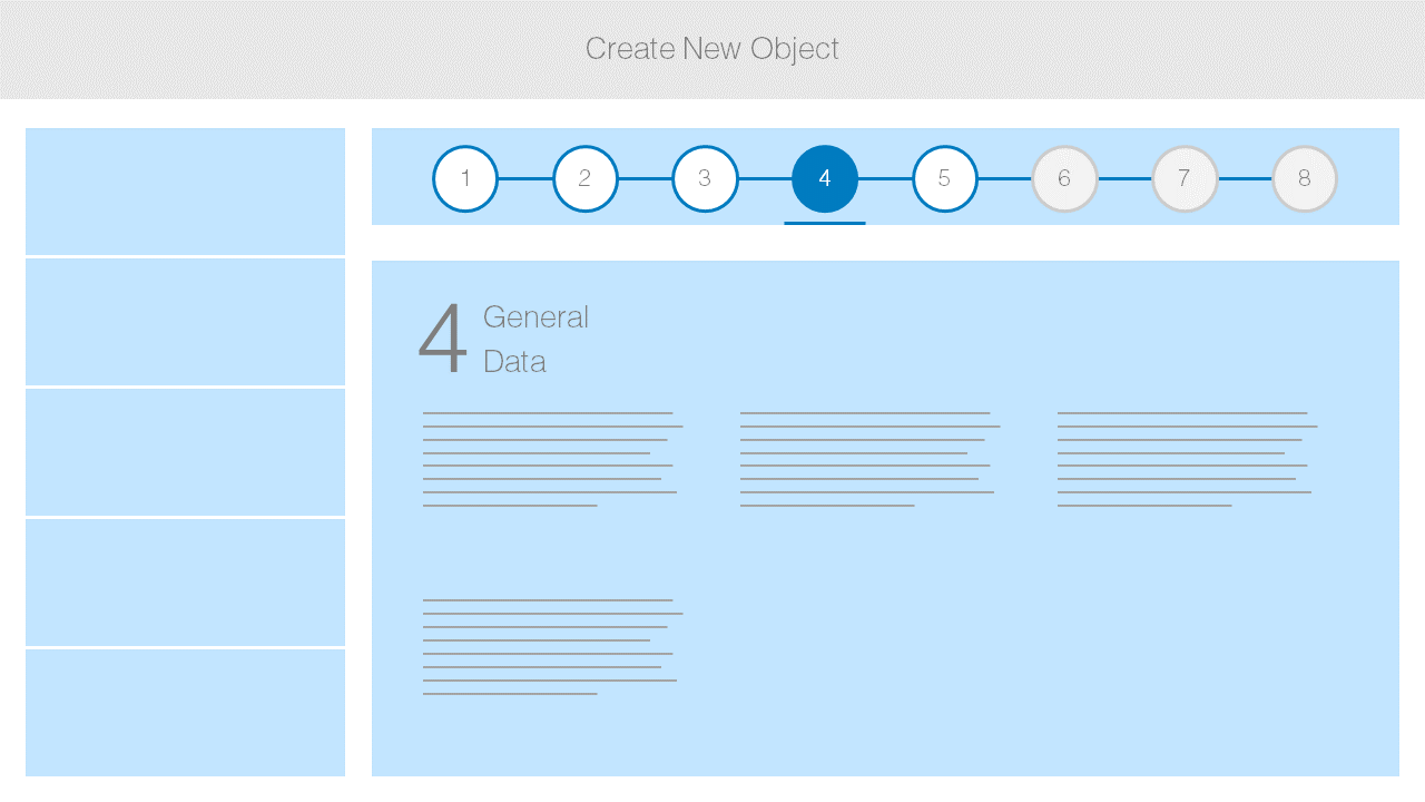
The wizard floorplan allows users to complete a long or unfamiliar task by dividing it into sections and guiding the user through it. The wizard consists of the walkthrough screen, where the form sections are revealed in sequence after each one is completed, and the summary page, where the form is displayed in read-only mode for assessment and final submission. You can use the wizard both in full-screen and split-screen layouts.
Wizard floorplan
Usage
When to Use the Wizard Floorplan
The wizard aims to help users by dividing large or complex tasks into segments. Use the wizard if the user has to accomplish a long task (such as filling out a long questionnaire) or a task that is unfamiliar to the user. The wizard should lead the user through a minimum of 3 and a maximum of 8 steps.
When Not to Use the Wizard Floorplan
If you have a task with only 2 steps or a format that the user is familiar with (for example, it is part of their daily routine), do not use the wizard as it only adds unnecessary clicks to the process. If your process needs more than 8 steps, the wizard will not support those steps as the process is too long and can be confusing for the user. In this case, you should consider restructuring the task.
The main use case for a wizard is creating business objects. For edit use cases, use the edit flow or the object page.
Structure
The wizard has two main screens: the walkthrough screen, where users complete a segmented task, and the summary screen, where they can check the data they are about to submit. Wizard content is not restricted to forms; other content such as a value help dialog can also be used.
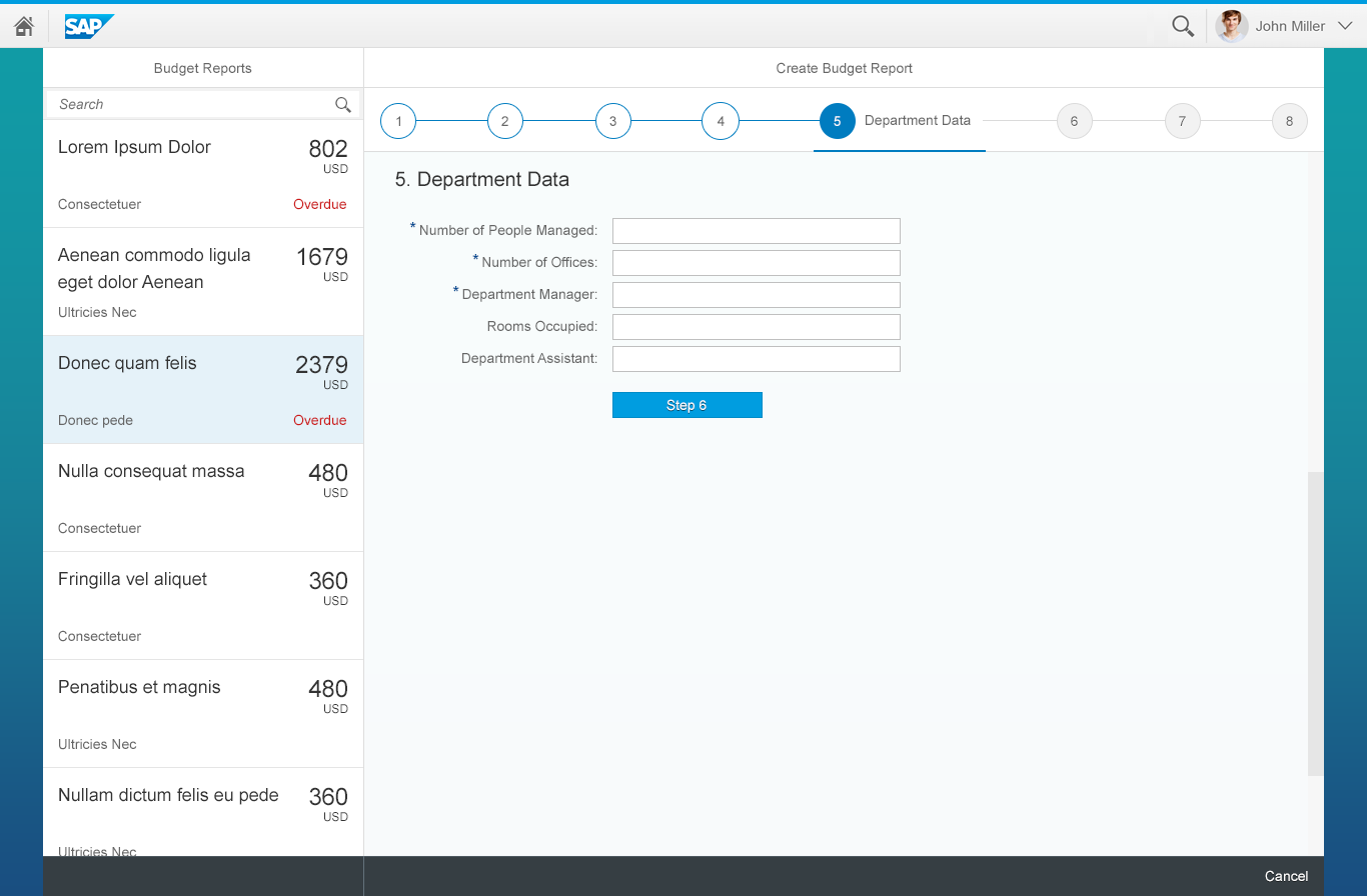
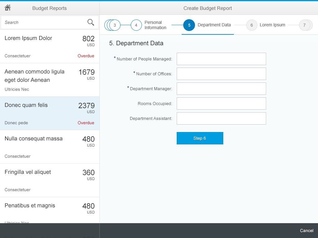
Walkthrough Screen
The walkthrough screen is the wizard’s main screen. After triggering the wizard, the user is taken to the walkthrough screen, which shows only the first section of the form. Once the user has filled out all the necessary fields, a Step XY button appears, which allows the user to move to the next step. When the user has completed the last section of the wizard, the button label changes to Review and the user is taken to the summary screen.
The wizard footer is used to display the Cancel button, which exits the wizard. If the user has modified any fields, a data loss message also prompts the user. You can also use a Save as Draft function in the footer if the form is long and the user may have to save it before finishing it.
Walkthrough screen in full screen layout
The progress bar/anchor navigation highlights the completed steps and the current step. It also allows the user to navigate between steps by clicking on any of the circles.
The progress bar exhibits a grouping behavior if there are multiple steps and the screen width is reduced. This behavior is the same on smartphone, tablet, and desktop screens.

Wizard progress bar and anchor navigation
Depending on user preference, you can also have an unknown number of steps after a particular step (“branching”). In this case, a dotted line shows that more steps will follow.

Wizard branching
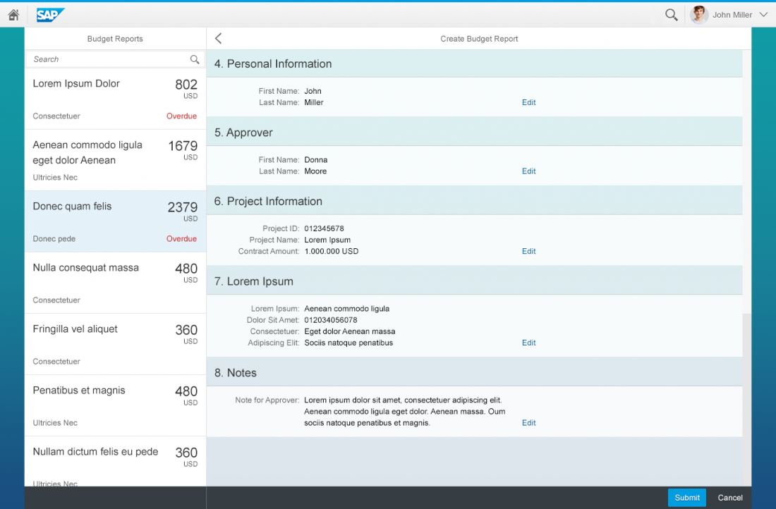
Summary Screen
The summary screen has no progress bar/anchor navigation. It shows the completed steps in read-only mode, which can then be proofread before being submitted.
The summary screen consists of the form sections displayed in read-only mode. To allow the user to go back and edit entries, an Edit button needs to be provided either in the footer or on each form section.
If the Edit button is placed in the footer, the user is taken back to the first section of the wizard, while the buttons on each section allow the user to jump to that particular step. Alternatively, users can click the back button to go to the last step. From here, they can scroll or tap through the sections.
The main action on the summary page should reflect the action taken by the user when completing the wizard, such as Submit or Save.
Wizard summary page example
Layout

Wizard structure in full screen layout
Wizard structure in split-screen layout
Types
There are two types of wizard – “standard” and “branching” – which differ in terms of the functions they offer.
Use the standard type if:
- The total number of steps is known in advance.
- The number of steps does not change during usage.
- There is linear progression from one step to the next.
Use the branching type if:
- The total number of steps is not known.
- The number of steps may change during usage.
- There is non-linear progression. In other words, the user’s choice during one step determines which step comes next.
Styles
In addition to the functional types, there are also different visual styles.
Numbers and Icons
By default, both versions use a number inside a circle to represent each step. App developers also have the option of using icons instead of numbers to help users identify the steps. If you plan to use icons, be sure to assign icons to all the steps (not just to some). The icons you choose should be unique and not look too similar. This will ensure that users do not get individual steps confused with one another.

Steps represented by numbers
Steps represented by icons
Explanatory Texts
Ideally, the steps’ headlines and field labels should be enough information for users to complete their tasks. However, if additional explanations are needed, applications can put a simple text underneath a step’s headline – either via the sap.m.Text or the sap.m.FormattedText control.
Responsiveness and Adaptation
The wizard supports all devices (except smartwatches). It is available in cozy and compact modes, and has been specified for high-contrast black as well.
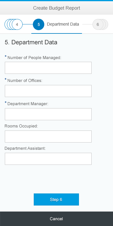
Wizard – Size S
Wizard – Size M
Wizard – Size L
Navigation and Error Handling
Navigation
Users can trigger the wizard app from another application, the launchpad, or a notification. The wizard always starts at the initial walkthrough page and ends after the user has clicked the main action (such as Submit) on the summary screen. The Step XY button is only used on the walkthrough page, and its purpose is to load the next section of the form.
On the summary page, the user can use either the Edit button in the footer or the “back” arrow to return to the wizard and edit any of the fields.
Modifying dependent steps: If there are steps that depend on each other (for example, a selection in step 2 triggers an optional step) and the user modifies the parent step, the dependent step is changed or deleted. This first triggers a warning message (when the input control loses focus) that data will be lost.
Error Handling
Error handling is done via message popovers. When the user clicks the Step XY button, the form sections and fields should be validated. When the user clicks the Submit button on the summary page, the entire form is validated. If there are any errors, the user stays on the walkthrough page, the message popover is displayed, and clicking any of the error items scrolls the page to the relevant field, which is also highlighted in red.
Section validation differs from validation of the entire form. In the first case, correct data entry in the form fields is validated. In the second case, the entire form is checked for backend system errors (such as duplicated data entry).

Wizard error handling
Resources
Want to dive deeper? Follow the links below to find out more about related controls, the SAPUI5 implementation, and the visual design.
 Your feedback has been sent to the SAP Fiori design team.