
- Latest SAPUI Version 1.124
- SAPUI5 Version 1.122
- SAPUI5 Version 1.120
- SAPUI5 Version 1.118
- SAPUI5 Version 1.116
- SAPUI5 Version 1.114
- SAPUI5 Version 1.112
- SAPUI5 Version 1.110
- SAPUI5 Version 1.108
- SAPUI5 Version 1.106
- SAPUI5 Version 1.104
- SAPUI5 Version 1.102
- SAPUI5 Version 1.100
- SAPUI5 Version 1.98
- SAPUI5 Version 1.96
- SAPUI5 Version 1.94
- SAPUI5 Version 1.92
- SAPUI5 Version 1.90
- SAPUI5 Version 1.88
- SAPUI5 Version 1.86
- SAPUI5 Version 1.84
- SAPUI5 Version 1.82
- SAPUI5 Version 1.80
- SAPUI5 Version 1.78
- SAPUI5 Version 1.76
- SAPUI5 Version 1.74
- SAPUI5 Version 1.72
- SAPUI5 Version 1.70
- SAPUI5 Version 1.68
- SAPUI5 Version 1.66
- SAPUI5 Version 1.64
- SAPUI5 Version 1.62
- SAPUI5 Version 1.60
- SAPUI5 Version 1.58
- SAPUI5 Version 1.56
- SAPUI5 Version 1.54
- SAPUI5 Version 1.52
- SAPUI5 Version 1.50
- SAPUI5 Version 1.48
- SAPUI5 Version 1.46
- SAPUI5 Version 1.44
- SAPUI5 Version 1.42
- SAPUI5 Version 1.40
- SAPUI5 Version 1.38
- SAPUI5 Version 1.36
- SAPUI5 Version 1.32
- SAPUI5 Version 1.30
- SAPUI5 Version 1.28
- SAPUI5 Version 1.26
- Latest SAPUI Version 1.124
- SAPUI5 Version 1.122
- SAPUI5 Version 1.120
- SAPUI5 Version 1.118
- SAPUI5 Version 1.116
- SAPUI5 Version 1.114
- SAPUI5 Version 1.112
- SAPUI5 Version 1.110
- SAPUI5 Version 1.108
- SAPUI5 Version 1.106
- SAPUI5 Version 1.104
- SAPUI5 Version 1.102
- SAPUI5 Version 1.100
- SAPUI5 Version 1.98
- SAPUI5 Version 1.96
- SAPUI5 Version 1.94
- SAPUI5 Version 1.92
- SAPUI5 Version 1.90
- SAPUI5 Version 1.88
- SAPUI5 Version 1.86
- SAPUI5 Version 1.84
- SAPUI5 Version 1.82
- SAPUI5 Version 1.80
- SAPUI5 Version 1.78
- SAPUI5 Version 1.76
- SAPUI5 Version 1.74
- SAPUI5 Version 1.72
- SAPUI5 Version 1.70
- SAPUI5 Version 1.68
- SAPUI5 Version 1.66
- SAPUI5 Version 1.64
- SAPUI5 Version 1.62
- SAPUI5 Version 1.60
- SAPUI5 Version 1.58
- SAPUI5 Version 1.56
- SAPUI5 Version 1.54
- SAPUI5 Version 1.52
- SAPUI5 Version 1.50
- SAPUI5 Version 1.48
- SAPUI5 Version 1.46
- SAPUI5 Version 1.44
- SAPUI5 Version 1.42
- SAPUI5 Version 1.40
- SAPUI5 Version 1.38
- SAPUI5 Version 1.36
- SAPUI5 Version 1.34
- SAPUI5 Version 1.32
- SAPUI5 Version 1.30
- SAPUI5 Version 1.28
- SAPUI5 Version 1.26
Master List
Intro
The master list pattern is part of the split-screen layout. It allows users to scan, select, and navigate the list items to be displayed in the details area.

A split-screen layout with a master list
Usage
Only use the master list in combination with the split-screen layout.
Structure
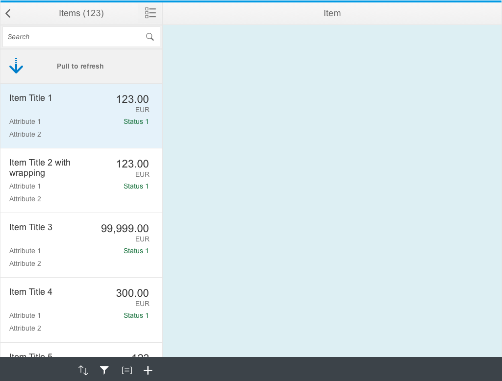
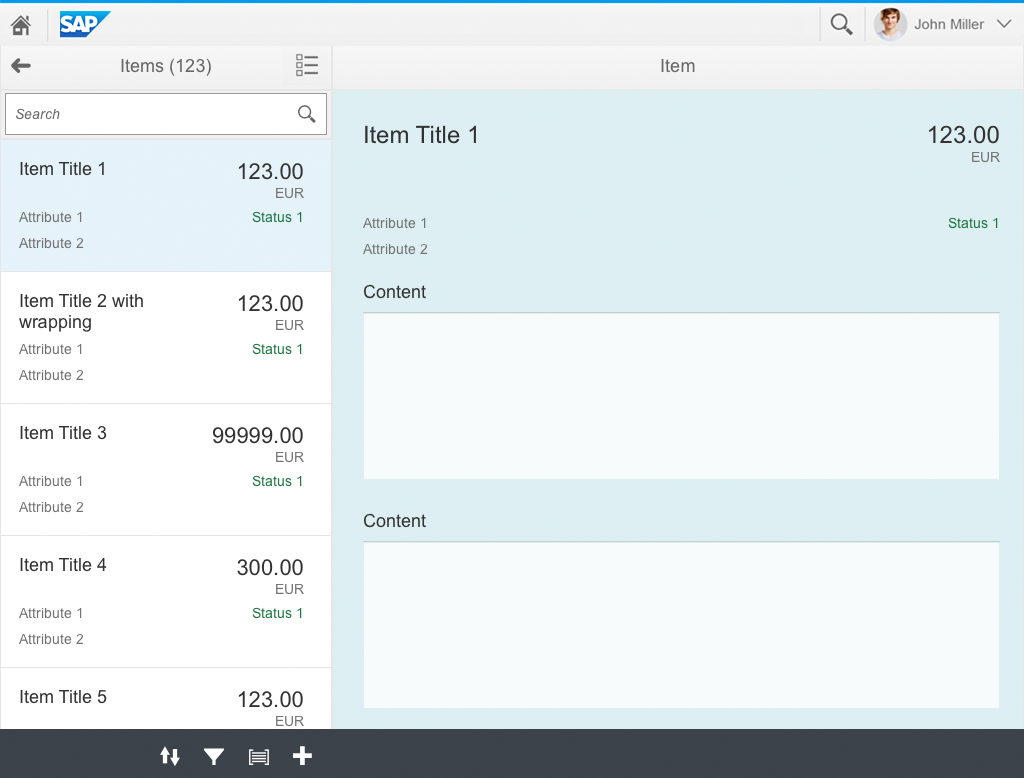
The master list consists of 3 main areas:
- Master list header
This is located at the top of the master list. It offers:- Back navigation
- Item title (also in the plural form) and a count
- Optional action on the right-hand side. Two possible actions are currently allowed: switch multiselection on/off, and set a context filter.
- A search field that can be embedded in the optional subheader (m.Toolbar) area below the master list.
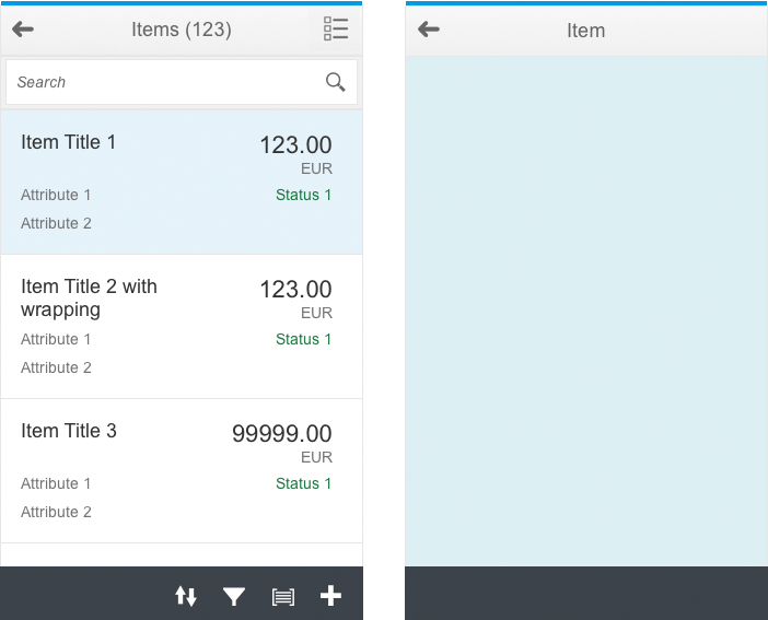
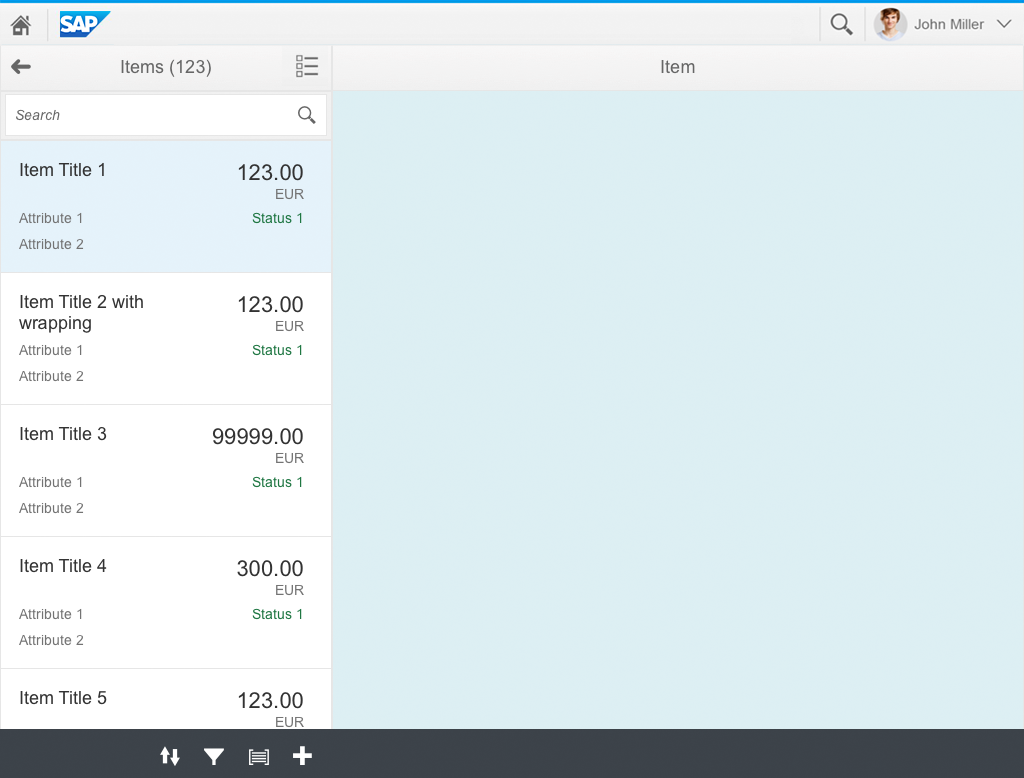
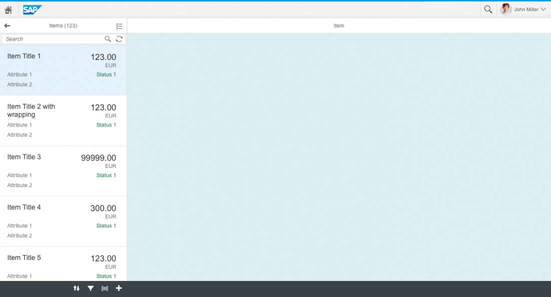
- Master list
This is located below the header. The master list contains the items to be displayed. The master list must use one of the following list items:- Object list item (defaultm.ObjectListItem) for most cases.
- Standard list item(m.StandardListItem) for simple cases or groups.
- Custom list item(m.CustomListItem) if none of the available list items suit your needs, you can build your own list items.
- Master list footer
This is located below the master list. It offers access to actions and the functionalities for filtering, sorting, and grouping the master list.
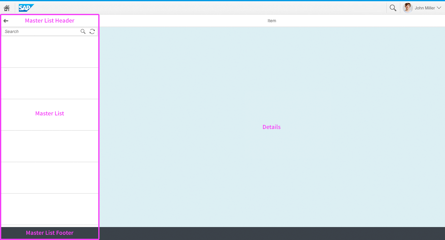
The structure of the master list
Responsiveness
Master and details screens on a smartphone
Master and details screen on a tablet
Master and details screen on a desktop
The master list itself does not require much adaptation as the split-screen layout takes care of most of the multidevice adaptation. This includes, for example, separating the master list from the details area for smartphone navigation and for portrait mode on tablets (see split-screen layout for more details).
One specific device adaptation is the support of Pull to refresh on touch devices. If you compare the desktop and touch versions, you will see that the search field on the desktop has two icons: a magnifying glass for searching, and a sync icon for refreshing. On touch devices, this field contains only the magnifying glass. The user can pull down and release the master list to trigger the refresh behavior. For more information about this behavior, see the article on searching.
Pull to refresh on touch devices replaces the Update button on devices with a mouse and keyboard
Behavior and Interaction
Search and Selection
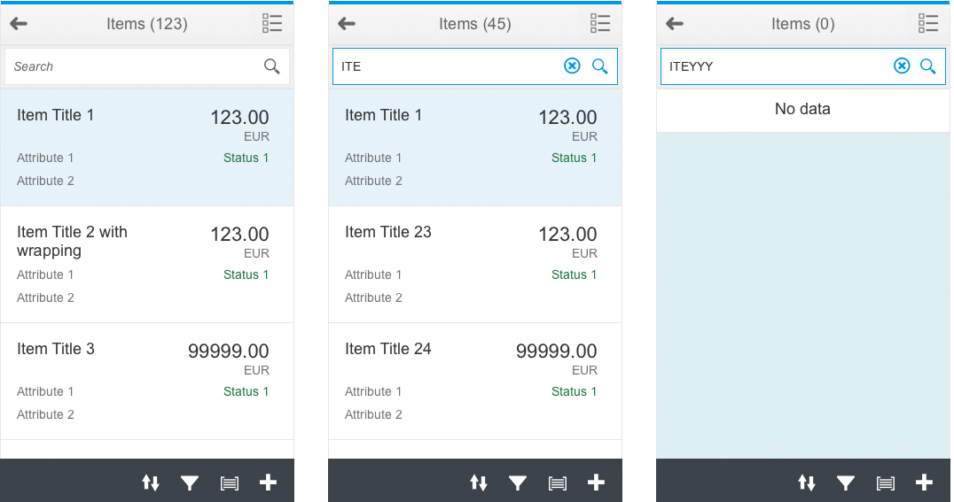
The master list header displays the number of items – It updates on search and filter
The title in the master list header displays the types of objects contained in the master list, together with an item count in brackets. When the user searches or filters, the item count is adjusted dynamically.
In general, there are two search modes:
- The live search, which updates the list as the user types (preferred option).
- The delayed search, where the user has to select the Search trigger to execute the search.
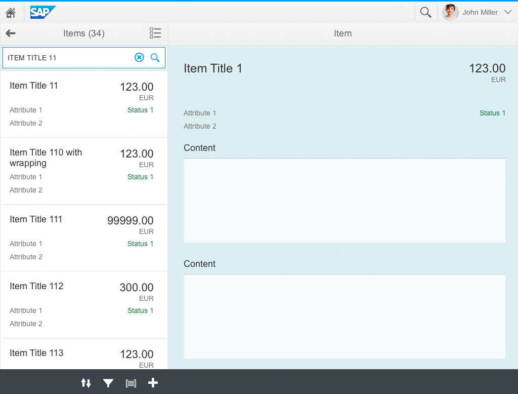
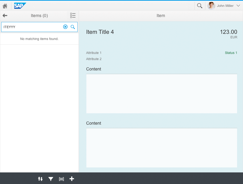
The first item in the list is selected on start-up by default. If a user has selected an item in the master list, it is displayed in the details area. If the user now searches or filters the list and the item is no longer displayed in the list, the item still remains visible in the details area. The visible part of the list does not show a selection until the user changes the selection. If the search or filter is reset, the selected item will be displayed again in the list.
For more information about the behavior of the search field, see the article on searching.

Master-detail app on a tablet – First item is selected by default
The user carries out a search
If a search does not yield results, the selected item remains visible in the details area
The user resets the search and the selected item remains visible
Message page
As the master list and the details area appear side-by-side on tablets and desktops, the message page must be shown in the details area if no item is available in the app.
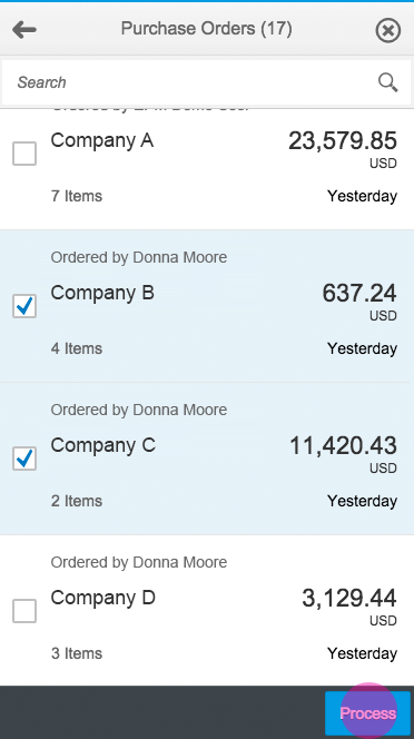
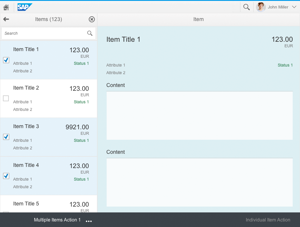
Selecting Multiple Items
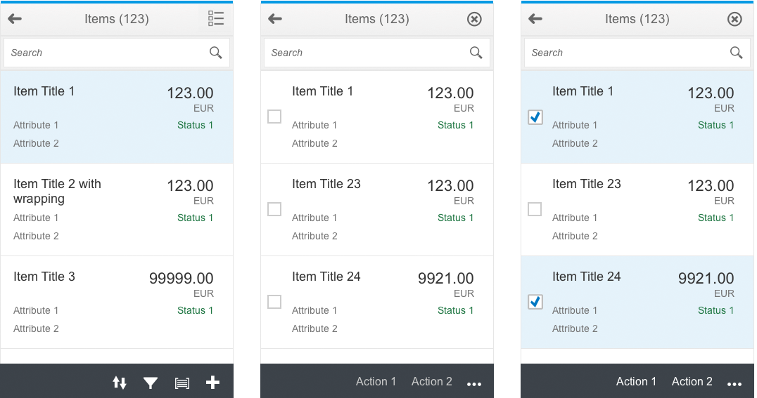
The master list header can contain an action for switching to multi-selection mode
If the app supports actions for multiple items simultaneously, a multiselect action can be placed in the master list header. When the user triggers multiselection mode, a checkbox appears next to each list item. The user can now select multiple items by checking each line item.
To exit this mode, the user selects the Close action in the master list header.
Apart from changing the selection mode, the user can also change the master list footer to display actions that can be applied to multiple items at the same time. If the footer only offers actions such as Sort and Filter in standard mode, multiselect mode should offer actions that can be applied to multiple items simultaneously, such as Delete and Approve.
Actions relating to the details are disabled when multiselection mode is switched on. Exception: If one of the selected items is in draft mode and the details of this item are shown, actions are enabled for this item. For more information, see draft handling.
There are three options for displaying selected items in the details area once the user triggers multiselection mode:
- Display last item (default)
- Display first item: In this case, the item selected first remains visible. Use this option if displaying an item takes too long and slows down selection.
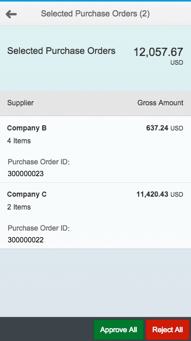
- Display aggregate: In this case, the details area displays a summary of the selected items, and offers added value or functionality.
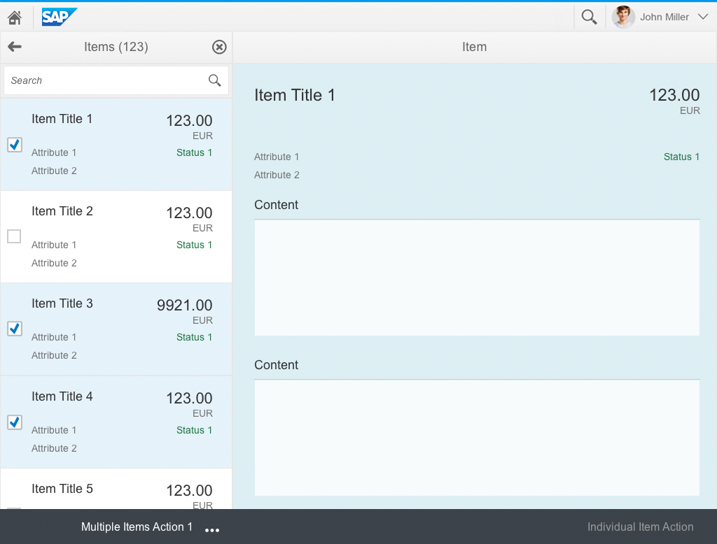
Option 1: Multiselection – First item remains displayed

Option 2: Multiselection – Last item is displayed
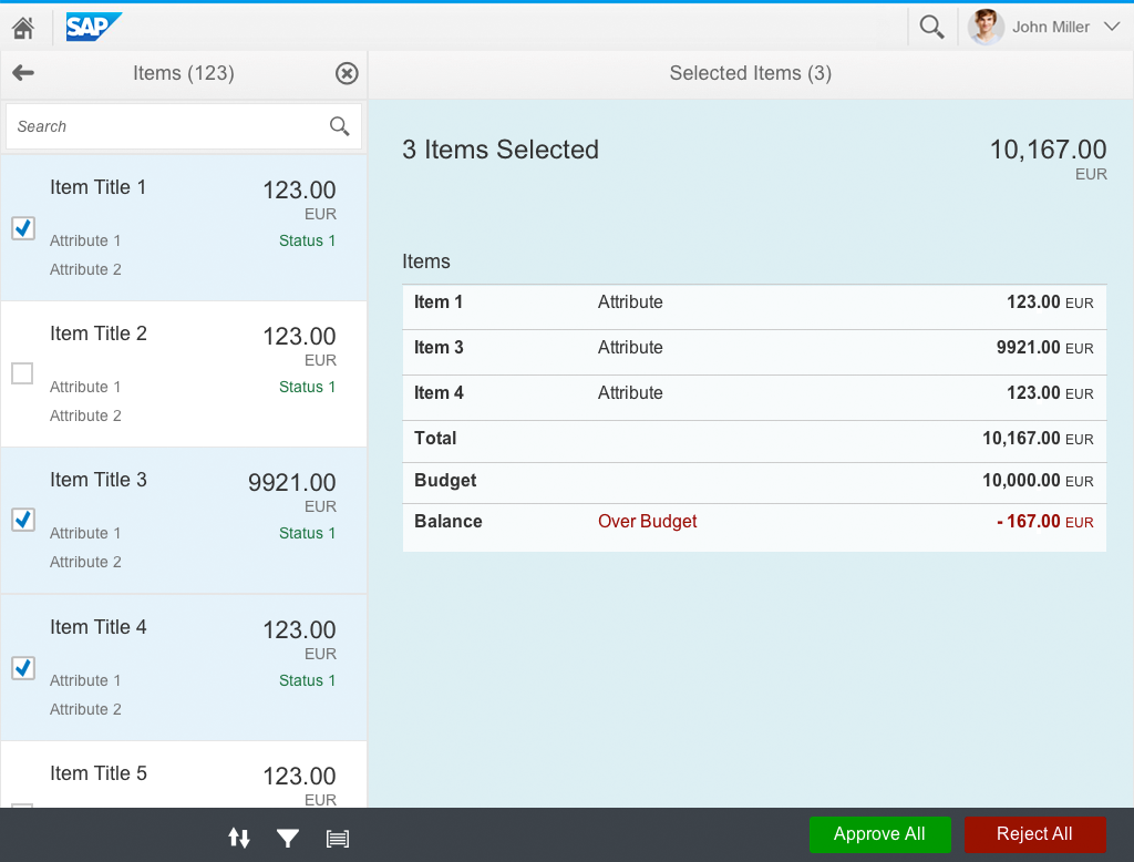
Option 3: Multiselection – Details shown as an aggregate
Option 3 on a smartphone: Multiselection – Details show an aggregate
The app can also allow the user to edit multiple items simultaneously. In this case, the edit action is displayed in the master list footer. By selecting the edit action, the details area switches to edit mode. For more information, see the Edit Multiple Items section below.
Hierarchical Master List
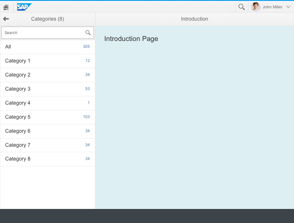
In some cases, the master list is not a flat list, but contains a hierarchy. Hierarchies in the master list should be limited to a maximum of one grouping and one item level. If you have deeper hierarchies, use the tree table in a full screen layout.
A typical case is an app that offers different categories of items. In this case, the app starts with the master list showing the categories. To display such groups, you can use a standard list item (sap.m.StandardListItem) with the information attribute displaying the item count. In the details area, the app must display a meaningful introductory page.
When the user selects a group, the master list navigates to the item level of the hierarchy (multiple nested groups are not allowed in the master list), and the first item in the list is displayed and selected. The master list header displays the group name with the number of visible items in brackets.
To navigate back to the group level, the user clicks or taps the back arrow, and a back navigation transition within the master list area takes place. The selected item remains visible. For more information about the navigation behavior, see split-screen layout.
Group level

Item level

Transition between group and item level
Editing an Item
The app can allow the user to edit an individual item. The item-specific actions are located in the details area of the split-screen layout and placed depending on the floorplan that is used there. In most cases, the entire item is switched into edit mode via footer toolbar. For more information, see manage simple objects.
In edit mode, the user sees an edit page with all the editable fields. The footer toolbar of the details area should then offer actions to Save and Cancel the changes.
The values displayed at field level depend on the entries for the selected items.
Any changes the user makes in edit mode are applied to all selected items upon saving. Existing entries are overwritten.
Clicking Edit in multiselect mode on a smartphone takes the user directly to the edit page
Master list with an edit action

Master list in edit mode
In edit mode, the user sees an edit page with all the editable fields. The footer toolbar of the details area should then offer actions to Save and Cancel the changes.
The values displayed at field level depend on the entries for the selected items. Check out the mass editing article for a detailed description.
Any changes the user makes in edit mode are applied to all selected items upon saving. Existing entries are overwritten.
Clicking Edit in multiselect mode on a smartphone takes the user directly to the edit page
Master list with an edit action
Master list in edit mode
Sorting
The Sort action resides in the master list footer. There are 2 ways to sort elements:
- View settings dialog (default, sap.m.ViewSettingsDialog): This is a reusable component that can offer generic sorting behavior in a consistent way. However, this might be too complex because it appears in a dialog. If a user selects the Sort icon, the view settings dialog must open with the sort tab.
- Select: If you only have a few predefined ways of sorting, you can also make them directly accessible in a select control (sap.m.Select), which can be embedded in the master list footer. The selected sorting criteria should be highlighted with the selection background.
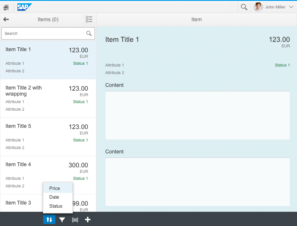
Basic sorting functionality using the select control
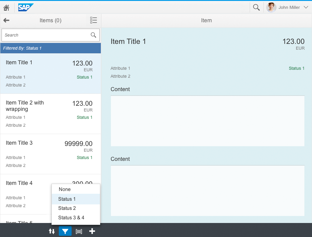
Filtering
The filter action is located in the master list footer. There are 3 ways to filter elements:
- View settings dialog (default, sap.m.ViewSettingsDialog): This is a reusable component that can offer generic filtering behavior in a consistent way. However, this might be too complex because it appears in a dialog. If the user selects the Filter icon, the view settings dialog must open on the filter tab.
- Select: If you have only a few predefined filters, you can also make them directly accessible in a select control (sap.m.Select), which can be embedded in the master list footer. The selected filtering criteria should be highlighted with the selection background. A no-filter option (None) must be provided in the first position.
- Select plus view settings: The select control is normally used for cases where the user frequently chooses a set of predefined filters. However, this might not be sufficient; in some cases, a user may want to create a more complex filter. In this case, the select control can contain a More… option that opens the view settings dialog.
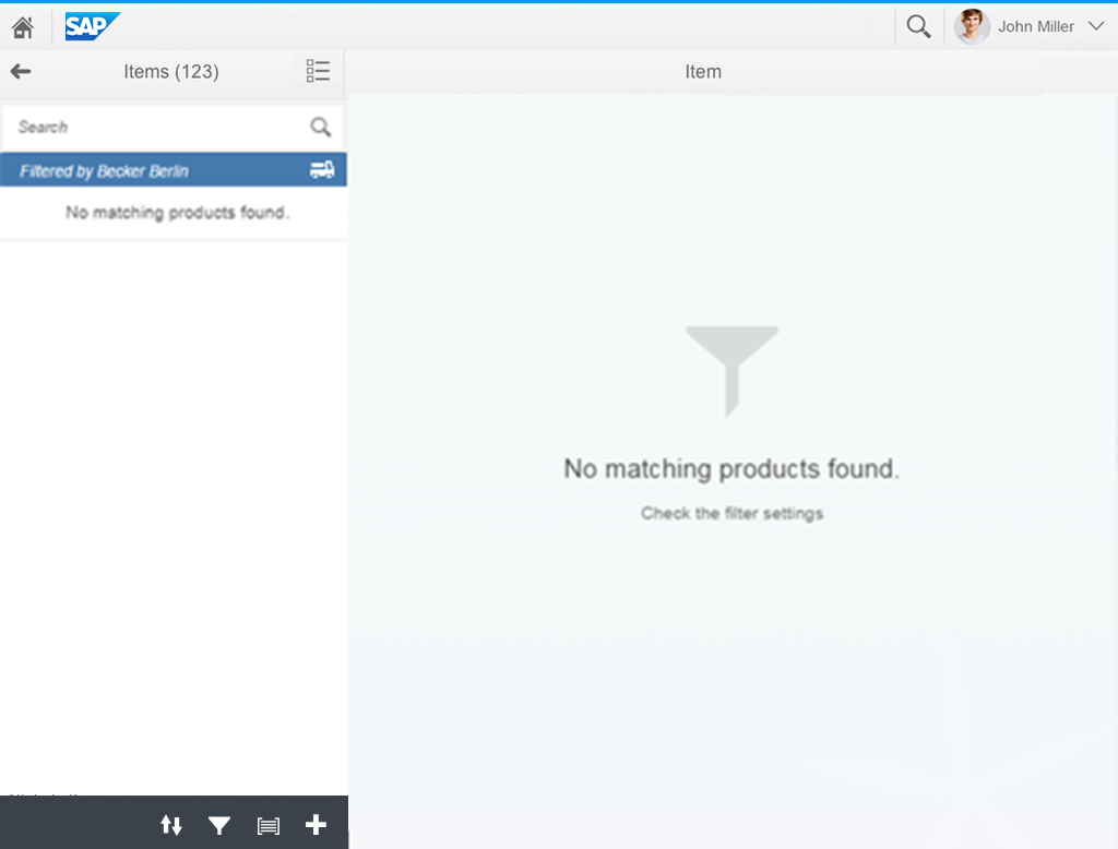
If a filter is applied to the master list, the infobar (a filter indication) should appear at the top of the list (use sap.m.toolbar, design: Info). It should inform the user of the criteria by which the list has been filtered (but not the values). The filter indication must not been shown if no filter is applied.
When the filter indication is selected, the view settings dialog should appear on the filter tab.
Simple filter functionality and filter indication
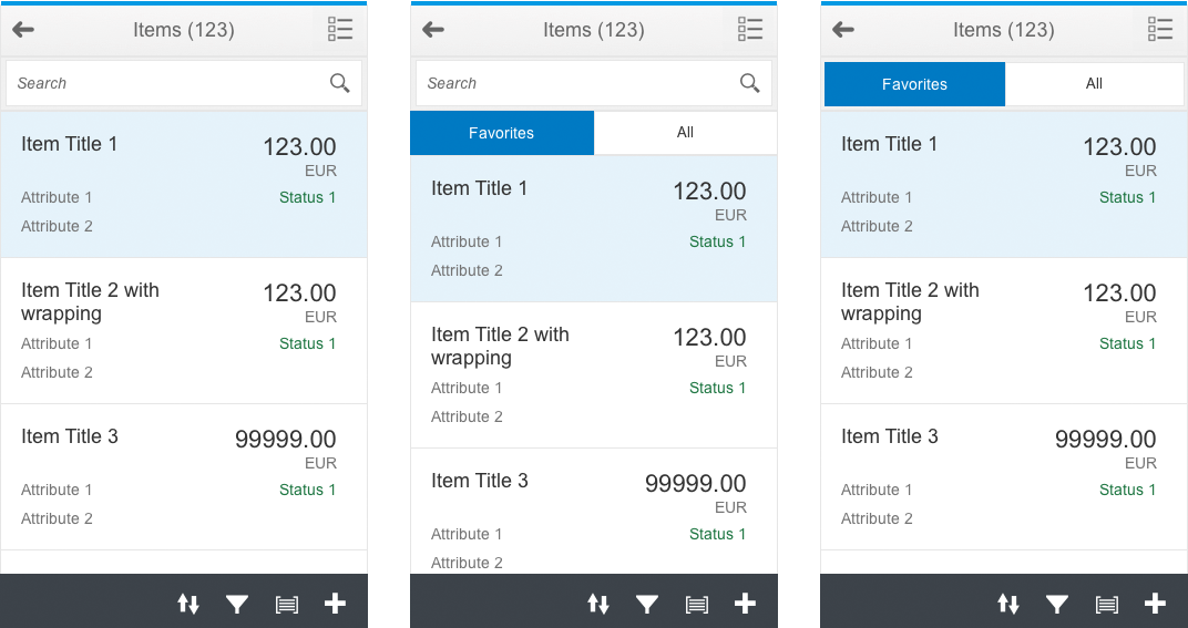
Using a segmented button to offer a switch between two sets of items
Sometimes users want to switch quickly between two sets of items, such as between their favorites and all items. They can generally do this by using the filter functionality. To make this more obvious, app developers can use the segmented button (sap.m.SegmentedButton) to offer these two options:
- You can place the segmented button as the first element in the master list content. It then scrolls away with the list.
- Alternatively, it can replace the search field in the subheader. Then it does not scroll away, but you no longer have a search function.
Other orders are not permitted. Use this solution carefully as it reduces the amount of screen real estate available.
Grouping
The grouping action resides in the master list footer. There are two ways to group elements:
- View settings dialog(default, m.ViewSettingsDialog): This is a reusable component that can offer generic grouping behavior in a consistent way. However, this might be too complex because it appears in a dialog. If a user selects the Group icon, the view settings dialog has to open with the group tab.
- Select: If you have only a few predefined groups, you can also make them directly accessible in a select control (m.Select) that can be embedded in the master list footer. The selected group criteria should be highlighted with the selection background. A no-grouping option (None) must be provided in the first position.
If grouping is applied to the master list, the group header should appear at the top of each group containing items. Empty groups do not appear. The group header should describe the group as follows:
Grouping Criteria: Group
(For example, Price Range: Below 500 EUR).

Simple grouping functionality using the select control
Adding an Item
The master list footer can contain an Add New Item action if this is supported by the app. Here, the user can create a new object and add it to the list. There are two ways to create a new item:
- Selecting the Add action causes the details area of the split-screen layout to load a create page floorplan. The new item appears in the master list only if it has been successfully created and saved. If the user navigates away, a data loss message is displayed. There are currently two options described by the data loss dialog and draft handling.
- Dialog: Selecting the Add action opens a popup dialog. This dialog offers all the form fields required to create the item. Selecting OK creates the new item and adds it to the master list. This option can be used if only a few fields are required to create the item.
Deleting an Item
To delete an item, the user selects an item in the master list to show the details. The user then clicks the Delete button in the details footer toolbar, and confirms the deletion of the item in the subsequent warning message dialog.
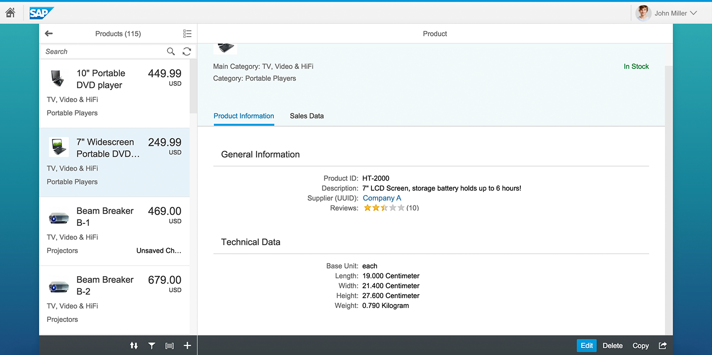
The user deletes single items by clicking the Delete button in the details footer toolbar
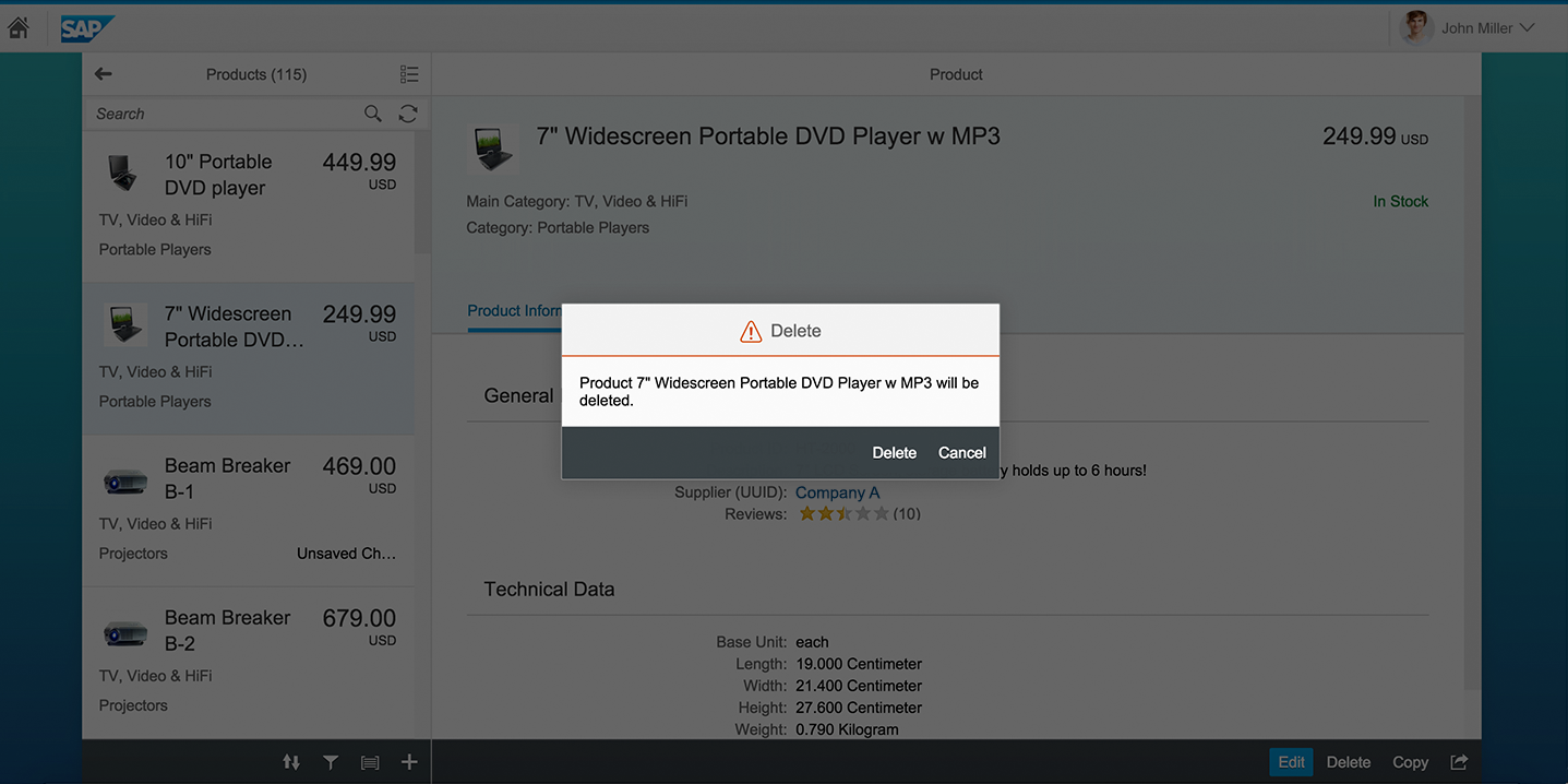
The user must then confirm the delete action in a dialog
Deleting Multiple Items
After activating multiselection mode in the master list header, the user selects the multiple items to be deleted. A Delete button is provided in the master list footer toolbar. When the user clicks or taps this button, a warning message dialog is shown, in which the user must confirm the deletion of the selected items.
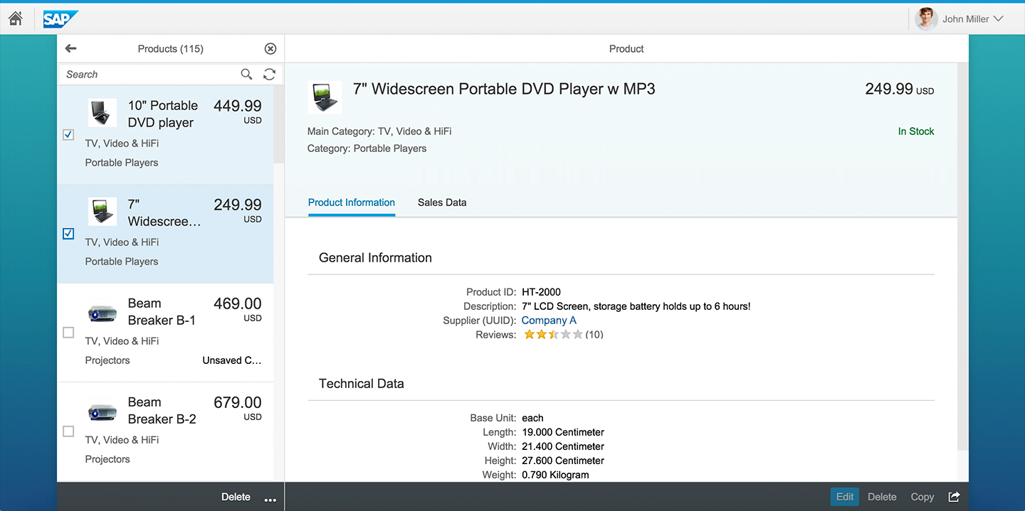
The user selects multiple items and clicks the Delete button in the footer toolbar to delete them
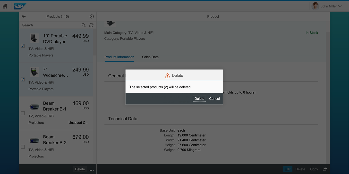
The user must then confirm the delete action in a dialog
Resources
Want to dive deeper? Follow the links below to find out more about related controls, the SAPUI5 implementation, and the visual design.
 Your feedback has been sent to the SAP Fiori design team.