
- Latest SAPUI Version 1.124
- SAPUI5 Version 1.122
- SAPUI5 Version 1.120
- SAPUI5 Version 1.118
- SAPUI5 Version 1.116
- SAPUI5 Version 1.114
- SAPUI5 Version 1.112
- SAPUI5 Version 1.110
- SAPUI5 Version 1.108
- SAPUI5 Version 1.106
- SAPUI5 Version 1.104
- SAPUI5 Version 1.102
- SAPUI5 Version 1.100
- SAPUI5 Version 1.98
- SAPUI5 Version 1.96
- SAPUI5 Version 1.94
- SAPUI5 Version 1.92
- SAPUI5 Version 1.90
- SAPUI5 Version 1.88
- SAPUI5 Version 1.86
- SAPUI5 Version 1.84
- SAPUI5 Version 1.82
- SAPUI5 Version 1.80
- SAPUI5 Version 1.78
- SAPUI5 Version 1.76
- SAPUI5 Version 1.74
- SAPUI5 Version 1.72
- SAPUI5 Version 1.70
- SAPUI5 Version 1.68
- SAPUI5 Version 1.66
- SAPUI5 Version 1.64
- SAPUI5 Version 1.62
- SAPUI5 Version 1.60
- SAPUI5 Version 1.58
- SAPUI5 Version 1.56
- SAPUI5 Version 1.54
- SAPUI5 Version 1.52
- SAPUI5 Version 1.50
- SAPUI5 Version 1.48
- SAPUI5 Version 1.46
- SAPUI5 Version 1.44
- SAPUI5 Version 1.42
- SAPUI5 Version 1.40
- SAPUI5 Version 1.38
- SAPUI5 Version 1.36
- SAPUI5 Version 1.32
- SAPUI5 Version 1.30
- SAPUI5 Version 1.28
- SAPUI5 Version 1.26
- Latest SAPUI Version 1.124
- SAPUI5 Version 1.122
- SAPUI5 Version 1.120
- SAPUI5 Version 1.118
- SAPUI5 Version 1.116
- SAPUI5 Version 1.114
- SAPUI5 Version 1.112
- SAPUI5 Version 1.110
- SAPUI5 Version 1.108
- SAPUI5 Version 1.106
- SAPUI5 Version 1.104
- SAPUI5 Version 1.102
- SAPUI5 Version 1.100
- SAPUI5 Version 1.98
- SAPUI5 Version 1.96
- SAPUI5 Version 1.94
- SAPUI5 Version 1.92
- SAPUI5 Version 1.90
- SAPUI5 Version 1.88
- SAPUI5 Version 1.86
- SAPUI5 Version 1.84
- SAPUI5 Version 1.82
- SAPUI5 Version 1.80
- SAPUI5 Version 1.78
- SAPUI5 Version 1.76
- SAPUI5 Version 1.74
- SAPUI5 Version 1.72
- SAPUI5 Version 1.70
- SAPUI5 Version 1.68
- SAPUI5 Version 1.66
- SAPUI5 Version 1.64
- SAPUI5 Version 1.62
- SAPUI5 Version 1.60
- SAPUI5 Version 1.58
- SAPUI5 Version 1.56
- SAPUI5 Version 1.54
- SAPUI5 Version 1.52
- SAPUI5 Version 1.50
- SAPUI5 Version 1.48
- SAPUI5 Version 1.46
- SAPUI5 Version 1.44
- SAPUI5 Version 1.42
- SAPUI5 Version 1.40
- SAPUI5 Version 1.38
- SAPUI5 Version 1.36
- SAPUI5 Version 1.34
- SAPUI5 Version 1.32
- SAPUI5 Version 1.30
- SAPUI5 Version 1.28
- SAPUI5 Version 1.26
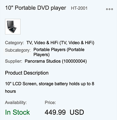
Snapping Header
sap.uxap.ObjectPageHeader | sap.uxap.ObjectPageHeaderContent
Intro
The snapping header is the uppermost element of the object page layout. It summarizes selected data and actions in a visually prioritized position to let the user quickly grasp the most relevant information.
Currently, the snapping header is only available for the object page floorplan.
Usage
Use the snapping header if:
- You are creating an object page manually based on the object page floorplan.
Do not use the snapping header if:
- You are using any other floorplan.
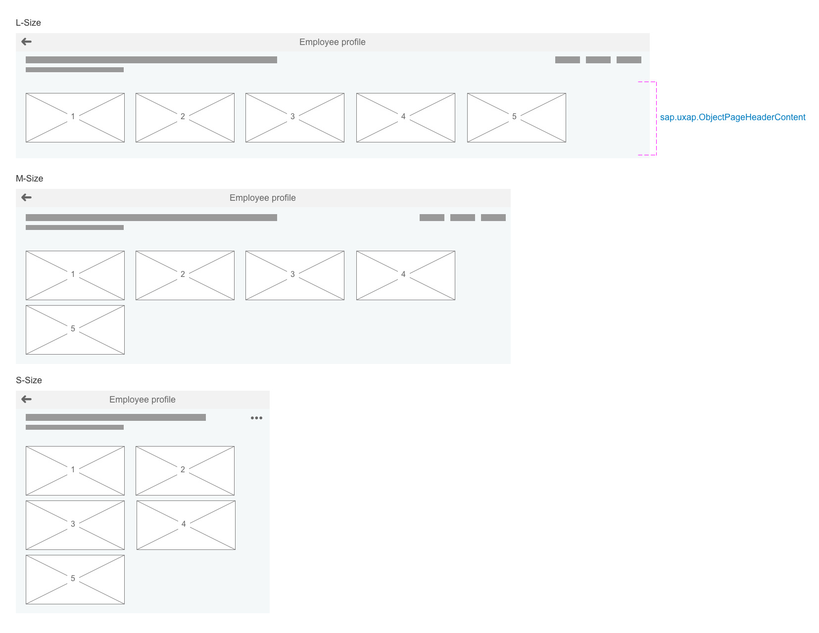
Responsiveness
The snapping header is designed to provide maximum flexibility. It adapts automatically to small, medium, and large screen sizes.
The header title and subtitle are never truncated. If necessary, the text wraps to the next line.
The toolbar follows the standard toolbar overflow guidelines by adding the available buttons to the overflow menu from right to left.
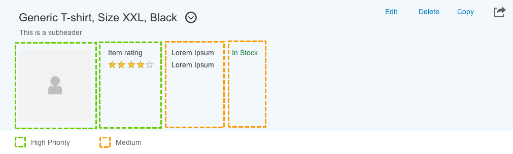
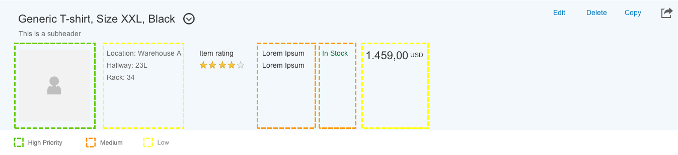
Object Header Content Priority
Each facet in the header content area has a priority assigned to it. Content prioritization aims to support responsive behavior. Priorities allow less important content to be omitted from rendering, depending on the screen space available. The user can always access omitted content on request.
Three priority types are available: high, medium, and low. According to the screen size, the facets are distributed as follows:
- Size L/XL: The facets with high, medium, and low priority are displayed.
- Size M: The facets with high and medium priority are displayed.
- Size S: Only the facets with high priority are shown.
Snapping header – Responsiveness – Size S
Snapping header – Responsiveness – Size M
Snapping header – Responsiveness – Size L/XL
Object header content priority for sizes S
Object header content priority for sizes M
Object header content priority for sizes L
Components
The snapping header comprises two main control elements:
- Mandatory: Title bar (sap.uxap.ObjectPageHeader)
- Optional: Header content (sap.uxap.ObjectPageHeaderContent)
There are different states for the snapping header. You can find further information under Behavior and Interaction in this article.
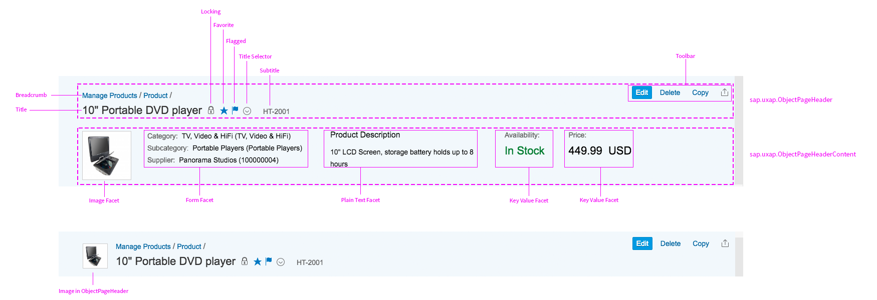
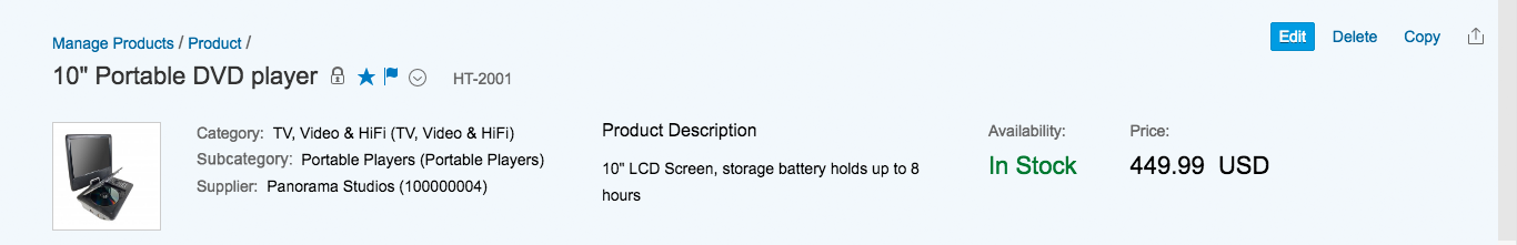
Title Bar
The title bar comprises the following elements:
- Header title (mandatory): The title is always visible.
- Header subtitle (optional)
- Title bar image (optional): The image has a shape parameter (square or with a round mask) and a placeholder parameter. A placeholder is displayed if no specific image is available.
- Toolbar: The toolbar contains the global actions for the floorplan. The actions should be represented only with buttons, text, or an icon. They can be transparent, regular, highlighted, or semantic. All buttons go from right to left into the overflow. Buttons should be arranged according to the current use case and always in a consistent visual order (see guidelines section below for example). If there are no global actions, the toolbar is not shown. Note that the object page uses the sap.m.Toolbar control instead of sap.m.OverflowToolbar.
- Child page visualization: Each object page can have drilldown navigation. The child object page can only be reached through the parent object page. A narrow vertical stripe at the left side of the snapping header helps to differentiate the child object page from the parent object page.
The title bar can also contain the following optional indicators:
- Favorite (property: markFavorite)
- Flagged (property: markFlagged)
- Locked (propertly: markLocked)
- Selector (property: showTitleSelector)
- Unsaved Changes (property: markChanges)
The title bar control also supports breadcrumb navigation. For more information scroll to section line item navigation.
Snapping header – Structure
Header Content
The header content is optional and located below the title bar.
You can use the header content (sap.uxap.ObjectPageHeaderContent) to display app-specific contextual information. You build the content using smaller content containers, called facets. Each facet contains a distinct information set, as described below. If there aren’t any facets, the header content is always hidden.
The facets are arranged in line with a left float. Each facet adapts its size to the content and makes optimal use of the space without truncating the texts. If the facets do not all fit on one line, those on the right wrap to the line below.
If the snapping header collapses, the header content is hidden. If the header content is empty, you can also hide it.
Header container – Floating content
Header Facets
There are several types of header facets, depending on the data that they display. The facets need to be handmade for stand-alone object pages.
Form Facet (Data Set)
The form facet can be used to display datasets in the snapping header. It consists of a headline and up to five label-text pairs.
Additional information:
- The headline is optional.
- It contains at least one but maximum five label-text pairs.
- The labels can be invisible, but need to have a text for accessibility reasons.
- The labels can be icons, but need to have a text for accessibility reasons.
- Each text of a label-text pair can have a press event.
Examples for the usage of form facets include document information such as creator and creation time, an address or contact information, and general information.
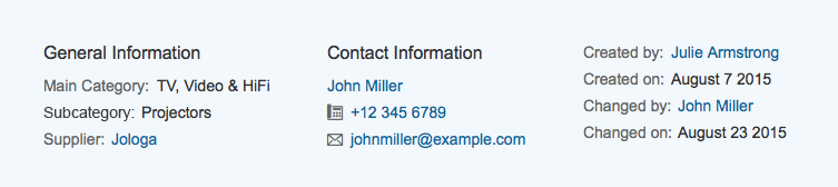
Header Facet - Form Facets
Plain Text Facet
The plain text facet can be used to display a continuous text in the snapping header. It consists of a headline and a continuous text.
Additional information:
- The width of the facet does not depend on its content, but can be set. The default width of the facet is 300px.
- The headline is optional.
- If the headline is broader than the facet width, the headline will wrap.
- Press events are only available inline in the continuous text. These can be links that navigate to another page or open a quickview. There can be more than one link in the continuous text with different actions.
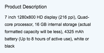
Header Facet - Plain text facet with default width
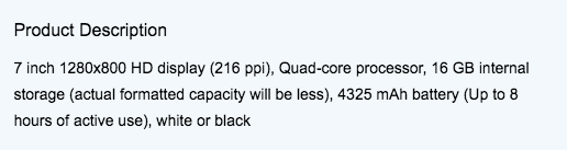
Header Facet - Plain text facet with custom width
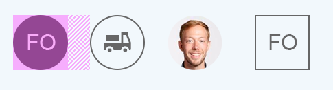
Image Facet
The image facet can hold exactly one image. The snapping header can only hold one or no image facet.
Additional information:
- The image can be either square or round.
- The image can also hold an icon.
- The image can also hold initials consisting of two letters.
- The image can have a press event. The default press event is the enlargement of the image.#
- When the header collapses, the image facet will move to the right of the title and become smaller.
Recommended usage of the different properties:
- Images of people, especially portraits, should be round. If there is no image for a person, initials (first letters from first and last name) should be used instead.
- All other images should be square. If there is no image for an object, an appropriate icon should be shown.
In all cases, it should be clear how the images will be managed and uploaded. This can either be via the edit mode of the object page or, especially where there are lots of images, via an external tool.
Header facet – Image facet specification
Key Value Facet
The key value facet holds a label in a smaller font size and a text or number in a bigger font size. It can be used to highlight important data or KPIs of the object.
If the key value facet is used with a text such as a status, it can also have an icon on the right side next to the text. This icon has to belong to the text and should only visually support but not expand it.
To display trend information for an object, the key value facet can have a trend arrow pointing up or down or a hyphen to indicate no changes next to the KPI.

Header Facet – Key value facets with KPIs and a status
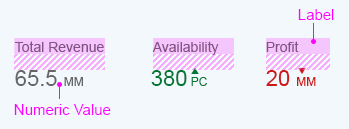
Header facet – Key value facets with trends
Micro Chart Facet
The micro chart facet consists of a headline, a subtitle, a micro chart and a footer.
The headline and the micro chart are mandatory, while the subtitle and the footer are optional. To display the unit used in the micro chart, the footer should be used.
The following micro charts can be used in the micro chart facet:
- Bullet Chart
- Column Chart
- Trend Chart
- Comparison Chart
- Delta Chart
- Harvey Ball Chart
- Radial Chart
The micro chart facet can have a click or tap event on the chart itself. This could, for example, lead to a page with a bigger chart or open a quickview.
For more information see micro charts.
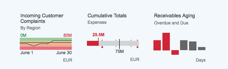
Header facet – Micro chart facets
Progress Indicator Facet
The progress indicator facet consists of a mandatory headline and a progress indicator (sap.m.progressIndicator). It can also contain two optional supplementary texts: a subtitle and a footer.
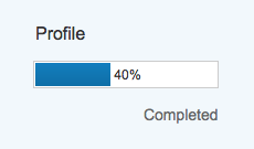
Header facet - Progress indicator facet
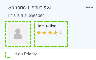
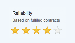
Rating Indicator Facet
The rating indicator facet consists of a headline, a rating indicator and one or two supplementary texts, which are dependent on the use case as described below.
The rating indicator can be modified as described in the rating indicator article.
Guidelines for using the rating indicator in the header facet:
- Use 5 symbols as default.
- Use the “favorite” icon as symbols.
- Use the option to display half stars for decimal values.
The rating indicator facet can be used for two different use cases as described below:
- Aggregated RatingWhen displaying an aggregated rating, which could be for example the average of several user reviews for a product, the facet can contain a mandatory header, an optional subtitle, the rating indicator, and a footer.The subtitle should display the amount of data on which the aggregation is based. For example, in the case of an average rating, the subtitle would show the number of ratings.The footer should show the exact value of the aggregation in the format “2.2 out of 5”, where “2.2” indicates the exact value of the aggregation, and “out of 5” indicates the maximum value of the rating.
- Single Value Rating When displaying the rating as a single value, the facet can have a mandatory header, an optional subtitle, and the rating indicator. Here the subtitle can be used as supplementary text, and a footer should not be used.
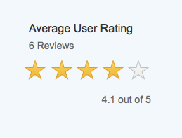
Header facet - Rating indicator facet with aggregated rating
Header facet - Rating indicator facet with singe value rating
Snapping
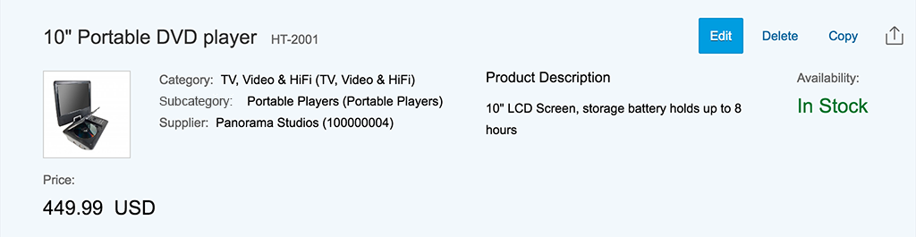
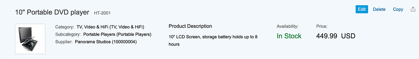
The snapping header is always expanded for all display sizes when the user opens the object page .
When the user scrolls down the page, the header content snaps closed (collapses), leaving only the title bar. This allows the user to see more of the object page content.
You can specify which information is shown in the title bar in the expanded and collapsed states. In the following example, the snapping header has been configured to show only the image in the title bar when the header content area is collapsed.
Snapping header – Expanded

Snapping header – Collapsed
Title Bar Only
If there is no need for the header content, the title bar only mode can be used. This means that there is no snapping behavior, because the title bar is always shown.
Header Content Always Shown
The snapping header can remain expanded while the user scrolls down the page if the property alwaysShowContentHeader is set to true for the object page layout (sap.uxap.ObjectPageLayout). This behavior is only available for desktops.
Child Page Visualization
Each object page can have drilldown navigation. The child object page can only be reached through the parent object page. A narrow vertical stripe on the left side of the snapping header helps to differentiate the child object page from the parent object page. To navigate between the child object pages of one parent object page, arrows are displayed within the header bar of the page. Breadcrumbs allow the user to easily navigate back to the object page. To enable the child page visualization, use the property isChildPage of the sap.uxap.ObjectPageLayout.
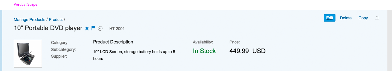
Child page visualization – Vertical stripe
The snapping header for the object page can contain a breadcrumb showing the navigation path for the current item. This feature was developed specifically for line item navigation within the object page.
The breadcrumb is located above the title in the title bar. The interaction is typical of a breadcrumb navigation pattern: all links in the breadcrumb chain point to a URL and are triggered by a press event.
If there is not enough space to show the full breadcrumb, it defaults to a dropdown control. In this case, the breadcrumb shows only the immediate parent of the current item. The symbol indicates that further information is available in a dropdown list.
The dropdown list reveals all the links in the breadcrumb chain. The user reads the breadcrumb from bottom to top: The root object is at the bottom of the list, the immediate parent is at the top, and the current item is selected.
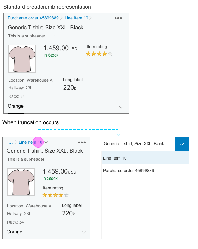
Breadcrumb – Truncation handling
Edit
There are two different ways to edit the header information:
- Global edit
- Partial edit
Please note: The majority of object pages do not have editable header content. Therefore, the object header should not be editable by default.
Global edit
A button in the header toolbar triggers the edit mode. For more information on global editing, see object page.
The visible facets can differ in create, edit and display mode. If there aren’t any facets in one mode, the header content is not displayed. Choose which information supports the user best in his or her current task. The thought behind this possibility assumes that a number of header facets are assigned to one given application. You can define which facets are shown in which mode.
Once the edit mode is activated, the header content is moved to a section in the content area of the object page. This section is assigned the anchor label Header. This is the first section in the document. All other sections are displayed in the order in which they are displayed in display mode. If editable, the object page title, subtitle, and image appear in the header content section. They also remain visible in the header title bar. If changed, they are shown only in preview mode. The user will have to save the document to actually enable the changes.
Exemplary scenarios when switching from display to edit mode:
- All header elements are editable: All of the header elements are displayed as editable forms in the Header section. The header content hides as no facets are displayed.
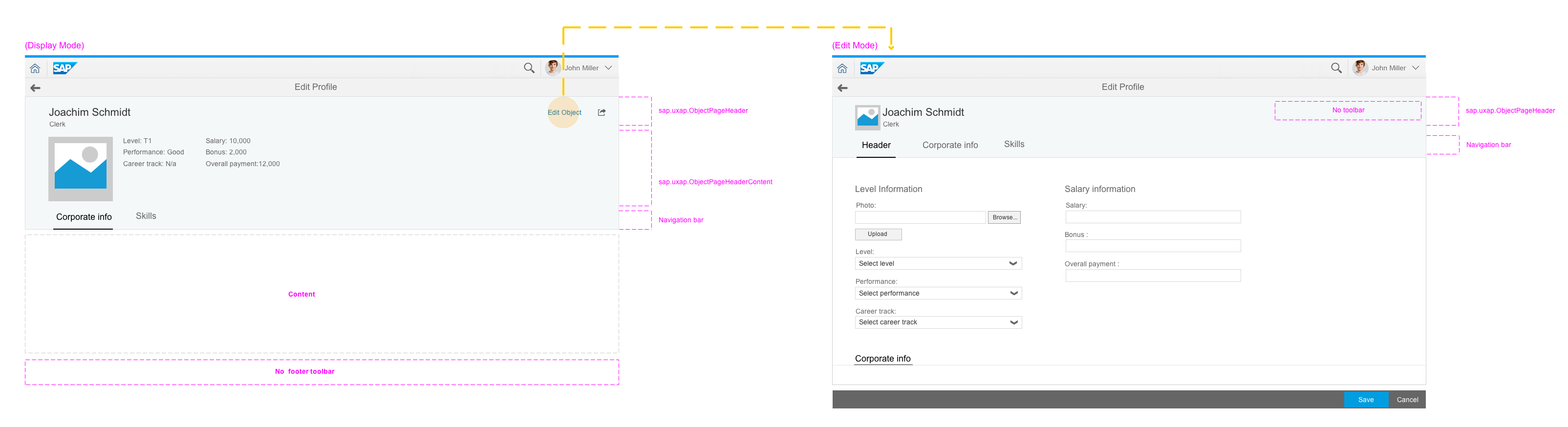
Global edit – All header facets editable
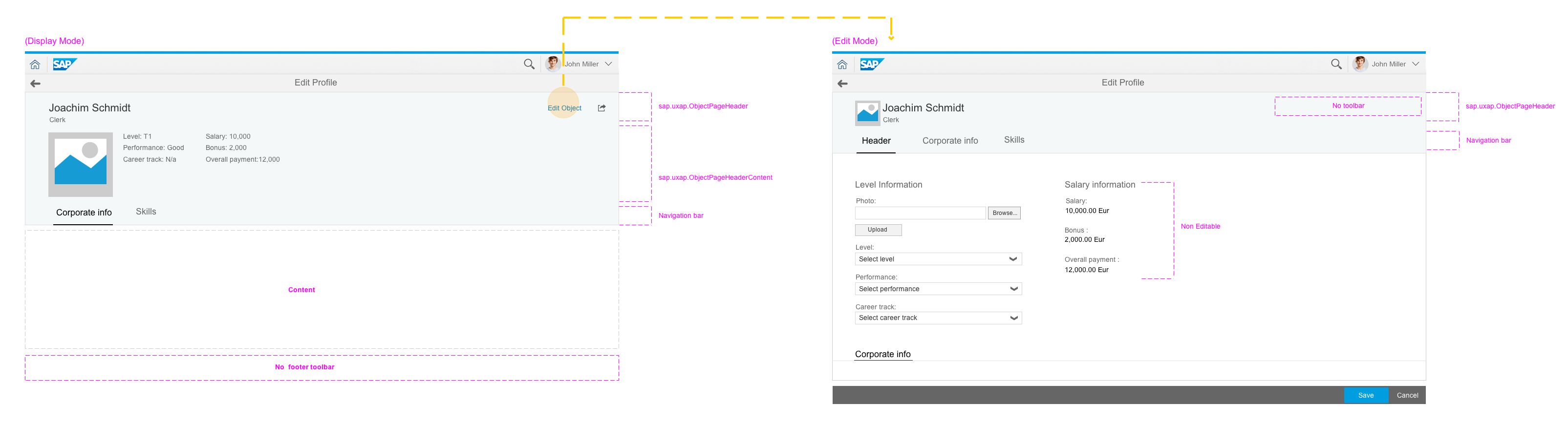
- Only some of the header elements are editable. All of the header elements are displayed in the Header section, but the content that is not editable is displayed as read-only to keep the layout consistent.
Global edit – Some header facets editable
- Independent header facets are present in edit mode: All of the header elements are displayed as editable forms in the Header section. A new facet that is related to the data that the user is editing is displayed in the object page header content area. This header facet is not shown in display mode.
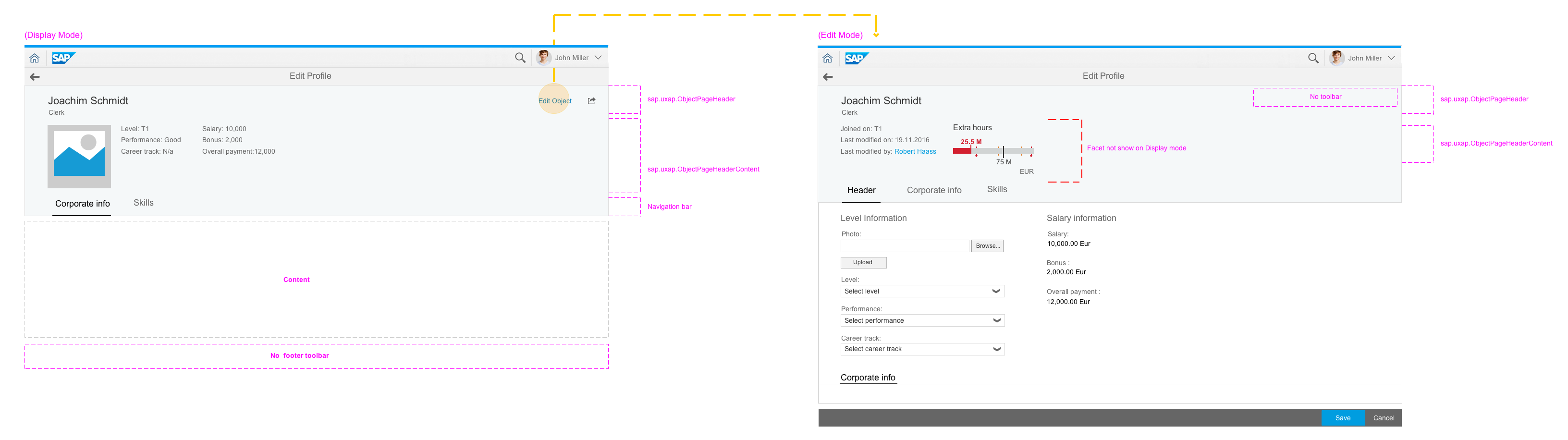
Global edit – Edit with header container and independent header facets
Partial Edit
Partial edit is used when the object page consists of large data sets and the user wants to be able to edit only the object header. Edit mode is triggered by a button that is located on the bottom right of the snapping header.
When there are only a few elements to be edited, the Edit Header button opens a dialog. When there are more editable elements, the button triggers a subpage. This subpage contains all editable data from the header without the toolbar, the navigation, or the breadcrumbs.

Partial edit – Editing in a dialog
Style
The snapping header is available with two themes (property headerDesign):
- Light flavor(default)
- Dark flavor (restricted)
The dark flavor does not yet support all controls in the header content area. The first version of the snapping header is not themeable and uses hard-coded colors. As a result, the dark header theme might cause contrast problems with some controls. For example, you might need to set lighter links (Less parameter: @sapUiLink, 40).

Snapping header – Light flavor
Snapping header – Dark flavor
Guidelines
Breadcrumbs
Use breadcrumb navigation only on the object page, and only where there is a hierarchical drilldown within the object (line item navigation). For other types of navigation, see the SAP Fiori navigation patterns.
Header toolbar
Do not use input fields, selects, checkboxes, search fields, or similar controls in the header toolbar. Use buttons only.
Header content area
Place only meaningful information in the header content containers. The content should help the user in the object context, or provide useful reference information.
Keep the header as clean and uncluttered as possible to allow users to take in the content at a glance. If there is too much information in the header, consider placing an overview section in the content area of the object page floorplan.
Themes
Until theme parameters are available for the snapping header, we recommend using the light flavor. This will avoid any contrast issues that might arise with the dark theme in the current implementation.
Images
When images are used in the object page header, you should consider the following needs:
- How will the user manage the images?
- How will the system block people without permission for image editing?
- How will these images be reflected in other floorplans if they are part of the object?
- If there are a large number of items, how would a company be able to manage images without having to navigate from page to page?
- Will the company be able to manage the images?
Resources
Want to dive deeper? Follow the links below to find out more about related controls, the SAPUI5 implementation, and the visual design.
Elements and Controls
- Navigation (guidelines)
- Micro Charts (guidelines)
- Progress Indicator (guidelines)
- Rating Indicator (guidelines)
- Breadcrumbs (guidelines)
- Dialog (guidelines)
- Toolbar (guidelines)
- Object Page Floorplan (guidelines)
Implementation
- Object Page Layout (SAPUI5 samples)
- Snapping Header (SAPUI5 API reference)
- Object Page Header Content (SAPUI5 samples)
- Micro Bullet Charts (SAPUI5 samples)
- Micro Column Charts (SAPUI5 samples)
- Micro Comparison Charts (SAPUI5 samples)
- Micro Area Charts (SAPUI5 samples)
- Micro Delta Charts (SAPUI5 samples)
- Micro Harvey Ball Charts (SAPUI5 samples)
- Breadcrumbs (SAPUI5 samples)
- Progress Indicator (SAPUI5 samples)
- Rating Indicator (SAPUI5 samples)
 Your feedback has been sent to the SAP Fiori design team.