
- Latest SAPUI Version 1.124
- SAPUI5 Version 1.122
- SAPUI5 Version 1.120
- SAPUI5 Version 1.118
- SAPUI5 Version 1.116
- SAPUI5 Version 1.114
- SAPUI5 Version 1.112
- SAPUI5 Version 1.110
- SAPUI5 Version 1.108
- SAPUI5 Version 1.106
- SAPUI5 Version 1.104
- SAPUI5 Version 1.102
- SAPUI5 Version 1.100
- SAPUI5 Version 1.98
- SAPUI5 Version 1.96
- SAPUI5 Version 1.94
- SAPUI5 Version 1.92
- SAPUI5 Version 1.90
- SAPUI5 Version 1.88
- SAPUI5 Version 1.86
- SAPUI5 Version 1.84
- SAPUI5 Version 1.82
- SAPUI5 Version 1.80
- SAPUI5 Version 1.78
- SAPUI5 Version 1.76
- SAPUI5 Version 1.74
- SAPUI5 Version 1.72
- SAPUI5 Version 1.70
- SAPUI5 Version 1.68
- SAPUI5 Version 1.66
- SAPUI5 Version 1.64
- SAPUI5 Version 1.62
- SAPUI5 Version 1.60
- SAPUI5 Version 1.58
- SAPUI5 Version 1.56
- SAPUI5 Version 1.54
- SAPUI5 Version 1.52
- SAPUI5 Version 1.50
- SAPUI5 Version 1.48
- SAPUI5 Version 1.46
- SAPUI5 Version 1.44
- SAPUI5 Version 1.42
- SAPUI5 Version 1.40
- SAPUI5 Version 1.38
- SAPUI5 Version 1.36
- SAPUI5 Version 1.32
- SAPUI5 Version 1.30
- SAPUI5 Version 1.28
- SAPUI5 Version 1.26
- Latest SAPUI Version 1.124
- SAPUI5 Version 1.122
- SAPUI5 Version 1.120
- SAPUI5 Version 1.118
- SAPUI5 Version 1.116
- SAPUI5 Version 1.114
- SAPUI5 Version 1.112
- SAPUI5 Version 1.110
- SAPUI5 Version 1.108
- SAPUI5 Version 1.106
- SAPUI5 Version 1.104
- SAPUI5 Version 1.102
- SAPUI5 Version 1.100
- SAPUI5 Version 1.98
- SAPUI5 Version 1.96
- SAPUI5 Version 1.94
- SAPUI5 Version 1.92
- SAPUI5 Version 1.90
- SAPUI5 Version 1.88
- SAPUI5 Version 1.86
- SAPUI5 Version 1.84
- SAPUI5 Version 1.82
- SAPUI5 Version 1.80
- SAPUI5 Version 1.78
- SAPUI5 Version 1.76
- SAPUI5 Version 1.74
- SAPUI5 Version 1.72
- SAPUI5 Version 1.70
- SAPUI5 Version 1.68
- SAPUI5 Version 1.66
- SAPUI5 Version 1.64
- SAPUI5 Version 1.62
- SAPUI5 Version 1.60
- SAPUI5 Version 1.58
- SAPUI5 Version 1.56
- SAPUI5 Version 1.54
- SAPUI5 Version 1.52
- SAPUI5 Version 1.50
- SAPUI5 Version 1.48
- SAPUI5 Version 1.46
- SAPUI5 Version 1.44
- SAPUI5 Version 1.42
- SAPUI5 Version 1.40
- SAPUI5 Version 1.38
- SAPUI5 Version 1.36
- SAPUI5 Version 1.34
- SAPUI5 Version 1.32
- SAPUI5 Version 1.30
- SAPUI5 Version 1.28
- SAPUI5 Version 1.26
Message Popover
sap.m.messagePopover
Intro
The message popover (sap.m.MessagePopover) control can handle multiple messages within SAP Fiori. In combination with a message manager, it automatically displays messages that occur after validation points.
With the message concept, we now provide a way to centrally manage messages and show them to the user without additional work for the developer.
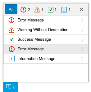
Message popover
Usage
Use the message popover if:
- You want to display multiple messages to the user.
- You do not want to interrupt users while they are performning an action.
Responsiveness
Size S (Smartphone)
On smartphones, the message popover is automatically shown in full-screen mode.
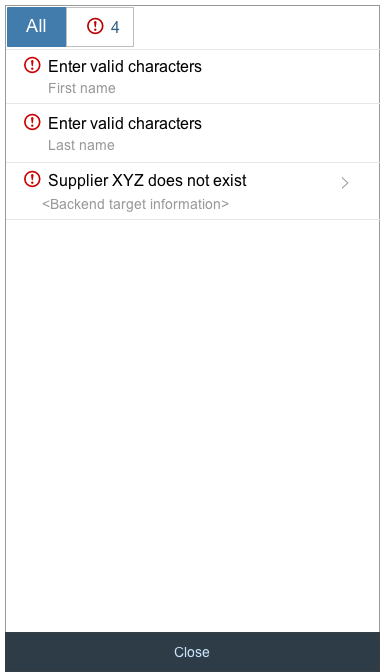
Full-screen message popover on a smartphone
Layout
Full Screen Layout
In a full screen layout, the messaging button always appears on the left side of the footer toolbar.
Messaging button in full screen layout
Split-Screen Layout
In a split-screen layout, the messaging button always appears on the left side of the footer toolbar of the details. Messages are usually field-related (for example, to a business object).

Messaging button in split-screen layout
Messaging Button
If there are no messages to display, you do not need to show a messaging button. The toolbar then only includes the “normal” actions related to the object.
If there are messages to display, the messaging button must look like the example shown in the figure on the right.

Messaging button in toolbar
How to Display the Message Popover
An overview of the different steps needed to display the message popover is provided below. For further information, see message handling.
Behavior and Interaction
Navigate to Details
The message popover uses the sap.m.List control, which provides truncation. If the message cannot be fully displayed or includes a long description, the message popover provides navigation to the detailed description.
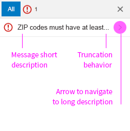
Message popover list view
Detailed view
Guidelines
Messaging Overview
No messages to display
If there are no messages to display, you do not need to include a message button in the toolbar.
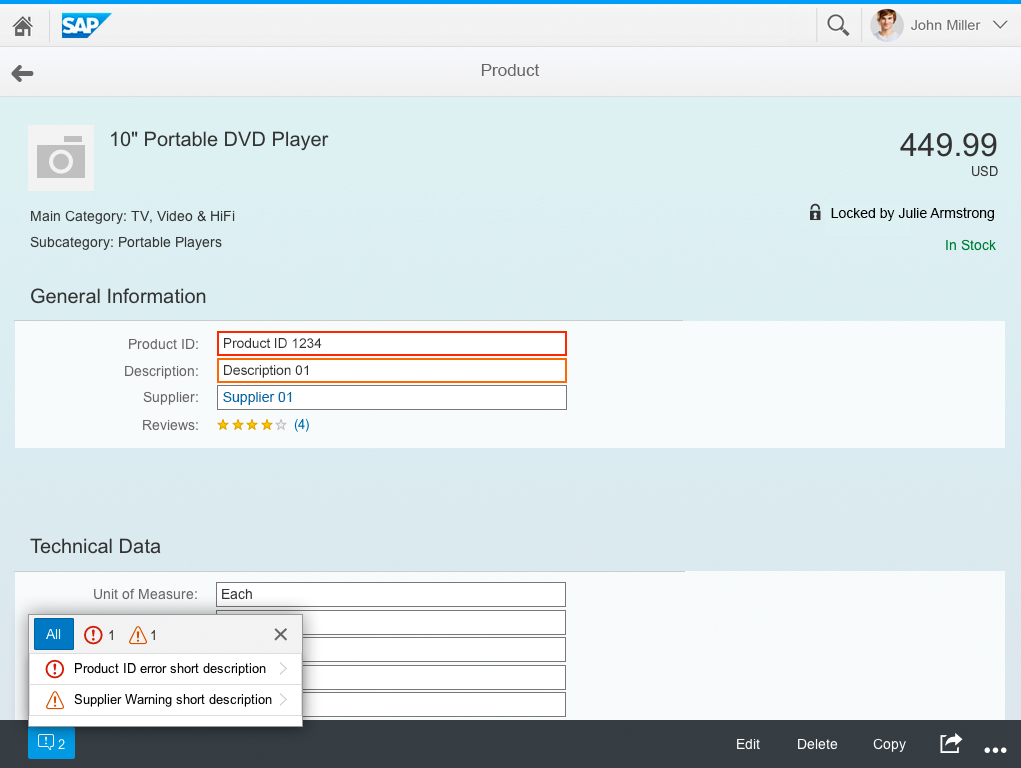
Highlight the fields
First, highlight the specific field(s) if possible, and change their value state according to the type of message, such as error, warning, or success messages.
Message popover
In addition to the field(s) being highlighted, a button also appears in the toolbar, displaying an icon and the number of messages that have occurred. This number matches the number of fields that have been highlighted. Whenever multiple messages occur, they should be displayed in the message popover, which can be triggered via a button on the left side of the footer toolbar.
Display single messages in a message box
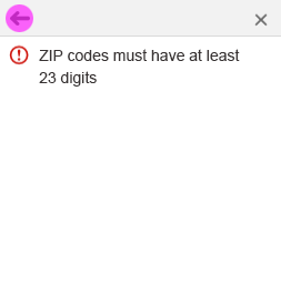
There may also be messages that have to interrupt the user. At present, we are only aware of technical issues such as network errors and connection issues.
Validation Points
No guidelines are currently available regarding data validation. Several cases are possible, which depend on the users, the performance, and the data that needs to be validated. These cases include:
- After focusing out
- After pressing a key
- After clicking or tapping an action, such as Save or Submit
Resources
Want to dive deeper? Follow the links below to find out more about related controls, the SAPUI5 implementation, and the visual design.
 Your feedback has been sent to the SAP Fiori design team.