
- Latest SAPUI Version 1.124
- SAPUI5 Version 1.122
- SAPUI5 Version 1.120
- SAPUI5 Version 1.118
- SAPUI5 Version 1.116
- SAPUI5 Version 1.114
- SAPUI5 Version 1.112
- SAPUI5 Version 1.110
- SAPUI5 Version 1.108
- SAPUI5 Version 1.104
- SAPUI5 Version 1.102
- SAPUI5 Version 1.100
- SAPUI5 Version 1.98
- SAPUI5 Version 1.96
- SAPUI5 Version 1.94
- SAPUI5 Version 1.92
- SAPUI5 Version 1.90
- SAPUI5 Version 1.88
- SAPUI5 Version 1.86
- SAPUI5 Version 1.84
- SAPUI5 Version 1.82
- SAPUI5 Version 1.80
- SAPUI5 Version 1.78
- SAPUI5 Version 1.76
- SAPUI5 Version 1.74
- SAPUI5 Version 1.72
- SAPUI5 Version 1.70
- SAPUI5 Version 1.68
- SAPUI5 Version 1.66
- SAPUI5 Version 1.64
- SAPUI5 Version 1.62
- SAPUI5 Version 1.60
- SAPUI5 Version 1.58
- SAPUI5 Version 1.56
- SAPUI5 Version 1.54
- SAPUI5 Version 1.52
- SAPUI5 Version 1.50
- SAPUI5 Version 1.48
- SAPUI5 Version 1.46
- SAPUI5 Version 1.44
- SAPUI5 Version 1.42
- SAPUI5 Version 1.40
- SAPUI5 Version 1.38
- SAPUI5 Version 1.36
- SAPUI5 Version 1.34
- SAPUI5 Version 1.32
- SAPUI5 Version 1.30
- SAPUI5 Version 1.28
- SAPUI5 Version 1.26
- Latest SAPUI Version 1.124
- SAPUI5 Version 1.122
- SAPUI5 Version 1.120
- SAPUI5 Version 1.118
- SAPUI5 Version 1.116
- SAPUI5 Version 1.114
- SAPUI5 Version 1.112
- SAPUI5 Version 1.110
- SAPUI5 Version 1.108
- SAPUI5 Version 1.106
- SAPUI5 Version 1.104
- SAPUI5 Version 1.102
- SAPUI5 Version 1.100
- SAPUI5 Version 1.98
- SAPUI5 Version 1.96
- SAPUI5 Version 1.94
- SAPUI5 Version 1.92
- SAPUI5 Version 1.90
- SAPUI5 Version 1.88
- SAPUI5 Version 1.86
- SAPUI5 Version 1.84
- SAPUI5 Version 1.82
- SAPUI5 Version 1.80
- SAPUI5 Version 1.78
- SAPUI5 Version 1.76
- SAPUI5 Version 1.74
- SAPUI5 Version 1.72
- SAPUI5 Version 1.70
- SAPUI5 Version 1.68
- SAPUI5 Version 1.66
- SAPUI5 Version 1.64
- SAPUI5 Version 1.62
- SAPUI5 Version 1.60
- SAPUI5 Version 1.58
- SAPUI5 Version 1.56
- SAPUI5 Version 1.54
- SAPUI5 Version 1.52
- SAPUI5 Version 1.50
- SAPUI5 Version 1.48
- SAPUI5 Version 1.46
- SAPUI5 Version 1.44
- SAPUI5 Version 1.42
- SAPUI5 Version 1.40
- SAPUI5 Version 1.38
- SAPUI5 Version 1.36
- SAPUI5 Version 1.34
- SAPUI5 Version 1.32
- SAPUI5 Version 1.30
- SAPUI5 Version 1.28
- SAPUI5 Version 1.26
Rating Indicator
sap.m.RatingIndicator
Intro
The rating indicator can be used to rate content or to indicate a rating. It enables users to rate an item on a numeric scale. The most popular scale is 1 (lowest) to 5 (highest).

Rating indicator
Responsiveness
The rating indicator runs on all form factors and therefore works on all devices. It is embedded in a container and thus behaves as part of it.

Rating indicator as part of a form – Size S
Rating indicator as part of a form – Size M
Layout
Context
You can use the rating indicator in forms, tables, in a dialog box, or in the filter bar.
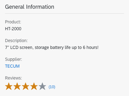
Rating indicator as part of a form
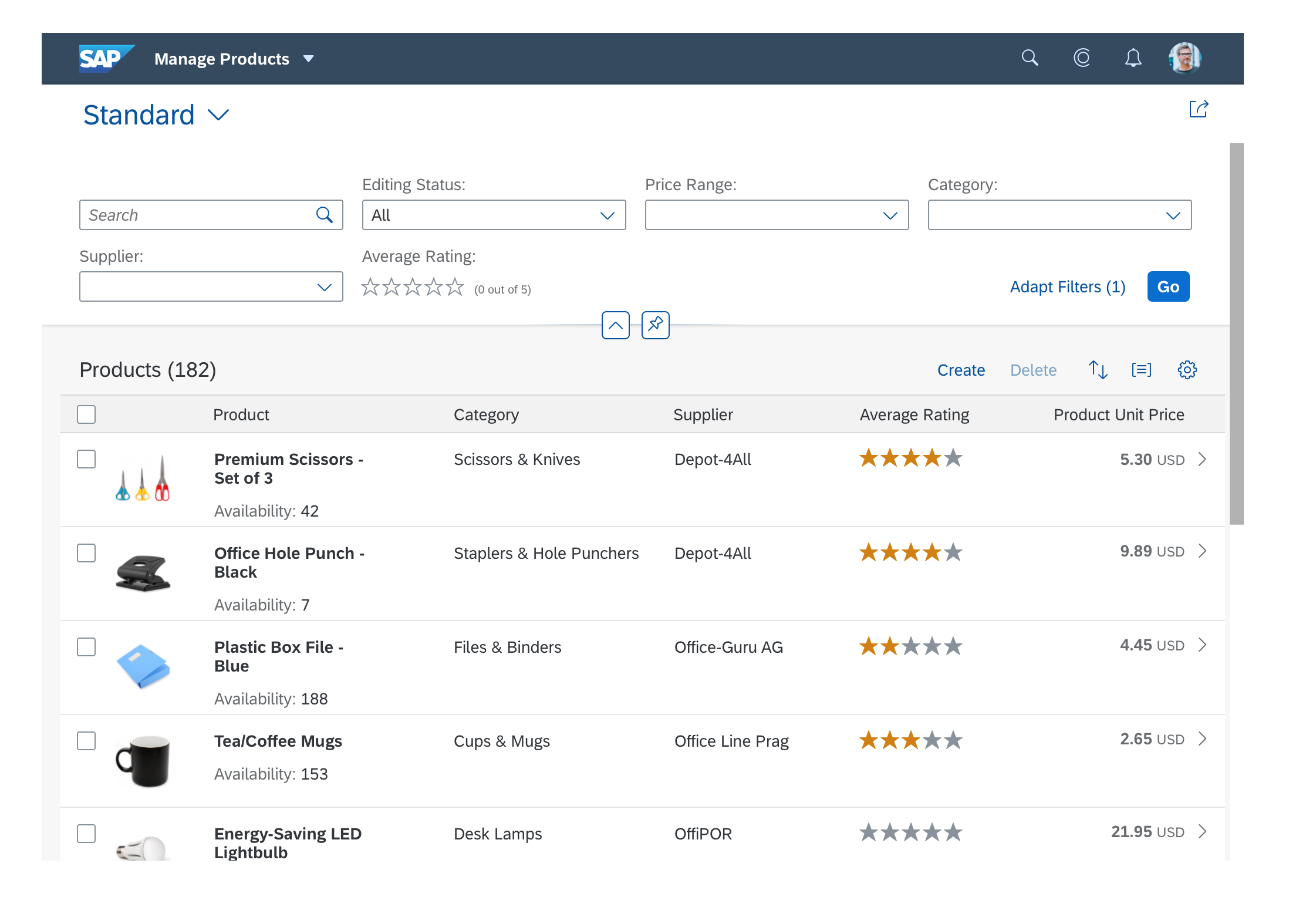
Rating indicator in the filter bar / as part of a table
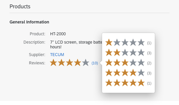
Rating indicator as part of a dialog
Rating details in a popover
Behavior and Interaction
Hover
When the user hovers over the rating indicator, a different icon or image is shown (property: iconHovered). This is an orange star by default.
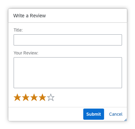
Select
If enabled for rating, the rating that the user previously selected is shown. When the user performs a rating, an event is triggered.
Types
There are two types of rating indicators:
- Interactive – used for rating an item
- Disabled
As the non-interactive state (rating result preview) is not available currently, use the disabled state instead.

Interactive state

Non-interactive state

Display mode
Disabled
Properties
Rating Symbols
You can also specify the URLs for the images or icons that are used as rating symbols (property: iconUnselected). Five star symbols are used by default. Although you can use other images or icons, we generally recommend that you use the star symbol. You can only choose 1 symbol for the unselected and 1 for the hovered state.
Number of Rating Symbols
You can specify the number of rating symbols (property: maxValue). We recommend using a maximum of 7 symbols, although 5 symbols are preferred.
Visual Mode of Rating Symbols
The visual mode defines how float values are visualized: as a half or a full star (property: visualMode). A half star cannot be select by a user. Therefore, it can only be displayed in read-only mode. The main use case for this is to show average ratings.
Size of Rating Symbols
The recommended sizes of the image or icon to be displayed are:
- Large: 2 rem (32 px)
- Normal: 1.375 rem (22 px) – default
- Small: 1 rem (16 px)
- XS: 0.75rem (12px)
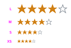
Possible sizes of a rating indicator: L, M, S, and XS
Resources
Want to dive deeper? Follow the links below to find out more about related controls, the SAPUI5 implementation, and the visual design.
 Your feedback has been sent to the SAP Fiori design team.