
- Latest SAPUI5 Version 1.120
- Version 1.118
- SAPUI5 Version 1.116
- SAPUI5 Version 1.114
- SAPUI5 Version 1.112
- SAPUI5 Version 1.110
- SAPUI5 Version 1.108
- SAPUI5 Version 1.106
- SAPUI5 Version 1.104
- SAPUI5 Version 1.102
- SAPUI5 Version 1.100
- SAPUI5 Version 1.98
- SAPUI5 Version 1.96
- SAPUI5 Version 1.94
- SAPUI5 Version 1.92
- SAPUI5 Version 1.90
- SAPUI5 Version 1.86
- SAPUI5 Version 1.84
- SAPUI5 Version 1.82
- SAPUI5 Version 1.80
- SAPUI5 Version 1.78
- SAPUI5 Version 1.76
- SAPUI5 Version 1.74
- SAPUI5 Version 1.72
- SAPUI5 Version 1.70
- SAPUI5 Version 1.68
- SAPUI5 Version 1.66
- SAPUI5 Version 1.64
- SAPUI5 Version 1.62
- SAPUI5 Version 1.60
- SAPUI5 Version 1.58
- SAPUI5 Version 1.56
- SAPUI5 Version 1.54
- SAPUI5 Version 1.52
- SAPUI5 Version 1.50
- SAPUI5 Version 1.48
- SAPUI5 Version 1.46
- SAPUI5 Version 1.44
- SAPUI5 Version 1.42
- SAPUI5 Version 1.40
- SAPUI5 Version 1.38
- SAPUI5 Version 1.36
- SAPUI5 Version 1.34
- SAPUI5 Version 1.32
- SAPUI5 Version 1.30
- SAPUI5 Version 1.28
- SAPUI5 Version 1.26
- Latest SAPUI5 Version 1.120
- Version 1.118
- SAPUI5 Version 1.116
- SAPUI5 Version 1.114
- SAPUI5 Version 1.112
- SAPUI5 Version 1.110
- SAPUI5 Version 1.108
- SAPUI5 Version 1.106
- SAPUI5 Version 1.104
- SAPUI5 Version 1.102
- SAPUI5 Version 1.100
- SAPUI5 Version 1.98
- SAPUI5 Version 1.96
- SAPUI5 Version 1.94
- SAPUI5 Version 1.92
- SAPUI5 Version 1.90
- SAPUI5 Version 1.88
- SAPUI5 Version 1.86
- SAPUI5 Version 1.84
- SAPUI5 Version 1.82
- SAPUI5 Version 1.80
- SAPUI5 Version 1.78
- SAPUI5 Version 1.76
- SAPUI5 Version 1.74
- SAPUI5 Version 1.72
- SAPUI5 Version 1.70
- SAPUI5 Version 1.68
- SAPUI5 Version 1.66
- SAPUI5 Version 1.64
- SAPUI5 Version 1.62
- SAPUI5 Version 1.60
- SAPUI5 Version 1.58
- SAPUI5 Version 1.56
- SAPUI5 Version 1.54
- SAPUI5 Version 1.52
- SAPUI5 Version 1.50
- SAPUI5 Version 1.48
- SAPUI5 Version 1.46
- SAPUI5 Version 1.44
- SAPUI5 Version 1.42
- SAPUI5 Version 1.40
- SAPUI5 Version 1.38
- SAPUI5 Version 1.36
- SAPUI5 Version 1.34
- SAPUI5 Version 1.32
- SAPUI5 Version 1.30
- SAPUI5 Version 1.28
- SAPUI5 Version 1.26
Text Area
sap.m.TextArea
Intro
The text area is an input control that allows the user to enter several lines of text.
Usage
Use the text area if you want users to enter multiple lines of text. If you only want them to enter a single line of text, use the text control instead.
Responsiveness
You can set the maximum number of lines to be shown. The amount of text depends on the size of the screen. On smaller screens, the user can scroll down the text area to see the entire text. To indicate that the text continues, the control shows only half of the last line. This also applies for mobile devices.
Components
The text area allows the user to enter multiple lines of text.
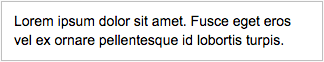
Text area – Default
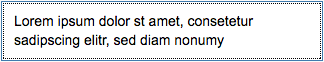
Text area – Active state
You can also set a placeholder (input prompt), which is inherited from sap.m.InputBase; property: placeholder. The prompt text is displayed when the input field is empty.
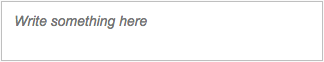
Text area – With placeholder (input prompt)
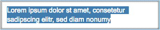
Text area – Selected state
Behavior and Interaction
Entering and Removing Text
As soon as the user starts typing, the placeholder disappears. It appears again when the user removes all the content from the text area.
You can also limit the number of characters a user can enter. In this case, the text area prevents the user from adding more characters than the maximum value defined (property: maxLength).
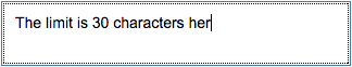
Text area – Limited
Making Text Non-Editable
You can set the text area to non-editable (property: editable). This mode still allows the user to scroll to the text that is currently hidden.
Text area – Read-only
Disabling Text
You can also set the text area to disabled. In this case, the user cannot edit or scroll (property: enabled).

Text area – Disabled state
Growing Behavior
The text area control offers a growing property. It gives the control the ability to automatically grow and shrink with its content while the user is typing.
The maximum height of the text area is configurable. Define the height to reflect the space where the control will be located.
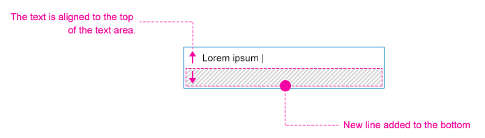
Growing text area: The text is aligned to the top of the text area. A new line is added to the bottom of the text area.
Text Area Counter
General Information
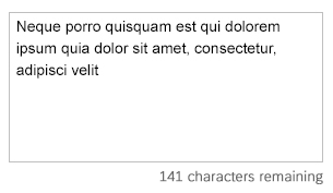
If you have set a character limit for the text box (property: maxLength), you can use the text area counter to show a character count (remaining characters, characters over the limit).
To turn on the counter, set the property showExceededText to true. The user can then see all inserted characters, including those that are over the limit.
Basic Interactions
The number of characters allowed is displayed below the text area, aligned to the right. A label indicates how many characters are left.
When the characters are over the limit:
- Тhe user can continue typing and the text area changes to a warning state.
- The value of the counter changes.
When the user pastes copied text, characters that are over the limit are selected automatically. The user can delete any excess characters by pressing Delete or Back on the keyboard (or virtual keyboard for phones and tablets).
Text area counter - Default state (within the limit)

Text area counter components
Text Area Counter - Basic Interactions

Styles
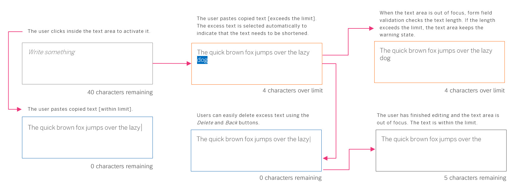
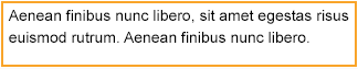
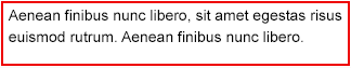
As with any other input control, you can validate the fields and show the result as a value state of the control (property: valueState). Possible value states are error, warning, success, information, or neutral (none).
For more information, see How To Use Semantic Colors and Form Field Validation.
Text area – Warning state
Text area – Error state
Text area - Success state
Text area - Information state
Guidelines
- As with other input fields, use a label. For exceptions regarding label usage, see the Exceptions section of the Label article.
- The placeholder does not substitute a label. It can be used to give an additional hint, but should not repeat the label in long format.
- If you want to use the text area with a fixed text length (property:
maxLength), for example, inside a form, use text beside the text area to count down the number of remaining characters while the user is typing. - If you are applying the growing behavior of the text area, bear in mind that its maximum height should not exceed the height of the screen.
Saving Forms with a Text Area Counter
If a text exceeds the limit for the text area, there are two options for saving the form:
- The form can be saved, but only contains the text within the character limit. If you follow this approach, inform the user that only part of the text will be saved. In this case, we strongly recommend setting the text area state to “warning” to indicate that there is a problem with the text.
- The form cannot be saved until the user edits the text and the character count is within the limit. In this case, we strongly recommend setting the text area state to “error”.
Properties
- You can provide a width by specifying the average character width (property:
cols). - You can define the height of the text area by specifying the number of lines of text (property:
rows). You can also set the height of the text area (property:height), which overrides therowsproperty. - You can define the type of wrapping for the text area (property:
wrapping) assoft,hard, oroff. sap.m.TextAreahas a growing property that enables the height of the text area to change dynamically while the user is typing.sap.m.TextAreacan show a count for the number of permitted characters, and allow users to type/paste text over the limit (property:showExceededText). This property determines whether characters that exceed the character limit are visible.- If this property is set to
false, the user is not allowed to exceed the number of characters set in themaxLengthproperty. - If this property is set to
true, characters exceeding themaxLengthvalue are selected on paste, and the counter below the input field displays the number of characters that are over the limit.
- If this property is set to
Resources
Want to dive deeper? Follow the links below to find out more about related controls, the SAPUI5 implementation, and the visual design.
Elements and Controls
- Text (guidelines)
- Label (guidelines)
- Form (guidelines)
- How To Use Semantic Colors (guidelines)
- Form Field Validation (guidelines)
 Your feedback has been sent to the SAP Fiori design team.