- Latest Version 1.128
- Version 1.126
- SAPUI Version 1.124
- SAPUI5 Version 1.122
- SAPUI5 Version 1.120
- SAPUI5 Version 1.118
- SAPUI5 Version 1.116
- SAPUI5 Version 1.114
- SAPUI5 Version 1.112
- SAPUI5 Version 1.110
- SAPUI5 Version 1.108
- SAPUI5 Version 1.106
- SAPUI5 Version 1.104
- SAPUI5 Version 1.102
- SAPUI5 Version 1.100
- SAPUI5 Version 1.98
- SAPUI5 Version 1.96
- SAPUI5 Version 1.94
- SAPUI5 Version 1.92
- SAPUI5 Version 1.90
- SAPUI5 Version 1.88
- SAPUI5 Version 1.86
- SAPUI5 Version 1.84
- SAPUI5 Version 1.82
- SAPUI5 Version 1.80
- SAPUI5 Version 1.78
- SAPUI5 Version 1.76
- SAPUI5 Version 1.74
- SAPUI5 Version 1.72
- SAPUI5 Version 1.70
- SAPUI5 Version 1.68
- SAPUI5 Version 1.66
- SAPUI5 Version 1.64
- SAPUI5 Version 1.62
- SAPUI5 Version 1.60
- SAPUI5 Version 1.58
- SAPUI5 Version 1.56
- SAPUI5 Version 1.54
- SAPUI5 Version 1.52
- SAPUI5 Version 1.50
- SAPUI5 Version 1.48
- SAPUI5 Version 1.46
- SAPUI5 Version 1.44
- SAPUI5 Version 1.40
- SAPUI5 Version 1.38
- SAPUI5 Version 1.36
- SAPUI5 Version 1.34
- SAPUI5 Version 1.32
- SAPUI5 Version 1.30
- SAPUI5 Version 1.28
- SAPUI5 Version 1.26
- Latest Version 1.128
- Version 1.126
- SAPUI Version 1.124
- SAPUI5 Version 1.122
- SAPUI5 Version 1.120
- SAPUI5 Version 1.118
- SAPUI5 Version 1.116
- SAPUI5 Version 1.114
- SAPUI5 Version 1.112
- SAPUI5 Version 1.110
- SAPUI5 Version 1.108
- SAPUI5 Version 1.106
- SAPUI5 Version 1.104
- SAPUI5 Version 1.102
- SAPUI5 Version 1.100
- SAPUI5 Version 1.98
- SAPUI5 Version 1.96
- SAPUI5 Version 1.94
- SAPUI5 Version 1.92
- SAPUI5 Version 1.90
- SAPUI5 Version 1.88
- SAPUI5 Version 1.86
- SAPUI5 Version 1.84
- SAPUI5 Version 1.82
- SAPUI5 Version 1.80
- SAPUI5 Version 1.78
- SAPUI5 Version 1.76
- SAPUI5 Version 1.74
- SAPUI5 Version 1.72
- SAPUI5 Version 1.70
- SAPUI5 Version 1.68
- SAPUI5 Version 1.66
- SAPUI5 Version 1.64
- SAPUI5 Version 1.62
- SAPUI5 Version 1.60
- SAPUI5 Version 1.58
- SAPUI5 Version 1.56
- SAPUI5 Version 1.54
- SAPUI5 Version 1.52
- SAPUI5 Version 1.50
- SAPUI5 Version 1.48
- SAPUI5 Version 1.46
- SAPUI5 Version 1.44
- SAPUI5 Version 1.42
- SAPUI5 Version 1.40
- SAPUI5 Version 1.38
- SAPUI5 Version 1.36
- SAPUI5 Version 1.34
- SAPUI5 Version 1.32
- SAPUI5 Version 1.30
- SAPUI5 Version 1.28
- SAPUI5 Version 1.26
Date/Time Picker
sap.m.DateTimePicker
Intro
The date/time picker allows users to select date and time values in a combined input.
Usage
Use the date/time picker if:
- You need a combined date and time input control.
Do not use the date time picker if:
- You want to use either a date or a time value. In this case, use the date picker or the time picker instead.
Responsiveness
The date/time picker runs on all form factors and fully adapts to all devices.
Behavior and Interaction
Selecting Date and Time Values
Sizes M and L/XL
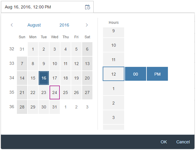
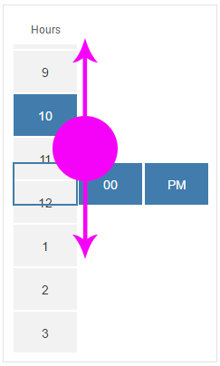
The date/time picker appears as a popover when the user clicks or taps a date (input field) on the calendar, The user can then select the desired date from the calendar, and the time from the rotating wheel.
When the user clicks or taps the OK button, the popover closes and the selected date and time appear in the input field. When the user selects Cancel, the action is aborted and the input field remains unchanged.
Size S and Mobile Size
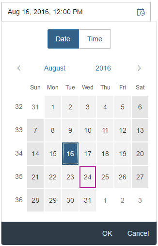
On smaller devices, the user can choose the date and time value in arbitrary order by tapping the segmented button on top of the screen. Be aware that the popover is superimposed on the input field during the selection process for mobile/S sizes.
The user can select the desired date from the calendar, and the time from the rotating time wheel. Clicking a date in the calendar automatically leads the user to the time selection screen.
When the user selects OK, the popover closes and the selected date and time appear in the input field. When the user selects Cancel, the action is aborted and the input field remains unchanged.
Guidelines
Date Picker and Time Picker
In general, we recommend separating the date/time picker controls as the time picker supports the mask input function and the date picker allows the user to enter date in different formats. This makes it easier and more convenient for the user to enter the desired values. For additional guidelines and information on the individual controls, see the resources section below.
Default Values
Independently of the chosen control, set the default values of the date/time picker carefully to avoid unnecessary scrolling. It often makes sense to set the default for the time to the full or half hour, setting the minutes to 00 or 30. Sometimes, it may also make sense to use the current time and date.
Formatting Dates and Times
For guidelines and information on the SAPUI5 date formatters, see formatting dates.
For guidelines and information on the SAPUI5 time formatters, see formatting times.
Properties
AM and PM are locale-dependent. The locale can be set using the property “localeId”.
You can set the display format (property: displayFormat) to define the format in which the time input field and the time picker dropdown display the time.
Resources
Want to dive deeper? Follow the links below to find out more about related controls, the SAPUI5 implementation, and the visual design.
Elements and Controls
- Time Picker (guidelines)
- Date Picker (guidelines)
- Formatting Time (guidelines)
- Formatting Dates (guidelines)


 Your feedback has been sent to the SAP Fiori design team.