- SAPUI5 Version 1.122
- SAPUI5 Version 1.120
- SAPUI5 Version 1.118
- SAPUI5 Version 1.116
- SAPUI5 Version 1.114
- SAPUI5 Version 1.112
- SAPUI5 Version 1.110
- SAPUI5 Version 1.108
- SAPUI5 Version 1.106
- SAPUI5 Version 1.104
- SAPUI5 Version 1.102
- SAPUI5 Version 1.100
- SAPUI5 Version 1.98
- SAPUI5 Version 1.96
- SAPUI5 Version 1.94
- SAPUI5 Version 1.92
- SAPUI5 Version 1.90
- SAPUI5 Version 1.88
- SAPUI5 Version 1.86
- SAPUI5 Version 1.84
- SAPUI5 Version 1.82
- SAPUI5 Version 1.80
- SAPUI5 Version 1.78
- SAPUI5 Version 1.76
- SAPUI5 Version 1.74
- SAPUI5 Version 1.72
- SAPUI5 Version 1.70
- SAPUI5 Version 1.68
- SAPUI5 Version 1.66
- SAPUI5 Version 1.64
- SAPUI5 Version 1.62
- SAPUI5 Version 1.60
- SAPUI5 Version 1.58
- SAPUI5 Version 1.56
- SAPUI5 Version 1.54
- SAPUI5 Version 1.52
- SAPUI5 Version 1.50
- SAPUI5 Version 1.48
- SAPUI5 Version 1.46
- SAPUI5 Version 1.44
- SAPUI5 Version 1.42
- SAPUI5 Version 1.40
- SAPUI5 Version 1.38
- SAPUI5 Version 1.36
- SAPUI5 Version 1.34
- SAPUI5 Version 1.32
- SAPUI5 Version 1.30
- SAPUI5 Version 1.28
- SAPUI5 Version 1.26
- Latest SAPUI Version 1.124
- SAPUI5 Version 1.122
- SAPUI5 Version 1.120
- SAPUI5 Version 1.118
- SAPUI5 Version 1.116
- SAPUI5 Version 1.114
- SAPUI5 Version 1.112
- SAPUI5 Version 1.110
- SAPUI5 Version 1.108
- SAPUI5 Version 1.106
- SAPUI5 Version 1.104
- SAPUI5 Version 1.102
- SAPUI5 Version 1.100
- SAPUI5 Version 1.98
- SAPUI5 Version 1.96
- SAPUI5 Version 1.94
- SAPUI5 Version 1.92
- SAPUI5 Version 1.90
- SAPUI5 Version 1.88
- SAPUI5 Version 1.86
- SAPUI5 Version 1.84
- SAPUI5 Version 1.82
- SAPUI5 Version 1.80
- SAPUI5 Version 1.78
- SAPUI5 Version 1.76
- SAPUI5 Version 1.74
- SAPUI5 Version 1.72
- SAPUI5 Version 1.70
- SAPUI5 Version 1.68
- SAPUI5 Version 1.66
- SAPUI5 Version 1.64
- SAPUI5 Version 1.62
- SAPUI5 Version 1.60
- SAPUI5 Version 1.58
- SAPUI5 Version 1.56
- SAPUI5 Version 1.54
- SAPUI5 Version 1.52
- SAPUI5 Version 1.50
- SAPUI5 Version 1.48
- SAPUI5 Version 1.46
- SAPUI5 Version 1.44
- SAPUI5 Version 1.42
- SAPUI5 Version 1.40
- SAPUI5 Version 1.38
- SAPUI5 Version 1.36
- SAPUI5 Version 1.34
- SAPUI5 Version 1.32
- SAPUI5 Version 1.30
- SAPUI5 Version 1.28
- SAPUI5 Version 1.26
Date/Time Picker
sap.m.DateTimePicker
Intro
The date/time picker allows users to select date and time values in a combined input.
Usage
Use the date/time picker if:
- You need a combined date and time input control.
Do not use the date time picker if:
- You want to use either a date or a time value. In this case, use the date picker or the time picker instead.
Responsiveness
The date/time picker runs on all form factors and fully adapts to all devices.
Behavior and Interaction
Selecting Date and Time Values
Sizes M and L/XL
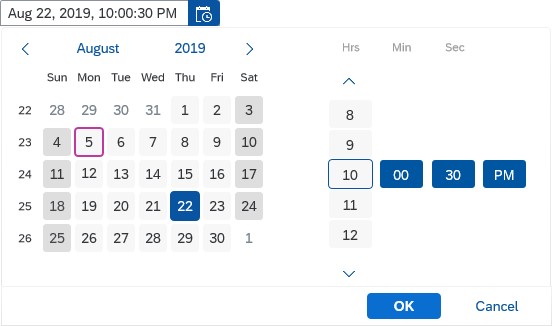
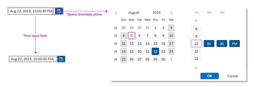
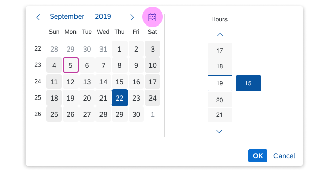
The date/time picker appears as a popover when the user clicks the date/time icon in the input field. The user can then select the desired date from the calendar and the time from the rotating wheel. For the time, it’s possible to select hours, minutes, and seconds.
When the user clicks the OK button, the popover closes and the selected date and time appear in the input field. When the user selects Cancel, the action is aborted and the input field remains unchanged.
If there is no value in the input field, no date is selected in the calendar. The user needs to explicitly select a date. If a date is already selected and the user changes the year or the month, they need to explicitly select the date again to confirm the change.
Size S and Mobile Size
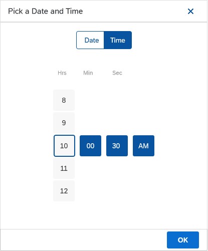
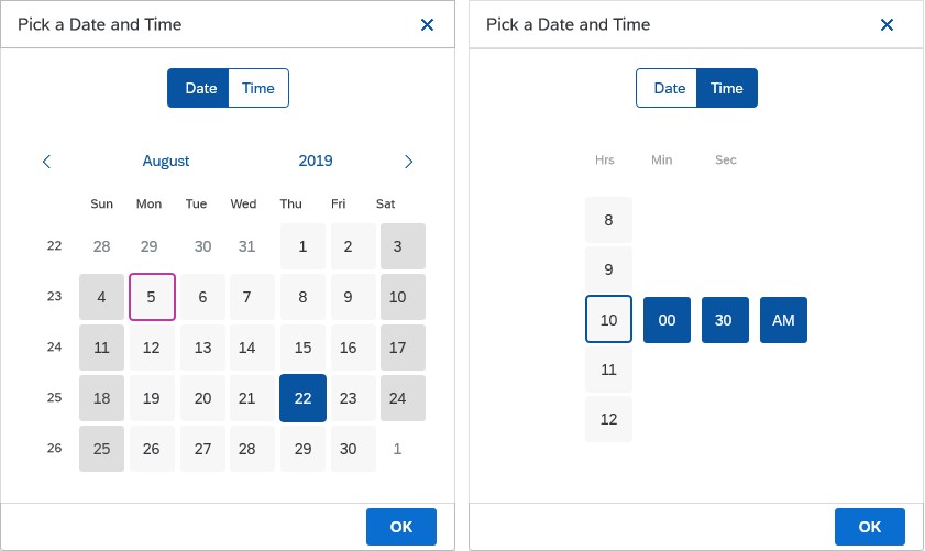
On smaller devices, the user can choose the date and time value in arbitrary order by tapping the segmented button on top of the screen. Be aware that the popover is superimposed on the input field during the selection process for mobile/S sizes.
The user can select the desired date from the calendar, and the time from the rotating time wheel. For the time, it’s possible to select hours, minutes, and even seconds. Clicking a date in the calendar automatically takes the user to the time selection screen.
When the user selects OK, the popover closes and the selected date and time appear in the input field. When the user selects Cancel, the action is aborted and the input field remains unchanged.
“Today” Button
You can offer a shortcut for navigating to the current date (sap.m.DateTimePicker, property: showCurrentDateButton). This displays an additional Today icon button ( ) in the navigation part of the calendar. Pressing this button sets the focus to the current date.
This feature is available for pickers that enable selection of individual days. For the others, the property has no effect.
Styles
Value States
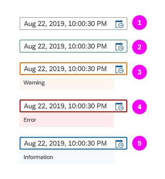
The Date/Time picker supports the following value states:
- Regular
- Success
- Warning
- Error
- Information
For the Warning, Error and Information states, there are additional messages available to provide hints for the user.
For more information, see How to Use Semantic Colors.
Guidelines
Date Picker and Time Picker
In general, we recommend separating the date/time picker controls as the time picker supports the mask input function and the date picker allows the user to enter date in different formats. This makes it easier and more convenient for the user to enter the desired values. For additional guidelines and information on the individual controls, see the resources section below.
Default Values
Independently of the chosen control, set the default values of the date/time picker carefully to avoid unnecessary scrolling. It often makes sense to set the default for the time to the full or half hour, setting the minutes to 00 or 30. Sometimes, it may also make sense to use the current time and date.
Date Input Field
It is possible to add additional “description” texts to the input field (a unit of measurement, for example) by using a new association in the sap.m.InputBase control called ariaDescribedBy. The association is responsible for referencing the elements that describe the control.
Formatting Dates and Times
For guidelines and information on the SAPUI5 date formatters, see formatting dates.
For guidelines and information on the SAPUI5 time formatters, see formatting times.
Setting Steps
You can set intervals for the minutes and seconds on the slider (properties: minutesStep and/or secondsStep). For example, if you set the seconds step to “5”, the slider offers “00”, “05”, “10”, “15”, and so on.
Time Zone
If the user has to set a time that is time zone-sensitive, offer a select control next to the date/time picker control to choose the appropriate time zone.
Properties
AM and PM are locale-dependent. The locale can be set using the property localeId.
You can set the display format (property: displayFormat) to define the format in which the time input field and the time picker dropdown display the time.
Resources
Want to dive deeper? Follow the links below to find out more about related controls, the SAPUI5 implementation, and the visual design.
Elements and Controls
- Time Picker (guidelines)
- Date Picker (guidelines)
- Formatting Time (guidelines)
- Formatting Dates (guidelines)

 Your feedback has been sent to the SAP Fiori design team.