
- Latest SAPUI5 Version 1.120
- Version 1.118
- SAPUI5 Version 1.116
- SAPUI5 Version 1.114
- SAPUI5 Version 1.112
- SAPUI5 Version 1.110
- SAPUI5 Version 1.108
- SAPUI5 Version 1.106
- SAPUI5 Version 1.104
- SAPUI5 Version 1.102
- SAPUI5 Version 1.100
- SAPUI5 Version 1.98
- SAPUI5 Version 1.96
- SAPUI5 Version 1.94
- SAPUI5 Version 1.92
- SAPUI5 Version 1.90
- SAPUI5 Version 1.88
- SAPUI5 Version 1.86
- SAPUI5 Version 1.84
- SAPUI5 Version 1.82
- SAPUI5 Version 1.80
- SAPUI5 Version 1.78
- SAPUI5 Version 1.76
- SAPUI5 Version 1.74
- SAPUI5 Version 1.72
- SAPUI5 Version 1.70
- SAPUI5 Version 1.68
- SAPUI5 Version 1.66
- SAPUI5 Version 1.64
- SAPUI5 Version 1.62
- SAPUI5 Version 1.60
- SAPUI5 Version 1.58
- SAPUI5 Version 1.56
- SAPUI5 Version 1.54
- SAPUI5 Version 1.52
- SAPUI5 Version 1.50
- SAPUI5 Version 1.48
- SAPUI5 Version 1.46
- SAPUI5 Version 1.42
- SAPUI5 Version 1.40
- SAPUI5 Version 1.38
- SAPUI5 Version 1.36
- SAPUI5 Version 1.34
- SAPUI5 Version 1.32
- SAPUI5 Version 1.30
- SAPUI5 Version 1.28
- SAPUI5 Version 1.26
- Latest SAPUI5 Version 1.120
- Version 1.118
- SAPUI5 Version 1.116
- SAPUI5 Version 1.114
- SAPUI5 Version 1.112
- SAPUI5 Version 1.110
- SAPUI5 Version 1.108
- SAPUI5 Version 1.106
- SAPUI5 Version 1.104
- SAPUI5 Version 1.102
- SAPUI5 Version 1.100
- SAPUI5 Version 1.98
- SAPUI5 Version 1.96
- SAPUI5 Version 1.94
- SAPUI5 Version 1.92
- SAPUI5 Version 1.90
- SAPUI5 Version 1.88
- SAPUI5 Version 1.86
- SAPUI5 Version 1.84
- SAPUI5 Version 1.82
- SAPUI5 Version 1.80
- SAPUI5 Version 1.78
- SAPUI5 Version 1.76
- SAPUI5 Version 1.74
- SAPUI5 Version 1.72
- SAPUI5 Version 1.70
- SAPUI5 Version 1.68
- SAPUI5 Version 1.66
- SAPUI5 Version 1.64
- SAPUI5 Version 1.62
- SAPUI5 Version 1.60
- SAPUI5 Version 1.58
- SAPUI5 Version 1.56
- SAPUI5 Version 1.54
- SAPUI5 Version 1.52
- SAPUI5 Version 1.50
- SAPUI5 Version 1.48
- SAPUI5 Version 1.46
- SAPUI5 Version 1.44
- SAPUI5 Version 1.42
- SAPUI5 Version 1.40
- SAPUI5 Version 1.38
- SAPUI5 Version 1.36
- SAPUI5 Version 1.34
- SAPUI5 Version 1.32
- SAPUI5 Version 1.30
- SAPUI5 Version 1.28
- SAPUI5 Version 1.26
Dialog
sap.m.dialog
Intro
The dialog control (sap.m.dialog) interrupts the current app process to prompt the user for information or a response. It is a forced decision or a confirmation that needs to be signed off by the user.
Usage
Use the dialog if:
- You want to display complex content but don’t want the user to navigate away from the current page.
- You want to display an additional step or process on the UI, which the user has to confirm via an action at the end.
Do not use the dialog if:
- You want to display a simple message (use the message box instead)
- You just want to confirm a successful action.
- You do not want to interrupt the user’s action.
Responsiveness
The dialog provides different behavior on a smartphone than on a tablet or desktop. You can distinguish between a cozy dialog and a compact dialog. For more information, see content density.
The buttons in the toolbar are aligned differently on the various devices. On a smartphone, they cover the entire footer, but on a tablet or desktop, they are right-aligned.
Size S (Smartphone)
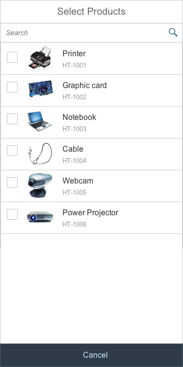
Full Screen Dialog
We recommend displaying dialogs in S size in full screen mode. Most of the content of a dialog is worth opening full screen so the user is able to focus on the content of the dialog. The stretch property can be easily set by the application to true. The toolbar on which actions are placed within a dialog is positioned at the bottom of the dialog.
Full screen dialog (size S)
Position of the Action Buttons
By default, the dialog can have one or two actions, which cover the entire footer on smartphones.
Footer actions alignment (size S)
When to Open Full Screen or Modal
Message dialogs should always be displayed as modals. There is no need to display a simple message in a full screen dialog. If you want to display a simple message, use the message box instead.
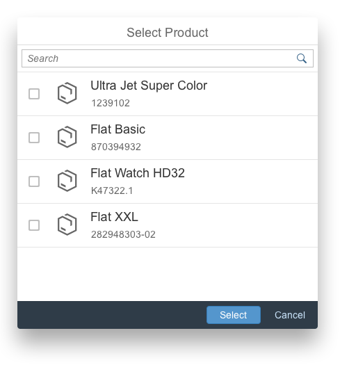
If you use standard dialogs such as value help, you should open them in full screen mode. The device’s entire screen is used to display the dialog, and the user can focus on the content of the message. The dialogs offer a stretch property for full screen behavior.
Size M (Tablet)
By default, the dialog can have up to two action buttons in the footer. The action buttons in the toolbar are right-aligned. Use cozy mode on tablet devices.
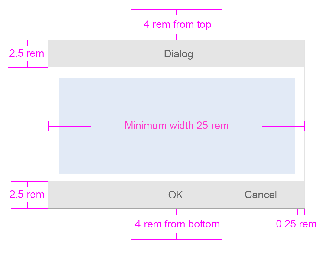
If the content height increases or is set to more than the screen height, the dialog height stops at 4 rem from the top and bottom. The user can then scroll through the content area.
Size L (Desktop)
By default, the dialog can have one or two actions. The action buttons on a desktop device are right-aligned. Use compact mode to ensure that the padding and margins are optimized for desktop devices.
If the content height increases or is set to more than the screen height, the dialog height stops at 4 rem from the top and bottom. The user can then scroll through the content area.
Dialog in compact mode (size L)
Layout
Position on the Screen
The dialog is positioned in the center of the screen. It opens in a modal window to ensure that it attracts the user’s attention when it displays emergency states.
On a smartphone, the stretch property allows you to achieve full screen behavior.
Behavior and Interaction
Navigation in a Dialog
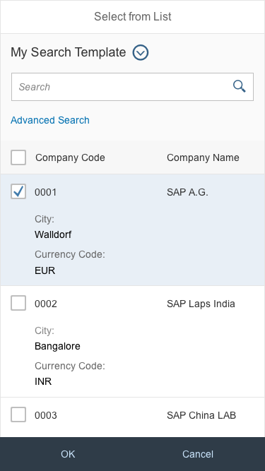
Navigation in a dialog enables the application to navigate to another page within the dialog. On the second page, an arrow on top of the dialog allows the user to navigate back to the first page.
Navigation example inside the dialog
Resizable
The user can change the size of the dialog by setting the “resizable” property to true. The following figure shows the resizing indicator, which helps the user to identify this functionality.
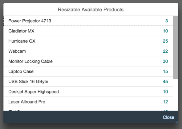
Resizable indicator on the bottom right-hand corner
Draggable
Dialogs can be moved by dragging the header to another position. Set the “draggable” property to ‘true’ and by clicking the title, the user can move the dialog to another position.
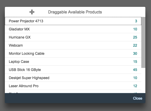
Dialog is movable by dragging the title of the dialog
Messaging in Dialog
Message popovers do not need to be displayed in dialogs. For example, to show an issue with with content in a field, highlighting can be used. For more information, see form field validation.
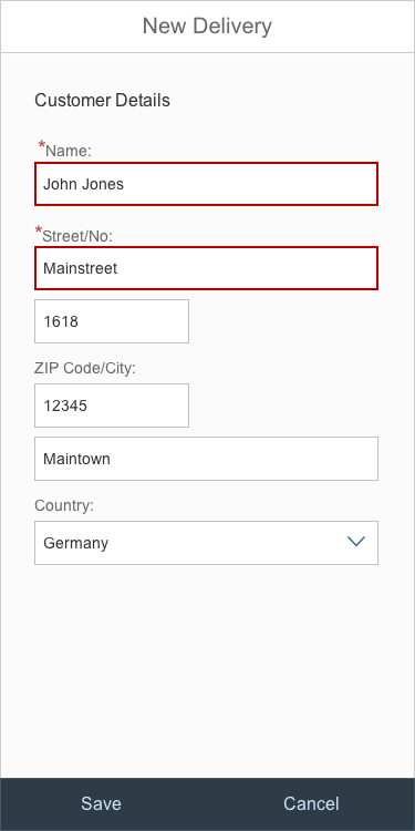
Highlighted form fields in dialog
Types
Standard Dialog
Use the standard dialog if you want to display a common dialog. The main visual differences are that the header is displayed with a grey background, and that no icon is shown.
The content can be filled with your application-specific data.
Other Types of Dialogs
Message Box
The message box is a special type of dialog that is used to display messages quickly. For each type of message, the app team can decide when to use a dialog. Use the message toast (sap.m.MessageToast) for success messages. For more information, see message box.
Components
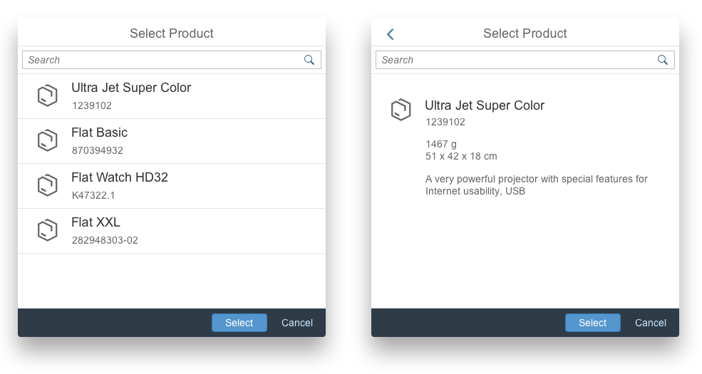
The dialog contains the following sections and options:
Title: Title text appears in the dialog header.
Subheader: When a subheader is assigned to a dialog (optionally), it appears below the main header. As the subheader is not part of the content area, it is not scrollable.
Content: This area contains the actual content of the dialog.
Footer with actions: The footer can contain up to two buttons (optionally).
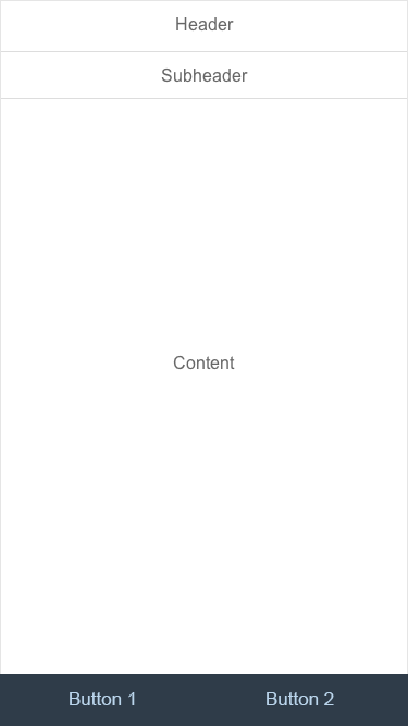
Example of a dialog structure
Emphasized Buttons in a Dialog
By emphasizing a button in the dialog toolbar, the user can focus more on the action that the application would see as the standard action. Use an emphasized button if you want to better guide your user.
Usage of an emphasized button in dialog toolbar
Resources
Want to dive deeper? Follow the links below to find out more about related controls, the SAPUI5 implementation, and the visual design.
 Your feedback has been sent to the SAP Fiori design team.