
- Latest SAPUI5 Version 1.120
- Version 1.118
- SAPUI5 Version 1.116
- SAPUI5 Version 1.114
- SAPUI5 Version 1.112
- SAPUI5 Version 1.110
- SAPUI5 Version 1.108
- SAPUI5 Version 1.106
- SAPUI5 Version 1.104
- SAPUI5 Version 1.102
- SAPUI5 Version 1.100
- SAPUI5 Version 1.98
- SAPUI5 Version 1.96
- SAPUI5 Version 1.94
- SAPUI5 Version 1.92
- SAPUI5 Version 1.90
- SAPUI5 Version 1.88
- SAPUI5 Version 1.86
- SAPUI5 Version 1.84
- SAPUI5 Version 1.82
- SAPUI5 Version 1.80
- SAPUI5 Version 1.78
- SAPUI5 Version 1.76
- SAPUI5 Version 1.74
- SAPUI5 Version 1.72
- SAPUI5 Version 1.70
- SAPUI5 Version 1.68
- SAPUI5 Version 1.66
- SAPUI5 Version 1.64
- SAPUI5 Version 1.62
- SAPUI5 Version 1.60
- SAPUI5 Version 1.58
- SAPUI5 Version 1.56
- SAPUI5 Version 1.54
- SAPUI5 Version 1.52
- SAPUI5 Version 1.50
- SAPUI5 Version 1.48
- SAPUI5 Version 1.46
- SAPUI5 Version 1.42
- SAPUI5 Version 1.40
- SAPUI5 Version 1.38
- SAPUI5 Version 1.36
- SAPUI5 Version 1.34
- SAPUI5 Version 1.32
- SAPUI5 Version 1.30
- SAPUI5 Version 1.28
- SAPUI5 Version 1.26
- Latest SAPUI5 Version 1.120
- Version 1.118
- SAPUI5 Version 1.116
- SAPUI5 Version 1.114
- SAPUI5 Version 1.112
- SAPUI5 Version 1.110
- SAPUI5 Version 1.108
- SAPUI5 Version 1.106
- SAPUI5 Version 1.104
- SAPUI5 Version 1.102
- SAPUI5 Version 1.100
- SAPUI5 Version 1.98
- SAPUI5 Version 1.96
- SAPUI5 Version 1.94
- SAPUI5 Version 1.92
- SAPUI5 Version 1.90
- SAPUI5 Version 1.88
- SAPUI5 Version 1.86
- SAPUI5 Version 1.84
- SAPUI5 Version 1.82
- SAPUI5 Version 1.80
- SAPUI5 Version 1.78
- SAPUI5 Version 1.76
- SAPUI5 Version 1.74
- SAPUI5 Version 1.72
- SAPUI5 Version 1.70
- SAPUI5 Version 1.68
- SAPUI5 Version 1.66
- SAPUI5 Version 1.64
- SAPUI5 Version 1.62
- SAPUI5 Version 1.60
- SAPUI5 Version 1.58
- SAPUI5 Version 1.56
- SAPUI5 Version 1.54
- SAPUI5 Version 1.52
- SAPUI5 Version 1.50
- SAPUI5 Version 1.48
- SAPUI5 Version 1.46
- SAPUI5 Version 1.44
- SAPUI5 Version 1.42
- SAPUI5 Version 1.40
- SAPUI5 Version 1.38
- SAPUI5 Version 1.36
- SAPUI5 Version 1.34
- SAPUI5 Version 1.32
- SAPUI5 Version 1.30
- SAPUI5 Version 1.28
- SAPUI5 Version 1.26
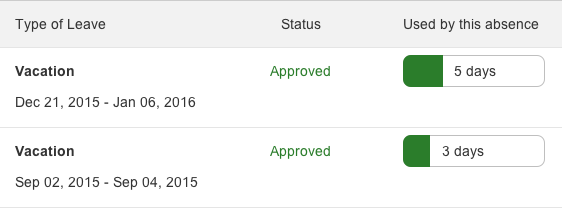
Progress Indicator
sap.m.ProgressIndicator
Intro
The progress indicator visualizes the current advancement of a process or a degree of accomplishment. The inside of the progress indicator is filled with color to indicate the state of progress. The advancement depends on the specific process. The progress is shown either using absolute numbers or the current percentage of completion together with a progress bar.
Within SAP Fiori, the progress indicator is used as a “meter” or mini chart. It indicates a current object status and is not related to any process that is currently running.
Usage
Use the progress indicator if:
- You need to visually show a current (static) status.
- You need to visually strengthen a current (static) status.
- You need to make different states comparable to each other at a higher level.
Do not use the progress indicator if:
- Visual feedback is needed for an ongoing operation. In this case, use a busy indicator instead.
Responsiveness
The progress indicator itself is not responsive. It supports the cozy and compact form factors. The compact form factor is used for apps that run on a device operated by a mouse and keyboard. For more information, see Content Density (Cozy and Compact).

Progress indicator in compact mode

Progress indicator in cozy mode
Layout
Show the current progress as a percentage value between 0% and 100%. Property: percentValue.

Progress indicator displaying 10% progress

Progress indicator displaying 50% progress

Progress indicator displaying 80% progress
Alternatively, you can show the current progress as text in addition to the bar. In this case, the text is shown on the right of the bar if the progress is 50% or less. In all other cases, the progress is shown right-aligned on the bar itself. Property: showValue.
Textual presentation for progress of 50% or less

Textual presentation for progress of more than 50%
Progress indicator without textual representation
You also have the option of showing any application-specific text instead of a percentage. Property: displayValue.

App-specific textual representation of progress
Styles
The progress indicator can be enabled or disabled. Property: enabled.

Disabled progress indicator
The progress indicator can visualize different value states that are represented by various theme-dependent semantic colors. The states are: normal, success, warning, and error. Property: state.
Progress indicator in normal state

Progress indicator in success state

Progress indicator in warning state

Progress indicator in error state
Guidelines
Use the progress indicator to add clarity and weight to an important state that needs to be perceived very quickly.

Progress indicator used for status display
Always provide a label for the progress indicator.
Exception: If the progress indicator is used as a single control inside a cell of a responsive table, the column header text is used as a label.
Progress indicator in a responsive table
Use a group of up to five bars to help users compare different states at a high level. Note that in a group of more than five bars, slight differences are much harder to perceive than a numeric display.
If the user has to compare a group of values, be sure to use the same visual display for all of them (only bars or only numbers).
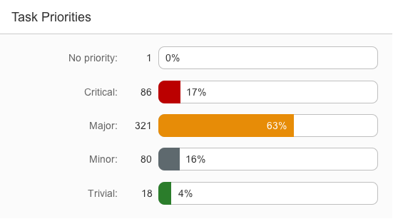
Group of progress indicators
Progress indicators are typically used within (but not restricted to) the following controls:
Properties
The following additional properties are available for the progress indicator:
- The property “width” defines the width of the progress indicator. The property “height” defines the height of the progress indicator. Adapt it only if the default height does not fit into the surrounding context. Do not use a height below 1.5 rems if text is shown inside the progress indicator.
- The property “textDirection” is used for localiaztion (right-to-left languages).
- The property “busy” sets the progress indicator to busy state.
- The property “visible” shows or hides the progress indicator.
- The property “tooltip” does not have an effect.
Resources
Want to dive deeper? Follow the links below to find out more about related controls, the SAPUI5 implementation, and the visual design.
 Your feedback has been sent to the SAP Fiori design team.