
- Latest SAPUI Version 1.124
- SAPUI5 Version 1.122
- SAPUI5 Version 1.120
- SAPUI5 Version 1.118
- SAPUI5 Version 1.116
- SAPUI5 Version 1.114
- SAPUI5 Version 1.112
- SAPUI5 Version 1.110
- SAPUI5 Version 1.108
- SAPUI5 Version 1.106
- SAPUI5 Version 1.104
- SAPUI5 Version 1.102
- SAPUI5 Version 1.100
- SAPUI5 Version 1.98
- SAPUI5 Version 1.96
- SAPUI5 Version 1.94
- SAPUI5 Version 1.92
- SAPUI5 Version 1.90
- SAPUI5 Version 1.88
- SAPUI5 Version 1.86
- SAPUI5 Version 1.84
- SAPUI5 Version 1.82
- SAPUI5 Version 1.80
- SAPUI5 Version 1.78
- SAPUI5 Version 1.76
- SAPUI5 Version 1.74
- SAPUI5 Version 1.72
- SAPUI5 Version 1.70
- SAPUI5 Version 1.68
- SAPUI5 Version 1.66
- SAPUI5 Version 1.64
- SAPUI5 Version 1.62
- SAPUI5 Version 1.60
- SAPUI5 Version 1.58
- SAPUI5 Version 1.56
- SAPUI5 Version 1.54
- SAPUI5 Version 1.52
- SAPUI5 Version 1.50
- SAPUI5 Version 1.48
- SAPUI5 Version 1.46
- SAPUI5 Version 1.42
- SAPUI5 Version 1.40
- SAPUI5 Version 1.38
- SAPUI5 Version 1.36
- SAPUI5 Version 1.34
- SAPUI5 Version 1.32
- SAPUI5 Version 1.30
- SAPUI5 Version 1.28
- SAPUI5 Version 1.26
- Latest SAPUI Version 1.124
- SAPUI5 Version 1.122
- SAPUI5 Version 1.120
- SAPUI5 Version 1.118
- SAPUI5 Version 1.116
- SAPUI5 Version 1.114
- SAPUI5 Version 1.112
- SAPUI5 Version 1.110
- SAPUI5 Version 1.108
- SAPUI5 Version 1.106
- SAPUI5 Version 1.104
- SAPUI5 Version 1.102
- SAPUI5 Version 1.100
- SAPUI5 Version 1.98
- SAPUI5 Version 1.96
- SAPUI5 Version 1.94
- SAPUI5 Version 1.92
- SAPUI5 Version 1.90
- SAPUI5 Version 1.88
- SAPUI5 Version 1.86
- SAPUI5 Version 1.84
- SAPUI5 Version 1.82
- SAPUI5 Version 1.80
- SAPUI5 Version 1.78
- SAPUI5 Version 1.76
- SAPUI5 Version 1.74
- SAPUI5 Version 1.72
- SAPUI5 Version 1.70
- SAPUI5 Version 1.68
- SAPUI5 Version 1.66
- SAPUI5 Version 1.64
- SAPUI5 Version 1.62
- SAPUI5 Version 1.60
- SAPUI5 Version 1.58
- SAPUI5 Version 1.56
- SAPUI5 Version 1.54
- SAPUI5 Version 1.52
- SAPUI5 Version 1.50
- SAPUI5 Version 1.48
- SAPUI5 Version 1.46
- SAPUI5 Version 1.44
- SAPUI5 Version 1.42
- SAPUI5 Version 1.40
- SAPUI5 Version 1.38
- SAPUI5 Version 1.36
- SAPUI5 Version 1.34
- SAPUI5 Version 1.32
- SAPUI5 Version 1.30
- SAPUI5 Version 1.28
- SAPUI5 Version 1.26
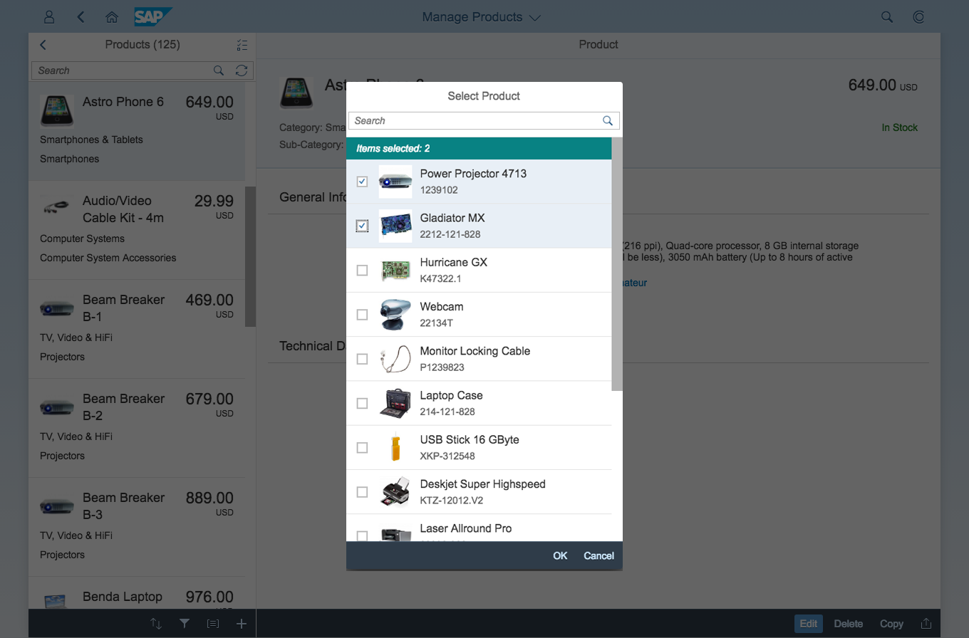
Select Dialog
sap.m.SelectDialog
Intro
The select dialog enables users to select one or more items from a comprehensive list. The select dialog comes with a list of entries and a search field to filter the list.
A more enhanced dialog for single selection and multiselection is the value help dialog as it offers range selection and excluding functions.
Usage
Use the select dialog if:
- Users need to select one or more entries from a comprehensive list that contains multiple attributes or values.
Do not use the select dialog if:
- Users need to pick one item from a predefined set of options that contains one attribute or value only such as languages. In this case, consider using the combo box or select instead.
- Your use case requires more enhanced functionalities such as a selection based on ranges. For the selection of values, consider using the value help dialog instead.
- Your use case requires tabs, filters, or an Add New functionality in the select dialog. In this case, use a standard dialog instead.
Responsiveness
The display of the select control depends on the device. On phones, the selection list takes up the whole screen. On desktop and tablet devices it appears as a popover.
Size S
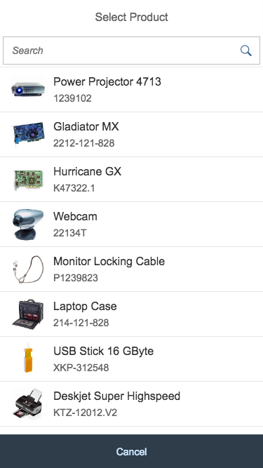
Single select dialog in full screen on smartphone
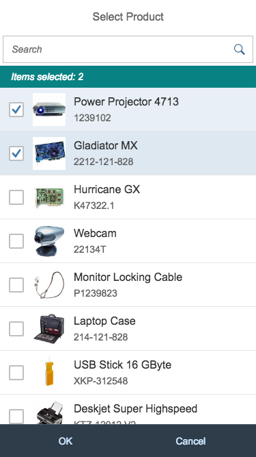
Multi-select dialog in full screen on smartphone
Size M
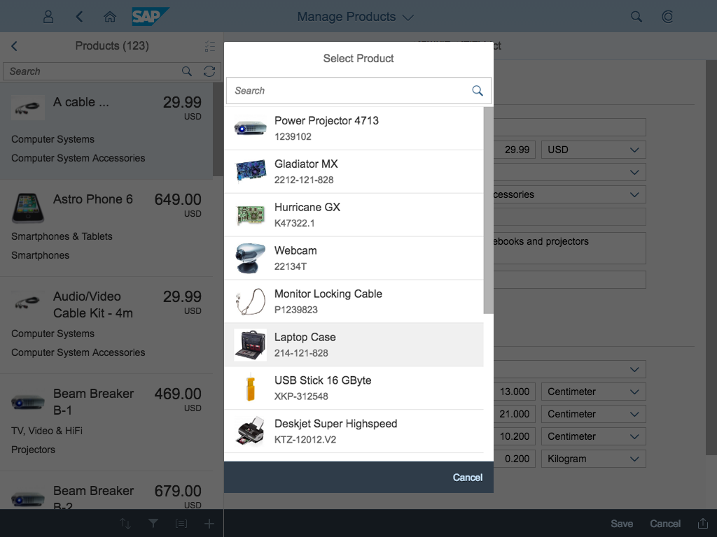
Single select dialog on tablet

Multi-select dialog on tablet
Size L
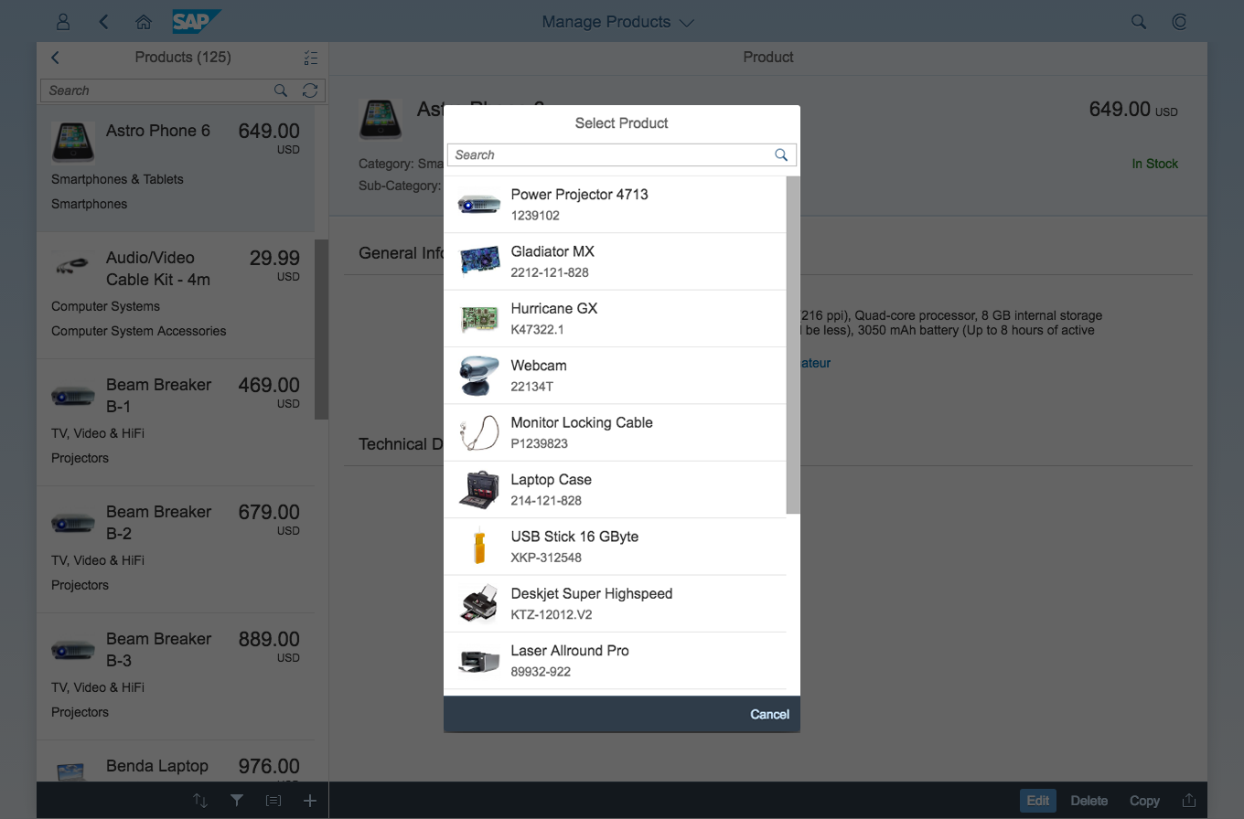
Single select dialog on desktop
Multi-select dialog on desktop
Components
Dialog Header
You need to set the title of the dialog header (1). We recommend the following form:
Single selection
Select <Entity>
Example: Select Product
Multi-selection
Select <Entities>
Example: Select Products
Search
The first element in the dialog is a standard search field (2).
Info Toolbar
The info toolbar (3) is only available in multi-selection mode. It shows the number of selected items in the following form:
Selected <Entities>: <Number>
Example: Selected Products: 2
Content
The content area (4) can be filled with any list content inherited from the list item base, such as standard list items, display list items, and feed list items. You can set the content to be displayed as grouped.
Button Toolbar
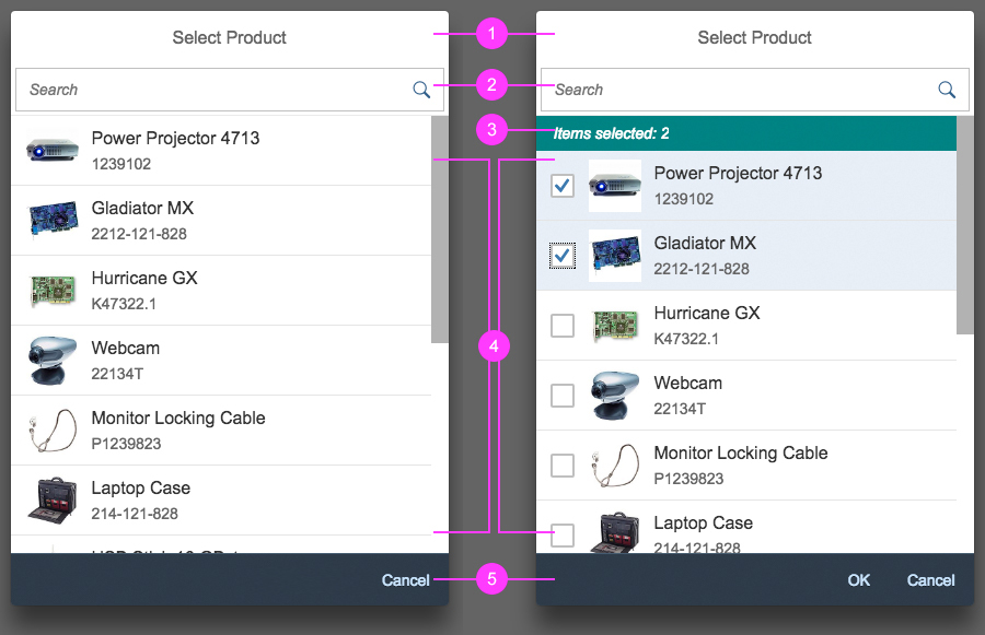
Components of the select dialog. Left: single select, right: multi select
Behavior and Interaction
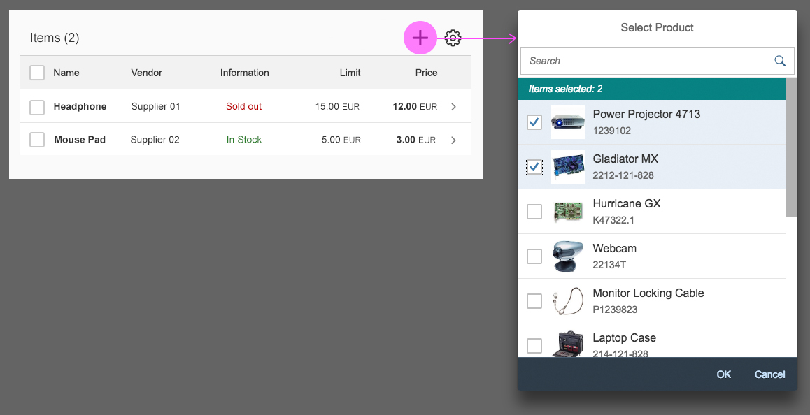
The select dialog can be called up from any control. The most common trigger is an input field with selection icon, also known as a “value help field”, or F4. Alternative triggers are buttons or icons, which add items to an existing list or the info bar in the master list in order to apply a contextual filter.
Single Select
Once users select an entry, the select dialog is closed and the selected entry is taken over. If applicable, the entry is displayed in the field from which the dialog was triggered.
Multi-Select
In the multi-select version of the select dialog, checkboxes are provided for choosing multiple entries. The selection is taken over when the user closes the dialog via OK. Cancel closes the dialog without taking over the selected values. An info bar indicates the number of selected items.
Search
The user can search items.
Guidelines
Search Behavior
Two types of search behavior are available:
(1) A live search, also known as “search-as-you-type” (property: liveChange), which is triggered by each character that the user enters or deletes
(2) A manual search, which is triggered explicitly after the user enters text in the search field and clicks or taps the Search icon or presses the Enter key
Although app developers need to decide themselves which search to use, we recommend implementing the live search whenever possible. Use the manual search only if the amount of data is too large and your app would otherwise run into performance issues. For more information, check out the article on search.
Remember Selections
If your use case requires selections in a dialog to be remembered so that the user can make corrections, you can set the rememberSelections function in the select dialog to ‘true’. When users exit the dialog by clicking or tapping Cancel, the selection is restored to the state it was in when the dialog was opened.
Selection is remembered after the dialog is reopened
Once the dialog is closed, the selection is reset by default. This allows users to make a new selection when they reopen the dialog. This functionality makes sense, for example, when users need to add multiple items to a table.

Selection is reset after the dialog is closed
Resources
Want to dive deeper? Follow the links below to find out more about related controls, the SAPUI5 implementation, and the visual design.
Elements and Controls
- Combo Box (guidelines)
- Select (guidelines)
- Value Help (guidelines)
- Search (guidelines)
Implementation
- No links
 Your feedback has been sent to the SAP Fiori design team.