
- Latest SAPUI Version 1.124
- SAPUI5 Version 1.122
- SAPUI5 Version 1.120
- SAPUI5 Version 1.118
- SAPUI5 Version 1.116
- SAPUI5 Version 1.114
- SAPUI5 Version 1.112
- SAPUI5 Version 1.110
- SAPUI5 Version 1.108
- SAPUI5 Version 1.106
- SAPUI5 Version 1.104
- SAPUI5 Version 1.102
- SAPUI5 Version 1.100
- SAPUI5 Version 1.98
- SAPUI5 Version 1.96
- SAPUI5 Version 1.94
- SAPUI5 Version 1.92
- SAPUI5 Version 1.90
- SAPUI5 Version 1.88
- SAPUI5 Version 1.86
- SAPUI5 Version 1.84
- SAPUI5 Version 1.82
- SAPUI5 Version 1.80
- SAPUI5 Version 1.78
- SAPUI5 Version 1.76
- SAPUI5 Version 1.74
- SAPUI5 Version 1.72
- SAPUI5 Version 1.70
- SAPUI5 Version 1.68
- SAPUI5 Version 1.66
- SAPUI5 Version 1.64
- SAPUI5 Version 1.62
- SAPUI5 Version 1.60
- SAPUI5 Version 1.58
- SAPUI5 Version 1.56
- SAPUI5 Version 1.54
- SAPUI5 Version 1.52
- SAPUI5 Version 1.50
- SAPUI5 Version 1.48
- SAPUI5 Version 1.46
- SAPUI5 Version 1.42
- SAPUI5 Version 1.40
- SAPUI5 Version 1.38
- SAPUI5 Version 1.36
- SAPUI5 Version 1.34
- SAPUI5 Version 1.32
- SAPUI5 Version 1.30
- SAPUI5 Version 1.28
- SAPUI5 Version 1.26
- Latest SAPUI Version 1.124
- SAPUI5 Version 1.122
- SAPUI5 Version 1.120
- SAPUI5 Version 1.118
- SAPUI5 Version 1.116
- SAPUI5 Version 1.114
- SAPUI5 Version 1.112
- SAPUI5 Version 1.110
- SAPUI5 Version 1.108
- SAPUI5 Version 1.106
- SAPUI5 Version 1.104
- SAPUI5 Version 1.102
- SAPUI5 Version 1.100
- SAPUI5 Version 1.98
- SAPUI5 Version 1.96
- SAPUI5 Version 1.94
- SAPUI5 Version 1.92
- SAPUI5 Version 1.90
- SAPUI5 Version 1.88
- SAPUI5 Version 1.86
- SAPUI5 Version 1.84
- SAPUI5 Version 1.82
- SAPUI5 Version 1.80
- SAPUI5 Version 1.78
- SAPUI5 Version 1.76
- SAPUI5 Version 1.74
- SAPUI5 Version 1.72
- SAPUI5 Version 1.70
- SAPUI5 Version 1.68
- SAPUI5 Version 1.66
- SAPUI5 Version 1.64
- SAPUI5 Version 1.62
- SAPUI5 Version 1.60
- SAPUI5 Version 1.58
- SAPUI5 Version 1.56
- SAPUI5 Version 1.54
- SAPUI5 Version 1.52
- SAPUI5 Version 1.50
- SAPUI5 Version 1.48
- SAPUI5 Version 1.46
- SAPUI5 Version 1.44
- SAPUI5 Version 1.42
- SAPUI5 Version 1.40
- SAPUI5 Version 1.38
- SAPUI5 Version 1.36
- SAPUI5 Version 1.34
- SAPUI5 Version 1.32
- SAPUI5 Version 1.30
- SAPUI5 Version 1.28
- SAPUI5 Version 1.26
Overview – Floorplans, SAP Fiori Elements and Frameworks
Intro
SAP Fiori has a simple user interface hierarchy, designed to support users in the best possible way. In general, the SAP Fiori launchpad is the entry point for the user. All the apps available to a user are presented as tiles in the app finder, while the home page shows a personalized view of tiles the user has selected. The shell bar offers an enterprise search and other services, which are available across all apps.
Most app designs are based on one of the two basic page layouts that we call split-screen layout and full screen layout. These basic page layouts can be used with a range of different floorplans.
Floorplan is an umbrella term for the overall SAP Fiori UX concept for floorplans. It covers the different layout types, the structure of the controls used, and how to handle different use cases. Floorplans can be built with SAP Fiori elements, or built from scratch (freestyle apps).
An application contains normally several pages. Every page shows a single floorplan, For example, the user starts by filtering a list in the list report floorplan and from there drills into a detail page showing the object page floorplan.
To get a better idea of the different floorplans, read on below.
Overview of Page Layouts
Dynamic Page Layout
Dynamic page layout
The dynamic page is a new layout control and it is designed in a way to support various floorplans and use cases. The layout is full responsive and will be the successor of the full screen layout with additional functionality to have a coherent and consistent snapping header concept that can be adapted throughout all floorplans.
For more information, see dynamic page layout.
Full Screen Layout
Full screen layout
The full screen layout uses the full width of the screen to display the app content. This layout provides maximum flexibility while maintaining the look and feel of SAP Fiori. The full screen layout is ideal for displaying wide tables with four or more columns, and for showing various types of information on one page. However, it is difficult to ensure that the layout is responsive due to the immense differences between a widescreen desktop and a mobile phone.
The new layout for displaying pages in full screen is the dynamic page layout. The dynamic page layout offers more flexibility and integrates features like the snapping header. It is the successor of the full screen layout. Please, check if you could use the dynamic page layout instead. From wave 1.44 (1702) on the full screen layout will be deprecated.
For more information, see full screen layout.
Split-Screen Layout
The split-screen layout is one of the most widely used and stable layouts in SAP Fiori. Use this layout if the user needs to switch easily between different work items. The master list on the left shows key information for each item, while the content area on the right shows the details and available actions. This layout lets the user work down the list without additional navigation. On a phone (or when the screen becomes too narrow), the master list and the details are split into two separate pages and the user navigates between the two.
For more information, see split-screen layout.
Dynamic Side Content
Dynamic side content layout
The dynamic side content layout is a control that allows additional content – such as a timeline, chat, and additional information – to be displayed in a way that flexibly adapts to different screen sizes. The behavior of the control on smaller screen sizes can be configured by app development following the guidelines.
For more information, see dynamic side content.
Overview of Floorplans
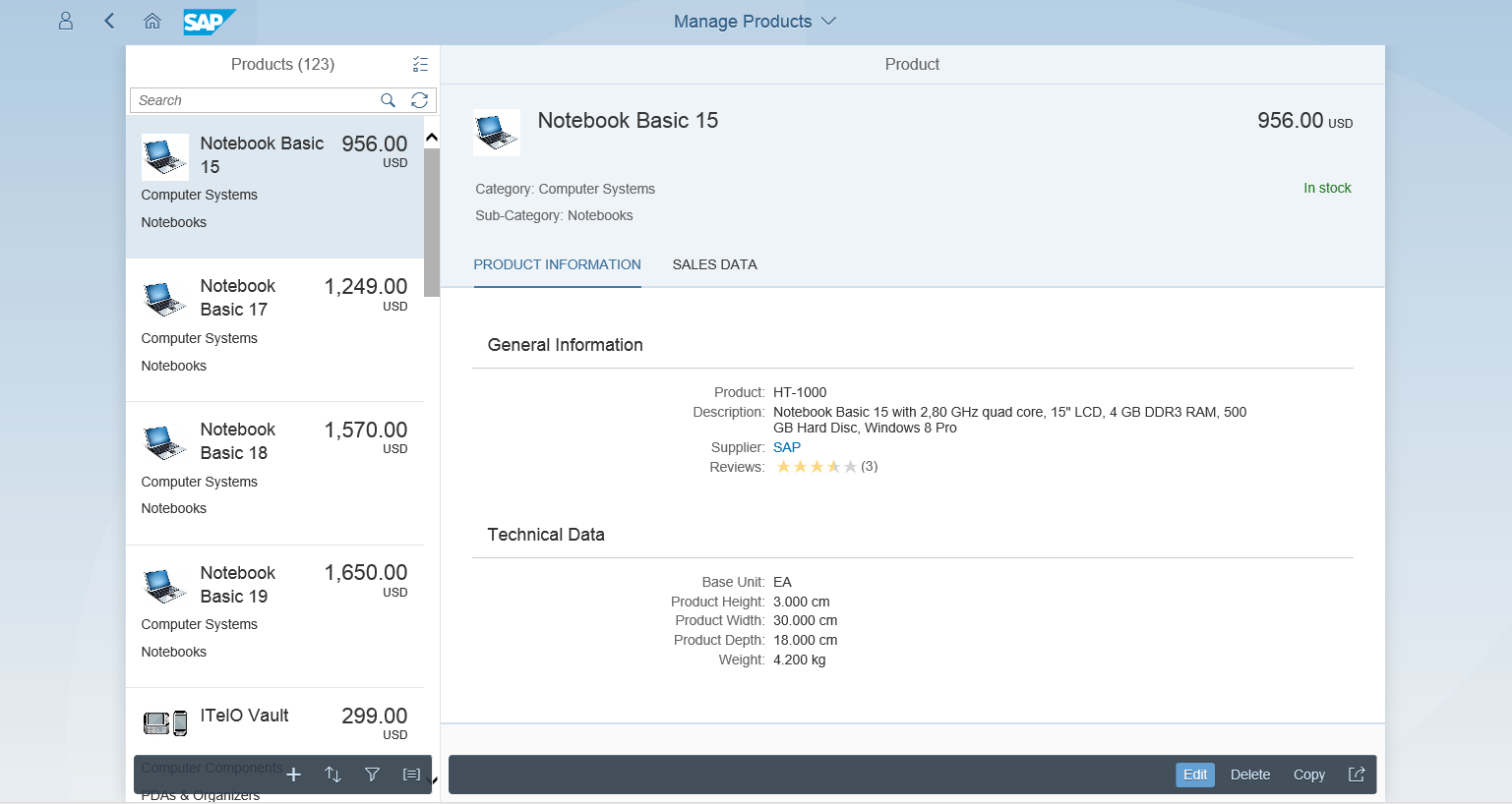
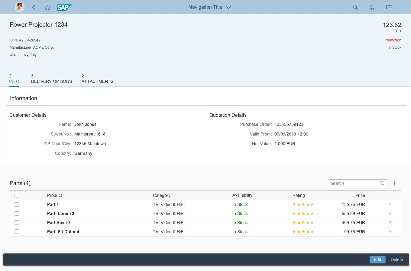
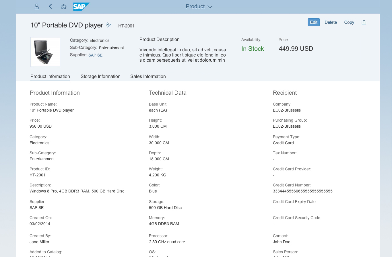
Object Page Floorplan
Object page floorplan
The object page floorplan is the new way to represent objects in SAP Fiori. The object page replaced the flat object view floorplan and the object view floorplan. New features in the object page, such as flexible headers, an alternative anchor, tab navigation, and a flexible responsive layout, enable you to adapt it for a wide range of use cases.
For more information, see object page floorplan.
Initial Page Floorplan
Initial page floorplan
Use the initial page floorplan if the user has to navigate directly to one object to view or edit it. The interaction point on the screen is a single input field that relies on assisted input to direct the user to the object in as few steps as possible (for example, value help and search as you type). If you need to display more than one object, use the list report floorplan instead.
For more information, see initial page floorplan.
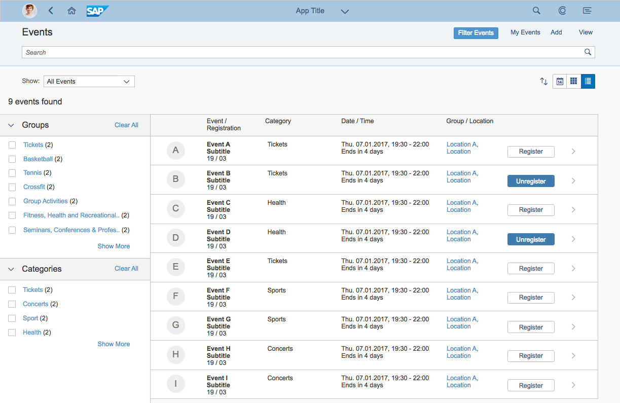
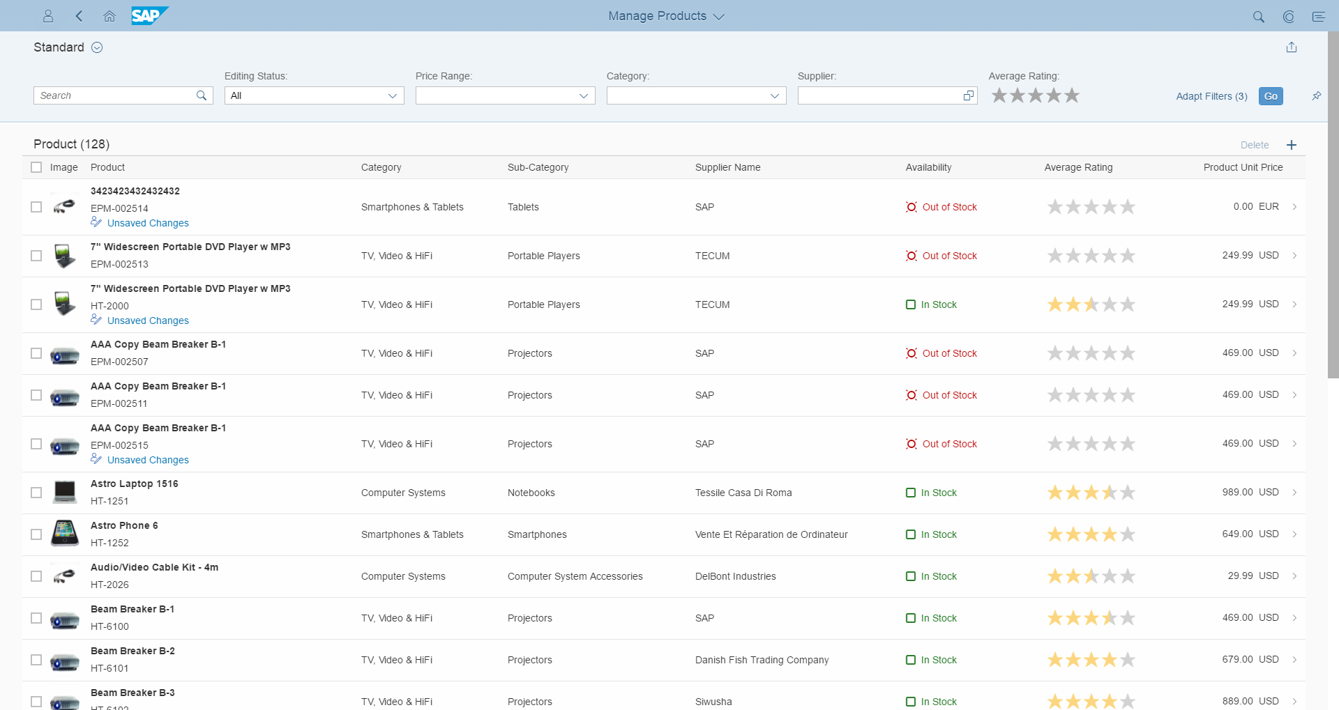
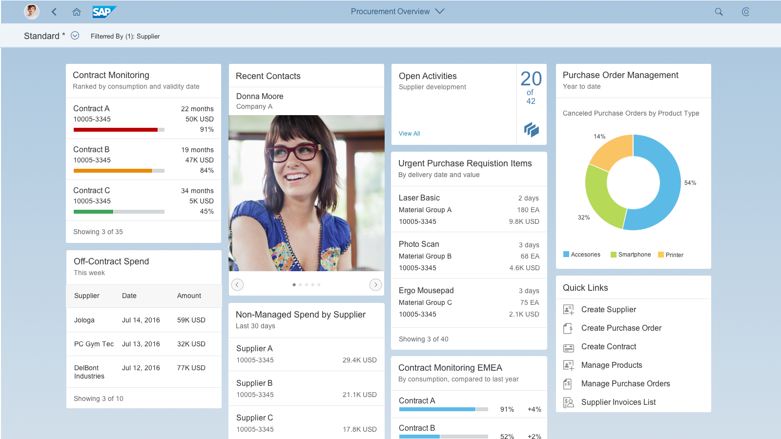
List Report Floorplan
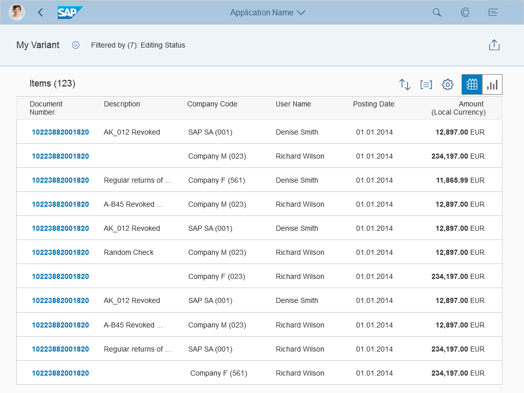
List report floorplan
The list report floorplan allows the user to work with large lists of items and take action. This floorplan combines powerful filtering capabilities for large amounts of data with diverse and useful ways to display the resulting item list. This floorplan can only be used in the full screen layout.
For more information, see list report floorplan.
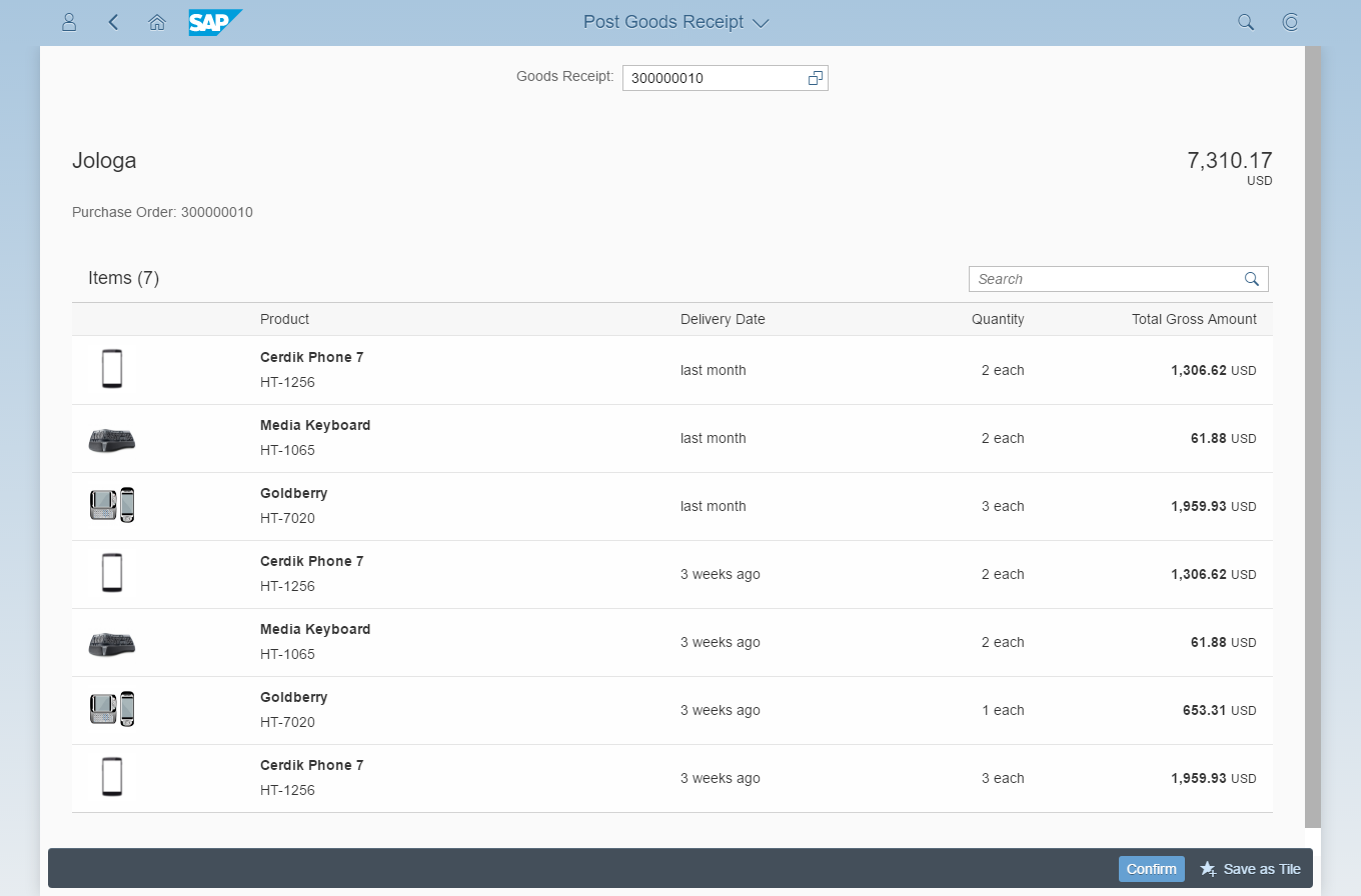
Worklist Floorplan
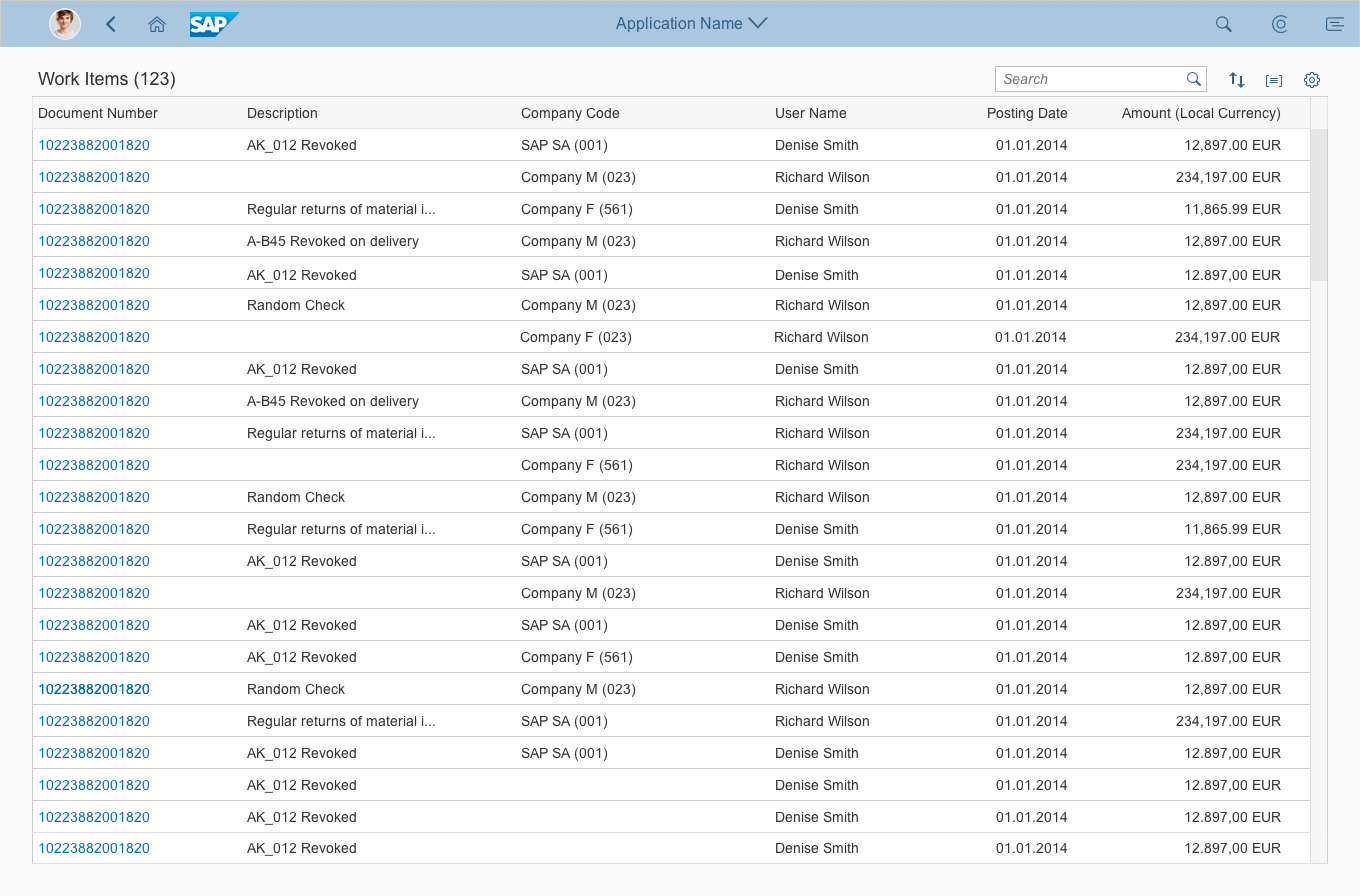
Worklist floorplan
The worklist floorplan displays a collection of items to be processed by the user. Working through the item list usually involves reviewing details of the list items and taking action. In general, the user has to either complete a work item or delegate it.
The focus of the worklist floorplan lies on processing the items. This differs from the list report floorplan, which focuses on filtering content to create a list.
For more information, see worklist floorplan.
Wizard Floorplan
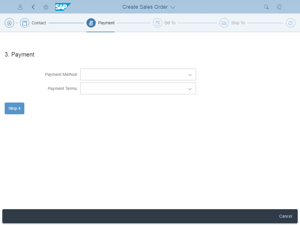
Wizard floorplan
The wizard floorplan guides users through long and/or unfamiliar tasks by dividing the task into sections and guiding the users through the different sections. The wizard comprises a walk-through screen, where the form sections are sequentially revealed as they are completed, and a summary page, where the form is displayed in read-only mode for assessment and final submission. This floorplan can be used in both full screen and split screen layouts.
For more information, see wizard floorplan.
Create Page Floorplan
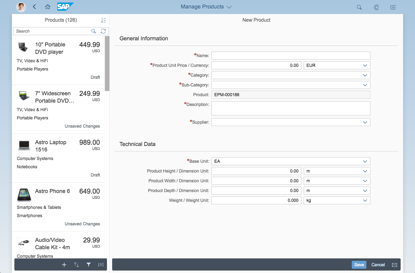
Create page floorplan
The create page floorplan is the simplest way to create new objects. It can either be used as a standalone in a full screen app, or as part of a split-screen layout. The floorplan is a regular form with multiple sections containing forms and tables. Users create the content in place, or by branching off into separate create screens (for example, to add items to a table).
The flow of the form should follow the logic for creating the respective object. For validation, forms use in-place messages that appear directly by the fields.
For more information, see create page floorplan.
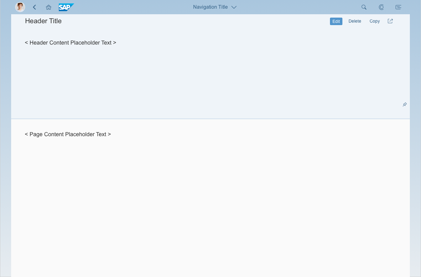
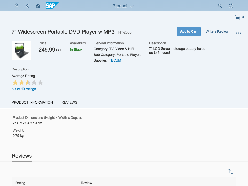
Object View Floorplan
Object view floorplan
The object view floorplan was the original floorplan used to display simple objects in SAP Fiori. It has since been replaced by the more comprehensive object page floorplan.
From guideline version 1.42, the object view floorplan is only allowed in combination with the icon tab bar.
For more information, see object view floorplan.
Overview of SAP Fiori Elements
SAP Fiori elements provide a framework for generating UIs at runtime based on metadata annotations and predefined templates for the most used application patterns. For more information, see the introduction to SAP Fiori elements.
List Report
List report - SAP Fiori element
The SAP Fiori element list report is an instance of the general list report floorplan implemented as a reusable template. Therefore, the guidelines for the list report generally apply. The list report floorplan allows the user to work with large lists of items and take action.
For more information, see list report floorplan (SAP Fiori element).
Object Page
Object page – SAP Fiori element
The object page floorplan is used to view, edit, and create objects. The object page can also be implemented as a SAP Fiori element. For details about the general floorplan and the SAP Fiori element, see the object page guidelines.
Overview Page
Overview page - SAP Fiori element
Based on a specific domain or role, the overview page (OVP) is a new data-driven SAP Fiori app that provides all the information a user needs to view, filter, and react to data in a one-stop-shop page. The OVP employs cards (containers of content) based on smart template technology as a UI framework for organizing large amounts of information on an equal plane within the page.
For more information, see overview page (SAP Fiori element).
Overview of Frameworks
Analysis Path Framework
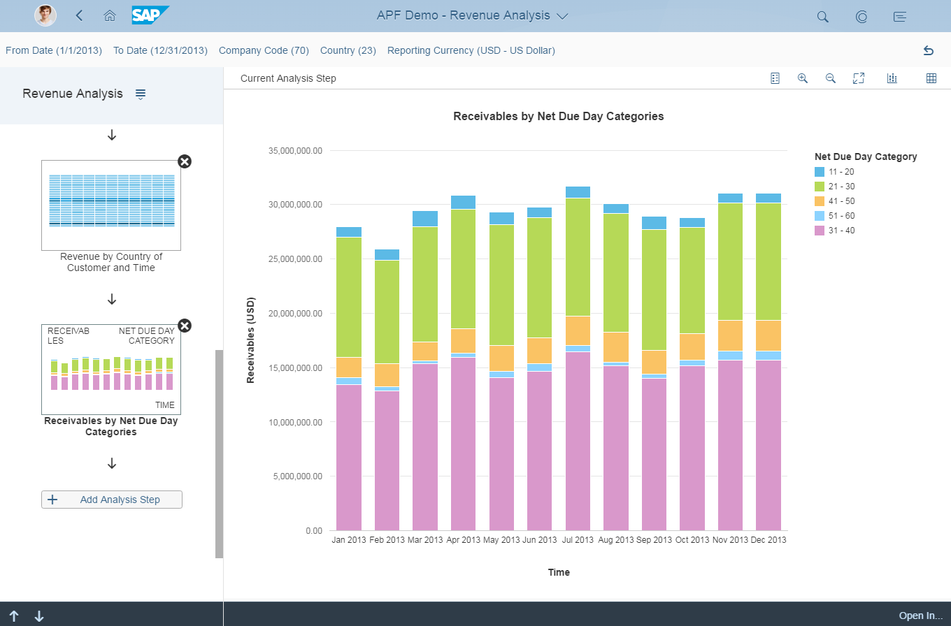
Analysis Path Framework (APF) is a framework for creating interactive, chart-oriented analytical drilldown apps by configuration. APF-based apps enable the user to view and analyze the data of several key performance indicators (KPIs) from different data sources. Users can interactively explore data step by step from different perspectives to analyze and investigate root causes.
For more information, see Analysis Path Framework.
SAP Smart Business Framework
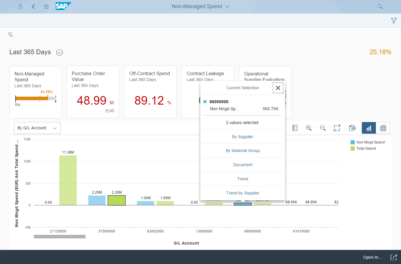
SAP Smart Business drilldown is an analytical app. It enables the user to view and analyze the data of one key performance indicator (KPI).
For more information, see SAP Smart Business Framework.
 Your feedback has been sent to the SAP Fiori design team.