
- Latest SAPUI Version 1.124
- SAPUI5 Version 1.122
- SAPUI5 Version 1.120
- SAPUI5 Version 1.118
- SAPUI5 Version 1.116
- SAPUI5 Version 1.114
- SAPUI5 Version 1.112
- SAPUI5 Version 1.110
- SAPUI5 Version 1.108
- SAPUI5 Version 1.106
- SAPUI5 Version 1.104
- SAPUI5 Version 1.102
- SAPUI5 Version 1.100
- SAPUI5 Version 1.98
- SAPUI5 Version 1.96
- SAPUI5 Version 1.94
- SAPUI5 Version 1.92
- SAPUI5 Version 1.90
- SAPUI5 Version 1.88
- SAPUI5 Version 1.86
- SAPUI5 Version 1.84
- SAPUI5 Version 1.82
- SAPUI5 Version 1.80
- SAPUI5 Version 1.78
- SAPUI5 Version 1.76
- SAPUI5 Version 1.74
- SAPUI5 Version 1.72
- SAPUI5 Version 1.70
- SAPUI5 Version 1.68
- SAPUI5 Version 1.66
- SAPUI5 Version 1.64
- SAPUI5 Version 1.62
- SAPUI5 Version 1.60
- SAPUI5 Version 1.58
- SAPUI5 Version 1.56
- SAPUI5 Version 1.54
- SAPUI5 Version 1.52
- SAPUI5 Version 1.50
- SAPUI5 Version 1.46
- SAPUI5 Version 1.44
- SAPUI5 Version 1.42
- SAPUI5 Version 1.40
- SAPUI5 Version 1.38
- SAPUI5 Version 1.36
- SAPUI5 Version 1.34
- SAPUI5 Version 1.32
- SAPUI5 Version 1.30
- SAPUI5 Version 1.28
- SAPUI5 Version 1.26
- Latest SAPUI Version 1.124
- SAPUI5 Version 1.122
- SAPUI5 Version 1.120
- SAPUI5 Version 1.118
- SAPUI5 Version 1.116
- SAPUI5 Version 1.114
- SAPUI5 Version 1.112
- SAPUI5 Version 1.110
- SAPUI5 Version 1.108
- SAPUI5 Version 1.106
- SAPUI5 Version 1.104
- SAPUI5 Version 1.102
- SAPUI5 Version 1.100
- SAPUI5 Version 1.98
- SAPUI5 Version 1.96
- SAPUI5 Version 1.94
- SAPUI5 Version 1.92
- SAPUI5 Version 1.90
- SAPUI5 Version 1.88
- SAPUI5 Version 1.86
- SAPUI5 Version 1.84
- SAPUI5 Version 1.82
- SAPUI5 Version 1.80
- SAPUI5 Version 1.78
- SAPUI5 Version 1.76
- SAPUI5 Version 1.74
- SAPUI5 Version 1.72
- SAPUI5 Version 1.70
- SAPUI5 Version 1.68
- SAPUI5 Version 1.66
- SAPUI5 Version 1.64
- SAPUI5 Version 1.62
- SAPUI5 Version 1.60
- SAPUI5 Version 1.58
- SAPUI5 Version 1.56
- SAPUI5 Version 1.54
- SAPUI5 Version 1.52
- SAPUI5 Version 1.50
- SAPUI5 Version 1.48
- SAPUI5 Version 1.46
- SAPUI5 Version 1.44
- SAPUI5 Version 1.42
- SAPUI5 Version 1.40
- SAPUI5 Version 1.38
- SAPUI5 Version 1.36
- SAPUI5 Version 1.34
- SAPUI5 Version 1.32
- SAPUI5 Version 1.30
- SAPUI5 Version 1.28
- SAPUI5 Version 1.26
Chart – Variation through Time
Intro
This article illustrates the different ways you can visualize changes of measures through time. The exact type of chart depends on the type of change you want to visualize and the number of time periods.
Time Category and Time Axis
By convention, time is represented horizontally from left to right which means it’s best to use the horizontal axis to represent the time in chart visualizations. We recommend using the time axis which has three main advantages:
- It allows you to display dates and times in a responsive manner.
- All the complexity involved with formatting the axis labels is automatically taken care of.
- The physical spacing between the data points accurately respects the time scale, as opposed to just displaying them equidistantly.
Additional Categories
In addition to the time category, there are additional categories that contain an intrinsic order and that that carry the notion of progression or trend.
For example, age, time period, or a rating.
As such, the rest of this article also applies to these categories.
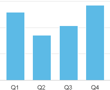
Column or Line Chart?
- Use a line chart if you want to emphasize the trend through time.
- Use a column chart if you want to emphasize the values themselves.
In the figure below, you can see that the trend of the values immediately stands out in the line chart, while we need to make an effort to visualize the trend of the values in the column chart. At the same time, the values can be compared more easily in the column chart.
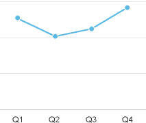
Emphasize on trend
Emphasize on values
One Set of Values
Illustrating the Trend
As previously stated, the line chart is the best way to illustrate a trend through time.
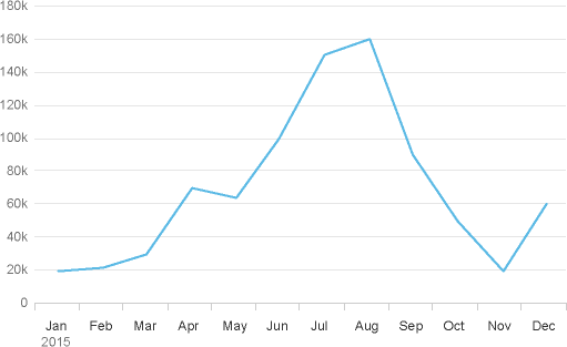
Trend through time with a moving average
Sometimes it’s difficult to see the global trend when the values vary a lot. In these circumstances you can display a moving average in the same chart as illustrated below. You can see the three month moving average of the total demand of ice cream displayed as a black line. Please note that you should avoid using a straight line to represent the global trend because the inclination depends too much on the start date and end date and is therefore misleading.
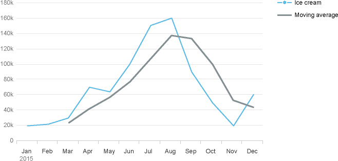
Trend through time with a moving average
Variation
If you want to display how closely clustered or spread out a set of data is through time, use a line chart as illustrated below. However, as you can see the values fall within a range of 250M to 350M and the vertical axis begins at zero. This results in a small magnitude (which is not good for appreciating the variation) and a lot of wasted space below the blue value line.
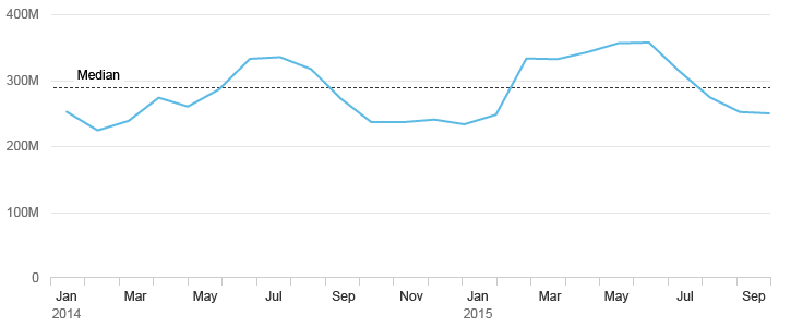
Variability through time
Now look at the chart below where we have altered the scale on the vertical axis (effectively zooming in on it), thereby increasing the magnitude of the line to emphasize the variation. Also note how we’ve started the vertical axis at 200M instead of zero to eliminate the wasted space. You can see how these improvements emphasize the variability and use the available space more effectively.
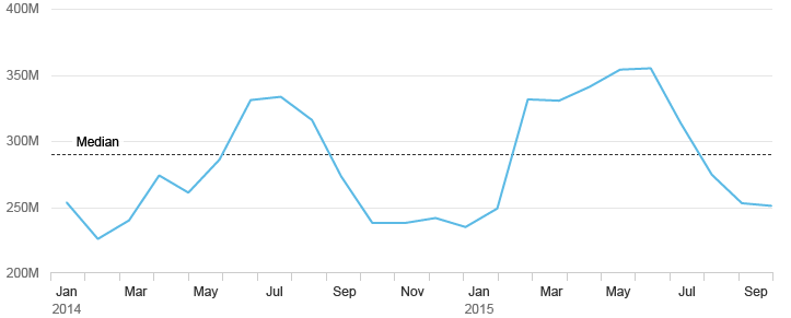
Variability through time with non 0 scale
Multiple Sets of Values
Illustrating Trends with Multiple Measures
You can display multiple lines in order to compare the trend of multiple values as illustrated in the chart below.
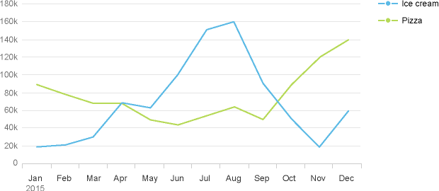
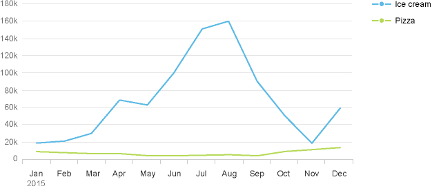
However, you can see that the measures do not have a similar magnitude in the chart below on the left. Not only is it hard to see the trend for the smallest measure (pizza), it is also difficult to compare both trends. Now look at the chart below to the right where we’ve transformed the actual sales figures into percentage figures. You will notice that it’s easier to recognize the trend for pizza, and it’s now much easier to compare trends.
Trend of two measures with vastly different orders of magnitude
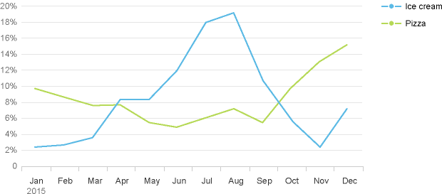
Trend of the same two measures now expressed in percentage
Illustrating Trends with Different Units
If you want to compare the trend of measures that have different units, it’s best to avoid using a line chart with a dual axis because they confuse the interpretation of the variation of values. It’s better use two separate line values which share the same horizontal axis as illustrated below.
Trend of two measures with different units
If you cannot display two separate values that share the same horizontal axis as illustrated above, but you have no option other than to display two measures in the same chart, we recommend using a combined column and line chart with a dual axis. In the chart below, the trend for Sales (in units) and the Cost (in USD) are clearly isolated from each other.
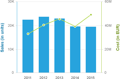
Trend of two measures with different units-combined column and line
Example of What Not To Do
You may be tempted to place two lines in the same chart to show two measures which have different units. However, you can see how confusing this would be in the chart below – the lines overlap, but that has absolutely no meaning and is very misleading.
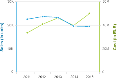
Do not display two measures with different units in the same chart
Combining Trends: Actual, Plan, Budget and Target
This section describes how to visualize the trend of values while comparing them with reference values such as plan, budget or target. The bullet chart below displays actual and target values for four years.
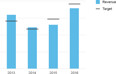
Trend of actual values
If you want to mix actual values with values that represent a projection in the future like a forecast or estimation, you can use a hatch pattern as represented below. For more information, see semantic patterns.
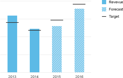
Trend of actual and forecast values
Note that in the bullet chart above, the most prominent element is the vertical bar, which represents the actual value or forecast value. This works well if you want to emphasize the actual or forecast. However, if the trend of the target is an important thing to visualize and there are many time periods, it makes more sense to display two lines to represent the trend of the two measures. In the example below, the black dotted line represents the evolution of the target through time.
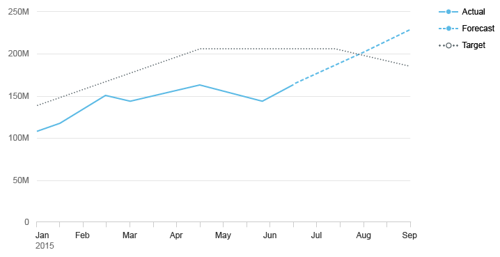
Trend of actual and plan values
Trend of Deviation
If you want to show how the deviation between two measures evolves through the time, please refer to the deviation article (see: time deviation).
Multiple Rates of Change
If you want to compare the rate of change of two measures over time, you can use percentages to express the rate of change and start from the initial date of the series. The chart below represents the rate of change of ice cream and the rate of change of pizza displayed in percentage from the original date.
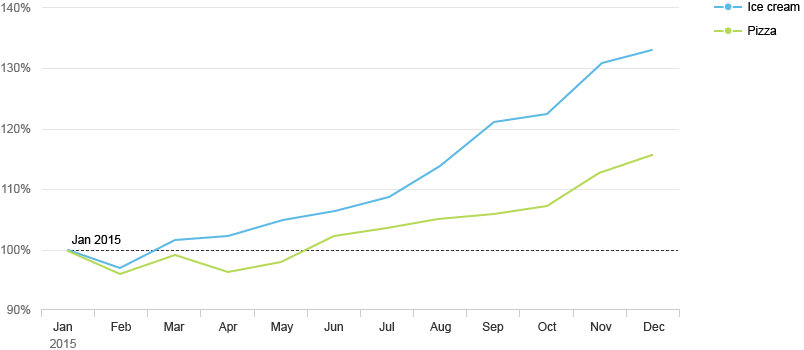
Rate of change expressed in %
Sum of Values
This section shows you how to visualize the variation through time of a sum of values. One solution would be to use a stacked column chart with each measure is stacked on top of each other.
The chart below is used in Sentiment Analysis, which enables product managers to view sentiment information for multiple products by analyzing the number of mentions in social media broken down by how positive, neutral and negative they were. You can see how the sum of the positive, negative and neutral mentions provides a good indication of the “buzz” around each product, independently of how good or bad it was.
However, this approach does not make it easy to compare multiple values within a series. You can see how hard it is to see whether the negative mentions have increased or decreased.
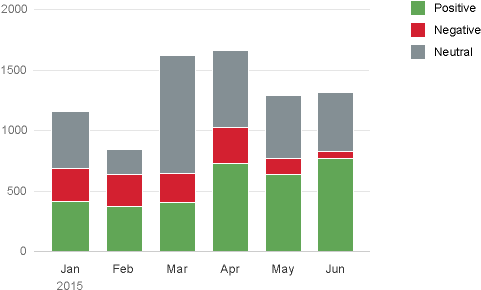
Sum of values through time
You can make it easier to compare multiple values within a series by using two line charts stacked on top of each other as illustrated below. The first line chart represents the total number of mentions and the second chart displays one line per type of mention. Now we can see better that the number of negative mentions has decreased.
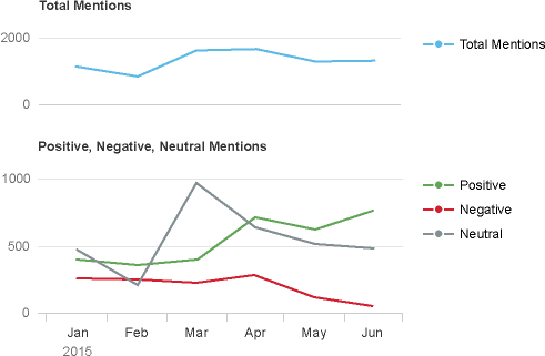
Sum of values through time - trend of each values
Part to Whole
Check out the part to whole article (see section: through time).
Resources
Want to dive deeper? Follow the links below to find out more about related controls, the SAPUI5 implementation, and the visual design.
Elements and Controls
- Chart (guidelines)
- Time Axis (guidelines)
- Chart – Semantic Patterns (guidelines)
Implementation
- No links.
 Your feedback has been sent to the SAP Fiori design team.