
- Latest SAPUI Version 1.124
- SAPUI5 Version 1.122
- SAPUI5 Version 1.120
- SAPUI5 Version 1.118
- SAPUI5 Version 1.116
- SAPUI5 Version 1.114
- SAPUI5 Version 1.112
- SAPUI5 Version 1.110
- SAPUI5 Version 1.108
- SAPUI5 Version 1.106
- SAPUI5 Version 1.104
- SAPUI5 Version 1.102
- SAPUI5 Version 1.100
- SAPUI5 Version 1.98
- SAPUI5 Version 1.96
- SAPUI5 Version 1.94
- SAPUI5 Version 1.92
- SAPUI5 Version 1.90
- SAPUI5 Version 1.88
- SAPUI5 Version 1.86
- SAPUI5 Version 1.84
- SAPUI5 Version 1.82
- SAPUI5 Version 1.80
- SAPUI5 Version 1.78
- SAPUI5 Version 1.76
- SAPUI5 Version 1.74
- SAPUI5 Version 1.72
- SAPUI5 Version 1.70
- SAPUI5 Version 1.68
- SAPUI5 Version 1.66
- SAPUI5 Version 1.64
- SAPUI5 Version 1.62
- SAPUI5 Version 1.60
- SAPUI5 Version 1.58
- SAPUI5 Version 1.56
- SAPUI5 Version 1.54
- SAPUI5 Version 1.52
- SAPUI5 Version 1.50
- SAPUI5 Version 1.46
- SAPUI5 Version 1.44
- SAPUI5 Version 1.42
- SAPUI5 Version 1.40
- SAPUI5 Version 1.38
- SAPUI5 Version 1.36
- SAPUI5 Version 1.34
- SAPUI5 Version 1.32
- SAPUI5 Version 1.30
- SAPUI5 Version 1.28
- SAPUI5 Version 1.26
- Latest SAPUI Version 1.124
- SAPUI5 Version 1.122
- SAPUI5 Version 1.120
- SAPUI5 Version 1.118
- SAPUI5 Version 1.116
- SAPUI5 Version 1.114
- SAPUI5 Version 1.112
- SAPUI5 Version 1.110
- SAPUI5 Version 1.108
- SAPUI5 Version 1.106
- SAPUI5 Version 1.104
- SAPUI5 Version 1.102
- SAPUI5 Version 1.100
- SAPUI5 Version 1.98
- SAPUI5 Version 1.96
- SAPUI5 Version 1.94
- SAPUI5 Version 1.92
- SAPUI5 Version 1.90
- SAPUI5 Version 1.88
- SAPUI5 Version 1.86
- SAPUI5 Version 1.84
- SAPUI5 Version 1.82
- SAPUI5 Version 1.80
- SAPUI5 Version 1.78
- SAPUI5 Version 1.76
- SAPUI5 Version 1.74
- SAPUI5 Version 1.72
- SAPUI5 Version 1.70
- SAPUI5 Version 1.68
- SAPUI5 Version 1.66
- SAPUI5 Version 1.64
- SAPUI5 Version 1.62
- SAPUI5 Version 1.60
- SAPUI5 Version 1.58
- SAPUI5 Version 1.56
- SAPUI5 Version 1.54
- SAPUI5 Version 1.52
- SAPUI5 Version 1.50
- SAPUI5 Version 1.48
- SAPUI5 Version 1.46
- SAPUI5 Version 1.44
- SAPUI5 Version 1.42
- SAPUI5 Version 1.40
- SAPUI5 Version 1.38
- SAPUI5 Version 1.36
- SAPUI5 Version 1.34
- SAPUI5 Version 1.32
- SAPUI5 Version 1.30
- SAPUI5 Version 1.28
- SAPUI5 Version 1.26
Stacked Bar Micro Chart
sap.suite.ui.microchart.StackedBarMicroChart
Intro
The stacked bar micro chart is designed to be embedded into a list, table, or object page header as a way to represent related values atop one another in order to visualize the singular values as part of a whole. These values can be displayed in two different ways:
-
Percentage compared to 100%
Use „% values“ if your goal is to see the composition in percentage of each value of the whole. By doing so, the sum of the bars will always be 100%.
%-Values (without labels)
Absolute values (without labels)
Please note: The stacked bar micro chart does not support negative values.
Usage
The stacked bar micro chart can be used in the following ways.
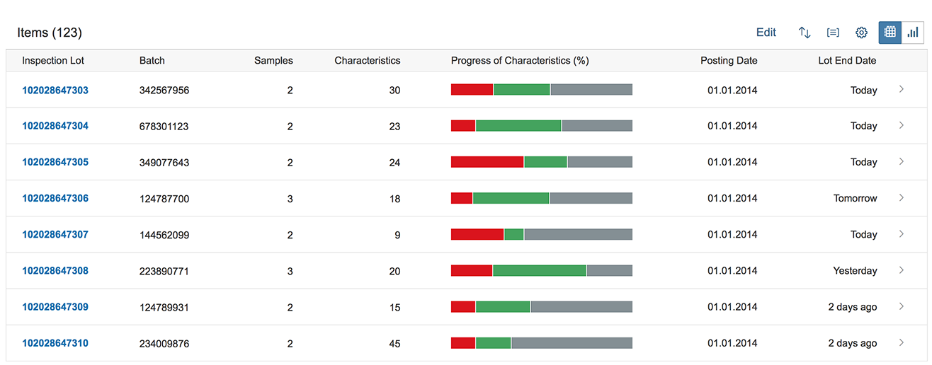
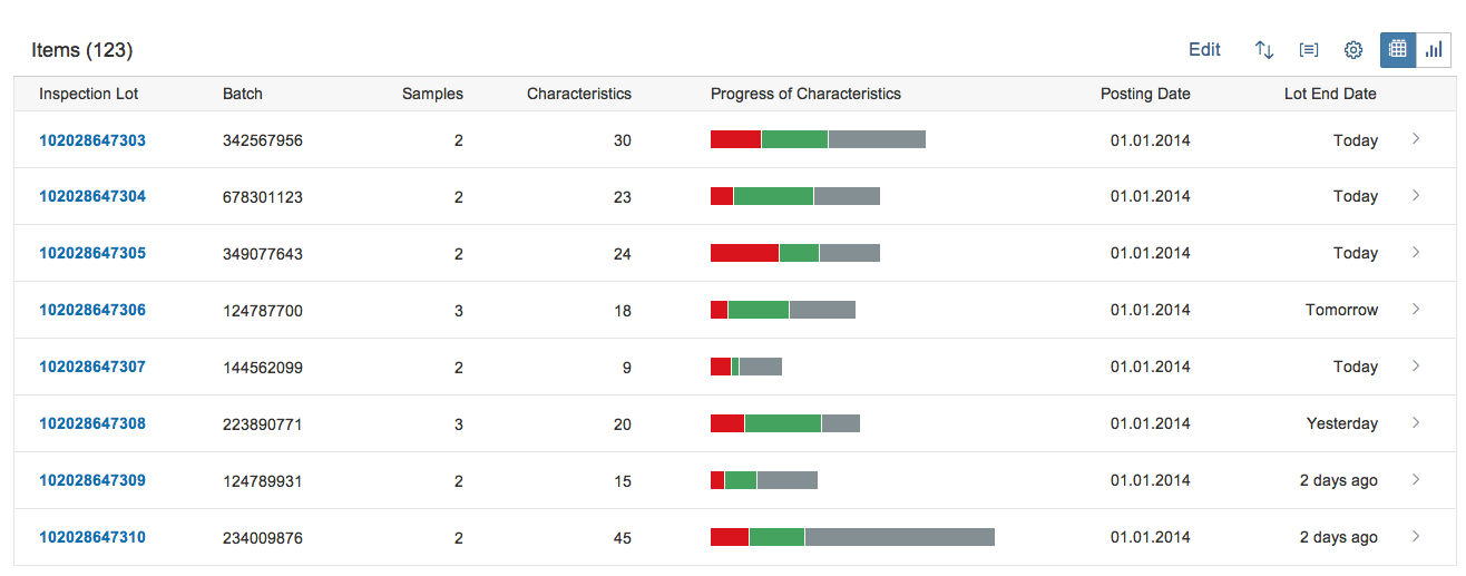
List or Table
The micro stacked chart can be embedded in a table with all the functionalities and options mentioned above.
Chart in table: %-values (without labels)
Chart in table: absolute values (without labels)
Header
The micro stacked chart can be embedded in an object page header with all the functionalities and options mentioned above.
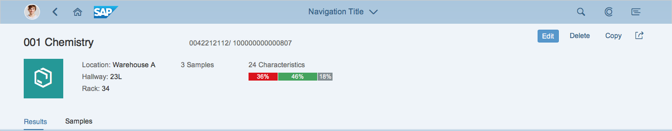
Chart in Header: %-values (with labels)
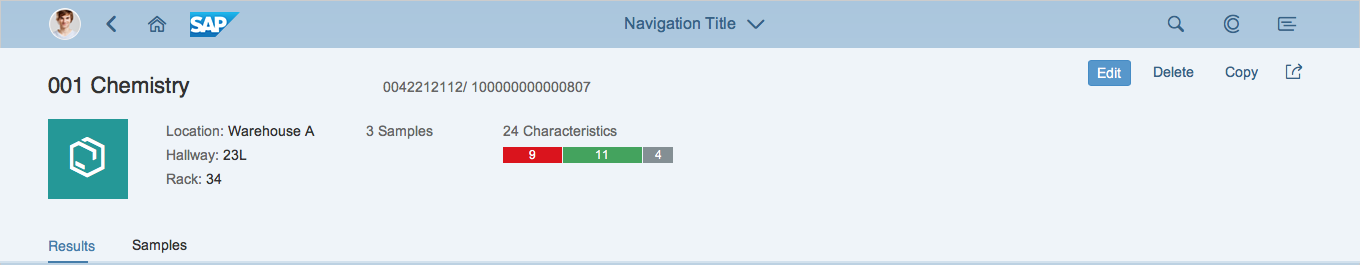
Chart in Header: absolute values (with labels)
Please consider using a Harvey Ball micro chart as alternative visualization to show a part to whole representation.
Tile
The micro stacked chart is not designed to be embedded into an SAP Fiori tile and is therefore not supported. Please consider to use a Harvey Ball micro chart as alternative visualization to show a part to whole representation.
Responsiveness
See the micro chart overview article.
Components
Maximum Value
The chart is scaled relative to the maximum value. This means if a maximum value (maxValue) is set, then the width of the stacked chart represents the maximum value and each value within the chart is scaled relative to this maximum.
If the maximum value is not set, then the width of the chart represents 100% and each value is displayed as a relative percentage.
Precision
By setting a specific value for the precision, an application developer can influence rounding calculations by defining how many digits are displayed. By default this value is 1.
Display Value
Besides the displayed default %-values of the bars, an application developer can set a specific display value to enable the display of absolute values. If the intention is to show bars only, please put a a blank space here.
Color
An application developer can set any color for the chart either by using names of semantic colors ( for example, “red” for negative values or “green” for positive values) or by using names from the qualitative palette (sapUiChartPaletteQualitativeHue1…11).
Please note: A legend is currently not available for the stacked bar micro chart and since the use of multiple colors is not self-explanatory, we highly recommend using semantic colors and explanatory title related to the chart.
Resources
Want to dive deeper? Follow the links below to find out more about related controls, the SAPUI5 implementation, and the visual design.
 Your feedback has been sent to the SAP Fiori design team.