
- Latest Version 1.128
- Version 1.126
- SAPUI Version 1.124
- SAPUI5 Version 1.122
- SAPUI5 Version 1.120
- SAPUI5 Version 1.118
- SAPUI5 Version 1.116
- SAPUI5 Version 1.114
- SAPUI5 Version 1.112
- SAPUI5 Version 1.110
- SAPUI5 Version 1.108
- SAPUI5 Version 1.106
- SAPUI5 Version 1.104
- SAPUI5 Version 1.102
- SAPUI5 Version 1.100
- SAPUI5 Version 1.98
- SAPUI5 Version 1.96
- SAPUI5 Version 1.94
- SAPUI5 Version 1.92
- SAPUI5 Version 1.90
- SAPUI5 Version 1.88
- SAPUI5 Version 1.86
- SAPUI5 Version 1.84
- SAPUI5 Version 1.82
- SAPUI5 Version 1.80
- SAPUI5 Version 1.78
- SAPUI5 Version 1.76
- SAPUI5 Version 1.74
- SAPUI5 Version 1.72
- SAPUI5 Version 1.70
- SAPUI5 Version 1.68
- SAPUI5 Version 1.66
- SAPUI5 Version 1.64
- SAPUI5 Version 1.62
- SAPUI5 Version 1.60
- SAPUI5 Version 1.58
- SAPUI5 Version 1.56
- SAPUI5 Version 1.54
- SAPUI5 Version 1.52
- SAPUI5 Version 1.48
- SAPUI5 Version 1.46
- SAPUI5 Version 1.44
- SAPUI5 Version 1.42
- SAPUI5 Version 1.40
- SAPUI5 Version 1.38
- SAPUI5 Version 1.36
- SAPUI5 Version 1.34
- SAPUI5 Version 1.32
- SAPUI5 Version 1.30
- SAPUI5 Version 1.28
- SAPUI5 Version 1.26
- Latest Version 1.128
- Version 1.126
- SAPUI Version 1.124
- SAPUI5 Version 1.122
- SAPUI5 Version 1.120
- SAPUI5 Version 1.118
- SAPUI5 Version 1.116
- SAPUI5 Version 1.114
- SAPUI5 Version 1.112
- SAPUI5 Version 1.110
- SAPUI5 Version 1.108
- SAPUI5 Version 1.106
- SAPUI5 Version 1.104
- SAPUI5 Version 1.102
- SAPUI5 Version 1.100
- SAPUI5 Version 1.98
- SAPUI5 Version 1.96
- SAPUI5 Version 1.94
- SAPUI5 Version 1.92
- SAPUI5 Version 1.90
- SAPUI5 Version 1.88
- SAPUI5 Version 1.86
- SAPUI5 Version 1.84
- SAPUI5 Version 1.82
- SAPUI5 Version 1.80
- SAPUI5 Version 1.78
- SAPUI5 Version 1.76
- SAPUI5 Version 1.74
- SAPUI5 Version 1.72
- SAPUI5 Version 1.70
- SAPUI5 Version 1.68
- SAPUI5 Version 1.66
- SAPUI5 Version 1.64
- SAPUI5 Version 1.62
- SAPUI5 Version 1.60
- SAPUI5 Version 1.58
- SAPUI5 Version 1.56
- SAPUI5 Version 1.54
- SAPUI5 Version 1.52
- SAPUI5 Version 1.50
- SAPUI5 Version 1.48
- SAPUI5 Version 1.46
- SAPUI5 Version 1.44
- SAPUI5 Version 1.42
- SAPUI5 Version 1.40
- SAPUI5 Version 1.38
- SAPUI5 Version 1.36
- SAPUI5 Version 1.34
- SAPUI5 Version 1.32
- SAPUI5 Version 1.30
- SAPUI5 Version 1.28
- SAPUI5 Version 1.26
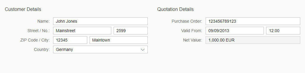
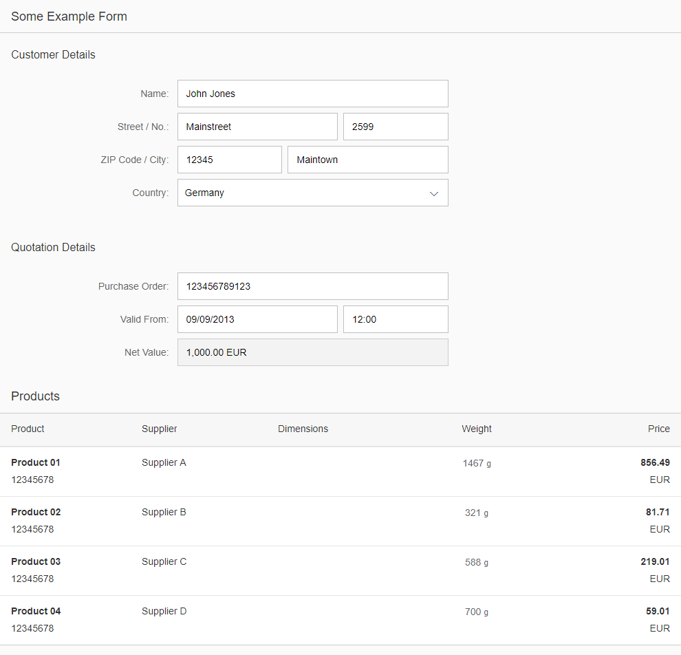
Form / Simple Form / Smart Form
sap.ui.layout.form.Form | sap.ui.layout.form.SimpleForm | sap.ui.comp.smartform.SmartForm (smart form since version 1.36)
Intro
A form is used to present data to the user and to allow users to enter data in a structured way.
The form acts as a container for other UI elements (such as labels, input fields, checkboxes, and sliders), while structuring these into a specific layout.
In SAPUI5, forms can be built using three different controls:
- Form – sap.ui.layout.form.Form (API)
- Simple form – sap.ui.layout.form.SimpleForm (API)
- Smart form – sap.ui.comp.smartform.SmartForm (API)
With a form, you can easily layout a list of properties and input fields. A form is structured into form containers. Each form container consists of form elements. And each form element consists of a label and an input field.
The simple form control gives you the possibility to achieve the same result as with the form control, but in a much easier way. Inside a simple form, a form control is created along with its form containers and form elements:
- The layout and structure are defined by the content that is entered.
- Form containers and form elements are created automatically according to the content type.
- A title (sap.ui.core.Title (API)) automatically starts a new form group (form container), and a label (sap.m.Label (API)) automatically starts a new row (form element).
- All other controls following this label will be assigned to its row (form element).
The smart form control belongs to the new set of smart controls. Smart controls give developers the possibility to build UIs without the need to build a complex UI code (the term “smart” refers to the annotations that add semantics and structures to the provided data). The goals are to ensure design consistency, keep apps up to date with evolving design guidelines, and reduce the amount of front-end code for building SAP Fiori apps. Compared to the corresponding standard controls, however, the settings may be limited.
Types
There are three types of forms:
- Display-only: the data is presented only as label-value field pairs without editable fields.
- Editable: the data is presented as label-input field pairs, so users can enter data.
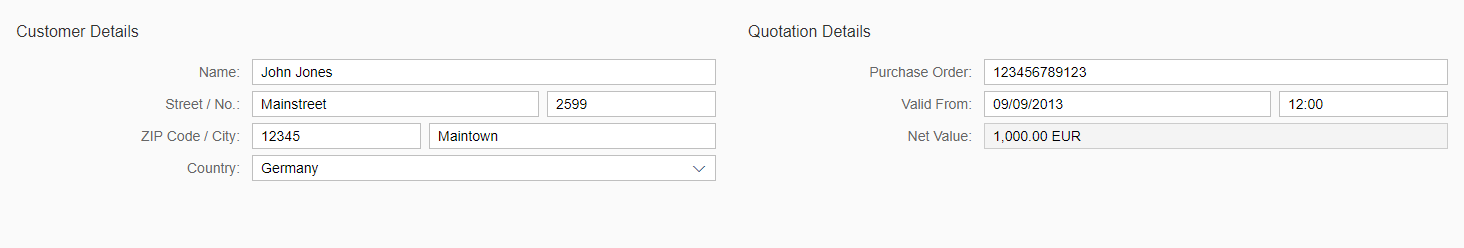
- Mixed: some fields are editable and some are not.
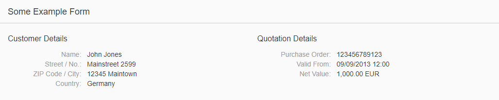
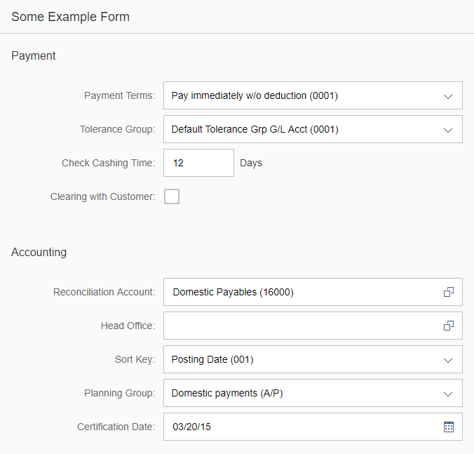
Form control in display only
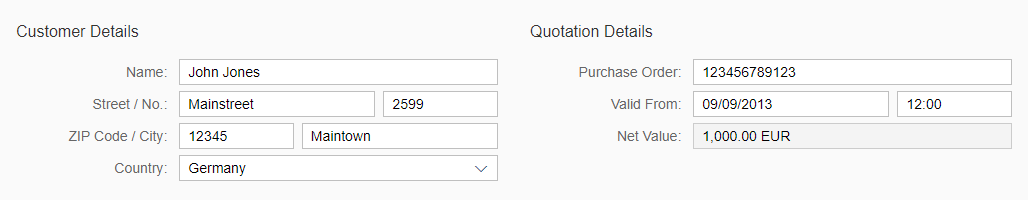
Mixed form with editable and non-editable fields
Responsiveness
Always assign the responsive grid layout (sap.ui.layout.form.ResponsiveGridLayout) for your form. Although there is a specific set of form layout controls available for forms, simple forms, and smart forms, these should not be used as they are only available to enable downward compatibility.
Note: For downward compatibility reasons, the default form layout control for the form and simple form is not the responsive grid layout. Therefore, you need to assign the responsive grid layout manually to each form or simple form by using the layout property.
By using the responsive grid layout, the form offers a responsive layout based on a 12-column grid. There are two breakpoints, which result in three supported sizes: L, M, and S. These breakpoints are not the L, M, and S breakpoints of the page. In contrast to the page’s breakpoints, which react to the screen width, the breakpoints of the responsive grid layout react to the width of the form.
Breakpoints
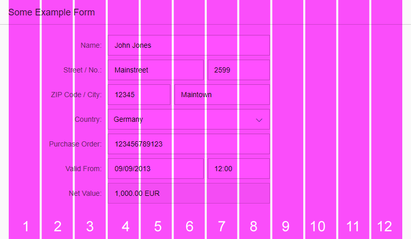
Size S reaches up to 600 px. This means that as soon as the width of the form reaches 601 px, it changes from S to M, because the default value of breakpointM is 600. The value of breakpointM is the first value of the smaller size.
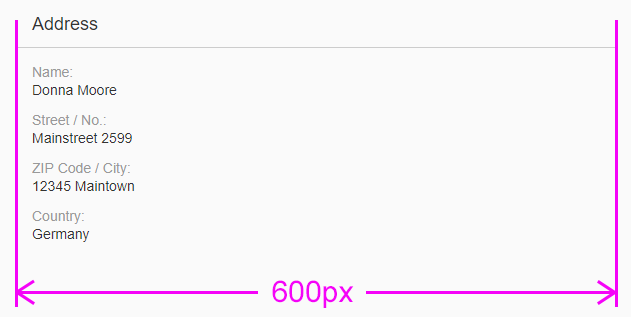
Form with breakpointM – Size S
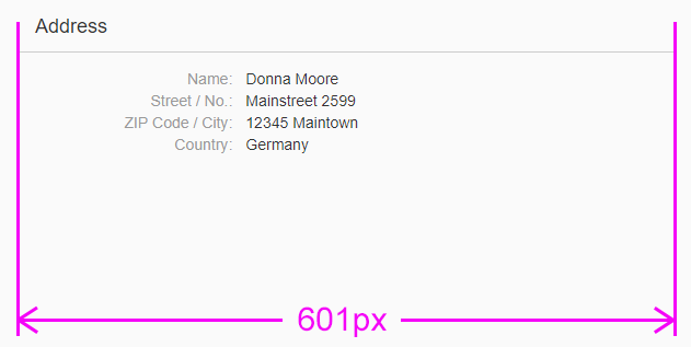
Form with breakpointM – Size M
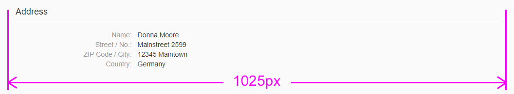
The property breakpointL between sizes L and M works in the same way: Size M reaches from 601 px to 1024 px. This means that as soon as the width of the form reaches 1025 px, it changes from M to L, because the default value of breakpointL is 1024.

Form with breakpointL – Size M
Form with breakpointL – Size L
Also the property breakpointXL between sizes L and XL works in the same way as before: Size L reaches from 1025 px to 1440 px. This means that as soon as the width of the form reaches 1441 px, it changes from L to XL, because the default value of breakpointXL is 1440.
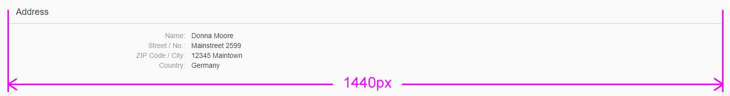
Form with breakpointXL – Size L
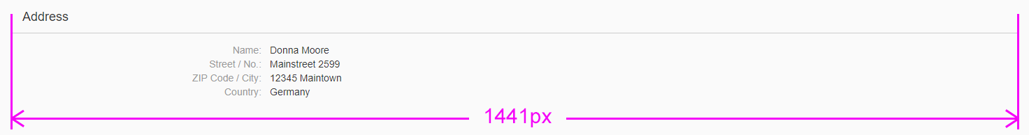
Form with breakpointXL – Size XL
In general if the page width changes to a smaller size, the width of the form in the next smaller breakpoint is usually reached before the width of the page reaches its breakpoints in that size. For example the width of a form reaches breakpoints M to S before the width of the page reaches the breakpoints from M to S. This happens due to the padding of the container in which the form is placed.
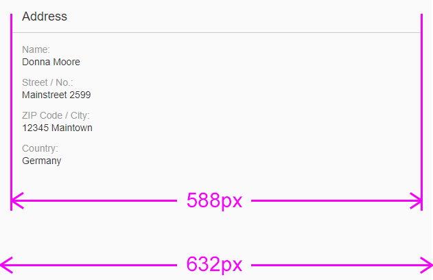
Padding of a container
Label-Field Ratio
For each size, you can define how many grid columns are used for labels (labelSpanXL, labelSpanL, labelSpanM, labelSpanS), fields (implicitly), and empty grid columns (emptySpanXL, emptySpanL, emptySpanM, emptySpanS).
The optional empty grid columns are placed after the input elements. They avoid excessive stretching of the input fields. This ratio is displayed as x:y:z, where x is the number of grids used by the labels, y stands for the fields, and z for empty columns.
We highly recommend to change the default of the label-field-ratio according to your app’s needs. For more information, see the recommended layouts in the Layout section.
Form with a label-field ratio 3:5:4
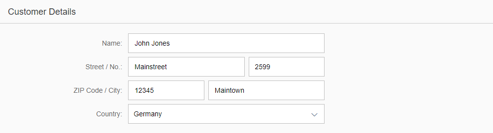
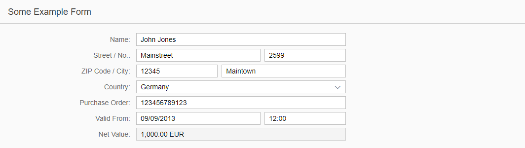
Size S (Smartphones and Dialogs)
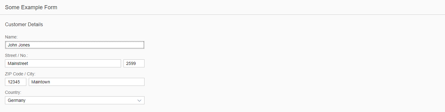
The form, simple form, and smart form use a single-column layout within the responsive grid layout in size S by default. This means that the form groups are positioned below each other in a single column and the labels are positioned above the fields to avoid truncation of the labels.
The label-field ratio is 12:12:0 by default:
- 12 grid columns of the responsive grid layout are used by the labels.
(A label handles the space of a whole row.) - 12 grid columns of the responsive grid layout are used by the fields.
(A field handles the space of a whole row.) - 0 grid columns of the responsive grid layout are used by empty columns.
(There is no empty space on the right of the field.)
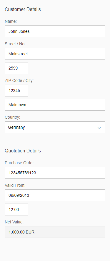
Form in size S
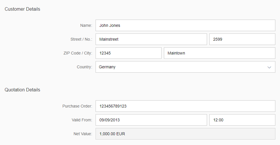
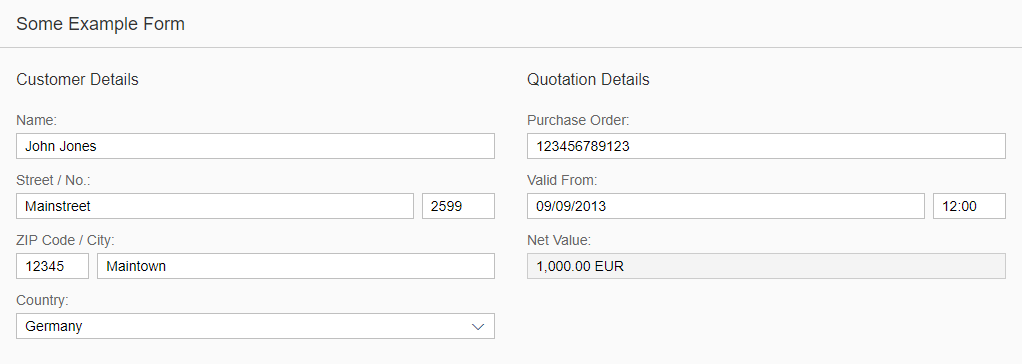
Size M
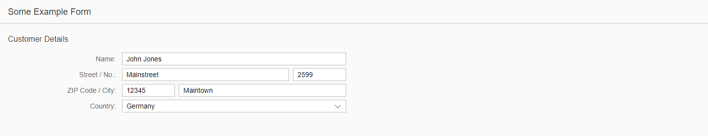
Size M of the form, simple form, and smart form also has a single-column layout within the responsive grid layout by default. However, in size M the labels are positioned in the same row as the corresponding input field or value, and form groups are positioned below each other.
The label-field ratio is 2:10:0 by default:
- 2 grid columns of the responsive grid layout are used by the labels.
- 10 grid columns of the responsive grid layout are used by the fields.
- 0 columns of the responsive grid layout are used by empty columns.
Please change the default 2:10:0 according to your app’s needs (see the recommended layouts in the Layout section).
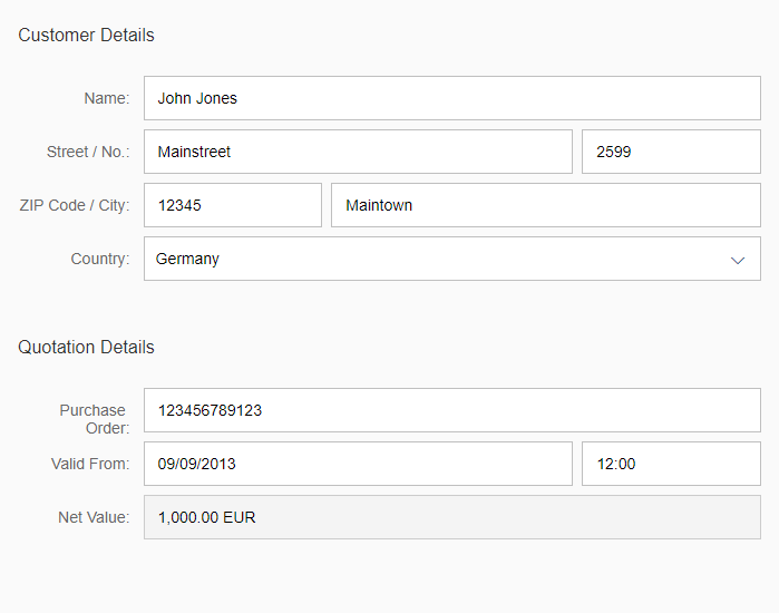
Form in size M
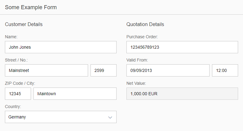
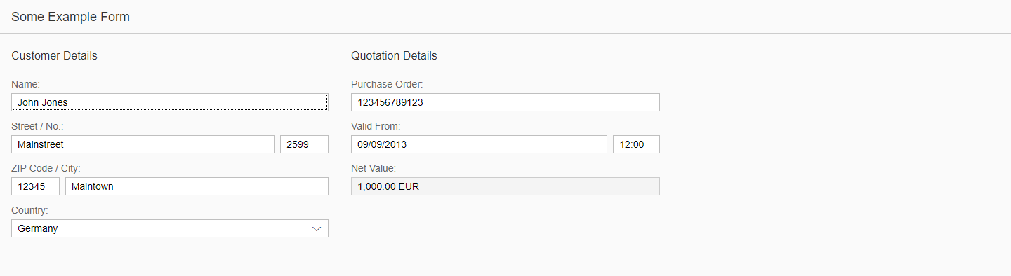
Size L
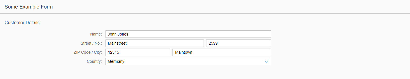
The form, simple form, and smart form in size L use a two-column layout within the responsive grid layout by default. That means that the form groups are placed next to each other to have all the information on one screen and to avoid scrolling. In these columns, the labels are positioned in the same row as the corresponding input field or value. So the form groups adopt the Z layout (reading direction in rows, not in columns).
The label-field ratio is 4:8:0 by default:
- 4 grid columns of the responsive grid layout are used by the labels.
- 8 grid columns of the responsive grid layout are used by fields.
- 0 grid columns of the responsive grid layout are used by empty columns.
Form in size L
Size XL
Like the form, the simple form, and the smart form in size L, the size XL uses also a two-column layout within the responsive grid layout by default. To have all the information on one screen and avoid scrolling, the form groups are placed next to each other. In these columns, the labels are positioned in the same row as the corresponding input field or value. The form groups adopt the Z layout.
The label-field ratio for size XL is 4:8:0 (technically the value is set to -1 and inherits the value of size L, see also the development hint below) by default:
- 4 grid columns of the responsive grid layout are used by labels.
- 8 grid columns of the responsive grid layout are used by fields.
- 0 grid columns of the responsive grid layout are used by empty columns.
Form in size XL
Layout
One Page, One Form
If a form contains only one group, do not use a group title – instead, use the form title.
Form with only one group (form title)
If the form is the only element on the page and if it has more than one group, you can use the group titles to capture the groups.
One form with several groups (no form title)
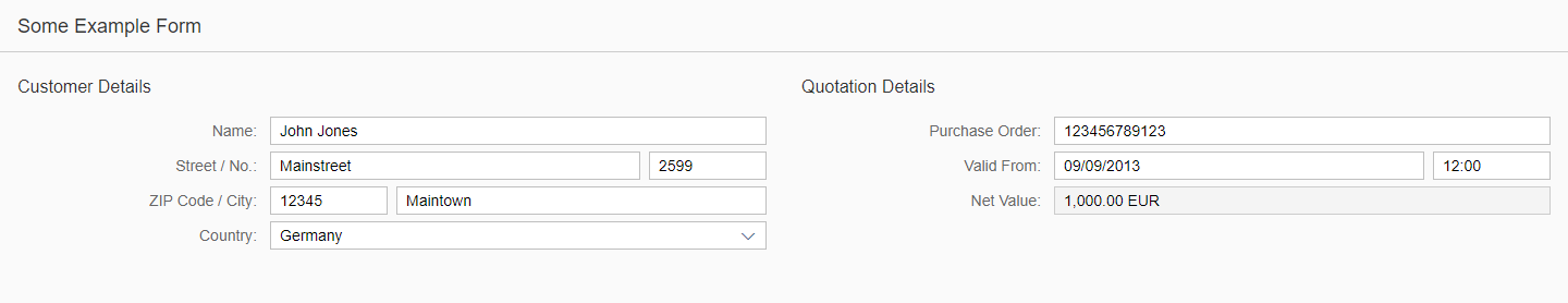
If the form is one of several elements on the page, such as tables and lists, use the form title as its caption.
A form as one of several elements on a page (form title)
One Page, Many Forms
If you want to emphasize that some groups are very distinct, use several forms on a page instead of one form with several groups. Visually this looks more separated than using a single form with several groups. Give each form a meaningful title. If necessary, you can structure each form with groups as well. In this case, also give the groups a title.
Several forms on a page (emphasized groups)

Forms with several groups
Various Layouts
The following sections give guidance on how to configure the form so that it meets the needs of different sizes. Depending on where you place the form, we highly recommend changing the default and using one of the following layouts according to your app’s needs.
Size S (Smartphones and Dialogs)
Retain the default behavior (single column layout with a label-field ratio 12:12:0).
Form in size S (12:12:0)
Size M (Tablet) – Full Screen
If you place the form in the details part of a split screen, use a single-column layout with the label-field ratio 4:7:1 (4 grid columns used by the labels, 7 grid columns used by the fields, and 1 grid column used by empty columns).
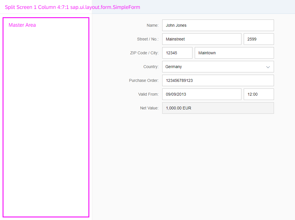
Form in a split screen – size M (4:7:1)
If you place the form in a full-screen app, use a single-column layout with the label-field ratio 3:5:4 (3 grid columns used by the labels, 5 grid columns used by the fields, and 4 grid columns used by empty columns).
Form in full screen – size M (3:5:4)
As explained already in the section Responsiveness (Breakpoints), Size M goes down to 601 px. In this size, the 3:5:4 approach may not be wide enough for longer labels and fields. So if you expect long labels or input values, use the label-field ratio 4:8:0 (4 grid columns used by the labels, 8 grid columns used by the fields, and 0 grid columns used by empty columns).
Form with long labels and fields – size M (4:8:0)
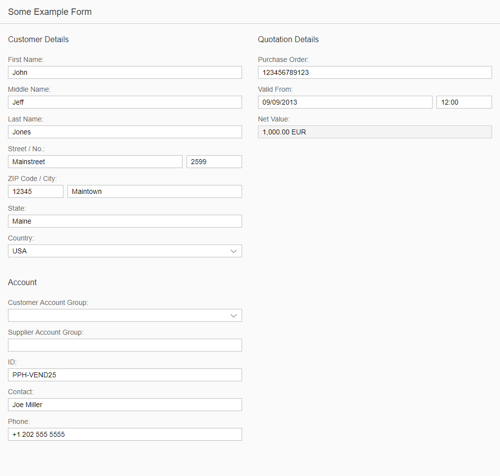
If you place the form in a full-screen app and it contains several form groups, use a two-column layout with its label-field ratio of 12:12:0 (12 grid columns used by the labels, 12 grid columns used by the fields, and 0 grid columns used by empty columns).
Form with several form groups (two columns) – size M (12:12:0)
Size L (Desktop Screens)
If the form contains a single form group, use a single-column layout with a label-field ratio of 3:5:4 (3 grid columns used by the labels, 5 grid columns used by the fields, and 4 grid columns used by empty columns).
Form with a single form group (one column) – size L (3:5:4)
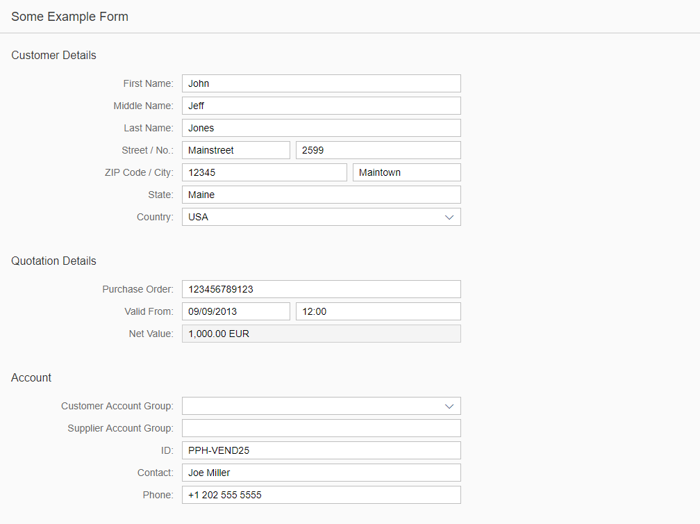
If the form contains multiple form groups, you can also use a two-column layout with a label-field ratio of 12:12:0 (12 grid columns used by the labels, 12 grid columns used by the fields, and 0 grid columns used by empty columns). As explained already in the section Responsiveness (Breakpoints), Size L goes down to 1025 px. In this size, long labels that are put next to the fields might not fit on smaller L-sized screens (especially in split apps). Therefore labels are put above fields.
Form with several form groups (two columns) – size L (12:12:0)
Size XL (Desktop Wide Screens)
If the form contains a single form group, use a single-column layout with a label-field ratio of 3:5:4 (3 grid columns used by the labels, 5 grid columns used by the fields, and 4 grid columns used by empty columns).
Form with a single form group (one column) – size XL (3:5:4)
The responsive grid layout has the new property singleContainerFullSize. This property enables you to insert empty columns in your form: You can for example then set the property columnsXL to 2, fill one column with the single form group in a label-field ratio of 4:8:0 (4 grid columns used by the labels, 8 grid columns used by the fields, and 0 grid columns used by empty columns), and leave the second column empty. For more information, see also the development hint below.
Form with an empty column – size XL (4:8:0)
If the form is put into a full-screen app, with the property singleContainerFullSize you can also set columnsXL to 3, fill one column with the single form group in a label-field ratio of 12:12:0 (12 grid columns used by the labels, 12 grid columns used by the fields, and 0 grid columns used by empty columns), and leave the second and third columns empty.
Form with empty columns – size XL (12:12:0)
If the form contains multiple form groups, you can also use a two-column layout with a label-field ratio of 4:8:0 (4 grid columns used by the labels, 8 grid columns used by the fields, and 0 grid columns used by empty columns).
Form with multiple form groups (two columns) – size XL (4:8:0)
If the form is put into a full-screen app and it contains multiple form groups, you can also use a three-column layout with a label-field ratio of 12:12:0 (12 grid columns used by the labels, 12 grid columns used by the fields, and 0 grid columns used by empty columns).
Form with two form groups (three columns) – size XL (12:12:0)
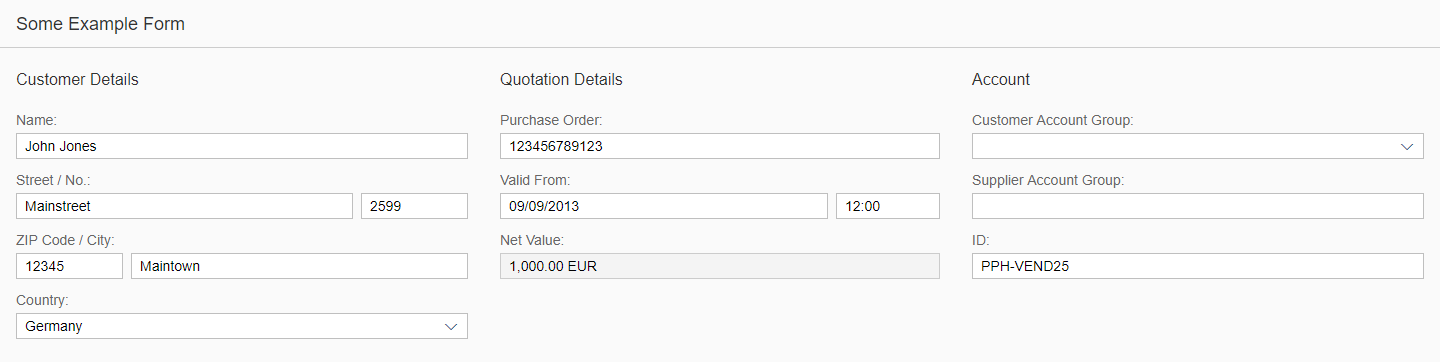
Form with three form groups (three columns) – size XL (12:12:0)
If you use a three-column layout for XL screens, do not use a two-column layout for L and M screens as it could create a lot of white space. In this case, use a single-column layout instead.
Form with a lot of white space (two columns)
Form with less white space (single-column layout)
Use of Columns
Recommended:
- XL2-L2-M2-S1
- XL2-L2-M1-S1
- XL2-L1-M1-S1
Also possible:
- XL3-L1-M1-S1
- XL1-L1-M1-S1
Not recommended:
- XL3-L2-M2-S1
- XL3-L2-M2-S1
Components
These are some examples of the types of UI elements that can be placed in the form container:
- Label and text elements, including dedicated text display containers such as object number, object status, sap.ui.unified.Currency, and so on
- Text input controls like input field and text area
- Selection controls such as select, combo box, date picker, radio button, and checkbox
- Icon
- Rating indicator
- Progress indicator
- Switch
- Slider
- Link
Guidelines
- Order the form logically from a user’s perspective. For example, ask for a user´s name before asking them for their address.
- Group related information by using form and group titles.
- Try to arrange form groups (especially in size L and XL) in a way that the form:
- Is easy to read and understand.
- Does not contain too much white space (split groups if necessary).
- A label is not a help text. Give each field a meaningful label. Labels should be succinct, short and descriptive.
- If you have combined fields that contain, for example, a postal code and the name of a city, you can provide one combined label (postal code and city) for this group.
- The label of a required field is marked with an asterisk (*). There is a corresponding property in the API for this. Do not write the asterisk manually in the label text. Just use the corresponding property and the asterisk will be inserted automatically.
- At the end of the label, the form container automatically inserts a colon (:), which is triggered by the stylesheet. Do not write the colon manually in the label text.
- Use default settings for labels. (For example, labels are not supported for manual bold formatting.)
- Less is more: try to minimize the number of labels and their corresponding fields as much as possible.
- If an input element is in an error or warning state, provide a meaningful message for the user. There is a corresponding property valueStateText in the sap.m.Input API.
Label
To make it easier for users to differentiate between labels and values, labels in display-only mode are displayed in a different style to labels in edit mode.
To avoid truncation, labels within forms wrap automatically.
Always aim to keep your labels as concise as possible. Remember that a label is not a help text. It must be meaningful, succinct, short, and descriptive. The purpose of the wrapping feature is make the full label text legible and to help avoid unnecessary use of abbreviations. It is not intended as a fallback for very long labels.
Data Loss Message
Provide a data loss message if the user accidentally navigates away from the page, such as when selecting an item in the master list and then using the Back or Home button. For details about how the message is delivered and what text you can use, see message handling.
Form Field Validation
Provide form field validation which describes the validation points and the choreography associated with messaging. For more information, see form field validation.
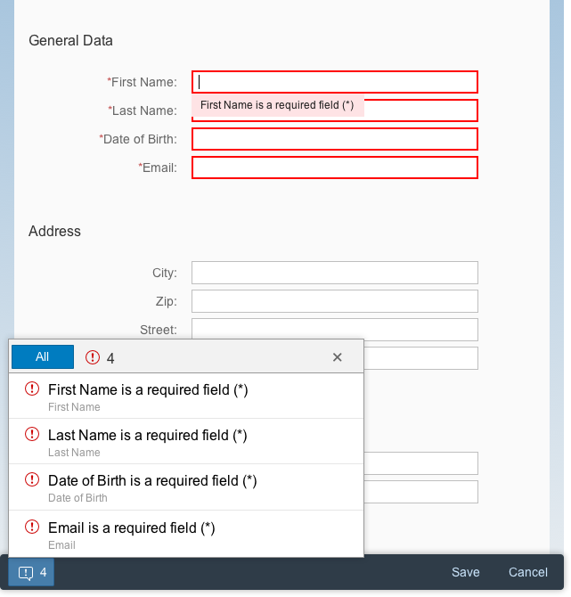
Field validation and validation report
Placeholder
Provide a placeholder (or input prompt) as a short hint (a word or short phrase) to help the user with data entry. A hint can be a sample value or a brief description of the expected format.
Avoid using the placeholder attribute as an alternative to a label. This is important because the placeholder text is overwritten as soon as the form is filled out. Labels are necessary to indicate the meaning of the form fields when the placeholders are no longer visible.
Never repeat the label in the placeholder text. Only offer a placeholder if it provides the user with additional information.
Resources
Want to dive deeper? Follow the links below to find out more about related controls, the SAPUI5 implementation, and the visual design.
Elements and Controls
- Manage Objects (guidelines)
- Label (guidelines)
- Text (guidelines)
- Link (guidelines)
- Input Field (guidelines)
- Text Area (guidelines)
- Select (guidelines)
- Combo Box (guidelines)
- Radio Button (guidelines)
- Checkbox (guidelines)
Implementation
- Form (SAPUI5 samples)
- Simple Form (SAPUI5 samples)
- Smart Form (SAPUI5 samples)
- Form (SAPUI5 API reference)
- Simple Form (SAPUI5 API reference)
- Smart Form (SAPUI5 API reference)
 Your feedback has been sent to the SAP Fiori design team.