
- Latest SAPUI Version 1.124
- SAPUI5 Version 1.122
- SAPUI5 Version 1.120
- SAPUI5 Version 1.118
- SAPUI5 Version 1.116
- SAPUI5 Version 1.114
- SAPUI5 Version 1.112
- SAPUI5 Version 1.110
- SAPUI5 Version 1.108
- SAPUI5 Version 1.106
- SAPUI5 Version 1.104
- SAPUI5 Version 1.102
- SAPUI5 Version 1.100
- SAPUI5 Version 1.98
- SAPUI5 Version 1.96
- SAPUI5 Version 1.94
- SAPUI5 Version 1.92
- SAPUI5 Version 1.90
- SAPUI5 Version 1.88
- SAPUI5 Version 1.86
- SAPUI5 Version 1.84
- SAPUI5 Version 1.82
- SAPUI5 Version 1.80
- SAPUI5 Version 1.78
- SAPUI5 Version 1.76
- SAPUI5 Version 1.74
- SAPUI5 Version 1.72
- SAPUI5 Version 1.70
- SAPUI5 Version 1.68
- SAPUI5 Version 1.66
- SAPUI5 Version 1.64
- SAPUI5 Version 1.62
- SAPUI5 Version 1.60
- SAPUI5 Version 1.58
- SAPUI5 Version 1.56
- SAPUI5 Version 1.54
- SAPUI5 Version 1.52
- SAPUI5 Version 1.48
- SAPUI5 Version 1.46
- SAPUI5 Version 1.44
- SAPUI5 Version 1.42
- SAPUI5 Version 1.40
- SAPUI5 Version 1.38
- SAPUI5 Version 1.36
- SAPUI5 Version 1.34
- SAPUI5 Version 1.32
- SAPUI5 Version 1.30
- SAPUI5 Version 1.28
- SAPUI5 Version 1.26
- Latest SAPUI Version 1.124
- SAPUI5 Version 1.122
- SAPUI5 Version 1.120
- SAPUI5 Version 1.118
- SAPUI5 Version 1.116
- SAPUI5 Version 1.114
- SAPUI5 Version 1.112
- SAPUI5 Version 1.110
- SAPUI5 Version 1.108
- SAPUI5 Version 1.106
- SAPUI5 Version 1.104
- SAPUI5 Version 1.102
- SAPUI5 Version 1.100
- SAPUI5 Version 1.98
- SAPUI5 Version 1.96
- SAPUI5 Version 1.94
- SAPUI5 Version 1.92
- SAPUI5 Version 1.90
- SAPUI5 Version 1.88
- SAPUI5 Version 1.86
- SAPUI5 Version 1.84
- SAPUI5 Version 1.82
- SAPUI5 Version 1.80
- SAPUI5 Version 1.78
- SAPUI5 Version 1.76
- SAPUI5 Version 1.74
- SAPUI5 Version 1.72
- SAPUI5 Version 1.70
- SAPUI5 Version 1.68
- SAPUI5 Version 1.66
- SAPUI5 Version 1.64
- SAPUI5 Version 1.62
- SAPUI5 Version 1.60
- SAPUI5 Version 1.58
- SAPUI5 Version 1.56
- SAPUI5 Version 1.54
- SAPUI5 Version 1.52
- SAPUI5 Version 1.50
- SAPUI5 Version 1.48
- SAPUI5 Version 1.46
- SAPUI5 Version 1.44
- SAPUI5 Version 1.42
- SAPUI5 Version 1.40
- SAPUI5 Version 1.38
- SAPUI5 Version 1.36
- SAPUI5 Version 1.34
- SAPUI5 Version 1.32
- SAPUI5 Version 1.30
- SAPUI5 Version 1.28
- SAPUI5 Version 1.26
Status Indicator
sap.suite.ui.commons.StatusIndicator
Intro
The status indicator uses a filled icon to visualize a single value. Unlike the progress indicator or the radial micro chart, the indicator provides the user with a meaningful association through its use of icons.

Variety of status indicators
Usage
Use the status indicator if:
- You want to display a single value with an icon that describes its context.
- You want to display a single value that can change in real time without requiring a page reload.
Do not use the status indicator if:
- You want to display a single value in a table. Use the progress indicator or radial micro chart instead.
- You want to show a rating. Use the rating indicator instead.
- The status indicator is decorative and does not provide the user with a meaningful association.
Responsiveness
The status indicator is fully responsive.
Types
Linear Fill
If the icon only shows one fill area, show a fill level.
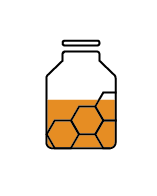
Status indicators with linear fill.
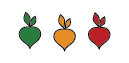
Sequential Fill
If the icon has more than one fill area, fill them sequentially.

Status indicators with sequential fill.
Solid Fill
If the icon is very small, always provide a solid fill. You can use semantic colors to show the state.
Status indicators with solid fill - states represented by different semantic colors.
Behavior and Interaction
You can set a click event for the status indicator. If the status indicators are grouped, you can set a click event for the individual status indicators or for the entire group.
Guidelines
The status indicator can be used within (but is not restricted to) the following controls:
Shape Definition
You can download the predefined shapes for use in your own SAP Fiori apps.
Thresholds
You can set one or more thresholds for each status indicator. Apply a color for each threshold; the color changes when a threshold has been passed. Only use thresholds and semantic colors if they support the use case. Do not use them for decorative purposes.
Resources
Want to dive deeper? Follow the links below to find out more about related controls, the SAPUI5 implementation, and the visual design.
Implementation
- Status Indicator (SAPUI5 sample)
- Status Indicator (SAPUI5 API reference)
- Download Predefined Shapes (ZIP file)
 Your feedback has been sent to the SAP Fiori design team.