
- Latest SAPUI Version 1.124
- SAPUI5 Version 1.122
- SAPUI5 Version 1.120
- SAPUI5 Version 1.118
- SAPUI5 Version 1.116
- SAPUI5 Version 1.114
- SAPUI5 Version 1.112
- SAPUI5 Version 1.110
- SAPUI5 Version 1.108
- SAPUI5 Version 1.106
- SAPUI5 Version 1.104
- SAPUI5 Version 1.102
- SAPUI5 Version 1.100
- SAPUI5 Version 1.98
- SAPUI5 Version 1.96
- SAPUI5 Version 1.94
- SAPUI5 Version 1.92
- SAPUI5 Version 1.90
- SAPUI5 Version 1.86
- SAPUI5 Version 1.84
- SAPUI5 Version 1.82
- SAPUI5 Version 1.80
- SAPUI5 Version 1.78
- SAPUI5 Version 1.76
- SAPUI5 Version 1.74
- SAPUI5 Version 1.72
- SAPUI5 Version 1.70
- SAPUI5 Version 1.68
- SAPUI5 Version 1.66
- SAPUI5 Version 1.64
- SAPUI5 Version 1.62
- SAPUI5 Version 1.60
- SAPUI5 Version 1.58
- SAPUI5 Version 1.56
- SAPUI5 Version 1.54
- SAPUI5 Version 1.52
- SAPUI5 Version 1.50
- SAPUI5 Version 1.48
- SAPUI5 Version 1.46
- SAPUI5 Version 1.44
- SAPUI5 Version 1.42
- SAPUI5 Version 1.40
- SAPUI5 Version 1.38
- SAPUI5 Version 1.36
- SAPUI5 Version 1.34
- SAPUI5 Version 1.32
- SAPUI5 Version 1.30
- SAPUI5 Version 1.28
- SAPUI5 Version 1.26
- Latest SAPUI Version 1.124
- SAPUI5 Version 1.122
- SAPUI5 Version 1.120
- SAPUI5 Version 1.118
- SAPUI5 Version 1.116
- SAPUI5 Version 1.114
- SAPUI5 Version 1.112
- SAPUI5 Version 1.110
- SAPUI5 Version 1.108
- SAPUI5 Version 1.106
- SAPUI5 Version 1.104
- SAPUI5 Version 1.102
- SAPUI5 Version 1.100
- SAPUI5 Version 1.98
- SAPUI5 Version 1.96
- SAPUI5 Version 1.94
- SAPUI5 Version 1.92
- SAPUI5 Version 1.90
- SAPUI5 Version 1.88
- SAPUI5 Version 1.86
- SAPUI5 Version 1.84
- SAPUI5 Version 1.82
- SAPUI5 Version 1.80
- SAPUI5 Version 1.78
- SAPUI5 Version 1.76
- SAPUI5 Version 1.74
- SAPUI5 Version 1.72
- SAPUI5 Version 1.70
- SAPUI5 Version 1.68
- SAPUI5 Version 1.66
- SAPUI5 Version 1.64
- SAPUI5 Version 1.62
- SAPUI5 Version 1.60
- SAPUI5 Version 1.58
- SAPUI5 Version 1.56
- SAPUI5 Version 1.54
- SAPUI5 Version 1.52
- SAPUI5 Version 1.50
- SAPUI5 Version 1.48
- SAPUI5 Version 1.46
- SAPUI5 Version 1.44
- SAPUI5 Version 1.42
- SAPUI5 Version 1.40
- SAPUI5 Version 1.38
- SAPUI5 Version 1.36
- SAPUI5 Version 1.34
- SAPUI5 Version 1.32
- SAPUI5 Version 1.30
- SAPUI5 Version 1.28
- SAPUI5 Version 1.26
Visual Filter Bar
Intro
The visual filter bar offers a unique way of filtering large datasets through visualizations. This helps users to recognize facts and situations, while reducing the number of interaction steps needed to gain insights or to identify significant single instances.
The visual filter bar allows users to combine measures with filter values. For example, a “Product” might have the filter value “Product Name” and the measure might typically be “Revenue”, “Cost”, or “Quantity”. If you opt for the measure “Revenue”, the chart would show the “Revenue by Product”, enabling the user to filter the data by choosing a particular product name and its revenue.
Chart visualization increases the joy of use and helps users to see relevant data more quickly. For filtering, the visual filter bar uses all of the three types of interactive chart: bar chart, line chart and donut chart.
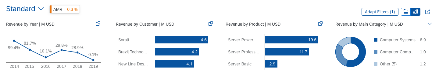
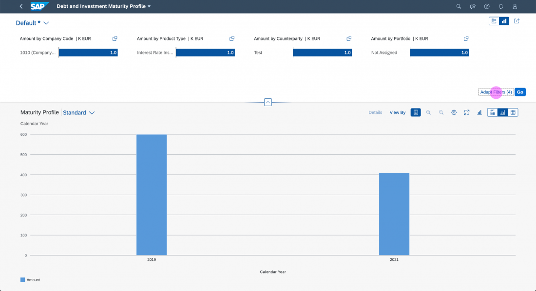
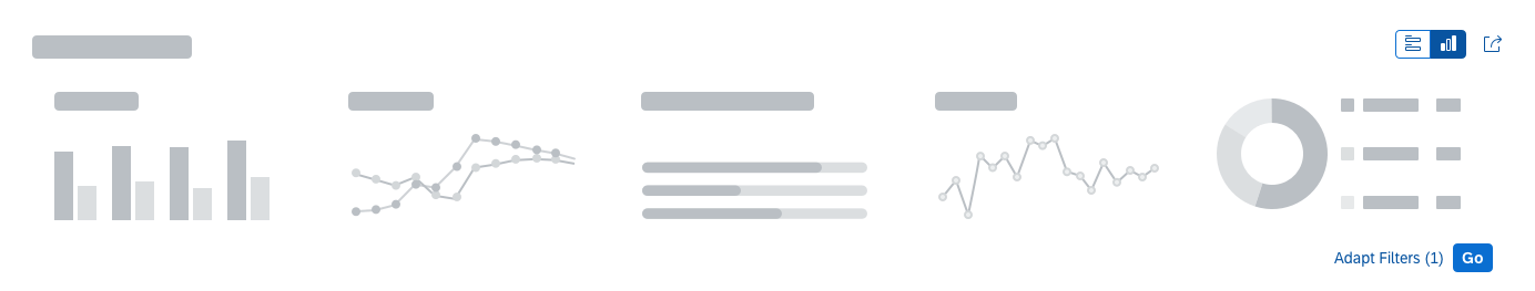
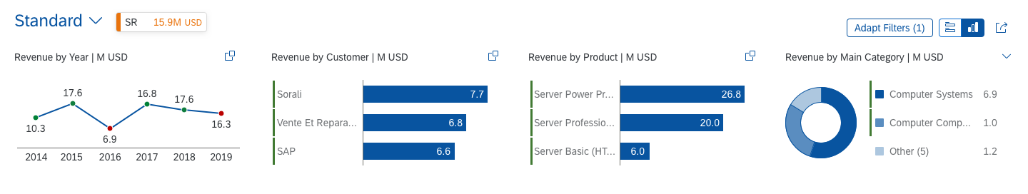
Visual filter bar - Size L
Usage
Use the visual filter bar if:
- You are using analytical list page floorplan.
- Users need to see both the result and the direct impact of their filter settings in a chart representation.
- You would like to give users a condensed overview of the data in the dataset.
Do not use the visual filter bar if:
- You are not using the analytical list page floorplan.
- Users are not interested in seeing the impact or their filter settings directly in a chart representation.
- Users are not interested in a condensed overview of the data in the dataset.
Responsiveness
The visual filter bar itself is fully responsive. For overall responsiveness within the analytical list page, see the Analytical List Page article.
Layout
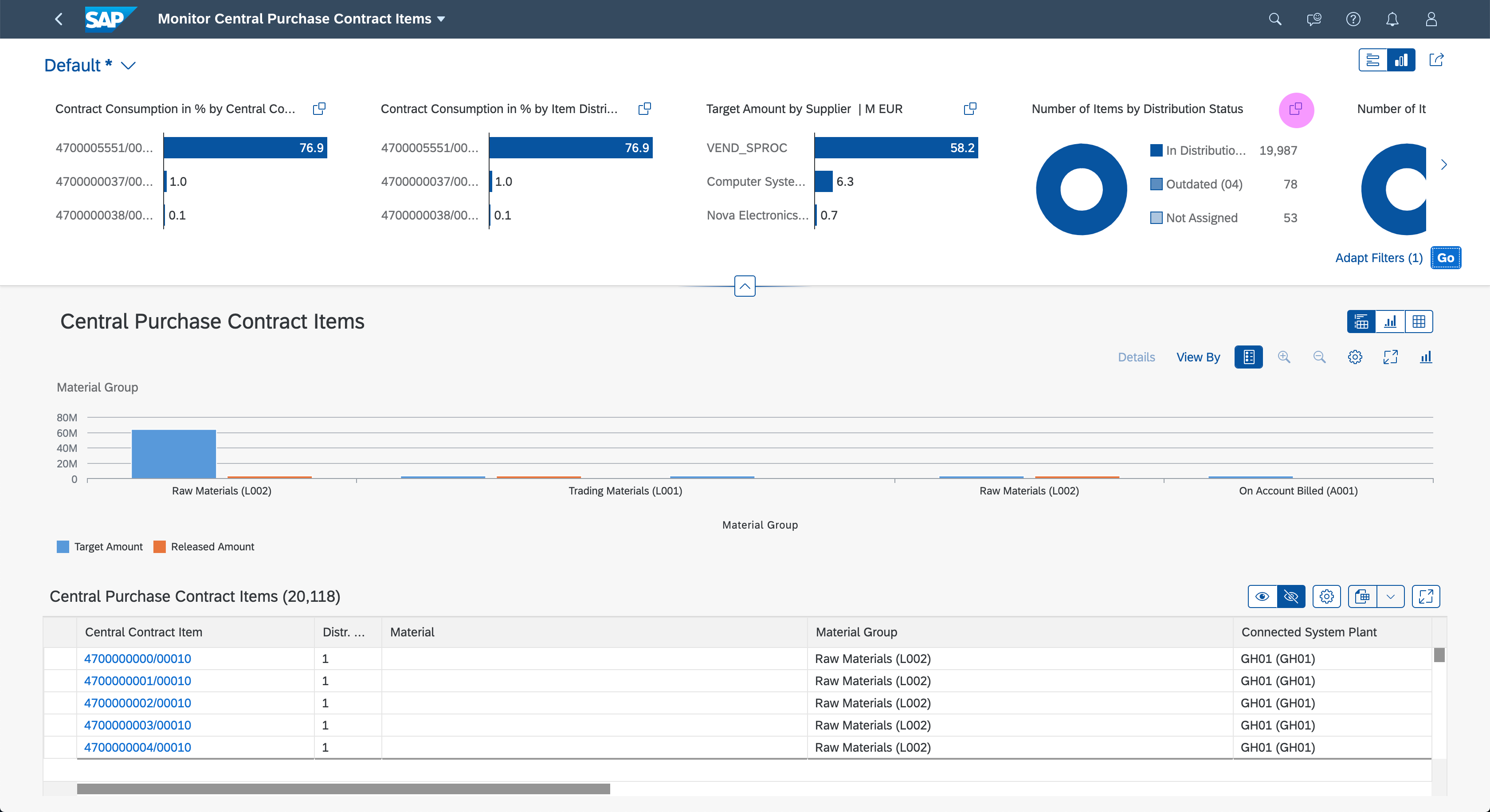
The visual filter bar is a composite control built with other responsive controls, such as the header container and the interactive charts. It is used in the header area of the analytical list page, which incorporates the dynamic page layout.
Collapsed Visual Filter Bar
The collapsed visual filter bar takes up less space, leaving most of the screen for displaying the actual results. However, the variant selector in the upper left corner is still available for switching between variants. The user can expand or collapse the filter bar by clicking the header. If required by the use case, you can expand the filter bar by default.
On desktop and tablet devices, the collapsed filter bar shows a summary of the filters currently applied. The format of the summary text is:
Filtered By (number of filters): <comma-separated list of the filters currently applied>
Example: Filtered By (2): Country/Region, Product
Up to 5 filters are listed. If more filters have been applied, an ellipsis (…) appears at the end of the string. If no filters have been applied, the summary text is Not Filtered.
Expanded Visual Filter Bar
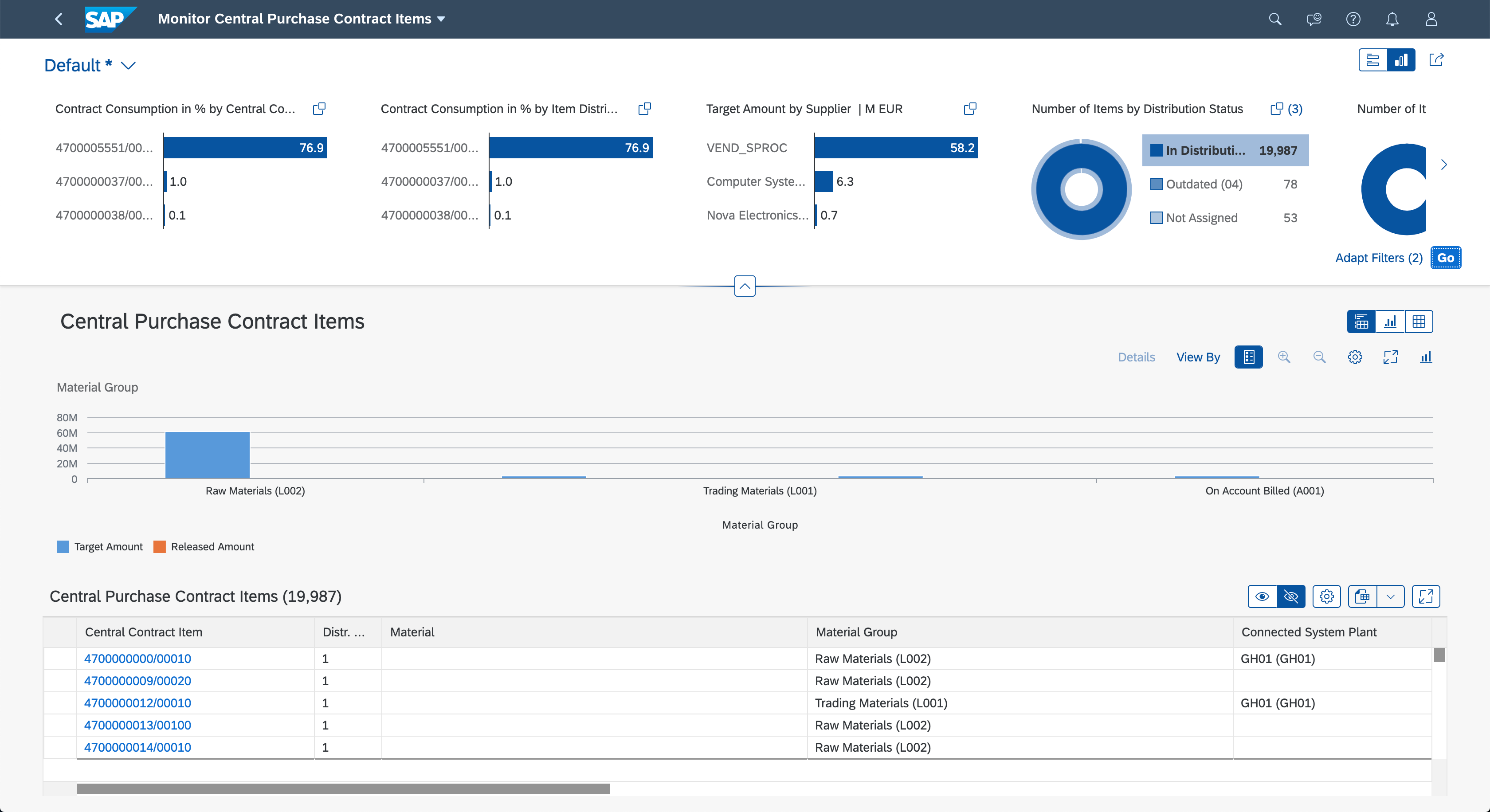
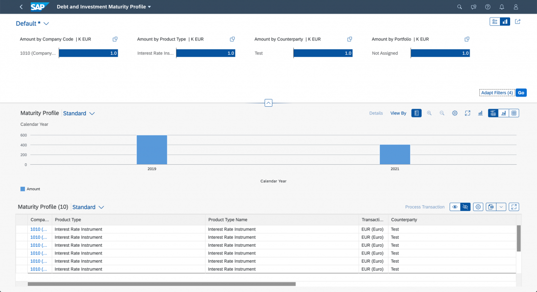
The expanded visual filter bar also shows a user-defined filter subset of the selected variant. The Adapt Filters link opens the visual filter dialog, where the user can add or hide visual filters. The switch button on the top right switches between the visual filter bar and the standard (input-based) filter bar. The Go button triggers the filter. Note that the Go button is only shown in manual update mode.
Structure
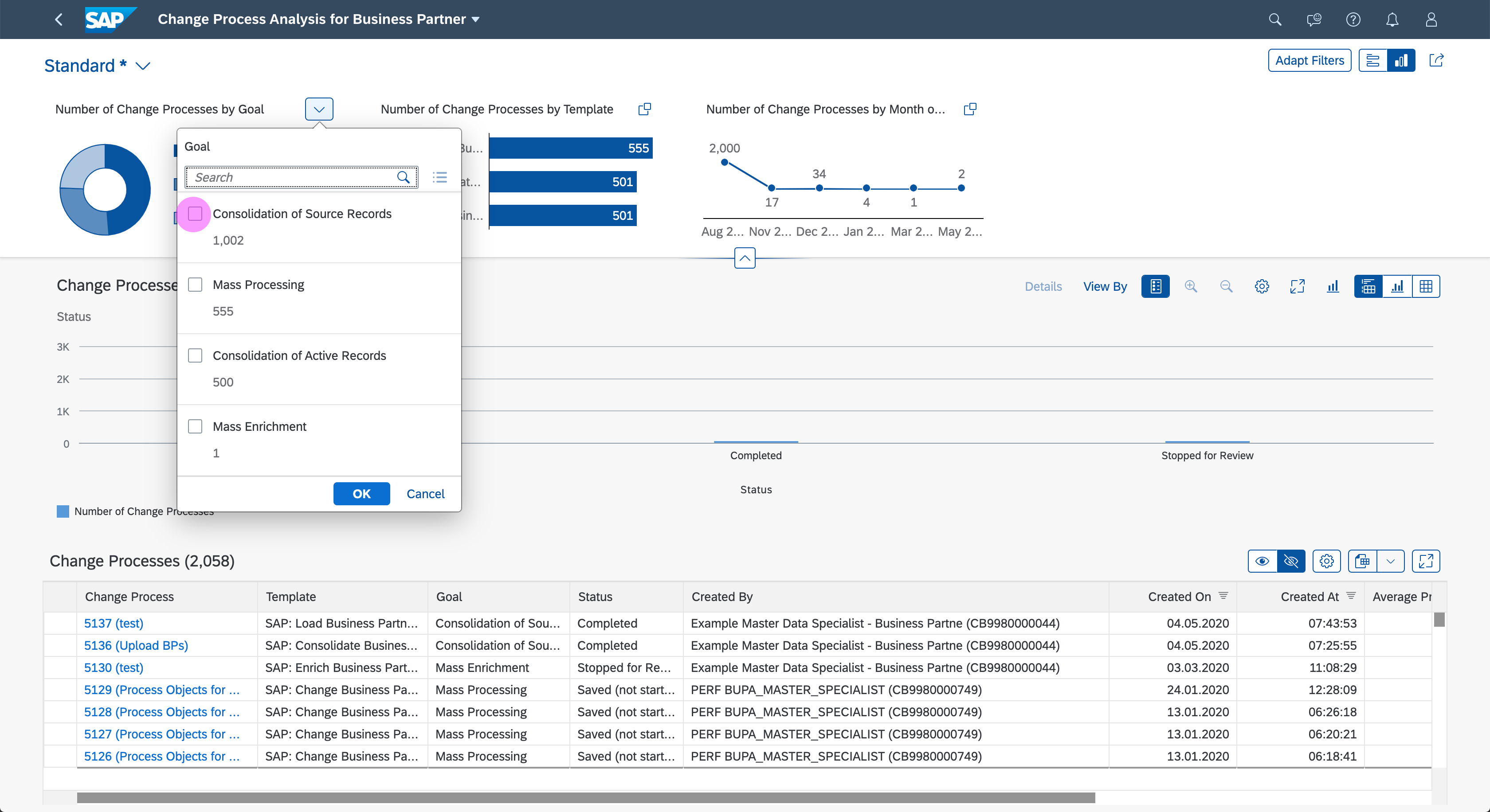
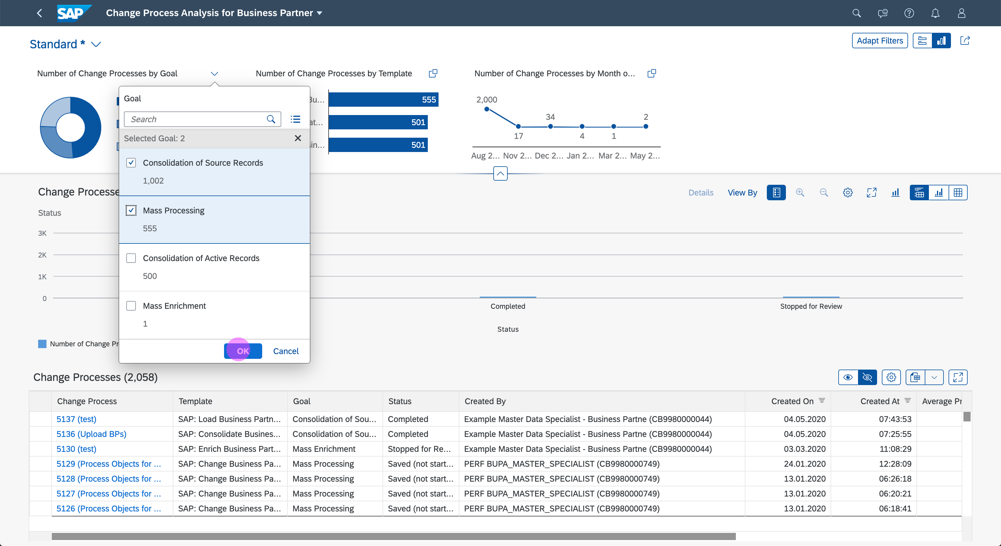
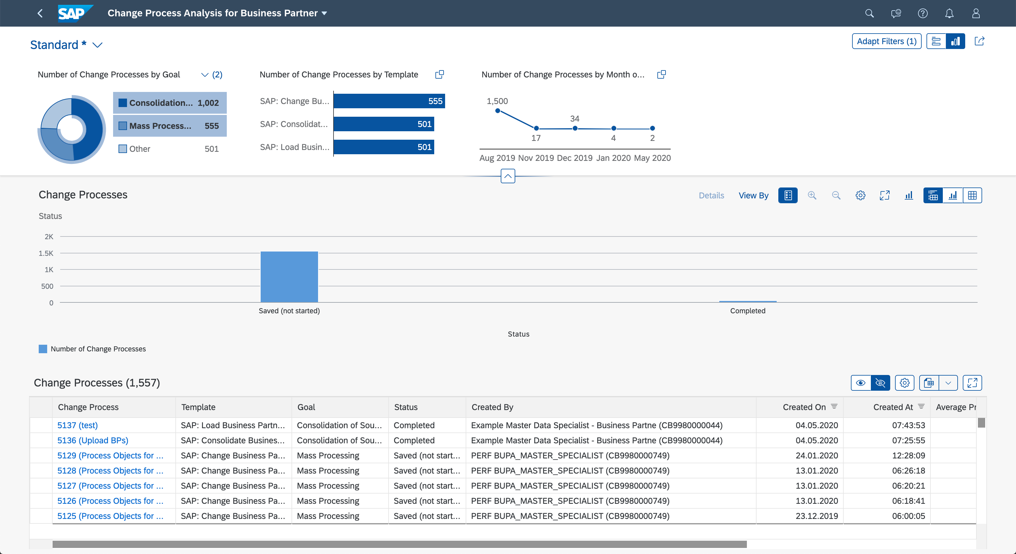
In order to achieve filtering through visualization, the visual filter bar uses interactive charts. Currently, three interactive chart types are available: bar chart, line chart, and donut chart. Each chart has a dedicated area for the chart title, the (x) link showing the number of applied filters, and the value help icon . When the user clicks the (x) link, a popover containing the selected filter values appears. The value help icon opens a value help dialog.
Filter Title Area
In addition to the chart title, the filter title area also contains a value help icon with (x) indicator, where “x” stands for the number of applied filters. Clicking the icon opens the value help dialog. The value help dialog can be replaced with the select popover icon .
Use the following naming convention for the filter title, using title case: <Measure Name> by <Dimension Name> | <Scale Factor> <Unit of Measure>. For example, Project Costs by Project | K EUR, Sales Volume by Commodity | M PC.

Visual filter bar - Title area

Visual filter bar - Title area with selected filter values
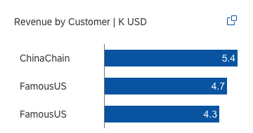
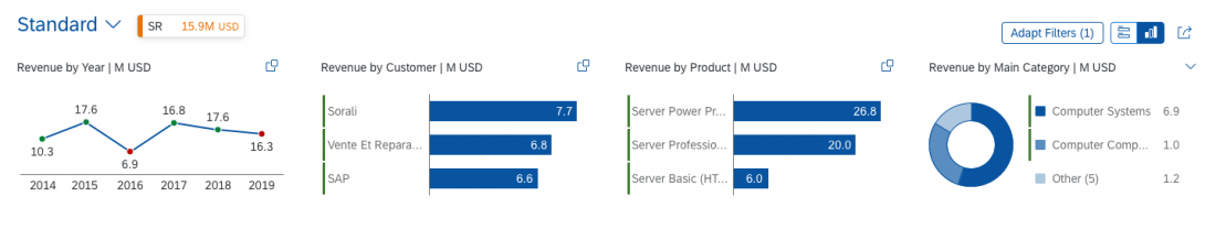
Bar Chart
The interactive bar chart in the visual filter bar can display only three bars. Based on the measure, they can be sorted ascending or descending. This makes it easy to compare the items and see the highest and lowest values.
Visual filter bar - Interactive bar chart
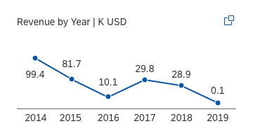
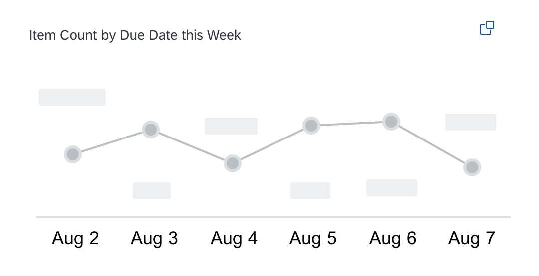
Line Chart
The interactive line chart is used to display variations over a specified period of time. This chart is only used for displaying a time series and can contain only the first or last six time points (for example, last six days, last six months, and so on).
Do not use a line chart to show categories. Instead, use a bar chart.
Visual filter bar - Interactive line chart
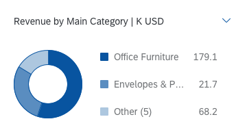
Donut Chart
The interactive donut chart is best used to display up to three slices. Use this chart if the exact value of each slice is not needed for filtering.
In the visual filter bar, only the top or bottom two values are shown; the rest are aggregated into the Other section.
Visual filter bar - Interactive donut chart
Visual Filter Selections
Any data point or segment selected in a chart remains selected when the user changes the measure, chart type, or sort order in any of the charts.
If a selected record falls outside the top or bottom three records being displayed, the (x) status above the chart shows the number of selected records.
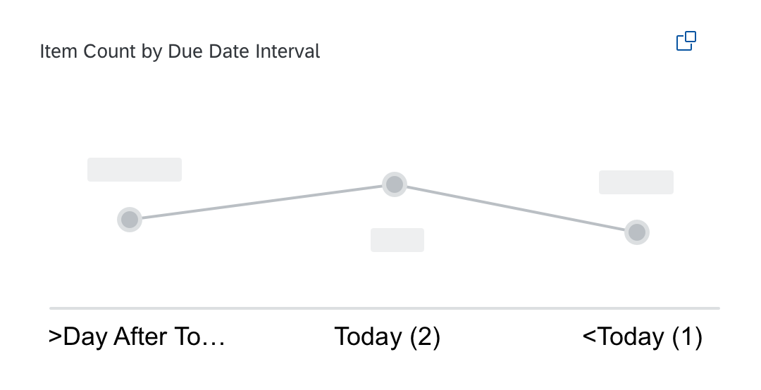
Don't use a relative format for time
Use titles that give context
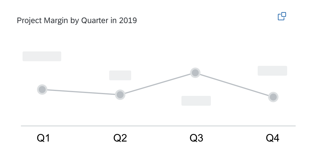
Add the year in the title if you display only 4 quarters
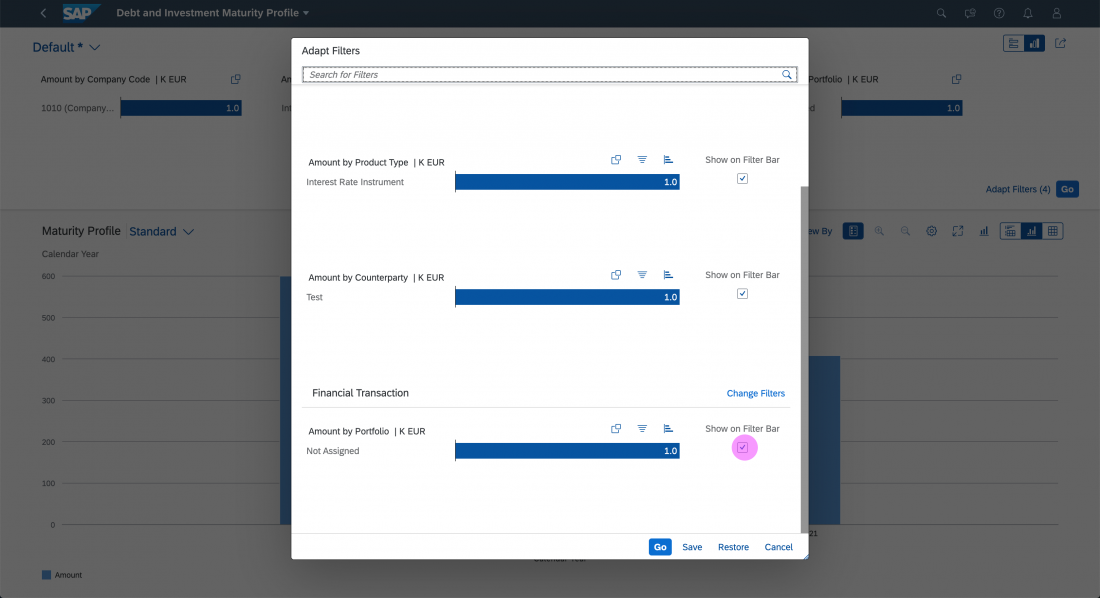
Visual Filter Dialog
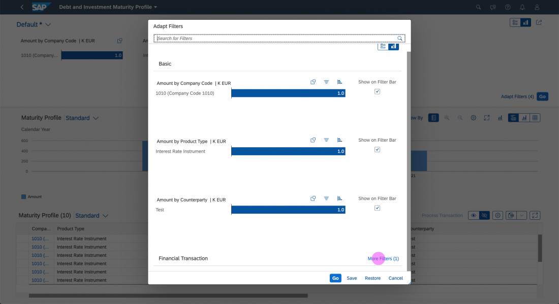
The filter dialog is launched by clicking the Adapt Filters (number of applied filters) link in the upper right filter area. In the filter dialog for visual filters, the user can choose which filter fields are shown in the visual filter bar.
In this dialog, the user can make the following changes:
- Add visual filters
- Delete visual filters
- Hide visual filters in the visual filter bar
- Search for visual filters
- Change the sort order of each visual filter
- Change the chart type of each visual filter
- Switch to other measures in the visual filter display
The footer toolbar at the bottom of the dialog provides the following functions:
- Save: Saves your modified filter set variant. Save and Save As can be provided.
- Cancel: Closes the dialog and undoes all changes.
- Restore: Restores the initial variant values. You can hide this button if it does not fit the app use case.
- Go: Applies the selected filter set.
- Clear (optional): Clears all filters. Only use this button if it fits the app use case.
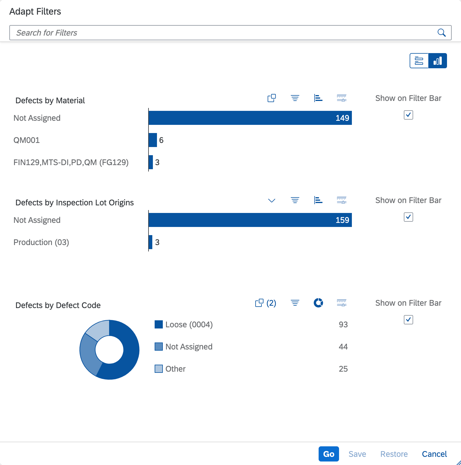
Visual filter dialog
Visual Filter Configuration
In the filter dialog, users can configure individual visual filters using the icons in the filter title area:
- Change the sort order (not supported for line charts)
- Switch to a different chart type
- Choose between different measures
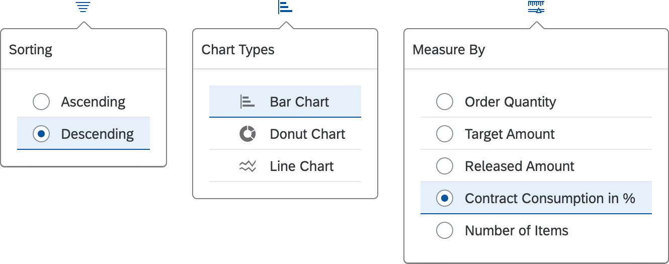
Visual filter configuration - Sort, chart type, measure
Behavior and Interaction
Unlike micro charts, the charts in the visual filter bar are interactive. If you are using live update mode, selecting a filter value triggers data filtering in the content area. Both single and multiple selection are supported.
Selecting Filters
In the visual filter, you can make a selection by clicking a chart value. To deselect it, you can either click the same value in the chart again, or click the (x) link showing the number of selected filters, such as (1).
Selecting a Filter Value in an Interactive Chart

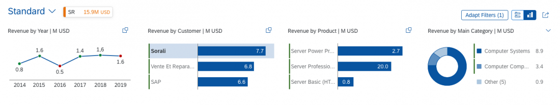
Any data point selected in a chart remains selected, even if the user selects a data point in another chart. Filter values also react to each other.
If a selected record in a chart falls outside the displayed filter values, the selection is visible in the (x) link above the chart, where (x) represents the number of selected records.
Users can select more filter values with the value help or select popover.
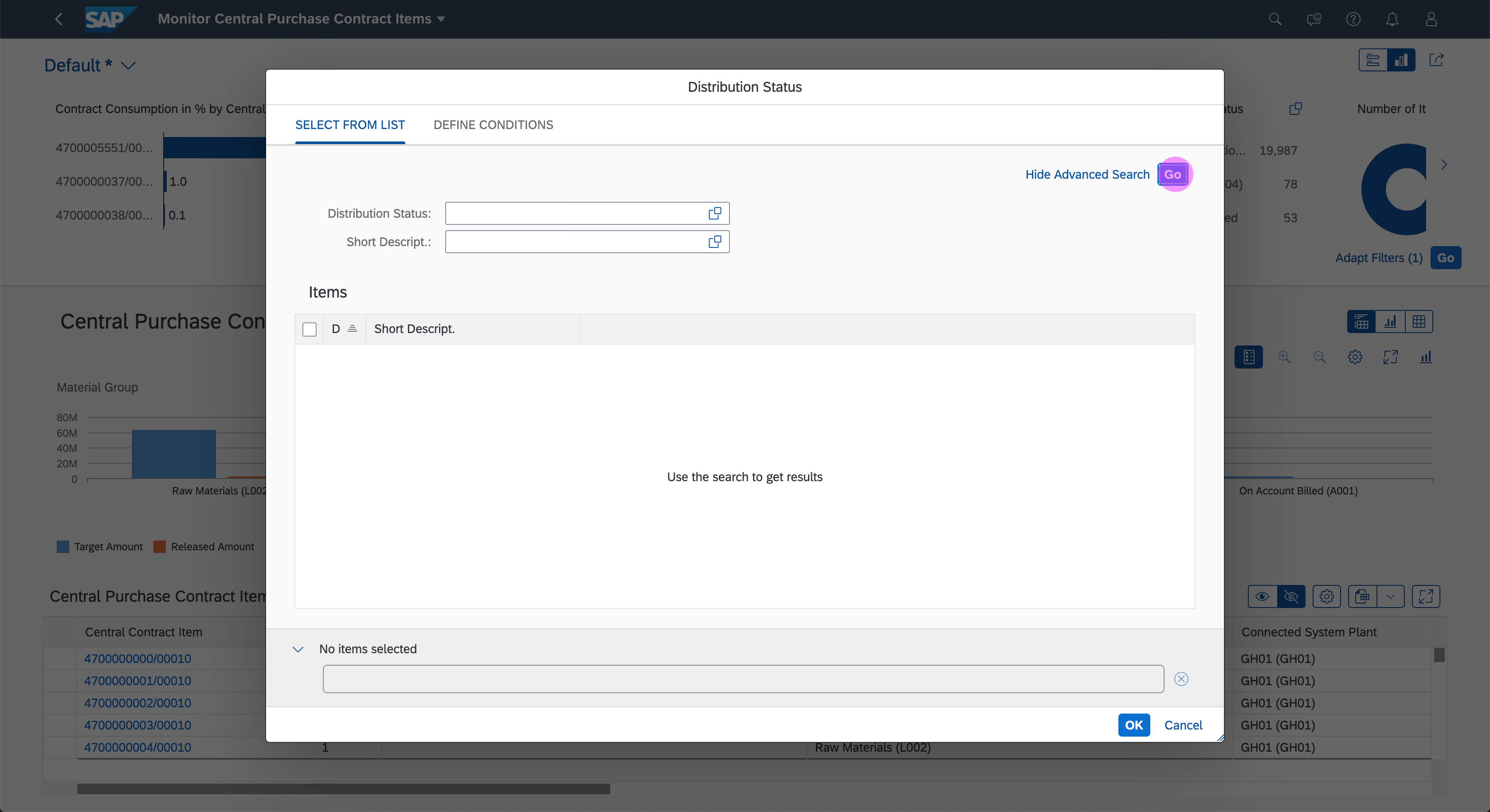
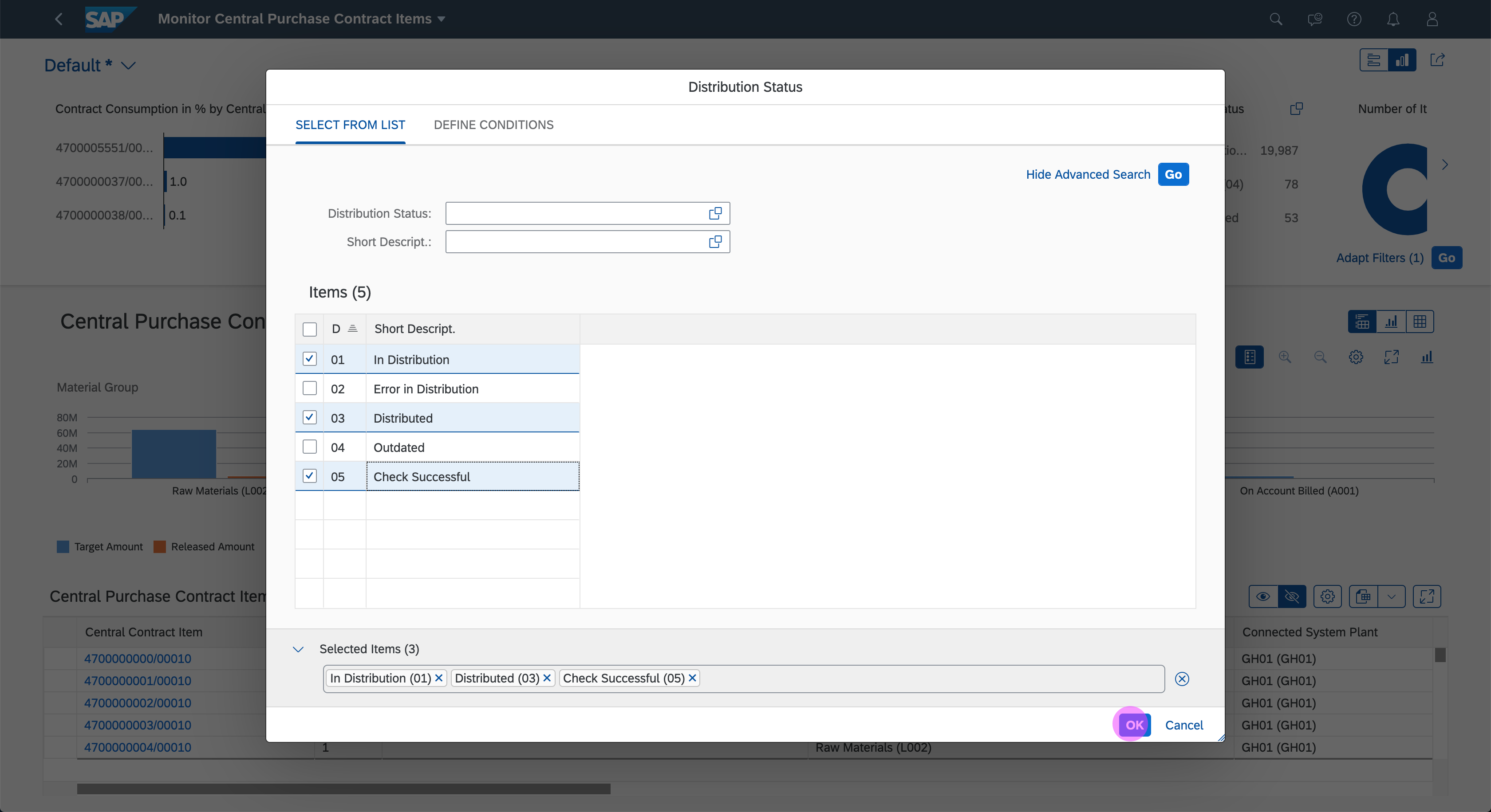
Selecting a Filter Value Using the Value Help
Selecting a Filter Value Using Select Popover
Personalizing the Visual Filter Bar
Add Visual Filter
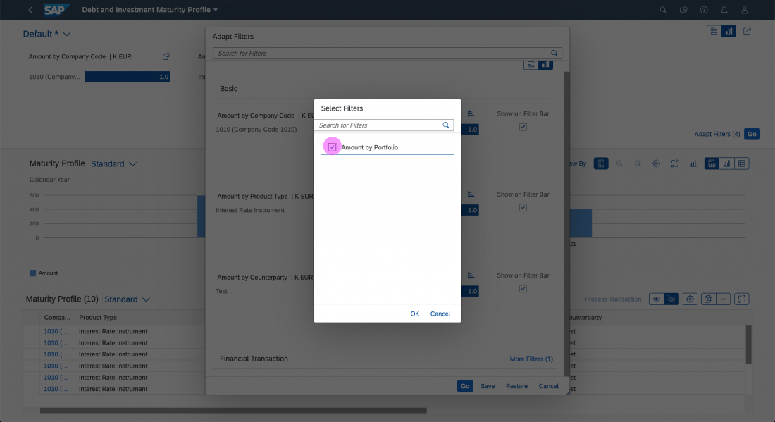
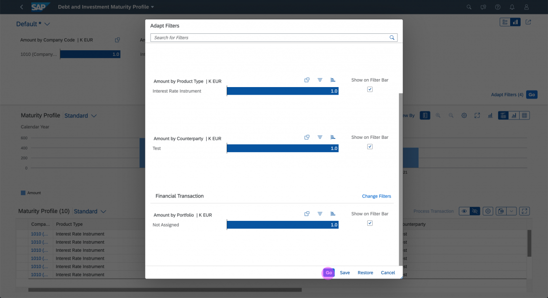
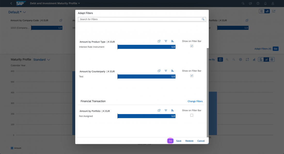
Users can add more visual filters via the visual filter dialog. The additional filter groups appear below the Basic filter group, which contains the standard filters for the application. While the Basic filter group is always visible, the additional filter groups are initially collapsed.
The More (x) link in the filter group header indicates the number of filters that have not yet been added, for example More (2). Clicking this link opens a dialog for selecting the additional filter. Once a filter has been selected, it displays under the group header in the visual filter dialog, and the user can customize the individual filter settings (sort order, chart type, measure, display in the visual filter bar).
If all filters in a group have already been added in the visual filter dialog, the More (x) link label in the filter group title switches to Change Filters.
Hide Visual Filter
Users can hide a filter by deselecting the checkbox next to the relevant filter in the filter dialog. This allows the user to hide filters that are rarely changed from the extended filter bar, giving complex filters a more lightweight appearance.
Guidelines
Live Update / Manual Update
The visual filter bar is available in two modes: live update and manual update. In both modes the visual filter charts refresh based on the selection.
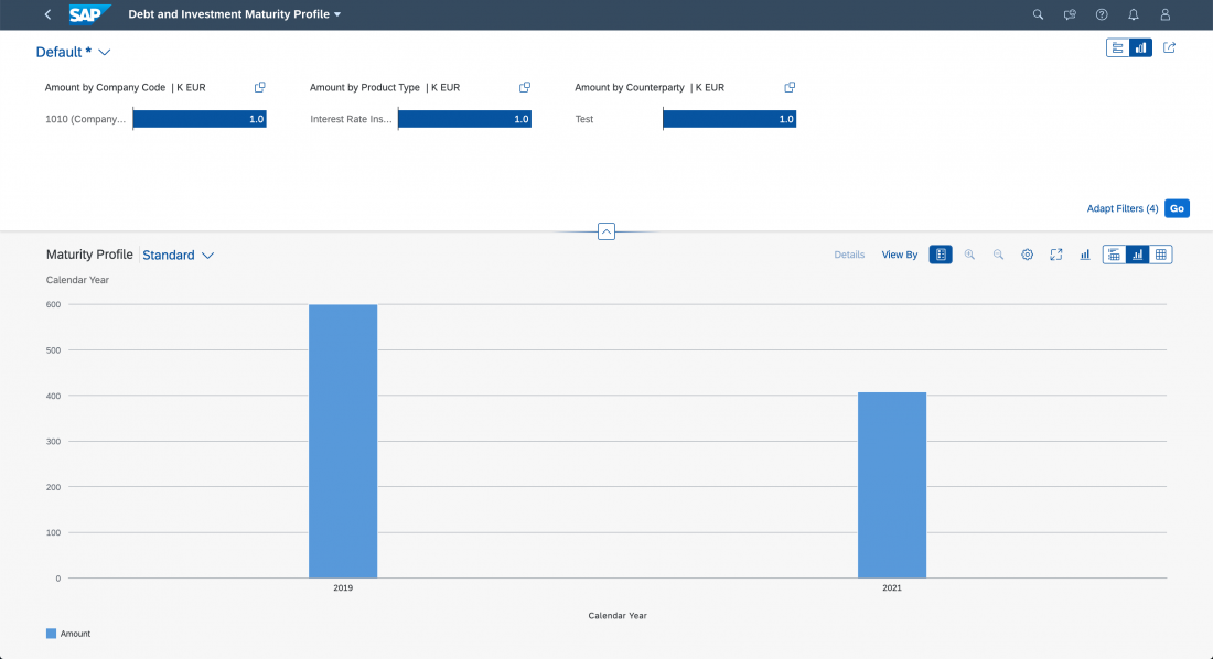
Live Update
In live update mode, the filter bar reacts instantly to every input change. Because the content area updates automatically whenever the user changes a filter selection, the Go button is not necessary, and is not shown.

Visual filter bar - Live update mode
Manual Update
In manual update mode, the filter results are only updated when the user clicks the Go button that is shown in manual mode. Pressing ENTER on the keyboard also triggers the filter.
Visual filter bar - Manual update mode
Recommendation
In general, use live update mode, which is more convenient for users. However, consider using manual update mode if the user has to configure multiple filters to obtain a useful result set, or if you expect the resulting traffic to be excessively high.
Chart Types
Choosing the right chart type as a representation for a particular filter will not only increase the joy of use but also will convey the right information to the user. Inappropriate chart types can mislead the user during the filtering process.
In the visual filter bar, you can choose between three interactive charts: bar chart, line chart, and donut chart.
Recommendation
- If you expect users to be working with a large number of datasets, and your scenario does not depict time periods, consider using a bar chart.
- If you want to measure trends and changes over time when filtering, consider using the line chart.
- If your scenario requires filtering by parts of a whole and has only a small number of datasets, consider using the donut chart.
Filter Selection
In the visual filter, users can make a selection by clicking a chart value or by using the value help to select data points that are not visible. Depending on the number of available data points, you can use the value help or the select popover.
Recommendation
If your scenario involves filtering 200 or more filter values, consider using the value help. For filtering less than 200 values, we recommend using the select popover.
Scaling Factor
Always use a scaling factor to display values larger than 1000. The scaling factor is usually displayed in the interactive chart header. Do not repeat the scaling factor inside the chart itself.
Recommendation
Due to the limited space inside the chart, we recommend showing a maximum of 3 digits before the decimal point.
Visual filter bar with scaling factor (M)
Resources
Want to dive deeper? Follow the links below to find out more about related controls, the SAPUI5 implementation, and the visual design.
Elements and Controls
- Analytical List Page (guidelines)
- Interactive Chart (guidelines)
- Interactive Bar Chart (guidelines)
- Interactive Donut Chart (guidelines)
- Interactive Line Chart (guidelines)
- Value Help Dialog (guidelines)
- Filter Bar / Smart Filter Bar (guidelines)
- Dynamic Page (guidelines)
Implementation
- No links.
 Your feedback has been sent to the SAP Fiori design team.