
- Latest SAPUI Version 1.124
- SAPUI5 Version 1.122
- SAPUI5 Version 1.120
- SAPUI5 Version 1.118
- SAPUI5 Version 1.116
- SAPUI5 Version 1.114
- SAPUI5 Version 1.112
- SAPUI5 Version 1.110
- SAPUI5 Version 1.108
- SAPUI5 Version 1.106
- SAPUI5 Version 1.104
- SAPUI5 Version 1.102
- SAPUI5 Version 1.100
- SAPUI5 Version 1.98
- SAPUI5 Version 1.96
- SAPUI5 Version 1.94
- SAPUI5 Version 1.92
- SAPUI5 Version 1.90
- SAPUI5 Version 1.86
- SAPUI5 Version 1.84
- SAPUI5 Version 1.82
- SAPUI5 Version 1.80
- SAPUI5 Version 1.78
- SAPUI5 Version 1.76
- SAPUI5 Version 1.74
- SAPUI5 Version 1.72
- SAPUI5 Version 1.70
- SAPUI5 Version 1.68
- SAPUI5 Version 1.66
- SAPUI5 Version 1.64
- SAPUI5 Version 1.62
- SAPUI5 Version 1.60
- SAPUI5 Version 1.58
- SAPUI5 Version 1.56
- SAPUI5 Version 1.54
- SAPUI5 Version 1.52
- SAPUI5 Version 1.50
- SAPUI5 Version 1.48
- SAPUI5 Version 1.46
- SAPUI5 Version 1.44
- SAPUI5 Version 1.42
- SAPUI5 Version 1.40
- SAPUI5 Version 1.38
- SAPUI5 Version 1.36
- SAPUI5 Version 1.34
- SAPUI5 Version 1.32
- SAPUI5 Version 1.30
- SAPUI5 Version 1.28
- SAPUI5 Version 1.26
- Latest SAPUI Version 1.124
- SAPUI5 Version 1.122
- SAPUI5 Version 1.120
- SAPUI5 Version 1.118
- SAPUI5 Version 1.116
- SAPUI5 Version 1.114
- SAPUI5 Version 1.112
- SAPUI5 Version 1.110
- SAPUI5 Version 1.108
- SAPUI5 Version 1.106
- SAPUI5 Version 1.104
- SAPUI5 Version 1.102
- SAPUI5 Version 1.100
- SAPUI5 Version 1.98
- SAPUI5 Version 1.96
- SAPUI5 Version 1.94
- SAPUI5 Version 1.92
- SAPUI5 Version 1.90
- SAPUI5 Version 1.88
- SAPUI5 Version 1.86
- SAPUI5 Version 1.84
- SAPUI5 Version 1.82
- SAPUI5 Version 1.80
- SAPUI5 Version 1.78
- SAPUI5 Version 1.76
- SAPUI5 Version 1.74
- SAPUI5 Version 1.72
- SAPUI5 Version 1.70
- SAPUI5 Version 1.68
- SAPUI5 Version 1.66
- SAPUI5 Version 1.64
- SAPUI5 Version 1.62
- SAPUI5 Version 1.60
- SAPUI5 Version 1.58
- SAPUI5 Version 1.56
- SAPUI5 Version 1.54
- SAPUI5 Version 1.52
- SAPUI5 Version 1.50
- SAPUI5 Version 1.48
- SAPUI5 Version 1.46
- SAPUI5 Version 1.44
- SAPUI5 Version 1.42
- SAPUI5 Version 1.40
- SAPUI5 Version 1.38
- SAPUI5 Version 1.36
- SAPUI5 Version 1.34
- SAPUI5 Version 1.32
- SAPUI5 Version 1.30
- SAPUI5 Version 1.28
- SAPUI5 Version 1.26
Calendar Date Interval
sap.ui.unified.CalendarDateInterval
Intro
The calendar date interval displays a range of days in a single row. The control allows the user to select a single day, multiple days, or a range of days. Content corresponding to the date selection is usually displayed below the control. The user can navigate the date intervals by browsing through them (using the Previous and Next arrows), or by going directly to a specific month or year.
Compared to the regular date range selection control, this control offers a flexible date range and consumes very little vertical space. You can also adapt the width to fit the available horizontal space.
When to Use
Use the calendar date interval if:
- You use the planning calendar or single planning calendar. Both use the calendar date interval internally.
- You want to display a range of days in a single row.
Do not use the calendar date interval if:
- The user simply needs a calendar. Use the calendar instead.
- The user wants to pick a single date out of a calendar view. Use the date picker instead.
- The user wants to pick a date and time. Use the date/time picker instead.
- The user wants to pick a date range out of a calendar view. Use date range selection instead.
- The user wants to set a dynamic date, such as “last x months”. Use the dynamic date instead.
Layout
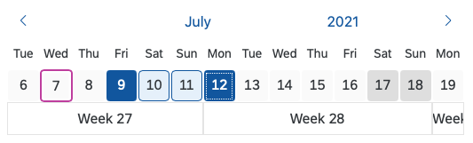
The date interval control is divided into two main areas: date interval navigation, and date interval display and selection.
The navigation area contains two arrows (one to the left, one to the right), which allow the user to navigate easily to the previous and next date ranges. This area also contains month and year indicators, which display the currently selected month and year. These indicators trigger the month and year navigation mode of the control.
The display/selection area is primarily used to display the range of days in the current date interval. You can also display a second row to show the calendar week (property: showWeekNumbers). When the user triggers month or year navigation, a range of months or years is displayed in this section to enable easy interval navigation.
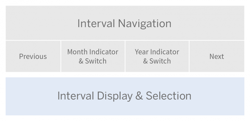
Schematic visualization of calendar date interval
Components
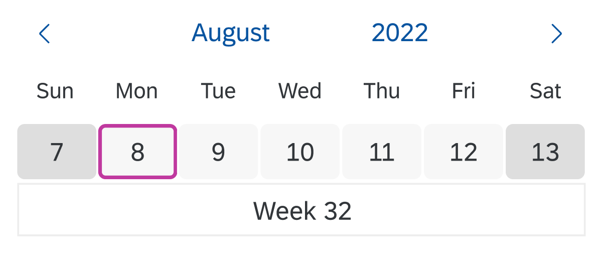
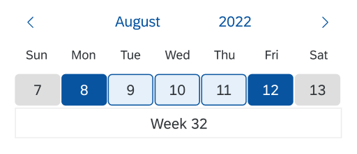
Current Day
The current day is highlighted by a colored frame. Weekends are shaded in a slightly darker gray.
Calendar date interval
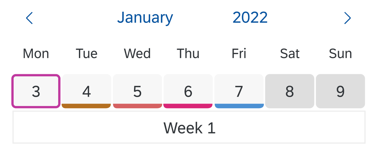
Special Days
You can mark special days, such as public holidays, with a colored line along the lower edge.
Color markings for special days
Behavior and Interaction
The behavior and interaction of the calendar date interval control can be divided into two parts: navigation and selection.
Navigation
Previous/Next
The user clicks the Previous or Next arrow to replace the currently displayed date interval with the previous or next date or period. Previous/Next navigation can be used while the user is in selection mode, as well as in month, year, or year interval navigation mode.
Navigation by Month
The user triggers month navigation mode by clicking the month link above the date range interval. The currently selected month is highlighted. Clicking a month switches the date range interval to the selected month. The user can browse the months by clicking the Previous and Next arrows.
Navigation by month
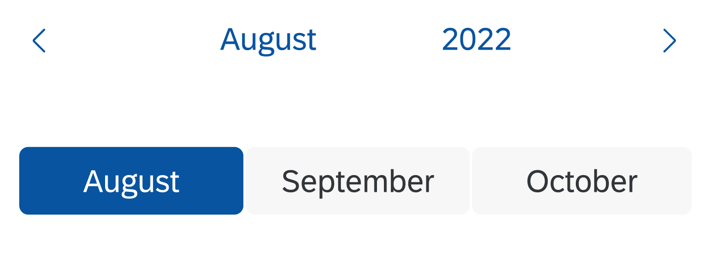
Navigation by Year
The user triggers year navigation mode by clicking the year link above the date range interval. The currently selected year is highlighted. Clicking a year switches the date range interval to the selected year. The user can browse the years by clicking the Previous and Next arrows.
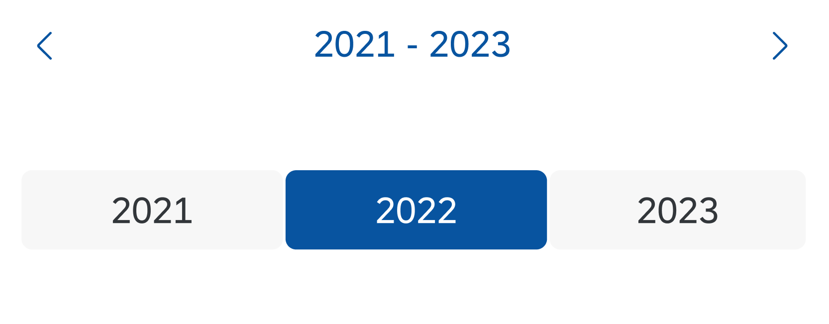
Navigation by year
Navigation by Year Interval
The user triggers the year interval navigation mode by clicking the year interval above the year selection area. The year interval containing the currently selected year is highlighted. Clicking a year interval switches the year range to the selected set of years. The user can browse the year intervals with the Previous and Next arrows.
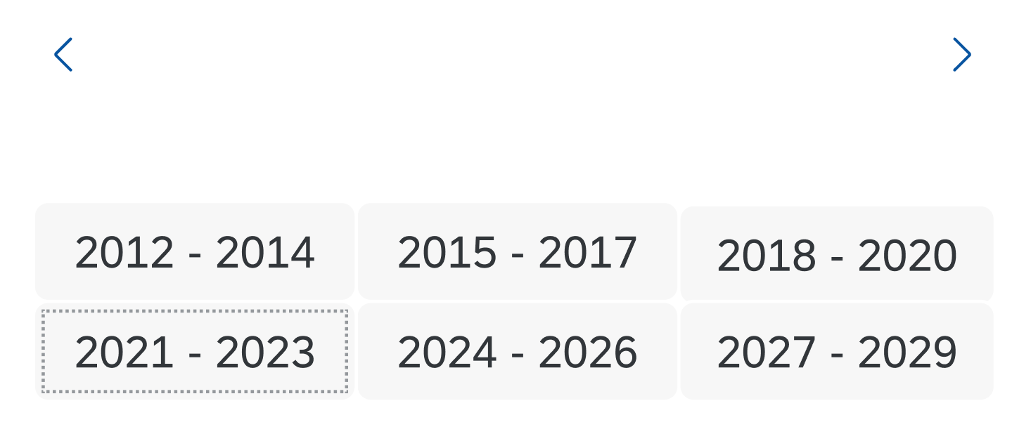
Navigation by year interval
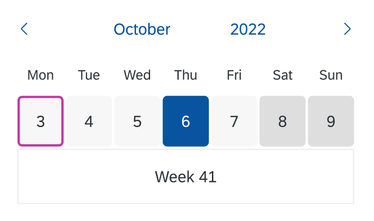
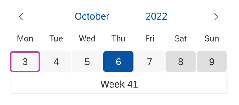
Selection
The calendar date interval control can be set up for single day selection, multiple day selection, or date range selection.
Single day
The user clicks an unselected day to select that particular day and deselect all previously selected days. Clicking a selected day a second time removes the selection. Only one day can be selected at a time. The selected day is highlighted.
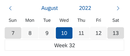
Selection – Single day
Multiple days
The user clicks an unselected day to select that particular day. Clicking a selected day a second time removes the selection. Multiple days can be selected. Selected days are highlighted.
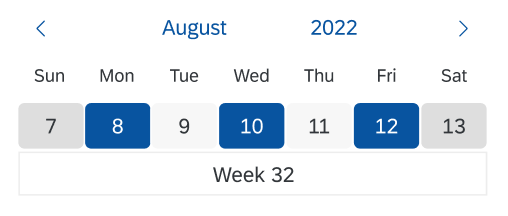
Selection – Multiple days
Date range
The user clicks an unselected day to select the start date. Clicking a second unselected day selects the end date. Both the start and end dates are highlighted. The days in between are highlighted in a lighter color. The minimum range is one day and only one range can be selected at a time.
Selection – Date range
Responsiveness
The horizontal space occupied by the control is already minimal, so the responsiveness is limited to the width of the control.
On small screens, the maximum number of days per range interval is automatically reduced to eight.
Cozy
Compact
Examples
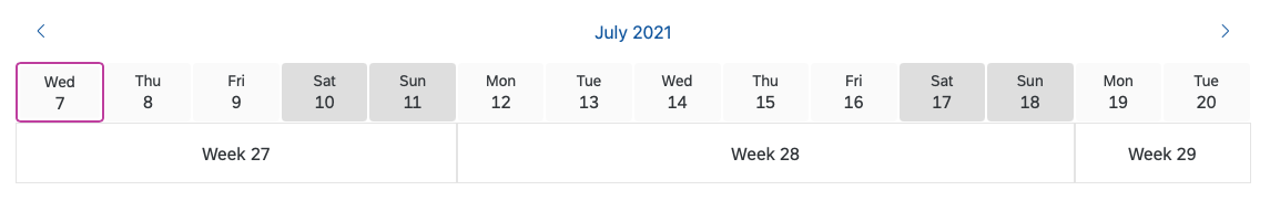
Calendar date interval displaying several weeks
Calendar date interval with a selection
Related Links
Elements and Controls
- Calendar (guidelines)
- Date Picker (guidelines)
- Date Range Selection (guidelines)
- Date/Time Picker (guidelines)
- Dynamic Date (guidelines)
Implementation
- Calendar Date Interval (SAPUI5 samples)
- Calendar Date Interval (SAPUI5 API reference)
 Your feedback has been sent to the SAP Fiori design team.